27 Old Toys With Specific Box Art That Determine Resale Price
There’s a particular kind of collector who doesn’t just want the toy — they want the box. Specifically, they want that box: the one with the right illustration, the right color blocking, the right era-specific font that tells you exactly which production run it came from.
To the uninitiated, this sounds like splitting hairs. To anyone who’s ever watched a near-mint G.I. Joe fetch three times the price of an identical loose figure simply because the cardback showed a specific weapons layout, it sounds like basic literacy.
Box art has always been doing more work than it gets credit for. Before unboxing videos and online reviews, the box was the marketing — a painted promise of what the toy could be in the right hands, usually depicting action scenes that the plastic inside had no physical ability to replicate.
But that gap between promise and reality is part of what makes certain boxes so collectible now. They’re artifacts of a specific imagination, a specific moment, a specific print run. And print runs matter enormously when money enters the conversation.
Star Wars Vintage Kenner (12-Back Cards)
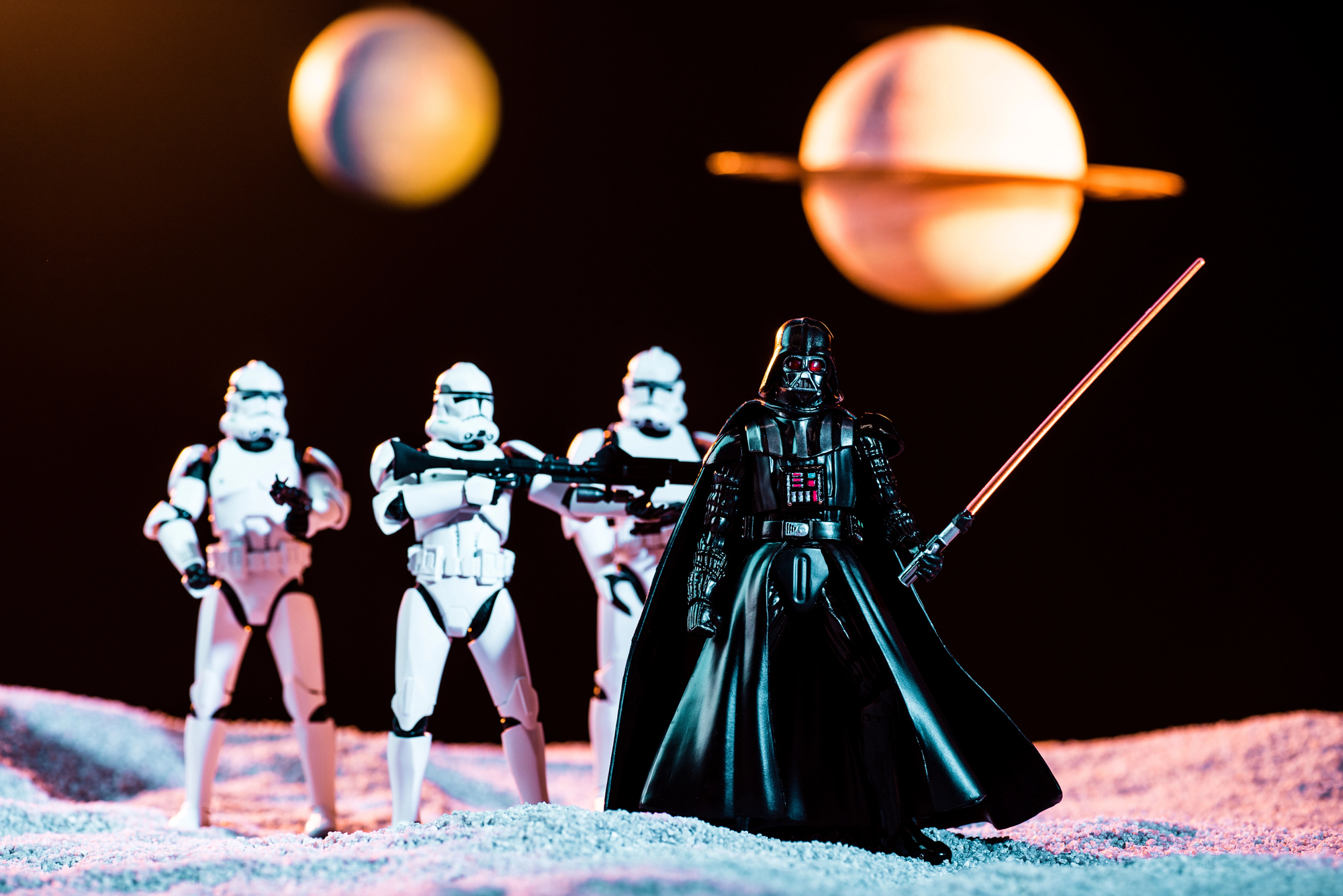
The earliest Star Wars action figures from Kenner came on cards advertising only 12 figures — hence “12-back.” A sealed or even unpunched 12-back Luke Skywalker card in sharp condition routinely sells for thousands of dollars, while the same figure on a later card might fetch a fraction of that.
The card art itself — that iconic starfield illustration — is consistent across the run, but the specific 12-back designation is the price anchor.
He-Man Masters of the Universe (Cross-Sell Art Variations)
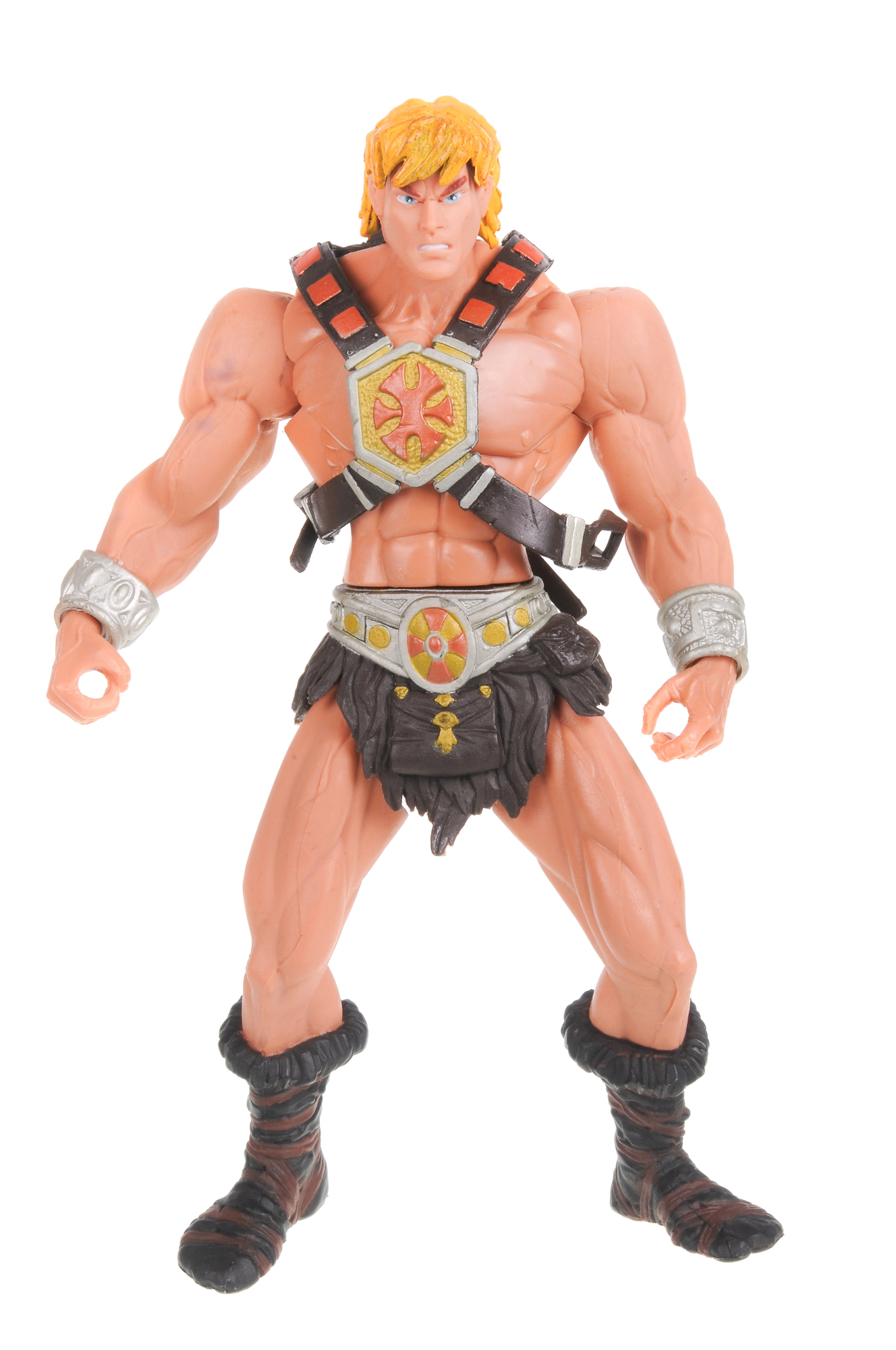
The earliest Masters of the Universe packaging featured painted cross-sell artwork on the back showing other figures available in the line, and collectors have mapped these variations obsessively — because a card with specific cross-sell art (showing, say, only the first wave of characters rather than later additions) places a figure firmly in the first production run, which is: exactly where serious buyers want to be. So a He-Man figure on a card with first-wave-only cross-sell art commands a meaningfully different price than the same figure on a later card, even when the plastic inside is identical.
The box art, in this case, is functioning less like packaging and more like a birth certificate.
Transformers Generation 1 (Rub Sign vs. Pre-Rub Variants)
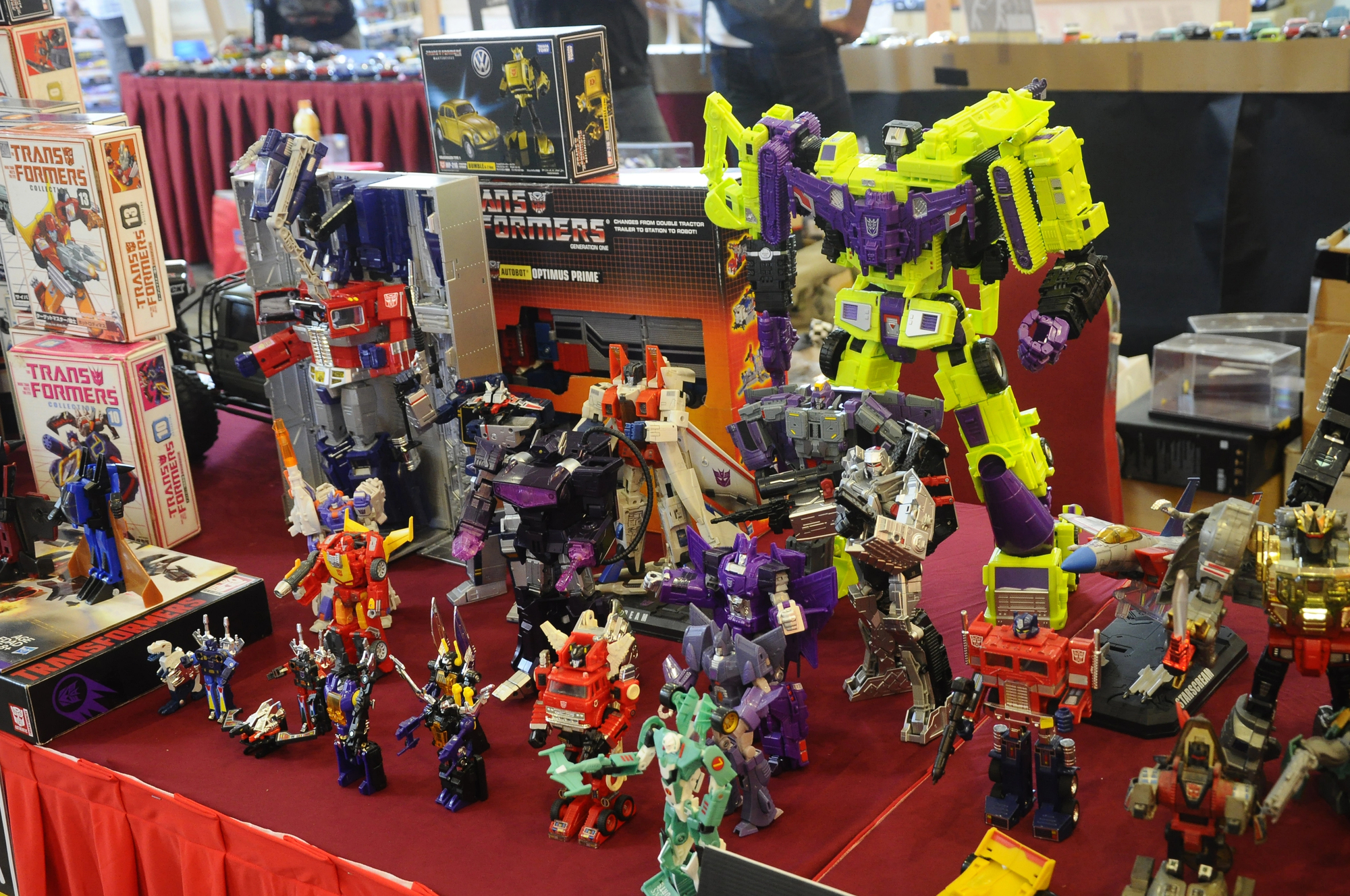
Pre-Rub Transformers — produced before Hasbro introduced the heat-activated “Autobot Rub Sign” in 1985 — carry significantly higher resale value than their later counterparts. The box art is nearly identical between variants, but collectors check the front panel specifically for the absence of the rub sign icon, which places the toy in the earliest production window.
A sealed Pre-Rub Optimus Prime in its original box is a legitimately serious collectible.
G.I. Joe A Real American Hero (File Card Variations)
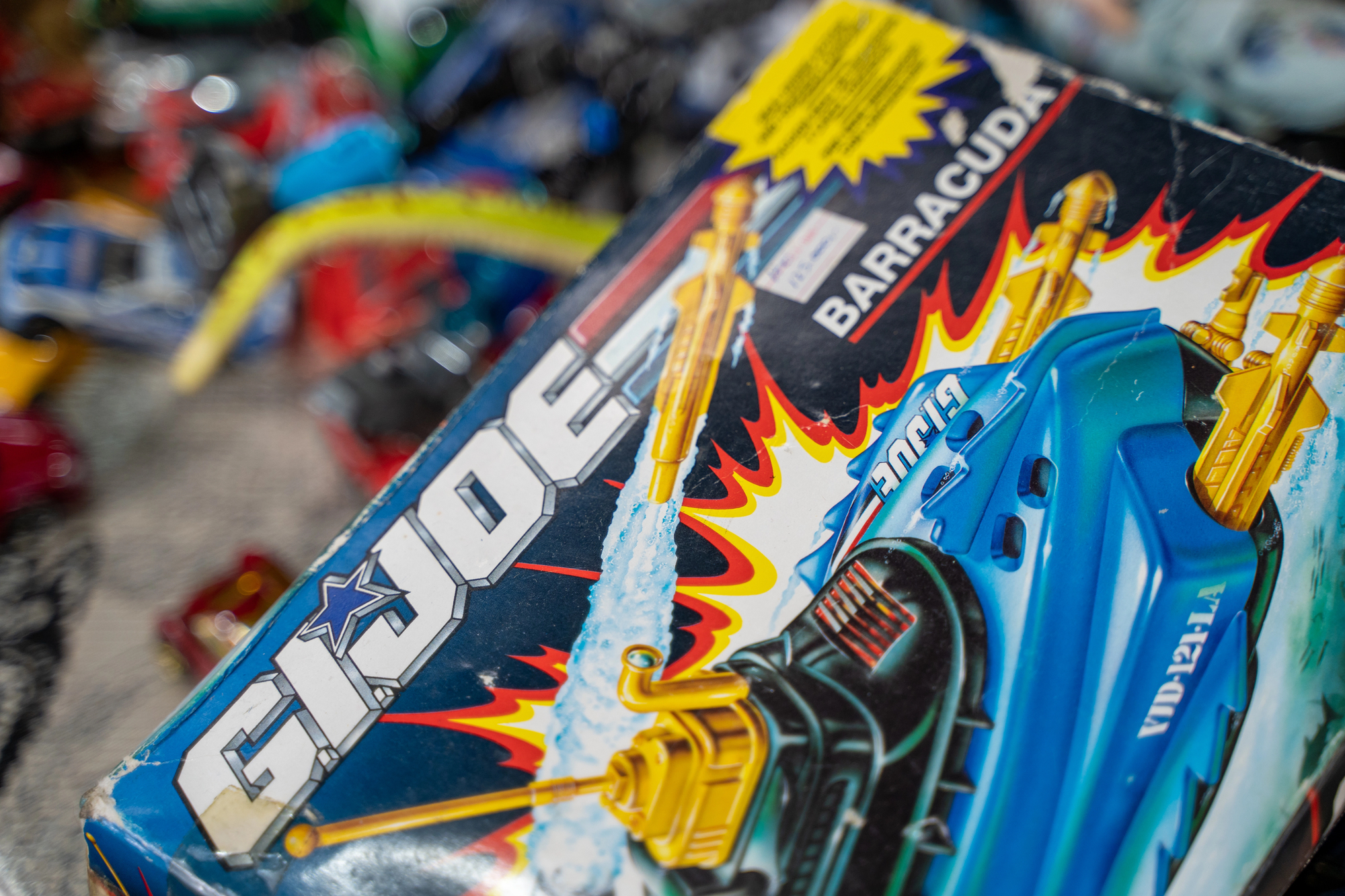
The file card printed on the back of G.I. Joe cardbacks — detailing each character’s specialties and biographical data — went through subtle revisions over production runs, and those revisions create collector tiers. First-print file cards with specific copyright dates, particular UPC formats, or early artwork that was later revised are the ones driving premium prices.
It’s one of those collecting niches where you genuinely need to memorize copyright footer formatting to know what you’re looking at.
Barbie (Swimsuit Era Boxes, 1959–1961)
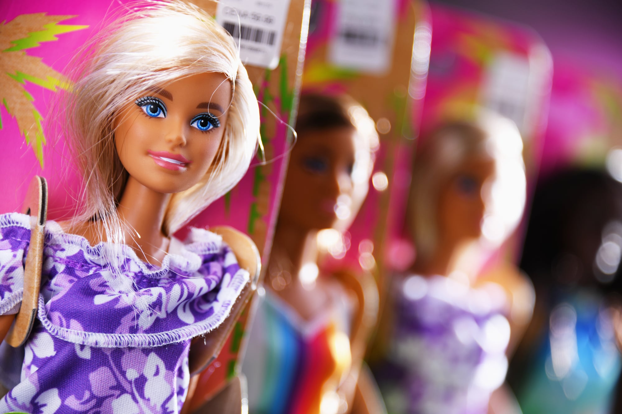
The original Barbie box from 1959 is less a toy package and more a small window into a very specific postwar optimism: all that clean typography, the restrained color palette, the suggestion of a lifestyle rather than a product. Boxes from the 1959–1961 period with the original black-and-white swimsuit illustration — before Mattel updated the graphics — have the quiet authority of things that didn’t know they were going to matter.
A worn example with intact graphics still commands attention; a crisp one with sharp corners corrects the market’s understanding of what “rare” means.
Hot Wheels Redlines (Blister Pack Graphics)
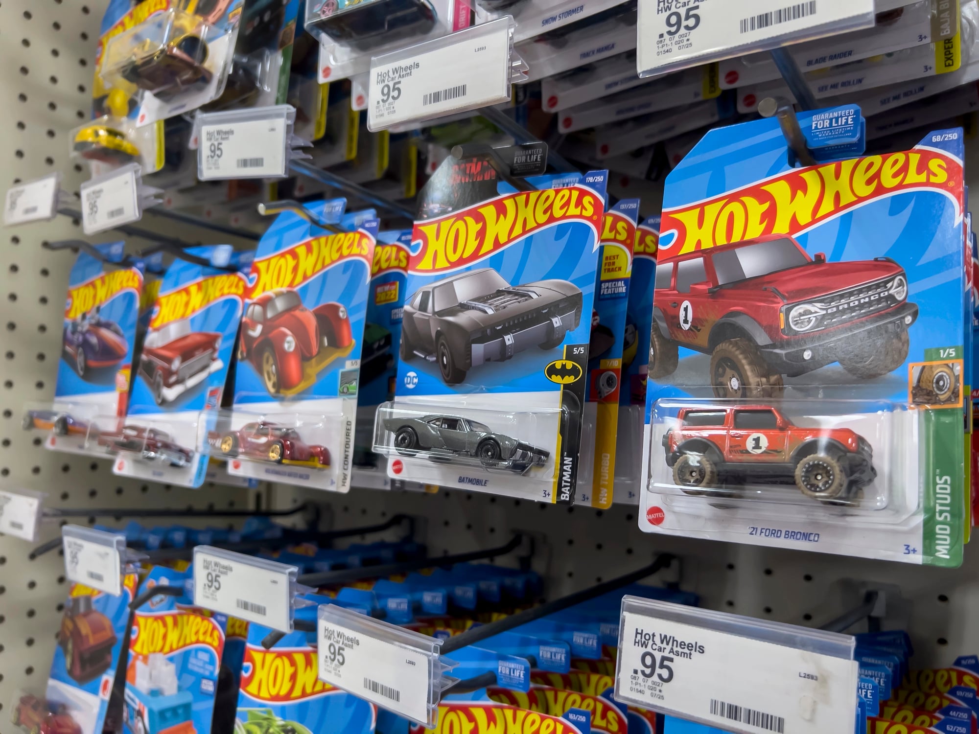
The earliest Hot Wheels from 1968 came in blister packs with a distinctive yellow header card featuring specific logo treatments and early car illustrations. Redline-era Hot Wheels — named for the red stripe on the tires — are already sought-after, but a carded example with an intact, unbleached, unpunched header card in strong condition multiplies the value sharply.
The yellow tends to fade, which means a vivid yellow card is its own kind of rarity.
Star Wars Power of the Force (Coin Cards)
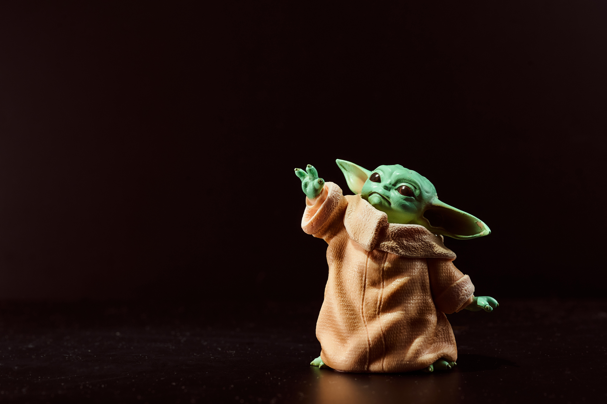
The 1984–1985 Power of the Force wave is the most undervalued Star Wars line to casual collectors and the most obsessed-over by serious ones. Each figure came on a card with a distinctive gold logo treatment and a collectible coin insert, and the specific card-to-coin pairing matters to completists in ways that can swing prices by hundreds of dollars.
Turns out, a Luke Skywalker in Battle Poncho on a clean POTF card with the matching coin attached is a different object entirely than a loose figure rattling around a dealer bin. The box art here is doing double duty as provenance documentation.
Strawberry Shortcake (First Edition Kenner Packaging)
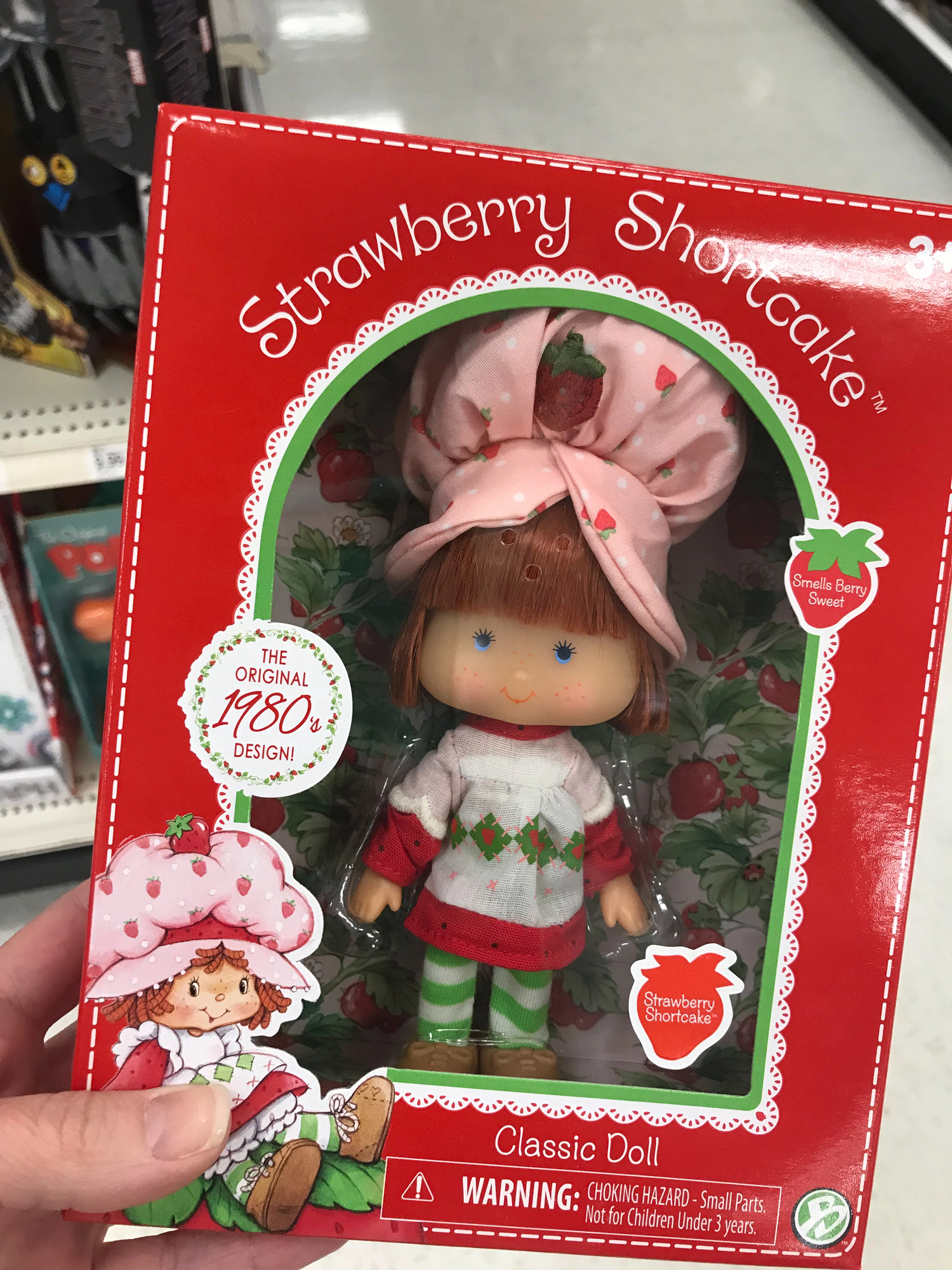
The original Kenner Strawberry Shortcake figures from 1979–1980 came in boxes with a very specific hand-illustrated style — warm, slightly uneven linework, colors that lean toward ochre and dusty rose rather than the brighter palette used in later runs. First-edition boxes in this style, particularly for the original six characters, are the ones that collectors chase.
The scented figures themselves degrade over time, so a sealed example with the original box art intact is genuinely uncommon.
Voltron (Matchbox vs. Panosh Place Packaging)
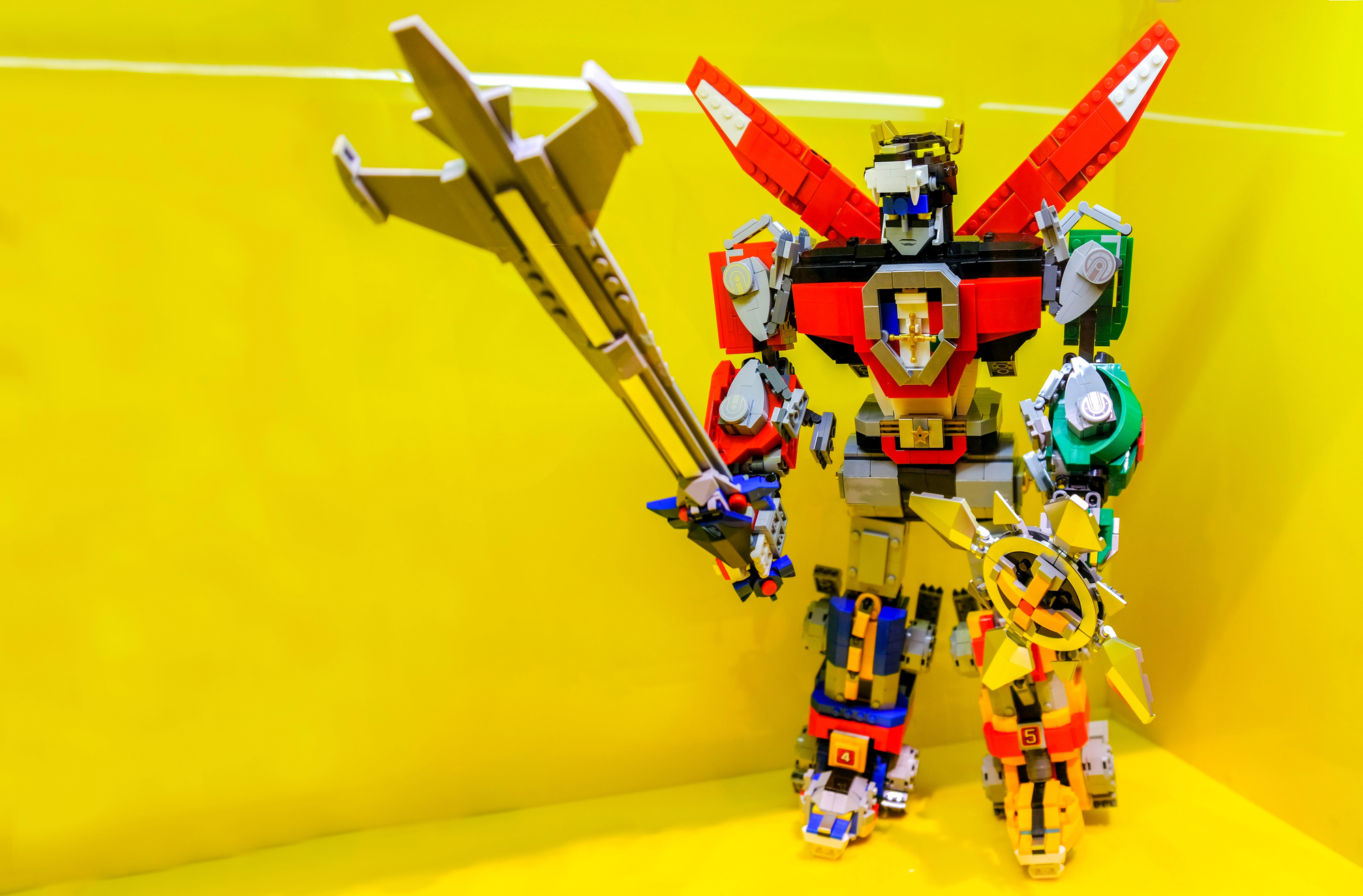
Voltron had two distinct American distributors at different points in the 1980s, and the packaging between Matchbox and Panosh Place versions differs enough that collectors treat them as separate collectibles — which, for pricing purposes, they essentially are. The Matchbox lion Voltron packaging (featuring that rich, deep blue background with the assembled robot looming large in painted glory) tends to command stronger prices than the Panosh Place character figures, partly because the box art on the Matchbox version has a compositional confidence that later packaging never quite matched.
And there’s something almost architectural about that original lion set box: large, heavy, the art wrapping around all four sides like it had something to prove.
LEGO Castle (Classic 1978–1984 Sets)
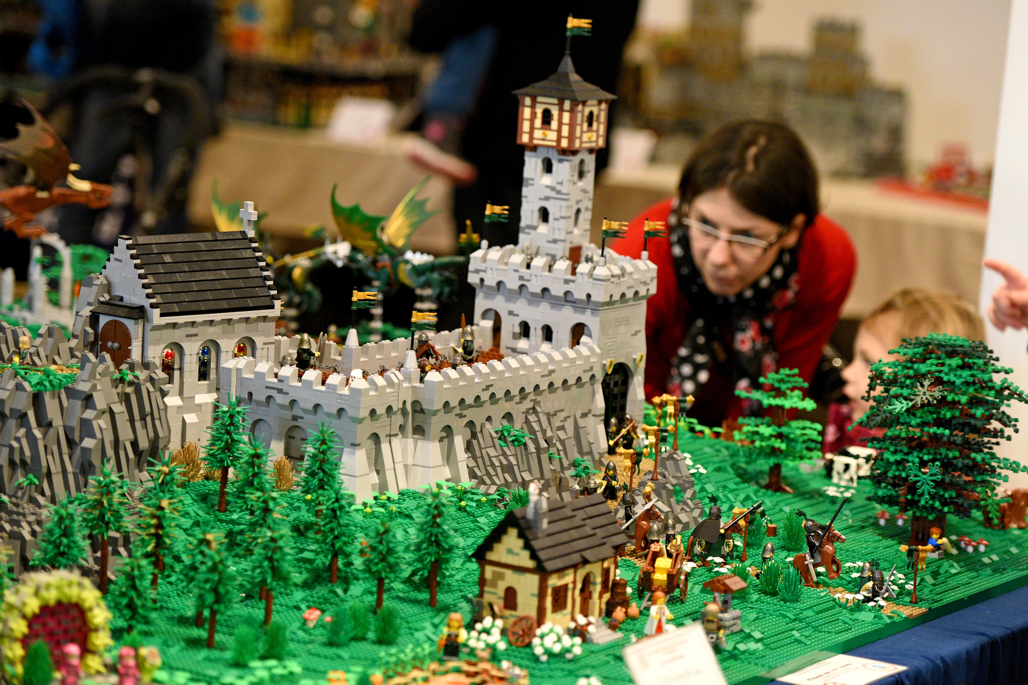
Early LEGO Castle sets — particularly 375/6075 Castle from 1978 — came in boxes with hand-rendered illustration art depicting knights in action scenes that had an almost storybook quality. These aren’t photographs of built models; they’re painted scenes.
Sealed examples of these early sets with intact box art in good condition have appreciated considerably, and the specific illustration style of the pre-1985 boxes is what collectors use to authenticate era. A creased or water-damaged box on the same set can cut the price by more than half.
Evel Knievel Stunt Cycle (Ideal Toys Packaging)
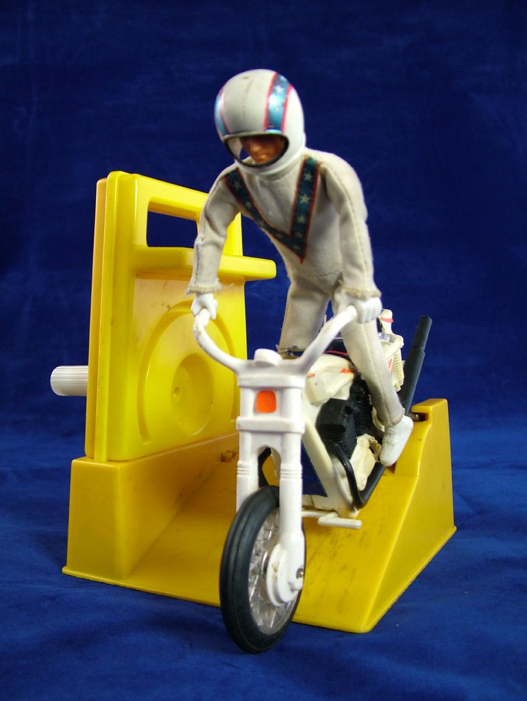
The Evel Knievel Stunt Cycle box from Ideal looked like a movie poster that got lost and ended up in the toy aisle — Evel himself mid-jump, the colors loud and unapologetic, the whole composition radiating the specific recklessness of 1972. That illustration wasn’t just selling a toy; it was selling a posture, a willingness to ignore consequences, which in retrospect explains a lot about the decade.
A complete boxed example with the original illustrated lid in strong condition has become legitimately hard to find, partly because the boxes were spectacular enough that kids wanted to look at them and terrible enough at surviving that almost none did.
Mego World’s Greatest Super Heroes (Type 1 vs. Type 2 Boxes)
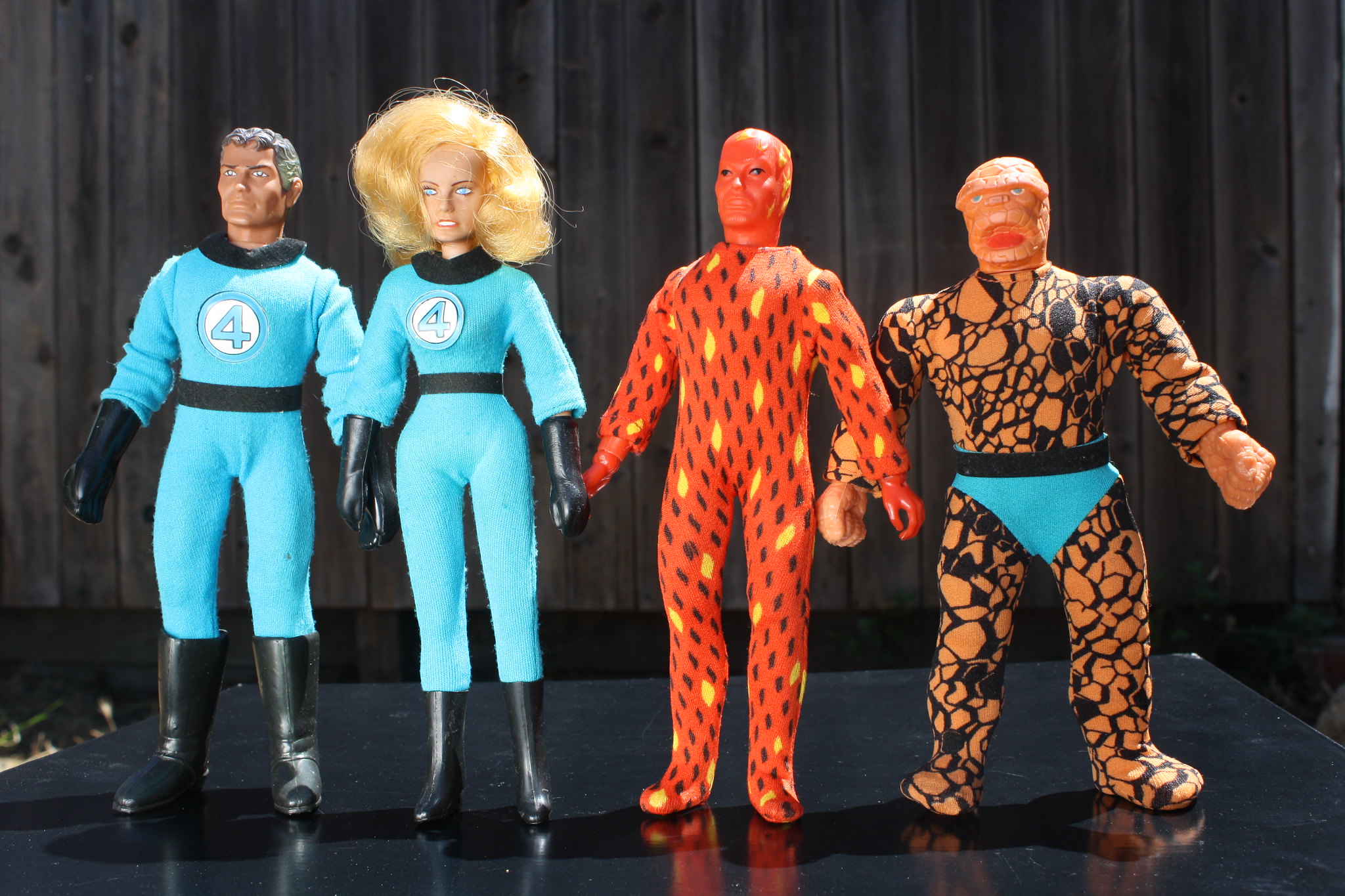
Mego’s 8-inch superhero figures went through distinct box variations, and the earliest “Type 1” boxes — featuring painted art rather than photographic images — are the primary target for collectors. A Batman in a Type 1 painted-art box is a fundamentally different purchase than the same figure in a later photo-illustrated box, and pricing reflects this accordingly.
The gap between them can run into the hundreds of dollars for common characters and well beyond that for rarer figures.
Cabbage Patch Kids (Original Coleco, 1983–1984 Boxes)
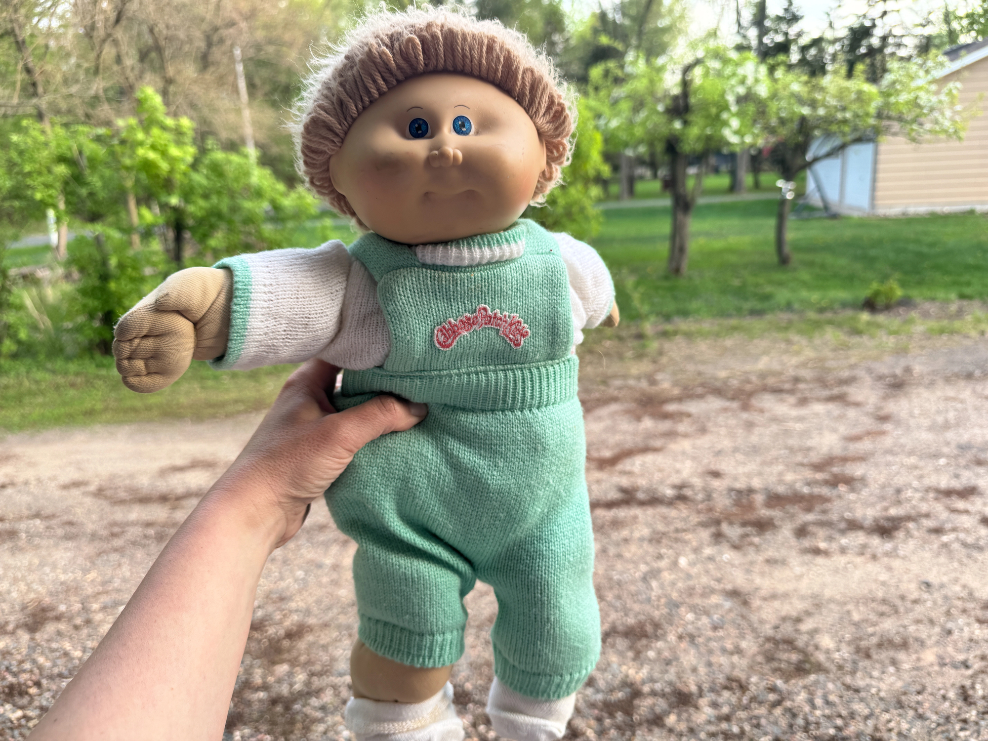
Original Coleco Cabbage Patch Kids boxes are distinctive. The typography, the birth certificate imagery, the specific green color — all markers of the first production years.
Later Xavier Roberts licensing updates changed the box design measurably. First-run boxes in collectible condition are the ones serious buyers want.
Care Bears (Kenner First Edition Plush Packaging)
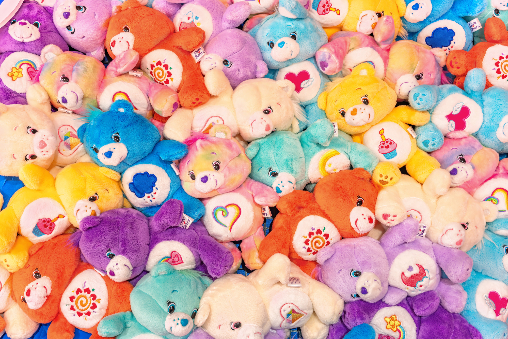
The original 1983 Kenner Care Bears came in window boxes with a specific cloud-and-rainbow illustrated background that later production runs softened and eventually replaced with photography. A sealed first-edition Care Bear in the original illustrated window box — particularly for the original ten characters — commands a meaningful premium over later packaging versions.
The illustrated cloud background is the tell.
GoBots (Tonka vs. Bandai Packaging)
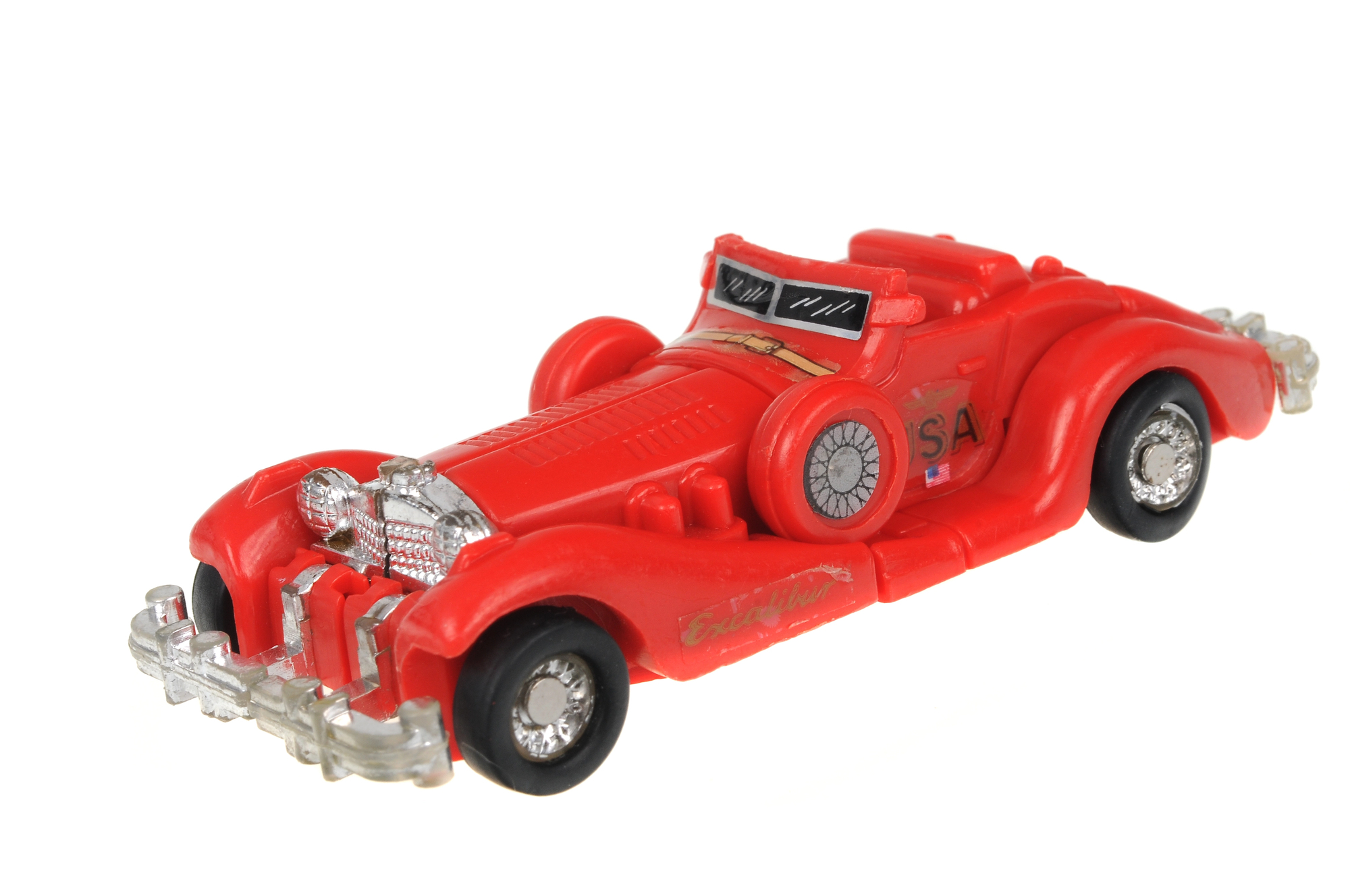
GoBots get dismissed as the lesser Transformers, which is reductive and also largely accurate, but that doesn’t make their packaging irrelevant to collectors. The original Bandai (Machine Robo) packaging used in Japan, and early Tonka packaging for the American market, are meaningfully different from later production boxes, and the first-run Tonka Leader-1 and Cy-Kill in original packaging fetch real money from the right buyers.
To be fair, the box art on the original Tonka releases had a genuine graphic intensity that later releases diluted into blandness.
Fisher-Price Little People (Wooden Figure Era Sets)
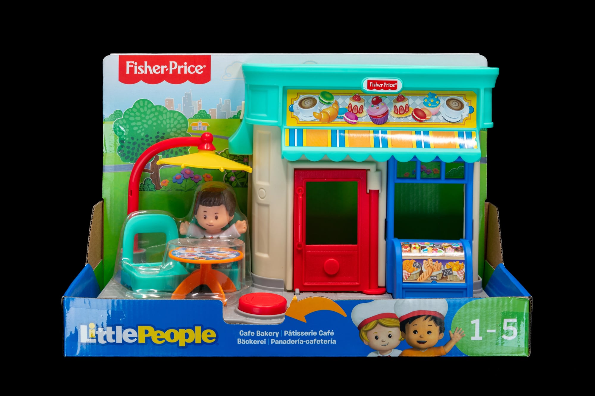
Pre-1985 Fisher-Price Little People sets — before the figures transitioned from wood-and-plastic to all-plastic — came in boxes with a very particular illustrated aesthetic: warm, slightly naive linework, unpretentious color use, an overall graphic sensibility that reads as unmistakably pre-Reagan. The Farm set (number 915) and the Airport set (number 996) in their wooden-era boxes with original intact graphics are what collectors specifically seek, and the presence of the box is often the deciding factor between a toy worth $30 and one worth $300.
Teenage Mutant Ninja Turtles (First Wave Playmates Cards)
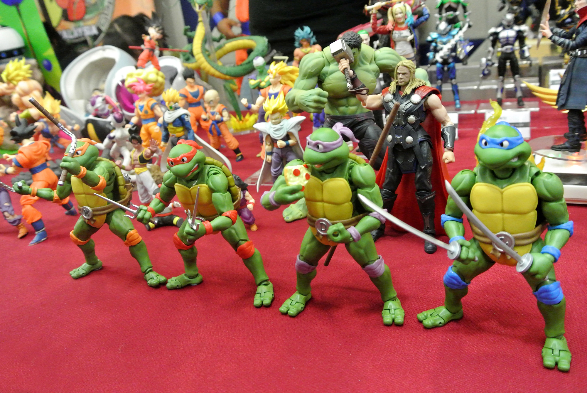
The first wave of Playmates TMNT figures from 1988 came on cards with a specific back-panel layout showing only the original four turtles and Splinter as available figures, and because the line expanded so aggressively and so quickly, those first-wave cards with the minimal cross-sell art became immediately dated — which is to say: immediately collectible.
A first-wave Leonardo on an unpunched card with the original back-panel art (showing just those five characters, no Shredder, no Bebop, no Rocksteady) is the version that serious collectors pay serious prices for, while the same figure on a card from six months later might be worth a fifth as much. So the box art here is functioning as a timestamp, and timestamps, it turns out, are expensive.
My Little Pony (First Generation Hasbro, 1982–1983)
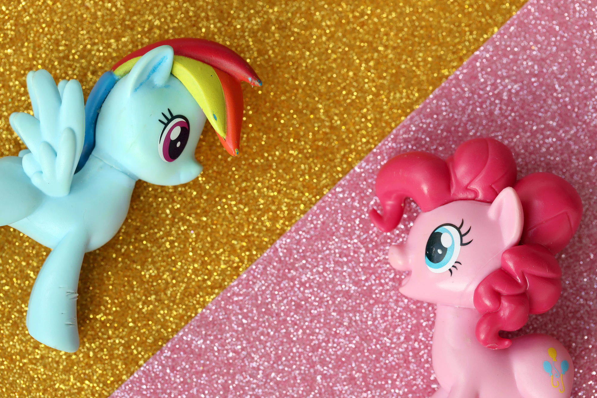
The original 1982–1983 My Little Pony releases came in boxes with a painted meadow illustration style that Hasbro updated fairly quickly as the line expanded. First-generation Earth ponies — particularly the original six — in their painted-art boxes with intact window panels are the targets for G1 MLP collectors.
The specific illustration style, combined with the copyright year printed on the box end, is how collectors date production runs and set prices accordingly.
Kenner Aliens (1992 Packaging Variations)
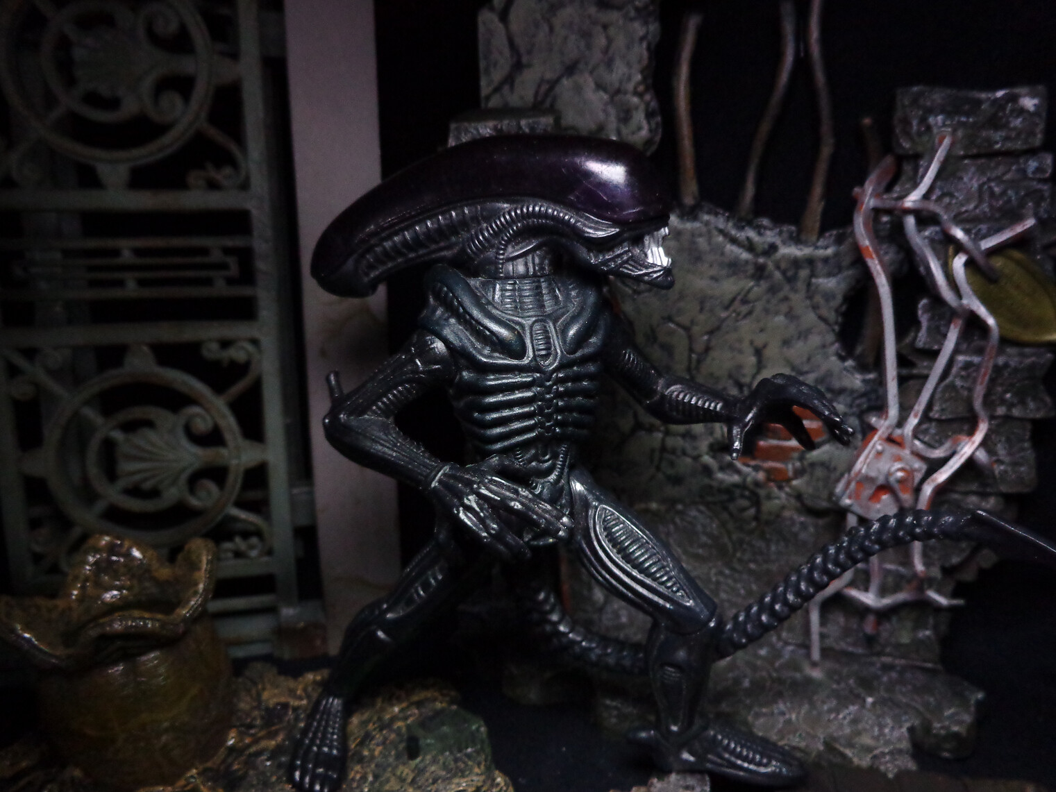
The Kenner Aliens line arrived in 1992 wearing box art that leaned heavily into deep shadow and a kind of industrial menace — dark backgrounds, aggressive angles, the whole visual vocabulary of something that understood it was selling fear in a toy aisle dominated by bright primaries. The Queen Alien packaging in particular has an almost operatic quality, the creature rendered at a scale that makes the cardback feel genuinely crowded.
Sealed first-run examples have appreciated steadily, partly because the line was short-lived and partly because that box art aged into something that reads less like old packaging and more like a period piece.
Speak & Spell (Texas Instruments, First Edition)
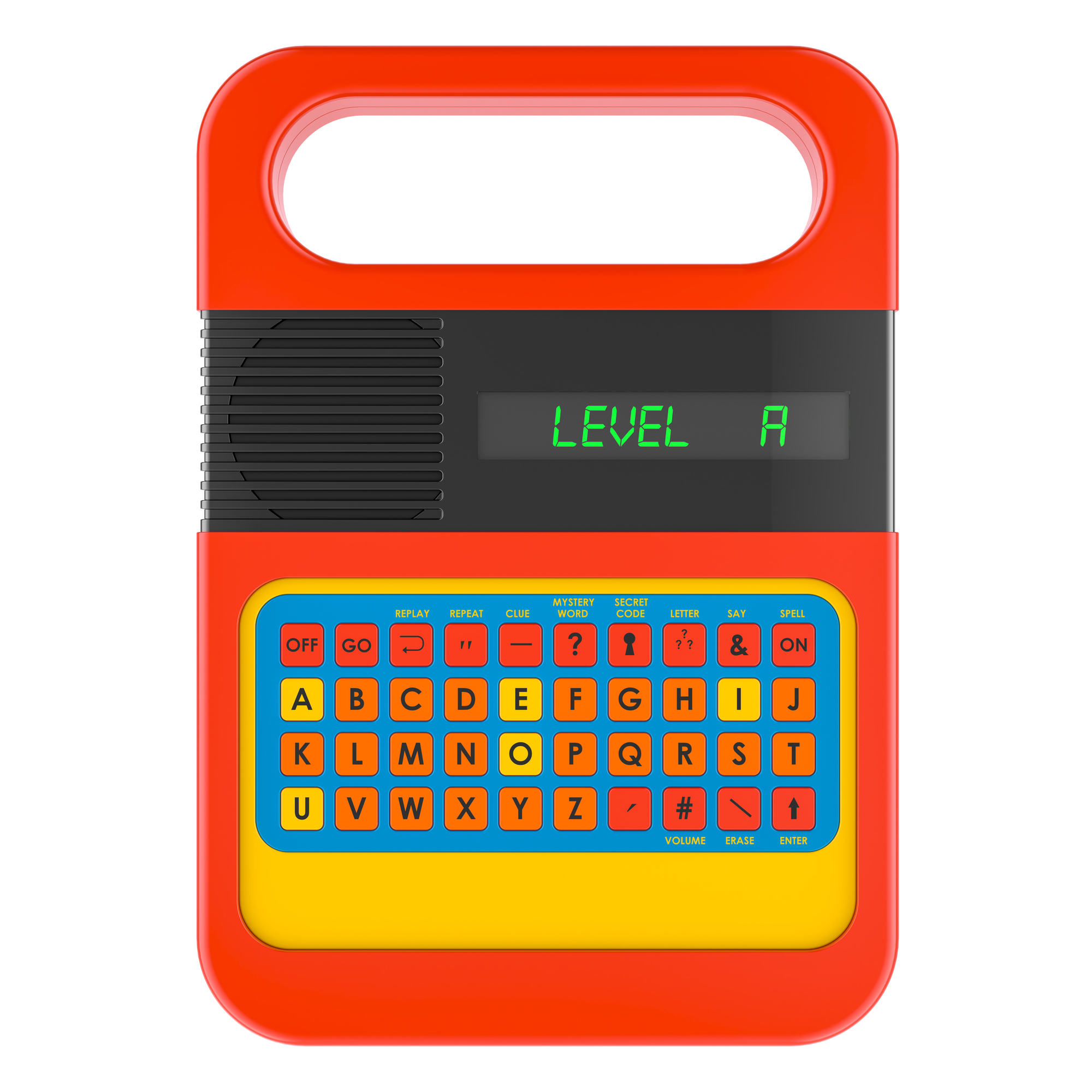
The original 1978 Texas Instruments Speak & Spell came in a box with a specific early logo treatment and a product illustration style that predates the more polished later packaging. First-edition boxes — identified by the specific TI logo treatment, the original patent-pending language, and the 1978 copyright — are what serious vintage electronics and toy collectors look for.
The toy itself changed very little between early and late production, but the box tells the whole story.
Big Jim (Mattel, Original 1971–1972 Packaging)
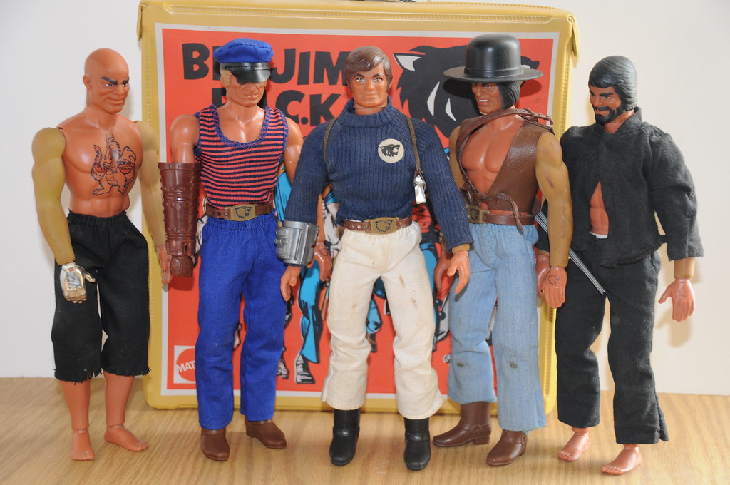
Big Jim’s original 1971 Mattel packaging is unmistakable. The action illustration style — Big Jim mid-flex, colors saturated to near-aggressive levels — established a template that competitors spent years chasing.
Later packaging softened the graphic intensity noticeably. First-run boxes with the original illustrated style are the ones that command collector prices.
Shogun Warriors (Mattel Large Figure Boxes)
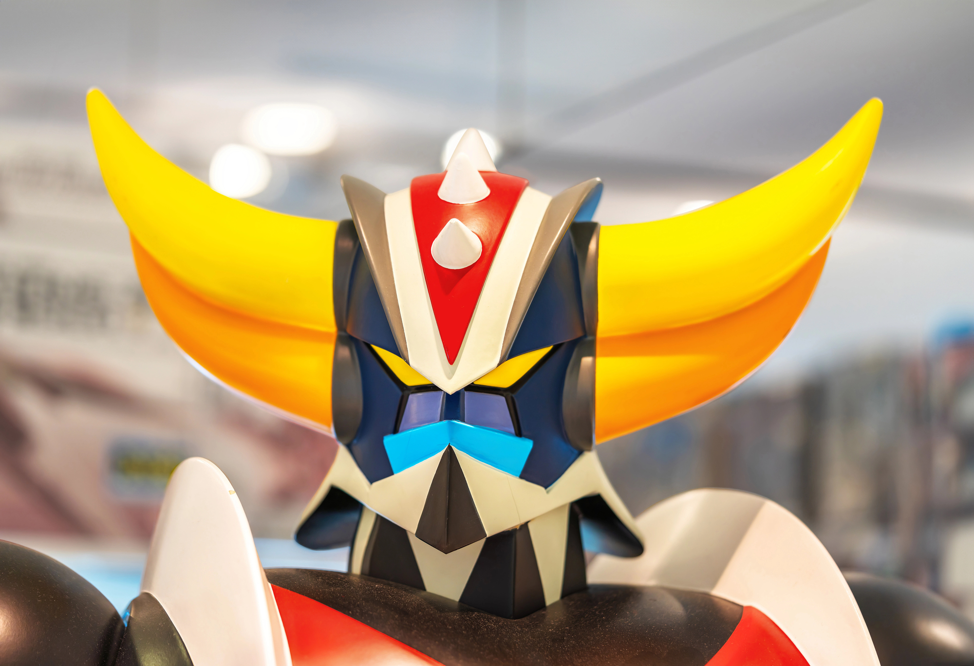
The oversized Mattel Shogun Warriors — Jumbo Machinder figures standing nearly 24 inches tall — came in boxes that were themselves nearly architectural in scale, featuring painted art showing the robots in combat poses against dark, dramatic backgrounds. These boxes are genuinely rare in intact condition simply because the toy’s size meant the packaging took significant abuse.
A Dragun or Mazinga in a clean, square box with sharp illustrated art intact is an exceptional find, and the price reflects that scarcity directly.
Dungeons & Dragons (LJN, 1983 First Wave Packaging)
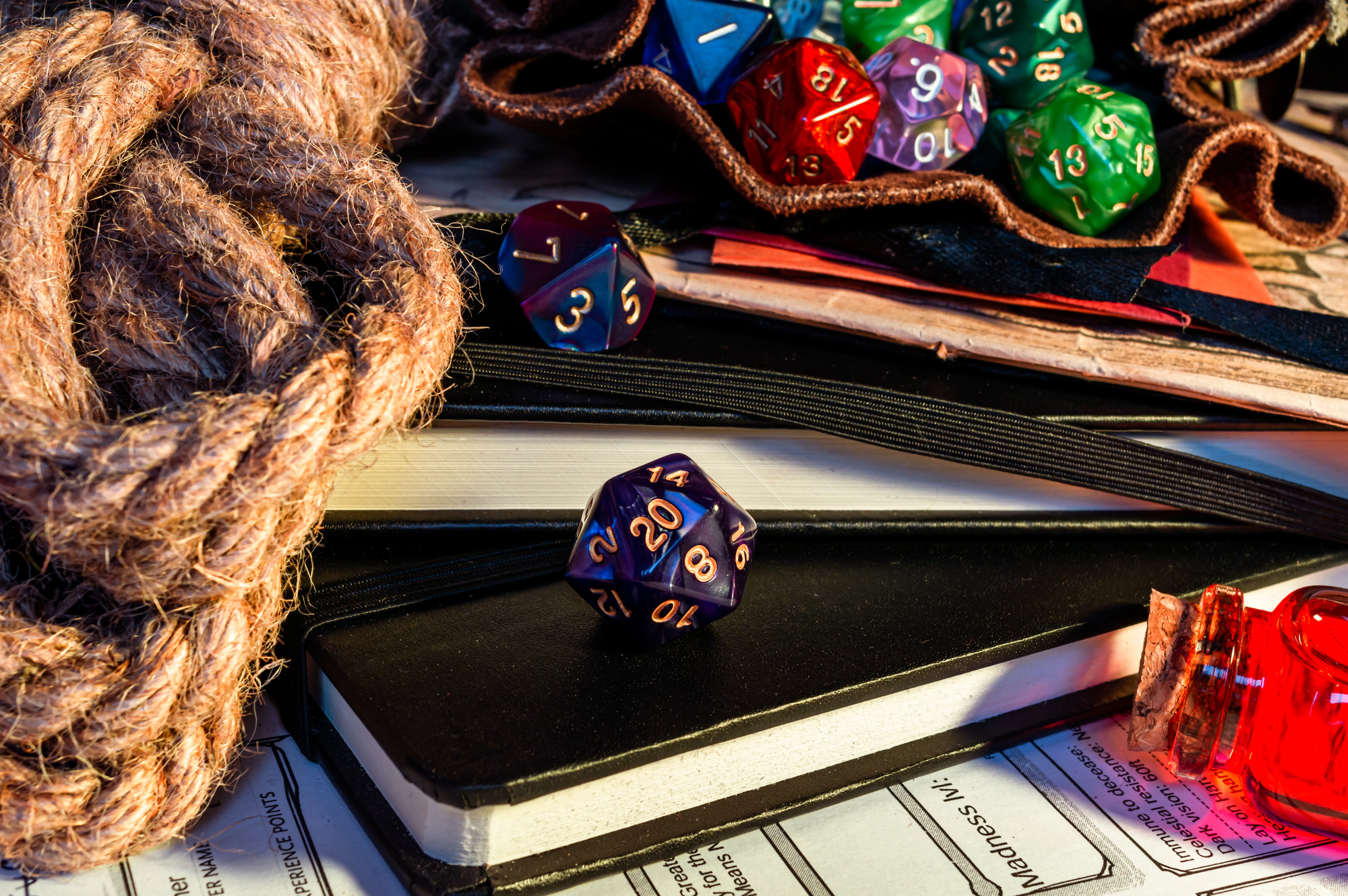
LJN’s 1983 D&D figures came on cards with beautifully rendered fantasy illustration art — painted dragons, dungeon backgrounds, color work that felt genuinely cinematic for a toy card — and because the line only ran a few years before disappearing, those first-wave cards with the original illustrated backing are now the objects of a fairly intense collector focus.
The Warduke figure on a first-wave card with the original illustration intact (as opposed to a worn or price-stickered example) is, in the best condition, a surprisingly expensive piece of cardboard attached to a piece of plastic. So the art wasn’t incidental to the toy: it was, and remains, half of what you’re buying.
Stretch Armstrong (Kenner, Original 1976 Box)
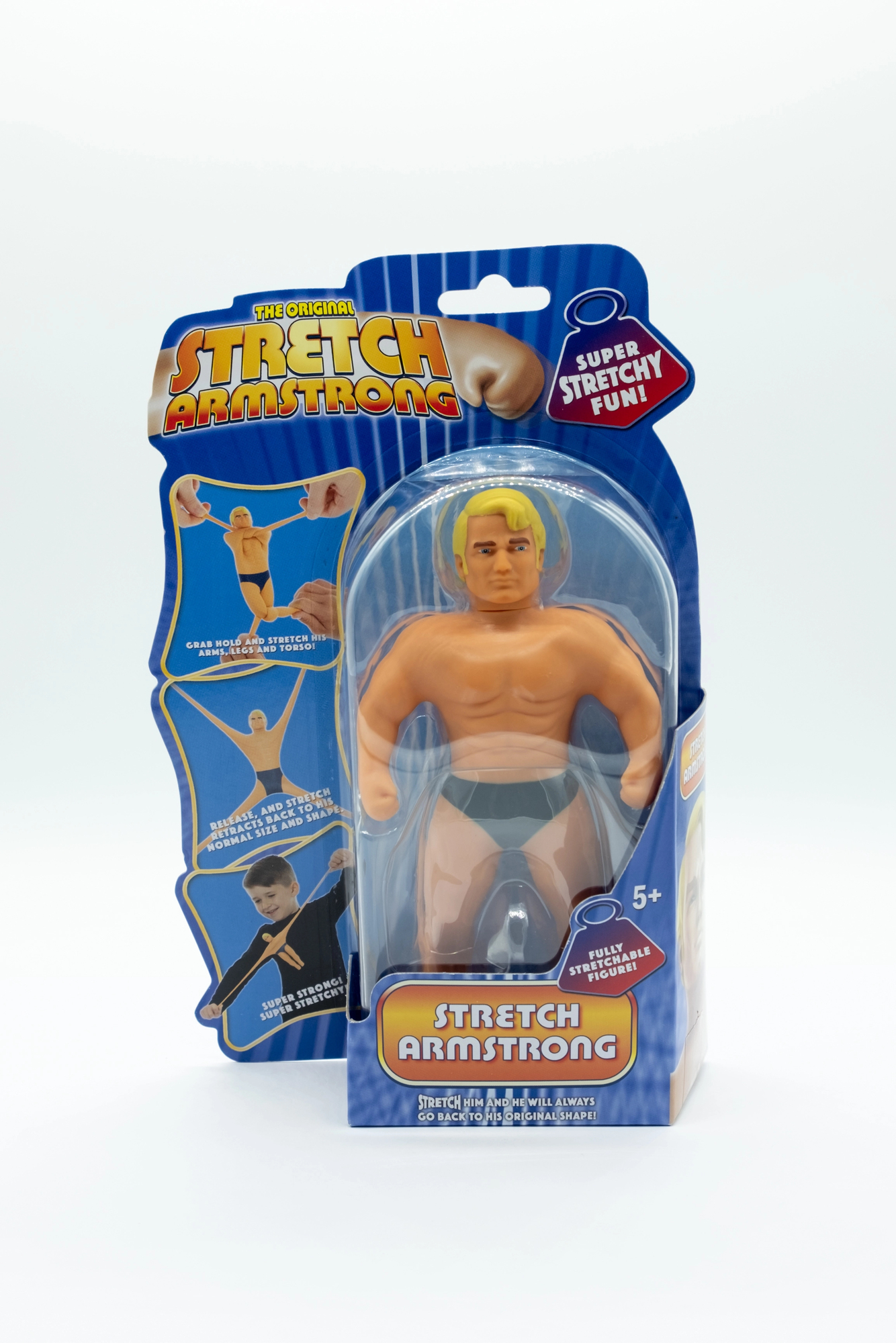
The original 1976 Kenner Stretch Armstrong box featured a specific product illustration with a color palette — that warm, slightly muddy yellow-orange — that immediately identifies it as a first-edition. Later reissues changed the graphic treatment.
Beyond that, the original boxes are exceptionally difficult to find in intact condition because the toy itself was heavy and prone to leaking, which tended to destroy whatever packaging it sat in.
Star Bird (Milton Bradley, 1978 Packaging)
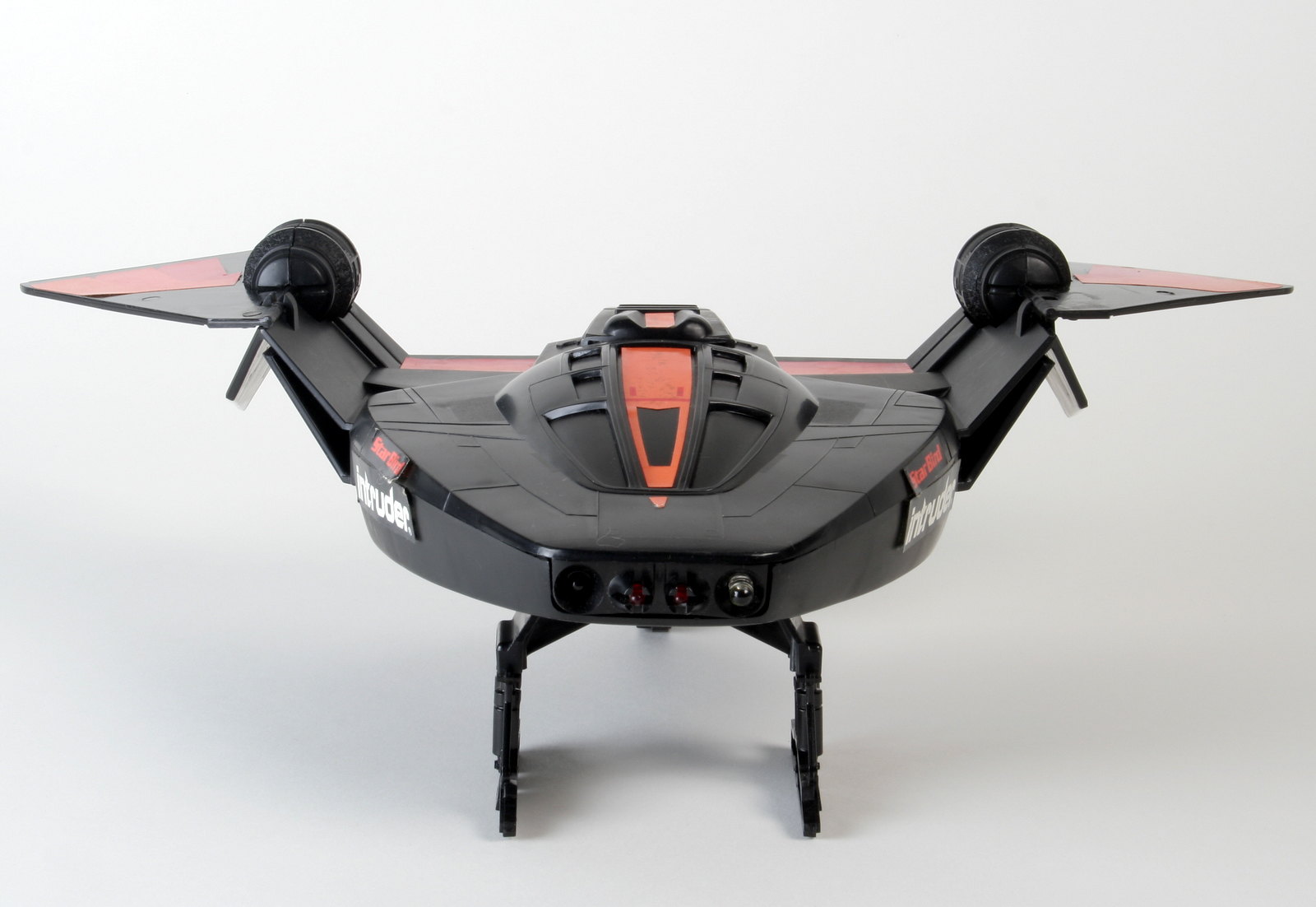
The Star Bird box from Milton Bradley in 1978 had the quiet confidence of something designed before market research fully colonized the toy industry — a single starship rendered against pure black, the light-up nose cone illustrated in a way that looked genuinely luminous, the whole thing suggesting a loneliness that outer space actually has. It sold the silence of it.
Intact Star Bird boxes in strong condition are stubborn finds at any price, and when they do surface, the box art is almost always cited by buyers as part of the appeal — not the afterthought it might seem on the surface.
Micronauts (Mego, Original 1976–1977 Packaging)
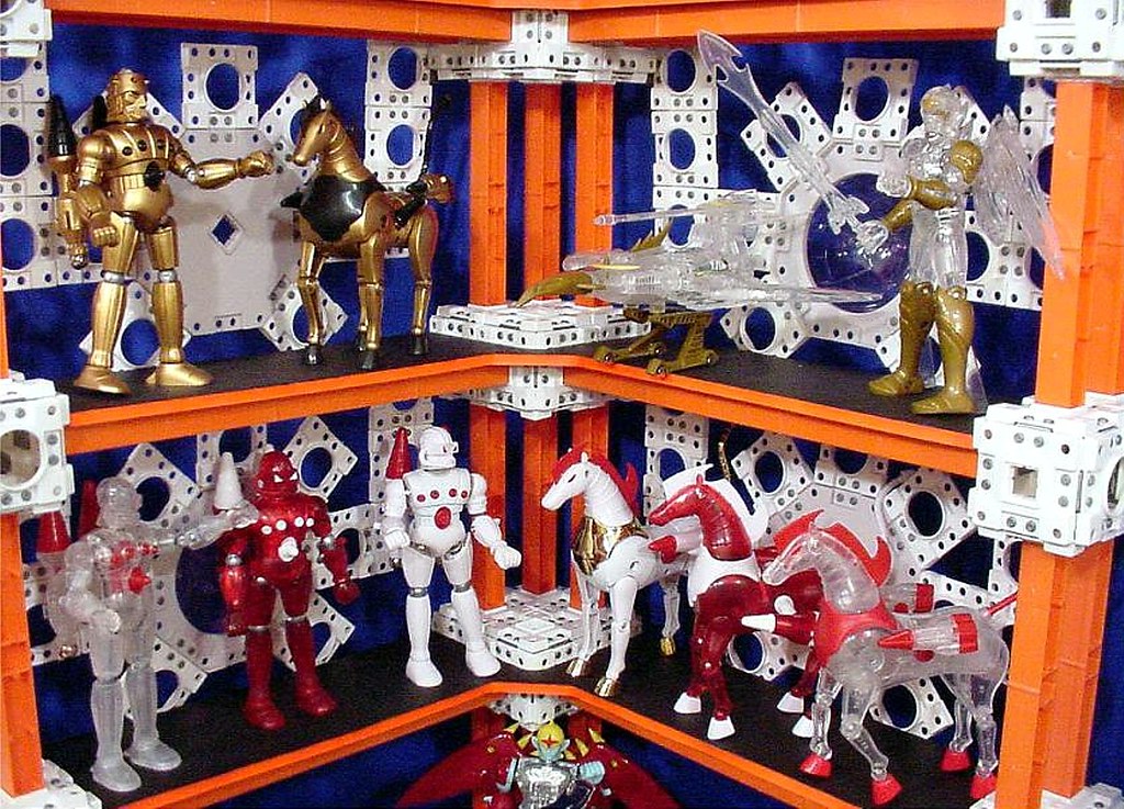
The original Mego Micronauts packaging used a bold, graphic style — clean backgrounds, strong typographic choices, a color system that felt more European than American — that reflected the line’s Japanese origins in the Microman toys. First-wave packaging for figures like Baron Karza and the Time Traveler in intact, unscratched condition is consistently among the more valuable American toy packaging of the late 1970s.
The graphic sophistication of the original art is part of what keeps collector interest elevated.
Atari Touch Me (1978 Handheld, Original Packaging)
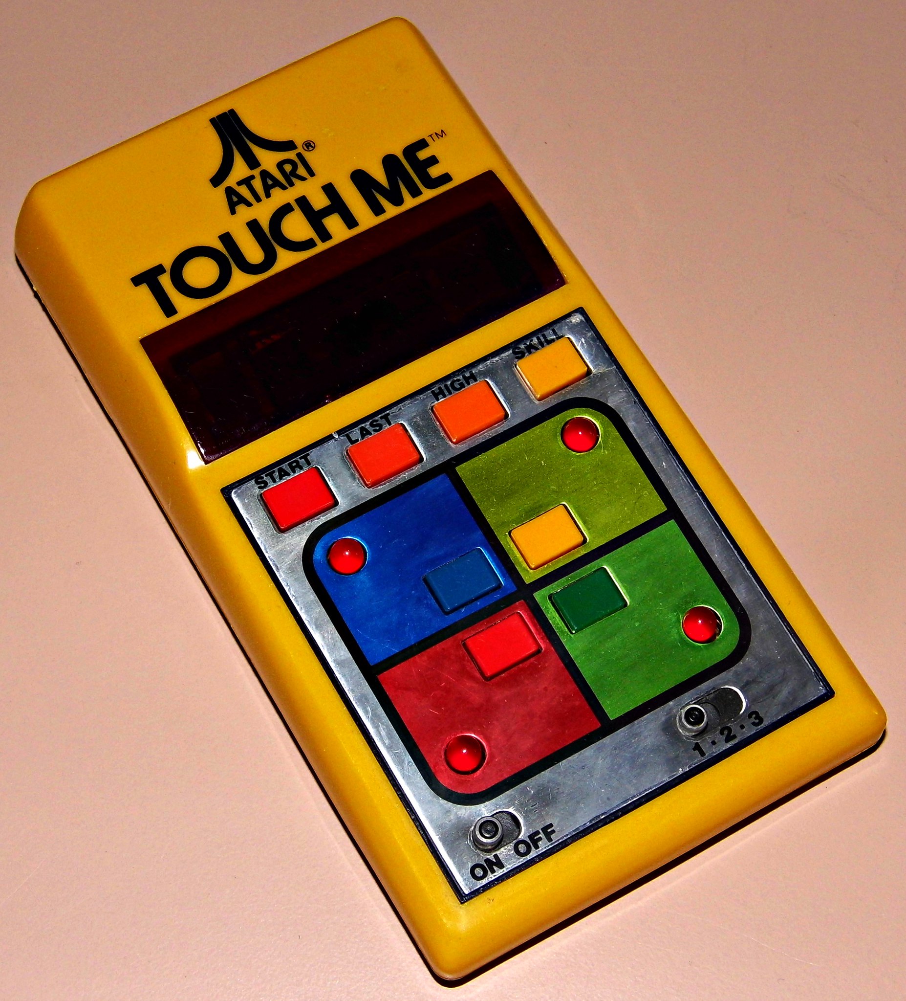
Atari’s Touch Me handheld from 1978 is not a beloved toy. The gameplay was repetitive, the design was utilitarian, and it lost decisively to Milton Bradley’s Simon in the marketplace.
But the original packaging — with its specific Atari logo treatment, the product illustration style, and the 1978 copyright marking it as a first-year release — makes it genuinely collectible to vintage Atari and electronic game enthusiasts. Turns out, failing spectacularly in front of a competitor that then dominated the market for decades is its own kind of historical footnote, and historical footnotes have prices.
Where the Real Value Lives
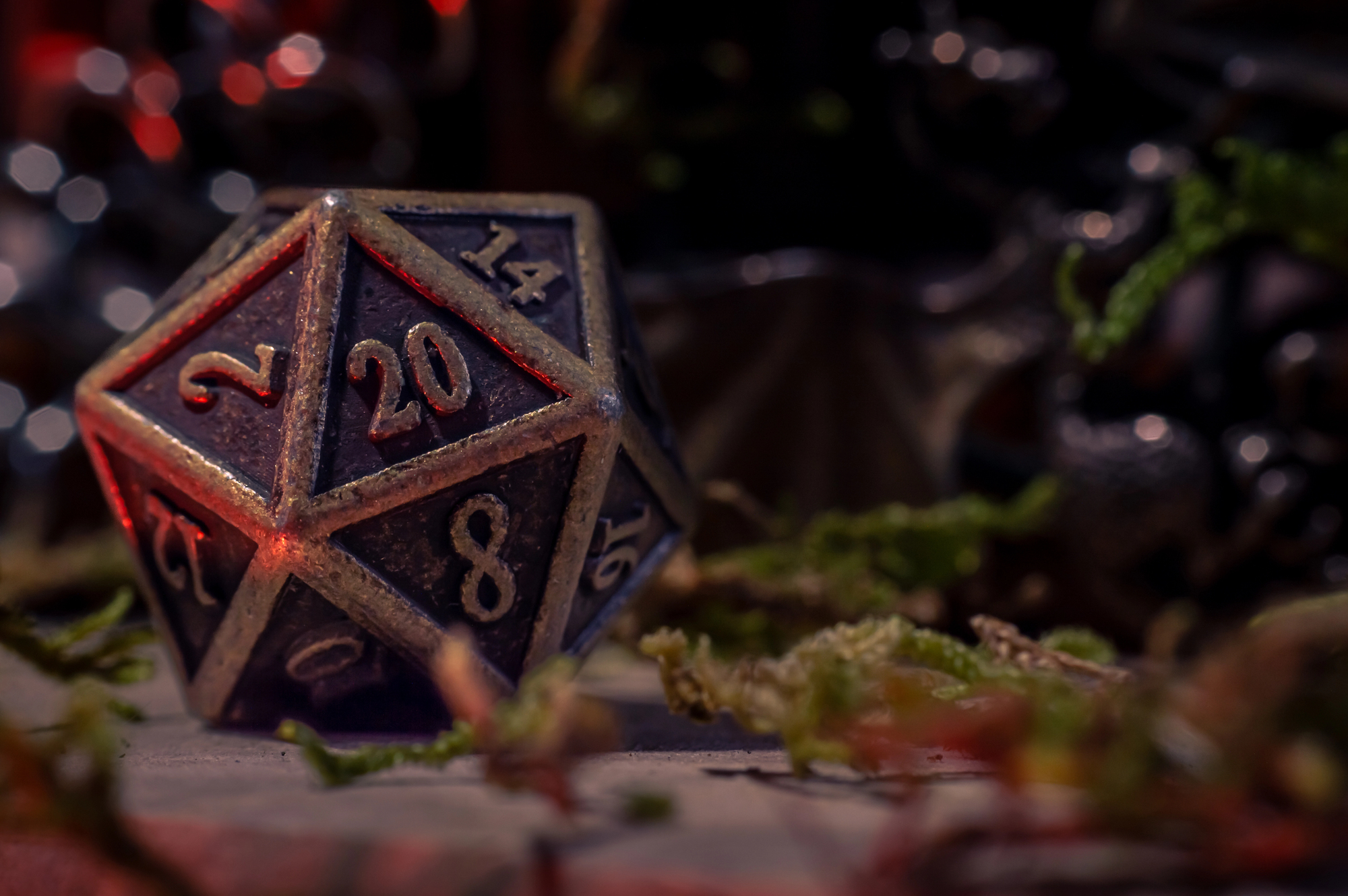
The pattern across all of these isn’t accidental — it’s structural. Box art functions as a timestamp, a production marker, and in many cases the primary visual identity of a toy that no longer has any other way to prove what it is or when it was made.
A loose figure is just a piece of plastic. The same figure on its original card, with the right cross-sell art and the right copyright footer and the right illustration style, is documentation.
More from Go2Tutors!

- The Romanov Crown Jewels and Their Tragic Fate
- 13 Historical Mysteries That Science Still Can’t Solve
- Famous Hoaxes That Fooled the World for Years
- 15 Child Stars with Tragic Adult Lives
- 16 Famous Jewelry Pieces in History
Like Go2Tutors’s content? Follow us on MSN.