29 Old Maps and Atlases With Outdated Borders That Sell for Surprising Amounts
There’s a particular kind of thrill in unrolling a map that shows a world that no longer exists. Countries that vanished, borders that shifted after a war nobody talks about anymore, colonies that got renamed twice before settling on something else entirely. Collectors have quietly been paying real money for these paper time capsules for decades, and the prices attached to some of them tend to catch people off guard.
What follows is a look at old maps and atlases where the outdated geography isn’t a flaw at all — it’s the entire reason someone’s willing to pay for it.
Ptolemy’s Geographia Editions
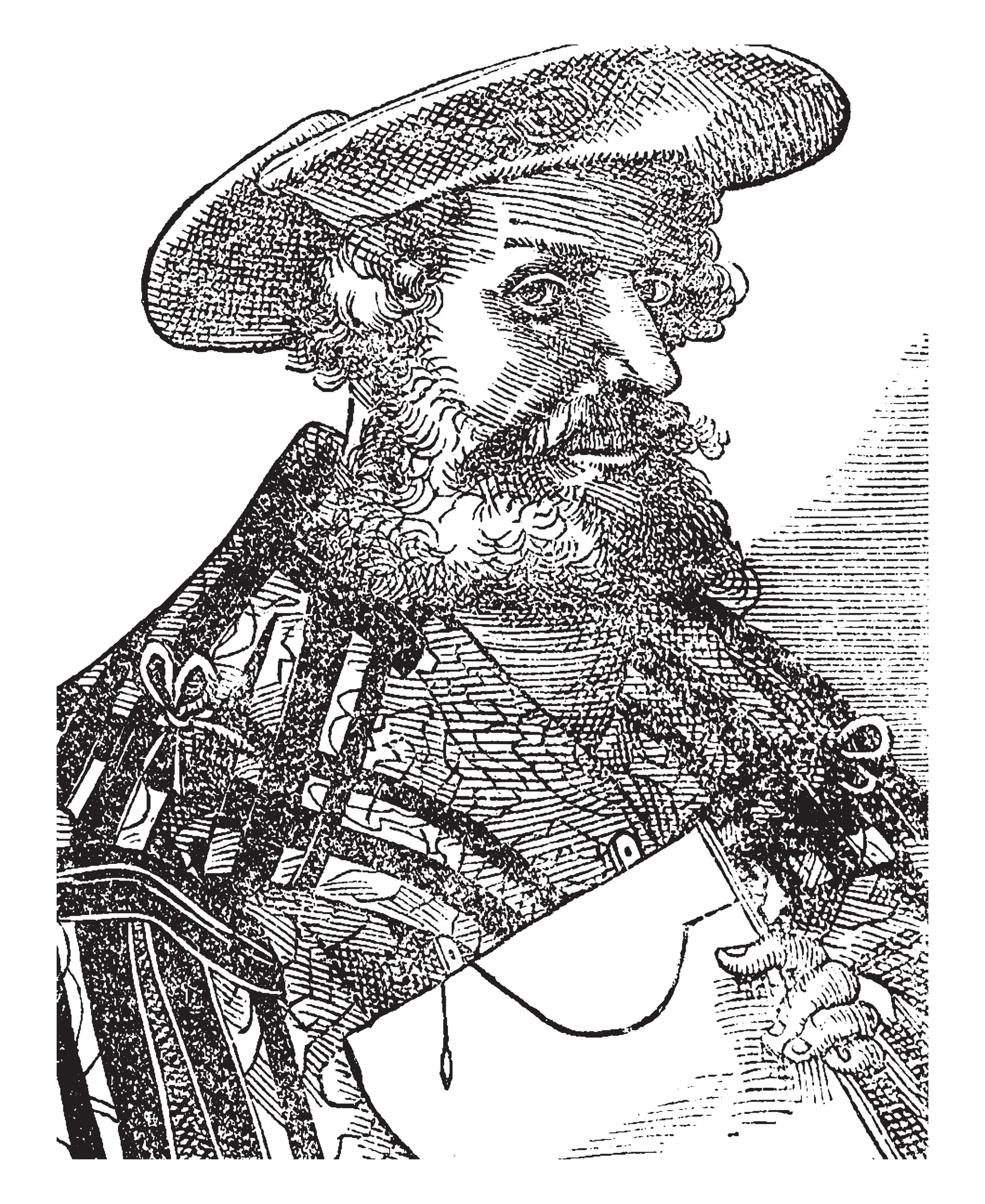
Printed editions of Ptolemy’s Geographia from the 15th and 16th centuries show a world built on secondhand accounts and ancient guesswork, and the borders reflect that uncertainty in ways modern eyes find strange. Africa trails off into blank space. Asia stretches far wider than it should. A well-preserved 1482 Ulm edition has sold at auction for over $200,000, and even later reprints with hand-colored woodcuts regularly bring five figures.
Collectors aren’t paying for accuracy here — they’re paying for the moment cartography was still guessing.
Waldseemüller’s 1507 World Map
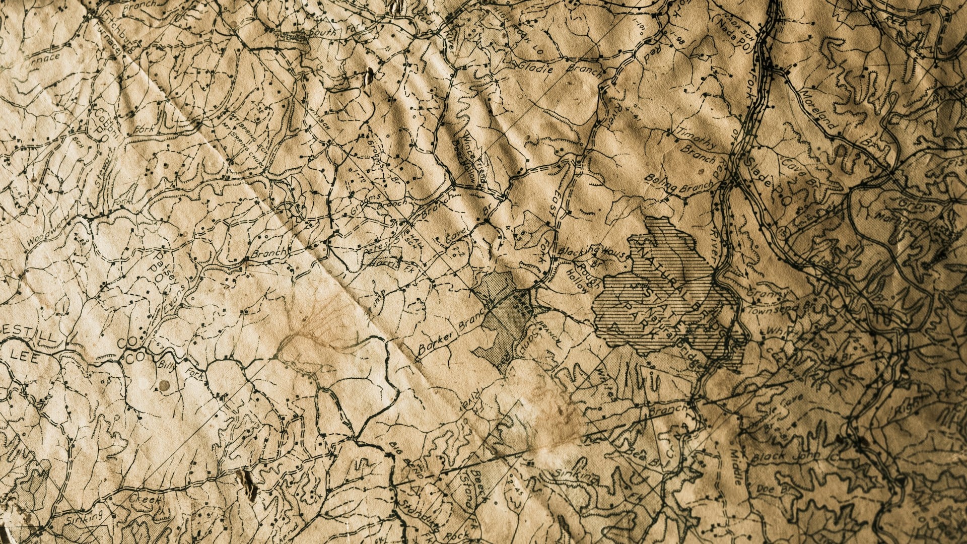
Nobody had ever printed the word “America” on a map before Martin Waldseemüller did it in 1507 — and that alone would make this thing valuable, but there’s more to it: the borders show a skeletal, half-formed Pacific coastline that nobody in Europe had actually seen yet, guessed at with a confidence that turns out to have been mostly right. The Library of Congress paid ten million dollars for the only surviving original in 2003, which remains one of the highest prices ever paid for a printed map.
Later facsimiles and 19th-century reprints still circulate at auction, and even those — because provenance matters so much here — can fetch several thousand dollars depending on the printing. So the outdated borders aren’t the selling point exactly; the audacity of drawing them at all is.
Ortelius’s Theatrum Orbis Terrarum
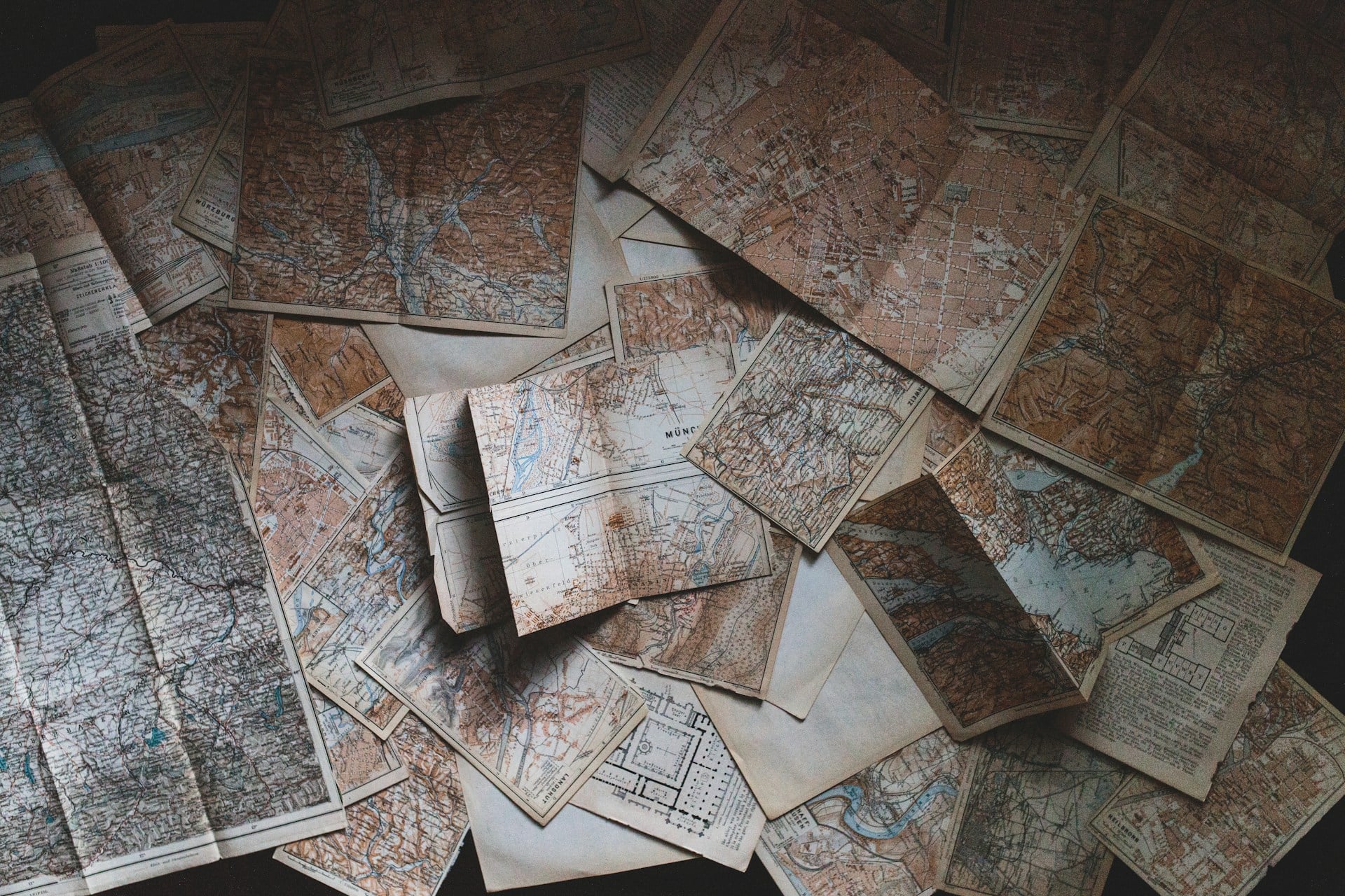
Think of Abraham Ortelius’s 1570 atlas as a photograph taken mid-blink — the world caught in that awkward instant before it fully came into focus, continents smudged at the edges where nobody had bothered to look yet. Terra Australis sprawls across the bottom of the page like a rumor nobody could confirm or kill, an entire imagined continent drawn with the same confidence as the coastlines that turned out to be real.
Individual maps pulled from later editions sell for a few hundred dollars at estate sales, but a complete first edition in good condition has crossed the $150,000 mark at auction. What collectors are really buying is that blink: the pause before the world corrected itself.
Mercator’s 1569 World Map
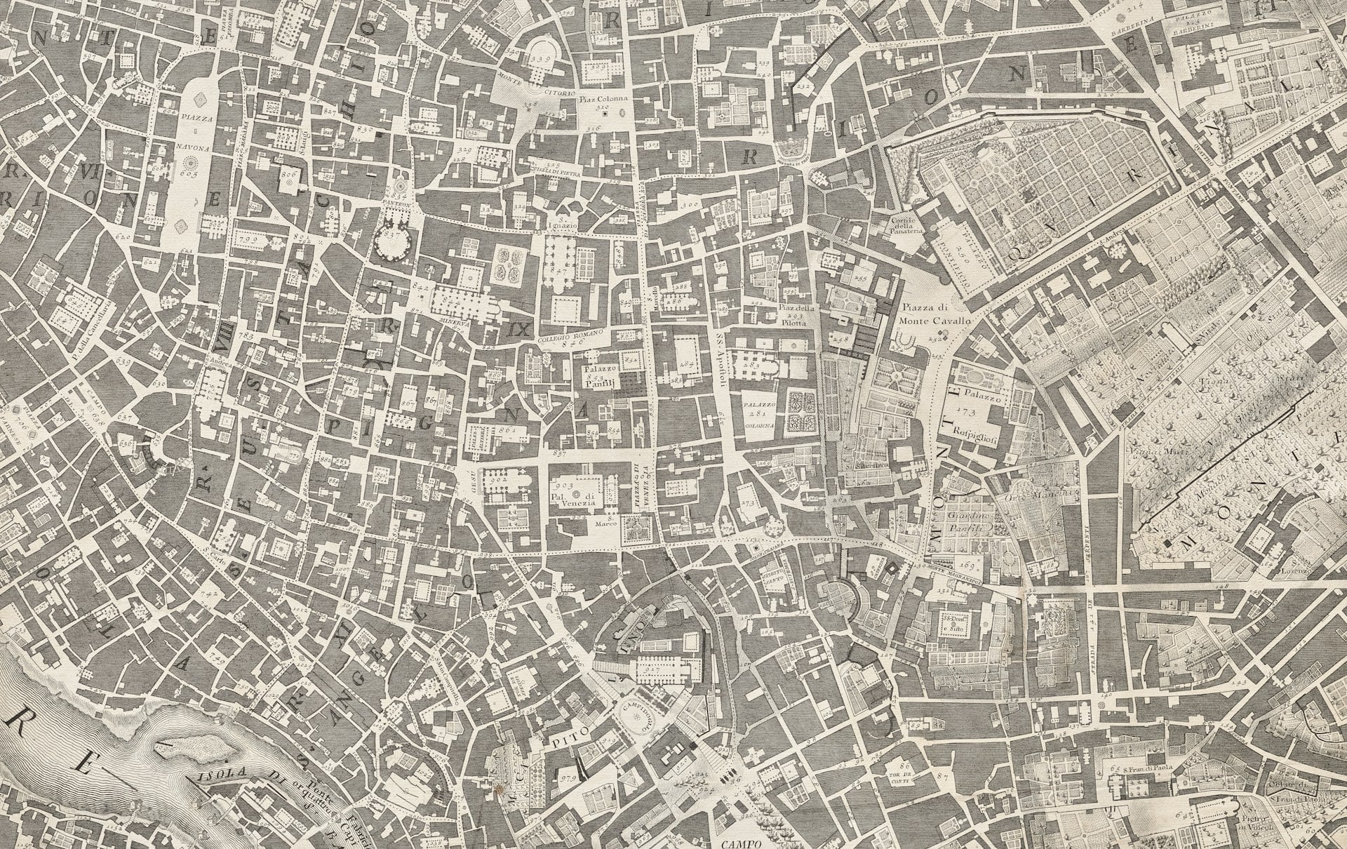
Gerardus Mercator gave the world a projection so useful that ships still relied on straight-line navigation from it centuries later, and that practicality is exactly why collectors chase his original prints so hard. Only a handful of complete 1569 editions survive, and when one surfaces, six-figure prices aren’t unusual — a fragment sold in the 1990s alone brought over $100,000.
The Arctic on that map is pure invention, four mythical islands surrounding a magnetic pole that never existed, which is either an embarrassing footnote or the whole point, depending on who’s buying. Nobody pays that kind of money for the parts Mercator got right.
Blaeu’s Atlas Maior
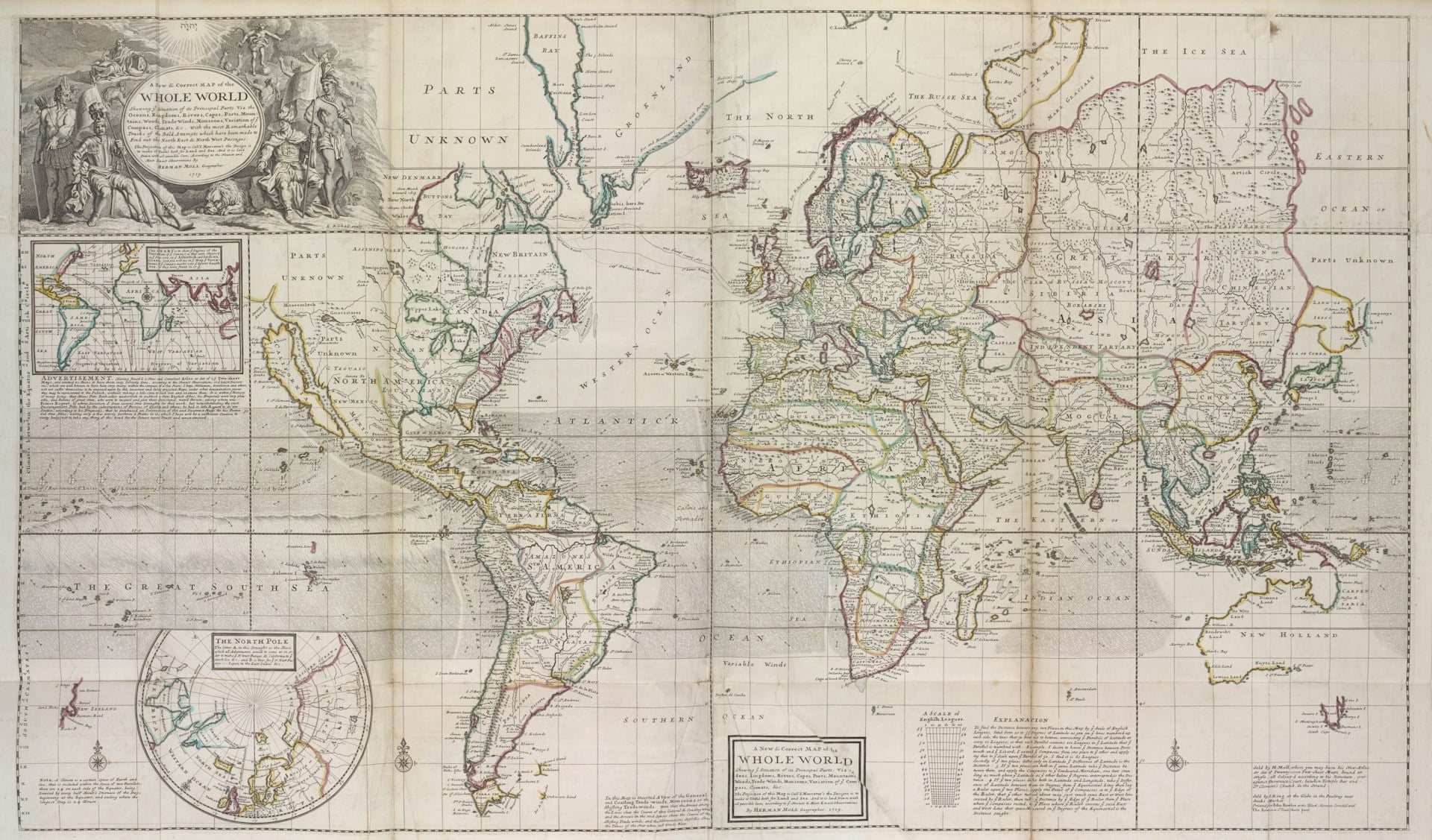
Willem Blaeu’s Atlas Maior ran to eleven volumes and hundreds of hand-colored plates, and it was the most expensive book a person could buy in the 17th century. The borders inside are confidently wrong in dozens of places — inland seas that don’t exist, kingdoms drawn bigger than their actual reach.
Complete sets rarely appear intact anymore, and when they do, auction houses have seen them clear $500,000. Individual plates still sell in the thousands, which tells you something about how much people still want a piece of it.
Herman Moll’s Beaver Map
Herman Moll’s 1715 map of North America — nicknamed the Beaver Map for the oversized rodents lounging in the corner cartouche, which is a strange thing to fixate on when the real drama is happening in the borders — shows British colonies stretching west in thin, hopeful strips that reach clear to the Pacific, land nobody in London had actually seen and certainly didn’t control. French Louisiana balloons across the middle of the continent in a shape that has almost nothing to do with the country that eventually formed there, and Spanish claims get squeezed into whatever space is left over: it’s less a record of what existed than an argument for what everyone wished existed.
So when a clean example turns up at auction, colonial history collectors treat it like a lottery ticket, and well-preserved copies have climbed past $15,000 in recent years. Nobody’s paying for the accuracy. There isn’t much of it to pay for.
John Speed’s Theatre of the Empire of Great Britaine
Picture a map as a family portrait taken before anyone in the frame knew what they’d become, county lines drawn like siblings who hadn’t yet decided if they liked each other. John Speed’s 1611 atlas gave England, Scotland, Wales, and Ireland their own individual portraits, each one crowded with coats of arms and tiny battle scenes stitched into the margins like gossip nobody asked for.
The county borders inside are stubborn things, drawn from old estates and older grudges that shifted or dissolved generations ago, yet the decorative engraving is so fine that collectors treat the wrongness as texture rather than error. Individual county plates turn up at auction for anywhere from a few hundred dollars to well over $5,000, and it’s never really the border people are buying — it’s the portrait.
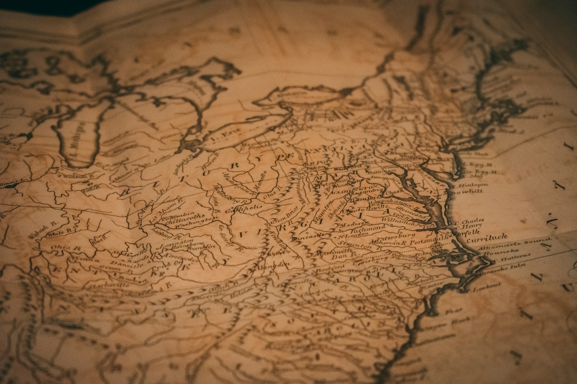
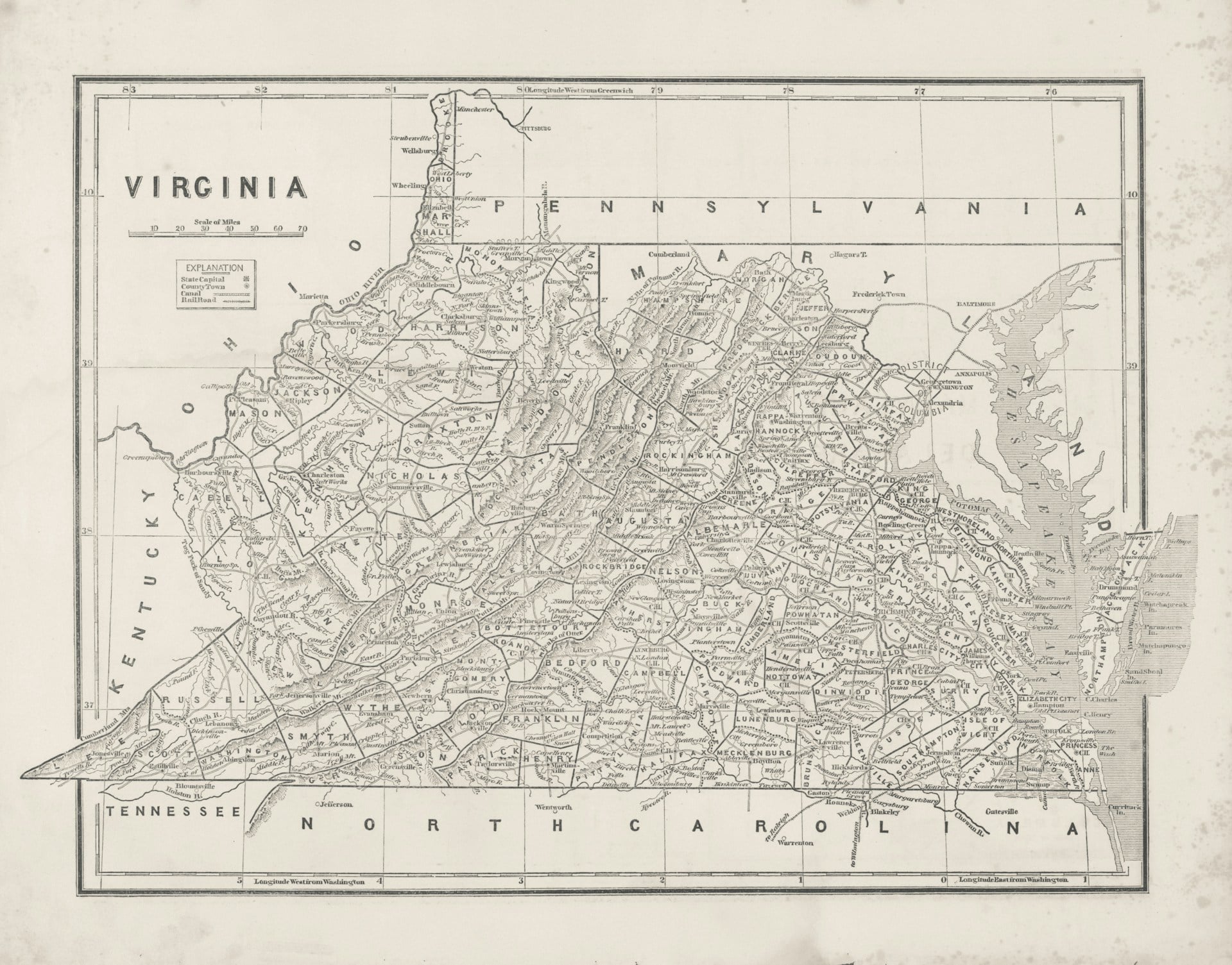
The Fry-Jefferson Map of Virginia
The 1751 Fry-Jefferson map is the best kind of historical irony: drawn by Peter Jefferson, father of a man who’d go on to reshape the country’s borders himself, and it still gets treated like a minor artifact compared to what came after. It’s wrong in ways that matter — the Blue Ridge Mountains are misplaced, western Virginia trails off into guesswork, and colonial boundaries are drawn with a confidence nobody in the actual territory would have backed.
First-state printings have sold for well over $50,000 at auction, which is a lot of money for a map that couldn’t find the mountains it was supposed to be mapping. Collectors don’t seem to mind. If anything, the errors are half the appeal.
California as an Island Maps
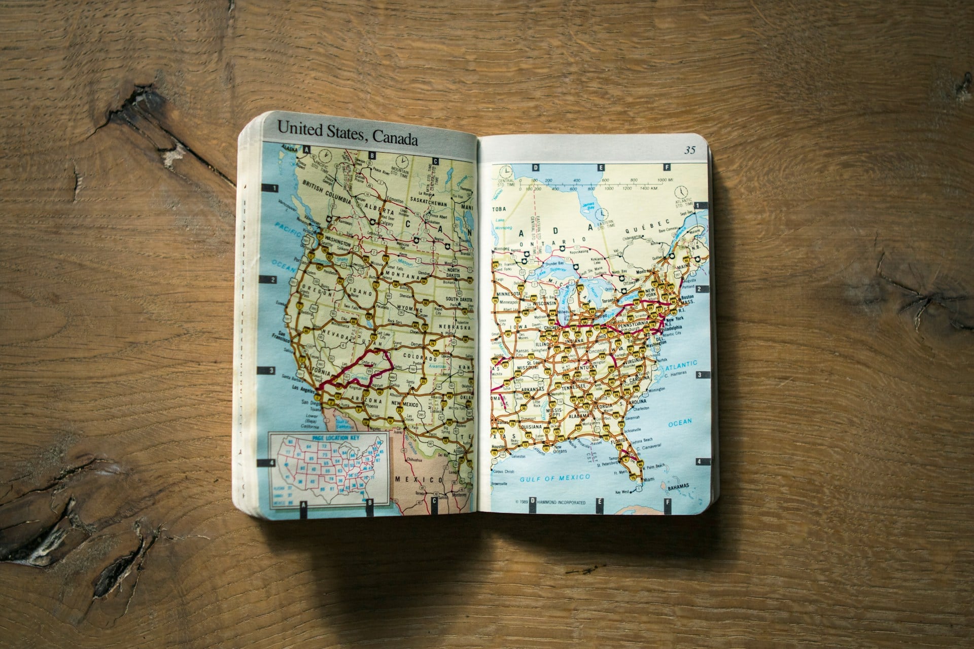
For nearly a century, mapmakers drew California as an island. Not a peninsula. A full, separate landmass floating off the coast, confidently inked and sold across Europe. Collectors chase these now specifically because the mistake is so wrong it’s almost charming, and clean 17th-century examples routinely sell for $3,000 to $20,000 depending on the engraver.
The Piri Reis Map
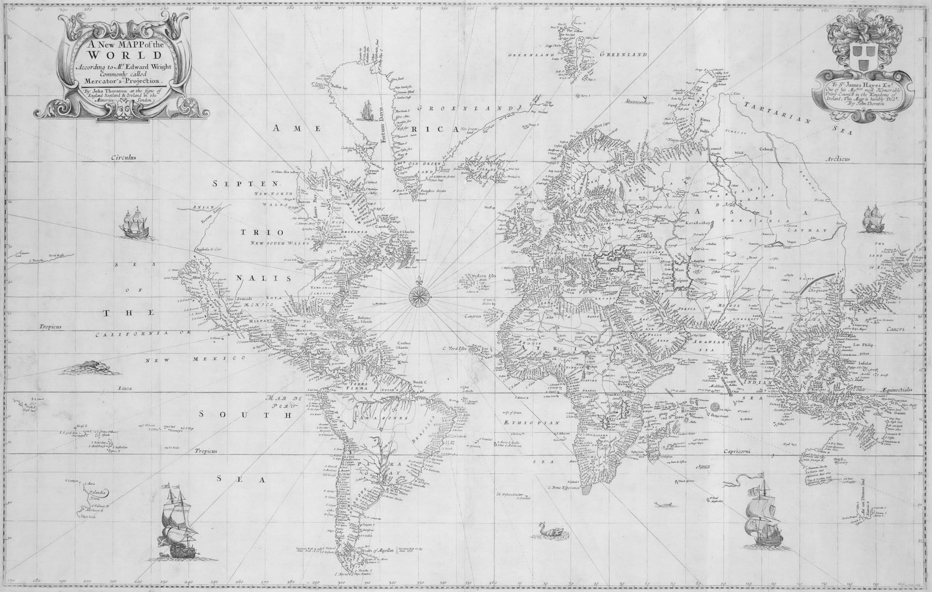
Somewhere in the Topkapi Palace archives sits the surviving fragment of a 1513 map drawn by an Ottoman admiral named Piri Reis — and it’s stayed there, which means nobody’s buying the original no matter how much money gets waved around, but that hasn’t stopped a thriving market in scholarly facsimiles and museum-authorized reproductions that still pull four figures at specialty auctions. The coastline it shows, part of South America bending south into a landmass that some enthusiasts insist looks vaguely Antarctic (it almost certainly isn’t, and most cartographic historians will tell you so with a sigh), has made it one of the most argued-over documents in the field: a gazelle-skin fragment that launched a genuine cottage industry of theories, documentaries, and increasingly expensive reprints
. So collectors aren’t chasing the map so much as chasing proximity to the argument, which is its own strange kind of value. And the borders on it — half-guessed, half-copied from earlier sailors’ charts nobody bothered to credit — are wrong in exactly the way that keeps people paying to own a version of the wrongness.
John Smith’s Map of Virginia
John Smith’s 1612 map of Virginia reads less like a survey and more like a sketch drawn from memory after a long, disorienting walk through unfamiliar woods. The coastline holds close to reality near the shore, then loosens the farther inland it travels, rivers bending into guesswork and Native towns marked with a confidence that outpaces what Smith actually witnessed himself.
There’s something almost tender in the small crosses scattered across the interior, a private code marking how far he’d genuinely traveled versus how far he’d simply been told to draw. Original editions rarely surface, but when they do, collectors have paid upward of $40,000 for a piece of paper that quietly admits how little anyone truly knew.
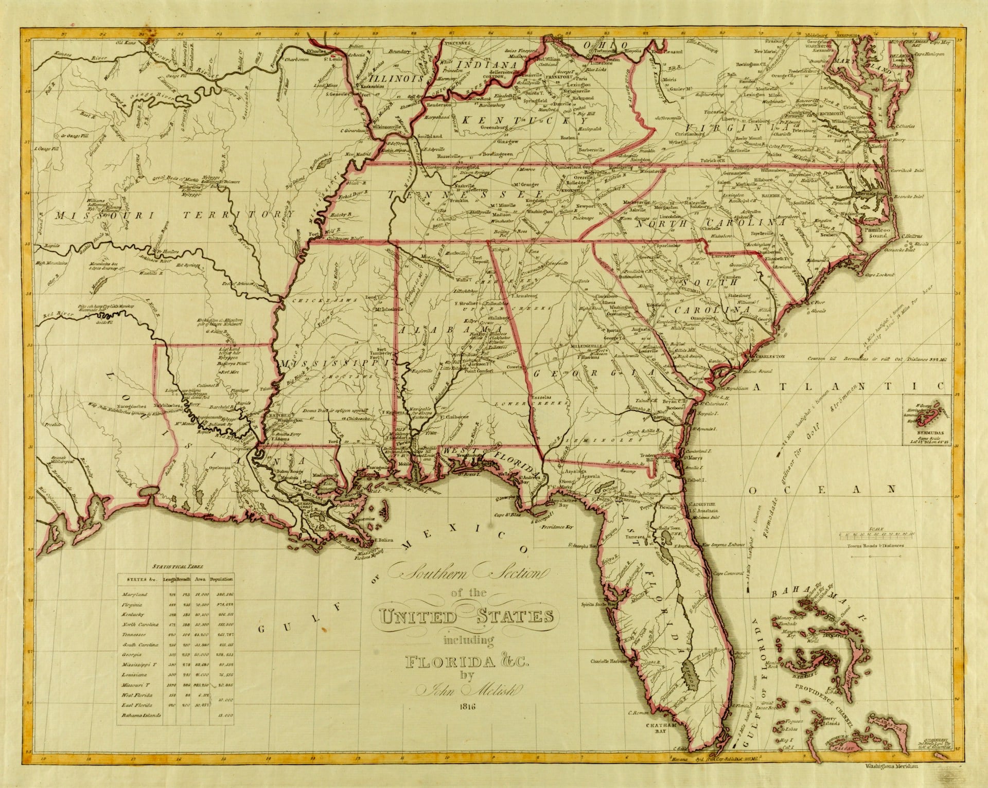
John Melish’s Map of the United States
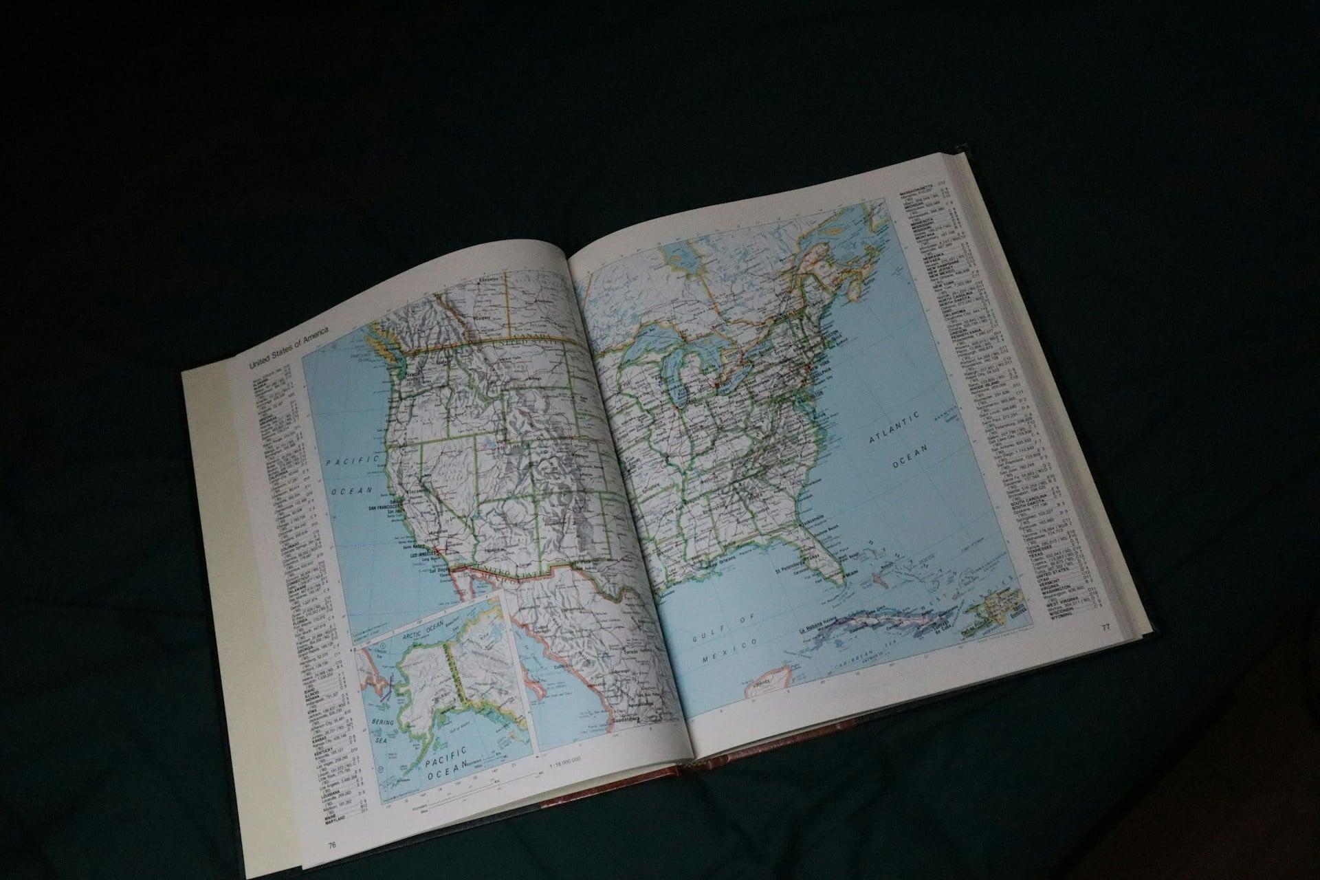
John Melish’s 1816 map deserves more credit than it usually gets, mostly because it had the nerve to draw the United States stretching clear from the Atlantic to the Pacific before the country actually controlled that much land. The western edge is basically a shrug — Oregon Country and Spanish Texas blur into each other in a way that reads like Melish ran out of confirmed information and kept drawing anyway.
Thomas Jefferson reportedly kept a copy close at hand during boundary talks, which is either flattering or slightly alarming depending on how seriously anyone took its guesswork. Surviving early editions in decent condition now sell for $20,000 to $50,000, which proves ambition on paper ages a lot better than accuracy does.
Guillaume Delisle’s Carte de la Louisiane
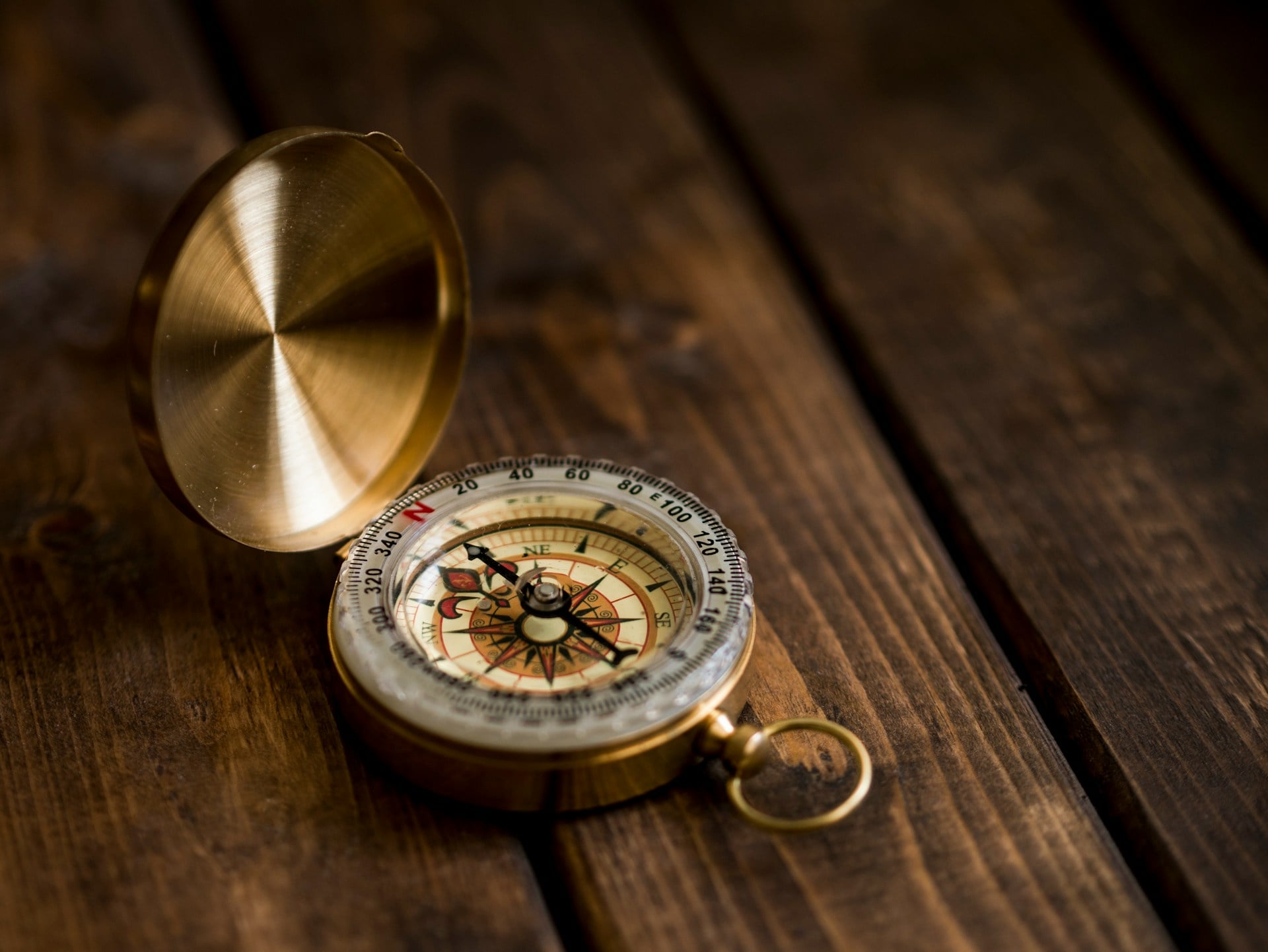
Guillaume Delisle’s 1718 map handed nearly a third of North America to a colony that never came close to controlling it. Louisiana stretches from the Gulf up past the Great Lakes, swallowing Texas whole along the way.
Spain hated this map. Original engravings still sell for $8,000 to $15,000, mostly because French claims that bold are rare enough to be funny now.
The Mitchell Map of 1755
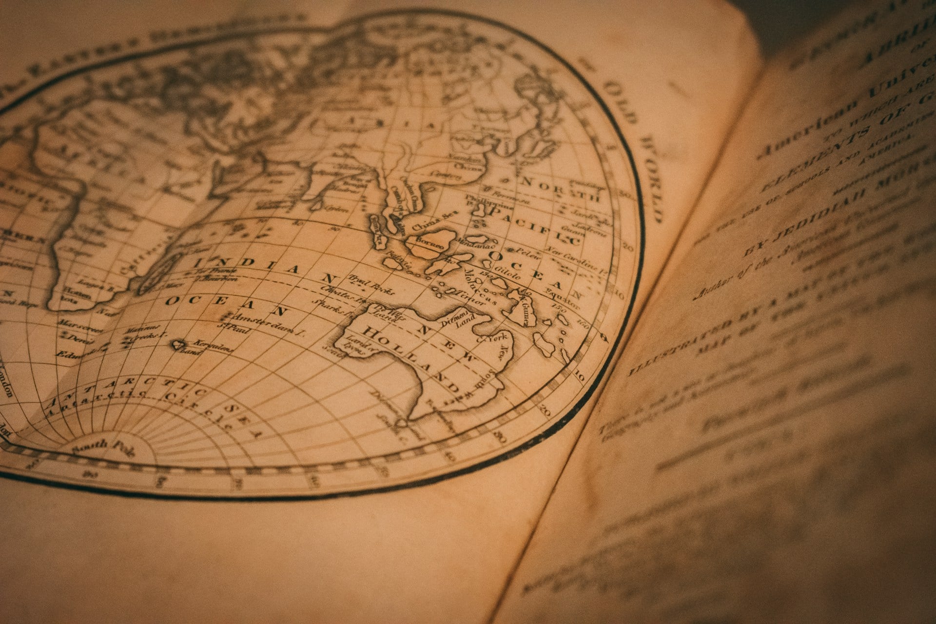
John Mitchell’s 1755 map of British and French dominions in North America ended up doing something almost nobody expects a map to do: it settled an international border dispute decades after it was drawn, because American and British negotiators pulled it out during the 1783 Treaty of Paris and used its confidently inked colonial lines to carve up a continent neither side fully controlled. The borders on it are generous almost to the point of comedy — Virginia’s claims stretch toward the Mississippi like the colony already owned the place, and the map doesn’t blink about it — and that overreach is exactly what makes it catnip for collectors now.
So a well-preserved first-state edition, especially one with the original hand coloring intact, has sold at auction for upward of $60,000, and even later states with reworked engraving plates still clear five figures if the provenance checks out. Nobody’s paying that kind of money for cartographic precision here: they’re paying for the paper that, quietly and almost by accident, decided where a country would end.
Jodocus Hondius’s World Map
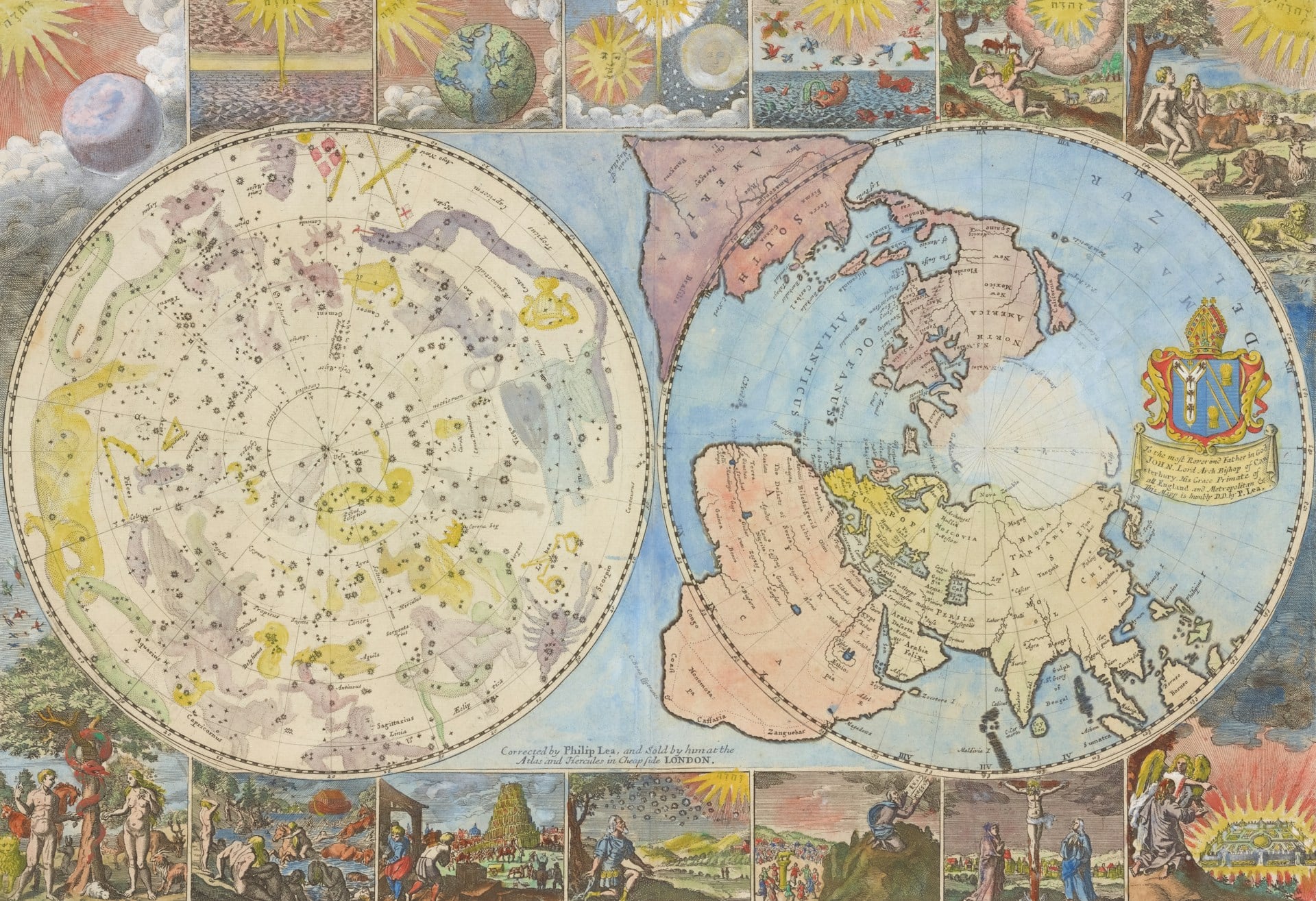
A map like this behaves less like a document and more like a held breath, the whole world paused mid-stretch between what sailors had actually seen and what geographers were willing to guess on their behalf. Jodocus Hondius’s 1595 world map draws South America squat and stubby, the Pacific coastline flattened into a rumor, and a phantom southern continent looming beneath everything like a shadow nobody bothered to check for shape.
There’s a strange tenderness in how confidently wrong it all is, the way a child draws a house before ever really looking at one closely. Well-preserved examples now surface at auction for $30,000 to $70,000, and buyers aren’t really chasing the coastline so much as chasing that pause before the world corrected itself.
Henry Popple’s Map of the British Empire in America
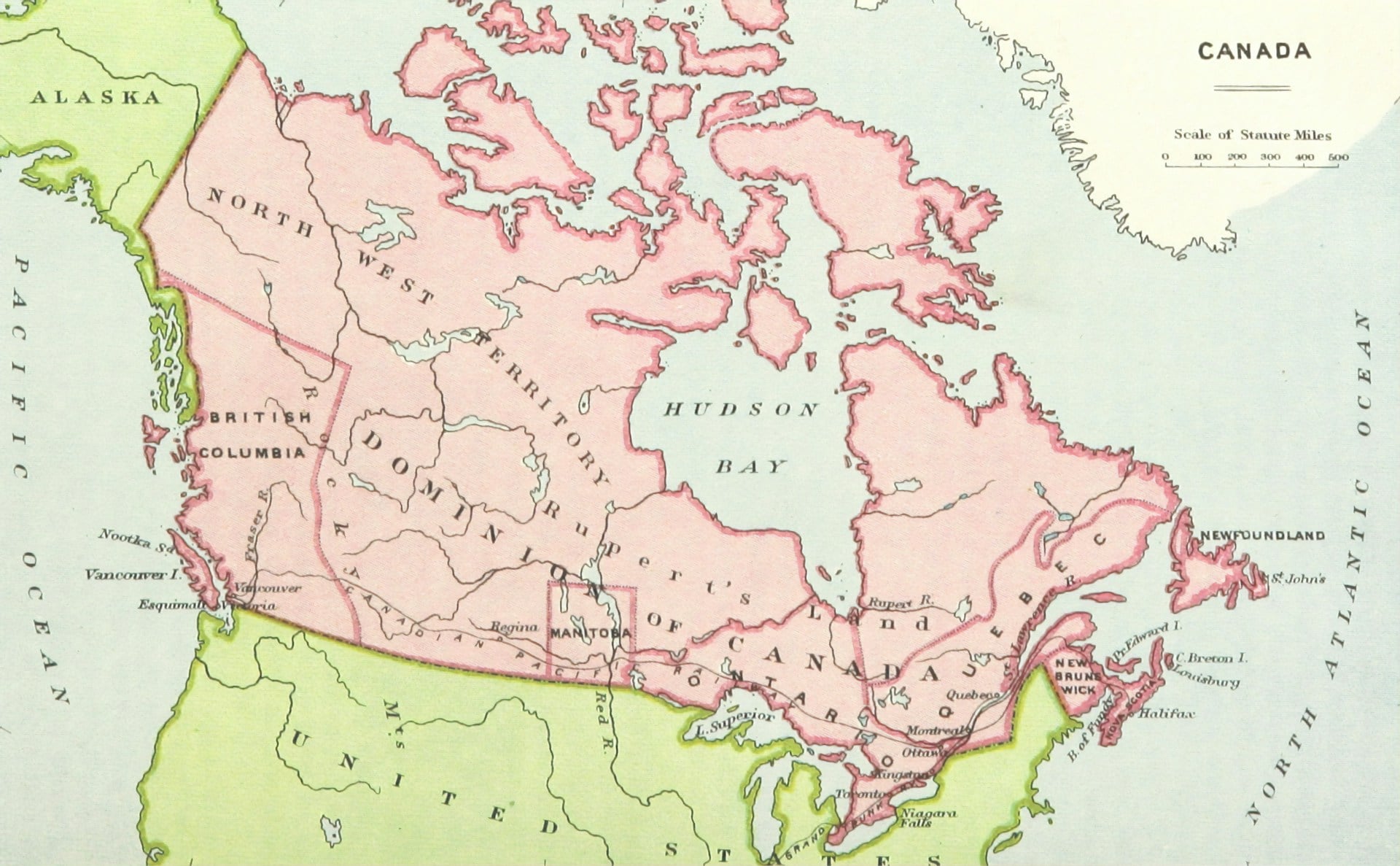
Henry Popple’s 1733 map is proof that bigger doesn’t always mean better, though it did mean more expensive to print, and that decision alone nearly bankrupted him. Twenty sheets stitched together into a wall-sized monster, drawn to flatter British claims that stretched deep into territory France and Spain were actively disputing at the time.
The borders inside are wishful thinking dressed up as cartography, which is exactly why a complete set has sold for over $100,000 at auction. To be fair, nobody buys a map this size for the coffee table.
The Vinland Map
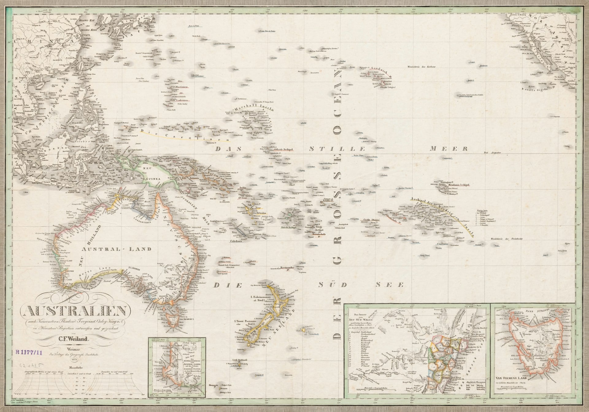
The Vinland Map claims Norse sailors charted a stretch of North America centuries before Columbus ever left port. Yale acquired it, tested it, doubted it, then tested it again. Ink chemistry says forgery.
Nobody’s fully settled the argument either way, and that argument alone keeps interest — and prices on study facsimiles and limited reprints — running well into the thousands.
Samuel de Champlain’s Map of New France
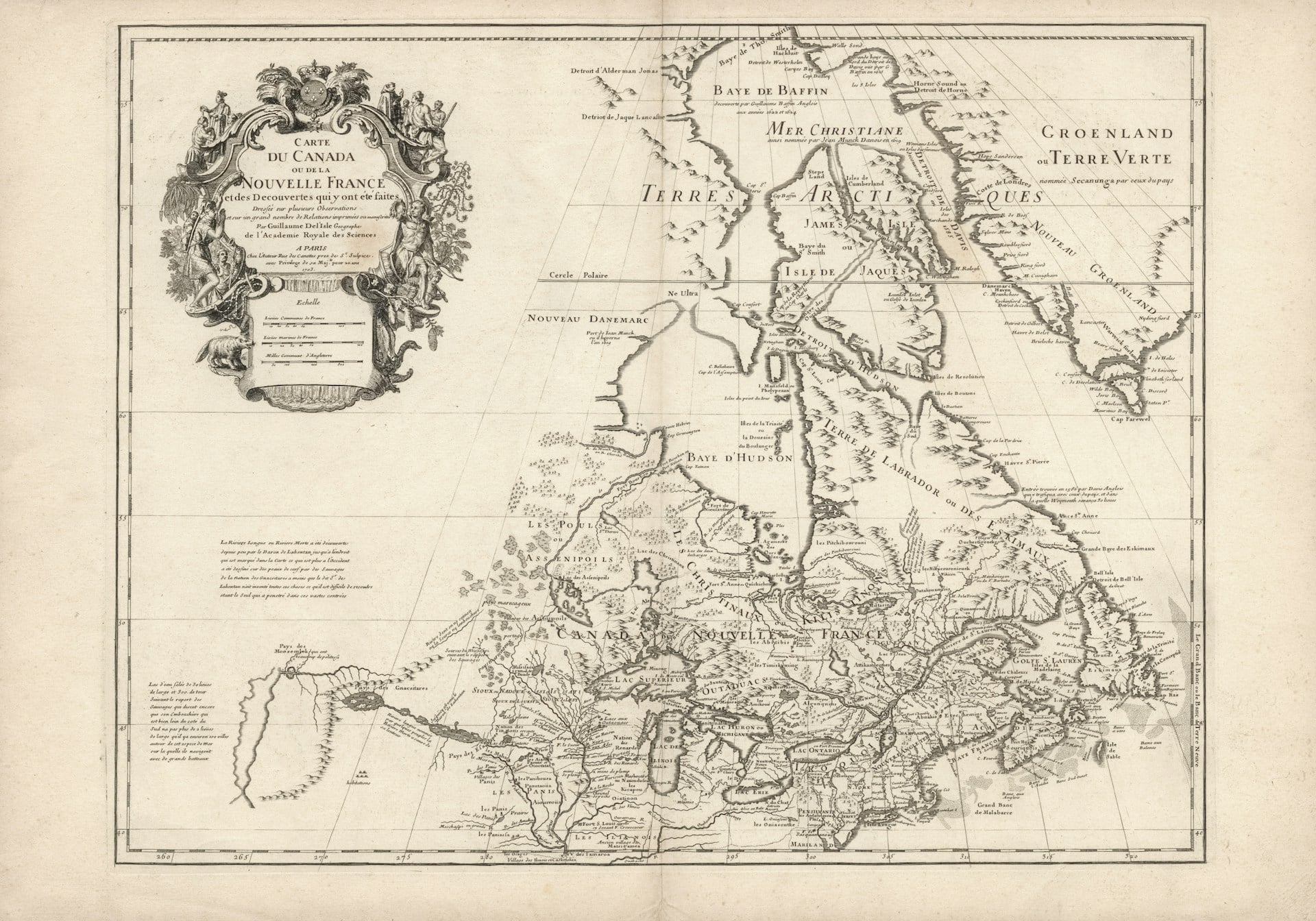
Champlain drew his 1612 map of New France after years of actual paddling through rivers nobody in Paris had bothered to ask about — and that’s the strange tension running through the whole thing: parts of the St. Lawrence are rendered with the patience of a man who’d counted every bend himself, while the interior just west of it dissolves into open space dotted with guesses about lakes he’d only heard described secondhand. So the borders lean confident near the coast and go soft the farther they wander from anywhere Champlain had personally stood, which turns out to be a pretty honest way of drawing a place nobody fully understood yet.
Original engravings rarely surface, but when they do, auction houses have cleared $25,000 to $45,000 depending on condition, and dealers will tell you the coastal precision is what sells it, not the fantasy geography further inland. Nobody’s paying for the empty lake basins, though it’s hard not to notice how much space they still take up on the page.
Waldseemüller’s Universalis Cosmographia
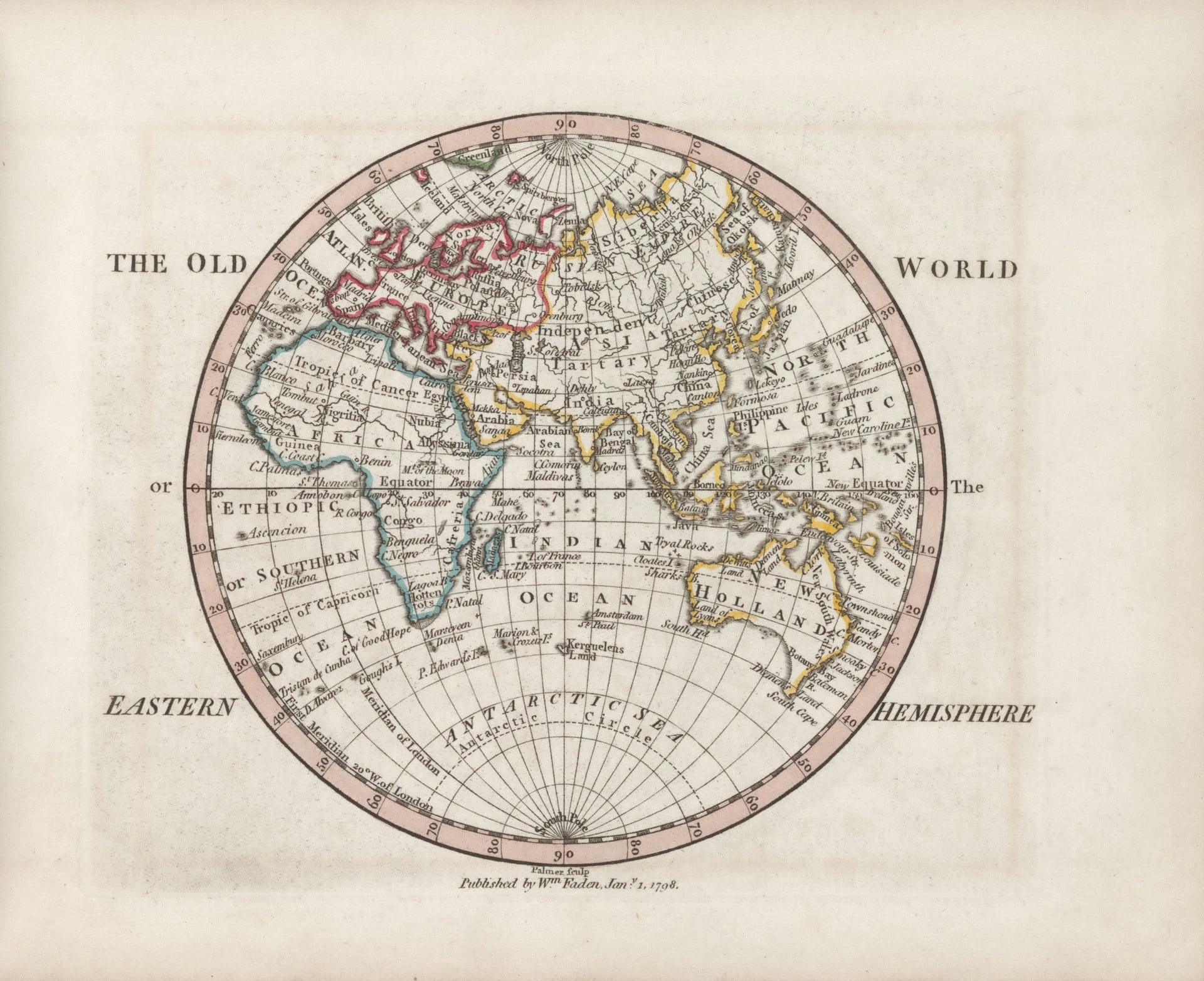
Martin Waldseemüller’s 1507 map behaves like a birth certificate filled out before the child had a name — a continent labeled “America” mere months after Columbus’s landfall and years before anyone had agreed the label was even accurate. The Pacific on it is a thin, apologetic strip, nowhere close to the ocean’s real breadth, and South America’s western coast trails off into a shape more hopeful than measured.
There’s something quietly moving in that confidence, the way a mapmaker working in a small French town could commit ink to a shoreline he’d never seen and never would. Only one printed copy survived long enough to matter, and when the Library of Congress finally secured it in 2003, the price landed at $10 million, a strange, fitting sum for the document that handed a hemisphere its name.
The Homann Heirs’ Atlas
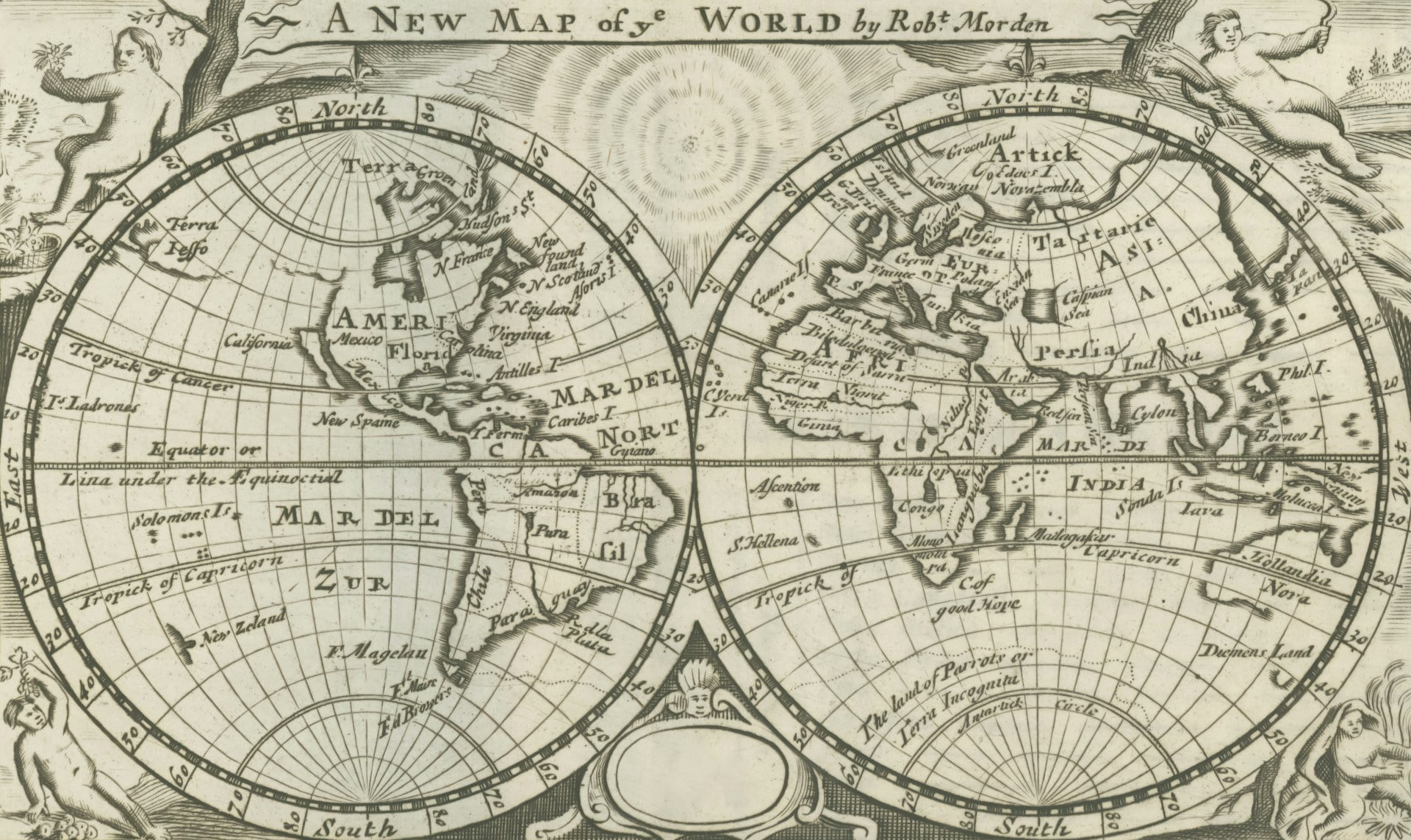
The Homann Heirs’ workshop kept cranking out atlases well into the 1740s, decades after founder Johann Baptist Homann had died, and the borders inside show it. Central Europe gets redrawn edition after edition as German principalities merge, split, and merge again, each version confidently final until the next one contradicted it.
Ottoman territory in the Balkans shrinks and swells depending on which war had just ended when the plates were engraved. Complete atlases in good condition sell for $15,000 to $35,000, and dealers will tell you the appeal is watching a region argue with itself across twenty years of printings.
Abraham Ortelius’s Theatrum Orbis Terrarum
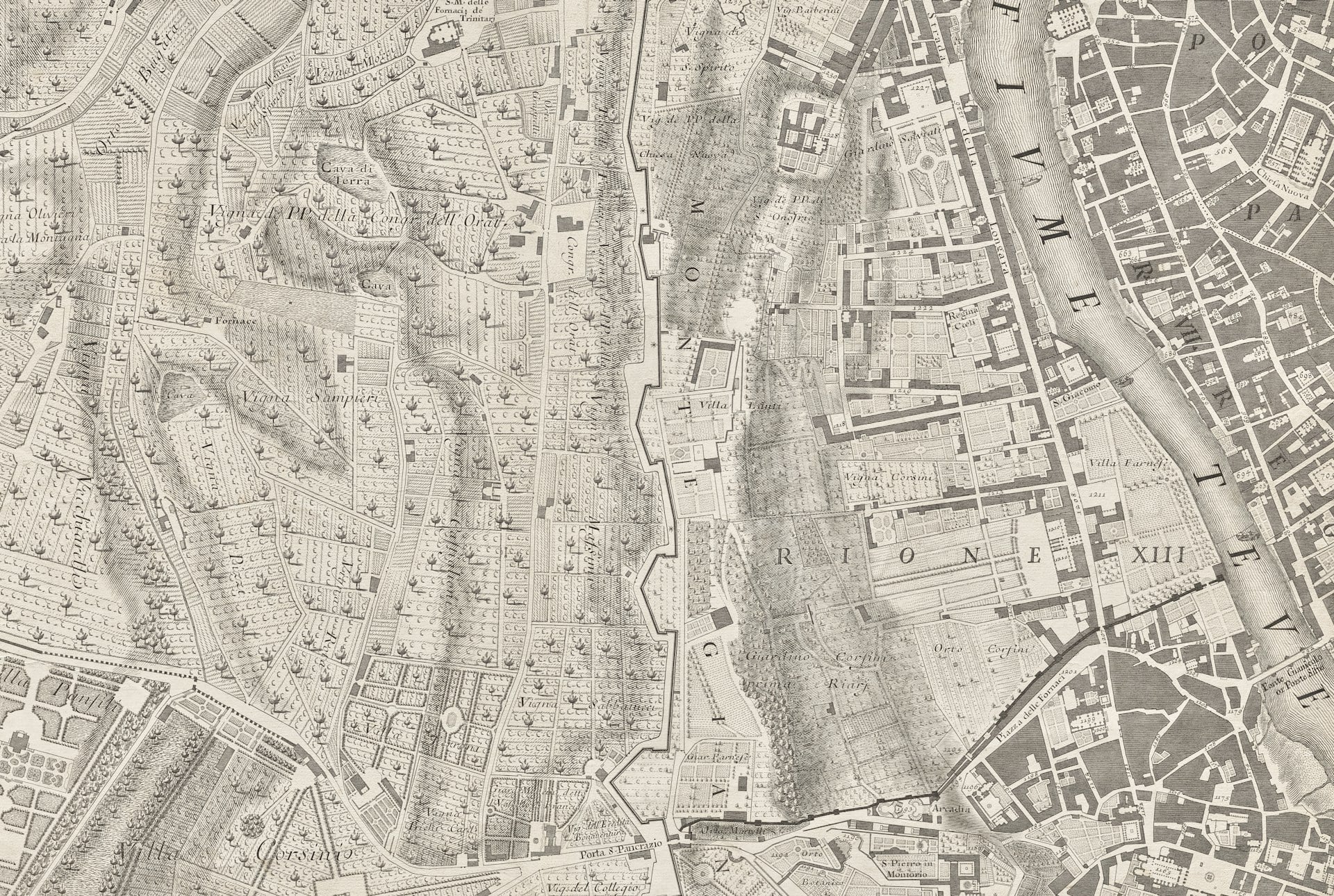
This is the map that started the whole atlas business. 1570, fifty-three maps bound together, sold as the first true collection of the known world assembled this way. Terra Australis fills the bottom third of the page like a country nobody bothered to check for, invented mostly to keep the map from looking unbalanced.
First editions in solid condition have sold for well over $150,000, and single plates showing the Americas still pull thousands on their own.
Nicolas Sanson’s Map of North America
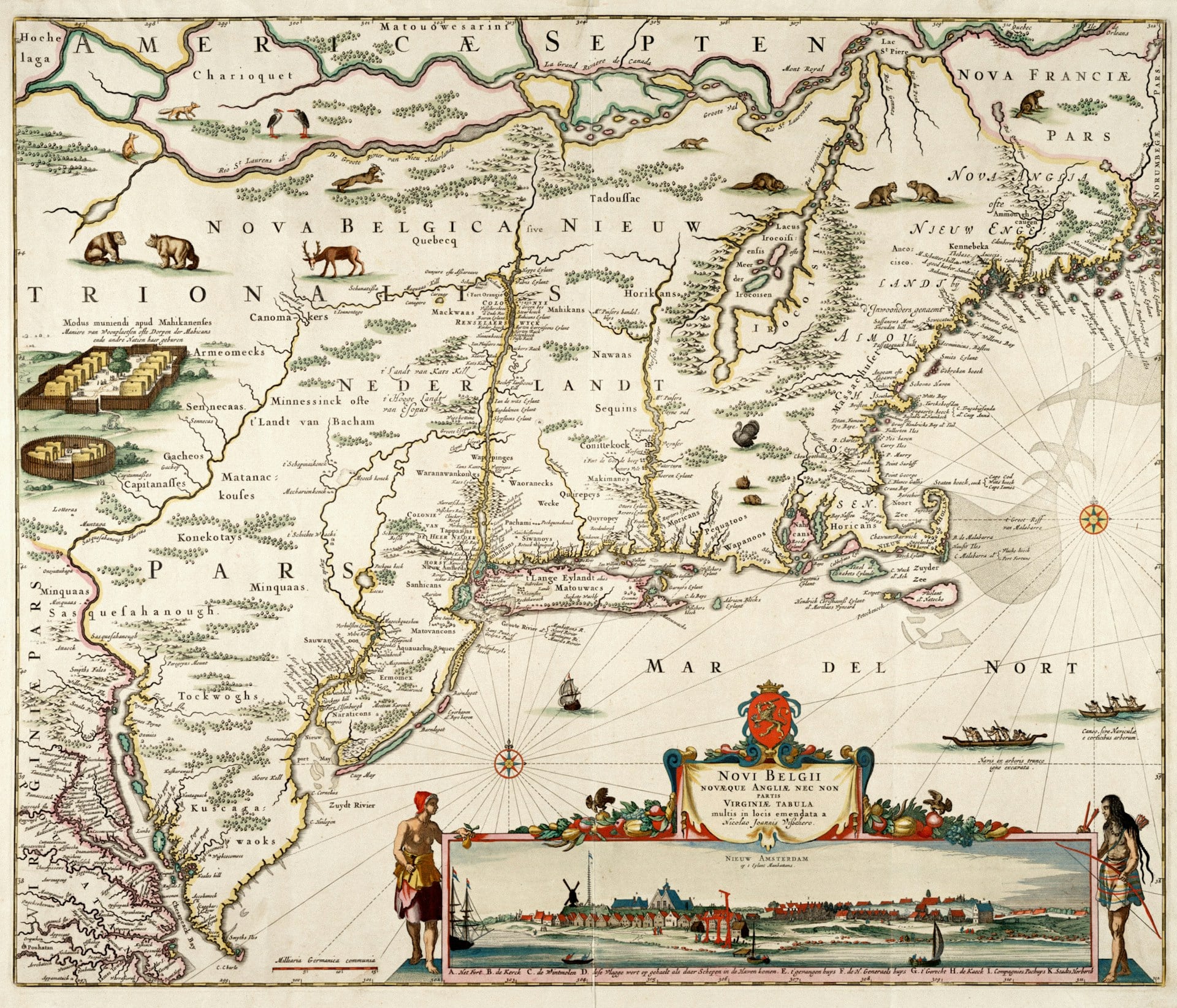
Nicolas Sanson published his map of North America in 1650, and what makes it strange to look at now isn’t the coastline (which holds up reasonably well, all things considered) but the way New France swallows nearly the entire Great Lakes region and keeps going, spilling south into land the French had barely scouted let alone settled, so the border reads more like a claim staked in ink than anything actually surveyed on foot. And the map does something else that trips up modern viewers: it draws the Great Lakes themselves with a rough, half-finished confidence — Lake Superior in particular comes out squeezed and misshapen, a lake nobody had paddled the full length of yet.
So when a clean first-state example surfaces, and they don’t surface often, auction estimates land somewhere between $12,000 and $25,000, mostly because Sanson was working from secondhand reports and still managed to produce something historians keep circling back to. Nobody’s paying for Lake Superior’s real shape here: they’re paying for the confident wrongness of the guess.
Herman Moll’s Beaver Map
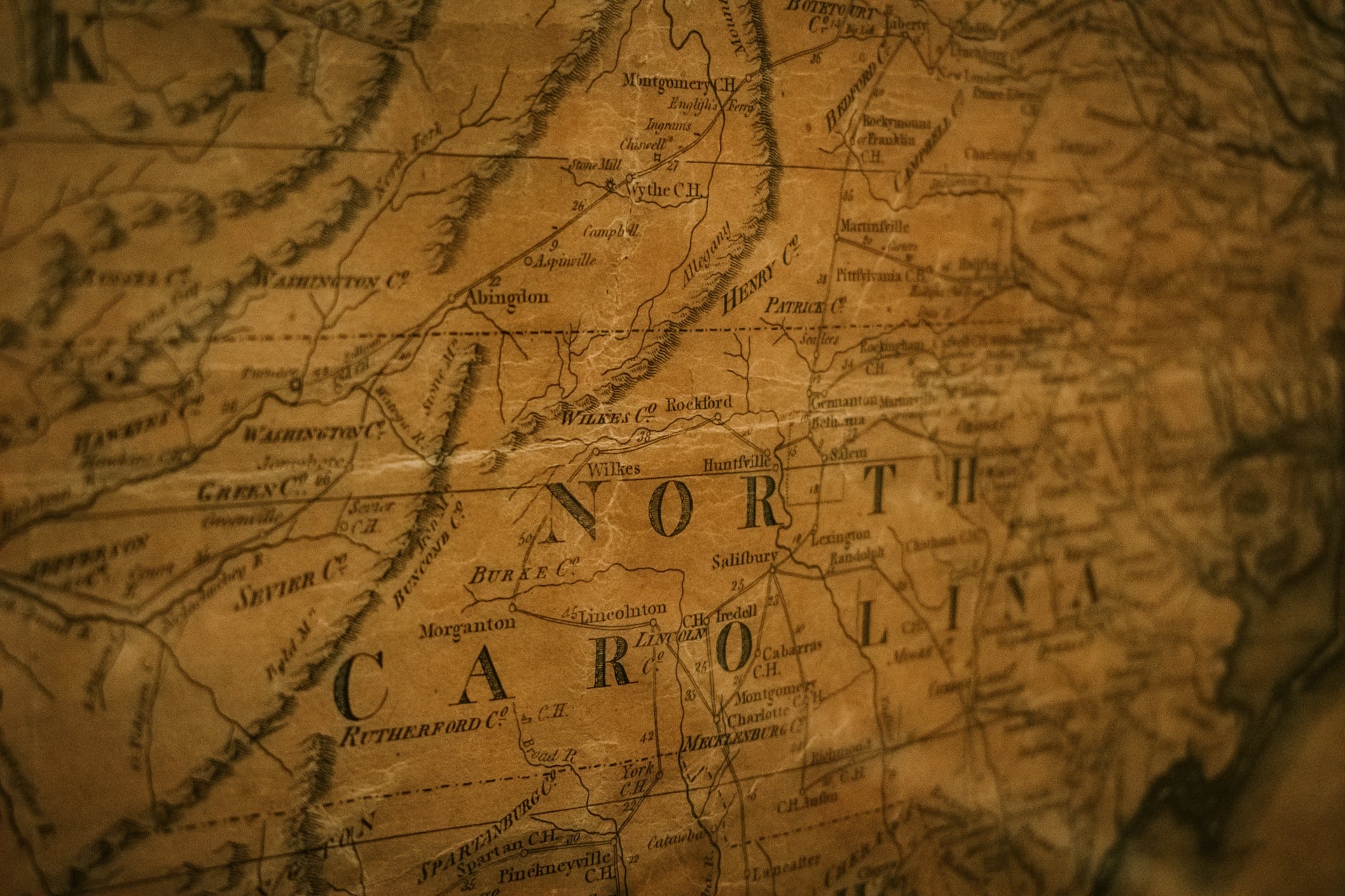
There’s a particular kind of confidence that shows up in the corners of old maps, tucked away where the actual geography can’t be bothered — and Herman Moll’s 1715 map of British North America keeps its confidence in a beaver dam, of all things, an elaborate engraving of industrious rodents building something sturdier than the border claims running above them. The colonies stretch west across the page like a stubborn hand smoothing out a wrinkle that refuses to lie flat, English territory pressing into land France was equally certain belonged to it.
Nobody asked the beavers, and nobody asked the people already living there either, which is its own quiet joke buried in the cartouche. Clean examples now draw $8,000 to $20,000 at auction, and it’s telling that the animals in the corner have aged better than the borders they’re sitting next to.
Willem Blaeu’s Map of the Americas
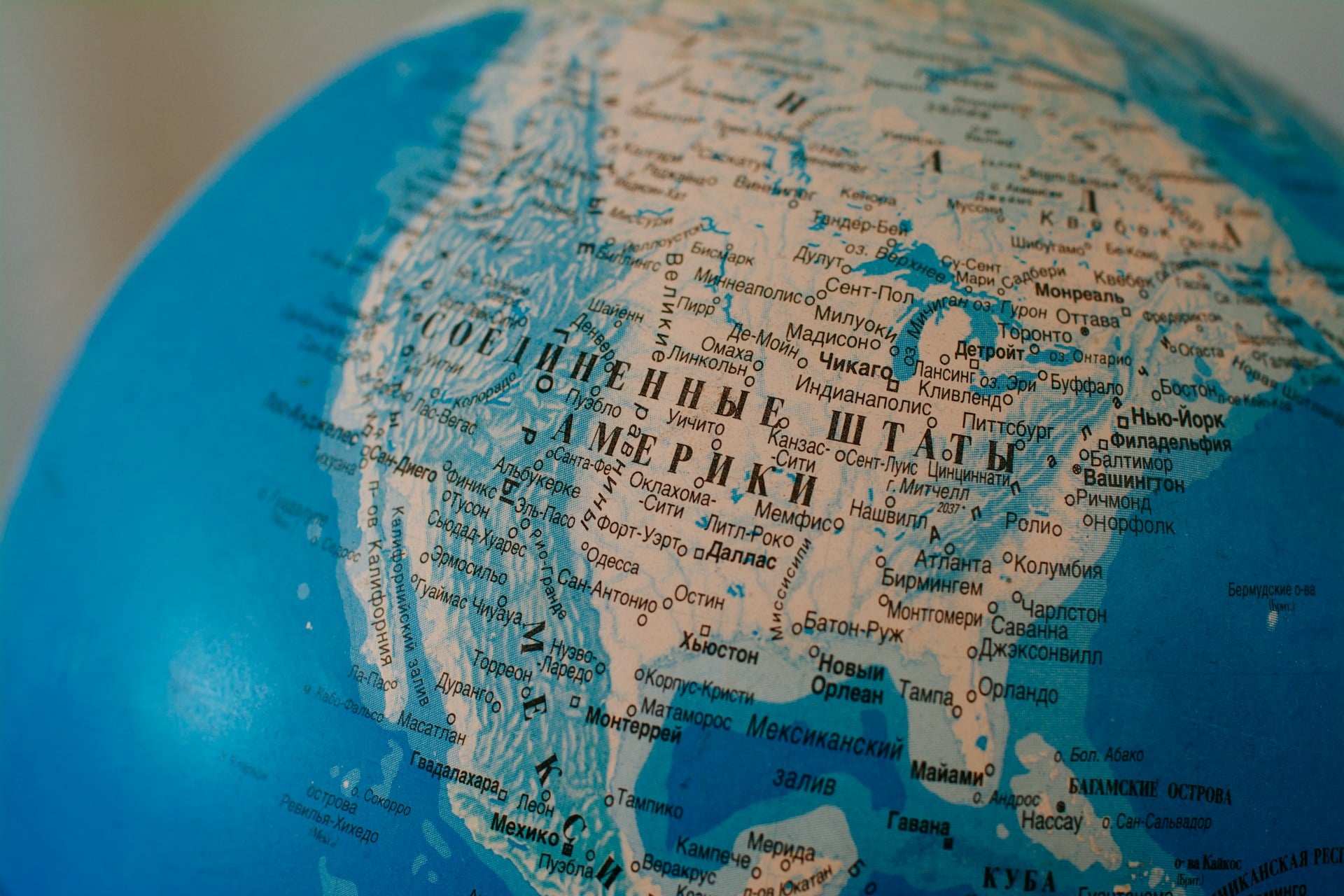
Willem Blaeu’s map of the Americas, first issued in the 1630s, gets overlooked mostly because everyone’s too busy fawning over Mercator. The coastline is careful, almost fussy, but the interior is a patchwork of invented rivers and mountain ranges sketched in with the confidence of a man who’d never set foot west of Amsterdam.
Spanish claims sprawl across territory nobody in Madrid had actually surveyed, which was standard practice at the time and still somehow surprising every time you see it laid out in ink. Hand-colored editions in solid condition now sell for $10,000 to $18,000, proof that guessing well pays better than guessing badly.
The Fry-Jefferson Map of Virginia
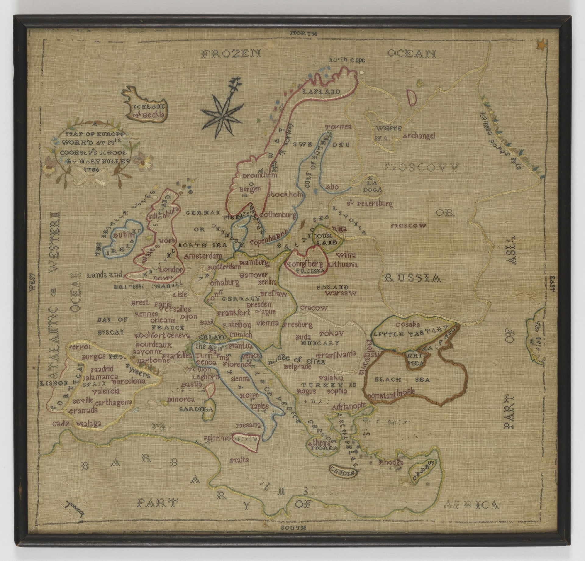
Joshua Fry and Peter Jefferson mapped Virginia in 1751, and they were not shy about it. The colony’s borders shove west past the Appalachians, past the Ohio River, deep into land Virginia claimed but never controlled.
Peter Jefferson’s son grew up with this map in the house, which probably explains a few things about how confidently the next generation drew lines on paper. Original first-state editions now sell for $30,000 to $60,000, and that’s before anyone starts arguing about which state of the plate they’re actually looking at.
Aaron Arrowsmith’s Map of North America
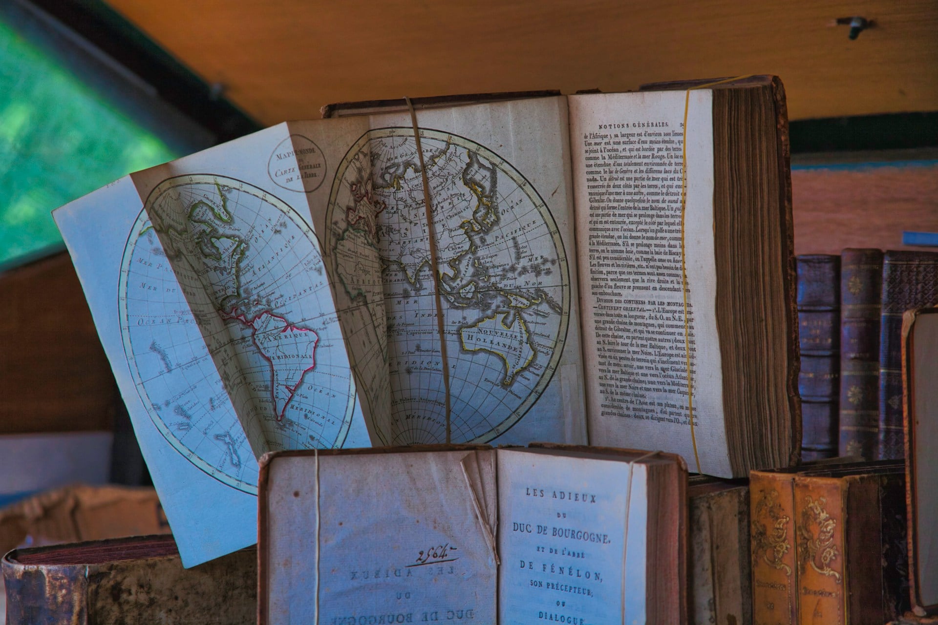
Aaron Arrowsmith published his map of North America in 1795 after years spent gathering fur-trade company records nobody else had bothered to cross-reference (Hudson’s Bay Company clerks, mostly, scribbling coordinates between shipments), and the result reads like the first honest attempt at stitching together a continent’s edges from secondhand paperwork rather than pure guesswork. So the borders west of the Mississippi thin into pale, uncertain lines — not because Arrowsmith was careless, but because the information simply ran out somewhere past the Rockies, and he refused to fake a confidence he didn’t have.
The eastern seaboard holds together with a precision that makes the western half look almost embarrassed by comparison, and that imbalance is exactly what collectors go looking for now: a map caught mid-sentence, one side finished, the other still waiting on information that wouldn’t arrive for another generation. Clean examples with the original hand coloring intact have sold for $18,000 to $30,000 at auction, which is a fair price for owning the exact moment a continent stopped being a rumor and started becoming a document.
The Gerald F. Danaher Collection Map
Unsplash/Smithsonian
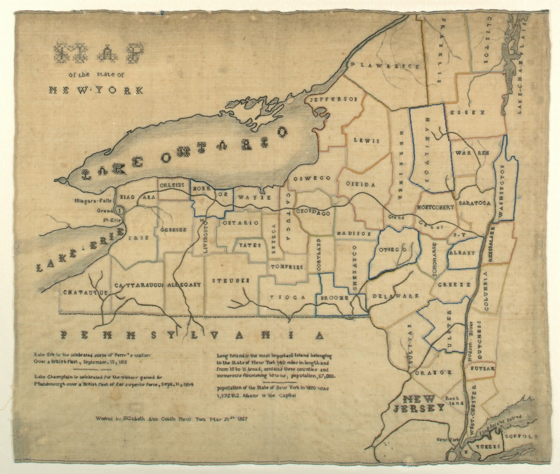
Some maps get famous for a name in the corner nobody outside the trade recognizes, and this is one of them. Gerald F. Danaher assembled a set of 19th-century American railroad and territorial maps that plot boundaries shifting year to year as territories waited on statehood, and buyers now chase the collection specifically because the borders never sit still.
Dakota Territory alone gets redrawn half a dozen times across the set before splitting into two states, which is more indecision than most countries manage in a century. Individual sheets from the collection have sold for $5,000 to $12,000, and complete bound groupings have cleared six figures when they surface at the right auction.
Emanuel Bowen’s Map of North America
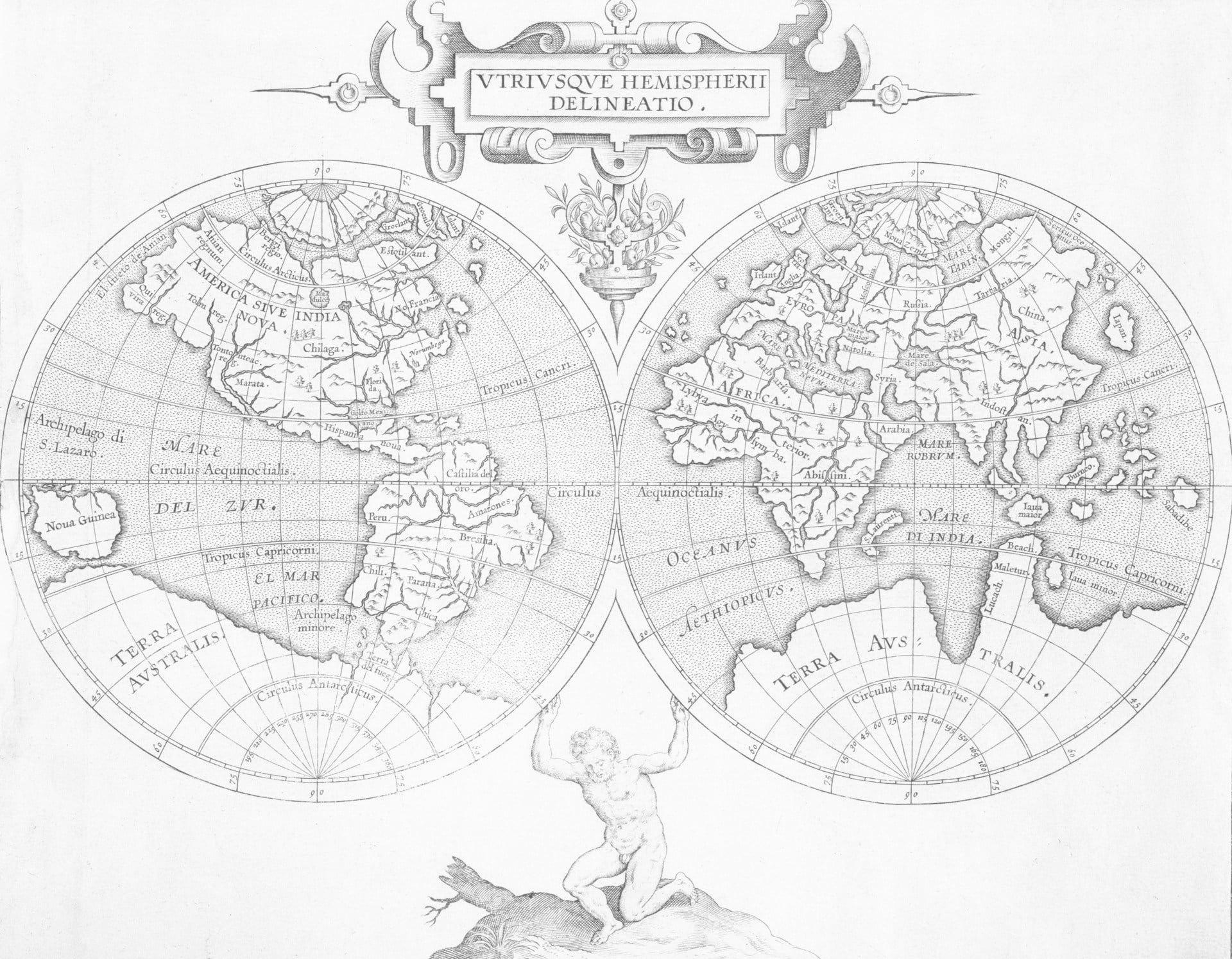
Emanuel Bowen carried the title “Royal Mapmaker” and still couldn’t keep the borders straight. His 1747 map of North America hands the Ohio Valley to three different claimants at once, England, France, and a vague notion of “disputed,” all inked with equal confidence.
Bowen died broke despite the royal title, which says something about how little accuracy paid even when the King’s own cartographer was the one getting it wrong. Surviving examples in good condition now bring $9,000 to $16,000 at auction, proof that royal approval never guaranteed a border held up.
John Melish’s Map of the United States
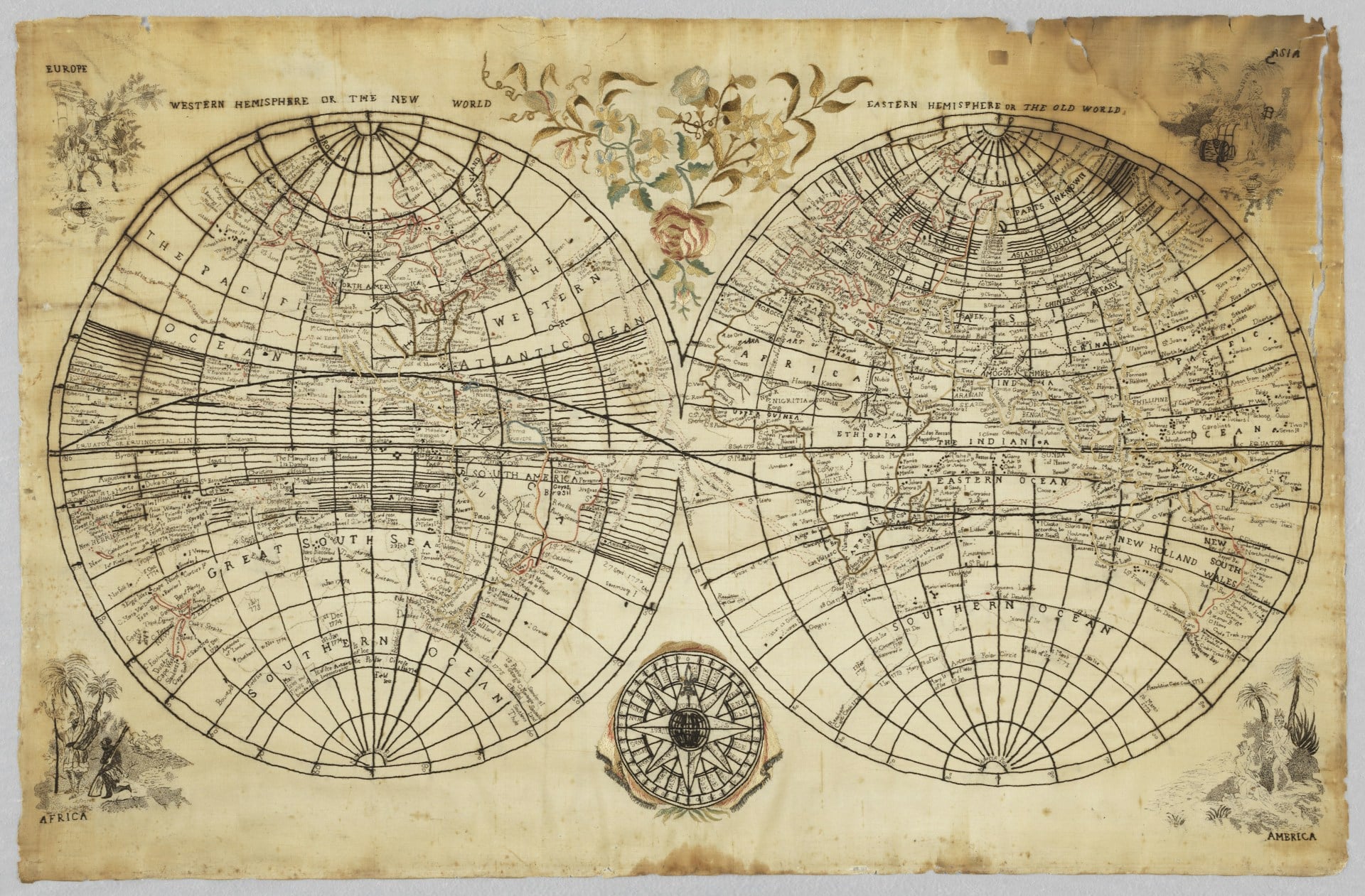
John Melish published his map of the United States in 1816, and it did something no American map had managed before: it stretched the country coast to coast, Atlantic to Pacific, years before Oregon was settled and decades before anyone called it Manifest Destiny out loud.
The western border is mostly confidence and cartographic nerve, Spanish territory reduced to a suggestion. Jefferson kept a copy close at hand while arguing boundary disputes with Spain, which tells you the map did real diplomatic work, not just decorative work.
Original hand-colored editions now sell for $12,000 to $22,000, and it’s the audacity of that coast-to-coast claim that collectors are actually paying for.
Lines That Kept Moving
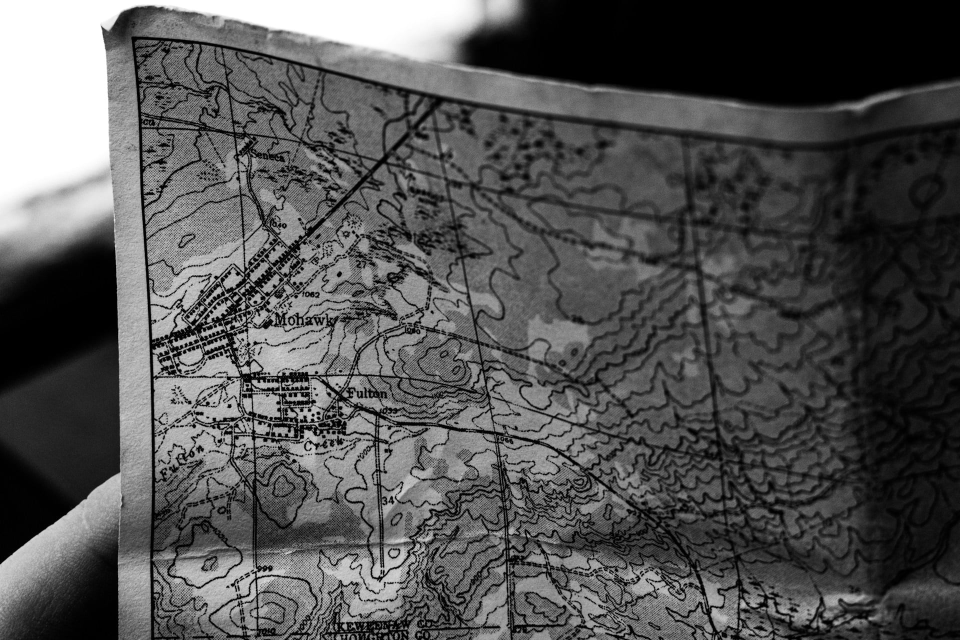
Every map on this list got something wrong, and that’s precisely the point. Borders drawn with total confidence, backed by treaties that hadn’t been signed yet or wars that hadn’t finished deciding anything, have a strange way of outliving the certainty that made them.
Nobody buys these things expecting accuracy. They buy them because a wrong line, inked boldly enough and left alone long enough, turns into something closer to a fingerprint than a mistake — proof that someone, somewhere, believed the world held still long enough to draw it.
More from Go2Tutors!

- The Romanov Crown Jewels and Their Tragic Fate
- 13 Historical Mysteries That Science Still Can’t Solve
- Famous Hoaxes That Fooled the World for Years
- 15 Child Stars with Tragic Adult Lives
- 16 Famous Jewelry Pieces in History
Like Go2Tutors’s content? Follow us on MSN.