29 Symbols With Origins Most People Get Completely Wrong
Symbols are everywhere — on your keyboard, your dollar bills, your medicine cabinet, your phone. You use them constantly, instinctively, without really thinking about where they came from or what they originally meant.
And that’s fine, mostly, until you realize that the story behind almost every familiar symbol is nothing like what you’d guess. Some carry histories that are darker, stranger, or more mundane than their modern meaning suggests.
A few have been completely repurposed so many times that their original intent would be unrecognizable to the people who invented them. These are the ones worth a second look.
The Heart Shape

The heart symbol has almost nothing to do with the human heart. The actual organ looks nothing like that paired-curve silhouette, and anatomists have known this forever.
One compelling theory traces the shape to the now-extinct silphium plant, used in ancient Carthage as a contraceptive, whose seed pods bore an uncanny resemblance to the symbol — which would mean the most recognizable emblem of romantic love originated as a marker for birth control.
The Caduceus

The caduceus — two snakes coiling around a winged staff — is widely used as a symbol of medicine in the United States, and it is the wrong symbol entirely. The correct symbol for medicine is the Rod of Asclepius, which has a single snake and no wings; Asclepius was the actual Greek god of healing.
The caduceus belongs to Hermes, the messenger god associated with commerce and, frankly, thieves — the U.S. Army Medical Corps adopted it by mistake in 1902, and the error simply spread.
The Swastika
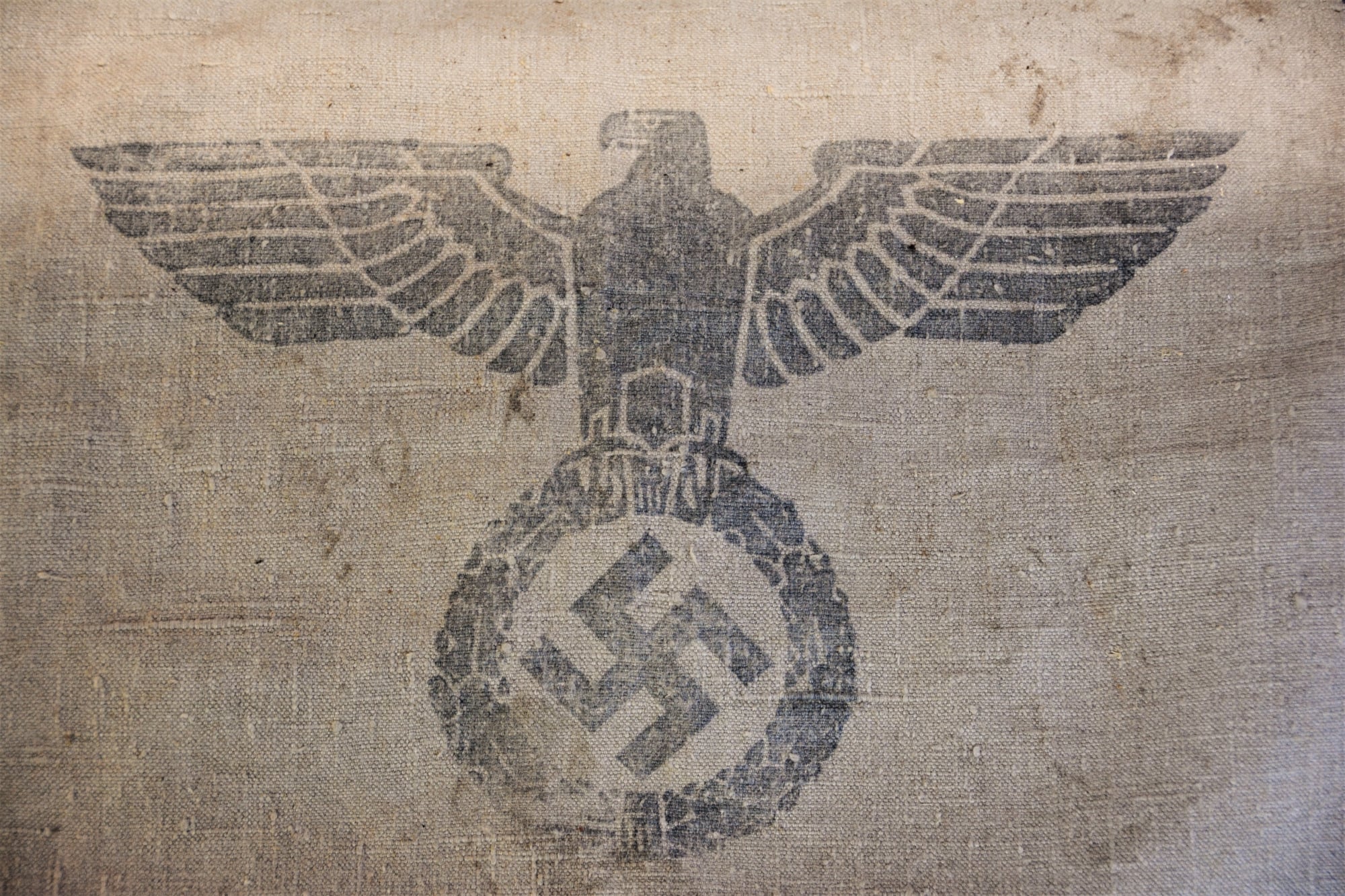
The swastika is one of the oldest symbols in human history, appearing in cultures from the Indus Valley to ancient Greece to Native American traditions, always carrying meanings of good fortune, prosperity, and the turning of the sun. It had been a benign, even beloved mark for thousands of years before the 20th century claimed it and buried everything that came before.
That layered history doesn’t erase what happened — but erasing the earlier history entirely is its own kind of historical mistake.
The Skull and Crossbones

Long before it meant poison, the skull and crossbones appeared on the gravestones of 17th-century Puritan colonists as a straightforward reminder of mortality — a memento mori carved into churchyards across New England. Pirates adopted a version of it (the Jolly Roger) to inspire dread at sea, and only later did it migrate onto poison bottles as a warning label.
So a single symbol cycled through death, piracy, and toxicology before most people ever saw it.
The Peace Sign

The peace sign was designed in 1958 by British graphic designer Gerald Holtom specifically for the Campaign for Nuclear Disarmament — it is not an ancient mystical symbol, and it was not borrowed from any occult tradition, despite decades of claims to the contrary. Holtom based it on the semaphore signal positions for the letters N and D, superimposed within a circle.
He designed it in a weekend, and it went on to become one of the most reproduced symbols in the world, which is saying something for a logo made of two stick lines.
The Dollar Sign

The dollar sign almost certainly did not originate as a stylized “U.S.” stamped on top of itself, despite how persistently that explanation circulates. The most credible etymology traces it to the Spanish peso, abbreviated as “ps” in handwritten colonial-era documents, where the “p” and “s” gradually merged into something that looked like a single glyph with a vertical stroke through an “S.”
The United States didn’t invent the dollar sign — they inherited it from Spanish colonial trade.
The Red Cross

The Red Cross symbol was chosen in 1863 as a deliberate tribute to Switzerland — it’s the Swiss flag with the colors reversed, adopted to honor Henry Dunant, the Swiss founder of the organization. It was never meant to carry religious significance, and the choice was purely nationalistic in a respectful sense.
That hasn’t stopped decades of confusion, particularly in Muslim-majority countries, which is precisely why the Red Crescent and Red Crystal exist as recognized alternatives.
The Ampersand
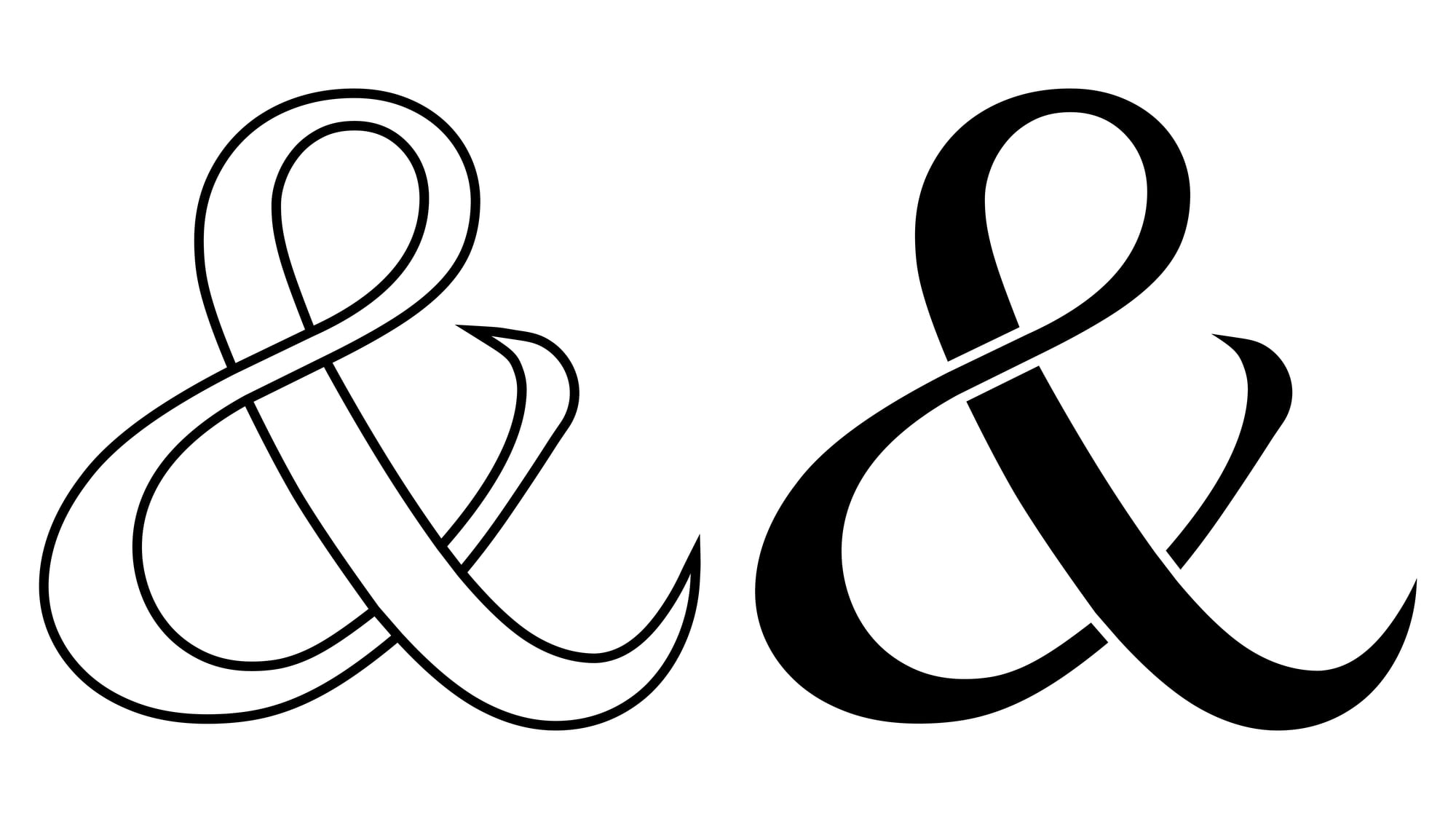
The ampersand (&) is a ligature — a merged letterform — of the Latin “et,” which simply means “and.” You can still see the “e” and “t” fused together if you look at certain stylized versions of the symbol.
The word “ampersand” itself comes from the phrase “and per se and,” which was how 19th-century schoolchildren recited it when it appeared at the end of the alphabet: “X, Y, Z, and per se and.” It was a symbol born from rushed handwriting that survived into the digital age because nothing replaces it quite right.
The @ Symbol
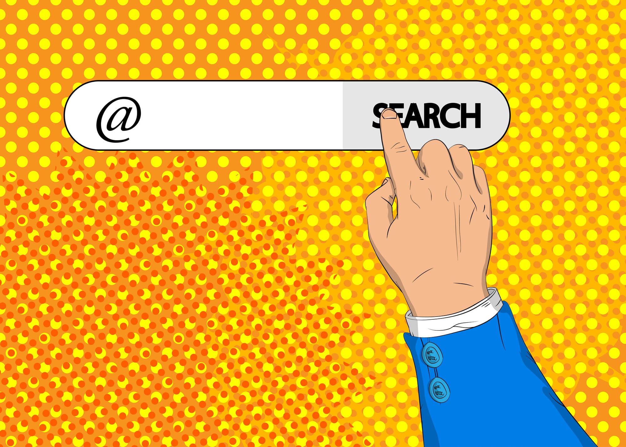
The @ symbol was a mundane merchant’s shorthand centuries before email gave it a second life — it appeared in 15th-century Florentine trade documents as an abbreviation for a unit of weight called the “amphora.” It also showed up in Spanish and Portuguese as a measure of weight known as the “arroba.”
Ray Tomlinson chose it for email addresses in 1971 not because of any symbolic meaning but because it was already on the keyboard and meant “at a location,” which was logistically convenient and, as it turned out, historically generous.
The Rx Symbol

The Rx symbol seen on every pharmacy prescription pad is most likely derived from the Latin word “recipe,” meaning “take” — as in, take this medicine. But some historians argue it traces back to the Eye of Horus, an ancient Egyptian symbol associated with healing and protection, which medieval scribes may have incorporated into their shorthand.
The Latin explanation is more widely accepted, but the Egyptian angle refuses to go away, which makes every pharmacy receipt a small contested battlefield.
The Thumbs Up

The thumbs-up gesture as a symbol of approval is largely a 20th-century American invention, popularized by WWII-era pilots and later cemented by television. The Roman gladiatorial arena origin — where the crowd’s thumbs determined a fighter’s fate — is almost entirely fictional, a romantic image passed down through Renaissance paintings rather than historical fact.
What Roman crowds actually did with their thumbs, if anything, remains genuinely unclear.
The Smiley Face
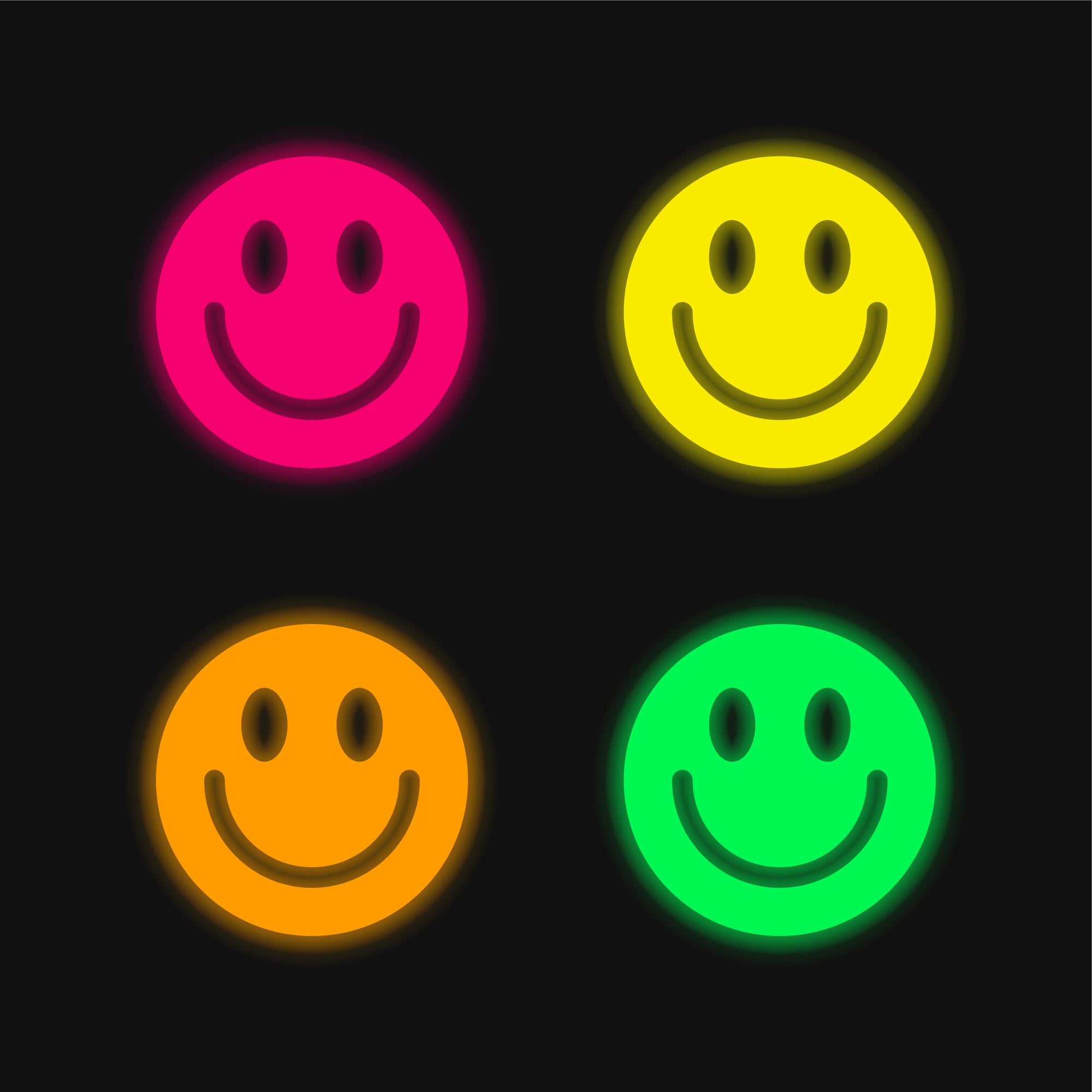
The smiley face — yellow circle, two dots, curved line — was created in 1963 by commercial artist Harvey for a workplace morale campaign at State Mutual Life Assurance Company in Worcester, Massachusetts. Harvey was paid $45 for it.
He never trademarked it, which is how it became one of the most ubiquitous images in history while he received almost nothing from its spread. Two brothers named Murray and Bernard Spain did trademark a version in the early 1970s and made millions — which is a tidy little lesson in the economics of authorship.
The Fleur-de-Lis

The fleur-de-lis looks like a stylized lily and is named for one, but the plant it actually depicts is almost certainly an iris — specifically, the yellow iris that grows along the riverbanks of northern France. The confusion comes partly from the fact that “lys” referred broadly to flowering plants, not strictly the lily, in medieval French.
Centuries of heraldic tradition have locked in the lily name anyway, and the iris just has to live with the misattribution.
The Olympic Rings
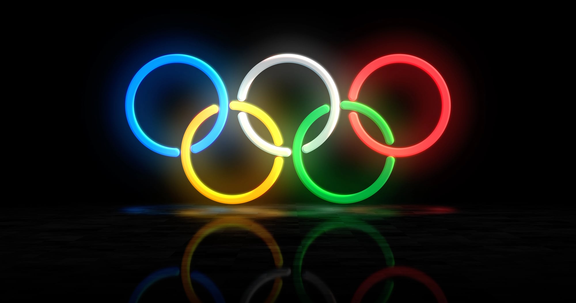
The five interlocking Olympic rings do not represent the five continents with a ring for each one, which is a version of the story that gets repeated constantly. They were designed by Pierre de Coubertin in 1912, and his explanation was that the rings’ colors — blue, yellow, black, green, and red — combined with the white background covered every national flag’s colors at the time.
The rings represent unity, not a literal map of the continents divided into regions.
The Barber’s Pole
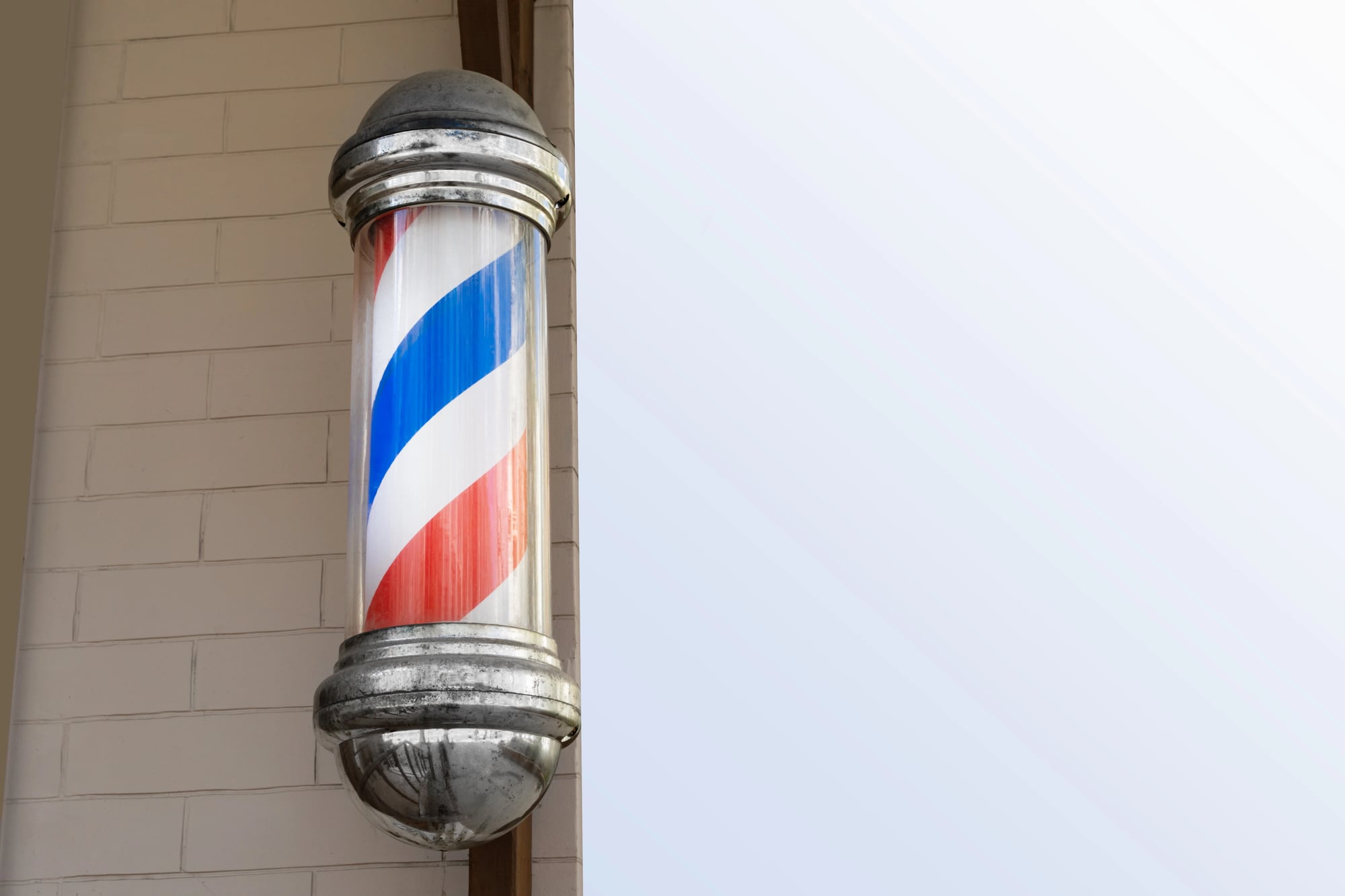
The spinning red-and-white barber’s pole is a direct reference to the days when barbers also performed surgical procedures, including bloodletting. The red represented blood, the white represented bandages, and the pole itself referenced the rod patients gripped during the procedure to encourage blood flow.
Barbers and surgeons were formally separated as professions in England in 1745, but the pole survived the divorce and just became a sign for haircuts.
The Bluetooth Symbol
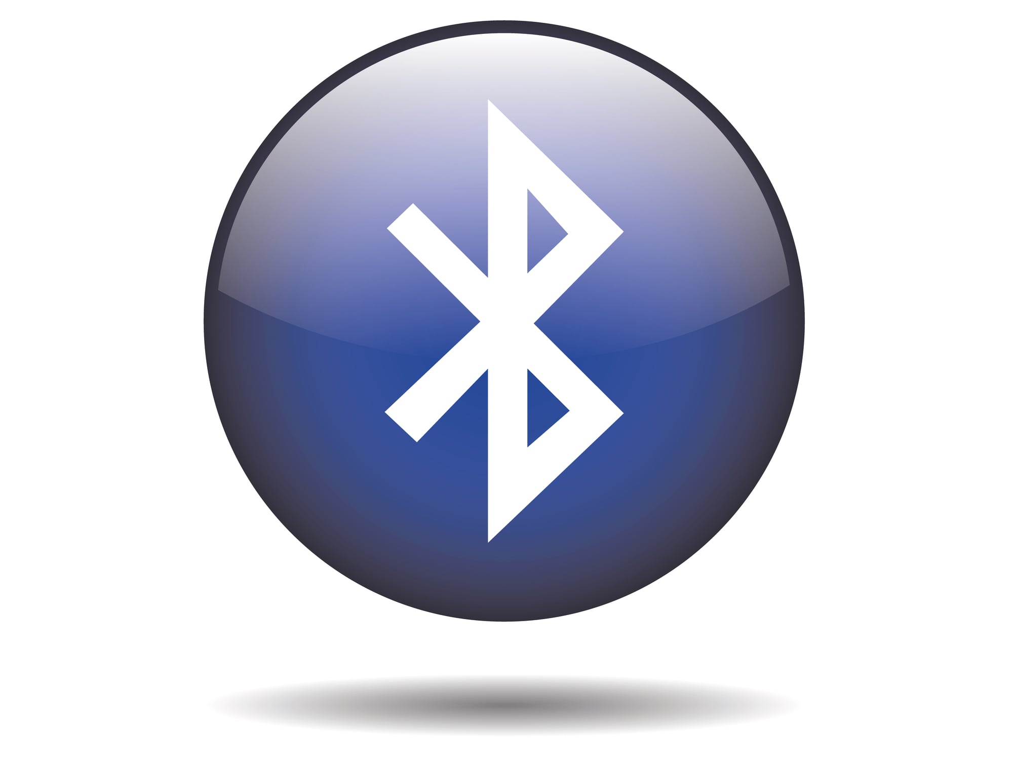
The Bluetooth symbol is a runic monogram of the initials “H” and “B” in the Elder Futhark alphabet, standing for Harald Bluetooth — a 10th-century Danish king who united warring Scandinavian tribes. The technology was named for him because the goal was to unite different communication protocols, and the symbol is his actual royal insignia compressed into a logo.
So every time you pair your headphones, you’re technically invoking a medieval Viking king, which is either satisfying or completely indifferent to you, depending on the day.
The Recycling Symbol

The universal recycling symbol — three chasing arrows in a triangle — was designed by Gary Anderson in 1970 as a student entry in a contest held for the first Earth Day. Anderson was 23 years old and a senior at the University of Southern California.
He won $2,500 and watched his symbol become a legal requirement on packaging around the world; the symbol itself was never copyrighted and entered the public domain immediately, which may say something about the relationship between good ideas and financial reward.
The Cross
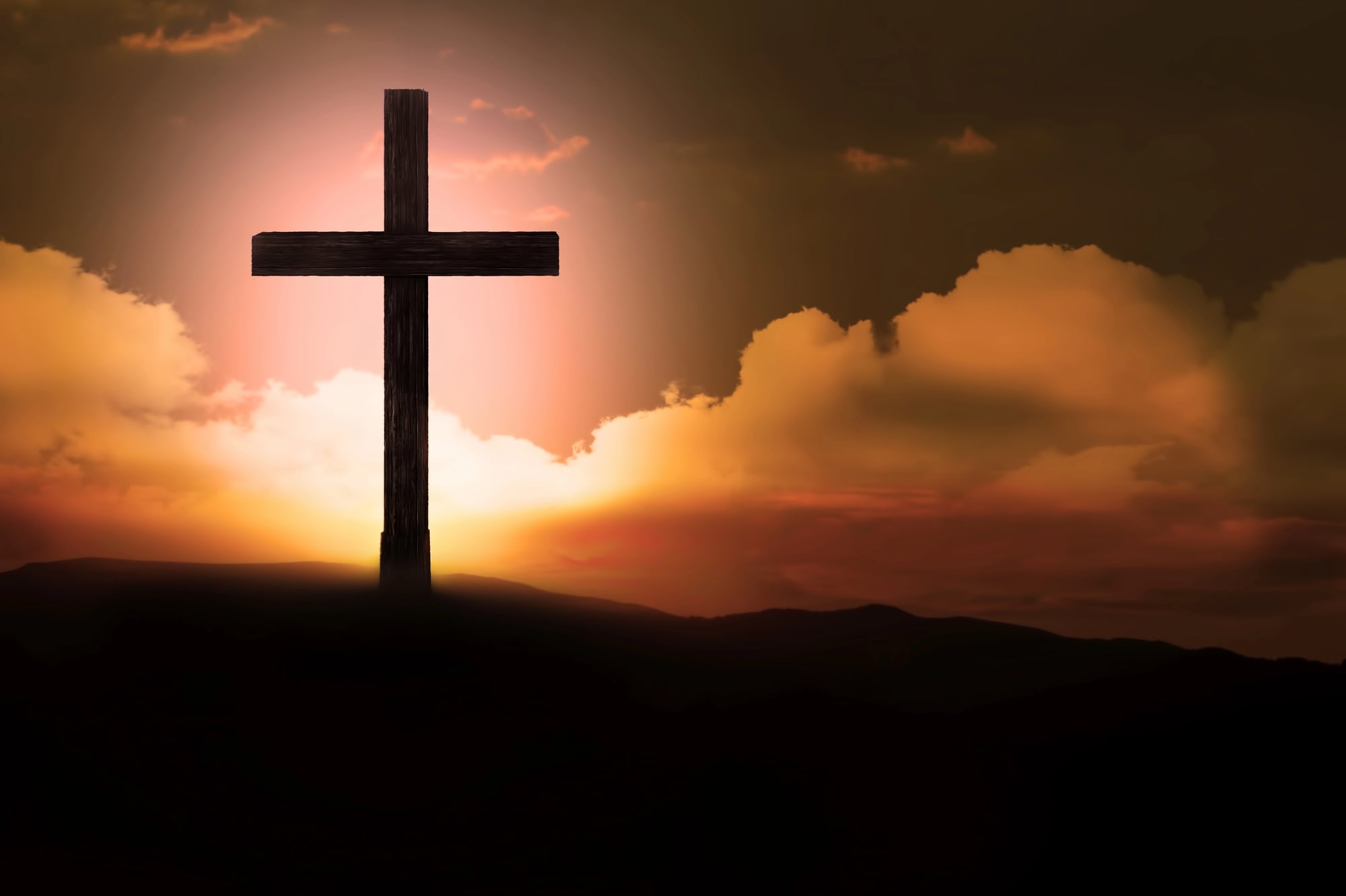
The Christian cross as a symbol did not come into widespread use among early Christians until several centuries after the crucifixion — early Christian communities used symbols like the fish (ichthys) and the chi-rho far more commonly. The cross was associated with shame and execution in Roman society, and displaying it openly was, for obvious reasons, not immediately appealing.
Constantine’s reign in the 4th century is generally credited with rehabilitating the cross as a symbol of victory rather than punishment.
The Star of David
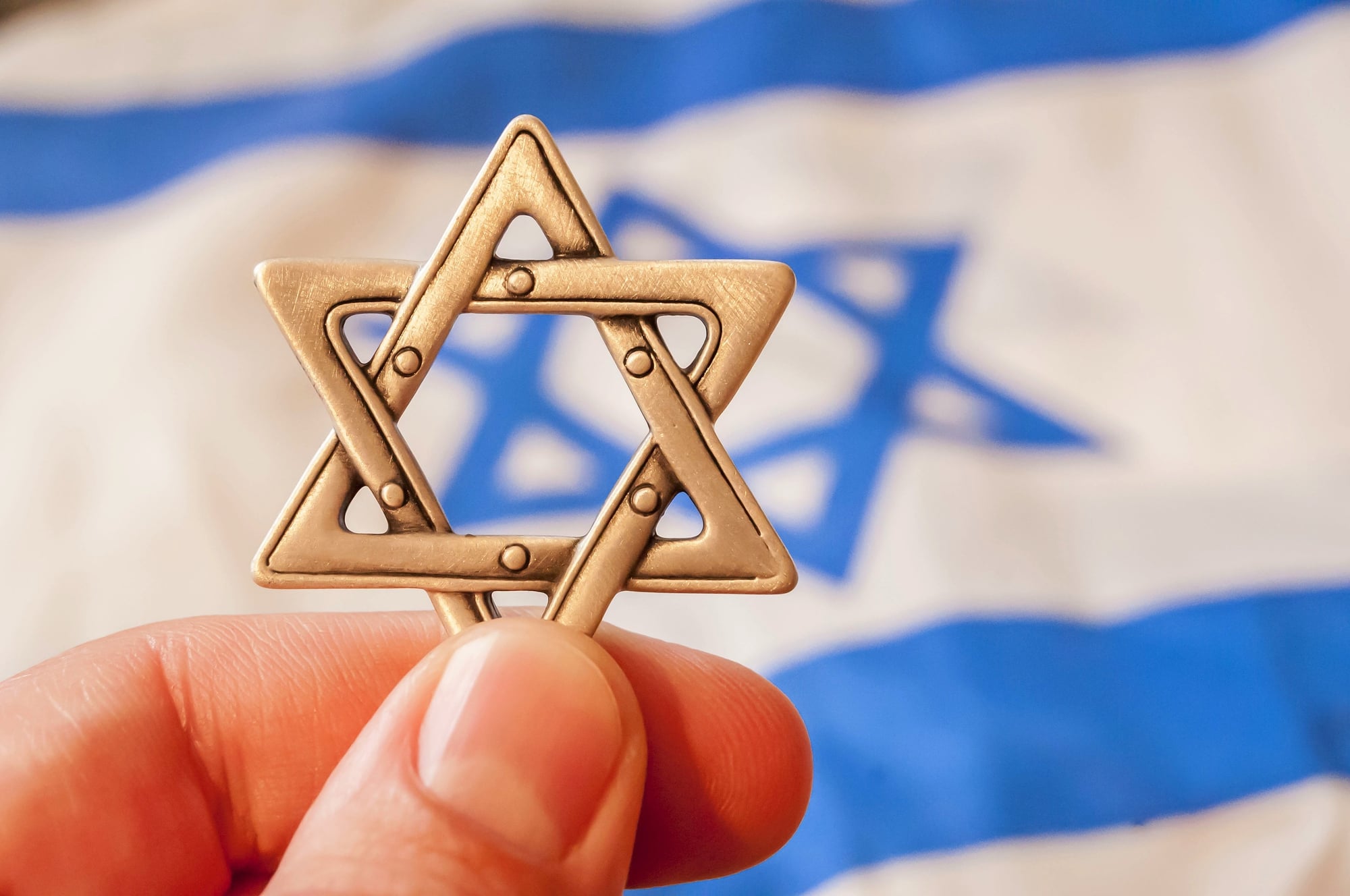
The Star of David — six-pointed, two overlapping triangles — was not historically exclusive to Jewish identity and appears in Islamic architecture, Hindu temples, and medieval Christian manuscripts throughout the centuries. Its strong association with Judaism is relatively recent, becoming widespread only in the 17th century and explicitly adopted as a Jewish symbol by the First Zionist Congress in 1897.
The Nazi use of the yellow star weaponized something that had only recently become a unifying emblem, which adds a particular weight to its modern meaning.
The White Flag
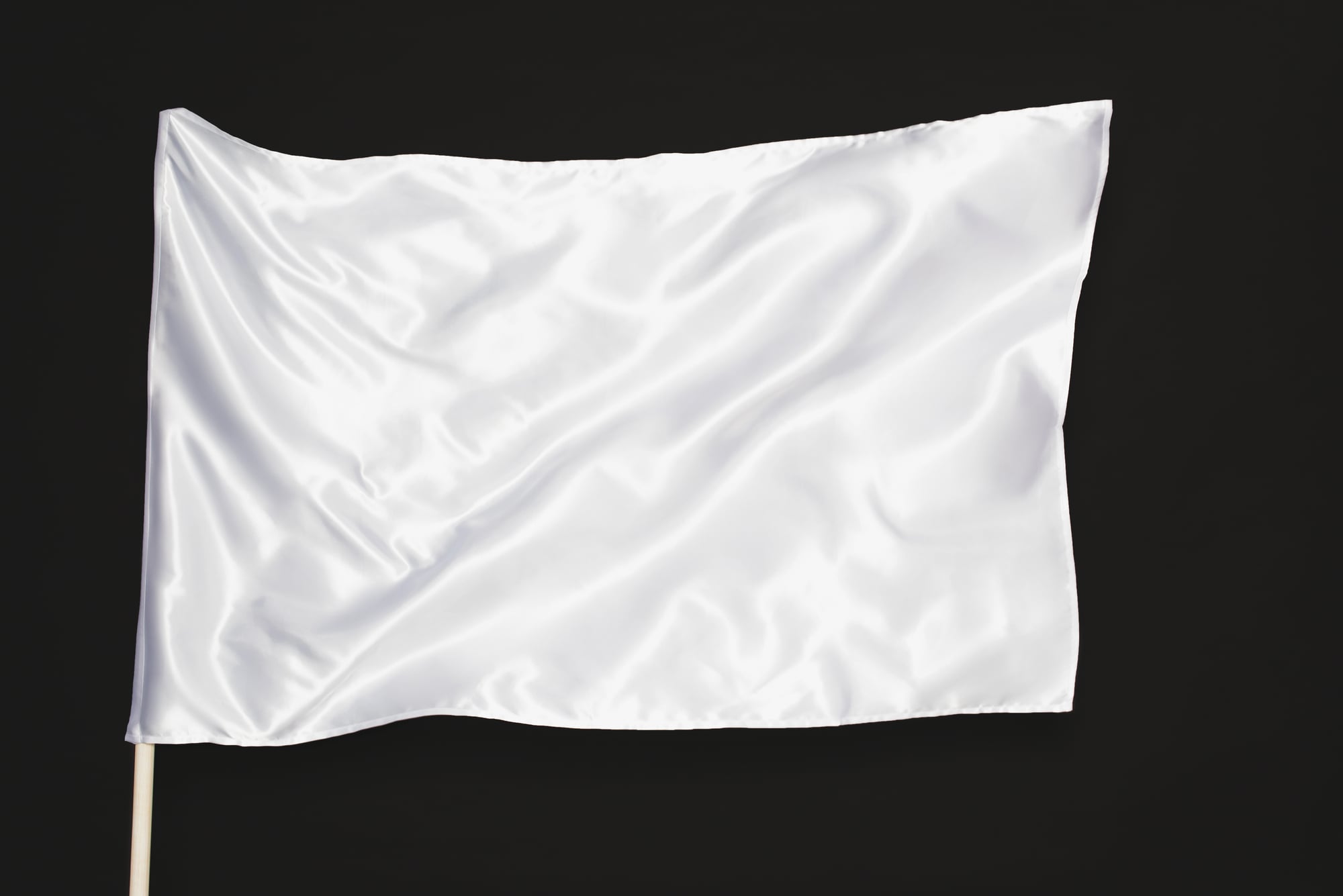
The white flag as a signal of surrender is old enough that its true origin is murky, but it appears in Chinese records as early as the Eastern Han dynasty and in Roman military writing from roughly the same era. The interesting wrinkle is that a white flag originally signaled a desire to communicate or negotiate, not necessarily surrender — the shift toward unconditional capitulation happened gradually through centuries of military practice.
Technically, you’re asking to talk. The other side decides what happens next.
The Question Mark

The question mark descends from the Latin word “quaestio,” meaning “question,” which medieval scribes abbreviated as “qo.” Over time, the “q” migrated above the “o,” the letterforms simplified, and the modern question mark emerged from that compression.
It’s a squashed Latin abbreviation — not a stylized hook, not a symbolic representation of uncertainty, just rushed handwriting that calcified into grammar.
The Hashtag

The hashtag symbol (#) is officially called an octothorpe — a name with disputed origins, possibly coined by Bell Telephone Labs engineers in the 1960s who needed a name for the symbol on the new touch-tone phone keypad. Before Twitter gave it its current life, it was used in proofreading to indicate where a space was needed, in music notation, in copywriting, and in computer programming.
The name “hashtag” itself only dates to 2007, making it one of the youngest named uses of a very old symbol.
The Arrow
Arrows as directional symbols predate written language, but the specific visual shorthand of a line with a pointed tip emerged much later than most people assume — widespread use in cartography and technical drawing only took hold in the 18th century. Before that, pointing hands (called “manicules”) were the preferred directional marker in manuscripts and early maps.
The arrow won out largely because it’s faster to draw, which is maybe the most practical reason a symbol has ever triumphed.
The Skull in Pirate Imagery
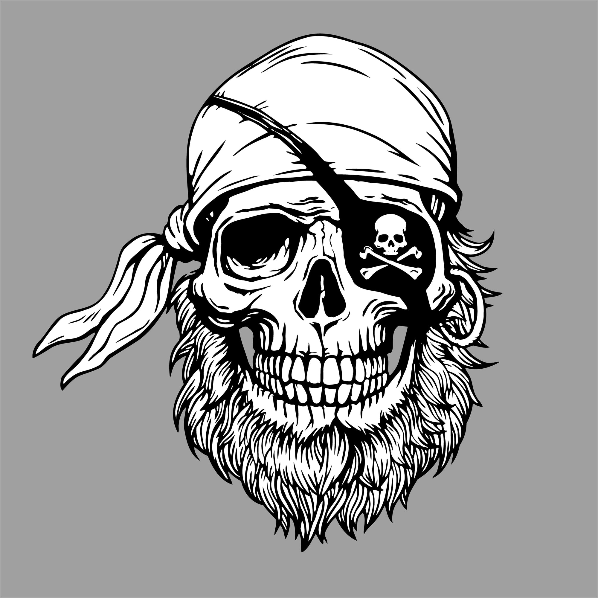
The specific design of pirate flags varied wildly between individual ships and captains — there was no single Jolly Roger, and “Jolly Roger” itself may derive from the French “jolie rouge,” meaning “pretty red,” referring to an early blood-red flag that meant no quarter would be given. The skull-and-crossbones version is just the design that happened to survive in popular imagination, largely because it made for better children’s books and theater costumes than a plain red flag.
History chose its aesthetic representative and moved on.
The Winged Foot
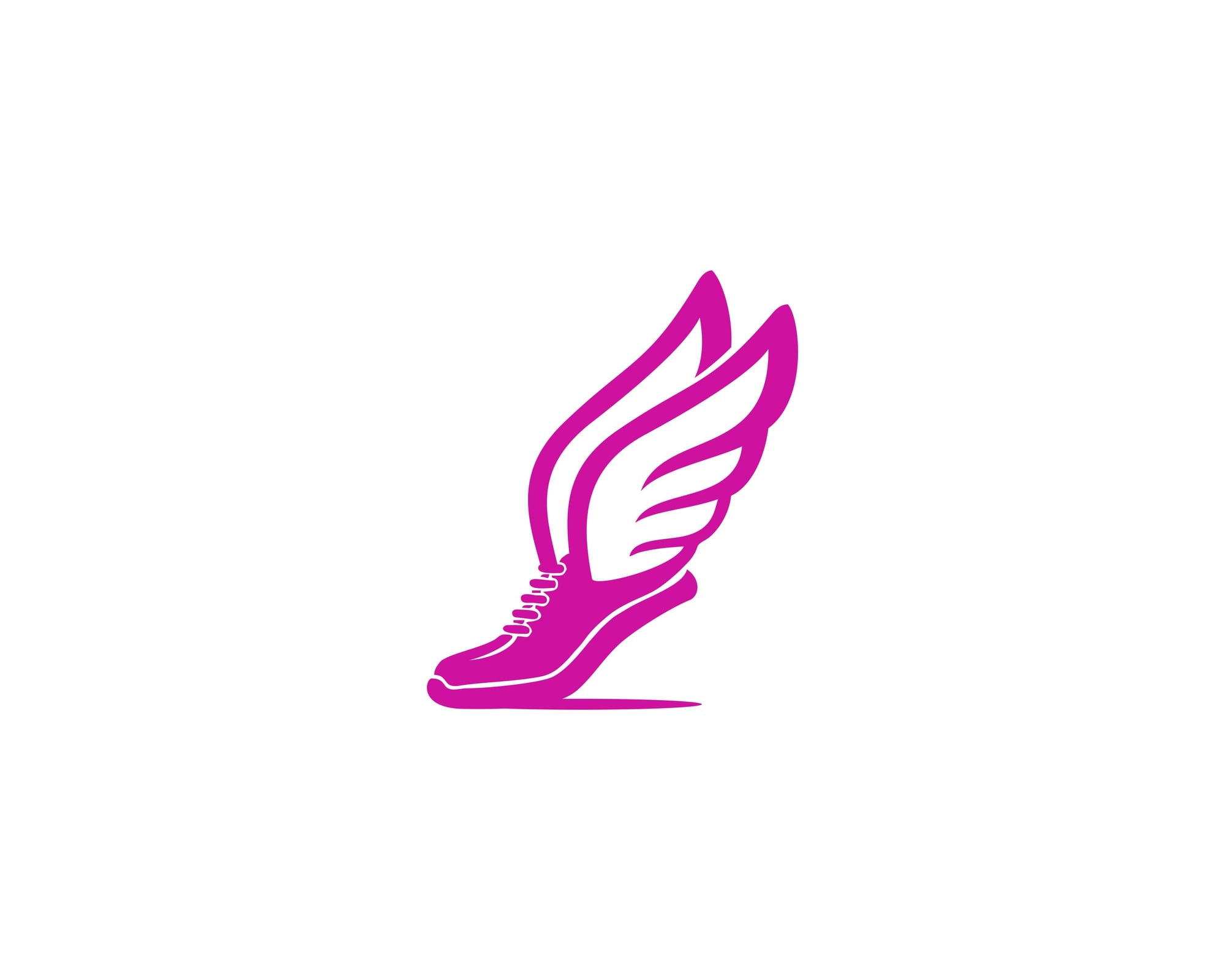
The winged foot or sandal is associated almost exclusively with Hermes in Greek mythology and Mercury in Roman mythology — gods of speed, travel, and communication. What’s less known is that Mercury became the symbol of commerce specifically because he was also the patron of merchants, which is why the same winged-foot image appears on FTD florist vans, the logo of several railroad companies, and old U.S. dime coins.
Speed and trade have been the same idea, apparently, for a very long time.
The Equal Sign
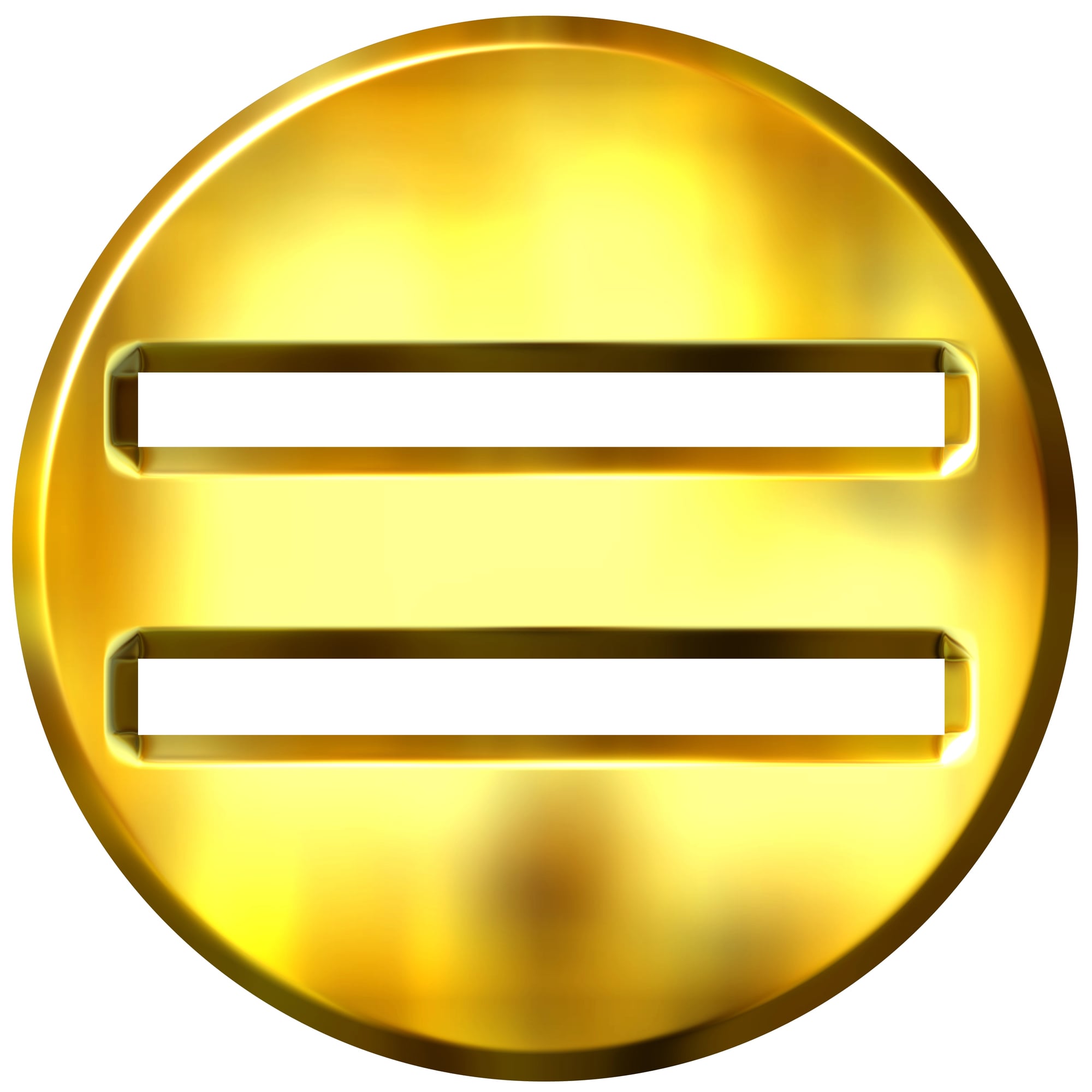
The equal sign (=) was invented by Welsh mathematician Robert Recorde in 1557, who explained in his book “The Whetstone of Witte” that he chose two parallel lines “because no two things can be more equal.” Before that, mathematicians wrote out the word “equals” in full — every single time — which is the kind of tedious detail that makes you appreciate a good shorthand.
It took over a century for the symbol to be universally adopted even after Recorde introduced it.
The Infinity Symbol
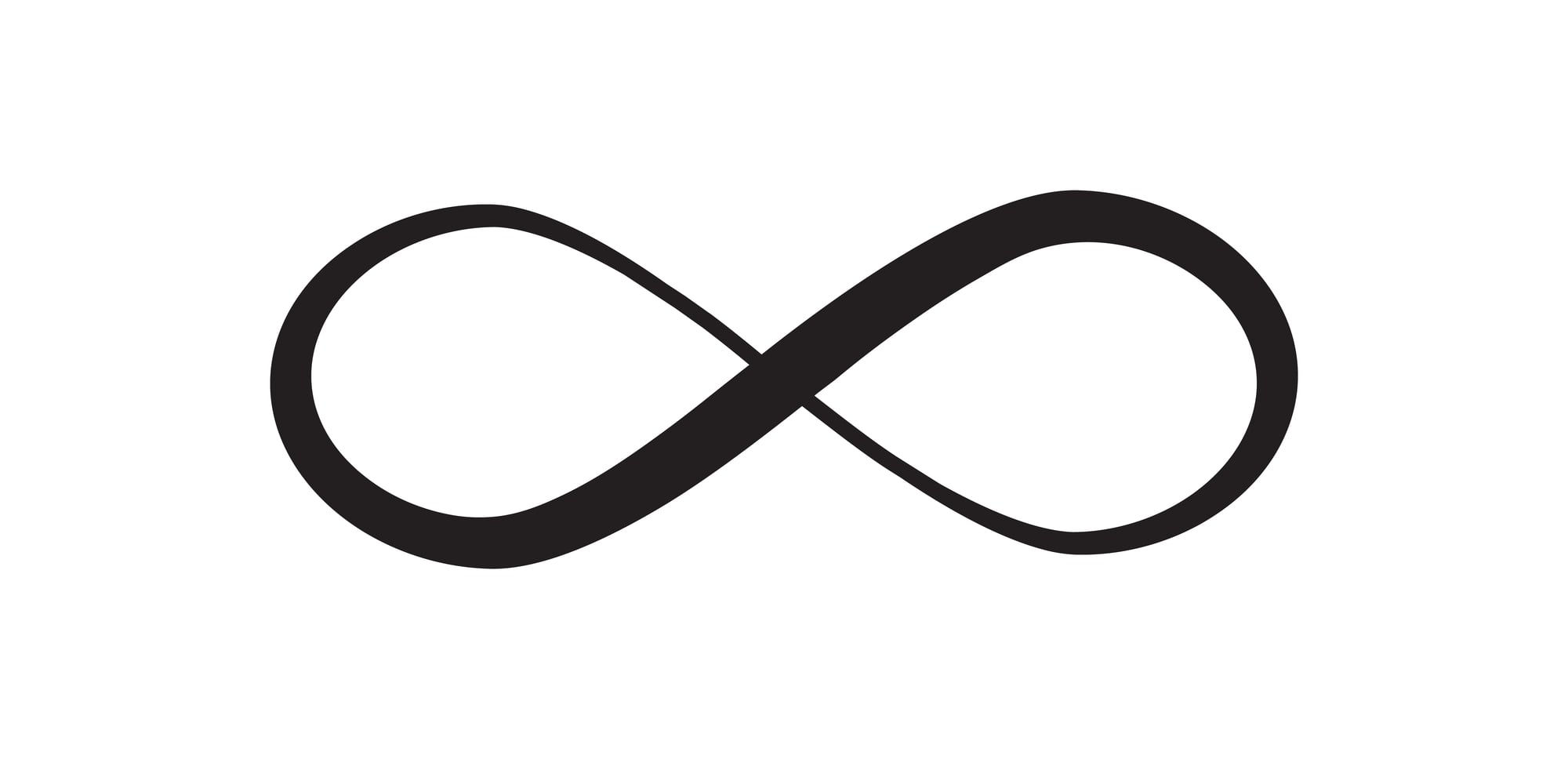
The infinity symbol (∞) was introduced by English mathematician John Wallis in 1655, and the reasons for his choice of that particular shape are not entirely documented — theories range from a stylized Roman numeral for 1,000 (which was colloquially used to mean “many”) to a variation of the Ouroboros, the ancient snake eating its own tail. Wallis never fully explained himself, which is the kind of mathematical behavior that feels appropriately unbounded for a symbol meant to represent something without end.
The Checkmark

The checkmark as a symbol of correctness is almost certainly derived from the Latin “veritas,” meaning “truth” — some historians argue the tick is a simplified “V” for “veritas” that Roman officials used when verifying records. In many countries, a checkmark actually means “wrong” rather than correct, including Finland and Japan, where it functions as an “X” equivalent.
The checkmark means whatever the culture around it agrees it means, which makes it one of the more philosophically unstable symbols in daily use.
The Power Button Symbol
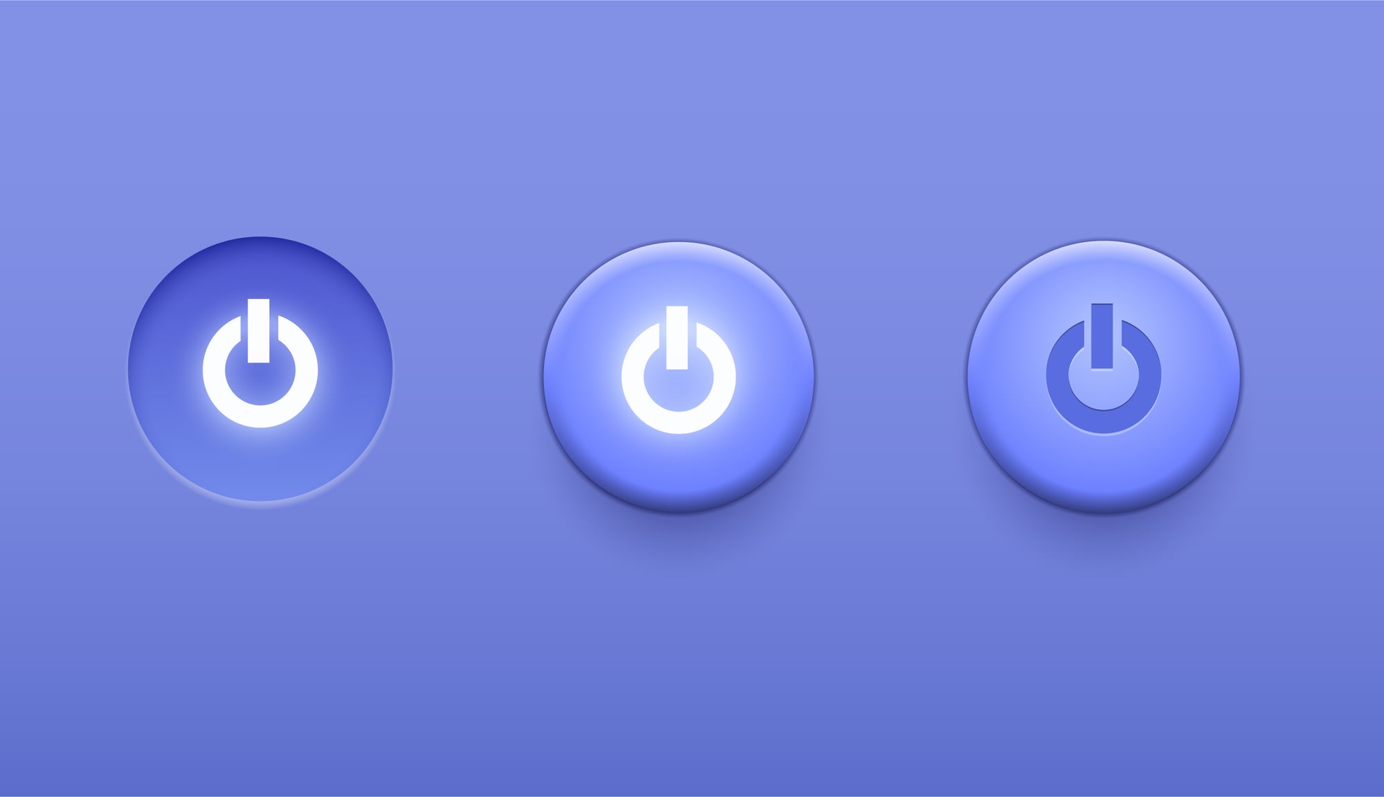
The power button symbol — a circle interrupted at the top by a short vertical line — is a direct encoding of binary notation, where 1 means on and 0 means off. The line is a “1,” the circle is a “0,” merged into a single icon that represents both states simultaneously.
The International Electrotechnical Commission standardized it in the 1970s, and it spread across every device in the world so quietly that most people spend years pressing it without ever noticing what it’s actually saying.
What You See When You Look Again
There’s something quietly disorienting about learning the real story behind a symbol you’ve used ten thousand times. The @ key stops being a mundane typographical mark and starts being a medieval weight measurement.
The barber’s pole stops being décor and starts being a record of a profession’s bloody past. None of these symbols changed — only the context did, and that’s the part that lands differently.
Symbols don’t carry meaning the way a container holds water; they carry it the way a word carries an accent — shaped by everywhere they’ve been, indifferent to where they’re going.
More from Go2Tutors!

- The Romanov Crown Jewels and Their Tragic Fate
- 13 Historical Mysteries That Science Still Can’t Solve
- Famous Hoaxes That Fooled the World for Years
- 15 Child Stars with Tragic Adult Lives
- 16 Famous Jewelry Pieces in History
Like Go2Tutors’s content? Follow us on MSN.