16 Massive Global Brands That Entirely Rebranded
Sometimes even the most successful companies reach a crossroads where their old identity simply doesn’t fit anymore. The world changes, technology evolves, and suddenly a brand that once felt cutting-edge starts looking like a relic from another era.
For some companies, a fresh coat of paint and a new slogan might do the trick. But for others, the only solution is to tear everything down and start over completely.
These transformations aren’t just about swapping out a logo or changing a color scheme. They’re about fundamentally reimagining what a company stands for, how it communicates with customers, and where it sees itself heading in the future.
The results can be spectacular successes that breathe new life into aging giants — or expensive mistakes that alienate loyal customers while failing to attract new ones.
Dunkin’
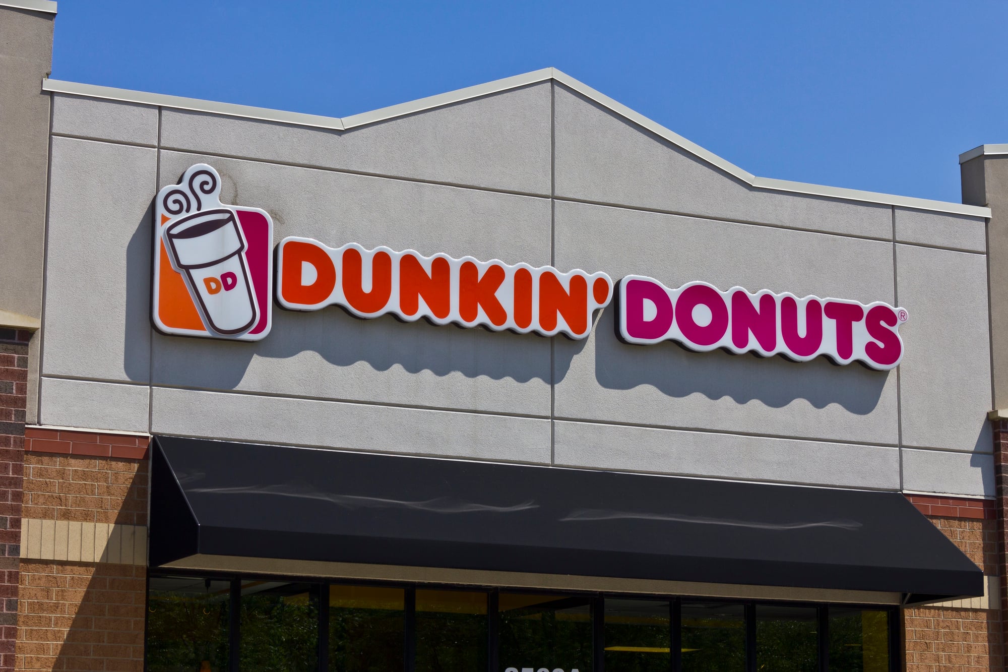
The company that spent decades drilling “Dunkin’ Donuts” into American consciousness decided in 2018 that donuts were holding them back. So they dropped half their name and became simply “Dunkin’.” Bold move for a brand built on fried dough.
The rebrand wasn’t just cosmetic — it signaled a fundamental shift toward positioning themselves as a beverage company first (which honestly makes sense, since their coffee keeps more people alive than their Boston Kremes ever did).
The orange and pink color scheme stayed, but everything else got streamlined and modernized. And despite some initial grumbling from donut purists, the strategy worked: people still knew exactly where to go for their morning caffeine fix.
Kentucky Fried Chicken To KFC
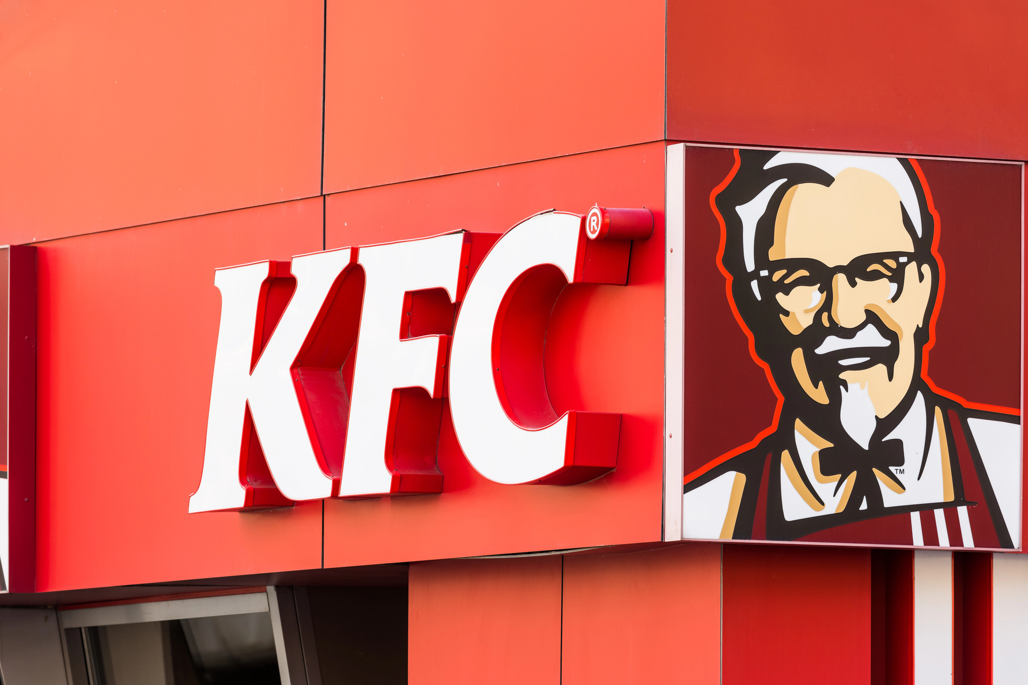
Colonel Sanders probably never imagined that “fried” would become a dirty word, but by the 1990s, KFC was dealing with a health-conscious public that increasingly viewed their signature cooking method as nutritional enemy number one. The solution was deceptively simple: make those two problematic words disappear entirely (or at least shrink them down to barely visible fine print).
The rebrand to KFC let them keep their iconic bucket branding and eleven herbs and spices mystique while quietly downplaying the whole deep-frying situation.
They could introduce grilled chicken, salads, and other supposedly healthier options without the cognitive dissonance of “Kentucky Fried” sitting right there in the name. The Colonel’s face stayed put, naturally — some things are too sacred to mess with.
The Facebook Company To Meta

When your company name becomes synonymous with privacy scandals, election interference, and congressional hearings, changing it starts looking like a pretty attractive option. Mark Zuckerberg’s decision to rebrand Facebook (the parent company) as Meta in 2021 was part damage control, part genuine pivot toward virtual reality and the so-called metaverse.
Of course, this created the slightly surreal situation where Facebook the app still exists under the Meta umbrella, which confused pretty much everyone for a while.
But the rebrand served its purpose: it gave Zuckerberg a way to talk about his company’s future without constantly relitigating its messy past. Whether the metaverse thing actually pans out remains to be seen, but at least the corporate PowerPoints look different now.
Weight Watchers To WW

Weight Watchers spent over five decades helping people lose weight before realizing that maybe centering your entire brand around the word “weight” wasn’t the most enlightened approach. In 2018, they shortened their name to WW and started talking about “wellness” instead of pounds and dress sizes.
This wasn’t just political correctness — it was smart business.
The diet industry was shifting away from the shame-based messaging that had dominated for decades, and Weight Watchers needed to evolve or risk becoming irrelevant. The rebrand let them expand beyond weight loss into broader health and lifestyle territory while keeping their core program intact.
Plus, “WW” fit better on smartphone apps, which is where most of their business was heading anyway.
Radio Shack To The Shack
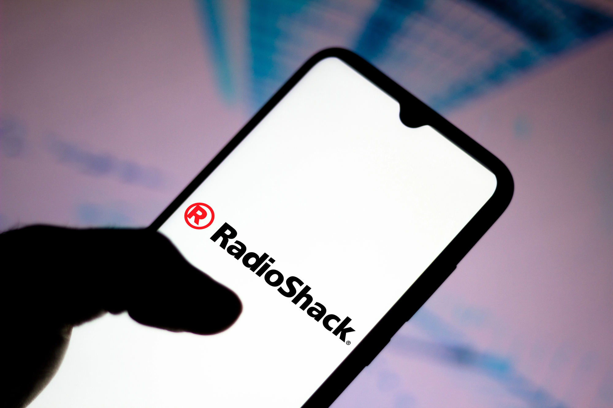
Radio Shack’s 2009 rebrand to “The Shack” ranks among the most universally mocked marketing decisions in recent memory — and that’s saying something in an era that gave us New Coke and Crystal Pepsi. The company was struggling to stay relevant in a world where people bought their electronics at Best Buy or Amazon, so they decided their name was the problem.
The logic was that “Radio Shack” sounded old-fashioned and intimidating to younger customers who didn’t know what a radio shack actually was.
“The Shack,” presumably, sounded cooler and more approachable. It didn’t work. The rebrand felt forced and desperate, and the company filed for bankruptcy just six years later.
Sometimes a failing business needs more than a name change to survive.
Taco Bell
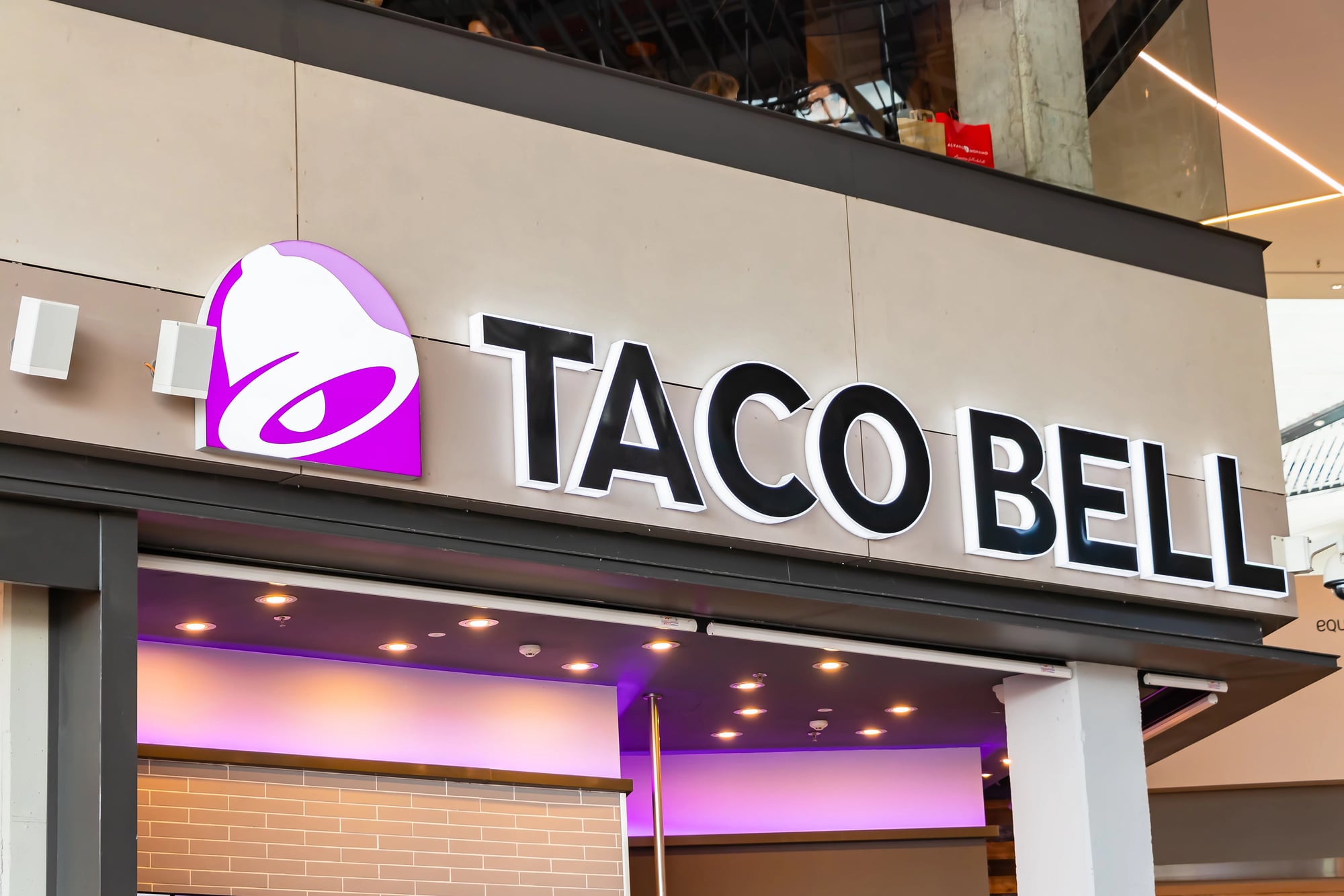
Few rebrands feel as natural as Taco Bell’s gradual evolution from a slightly cheesy fast-food chain to a brand that fully embraces being slightly cheesy. This transformation didn’t happen overnight — it’s been a slow burn spanning the better part of two decades, with the company leaning harder into millennial humor, late-night culture, and self-aware marketing.
The visual rebrand in 2016 was just the culmination of this cultural shift.
They simplified their logo, updated their restaurant design, and committed fully to being the fast-food chain that doesn’t take itself too seriously. This strategy worked brilliantly because it aligned the brand with how people actually experienced Taco Bell: as the place you go at 1 AM when you want something ridiculous and delicious.
Sometimes the best rebrand is just accepting what you already are.
Old Spice
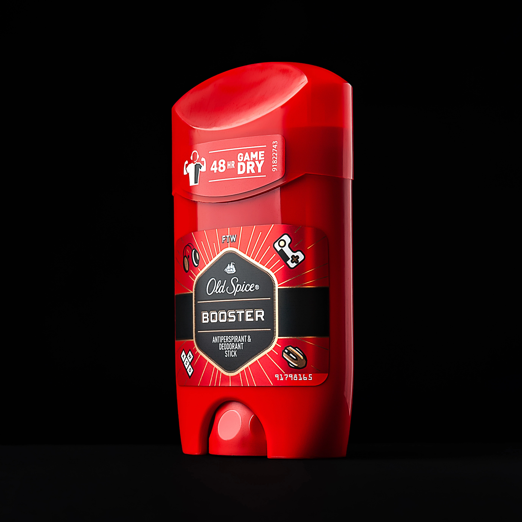
Old Spice spent the 1990s and early 2000s as the aftershave your grandfather used — reliable, familiar, and completely irrelevant to anyone under 50. Then came 2010 and “The Man Your Man Could Smell Like,” an advertising campaign so bizarre and effective that it single-handedly transformed Old Spice from a dusty drugstore relic into a cultural phenomenon.
The rebrand wasn’t just about advertising, though.
They redesigned their packaging, expanded their product line, and completely reimagined their target demographic. Instead of marketing to middle-aged men who remembered the brand from their youth, they started targeting young guys who had never heard of Old Spice but were suddenly very interested in smelling like the shirtless man on the boat.
The transformation was so complete that many people assumed Old Spice was a new brand entirely.
Starbucks
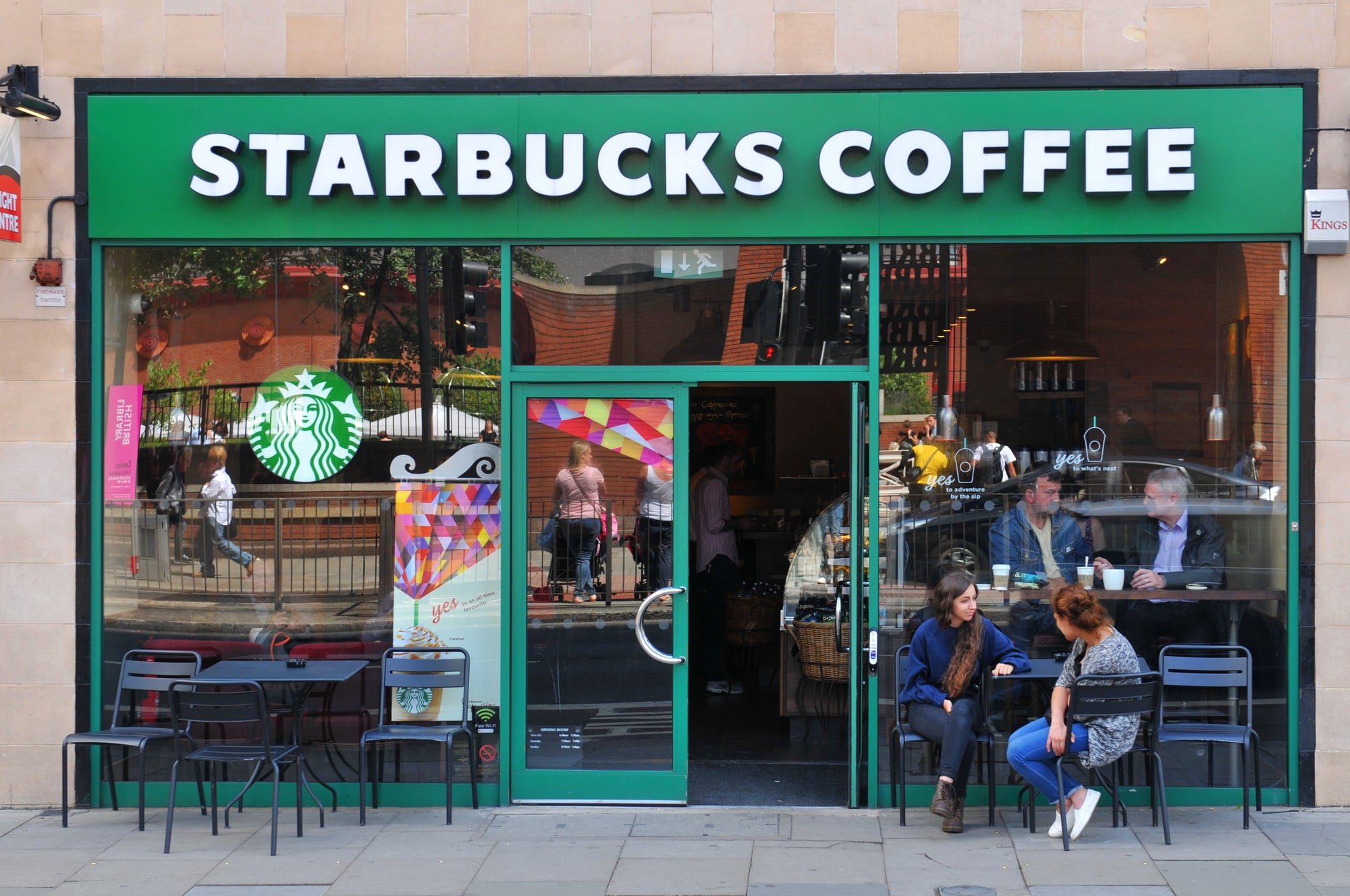
Starbucks removed “Coffee” from their logo in 2011, which seemed like a risky move for a company built entirely on selling coffee. But the change reflected their broader ambitions to become a lifestyle brand that happened to serve excellent espresso, rather than just a coffee shop that happened to have nice ambiance.
The simplified logo — just the siren, no text — gave them room to expand into tea, food, merchandise, and whatever else they wanted to sell without being locked into the coffee category.
It was a confident move that signaled they trusted their brand recognition enough to let the green mermaid speak for herself. And it worked: Starbucks stores now sell everything from protein boxes to vinyl records, and none of it feels out of place.
Aunt Jemima To Pearl Milling Company
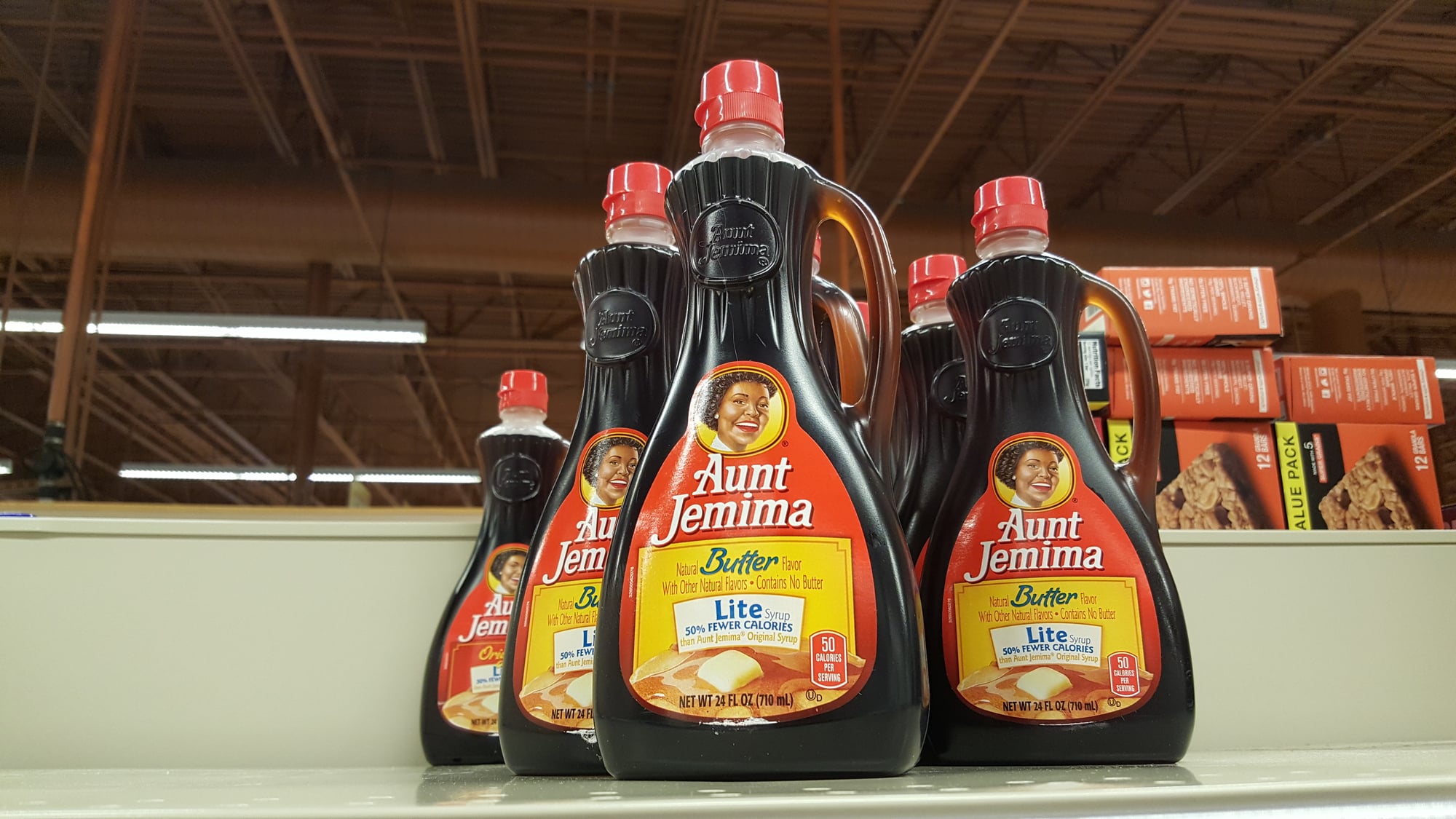
Some rebrands happen because companies want to grow or modernize. Others happen because the old brand was built on imagery that should have been retired decades earlier. Aunt Jemima’s transformation to Pearl Milling Company in 2021 fell firmly in the latter category — a long-overdue reckoning with a brand identity rooted in racist stereotypes.
The new name references the original mill where the pancake mix was first produced in 1889, which gives the brand a historical foundation that doesn’t rely on offensive caricatures.
The packaging got completely redesigned, the marketing messaging shifted, and the company finally had a brand they could promote without cringing. Some changes are about business strategy.
Others are about basic human decency.
Blackwater To Xe To Academi
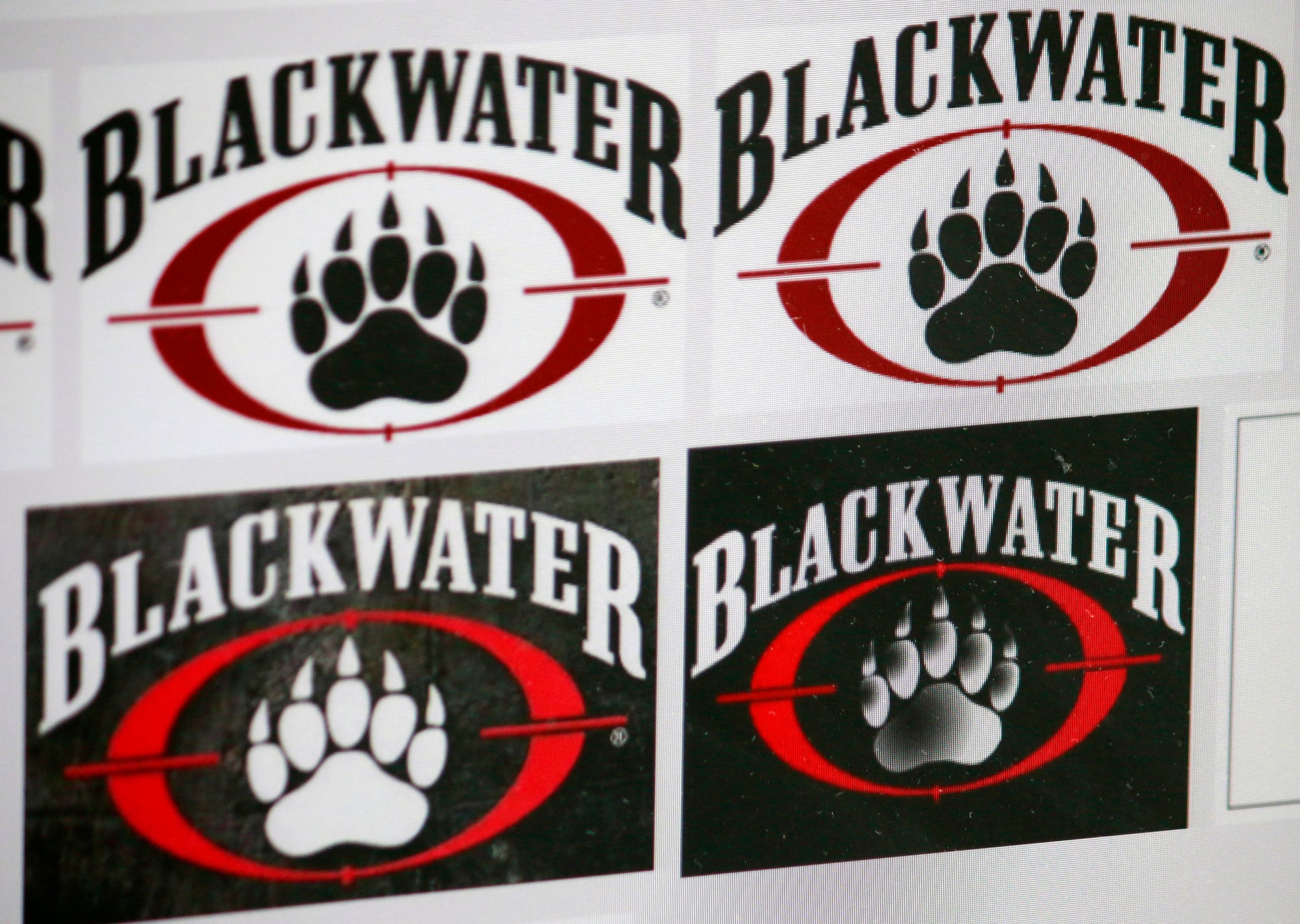
When your private military company becomes synonymous with controversy and congressional investigations, rebranding starts looking less like marketing and more like survival. Blackwater changed their name to Xe Services in 2009, then to Academi in 2011, in an attempt to distance themselves from the negative publicity surrounding their work in Iraq.
The rebrand strategy was essentially to make people forget that Blackwater had ever existed, which is a tough sell when your previous name is still showing up in news articles and government reports.
Multiple name changes rarely inspire confidence — they tend to make organizations look like they’re running from something. Which, in this case, they absolutely were.
Google To Alphabet
Google’s corporate restructuring in 2015 created Alphabet as the parent company, with Google becoming just one (admittedly massive) subsidiary. This wasn’t a traditional rebrand so much as an organizational shuffle designed to give Google’s various side projects room to grow without being tied to search advertising revenue.
The move let them separate their core search and advertising business from moonshot projects like self-driving cars and life extension research.
It also gave investors better visibility into which parts of the company were actually making money and which parts were expensive experiments. The rebrand was aimed more at Wall Street than Main Street — most people still think of everything as “Google,” and that’s probably fine with Alphabet.
Philip Morris To Altria
Tobacco companies face a unique branding challenge: their core product kills people, everyone knows it, and they still need to market to investors and recruit employees. Philip Morris’s 2003 rebrand to Altria was an attempt to create some distance between the corporate entity and the cigarettes that made them infamous.
The name change didn’t fool anyone — people weren’t suddenly going to forget that Altria was the company behind Marlboro and Parliament.
But it did give them a cleaner slate for corporate communications and made it slightly easier to discuss their business without immediately triggering associations with lung cancer.
Sometimes rebranding isn’t about changing perceptions so much as making conversations possible.
Comcast To Xfinity
Comcast had a problem: their customer service was so legendarily bad that their name had become a punchline. You couldn’t mention Comcast without someone launching into a story about being on hold for three hours or having a technician show up six weeks late. So in 2010, they started branding their consumer services as Xfinity while keeping Comcast as the corporate name.
The strategy was transparent — everyone knew Xfinity was still Comcast — but it gave them a fresh start in marketing materials and customer communications.
They could talk about Xfinity’s fast internet and reliable service without the baggage of the Comcast name dragging down every conversation. Whether the actual service improved is debatable, but at least the brochures looked different.
Datsun To Nissan
Datsun had built a solid reputation in the American market by the 1970s, with reliable cars that offered good value for money. So Nissan’s decision to phase out the Datsun name in the early 1980s seemed like corporate self-sabotage — they were abandoning a known quantity for a name that most Americans had never heard of.
The rebrand was part of Nissan’s global strategy to operate under a single name worldwide, rather than maintaining different brands in different markets.
From a business perspective, it made sense: unified marketing, streamlined operations, consistent brand identity. From a customer perspective, it was confusing and unnecessary.
The transition took years to complete, and Nissan spent the 1980s essentially rebuilding the brand recognition that Datsun had already established.
International Harvester To Navistar
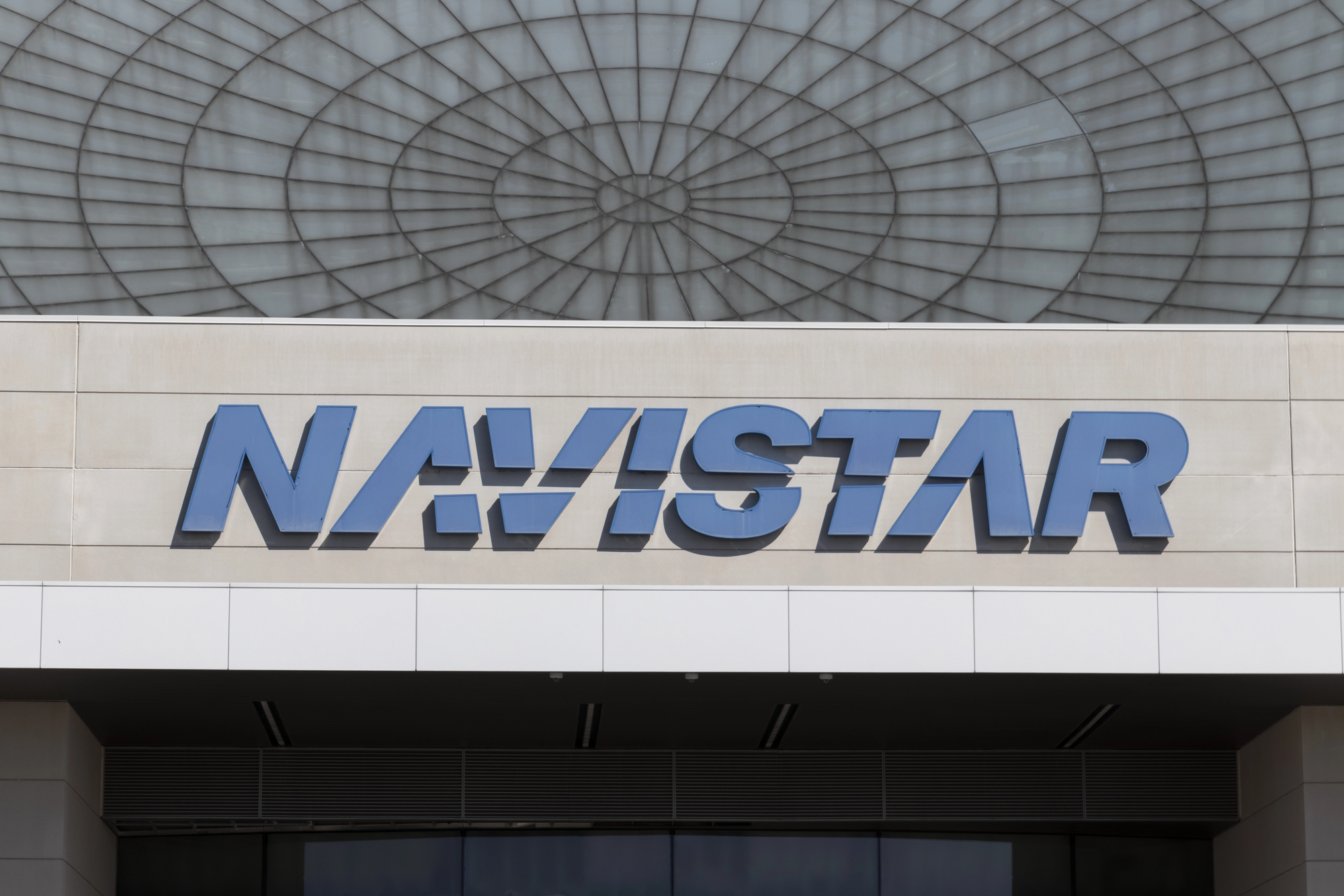
When your company has been making farm equipment since 1902, changing the name feels like abandoning your entire heritage. But International Harvester’s 1986 rebrand to Navistar reflected a fundamental shift in their business model — they were getting out of agriculture and focusing entirely on commercial trucks and engines.
The old name no longer fit what they actually did, which created marketing challenges and confused potential customers.
Navistar sounded modern and industrial without being tied to any specific product category, giving them flexibility to expand into new markets. The rebrand worked because it accurately reflected the company’s new focus, rather than trying to make people forget their past.
Valvoline Instant Oil Change To Valvoline
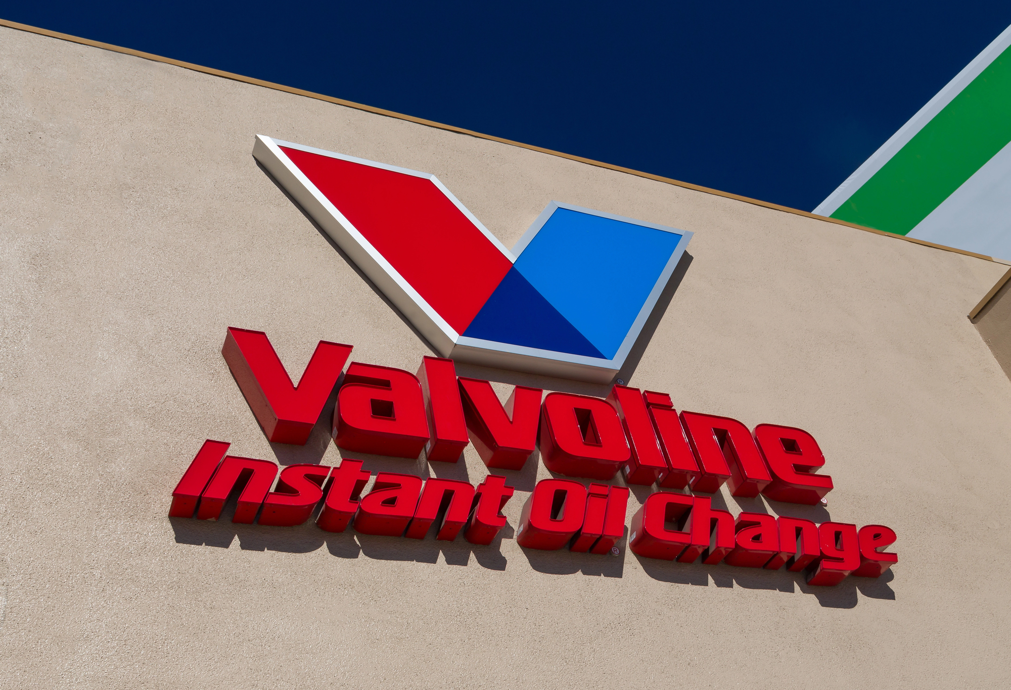
Sometimes the most effective rebrand is also the most obvious one. Valvoline Instant Oil Change shortened their name to just Valvoline in 2020, recognizing that their brand equity was already built around the oil company name rather than the service description.
The change also reflected their expansion beyond basic oil changes into more comprehensive automotive services.
“Instant Oil Change” was specific but limiting; “Valvoline” was flexible enough to cover whatever services they wanted to offer. Plus, it simplified their signage, advertising, and digital presence — always a bonus in an era where brand names need to fit on smartphone screens.
The Power Of Starting Over

The companies that emerge successfully from complete rebrands share one crucial trait: they changed their identity because their business had actually evolved, not because they were trying to run from their problems. A new logo and company name can signal growth, modernization, or a shift in strategy.
But they can’t fix fundamental issues with products, services, or corporate culture.
The most effective rebrands feel inevitable in hindsight — of course Dunkin’ was always more about coffee than donuts, of course Old Spice needed to reach younger customers, of course Starbucks was bigger than just coffee. The failures tend to be the ones that felt forced or desperate, where companies hoped a fresh coat of marketing paint would distract from deeper problems.
Your brand can only be as strong as the business behind it.
More from Go2Tutors!

- The Romanov Crown Jewels and Their Tragic Fate
- 13 Historical Mysteries That Science Still Can’t Solve
- Famous Hoaxes That Fooled the World for Years
- 15 Child Stars with Tragic Adult Lives
- 16 Famous Jewelry Pieces in History
Like Go2Tutors’s content? Follow us on MSN.