16 Everyday Items with Design Details Most People Never Notice
Walking through life, most people interact with hundreds of designed objects every day without giving them much thought. A door handle gets turned, a bottle cap gets twisted, a zipper gets pulled.
These interactions feel automatic, almost invisible. But behind each mundane moment lies a collection of deliberate design choices — tiny details that someone, somewhere, spent considerable time perfecting.
These aren’t happy accidents or aesthetic flourishes. They’re purposeful solutions to problems most people never realized existed.
Pens
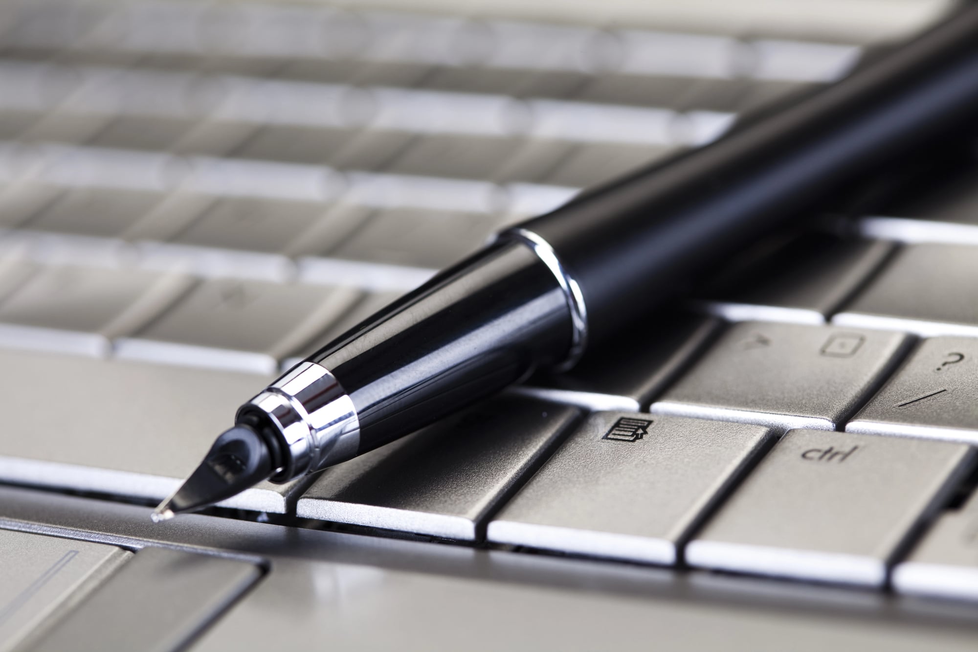
The tiny pit near the tip of a ballpoint pen cap serves a specific purpose that has nothing to do with writing. If someone (usually a child) swallows the cap, that opening allows air to pass through, preventing complete airway obstruction.
It’s a design detail born from tragedy — too many people choked on pen caps before manufacturers started including this small but critical feature.
Staples
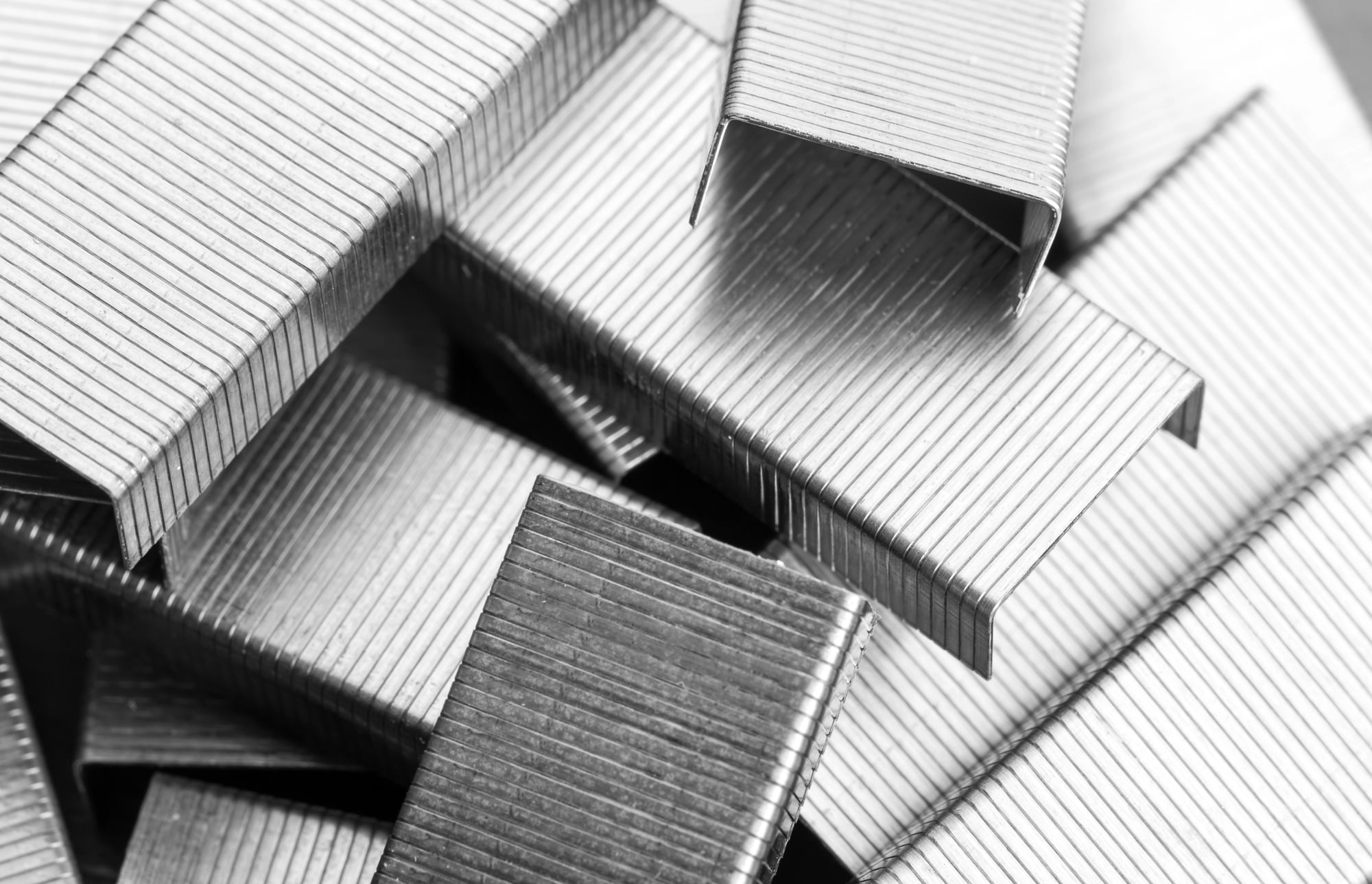
Look closely at a stapled document and notice how the metal legs fold. On most staplers, they bend inward toward each other.
But flip a small switch or rotate a metal plate on the base, and those legs will curl outward instead. This “temporary staple” mode makes the staple much easier to remove later — perfect for documents that need to be sorted or redistributed.
Coffee Cups

The ridged cardboard sleeve around a hot coffee cup does more than protect fingers from heat (though admittedly, that’s its primary job, and the physics behind it are more elegant than they appear — the corrugated design traps air, which is a terrible conductor of heat, creating an insulating barrier that works better than a simple flat layer ever could). But there’s something else: those sleeves are designed to be the exact width that accommodates the most common cup sizes across different coffee chains.
So the sleeve that fits a small at one place will fit a medium at another, which is why coffee shops can order sleeves in bulk without worrying about brand-specific sizing. And yet — here’s the detail most people miss — many sleeves have a small tab or a slight overlap that, when pressed, creates a small lip you can use to test the temperature of your drink without removing the lid entirely.
Keyboards

The tiny bumps on the F and J keys aren’t random texture. They’re tactile markers that let touch typists position their index fingers correctly without looking down.
Your left index finger finds F, your right finds J, and every other finger falls into its home position automatically. It’s a navigation system that works entirely through feel.
Bottle Caps
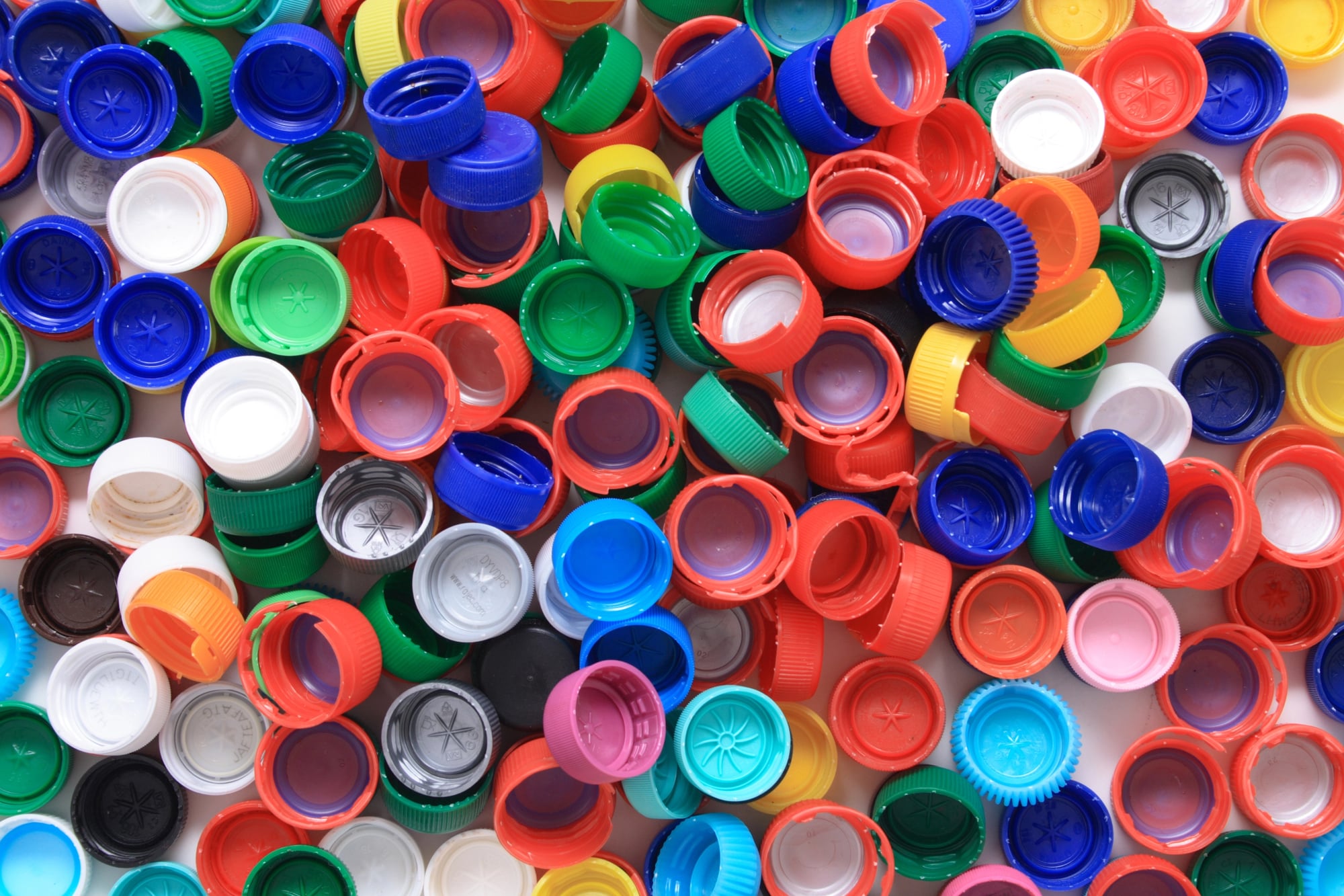
The plastic ring around the rim of most soda bottles has an annoying habit of staying attached to the cap when opened. This isn’t sloppy manufacturing — it’s intentional.
That ring proves the bottle hasn’t been opened before purchase, serving as a tamper-evident seal. The ring breaks in a specific pattern that’s nearly impossible to replicate if someone tries to reseal the bottle.
Zippers
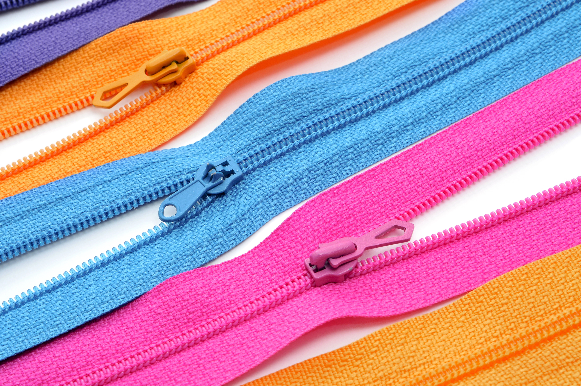
Every zipper pull has a small piece of fabric or a tiny metal loop attached to it (the fabric rectangle might look decorative, or like branding space, but its real purpose runs deeper than aesthetics — it’s there because zippers, when left to their own devices, have a maddening tendency to work their way open due to vibration, movement, or just the weight of the zipper pull itself pulling downward over time). That fabric tab, when folded over the zipper teeth and pressed down, creates just enough friction to keep everything in place.
But even more clever: on quality jackets, that tab is positioned so it naturally falls against the zipper teeth when the pull is in the “up” position, automatically engaging this locking mechanism without any conscious effort from the wearer.
Traffic Lights
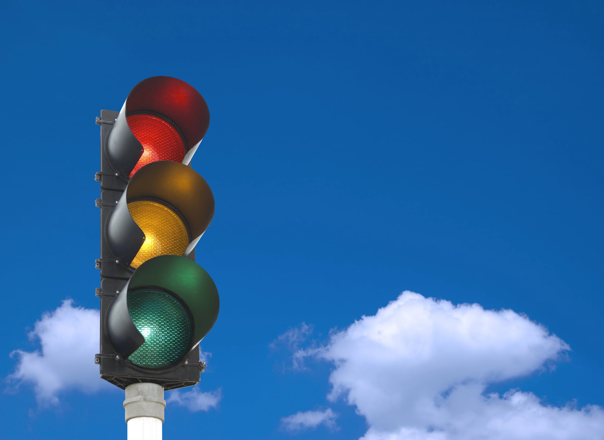
The arrangement of colors on traffic lights isn’t arbitrary. Red is always on top (or left, if horizontal) because people with color blindness can navigate by position alone.
But there’s another detail: the red light uses a slightly different shade than pure red — it leans toward orange. This makes it more visible to people with red-green color blindness, the most common form of the condition.
Traffic light design carries the weight of split-second decisions made by people who might be tired, distracted, or driving in conditions where color perception is compromised. Someone realized that perfect red wasn’t perfect enough.
Door Handles
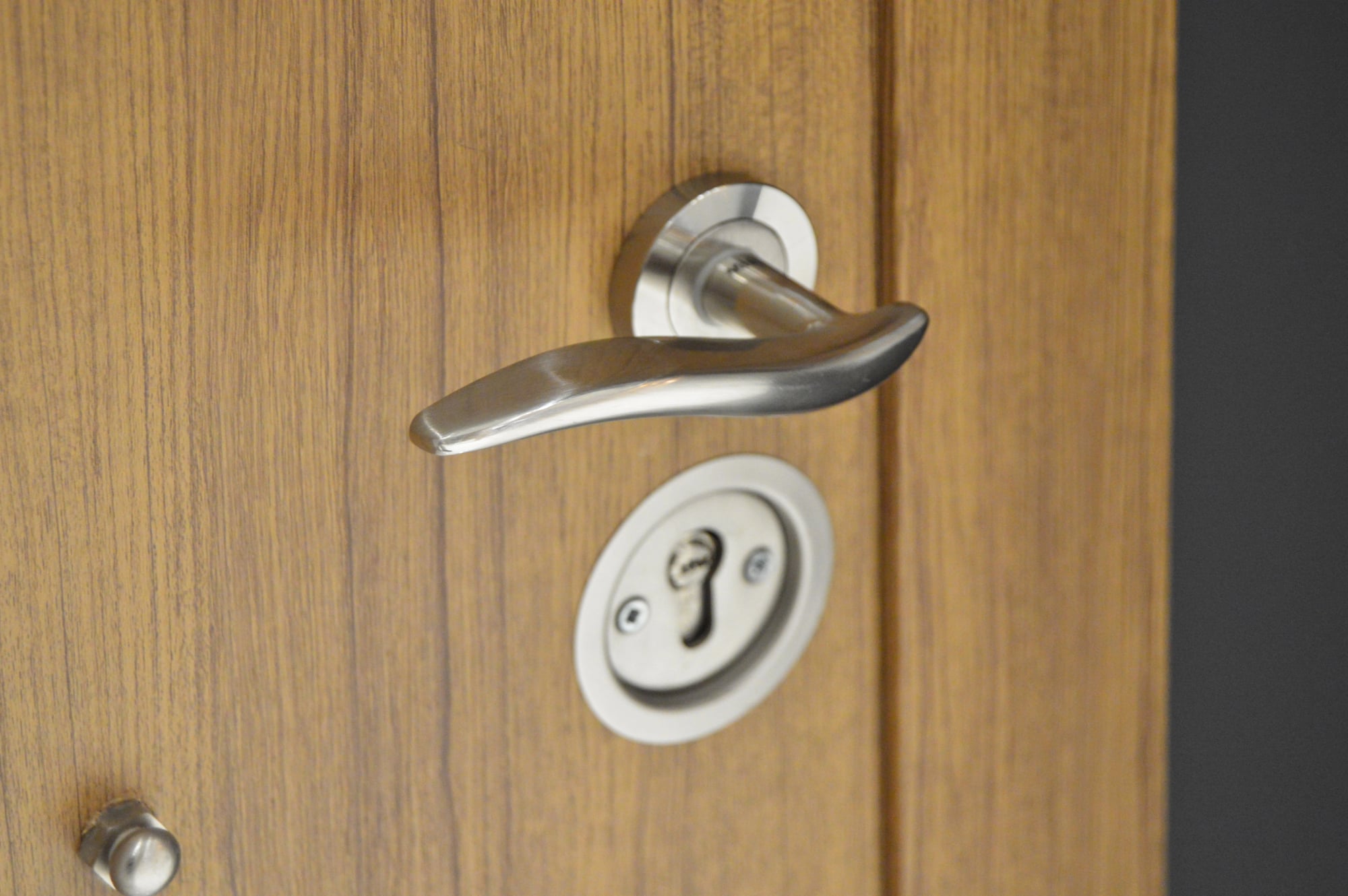
Hotel room doors have handles that turn downward to open. This isn’t coincidence — it’s accessibility design.
A downward motion can be accomplished with an elbow, forearm, or even a foot if necessary. Someone carrying luggage, using crutches, or dealing with limited hand mobility can still open the door.
The design anticipates human limitation without announcing it.
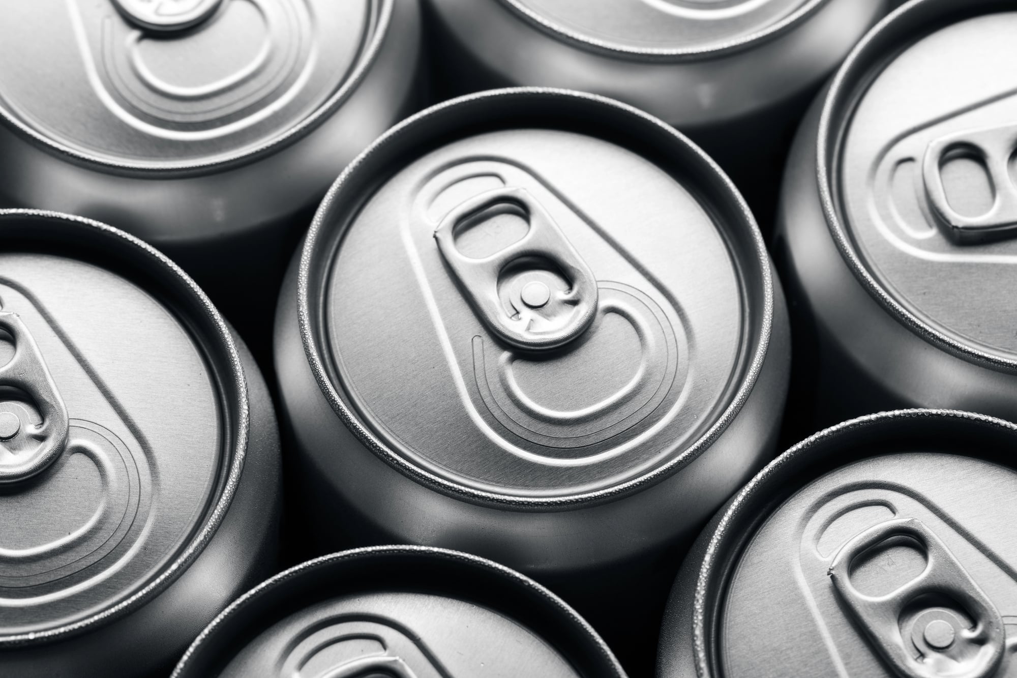
Can Openers
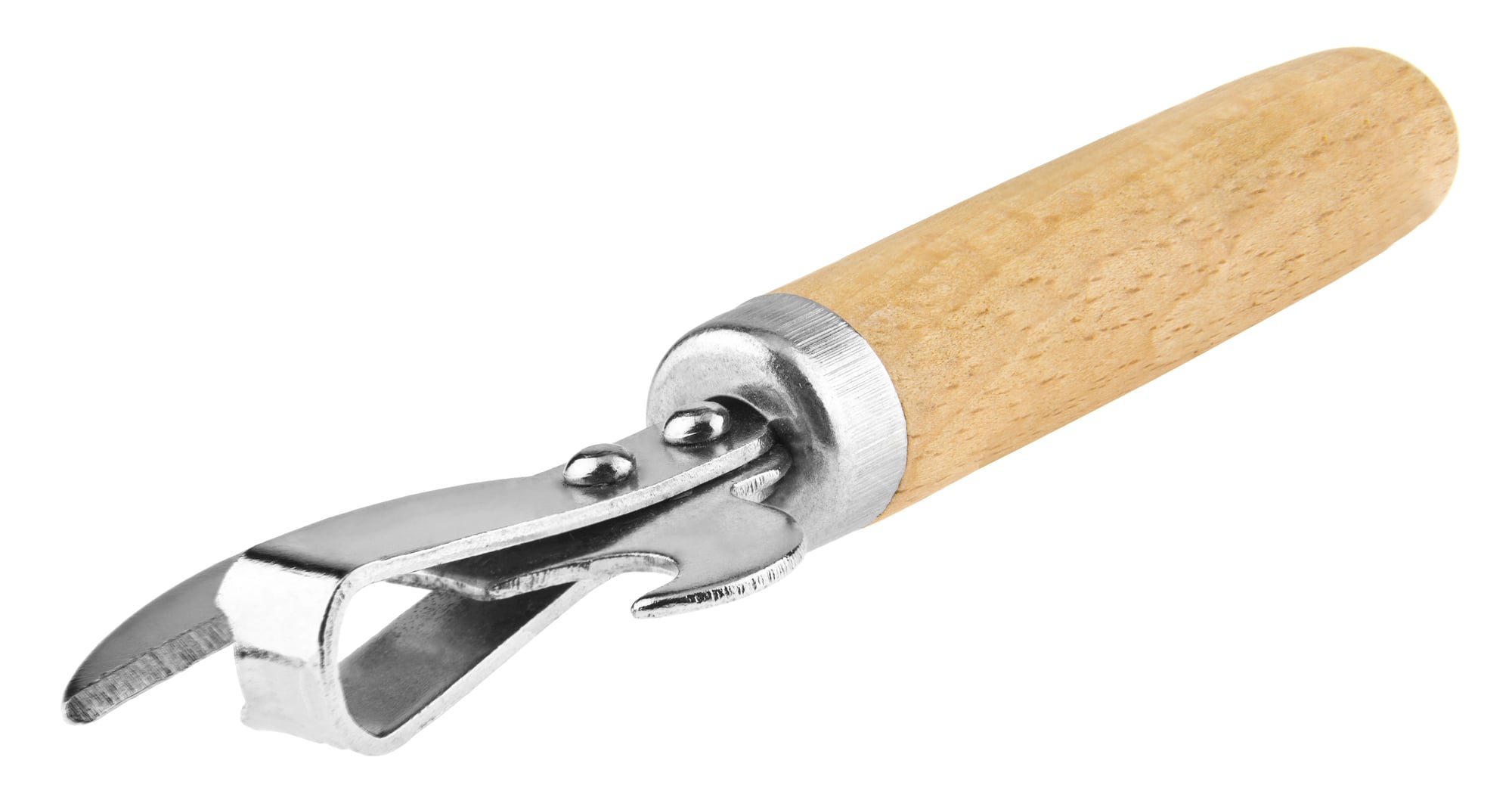
The metal tab on aluminum cans has a small raised dot or bump on top. This isn’t decoration — it’s a tactile indicator for people with visual impairments.
The bump confirms which direction the tab needs to be pulled and provides a grip point that works even when fingers are wet or the lighting is poor. Every soda becomes accessible through a detail smaller than a pencil eraser.
Shopping Cart Handles

The metal loops on shopping cart handles aren’t just for structural support. They’re designed to hold a purse strap or reusable bag handles, keeping personal items secure and visible while shopping.
The loop size is standardized across most cart manufacturers to accommodate common strap widths. It’s a solution hiding in plain sight.
Paper Clips
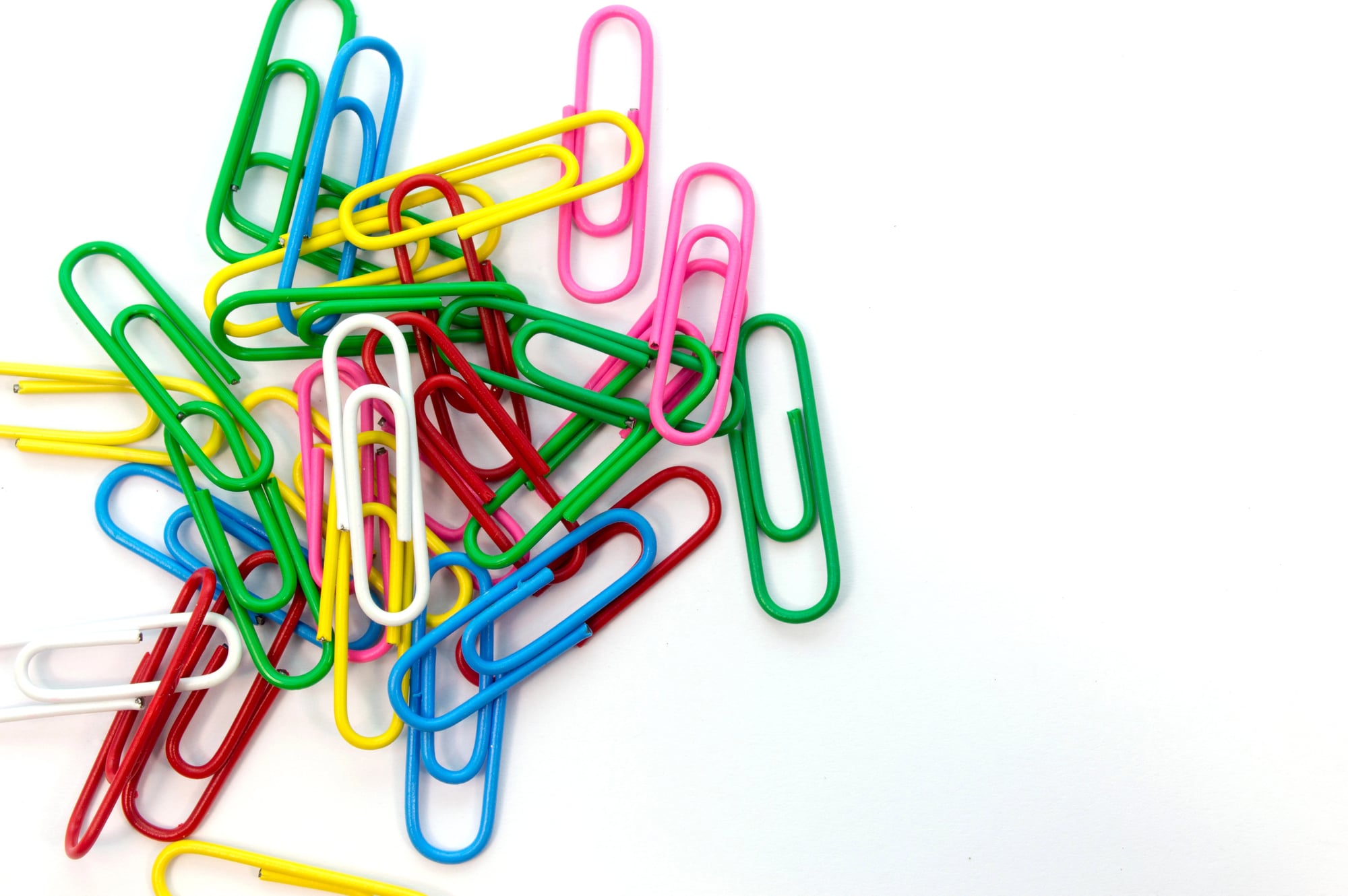
Standard paper clips have one leg slightly longer than the other. This asymmetry makes the clip easier to slide onto paper — the longer leg goes underneath, the shorter leg goes on top, and the offset creates a natural pathway for documents to slide into place.
A perfectly symmetrical clip would be harder to use, even though it would look more balanced.
USB Cables
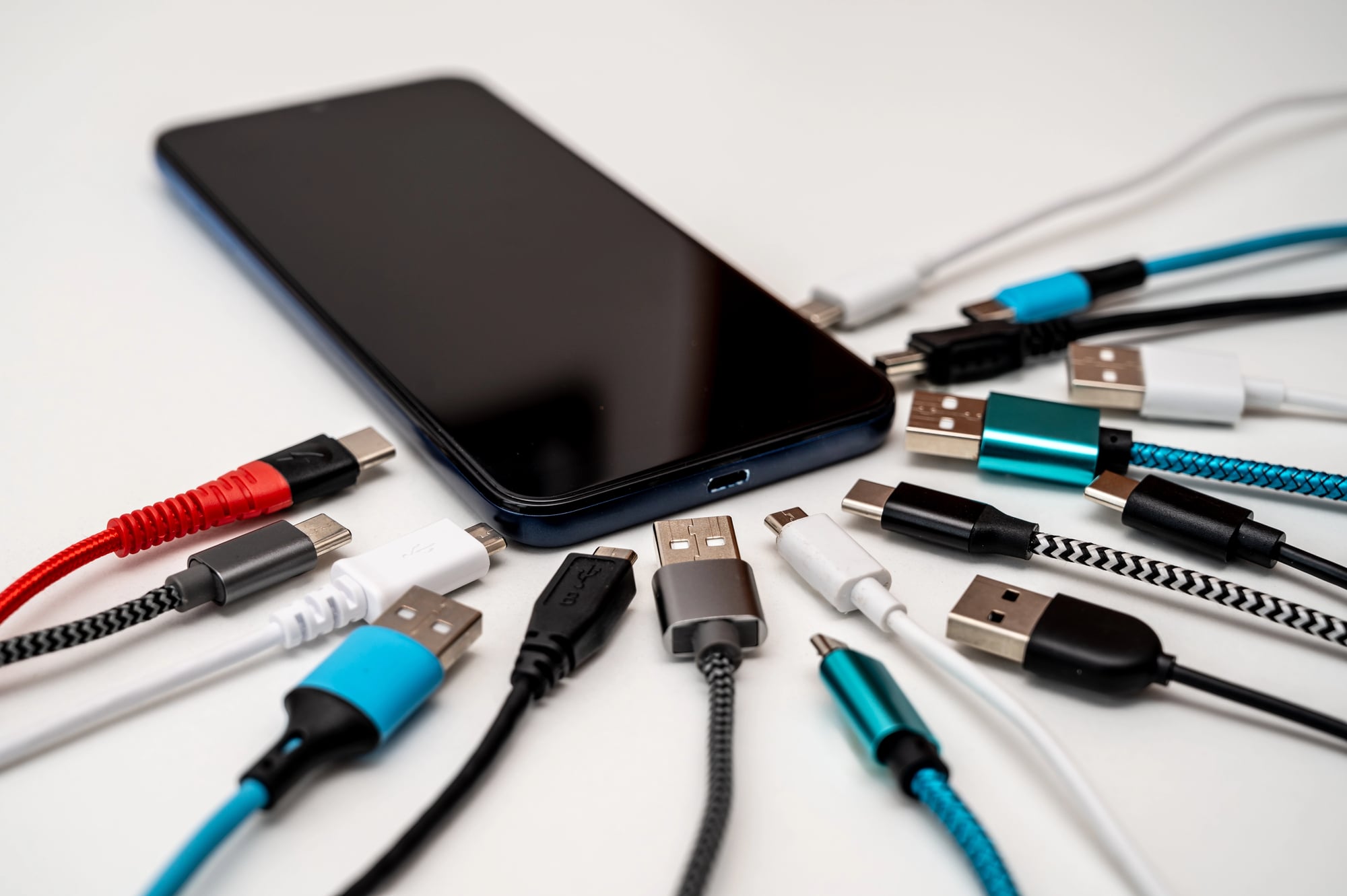
The USB symbol printed on most USB connectors isn’t just branding — it indicates which side should face up when plugging into a horizontal port. The symbol always goes on the side that faces toward you when the port is properly oriented.
This only works if device manufacturers follow the standard, which they mostly do, but the detail exists for anyone who knows to look for it.
Escalator Steps

Those metal ridges on escalator steps aren’t just for traction. They’re designed to mesh with identical ridges at the top and bottom of the escalator, creating a self-cleaning action that prevents debris from accumulating.
Every step sweep removes dirt and small objects that would otherwise build up in the mechanism.
The ridges also create a visual pattern that helps people judge distance and foot placement, which matters more when the ground is moving beneath them. Static friction and optical guidance, built into something that looks like basic metal texture.
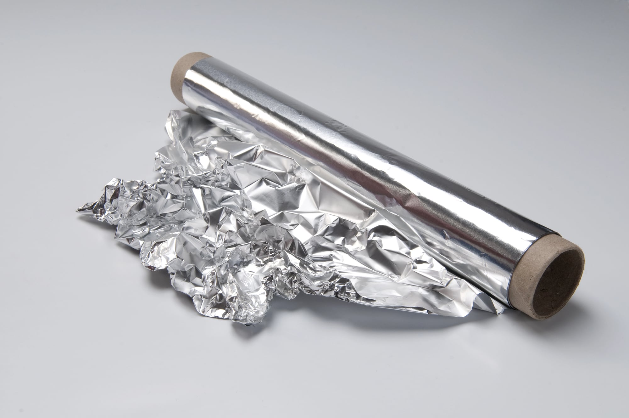
Aluminum Foil Boxes
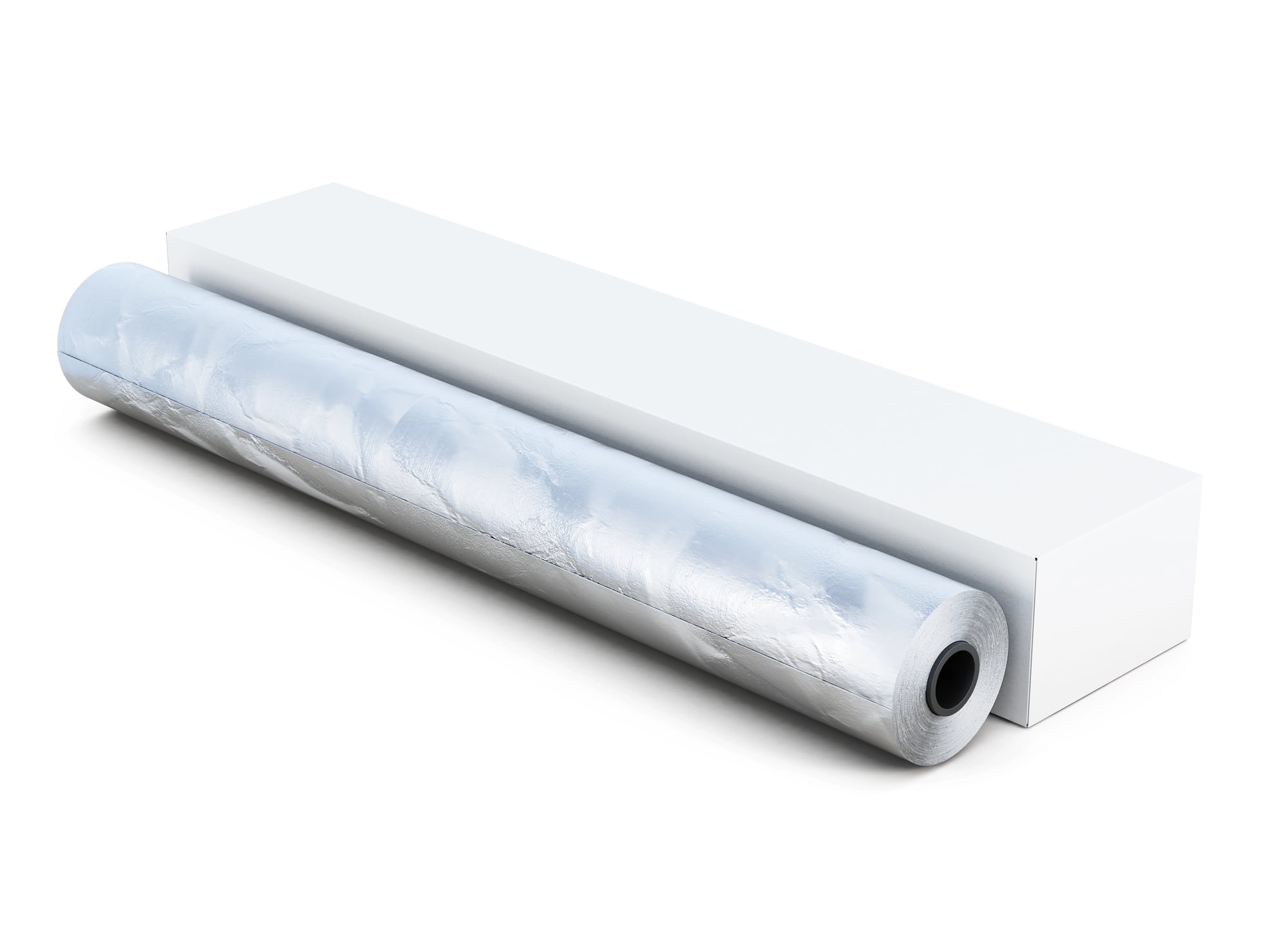
The perforated edge of aluminum foil boxes has small tabs on each end that can be pushed inward. These tabs create friction points that hold the roll in place when foil is pulled, preventing the entire roll from sliding out of the box.
Most people fight with runaway foil rolls for years before discovering this feature exists.
Soda Can Tabs
The loop in a soda can tab isn’t just for pulling — it’s perfectly sized to hold a straw. Thread the straw through the loop after opening the can, and it stays in place instead of floating around or falling out.
This works especially well with the wider straws used for smoothies or bubble tea, though standard straws fit too.
Wine Bottles

That indent in the bottom of wine bottles has a name (punt) and multiple purposes, though most people never notice it at all — which is strange, considering how it affects the way every wine bottle sits on a table, feels in the hand, and even how it sounds when set down (the punt creates a different resonance than a flat bottom would). The practical reasons are straightforward enough: it strengthens the bottle against the pressure created during the wine-making process, helps with temperature distribution during storage, and makes the bottle easier for servers to hold when pouring.
But the detail that rarely gets mentioned is how the depth of the punt often correlates with the price point of the wine — cheaper bottles tend to have shallower punts, while expensive bottles often have deep ones, not because expensive wine needs more structural support, but because a deep punt simply feels more substantial in the hand.
The Small Things That Shape Everything
These details share something in common — they solve problems before most people realize the problems exist. Someone anticipated that children would chew on pen caps, that color-blind drivers would need to navigate intersections, that people would struggle with shopping carts while carrying bags.
The solutions became invisible precisely because they work so well.
Good design doesn’t announce itself. It simply makes life a little easier, a little safer, or a little more accessible, one small detail at a time.
More from Go2Tutors!

- The Romanov Crown Jewels and Their Tragic Fate
- 13 Historical Mysteries That Science Still Can’t Solve
- Famous Hoaxes That Fooled the World for Years
- 15 Child Stars with Tragic Adult Lives
- 16 Famous Jewelry Pieces in History
Like Go2Tutors’s content? Follow us on MSN.