Photos of the Most Beautiful Flags in the World
Flags tell stories without saying a word. They carry centuries of history in their colors, capture the spirit of entire nations in simple shapes, and somehow manage to stir something deep when they catch the wind just right. There’s an art to flag design that goes beyond patriotism — the best flags work as pure visual poetry, combining meaning with beauty in ways that feel both intentional and effortless.
Some flags achieve this better than others. While design purists might argue for minimalism and others champion intricate details, the most beautiful flags share something harder to define: they feel inevitable, as if those particular colors and patterns were always meant to represent that place and those people.
Japan
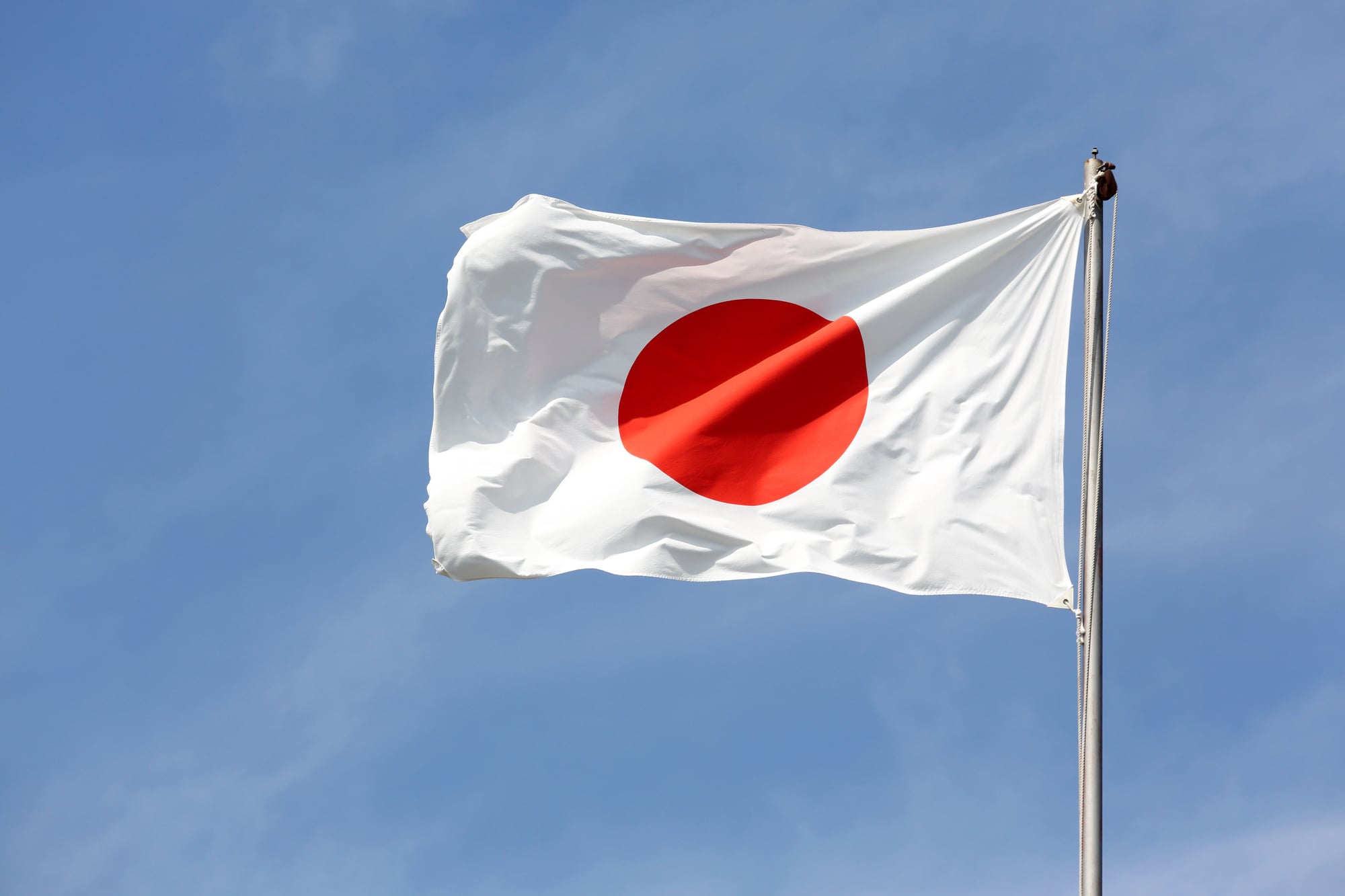
Clean lines win. A red circle on white fabric — nothing else, nothing more. The Hinomaru doesn’t apologize for its simplicity.
Most flags try too hard. This one just exists.
Bhutan
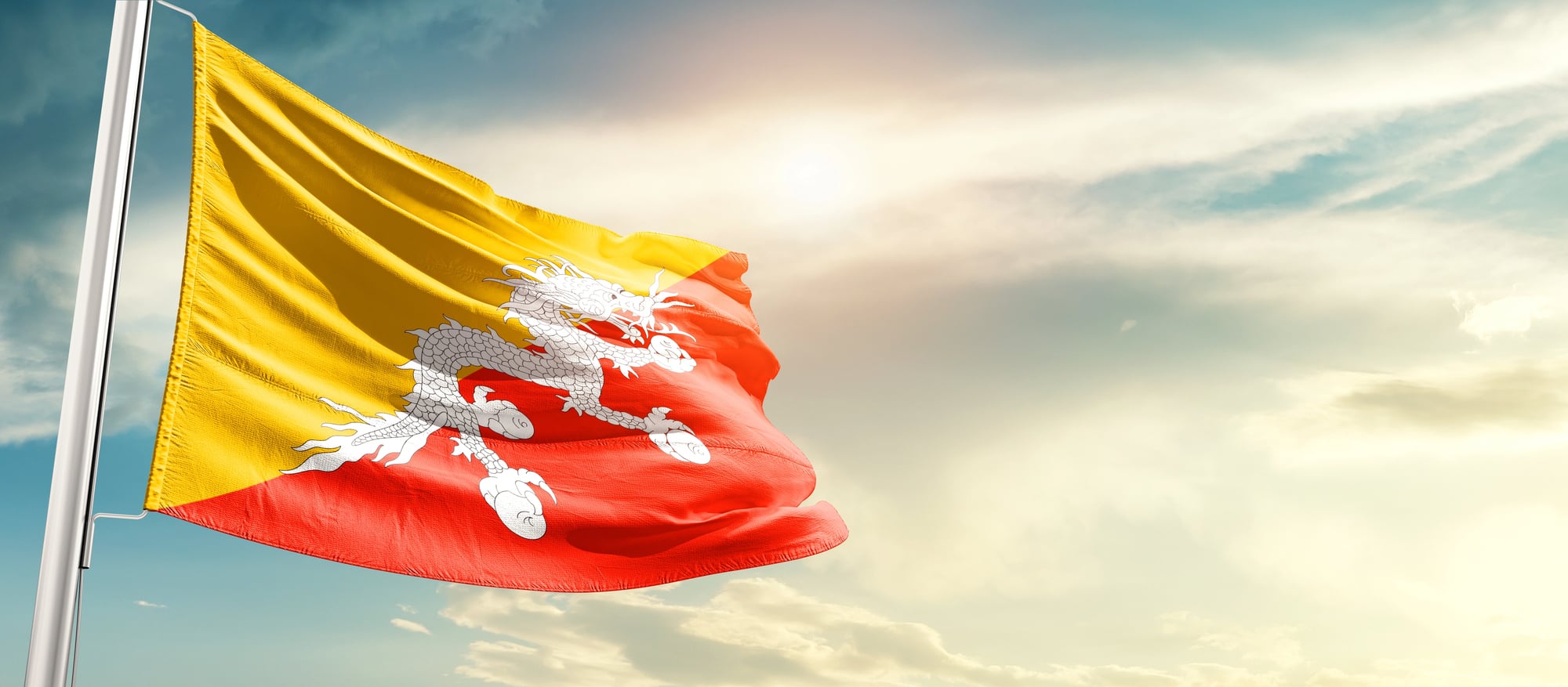
The dragon sprawled across Bhutan’s flag feels like it escaped from an illuminated manuscript, all fierce curves and deliberate detail against blocks of gold and orange that shouldn’t work together but absolutely do (and there’s something to be said for a country confident enough to put a mythical creature front and center on their national symbol). The colors themselves tell the story: the golden yellow represents the secular authority of the king while the orange speaks to the Buddhist spiritual tradition, but really what matters is how the dragon seems to be caught mid-motion, as if the flag itself is alive. So you get this rare thing in flag design: complexity that doesn’t feel cluttered. And the dragon’s holding jewels in its claws, because apparently when you’re designing a flag around a mythical creature, you might as well commit fully to the concept — which Bhutan clearly did.
The whole design manages to feel both ancient and immediate. Like opening a book of fairy tales, but the fairy tale is real.
Canada
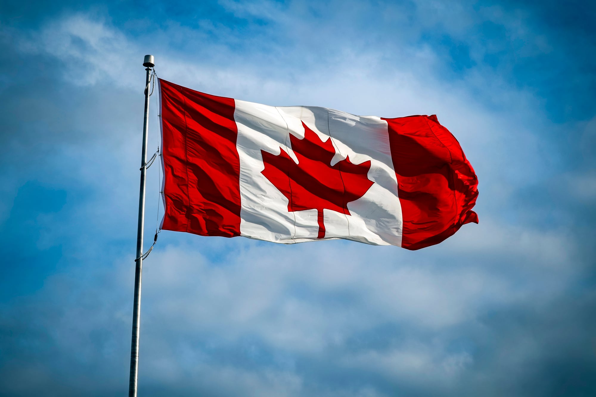
There’s something stubborn about the maple leaf that makes perfect sense for Canada. Not the flowery symbolism of other national emblems, not some abstract geometric pattern — just a leaf, honest and unmistakable. The red catches your attention from across a field, but it’s the proportions that make it work: those white bands flanking the central square create space for the maple leaf to breathe.
The design corrects you if you think flags need to be complicated. Sometimes the most obvious choice turns out to be the right one. The leaf sits there with quiet confidence, the same way Canada itself tends to exist in the world — present, recognizable, unpretentious.
Nepal
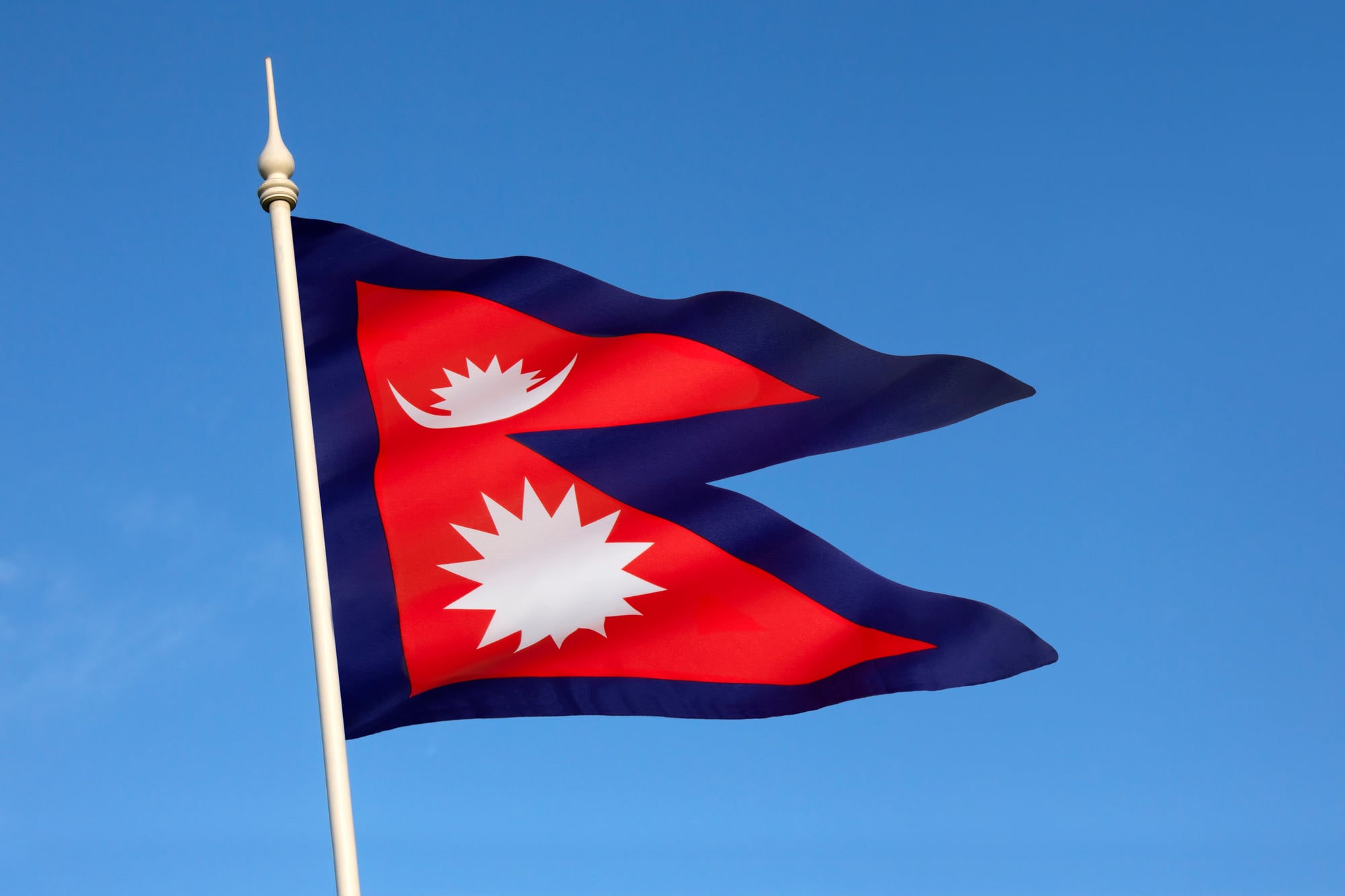
Nepal’s flag breaks the rules because Nepal decided the rules were optional. Two triangular pennants stacked on top of each other — forget rectangles, apparently — with a sun perched above a crescent moon in white outlines against deep blue and red.
The shape alone makes every other flag look like it’s playing it safe. Nepal went ahead and created something that looks like it was designed by someone who’d never seen a flag before and had to invent the concept from scratch.
Turns out breaking fundamental design conventions works just fine when you commit to it completely.
South Korea
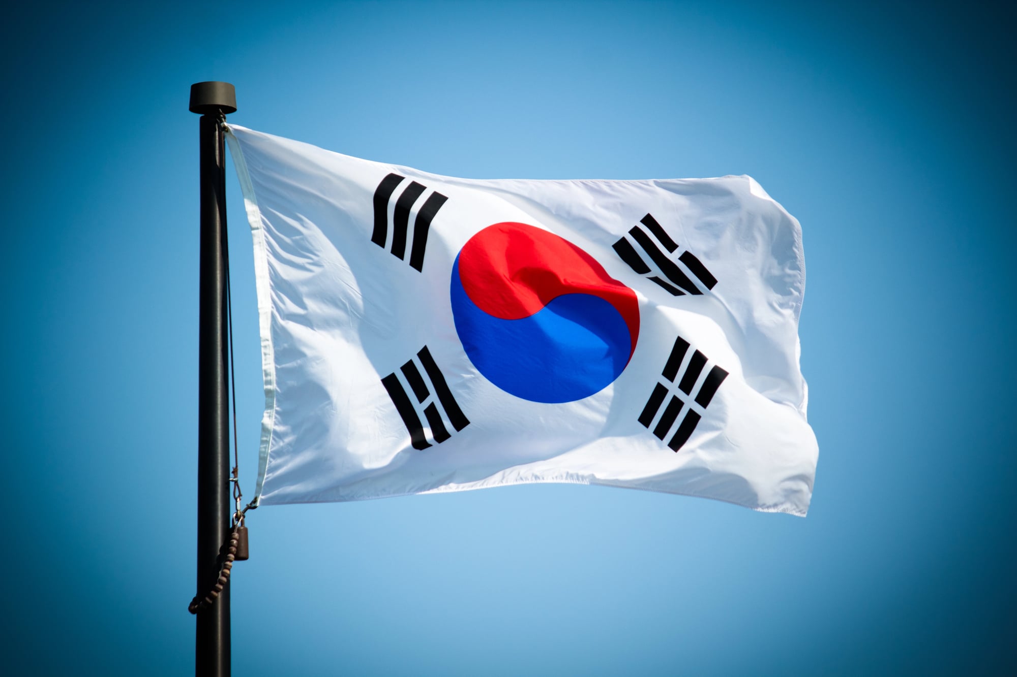
The yin-yang symbol floats in the center like a meditation made visible, surrounded by four trigrams that feel both ancient and oddly contemporary — as if someone designed them yesterday but they’ve actually been around for millennia. The white background doesn’t just hold everything together; it creates this sense of space and breathing room that makes the other elements feel more important rather than less. And the trigrams themselves (representing heaven, earth, fire, and water, if you’re keeping track) are positioned with the kind of precision that suggests someone spent considerable time thinking about balance, both visual and philosophical.
The whole flag operates on this principle that meaning and beauty don’t have to choose sides. The colors are restrained — red, blue, black on white — but the effect feels rich without being busy. So you get symbolism that works even if you don’t know what the symbols mean.
Seychelles
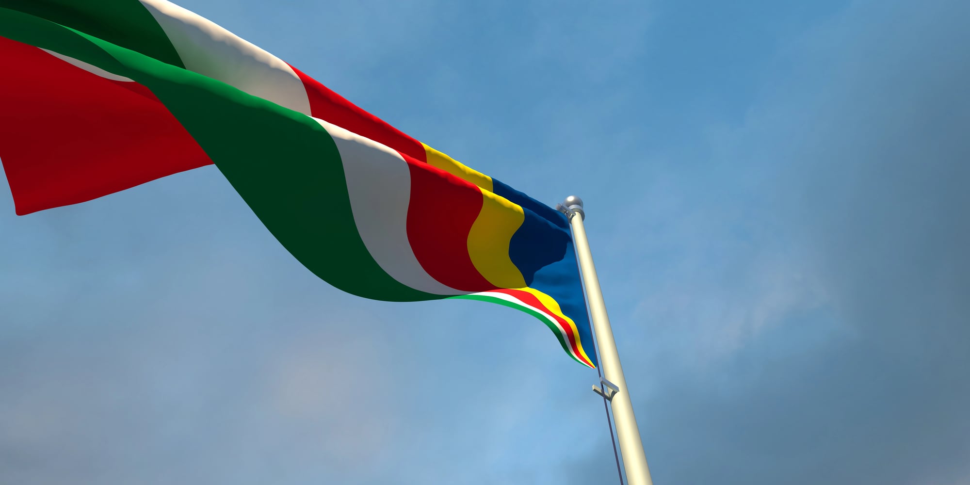
Picture the ocean at that moment just before sunset when all the colors decide to show up at once — that’s what Seychelles managed to capture in fabric form. Five diagonal bands radiating outward from the bottom left corner in blue, yellow, red, white, and green, creating this sense of movement that most flags can’t touch. The colors flow into each other like watercolors showing across paper.
Most flags sit there politely. This one feels like it’s actively happening, as if you’re watching light scatter across water. The diagonal design makes it impossible to ignore — it demands attention without being aggressive about it, which is a tricky balance to strike.
Brazil
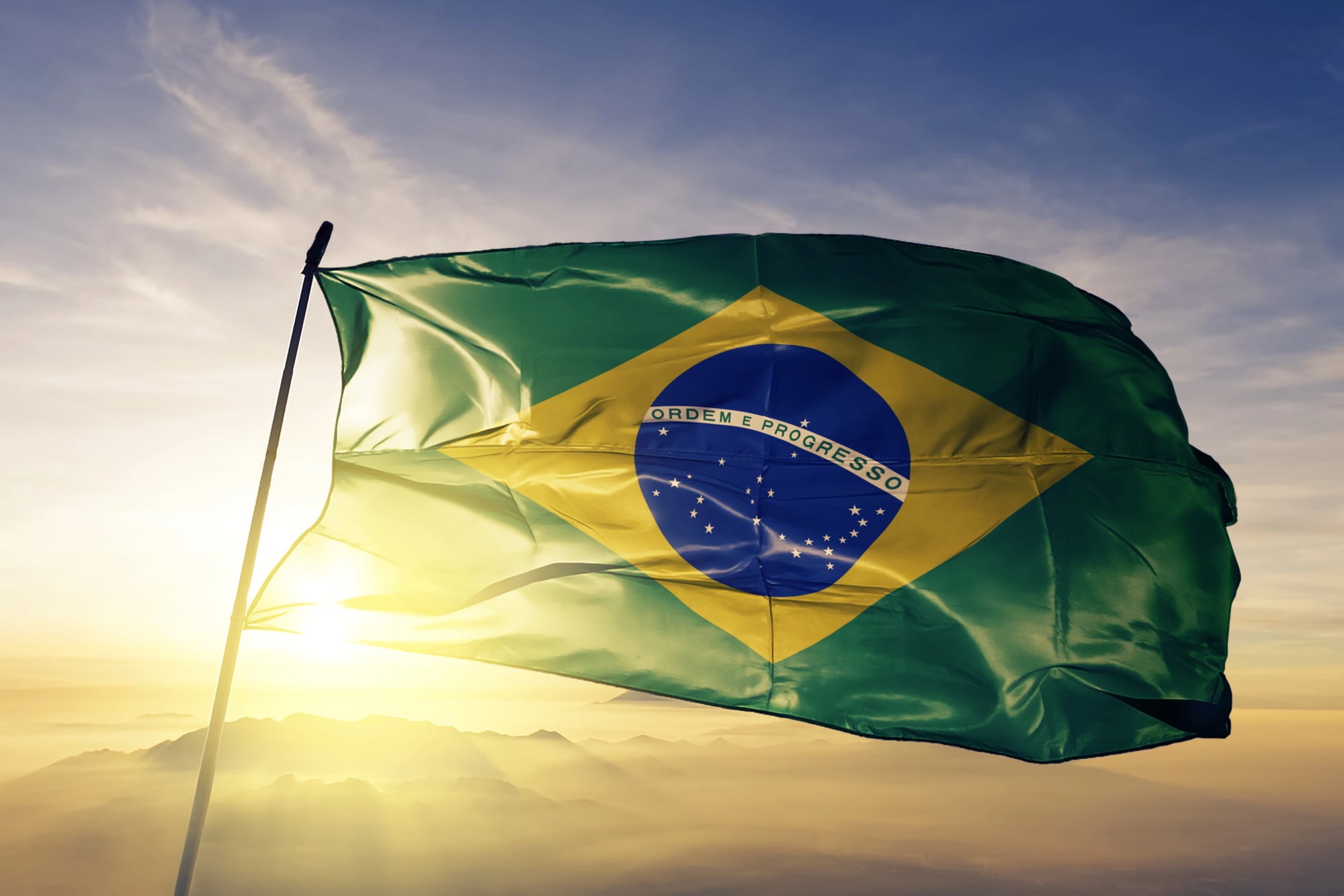
Brazil’s flag operates on a completely different logic than most national symbols. That deep green field holds a yellow diamond, and inside that diamond sits a blue circle scattered with stars — the actual constellation pattern visible from Rio de Janeiro on November 15, 1889, because apparently when you’re designing a flag, astronomical accuracy matters.
The banner stretched across the blue sphere reads “Ordem e Progresso” in Portuguese, which feels simultaneously grand and oddly specific. Brazil took the concept of a flag and turned it into a piece of applied astronomy.
The result is something that looks like no other flag in existence, which seems appropriate for a country that takes up half a continent.
Cyprus
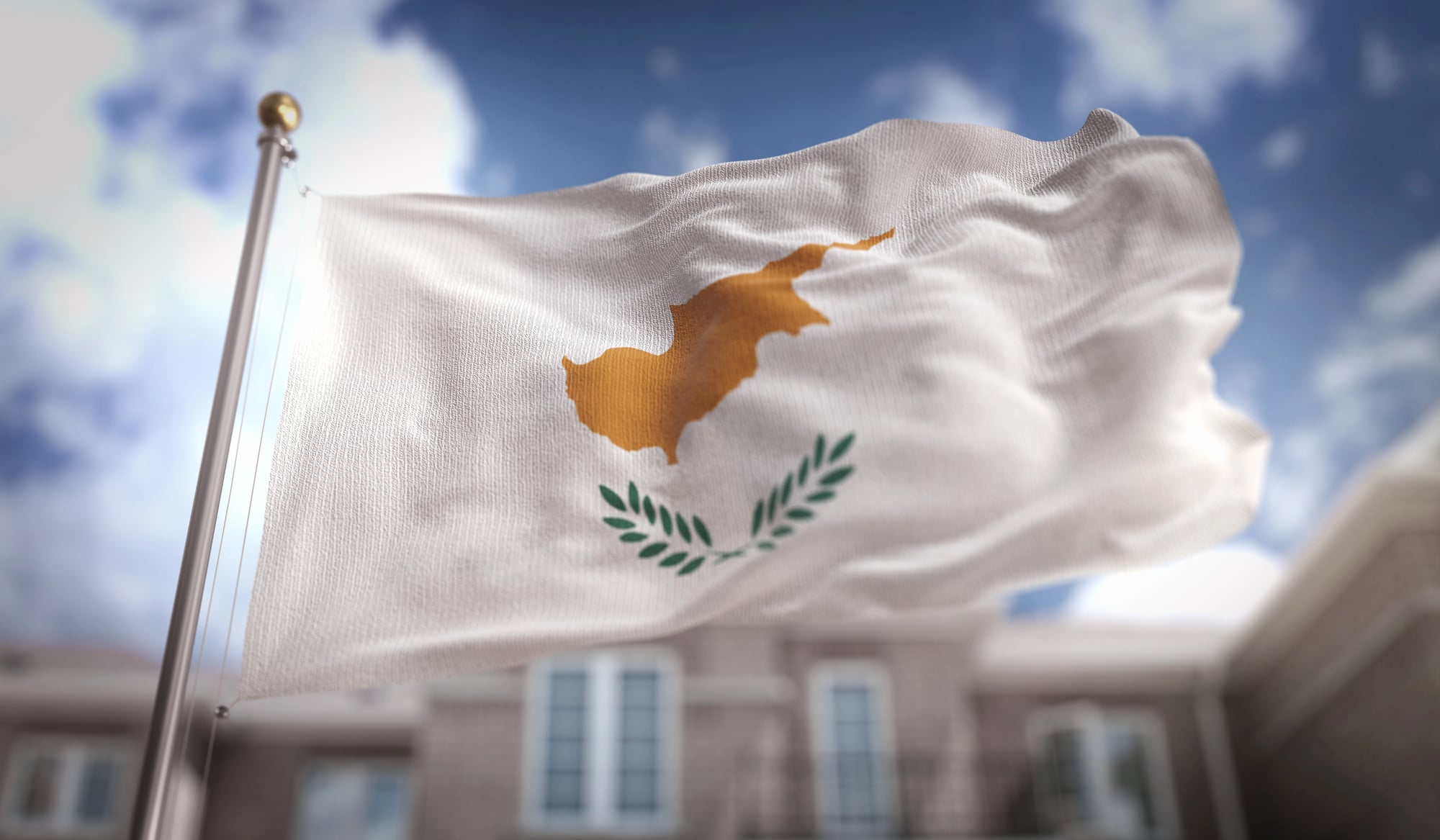
The entire island appears in copper-orange silhouette against white, positioned above two olive branches that curve beneath it like cupped hands. No abstract symbolism here — Cyprus put their actual geographic shape on their flag, as if to say this is exactly what we’re talking about when we say Cyprus.
The olive branches add the only other color, that muted green that speaks to peace without having to announce it. The design feels refreshingly literal in a world of flags that require explanation. This is our island, these are our olive trees, this is who we are.
Kiribati
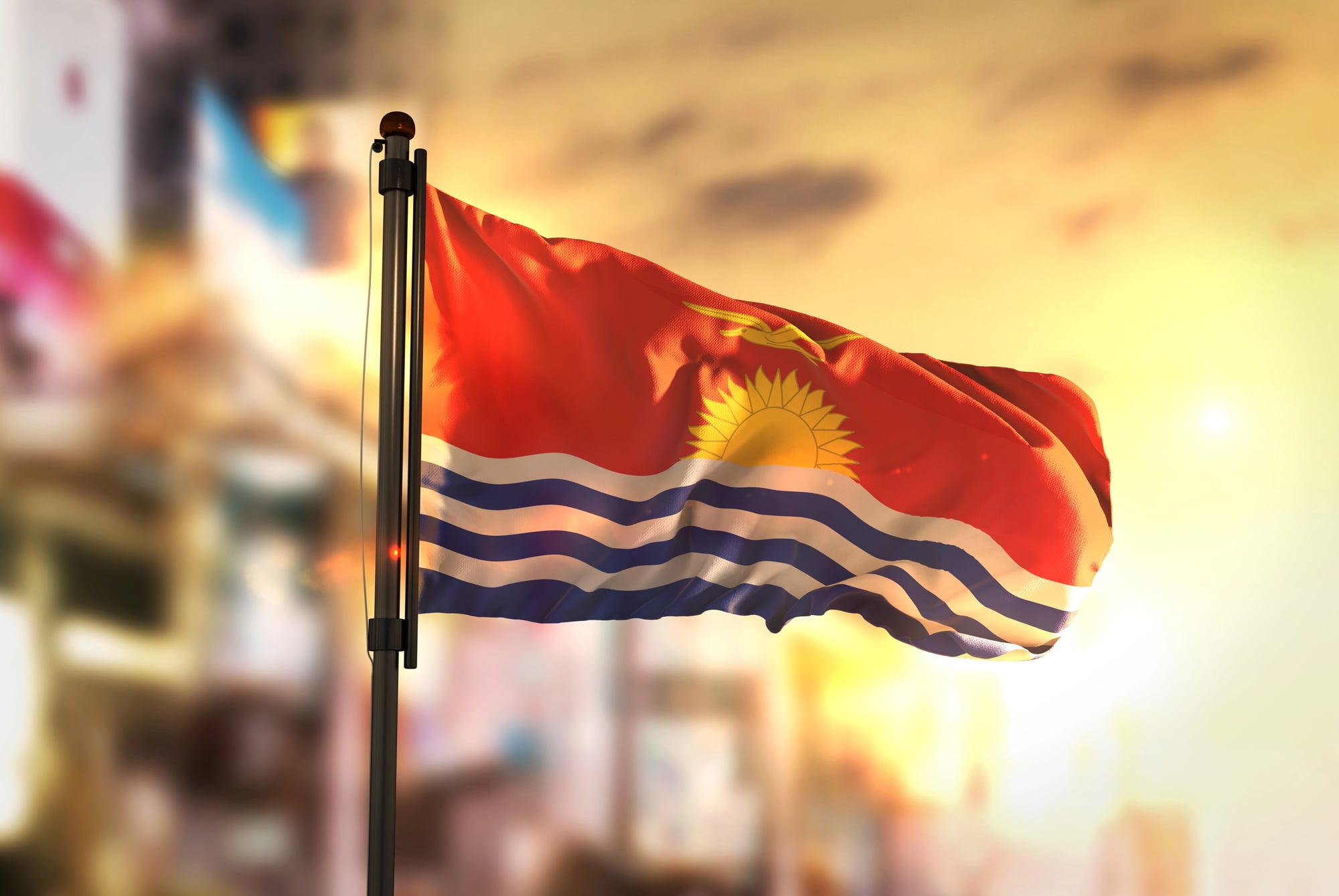
Kiribati’s flag captures a specific moment: sunrise over the Pacific, complete with a frigatebird in flight and ocean waves rendered in careful wavy lines of blue and white. The sun emerges from stylized water while the bird — wings spread wide — crosses in front of it. Above everything, that field of red represents the sky at dawn.
The whole design reads like a postcard, but somehow that literal approach works. Most flags abstract their meanings into shapes and colors. Kiribati decided to paint a scene instead.
The effect is unmistakably tropical, unmistakably Pacific, unmistakably theirs.
Wales
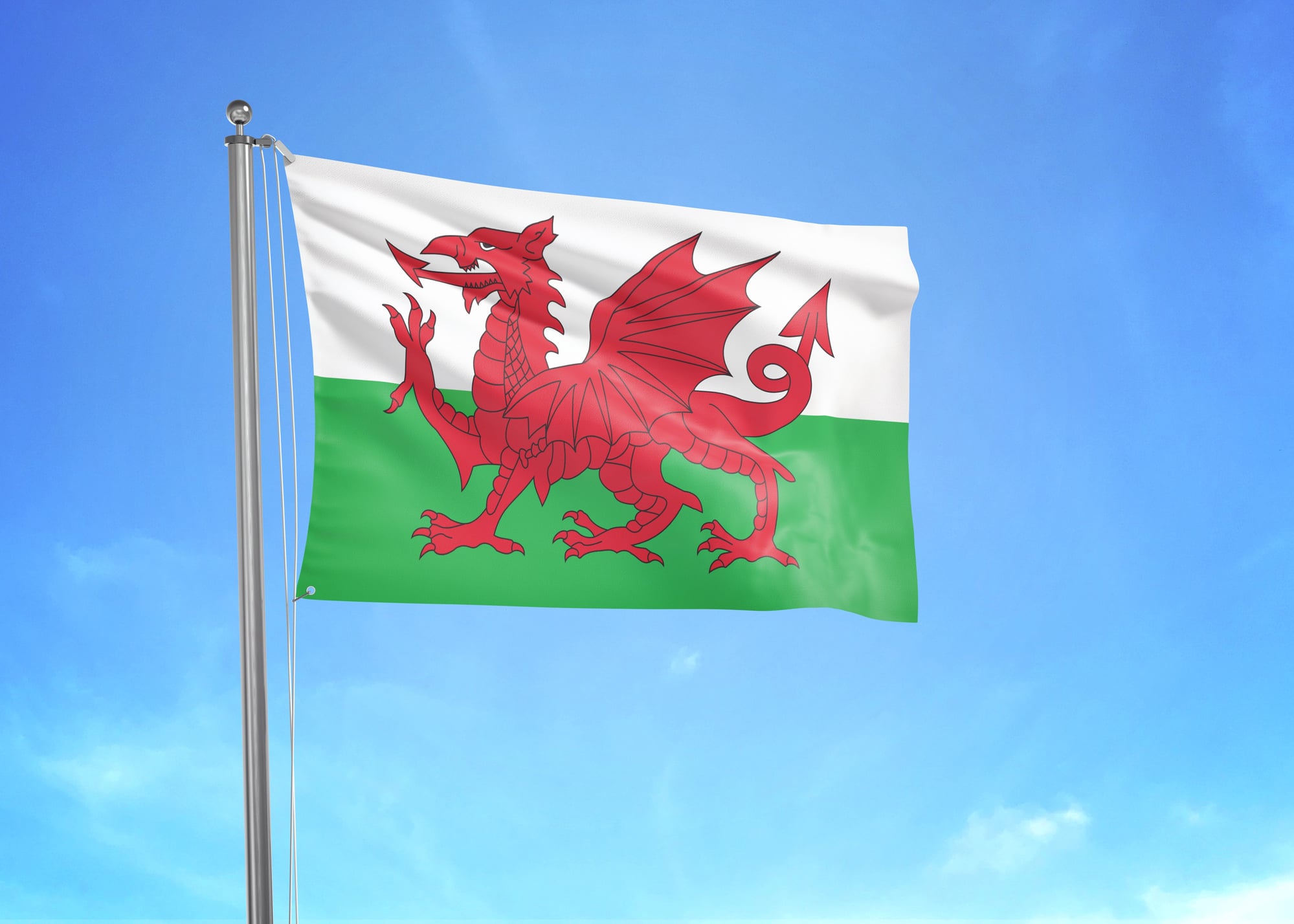
The red dragon rampant on a field of green and white refuses to be ignored. This isn’t some subtle heraldic symbol tucked discretely into a corner — the dragon takes up serious real estate, all claws and wings and attitude, positioned as if it’s about to leap off the fabric entirely.
The dragon has been Wales’ symbol for over a thousand years, which gives it a kind of historical authority that newer flag designs can’t match. The creature looks perpetually irritated, which seems fitting for a country that’s spent centuries asserting its distinct identity.
Most dragons in heraldry look decorative. This one looks ready for a fight.
Marshall Islands
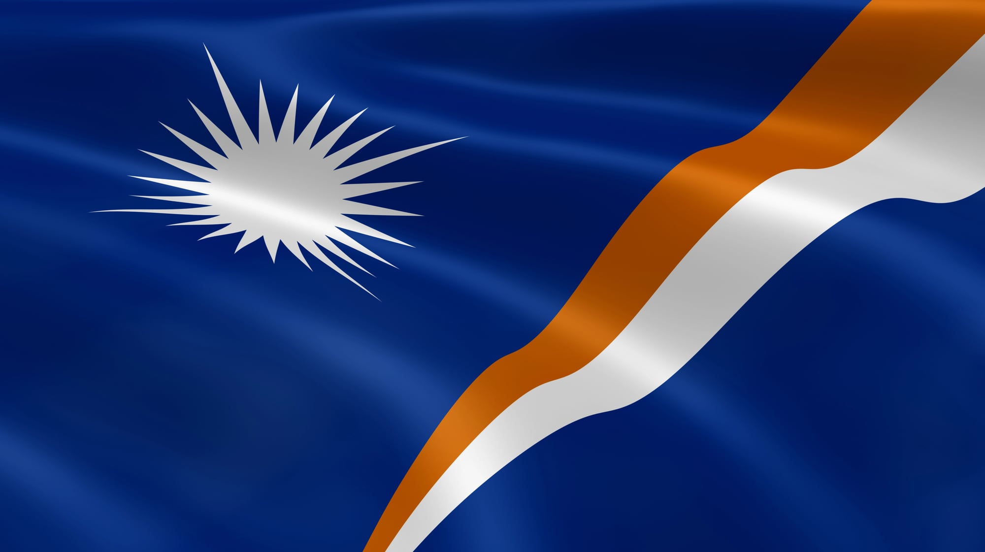
Two diagonal bands sweep upward from the lower left corner in blue and orange, intersecting at angles that create this sense of forward motion. In the upper left, a white star sits surrounded by twenty-four rays that reach toward the colored bands like light spreading across water.
The design captures something essential about Pacific island geography: that sense of space and movement, of being surrounded by ocean that stretches beyond the horizon. The star represents the capital, Majuro, while the rays symbolize the country’s municipalities, but really what matters is how the whole flag feels like it’s in motion even when it’s hanging still.
The colors themselves — that deep blue of deep water, the orange of sunset — feel specifically tropical without being cliché about it.
Estonia
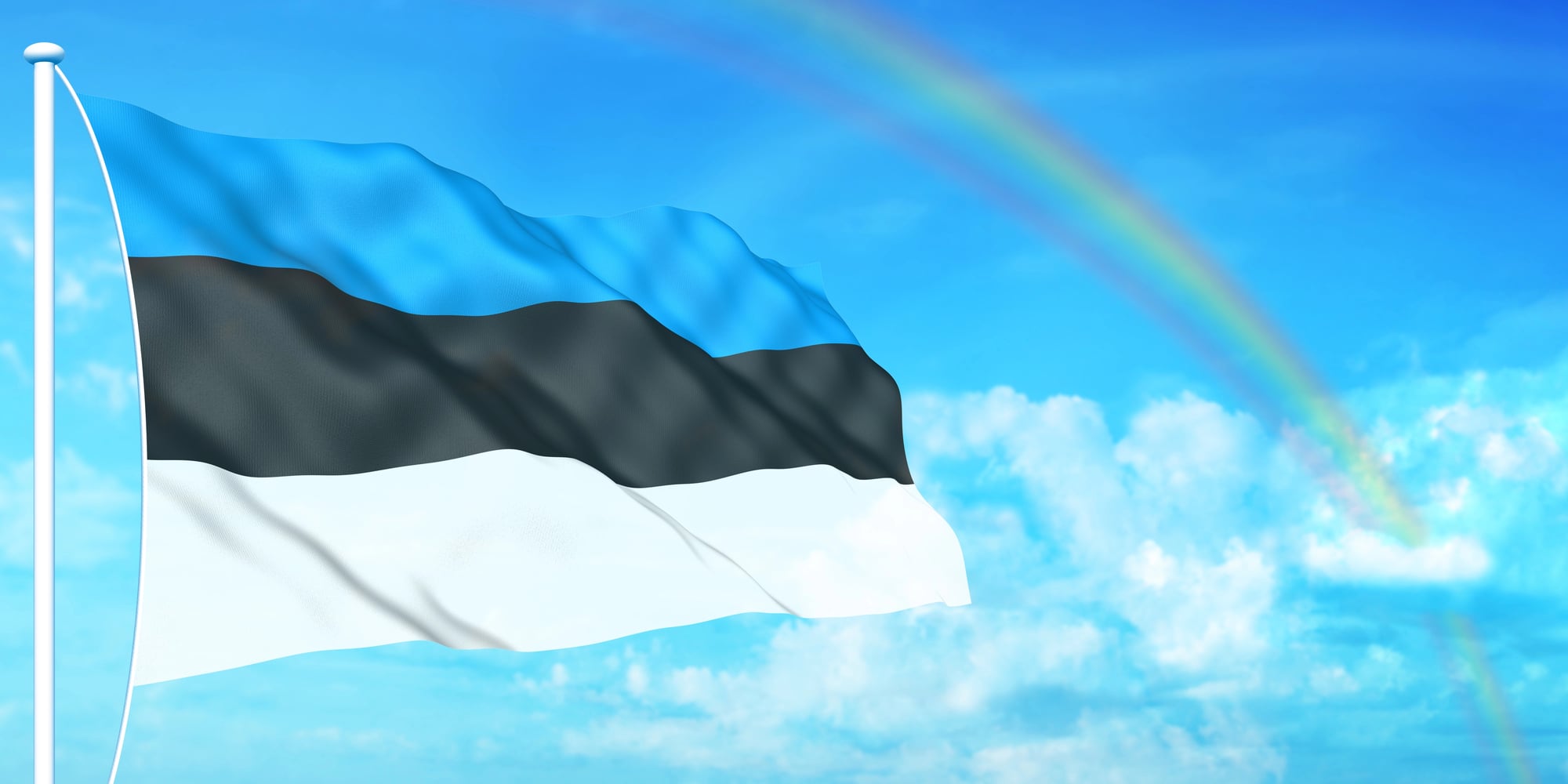
Three horizontal stripes in blue, black, and white stack with the kind of restraint that makes other flags seem overdressed. The blue represents the sky and Estonia’s lakes, the black symbolizes the soil and the hardships the country has endured, while white stands for the snow and the hope for brightness and happiness.
The symbolism works, but what really works is the combination itself — those particular blues and blacks and whites creating something that feels both Nordic and distinct. The proportions are clean, the colors are definitive, and the overall effect suggests a country that knows exactly what it is.
No flourishes, no complications. Just three bands that somehow contain everything necessary.
Palau
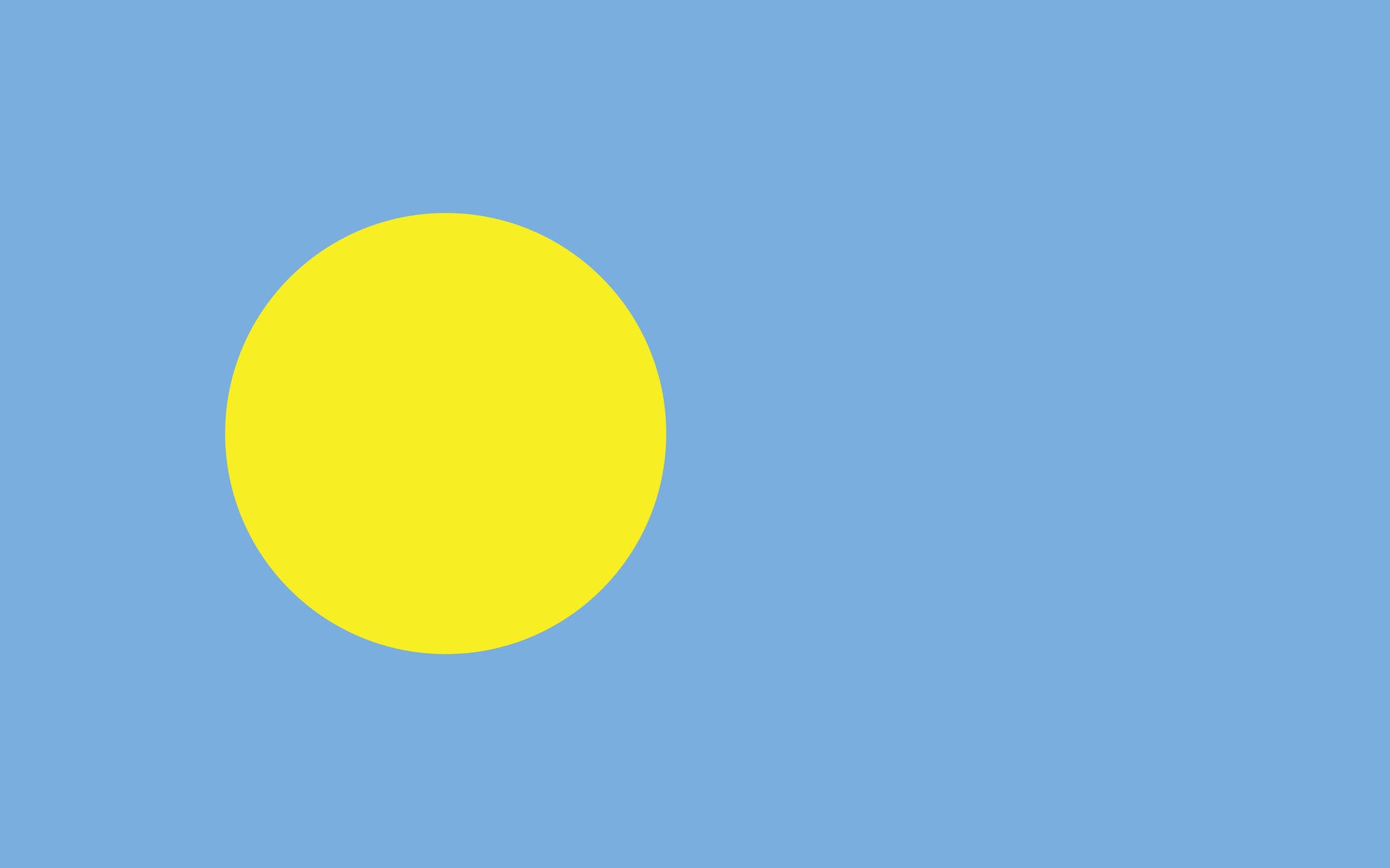
A golden circle sits slightly off-center against a field of light blue, creating one of the most serene flag designs in existence. The circle represents the full moon, while the blue symbolizes the Pacific Ocean — simple elements that combine into something unexpectedly powerful.
The off-center placement makes all the difference. A centered circle would feel static, balanced to the point of boredom. Shifted slightly toward the hoist, the moon feels like it’s moving across the flag the same way it moves across the night sky. The colors themselves are soft enough to feel peaceful but definitive enough to read clearly from a distance.
Capturing More Than Geography
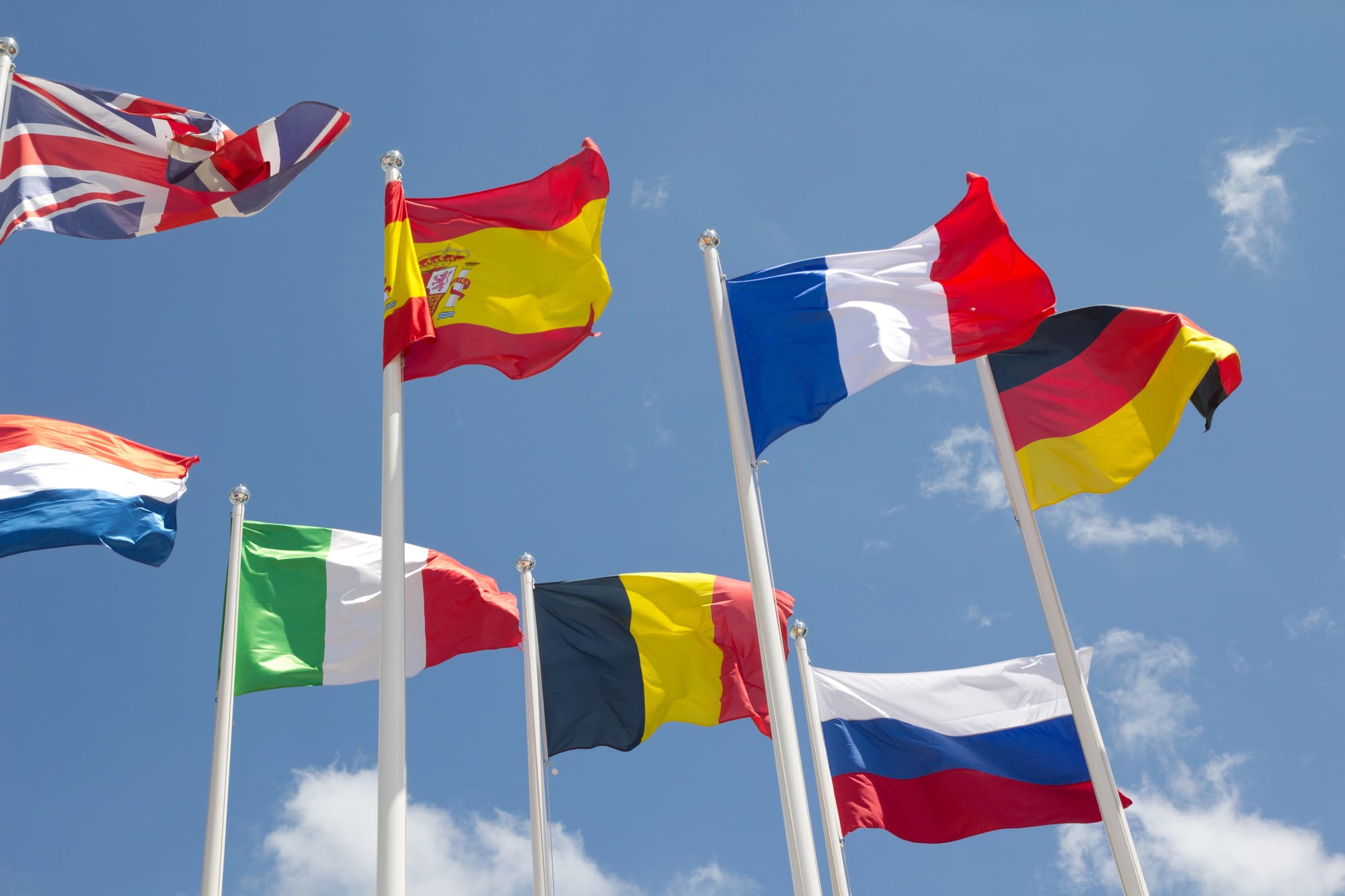
Flags work best when they stop trying so hard to be flags and start being themselves. The most beautiful ones feel inevitable — not designed so much as discovered, as if those colors and shapes were always meant to represent those particular places and people. They capture something essential that goes beyond geography or politics, something closer to the feeling of a place rather than just its location on a map.
More from Go2Tutors!

- The Romanov Crown Jewels and Their Tragic Fate
- 13 Historical Mysteries That Science Still Can’t Solve
- Famous Hoaxes That Fooled the World for Years
- 15 Child Stars with Tragic Adult Lives
- 16 Famous Jewelry Pieces in History
Like Go2Tutors’s content? Follow us on MSN.