15 Iconic Album Covers and the Untold Stories Behind Them
Album covers have always been more than just packaging. They’re the first handshake between artist and listener, frozen moments that somehow capture entire worlds of sound before you’ve heard a single note.
Some become so deeply embedded in culture that they transcend music entirely, living on as art, fashion statements, and symbols of their time. The stories behind these covers often reveal as much about the creative process as the music itself.
Sometimes they’re accidents that became legendary. Other times they’re carefully orchestrated visions that took months to execute.
What connects them all is their ability to distill complex artistic statements into a single, unforgettable image.
The Beatles – Abbey Road
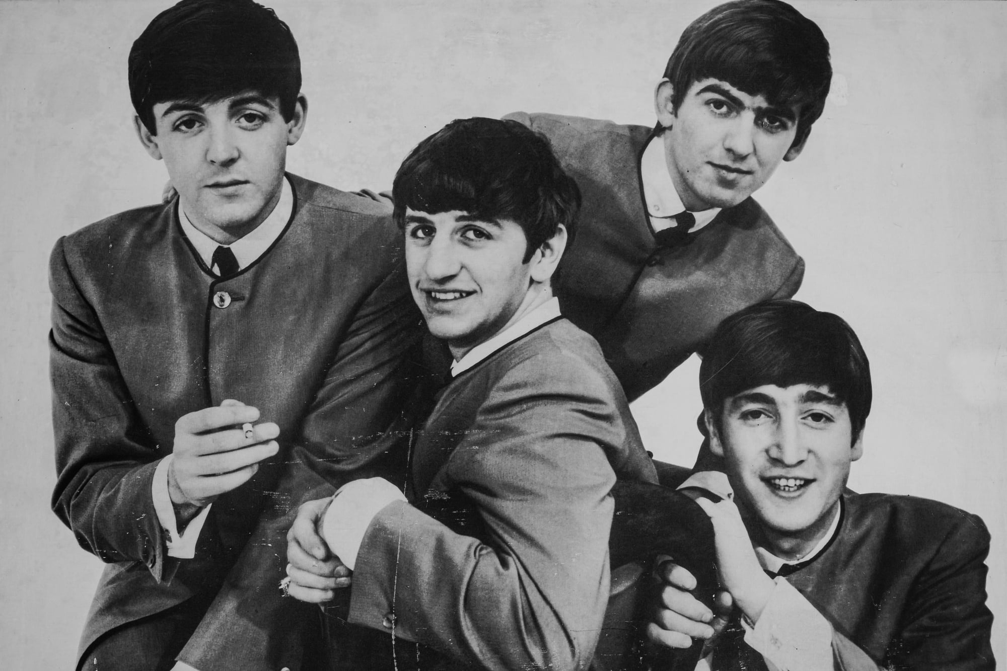
The Beatles walked across that zebra crossing exactly six times. Paul McCartney was barefoot because his shoes hurt.
John Lennon wore white because he felt like it that morning. The entire shoot took ten minutes.
Abbey Road’s cover became iconic by accident. Photographer Iain Macmillan stood on a stepladder in the middle of the street while a police officer held back traffic.
The band walked back and forth while he snapped away. The fifth shot was the keeper.
What nobody expected was the conspiracy theories. Paul’s bare feet sparked the “Paul is dead” rumors that haunted the band for years (the theory suggested this was evidence Paul had died and been replaced by a lookalike).
The license plate reading “28IF” was interpreted as Paul’s age “if” he had lived, though he was actually 27. Sometimes the most casual decisions create the biggest mysteries.
Pink Floyd – The Dark Side Of The Moon
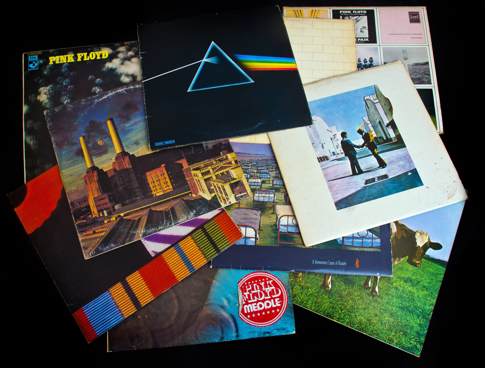
Storm Thorgerson’s prism design came from a physics textbook, but the execution required genuine problem-solving that would make any engineer proud. The photographer needed to create a beam of light passing through a glass prism that would split into a perfect rainbow spectrum, and this was 1973 — long before digital manipulation could clean up imperfections.
The setup involved precise lighting, multiple exposures, and a triangular piece of glass positioned at exactly the right angle. Thorgerson and his team at Hipgnosis spent weeks perfecting the shot, treating it like a scientific experiment rather than an artistic endeavor.
And it had to be scientific: the band wanted something that reflected both the album’s exploration of light and sound and their own fascination with the technical aspects of recording. But here’s what makes it perfect — the design suggests motion even though it’s completely static.
Your eye follows that beam of light as it transforms, just like your ear follows the album as it moves from heartbeat to heartbeat across 43 minutes. The prism doesn’t just look cool; it performs the same function as the music, taking something pure and revealing all the colors hidden inside.
Nirvana – Nevermind
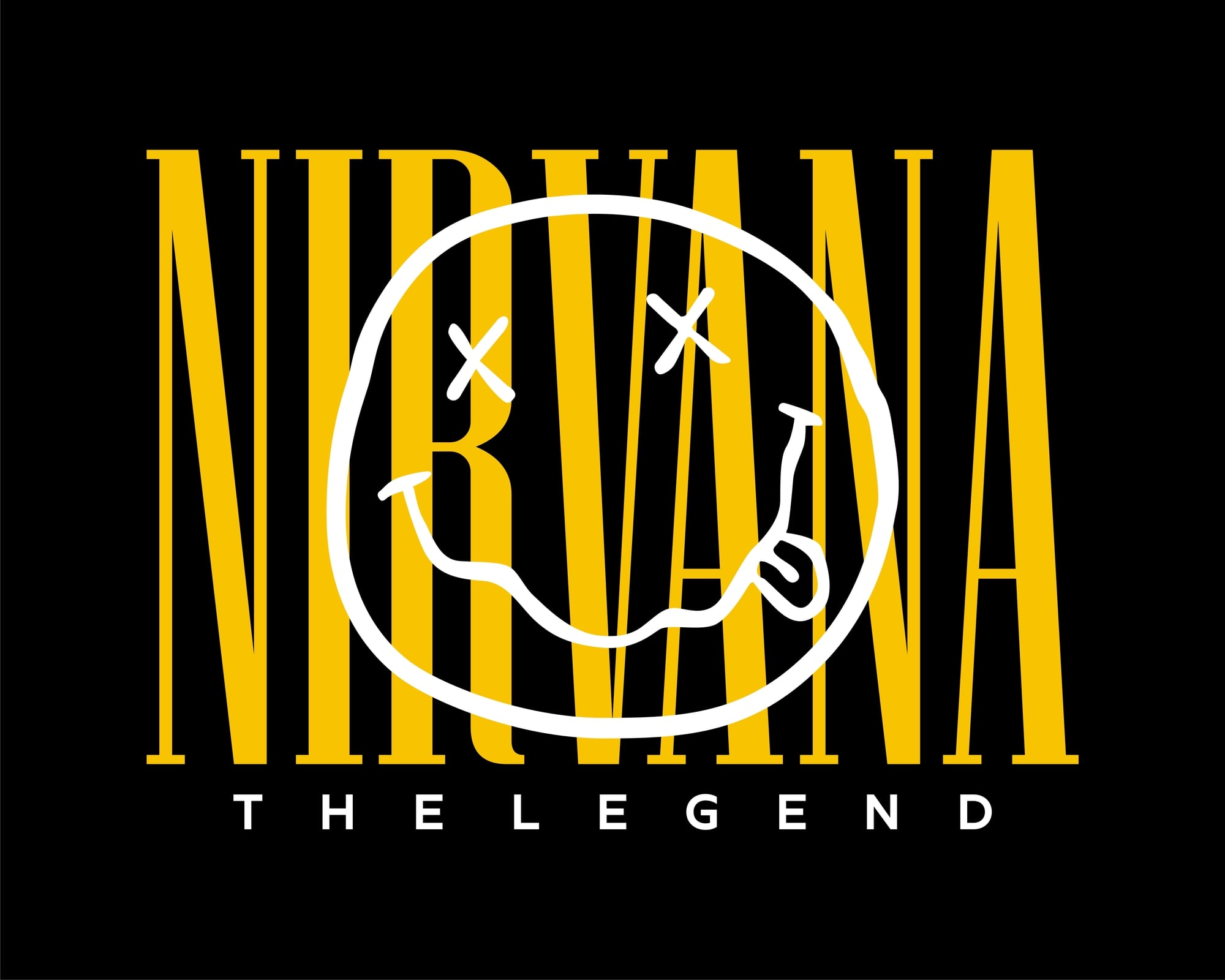
The baby is Spencer Elden, and he was four months old when photographer Kirk Weddle captured him underwater at the Rose Bowl Aquatic Center in Pasadena. The dollar bill on a fishhook was added later — a detail that transformed an innocent swimming photo into a commentary on capitalism and innocence.
Kurt Cobain initially wanted the image without the dollar bill, but the band’s label suggested adding it to strengthen the concept. Cobain agreed, though he later expressed some ambivalence about the symbolism becoming so heavy-handed.
The image worked because it captured the album’s central tension: the purity of punk ideals being pulled into the commercial machinery of major-label success. Spencer’s parents were paid $200 for the shoot.
The album sold over 30 million copies worldwide. That contrast — the modest payment against massive commercial success — accidentally became part of the cover’s meaning, embodying exactly what Cobain feared about commodifying underground music.
The Velvet Underground & Nico
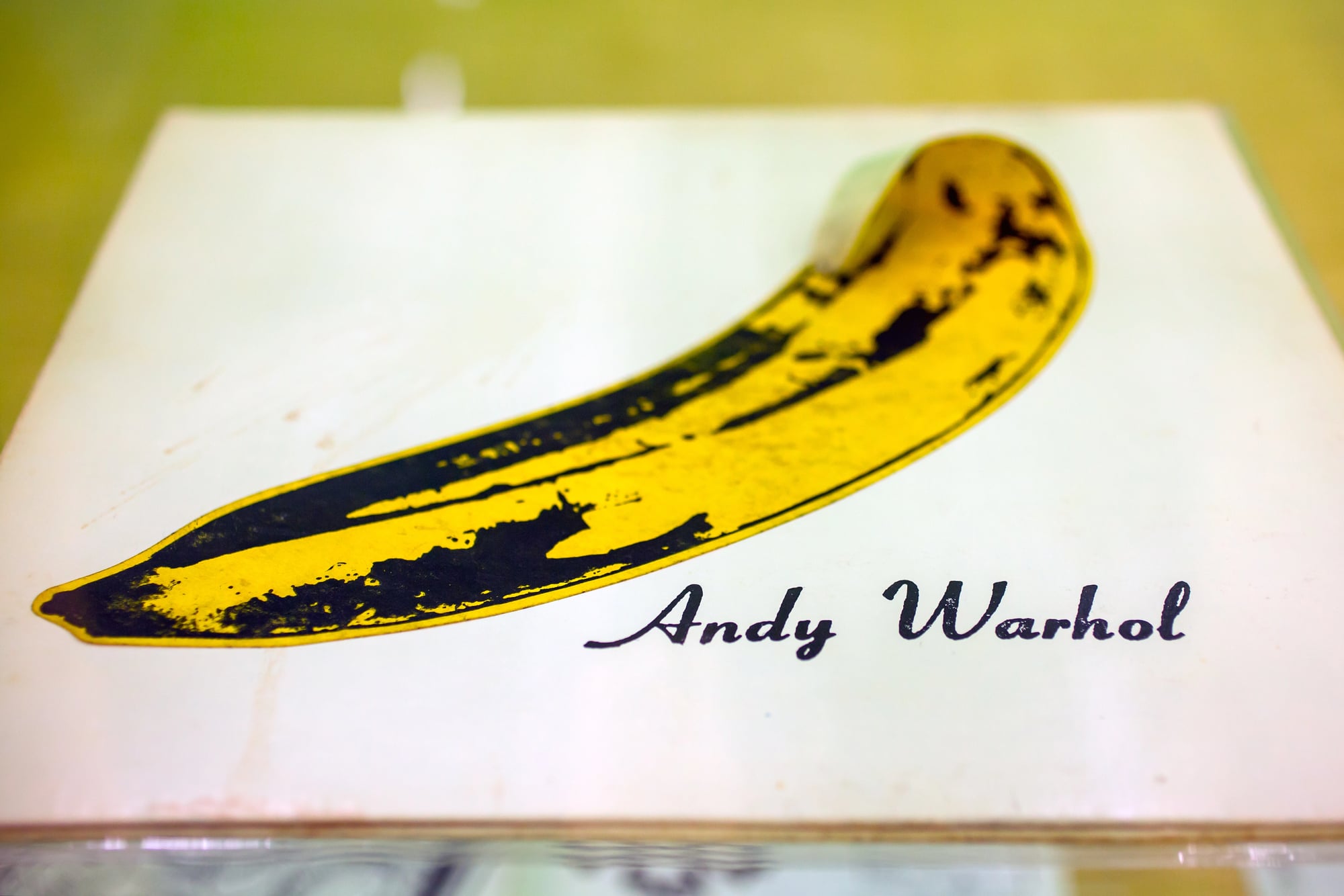
Andy Warhol’s banana wasn’t just art — it was interactive. The original pressing featured a peel-off sticker that revealed pink fruit underneath when you scratched it off.
The instruction “Peel slowly and see” appeared in tiny text along the banana’s edge. Warhol produced the album and designed the cover as part of his broader exploration of consumer culture and repetition.
The banana came from his grocery store paintings, but placing it on an album cover transformed it into something both innocent and suggestive, depending on how your mind worked. This ambiguity was entirely intentional — Warhol understood that the best pop art operates on multiple levels simultaneously.
The peel-off feature caused production nightmares. The adhesive sometimes stuck to other records during shipping, and the extra manufacturing cost ate into already thin profit margins.
Most people peeled their bananas immediately, making intact original pressings increasingly rare. Warhol had created cover art that literally destroyed itself through interaction — conceptually perfect for a band that would burn bright and flame out within a few years.
Led Zeppelin – Led Zeppelin IV
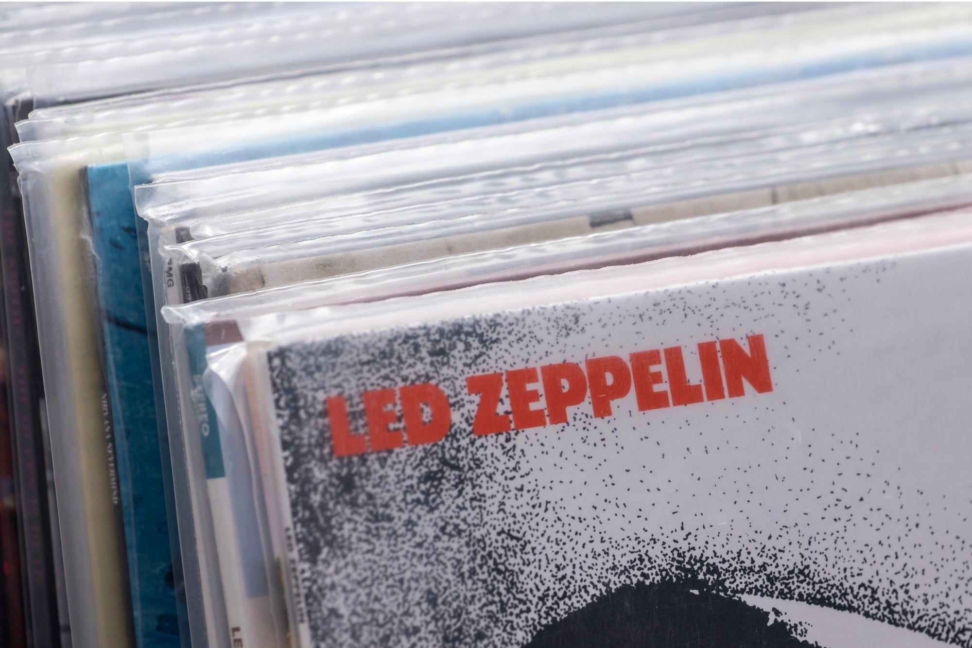
The four symbols represent each band member, but Jimmy Page never fully explained what his means. The symbol was hand-drawn by Page himself and appears in various occult texts, though its exact origins remain deliberately mysterious.
Robert Plant’s feather represents a writer’s quill. John Paul Jones chose a circle intersecting a triangle, representing a confident person.
John Bonham’s three interlocking circles represent the trinity of mother, father, and child. Page insisted on the symbol-only cover as a response to critics who claimed the band’s success was purely due to publicity rather than musical merit.
No band name, no album title, no text whatsoever — just four symbols against a weathered photograph of an old man carrying sticks. The image came from a Victorian-era painting that the band discovered in an antique shop.
The decision nearly caused a distribution crisis. Record stores didn’t know how to catalog it.
Radio DJs couldn’t announce it properly. Fans called it everything from “Four Symbols” to “Zoso” to “The Runes Album.”
But Page had made his point: the music would have to speak entirely for itself.
The Rolling Stones – Sticky Fingers
Andy Warhol photographed the crotch of actor and Warhol Factory regular Joe Dallesandro, though this wasn’t confirmed until decades later. The original cover featured a working zipper — you could actually unzip the jeans to reveal underwear underneath.
Warhol’s design played with the tension between high art and low commercial appeal, much like his Campbell’s Soup Cans had done a decade earlier. But the zipper created practical problems almost immediately.
It scratched other albums when stored together, and the metal hardware made shipping expensive and complicated. Mick Jagger reportedly loved the concept but worried about radio stations and record stores refusing to display something so overtly suggestive.
The solution was typically Stones: they went with it anyway, letting the controversy generate its own publicity. The cover became a statement about artistic freedom and commercial rebellion — appropriate for an album that included “Brown Sugar” and “Wild Horses.”
Joy Division – Unknown Pleasures

The image shows radio waves from a pulsar, specifically PSR B1919+21, the first pulsar ever discovered. Peter Saville found it in an astronomy textbook and inverted the colors from black on white to white on black.
No band name, no album title — just 100 successive radio telescope readings stacked to show the pulsar’s rhythmic emissions. Saville chose the image because it felt both scientific and mysterious, much like Joy Division’s music.
The pulsar data represented something vast and unknowable broadcasting across impossible distances — a perfect metaphor for Ian Curtis’s lyrics about isolation and alienation. The clean, minimal design reflected post-punk’s rejection of rock’s visual excess.
What makes it brilliant is the accidental poetry: a dead star’s final signals became the cover for a band whose singer would die just as they achieved recognition. The pulsar image suggests both precise measurement and cosmic loneliness.
Even without knowing what it depicts, you can feel the space between each line, the rhythm in the repetition, the sense that something important is being transmitted across a void.
Fleetwood Mac – Rumours
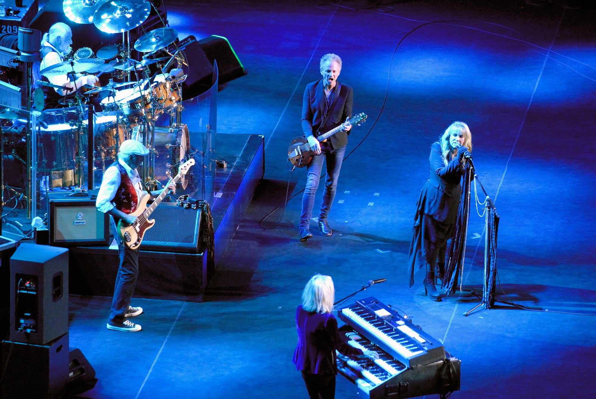
The cover features Mick Fleetwood and Stevie Nicks in costume, though most people focus on the mysterious orbs of light between them. Those orbs were created using a technique called “light painting” — photographer Herbert Worthington used mirrors and colored lights during a long exposure to create the ethereal effect.
The shoot happened during the album’s recording sessions, when the band was falling apart personally but creating their best music professionally. Stevie Nicks and Lindsey Buckingham had broken up.
Christine and John McVie were divorcing. Mick Fleetwood’s marriage was ending.
The mystical, otherworldly cover suggested transformation and magic during a period when everyone involved felt like their lives were dissolving. The costume choice — flowing fabrics and classical draping — deliberately evoked Greek mythology and ancient rituals.
This wasn’t accidental. The band wanted imagery that suggested endurance and timelessness, something that could outlast personal drama and industry changes.
The cover promised that whatever chaos surrounded the music, the songs themselves would survive.
Bob Dylan – Highway 61 Revisited
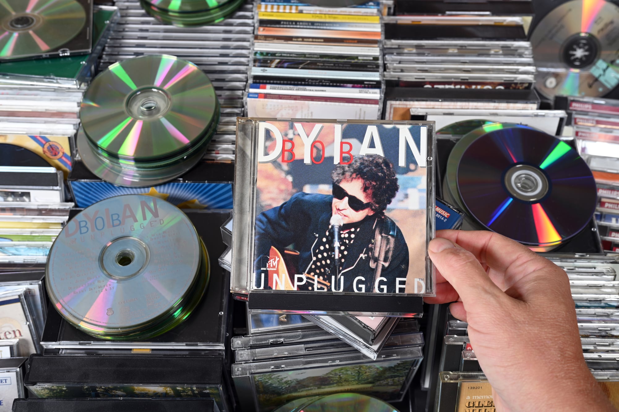
Dylan’s sunglasses and T-shirt were a calculated departure from folk’s earnest, acoustic image. The motorcycle T-shirt especially signaled his embrace of electric rock and roll.
Photographer Daniel Kramer shot the cover in Woodstock using natural light and minimal staging. The casual pose and direct gaze challenged folk music’s humble presentation.
Dylan looks like a rock star before rock stars really existed — confident, slightly dangerous, completely uninterested in explaining himself to anyone. This was exactly the image that infuriated folk purists who felt he was abandoning political commitment for commercial success.
But the T-shirt tells the real story. Motorcycles represented freedom, rebellion, and working-class culture — values that connected folk’s social consciousness to rock’s individualism.
Dylan wasn’t abandoning his principles; he was expanding his vocabulary. The cover showed an artist refusing to be trapped by genre expectations, confident enough to risk alienating his existing audience to reach a larger one.
David Bowie – Aladdin Sane
The lightning bolt was Brian Duffy’s idea, painted directly onto Bowie’s face using makeup artist Pierre Laroche’s techniques. The bolt required precise application — one side gold, one side red, perfectly symmetrical across Bowie’s features.
The teardrop below his collarbone was added for balance and emotional resonance. Duffy lit the shot dramatically, using shadows to emphasize the bolt’s geometry while keeping Bowie’s expression vulnerable and accessible.
The combination of theatrical makeup and intimate lighting created something both alien and human — appropriate for an album exploring fame, madness, and identity. The lightning bolt became Bowie’s most recognizable visual signature, appearing in countless tributes after his death.
But its original meaning was specific to 1973: a symbol of transformation and energy during glam rock’s peak. Bowie understood that creating memorable characters required memorable imagery.
The bolt didn’t just decorate his face; it announced his willingness to become someone entirely different for the sake of artistic expression.
The Clash – London Calling
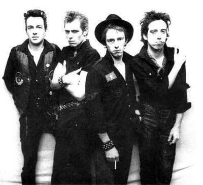
Pennie Smith’s photograph captured Paul Simonon smashing his bass guitar at the Palladium in New York, but she initially thought the shot was unusable because of motion blur. Ray Lowry’s design, inspired by Elvis Presley’s first album cover, transformed the “mistake” into an iconic image of punk rebellion.
The pink and green color scheme deliberately referenced early rock and roll, connecting punk’s energy to its musical roots. Lowry understood that punk wasn’t rejecting everything that came before — it was reclaiming rock’s original rebellious spirit from corporate sanitization.
Simonon smashed the bass out of frustration with the audience’s passive response, but the photograph captured something larger: the moment when controlled artistic expression becomes raw emotional release. The blur makes it feel immediate and unposed, like documentary evidence of punk’s essential energy.
Sometimes technical imperfections create more authentic results than perfect execution.
Patti Smith – Horses

Robert Mapplethorpe’s black-and-white photograph shows Smith in a white shirt and black jacket, her hair unkempt, her gaze direct and challenging. The composition deliberately references classical portraiture while the subject’s androgynous appearance challenges gender conventions.
Mapplethorpe, who was Smith’s roommate and occasional romantic partner, understood her artistic vision intimately. The cover needed to establish Smith as a serious artist while acknowledging her punk aesthetic.
The formal composition suggests literary weight; the casual styling suggests rock and roll rebellion. The photograph works because it captures Smith’s essential contradiction: intellectual sophistication combined with raw emotional expression.
She looks like someone who could quote French poetry and then spit on the floor — which was exactly the combination that made her music so compelling. The cover promised that punk could be both smart and fierce, literary and loud.
Black Sabbath – Black Sabbath

The cover features Keef Macmillan’s photograph of a mysterious figure in black standing near an old mill, creating an atmosphere of supernatural dread that perfectly matched the album’s content. The image was shot at Mapledurham Watermill in Oxfordshire, using natural fog and overcast lighting to enhance the gothic mood.
Vertigo Records wanted artwork that would distinguish the band from other heavy rock acts, and the stark, horror-movie aesthetic delivered exactly that differentiation. The figure’s identity remains unclear — some sources suggest it’s a model, others claim it’s someone connected to the band.
The ambiguity adds to the cover’s unsettling effect. What makes it brilliant is how completely it commits to its mood.
There’s nothing ironic or self-aware about the gothic imagery — it takes itself completely seriously, just like the music. The cover established heavy metal’s visual vocabulary: darkness, mystery, and supernatural themes presented with absolute conviction.
The Stooges – The Stooges
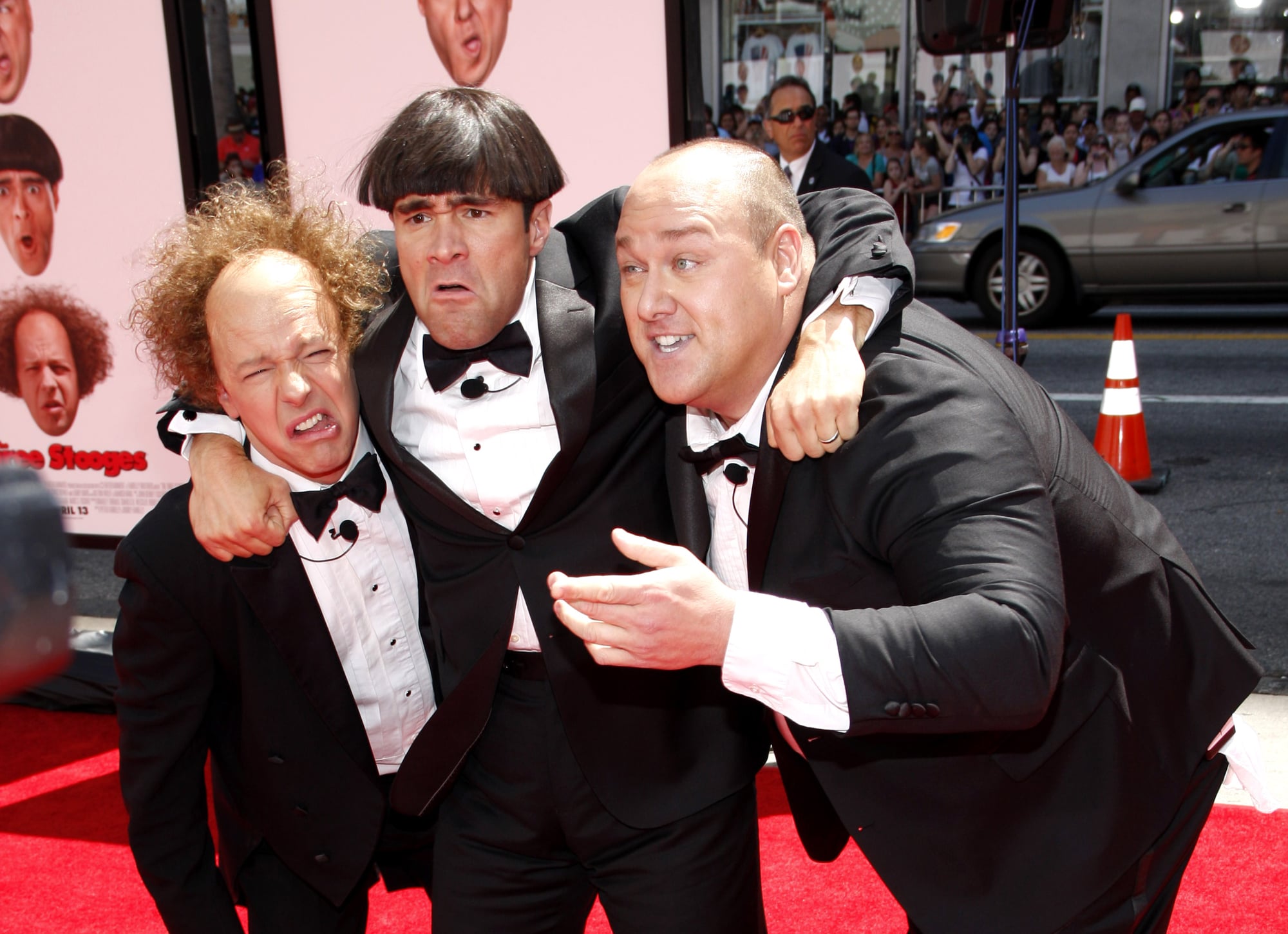
The band photograph was taken by Joel Brodsky, who captured the group’s raw energy while maintaining enough compositional control to create a striking image. Iggy Pop’s intense stare and the band’s casual-but-deliberate positioning suggested both accessibility and danger.
The simple band photo approach was unusual for 1969, when album covers often featured elaborate artwork or conceptual photography. But the direct presentation matched the music’s stripped-down aggression.
The Stooges weren’t interested in artistic pretension — they wanted to grab listeners by the throat and shake them. The cover’s effectiveness lies in its refusal to explain itself.
The band looks confident but unpredictable, like they might start playing music or start a fight depending on their mood. This ambiguity perfectly captured proto-punk’s essential tension between artistic expression and barely controlled chaos.
Talking Heads – Remain In Light
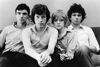
The cover features computer-generated imagery created by MIT’s Architecture Machine Group, making it one of the first albums to use digital art. The red faces against geometric patterns reflected the album’s Afrobeat influences while pointing toward electronic music’s future.
David Byrne worked with the MIT team to create imagery that matched the album’s polyrhythmic complexity. The repeated face patterns suggested both African textile designs and computer processing — appropriate for music that combined traditional rhythms with cutting-edge production techniques.
The cover announced Talking Heads’ evolution from art-punk to something more experimental and globally influenced. The digital imagery suggested that technology could enhance rather than replace human creativity, a theme that would define much of the following decade’s most interesting music.
The Power Of Visual Storytelling
These covers endure because they solved the impossible problem of translating sound into image. Each one captures not just the music’s mood but its cultural moment, creating visual symbols that outlast fashion and technology.
They remind us that the best album artwork doesn’t just decorate music — it extends and amplifies its meaning, creating connections between artist and audience that transcend the purely auditory. The stories behind them reveal creative processes driven by instinct as much as intention.
Sometimes accident creates legend. Sometimes meticulous planning yields magic.
But always, the most memorable covers emerge from artists willing to take visual risks that match their musical ones, trusting that audiences will understand symbols and metaphors that capture what words and marketing copy never could.
More from Go2Tutors!

- The Romanov Crown Jewels and Their Tragic Fate
- 13 Historical Mysteries That Science Still Can’t Solve
- Famous Hoaxes That Fooled the World for Years
- 15 Child Stars with Tragic Adult Lives
- 16 Famous Jewelry Pieces in History
Like Go2Tutors’s content? Follow us on MSN.