31 Logos That Changed So Gradually Nobody Noticed
There’s a particular kind of change that works best when nobody sees it happening. Not the dramatic overnight rebrand — the kind that makes headlines and triggers social media meltdowns — but the slow, patient reshaping of something familiar into something slightly different, so incrementally that your brain keeps filing it under “same as always.”
Logo design has made an art form out of this. The world’s most recognized brands have been quietly updating their visual identities for decades, nudging a curve here, dropping a shadow there, swapping a font that took ten years to feel wrong.
By the time you notice the difference, the new version already feels like the one you always knew.
Pepsi
Pepsi’s logo has been redesigned so many times it practically has its own autobiography. The red, white, and blue circle most people picture bears only a passing resemblance to the swirling script bottle cap from the 1940s, and yet no single change felt seismic enough to register.
Each decade brought a subtle tightening: less ornament, more geometry, until the 2008 version arrived with its slightly tilted white wave and a leaked 27-page internal strategy document, titled “Breathtaking,” that compared the logo’s proportions to the Earth’s magnetic field, the Mona Lisa, and the Golden Ratio. That document was real, and it remains one of the most quietly ridiculous artifacts in branding history.
Pepsi quietly moved the wordmark back inside the globe again in 2023, which means the joke has already outlived two more redesigns.
Coca-Cola
Coca-Cola is the rare exception that proves the rule, and it’s worth understanding why. The Spencerian script — that looping, confident cursive — has stayed essentially intact since 1887, but the surrounding identity has shifted constantly: the contour bottle silhouette appeared, disappeared, returned; background colors cycled through red, white, and various shades of holiday; the wordmark itself was cleaned up microscopically in the early 2000s.
The logo feels eternal because the core never moved, but the frame around it has been repainted more times than most people’s living rooms.
Apple
The rainbow Apple logo lasted from 1977 to 1998 — longer than most people remember. When Steve Jobs returned to Apple and the monochrome version took over, it didn’t feel like a loss because the company was already changing so fast that the logo was the least of it.
Since then, the shape has stayed constant while the finish has moved through solid chrome, glossy black, matte silver, and the flat single-tone version that exists today. Same apple. Completely different apple.
Google’s original logo was set in a free font called Catull, with a bevel effect that looked genuinely dated by 2010. The company spent years quietly adjusting the letterforms — softening the curves, stripping the three-dimensional styling — before making the full switch to the custom sans-serif Product Sans in 2015.
That 2015 change felt radical when it landed, but it only felt that way because people hadn’t tracked the decade of smaller adjustments that preceded it. By the time Product Sans arrived, the old logo had already been half-erased.
Nike
The Nike swoosh hasn’t changed shape since Carolyn Davidson designed it in 1971 for a fee of $35, billed at $2 an hour for roughly seventeen and a half hours of work. What has changed, deliberately, is everything around it — the wordmark “Nike” was dropped from the standalone logo in 1995 once the swoosh had become recognizable enough to carry the brand alone.
That’s not a redesign. That’s a brand deciding it no longer needs to introduce itself. Quietly confident, which is saying something for a shoe company.
Shell
Shell’s pecten — the scallop shell logo — has been refined roughly a dozen times since 1900, and the current version dates to 1971, designed by Raymond Loewy. What makes Shell’s evolution instructive is how the changes track exactly with print technology and signage norms: more detail when detail was achievable, less when legibility at highway speed became the priority.
Each version looked inevitable at the time. Each version quietly made the previous one look fussy.
FedEx
The FedEx logo, redesigned by Lindon Leader in 1994, is most famous for the hidden arrow between the E and the x — but what people miss is how dramatically the company’s visual identity had evolved before that moment. The original Federal Express logo from 1973 was a purple-and-orange wordmark with uppercase letters and zero subtlety; the 1994 version kept the purple and orange but stripped everything else down to something almost architectural.
The arrow wasn’t a gimmick. It was a punctuation mark on more than twenty years of gradual compression.
McDonald’s
The Golden Arches weren’t always the logo — they were originally literal architectural arches on the physical buildings, designed by Stanley Meston in the 1950s. The stylized M didn’t fully consolidate into the clean mark people recognize today until a 1960s redesign, and even then it took decades of color and proportion tweaks to arrive at the current version.
What hasn’t changed is the yellow-on-red color relationship, which is now so deeply embedded in public memory that the logo barely needs the arches at all. The shape just confirms what the colors already said.
Starbucks
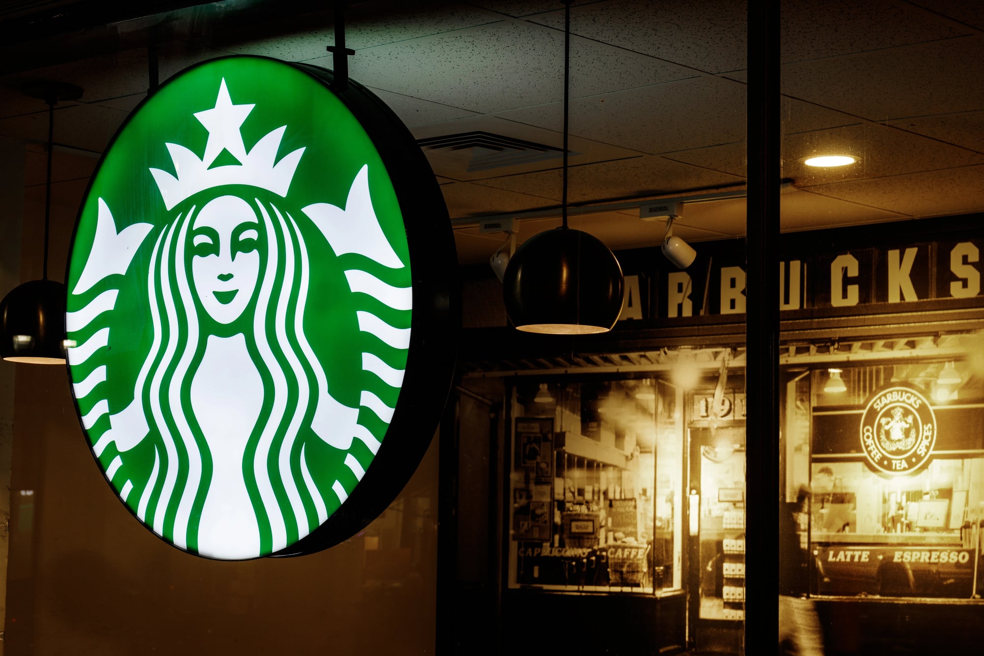
Starbucks has been quietly cropping their siren for decades, like a slow zoom on a photograph that nobody authorized. The original 1971 logo showed the twin-tailed siren in full; by 1987 she’d been zoomed in and the image softened; by 1992, cropped further; by 2011, the wordmark “Starbucks Coffee” was dropped entirely, leaving just the siren’s face centered in a green circle.
The siren went from mythological figure to abstract mascot without anyone filing a complaint.
Amazon
Amazon’s original logo in 1994 featured a stylized river graphic — literal Amazon River imagery — which aged about as well as an early personal website. By 2000, the river was gone and the smile arrow appeared, running from the A to the Z to suggest both a smile and the idea that Amazon sells everything from A to Z.
The current logo has been largely stable since then, with only minor weight adjustments to the typeface. Sometimes a logo just arrives at the right answer and has the good sense to stop.
Twitter / X
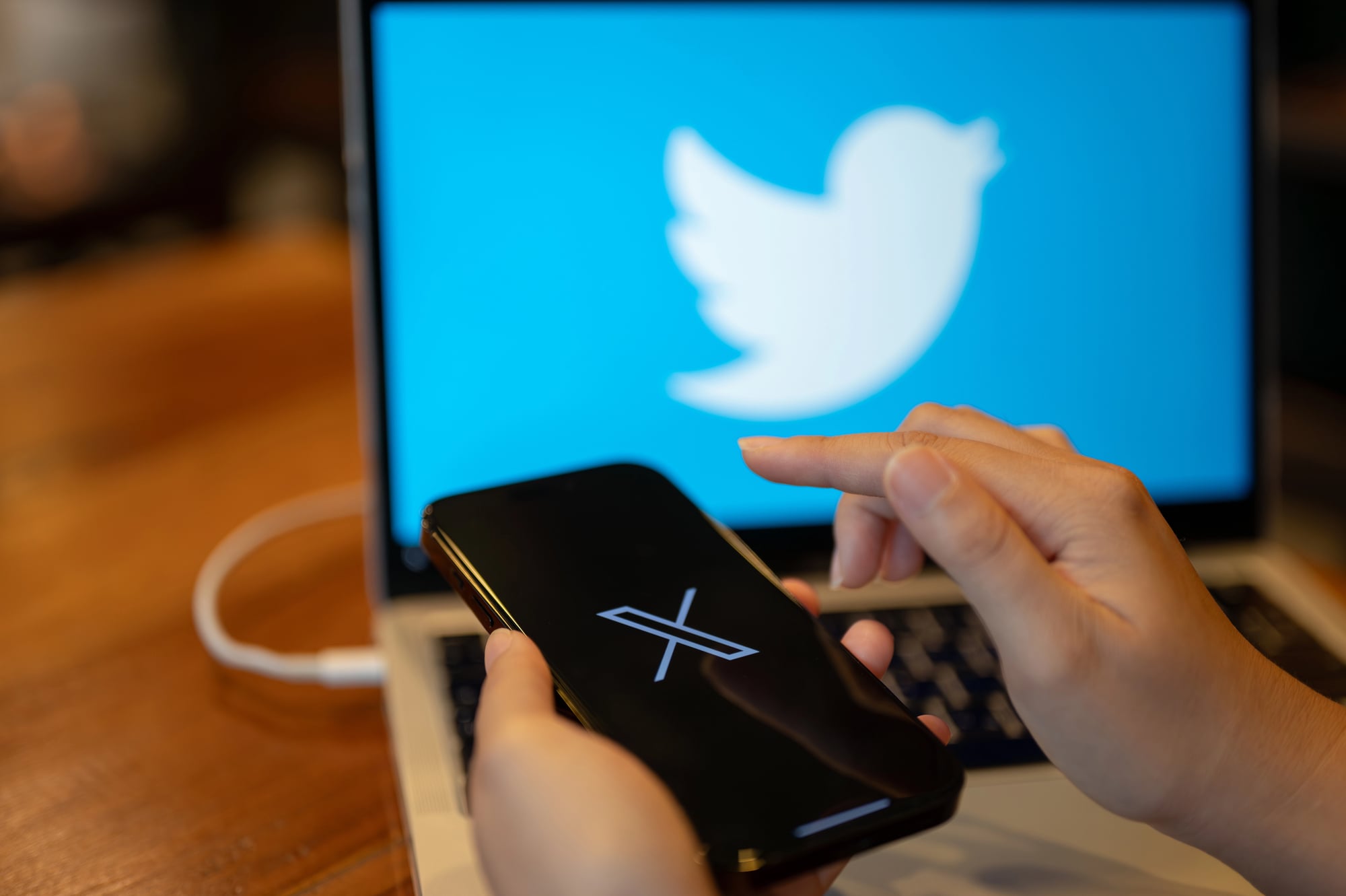
Twitter’s bird logo underwent several rounds of refinement between 2006 and 2012, each time becoming more aerodynamic and less cartoon-like — fewer outlines, cleaner curves, a posture that shifted from passive to upward-facing. Then in 2023, Elon Musk replaced the bird with an X overnight, which was the opposite of gradual and felt exactly like what it was: a brand identity decision made in a hurry.
The bird, in retrospect, had been one of the most quietly well-executed logo evolutions in social media history. And then it wasn’t.
IBM
IBM’s striped logo — the horizontal lines cutting through the bold blue letters — was designed by Paul Rand in 1972, but the IBM wordmark itself dates back to a 1947 refinement of a 1924 original. Rand’s stripes didn’t change the letterforms; they changed the personality, turning a conservative corporate serif into something that felt technical and precise without losing the authority the letterform already carried.
The number of stripes even shifted — eight-stripe and thirteen-stripe versions coexisted for years depending on the application. Same letters. Different frequencies.
UPS
UPS ran with a bow-tied package logo designed by Paul Rand from 1961 all the way to 2003, making it one of the longer-lived corporate logo runs of the twentieth century. The 2003 redesign dropped the shield’s package-and-ribbon graphic and introduced a more dimensional, gradient-heavy version of the shield — a decision that felt very of-its-moment in the best and worst possible ways.
The current version has been flattened back out since then, quietly correcting for the era it was designed in.
Walmart
Walmart’s logo carried an asterisk-style burst for years before the company switched to the now-familiar six-petal spark in 2008. The font changed from a blocky, all-caps treatment to a softer lowercase “Walmart” in a custom sans-serif, and the blue shifted slightly warmer.
The old logo had a certain no-nonsense bluntness that matched the brand’s early identity; the new one reads friendlier, less like a warehouse and more like a neighborhood. Whether that’s accurate is a separate question.
Target
Target’s bullseye has barely moved since it appeared in 1968, but the surrounding wordmark has cycled through several type treatments — a bold slab serif, a condensed sans, and eventually the clean rounded version paired with the mark today. The 2004 decision to drop “Target” from many applications and let the bullseye stand alone mirrored what Nike had done roughly a decade earlier.
Once a shape becomes genuinely iconic, the name is just extra weight.
NBC
NBC’s peacock logo has one of the more interesting evolutionary backstories in broadcast history. The original multicolored peacock appeared in 1956 specifically to encourage viewers to buy color television sets — NBC was owned by RCA, which made color TVs, so the logo was partly advertising for the hardware.
The peacock was retired in 1975, brought back in 1979, refined in 1986, and has been subtly adjusted several times since. The current version, introduced in 1986 and minimally updated since, has outlasted every technology it was originally designed to sell.
Volkswagen
Volkswagen’s circular VW logo has been simplified continuously since the 1930s, shedding detail with each decade — the cog-wheel border went first, then the eagle that appeared atop the circle in early versions, then the three-dimensional styling that defined the 1990s version. The 2019 redesign stripped the mark to its flattest, most minimal state yet: a two-dimensional outline with no gradient, no depth, no shadow.
It’s a logo that has been losing weight for ninety years and still hasn’t hit the floor.
BMW
BMW’s logo is routinely cited as one that has “never changed,” which is only true if you squint. The roundel — the blue-and-white quartered circle — has been the consistent core since 1917, but the chrome ring surrounding it has been added, removed, thickened, and thinned across different eras, and the 2020 update flattened the entire mark for digital use while keeping a three-dimensional version for physical applications.
BMW now runs two versions of the same logo simultaneously. That’s a kind of evolution most people don’t even register as a decision.
Levi’s
The Levi’s batwing logo — the two-horse patch on the back pocket — has been a fixture since 1886, and the red tab with “LEVI’S” in white has been on the back pocket since 1936. What’s changed, slowly and without announcement, is the capitalization and font weight of the wordmark used in advertising and on packaging: the version that shows up on billboards today is slightly more condensed, slightly bolder, slightly more modern than the version from thirty years ago.
The jeans themselves have changed more than the logo, which feels about right.
Burger King
Burger King ran one of the more visually cohesive branding eras in fast food from 1969 to 1994, then spent the next twenty-five years in a kind of visual identity crisis — too many gradients, too much dimension, fonts that kept changing. The 2021 rebrand returned to something close to the 1969–1994 aesthetic: a rounded, retro wordmark sandwiched between two bun-shaped arcs in orange.
It looked like a throwback and it was, but it also worked, which is proof that gradual drift can sometimes be corrected by a deliberate jump backward.
Sprint
Sprint’s logo changed so many times between 1992 and 2020 that tracking the progression feels like watching a company search for a personality in real time. The pin-drop icon appeared in the early 1990s and lasted in various forms for decades — sometimes flat, sometimes three-dimensional, sometimes paired with the name in yellow, sometimes in black.
When T-Mobile acquired Sprint in 2020, the brand was retired entirely, which ended the search. Sometimes a logo evolution concludes not with a final design but with an obituary.
Domino’s
Domino’s dropped the word “Pizza” from its logo in 2012, a decision that read as either confidence or hubris depending on your relationship with their breadsticks. The domino tile graphic — three dots arranged two-and-one — has been a constant since the brand’s founding in 1965, but the surrounding type has moved from a chunky, all-caps treatment to a cleaner, more contemporary sans-serif.
The tile has stayed. The personality around it has been updated, quietly, at regular intervals.
Adidas
Adidas has the genuinely unusual distinction of running multiple logos simultaneously for different sub-brands — the three stripes, the trefoil, the mountain logo — with each mark representing a different product line rather than a different era. The three-bar mountain logo, introduced in 1991 for the Performance line, is the primary mark most people associate with the brand today, having gradually displaced the trefoil in retail visibility even though both remain in active use.
It’s less an evolution than a slow changing of the guard.
Gap
Gap’s brief and widely mocked 2010 logo redesign — a blue square dropped behind the right side of the word “Gap” in Helvetica — lasted approximately six days before public outcry forced a reversion to the original. What’s interesting is that the original logo, which returned victorious, was itself a refinement of earlier versions.
The blue box and white capitalized “GAP” in a custom serif had been tweaked in spacing and proportion several times since the 1980s — but those changes were invisible because they were competent. The 2010 redesign was visible because it was not.
Pepperidge Farm
Pepperidge Farm’s logo has carried a silhouette of a covered wagon and farmhouse since the brand’s early packaging, and the general pastoral aesthetic has never left — but the illustration style has been progressively simplified over the decades, moving from a detailed etching style toward a cleaner, more graphic rendering. The script wordmark has been refined without being replaced.
It’s a logo that communicates “old and trustworthy” while actually being a carefully maintained modern artifact, which is a harder trick than it looks.
The New York Times
The New York Times masthead — set in a gothic blackletter typeface — has been in continuous use since 1857, which makes it one of the longest-running logo designs in American publishing. Adjustments have been almost imperceptible: slight tightening of letter spacing, minor refinements to stroke contrast, a shift in how the masthead reproduces digitally.
The font itself signals permanence so loudly that any change becomes nearly impossible to make — the logo has become its own argument against being updated.
Heinz
Heinz’s keystone logo — the shape that’s appeared on bottles since the late 1800s — has been refined repeatedly while looking essentially identical. The script wordmark inside the keystone has been cleaned up for legibility, the proportions adjusted for different label formats, and the color treatments updated for modern printing.
What makes Heinz instructive is that the brand has never once tried to modernize dramatically. The gradual refinement is the strategy, not the compromise.
Playboy
The Playboy rabbit head logo, designed by Art Paul in 1953, is one of the most minimal corporate marks ever produced: a silhouette of a rabbit in profile wearing a bow tie. It has barely changed in over seventy years.
Minor adjustments to the bow tie proportion, very subtle refinements to the ear angle, small shifts in how the eye dot is placed — but the overall silhouette remains almost exactly what Paul drew for the first issue. Some logos are so minimal that there’s simply nothing left to simplify.
Dunkin’
Dunkin’ Donuts became Dunkin’ in 2019, dropping the second word from the brand name after decades of the donut being central to the identity. The font — a rounded, friendly sans-serif in orange and pink — survived the name change largely intact, which made the transition feel less like a rebrand and more like editing a sentence.
The donuts haven’t gone anywhere. The company just decided the word was doing less work than the color combination was. They were probably right.
Batman
The Batman logo is technically a commercial trademark rather than a corporate logo, but it functions exactly like one — and its evolution across film adaptations since 1966 follows the same logic as any brand refinement. Each new film brought a new bat symbol: wider, narrower, more angular, more streamlined, sometimes with pointed ear extensions, sometimes without.
The Tim Burton versions from 1989 and 1992 are to the Batman logo what Paul Rand was to IBM — the moment a functional symbol became genuinely iconic. Everything since has been working in that shadow.
Mastercard
Mastercard simplified its logo in 2016 to two overlapping circles — one red, one orange-red — with no text at all, becoming one of only a handful of global brands that can operate without a wordmark in most contexts. The circles had been there since 1966, but they spent decades surrounded by text, gradients, and dimensional effects.
Stripping all of that away to leave just two clean overlapping circles wasn’t minimalism for its own sake. It was a company finally trusting that fifty years of repetition had done their job.
When Nobody’s Watching, Everything Changes
The slow logo is, in a way, the truest kind of design. It doesn’t ask for your attention or demand that you notice what’s different.
It simply arrives, slightly improved, slightly more confident, slightly more aligned with the world it now lives in, and waits for your eyes to update their records without ever telling them to.
Most of the logos on this list are still technically “the same” logo they started as, in the sense that a river is still the same river even though none of the water in it has stayed put. That’s the real trick gradual design plays: it lets a brand change everything about how it looks while preserving the one thing that actually matters, which is the feeling that nothing has changed at all.
More from Go2Tutors!

- The Romanov Crown Jewels and Their Tragic Fate
- 13 Historical Mysteries That Science Still Can’t Solve
- Famous Hoaxes That Fooled the World for Years
- 15 Child Stars with Tragic Adult Lives
- 16 Famous Jewelry Pieces in History
Like Go2Tutors’s content? Follow us on MSN.