13 Ways a Restaurant Menu Is Designed to Change What You Order
The menu in your hands at a restaurant is not a neutral document. It’s a sales tool, and it’s been designed — sometimes by specialists who charge significant consulting fees — to guide your choices in specific directions before you’ve decided anything consciously. Behavioural economists, hospitality researchers, and marketing psychologists have spent decades studying how people read menus, and the restaurant industry has spent roughly the same amount of time applying what they found.
None of this means you can’t order what you want. You can. But knowing the architecture of the document in your hands means the choices you make are genuinely yours, rather than the result of layout decisions you never noticed.
Price Anchoring Sets Your Sense of What’s Normal
The most expensive item on a menu is rarely the most ordered. It’s there to do a different job: reset your internal sense of what’s reasonable. If the first entree you see is a $58 dry-aged tomahawk steak, the $34 pan-seared halibut a few lines down feels moderate — even if you’d have hesitated at $34 on any other day.
Research published through Cornell University’s Center for Hospitality Research confirmed that when higher-priced sections appear first on a menu, spending in subsequent categories increases. The restaurant isn’t expecting you to order the $58 steak. It’s expecting you to feel better about ordering the $34 one.
The Decoy Effect Steers You Toward the Middle
The decoy effect is one of the most well-documented tricks in menu design. Present two options and they’re genuinely hard to compare. Add a clearly inferior third option that’s priced close to one of them — but offers less — and suddenly the comparison resolves.
The expensive-but-good option now looks like the obvious choice. In drinks, this often works as: a small glass, a medium glass, and a large glass priced so that the large is barely more than the medium. The medium is the decoy. Most customers choose the large, convinced they’ve made a rational value decision.
Studies suggest strategic decoy placement increases selection of mid-range items by around 15 percent.
The Upper-Right Corner Gets Disproportionate Attention
Eye-tracking research on menu reading has consistently identified what hospitality consultants call the “golden triangle”: the eye tends to move to the centre of a page first, then to the upper-right, then to the upper-left. Restaurants have used this research to position high-margin items — not necessarily their most expensive dishes, but their most profitable ones — in the zones that get the most eye time.
A dish that costs the kitchen very little to produce but sells at a good price is worth making sure the customer sees first.
Removing Dollar Signs Makes You Spend More
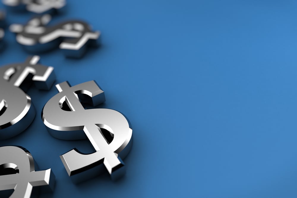
Prices listed as “28” rather than “$28.00” consistently produce higher spending in studies of restaurant behaviour. The dollar sign is a mental trigger — it activates cost-conscious thinking and shifts attention to expenditure.
Removing it frames the number as information about the dish rather than as a financial decision. Similarly, aligning all prices in a neat right-justified column makes price comparison effortless, which isn’t what a restaurant wants. Prices buried at the end of a description, in the same font as the text, encourage reading the dish first and registering the price as a secondary detail.
Descriptive Language Changes Perceived Quality — and Actual Satisfaction

The same dish described as “grilled chicken” versus “slow-roasted Appalachian farm chicken with herbs from our kitchen garden” produces different responses — not only in what people are willing to pay but in how satisfied they report being after eating it. Research by Brian Wansink at Cornell found that descriptively labelled menu items outsold identical items with plain names by 27 percent, and diners reported higher satisfaction scores.
The description creates an expectation, and the expectation shapes the experience. You’re not imagining it: the food tastes better when the menu primes you to taste more.
Category Order Shapes What You Consider First
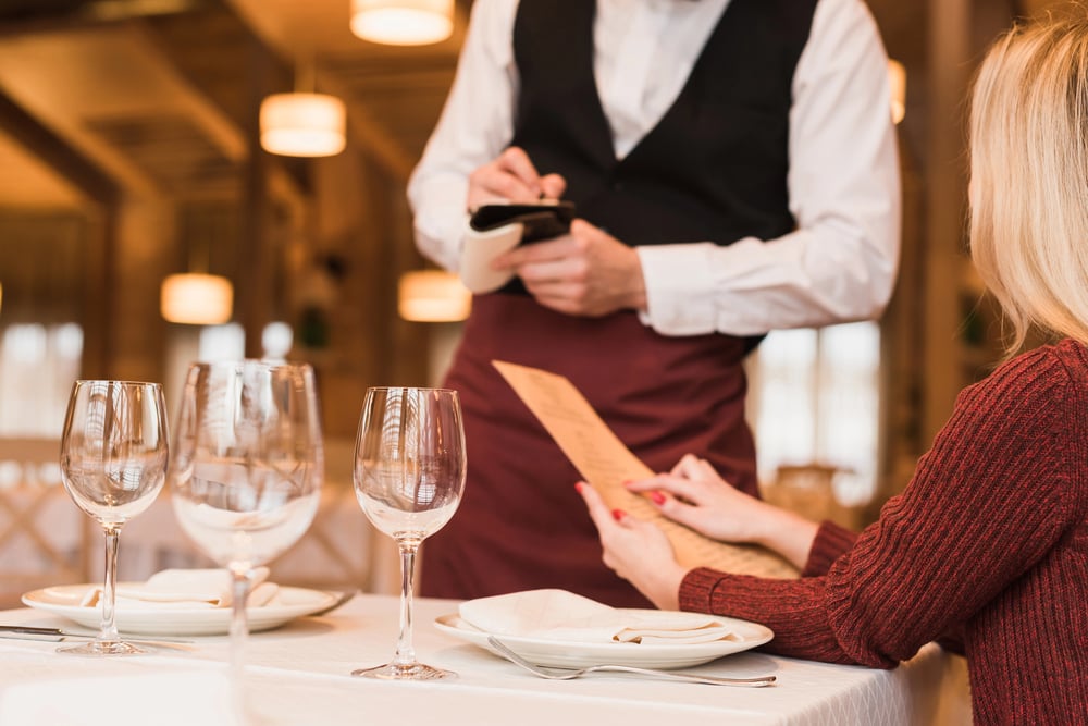
The order in which categories appear on a menu — whether starters come before mains, whether desserts appear at the back or are integrated throughout — influences what gets considered seriously versus what gets skimmed. Items at the top of any category list receive more attention than those further down.
Research on primacy in menu ordering mirrors what’s found in ballot studies and product placement research: the first option people see is the one they’re most likely to hold in mind as the default, even after reading everything else.
Limited Menus Sell More Than Long Ones
The Paradox of Choice, identified by psychologist Barry Schwartz, describes the counterintuitive finding that too many options reduce satisfaction and can actually reduce purchasing. When a menu offers 80 items, decision fatigue sets in and people default to familiar choices or the path of least resistance. Restaurants that have reduced their menus significantly — cutting to 20 or 30 items from larger previous versions — have generally found that sales of the remaining items increase.
Fewer items to consider means more mental energy for each one, which produces better decisions and higher satisfaction with the choice made.
Box Borders Highlight Profit Margins, Not Quality
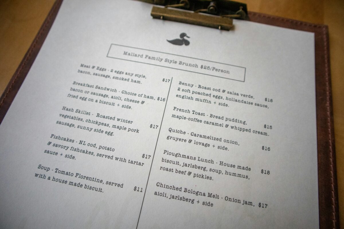
A dish displayed in a bordered box on a menu is not necessarily the best dish. It’s the dish the restaurant most wants you to order — which typically means either the highest margin or the one currently in excess supply. The visual distinction created by a border signals “featured” or “special” to the reader, without specifying what it’s featured for.
Customers generally interpret box treatments as endorsements of quality. In practice, the endorsement is commercial.
Colour Affects Appetite and Perceived Healthiness
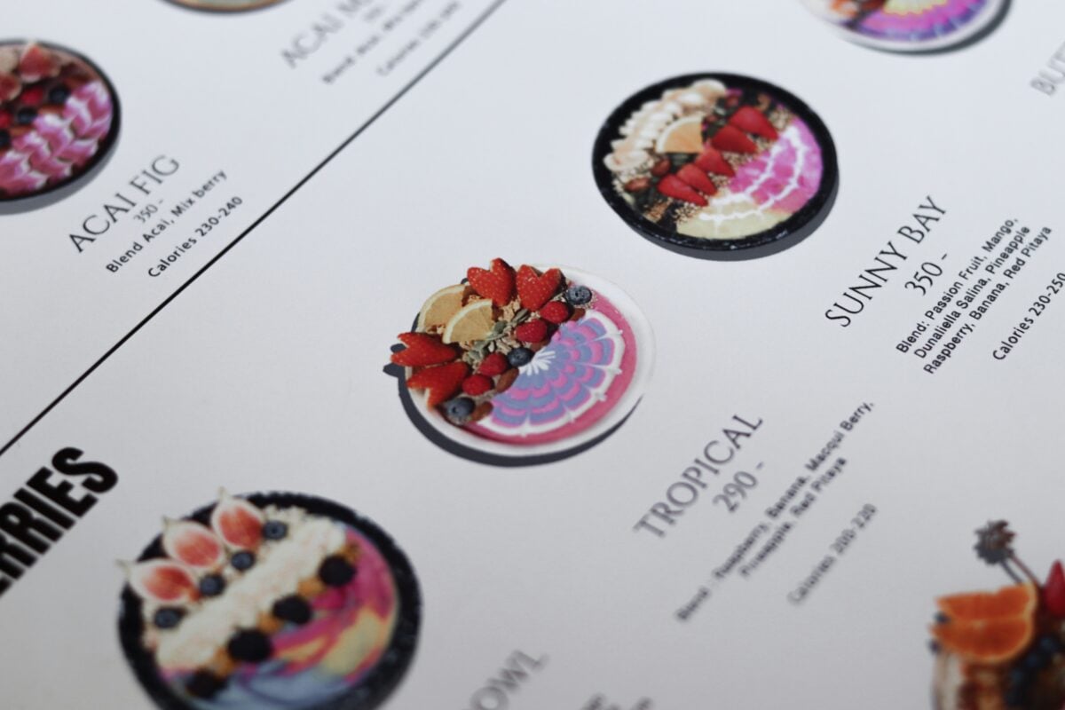
Red and orange stimulate appetite in controlled studies, which is why they appear in fast food branding so consistently. Green signals freshness, health, and naturalness — which is why organic and health-focused restaurants use it heavily regardless of whether the food is actually healthier.
Fine dining menus often use cream, tan, and minimal colour to signal sophistication and restraint. These colour associations operate largely outside conscious awareness. People don’t think “this menu is orange, so I’m hungry” — they just find themselves more interested in eating.
Round Numbers Signal Premium; Odd Pricing Signals Value
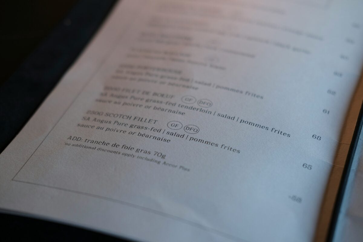
Pricing psychology distinguishes between charm pricing (£9.95 reads as closer to £9 than £10) and premium pricing (£10 signals a restaurant confident enough not to bother with pence tricks). High-end restaurants tend to use round numbers because the deliberate directness signals quality.
Mid-market restaurants tend to use charm pricing because the psychological discount encourages spending. Neither is accidental, and both work as intended on the relevant audience.
Menu Length Signals What Kind of Restaurant You’re In
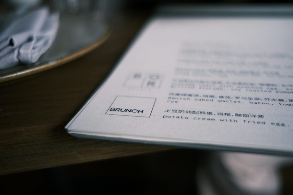
A one-page menu signals focus, confidence, and the conviction that the kitchen does a small number of things extremely well. A twenty-page menu signals something different — range, accessibility, and a willingness to accommodate whatever you feel like.
Both can be commercial strategies rather than reflections of actual culinary philosophy. A restaurant that wants to position itself as high-end will sometimes reduce its menu specifically as a positioning decision, independent of what the kitchen is capable of producing.
Photographs Send Diners Toward the Photographed Item
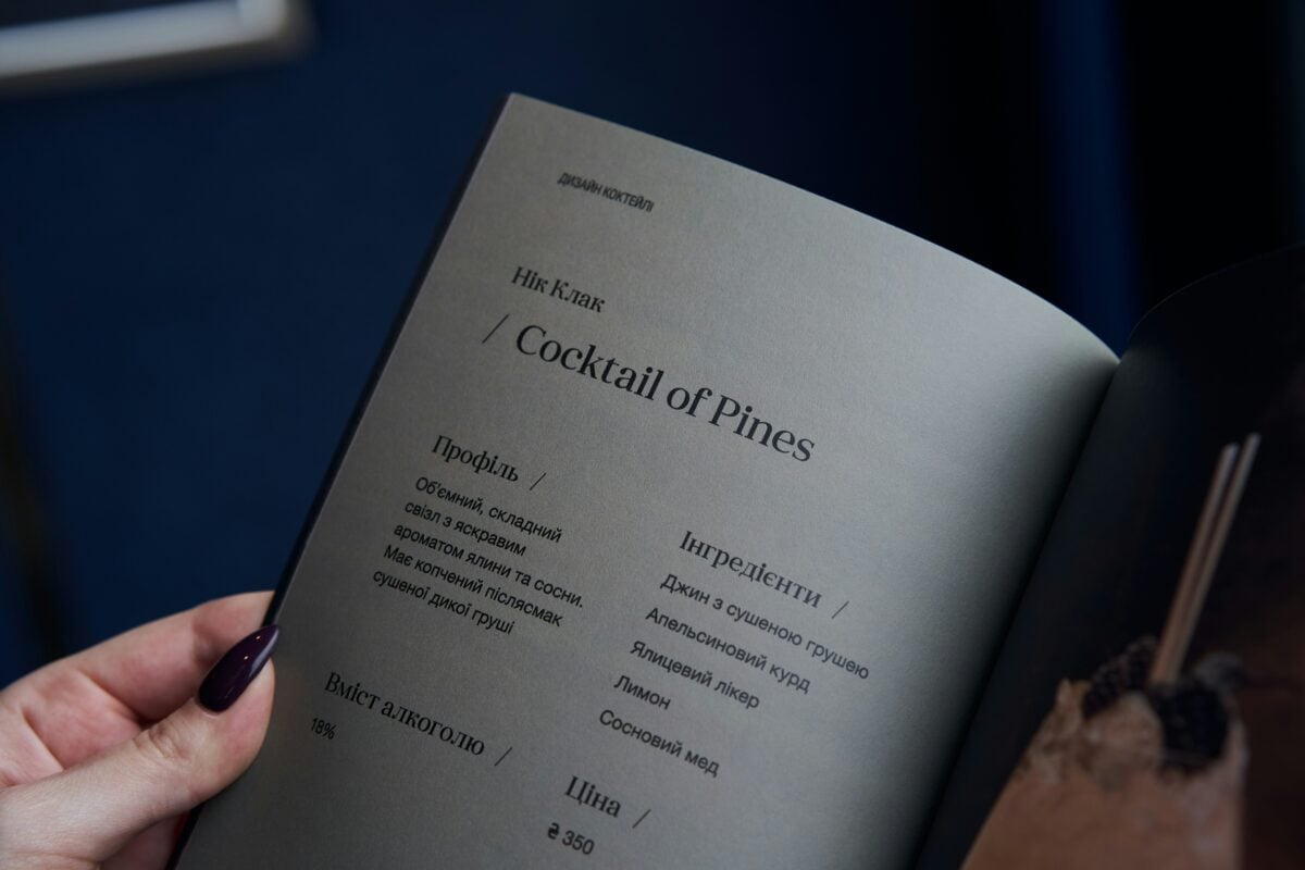
The presence of a photograph on a menu item consistently increases orders for that item, even in contexts where the photograph is mediocre. Fast food menus use this extensively, with backlit display boards dominated by photographed items.
In more upmarket settings, photographs are avoided because they signal a certain kind of restaurant — the type where you might be unsure what the food looks like without visual assistance. The absence of photographs is itself a signal: the restaurant assumes you know what a risotto is and trusts itself to make it well.
Your Mood and Hunger Level Were Already Factored In
Menu designers know that you’re most susceptible to anchoring and descriptive influence when you’re hungry and haven’t yet looked at the drinks list. They know that alcohol loosens restraint on spending.
They know that large groups order differently from couples, and couples on dates order differently from couples on ordinary evenings. Menus for tasting-menu restaurants don’t include choices at all — an extreme application of the same principle: the restaurant that removes your ability to choose exercises the maximum possible control over the experience, and charges premium prices for the privilege.
Every design decision assumes something about the state you’ll be in when you arrive.
The Menu Is a Model of You
What makes restaurant menu psychology genuinely interesting is that it works because restaurants have accurate models of how humans behave. Anchoring works because that’s how price perception functions. The decoy effect works because that’s how comparison and choice resolution function.
Descriptive language raises satisfaction because expectation shapes experience in documented and reproducible ways. None of these techniques are manipulations in a sinister sense — they’re applications of real findings about real behaviour.
The discomfort, if there is any, is less about restaurants taking advantage and more about how much of what feels like a free choice is actually a response to the environment in which the choice is presented. You pick what you pick. You just pick it inside a frame someone else built.
More from Go2Tutors!

- The Romanov Crown Jewels and Their Tragic Fate
- 13 Historical Mysteries That Science Still Can’t Solve
- Famous Hoaxes That Fooled the World for Years
- 15 Child Stars with Tragic Adult Lives
- 16 Famous Jewelry Pieces in History
Like Go2Tutors’s content? Follow us on MSN.