Bizarre History of the First Ever Starbucks Logo
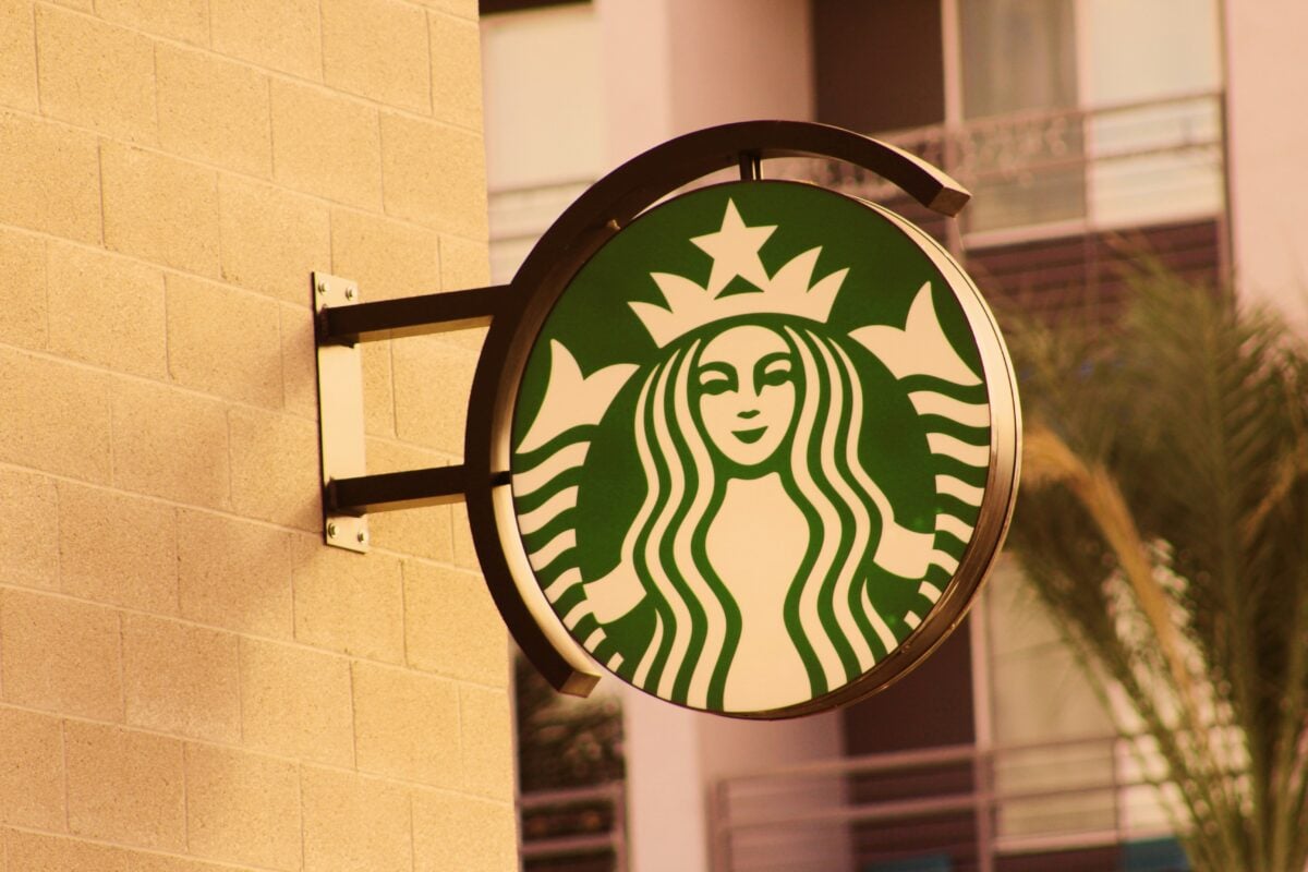
Walk into any Starbucks today and you’ll see a familiar green circle featuring a crowned mermaid with flowing hair. Clean, corporate, recognizable from blocks away.
But that polished symbol bears almost no resemblance to the original logo that graced the first Starbucks store in Seattle’s Pike Place Market back in 1971. The story of how a seductive, bare-breasted siren became today’s sanitized coffee queen involves artistic inspiration, corporate panic, and decades of gradual airbrushing that would make any publicist proud.
The Medieval Inspiration
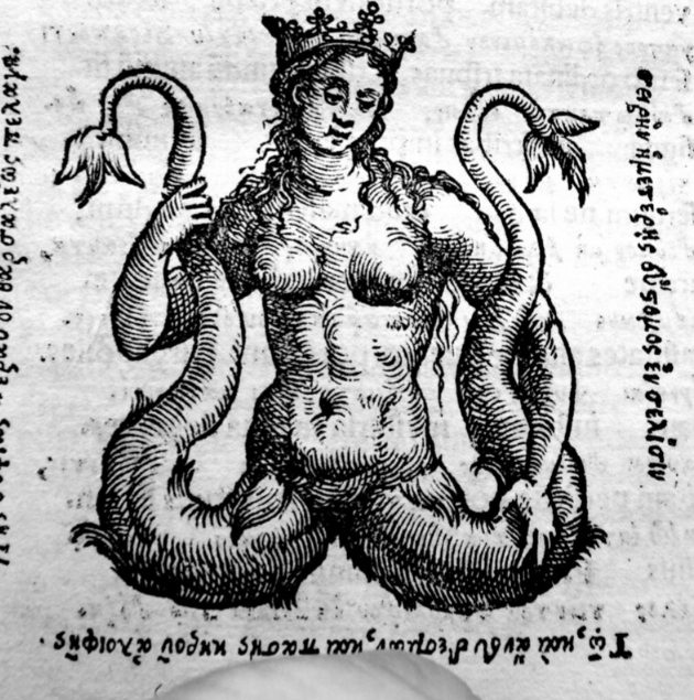
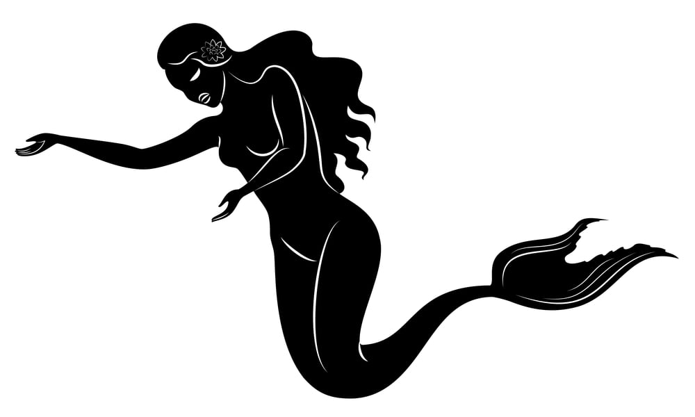
The original Starbucks logo wasn’t born in a boardroom or sketched by a marketing firm. Terry Heckler, the graphic designer tasked with creating the company’s visual identity, spent hours digging through old maritime books and medieval art collections.
He was hunting for something that would capture the seafaring spirit of coffee trading — those long voyages across oceans to bring exotic beans back to port. So when Heckler stumbled across a 16th-century Norse woodcut of a twin-tailed mermaid, he knew he’d found his muse.
The image was raw, powerful, and undeniably provoking. This wasn’t some Disney princess waiting to be rescued.
This was a siren in the truest sense — dangerous, provoking, completely unashamed of her own power.
The Siren’s Shocking Debut
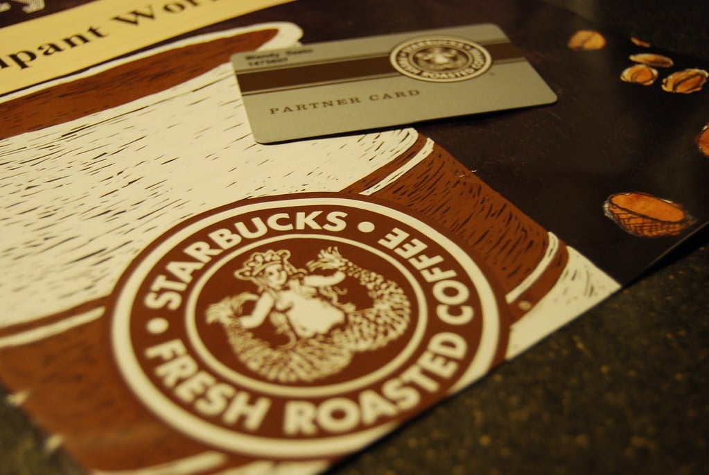
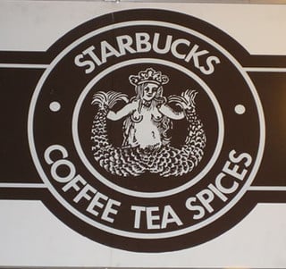
Picture this: it’s 1971, and the first Starbucks logo features a topless mermaid with flowing hair, a naval crown, and two prominent fish tails spread wide (which, depending on how you looked at it, resembled something far more anatomical than aquatic). Her breasts were fully visible, rendered in the bold, unapologetic style of medieval woodcuts that didn’t concern themselves with modern sensibilities.
The brown circular logo surrounded this provoking figure with the words “Starbucks Fresh Roasted Coffee” in a ring around the border. But it was that central image that stopped people in their tracks — sometimes in appreciation, sometimes in shock, always with a reaction.
The three founders, J. Baldwin, Zev Siegl, and Gordon Bowker, had wanted something that would stand out among the Pike Place Market vendors. Mission accomplished.
Public Reaction and Early Controversy

The logo didn’t just raise eyebrows — it practically launched them into orbit. Customers walking by the original store would do double-takes, parents would hurriedly steer their children past the window, and more than a few passersby would stop to debate whether they were looking at art or something that belonged in a very different kind of establishment altogether.
And yet (because controversy has a way of generating curiosity), the provoking imagery worked in Starbucks’ favor during those early years. People remembered the store, talked about it, brought friends by to see the “shocking” logo for themselves. In an era before viral marketing, the siren was generating exactly the kind of word-of-mouth buzz that money couldn’t buy.
The founders had stumbled onto something powerful: a logo that people couldn’t ignore, even when they weren’t entirely sure they approved of it.
The Logo’s Hidden Symbolism
Strip away the obvious controversy, and the original siren actually carried layers of meaning that connected perfectly to coffee culture. In maritime folklore, sirens were known for their irresistible call — they drew sailors off course with promises of something extraordinary.
Sound familiar? That’s essentially what great coffee does: it interrupts your routine, pulls you toward something richer and more complex than whatever you were doing before. The twin tails weren’t just decorative flourishes.
They represented the duality of temptation itself — beauty and danger, comfort and stimulation, the familiar and the exotic all wrapped into one compelling package. Medieval artists understood that the most powerful symbols contained contradictions, and the Starbucks founders had unknowingly tapped into centuries of visual storytelling about desire and transformation.
Corporate Pressure and the First Changes

Success brought scrutiny. By 1987, Howard Schultz had purchased Starbucks and was planning an aggressive expansion beyond Seattle’s bohemian coffee culture. The original siren, with her uncompromising medieval frankness, suddenly seemed less like a charming local quirk and more like a potential public relations nightmare waiting to happen in shopping malls across America.
The first major redesign kept the basic structure but made strategic modifications. The siren’s breasts disappeared behind flowing hair that seemed to have grown considerably longer and more strategically placed. Her navel vanished.
The twin tails became less prominent, less suggestive. She was still recognizably the same figure, but she’d apparently found a medieval swim top somewhere between the old logo and the new one.
The 1992 Makeover
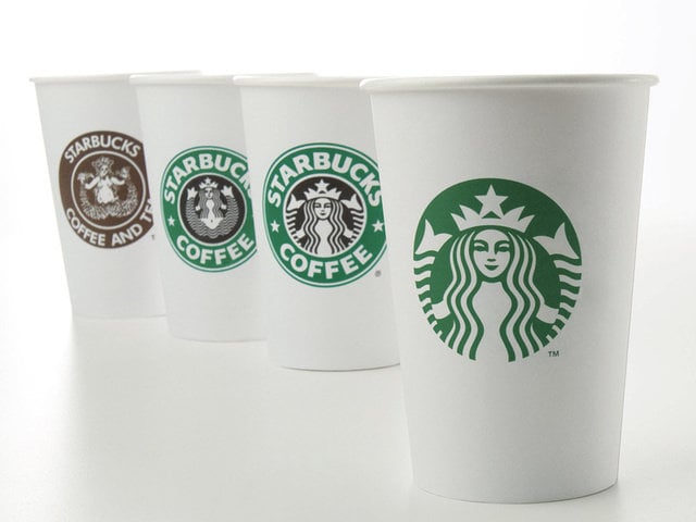
Corporate expansion demanded further sanitization. The 1992 version took the airbrushing process several steps further, cropping the image so tightly that only the siren’s face and crown remained visible.
Her body — the source of all that original controversy — simply disappeared below the frame. This wasn’t just editing; it was strategic amnesia.
Starbucks was betting that customers would accept this new, family-friendly version without mourning the loss of the original’s power. The logo kept the circular green background and maintained enough visual continuity that regular customers could recognize it, but newcomers would never guess what they were missing.
The siren had been transformed from temptress to corporate mascot in a single redesign.
International Expansion Concerns

Different countries, different sensibilities. As Starbucks pushed into international markets throughout the 1990s, executives realized that even their toned-down siren might not translate well across various cultural contexts.
What seemed merely artistic in liberal Seattle could read as offensive in more conservative regions, potentially limiting expansion opportunities before they even began. The solution was further abstraction.
Each redesign moved the logo another step away from its literal maritime origins and closer to pure brand recognition. The siren was becoming less of an actual mythological figure and more of a stylized corporate symbol that happened to have historical roots in something more interesting.
Function was overtaking form, market research was overruling artistic vision, and the original’s rebellious spirit was being focus-grouped into submission.
The Modern Minimalist Approach
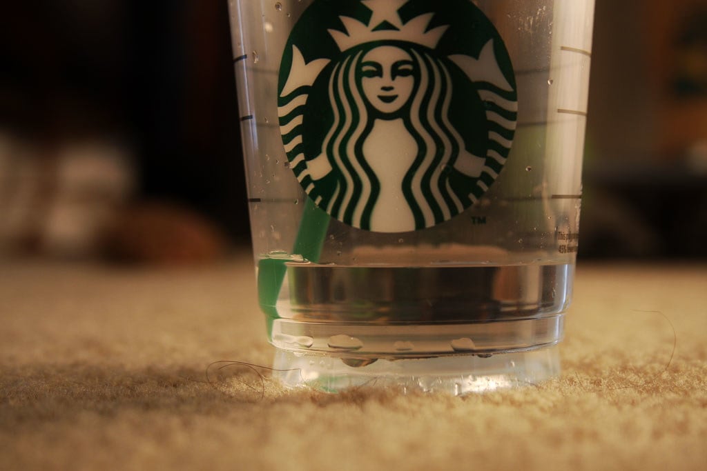
By 2011, Starbucks had enough brand recognition to make a bold move: they dropped the text entirely. The current logo features just the siren herself — though she’s been so stylized and simplified that she bears only the faintest resemblance to Heckler’s original medieval inspiration.
Her crown is now a simple geometric pattern, her hair flows in perfectly symmetrical waves, and her face has been smoothed into the kind of idealized features you’d find in a corporate style guide. The twin tails are still there, but they’ve been abstracted into decorative elements that most customers probably don’t even recognize as anatomical features.
She’s become a green symbol that means “coffee” to millions of people worldwide, but the dangerous allure that made the original logo so compelling has been completely sanitized away. Mission accomplished, depending on your perspective.
Lost Artistic Heritage

Something genuine was lost in all that corporate evolution. The original logo connected Starbucks to centuries of maritime art and mythology in a way that felt authentic and unforced.
Medieval woodcuts weren’t trying to sell anything — they were capturing human fascination with beauty, danger, and the unknown in its purest form. Modern corporate logos, no matter how well-designed, can’t replicate that kind of historical weight.
They’re created by committee, tested by focus groups, and designed to offend no one while appealing to everyone. The result is usually competent and forgettable.
The original Starbucks siren was neither competent nor forgettable — she was art that happened to sell coffee, rather than coffee marketing that happened to reference art.
The Collector’s Market

Try to find an original 1971 Starbucks logo item today. Mugs, signs, shopping bags, anything bearing that first uncensored siren design commands serious money among collectors who understand exactly what they’re buying.
These aren’t just vintage coffee memorabilia — they’re artifacts from a brief moment when a major corporation accidentally embraced something genuinely challenging and historically significant. The irony is obvious: items that Starbucks has spent decades trying to make people forget are now worth more than anything they’re currently producing.
Collectors aren’t just buying nostalgia; they’re buying authenticity, artistic integrity, and a connection to something that felt real before it got focus-grouped into submission. The market has spoken, and it preferred the version that made people uncomfortable.
Cultural Impact and Legacy
That original logo influenced an entire generation of coffee shop branding, even if most people don’t realize it. Independent coffee shops still reach for maritime imagery, medieval symbolism, and provoking design elements that trace directly back to what Heckler created for Starbucks in 1971.
They understand intuitively what corporate Starbucks has forgotten: coffee culture thrives on a little bit of rebellion. The original siren represented something that modern branding has largely abandoned — the idea that a logo could be genuinely surprising, that it could make people feel something beyond mere brand recognition.
She was art first and marketing second, which is precisely why she was so effective and precisely why she had to go. Corporate success and artistic integrity rarely coexist peacefully, and someone always has to blink first.
A Mythology Sanitized
Walk into any Starbucks today and look closely at that green circle on your cup. Somewhere underneath all those layers of corporate revision and focus-group refinement, there’s still a medieval siren calling sailors toward something extraordinary.
She’s been airbrushed and abstracted beyond recognition, but she’s still there — a faint echo of what happens when art and commerce collide before commerce figures out how to win cleanly. The original logo wasn’t just bizarre; it was fearless.
That’s the real difference, and that’s what made it unforgettable.
More from Go2Tutors!

- The Romanov Crown Jewels and Their Tragic Fate
- 13 Historical Mysteries That Science Still Can’t Solve
- Famous Hoaxes That Fooled the World for Years
- 15 Child Stars with Tragic Adult Lives
- 16 Famous Jewelry Pieces in History
Like Go2Tutors’s content? Follow us on MSN.