Evolution of Professional Sports Team Logos
Professional sports teams know that a logo isn’t just a pretty picture—it’s the face of a franchise.
Over the decades, these emblems have transformed from simple designs into carefully crafted symbols that represent entire cities and fan communities.
Some teams have stuck with their original look, while others have gone through dramatic makeovers that left fans either cheering or cringing.
Here is a list of 15 professional sports team logos and how they’ve evolved over the years.
New England Patriots
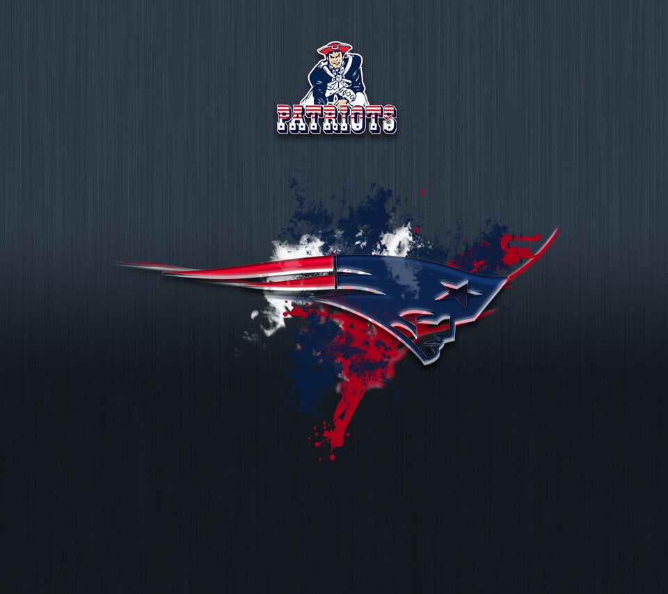
The Patriots started out in 1960 with a simple tricorn hat as their logo, which lasted exactly one season before they realized it needed more personality.
In 1961, they introduced Pat Patriot, a cartoonish Revolutionary War soldier hiking a football.
This beloved character stuck around for over three decades, becoming deeply embedded in New England sports culture.
The big shift came in 1993 when new ownership wanted something sleeker for the retail market, so designer Ken Loh created what fans now call ‘Flying Elvis’—a streamlined profile of a patriot’s head with a star on his hat.
The logo got a minor facelift in 2000 with darker blue shades and sharper lines, giving it the modern look that’s accompanied six Super Bowl victories.
Los Angeles Dodgers

The Dodgers’ logo journey mirrors their geographic transformation from Brooklyn to Los Angeles.
When they were the Brooklyn Superbas starting in 1899, they used an ornate Gothic-style ‘B’ that changed colors from red to blue over the years.
The team experimented with various frames around the letter, including diamonds and circles, before ditching the ‘B’ entirely in 1938 when they adopted the name Dodgers.
That’s when the iconic script wordmark was born, featuring elegant cursive lettering that slanted upward.
After moving to Los Angeles in 1958, they added the famous red baseball with motion lines above the word ‘Dodgers,’ creating the timeless design that’s barely changed since.
The 2012 update made subtle refinements like removing the tail from the ‘O’ and smoothing the connection between letters, but the overall look remains wonderfully retro.
Chicago Bulls
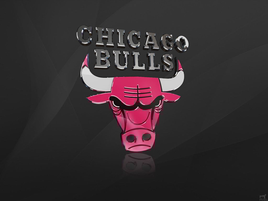
Here’s something remarkable—the Bulls have never changed their logo since joining the NBA in 1966.
Designer Dean P. Wessel created the fierce red bull’s head with white horns tipped in red, and it’s been the exact same ever since.
The logo perfectly captured the strength and aggression the team wanted to project, especially fitting for a city with deep meatpacking industry roots.
While other teams have felt pressure to modernize or refresh their look, the Bulls recognized they had something special from day one.
The fact that Michael Jordan and the dynasty teams of the 1990s wore this unchanged logo only cemented its legendary status in sports history.
Toronto Maple Leafs
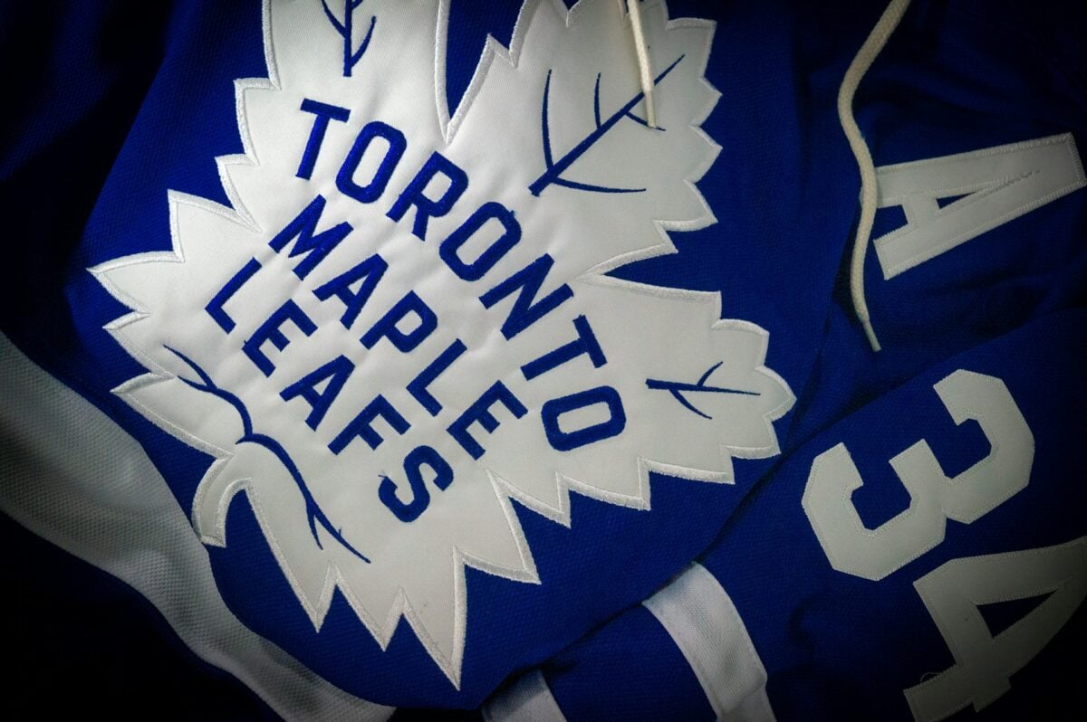
The Maple Leafs adopted their name and leaf-based logo in 1927 when owner Conn Smythe bought the team, previously known as the St. Patricks.
Smythe chose the maple leaf to honor the Canadian soldiers who fought in World War I under the Maple Leaf Regiment, where he had served.
The team has gone through eight different logo variations since then, but they’ve always featured Canada’s national symbol at the center.
Early versions showed detailed, realistic leaves with intricate veining, while later designs simplified the shape for better reproduction on merchandise and broadcasts.
The current logo features an 11-point maple leaf in blue and white, the team’s signature colors, enclosed in a clean circular design that balances tradition with contemporary aesthetics.
Los Angeles Lakers
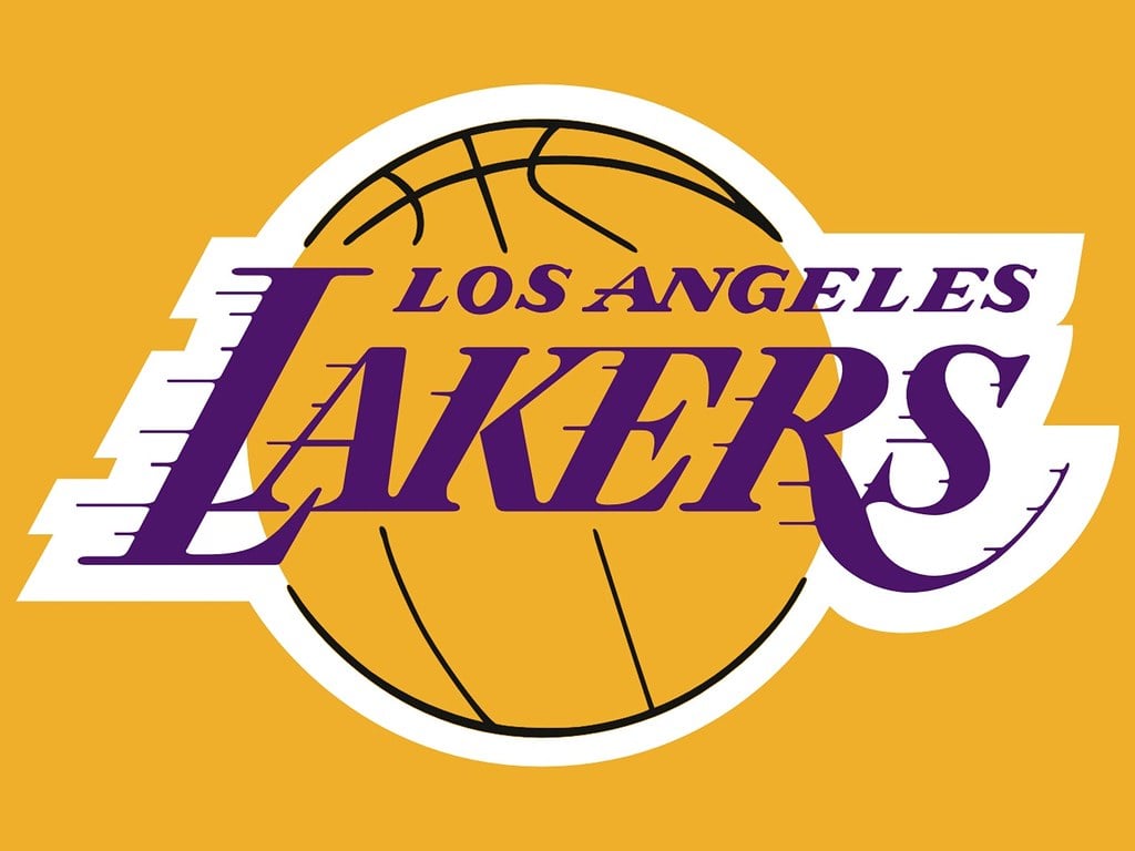
The Lakers’ logo tells the story of a team that kept a geographically nonsensical name after relocating from Minnesota.
The original Minneapolis Lakers logo featured a basketball with reference to the ‘Land of 10,000 Lakes,’ which made perfect sense for Minnesota.
When they moved to Los Angeles in 1960, they kept the Lakers name despite LA’s notable lack of lakes, focusing instead on developing the now-iconic purple and gold color scheme.
The current wordmark logo, introduced in the 1970s, uses these royal colors to project glamour and success rather than geographic accuracy.
The simple text-based design has seen minor tweaks over the years but remains one of the most recognizable logos in professional sports.
Detroit Lions
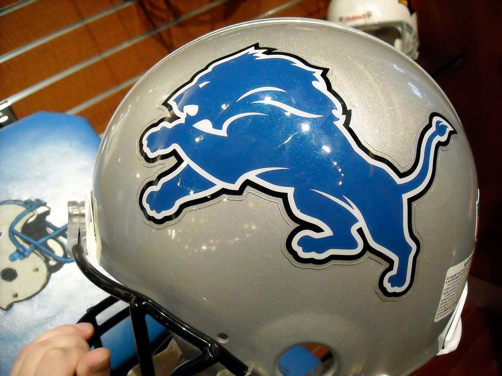
The Lions debuted in 1952 with a logo showing a crouching lion beside a football player, which was pretty busy by today’s standards.
In 1961, they simplified dramatically to a white lion jumping over two blue bars of different shades, creating a cleaner and more distinctive look.
The real refinement came in 1970 when they introduced the lunging blue lion that forms the basis of today’s logo.
Over the following decades, the team made subtle adjustments to the lion’s outline, sharpening edges and refining the white highlights to make the design pop more on helmets and uniforms.
The shape has remained consistent since 1970, showing that sometimes finding the right design means sticking with it rather than constantly chasing trends.
Green Bay Packers

The Packers started with a simple logo from 1951 to 1955 showing a football with blocky green lettering spelling ‘Packers.’
They briefly tried a more complex design in 1956 featuring a football player inside the outline of Wisconsin, but it felt cluttered.
The breakthrough came in 1961 with the introduction of the ‘G’ logo—a white letter G on a green oval that looked simple but effective.
This design has barely changed since then, with the only notable update in 1980 being the addition of a yellow outline around the green oval.
The Packers proved that minimalism works, creating one of the most instantly recognizable logos in the NFL despite using just a single letter.
Golden State Warriors
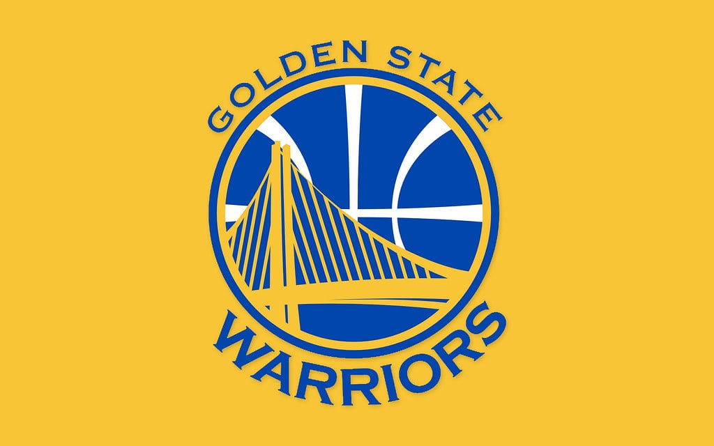
The Warriors have had one of the most turbulent logo histories in the NBA, reflecting the team’s ups and downs both on and off the court.
After finally moving away from Native American imagery in 1969, they adopted a cable car design when playing in San Francisco, complete with whimsical script letters and bright gold coloring.
The 1997 redesign was universally panned for its awkward cartoon lightning bolt and forgettable color palette, and unsurprisingly, those teams struggled mightily.
In 2010, the Warriors modernized with a sleeker bridge design referencing the Bay Area, and this coincided with their transformation into a dynasty.
The current logo, refined in recent years, features bold gold and blue colors with a simplified bridge icon that feels both contemporary and connected to local culture.
Brooklyn Nets

The Nets went through an identity crisis that lasted decades when they were the New Jersey Americans, then the New York Nets, then the New Jersey Nets.
None of these iterations produced a memorable logo that resonated with fans or captured the imagination.
Everything changed in 2012 when the team moved to Brooklyn and brought in Jay-Z as part-owner.
He pushed for a radical simplification—a stark black and white design featuring just a basketball with a ‘B’ in the center.
This minimalist approach was controversial at first but has since been praised for its clean, modern aesthetic that stands out in an era of increasingly complex logos.
The design perfectly captures Brooklyn’s urban sophistication.
Seattle Seahawks
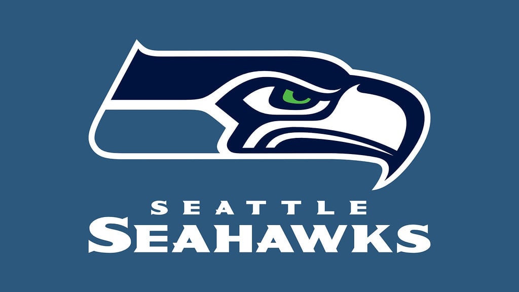
The Seahawks introduced their original logo in 1976, featuring a Native American-inspired design based on the Pacific Northwest’s tribal art traditions.
The logo showed a stylized seahawk head in profile, but the early version had softer lines and less aggressive features.
Over the years, the team made the bird progressively fiercer, with sharper angles and more intense coloring.
The 2002 redesign brought the most dramatic changes, making the eye piercingly green, the beak more menacing, and the overall look significantly more intimidating.
The logo draws from the Thunderbird mythology of Indigenous peoples in the region, and the modern version perfectly balances cultural respect with contemporary athletic branding.
Boston Celtics
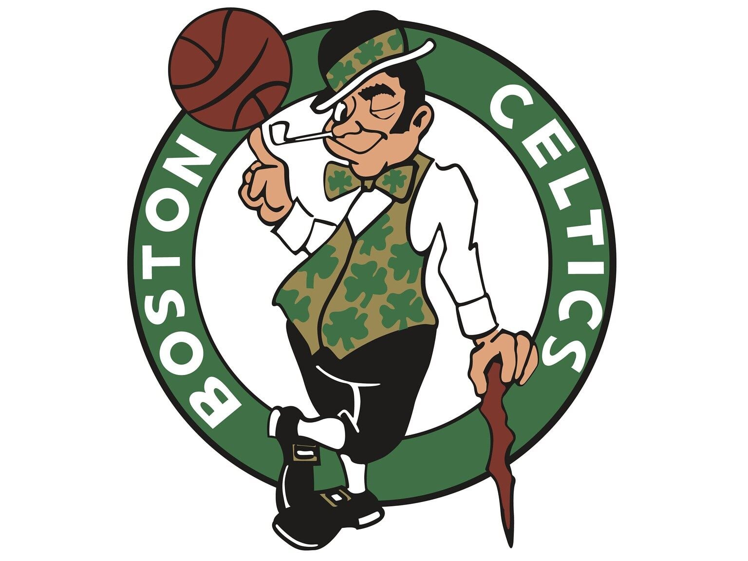
The Celtics’ lucky leprechaun has been spinning a basketball since the 1950s, designed by Zang Auerbach, brother of legendary coach Red Auerbach.
The original design showed a simpler, less detailed character that looked almost amateurish by today’s standards.
Over the decades, artists added more personality to the little guy—giving him a more mischievous expression, adding a shamrock to his hat, and refining the details of his clothing and facial features.
The leprechaun perfectly represents the team’s Irish heritage and Boston’s strong Irish-American community.
While the core concept has never changed, the gradual improvements have kept the logo feeling fresh without abandoning the tradition that makes it special.
New York Yankees
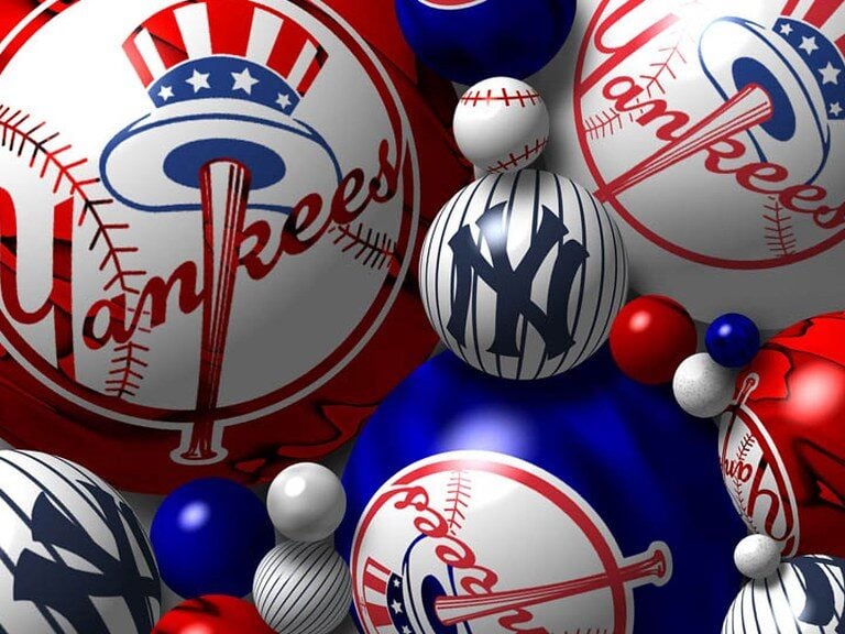
The Yankees’ interlocking ‘NY’ logo is arguably the most famous in all of sports, worn by people worldwide who’ve never watched a baseball game.
Introduced in 1909, the design has remained virtually unchanged for over 115 years, which is extraordinary in professional sports.
The logo appeared on the team’s uniforms in 1936 and quickly became synonymous with baseball excellence and New York City itself.
The interlocking letters were created by Tiffany & Co. and their timeless elegance reflects the sophistication the Yankees have always tried to project.
While the team has made microscopic adjustments to line weights over the years, the logo’s enduring power comes from never messing with perfection.
Tampa Bay Buccaneers
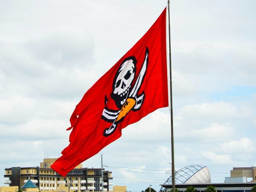
The Buccaneers started in 1976 with ‘Bucco Bruce,’ a winking pirate with a feathered hat and a dagger between his teeth.
This cartoonish logo appeared on the team’s infamous creamsicle orange uniforms and became beloved despite the team’s terrible record.
In 1997, the Bucs went in a completely different direction with a menacing pirate flag featuring a red skull, crossed swords, and a football-shaped bone.
This darker, more aggressive design coincided with the team’s transformation into winners, culminating in a Super Bowl victory in 2003.
The rebrand showed how a logo can signal a fresh start and new expectations, though many fans still nostalgically remember Bucco Bruce.
Toronto Raptors
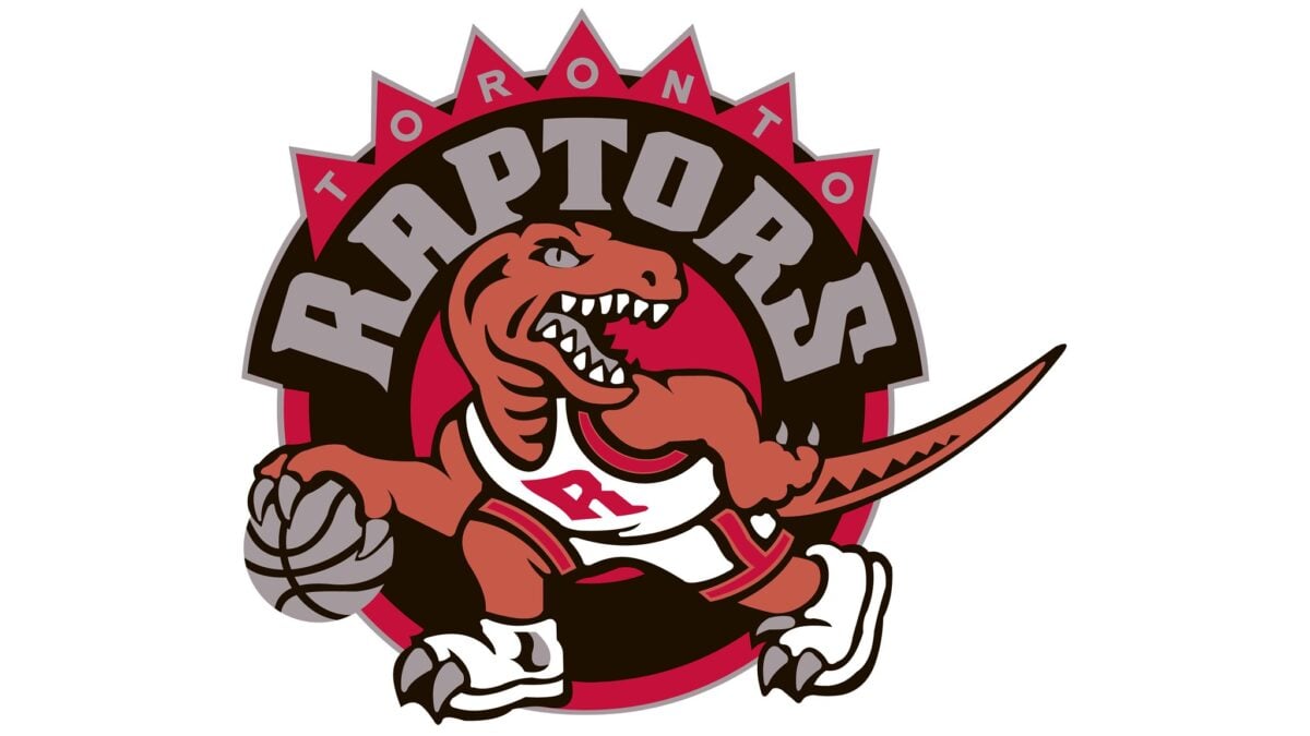
When the Raptors joined the NBA in 1995, they rode the wave of ‘Jurassic Park’ mania with a purple cartoon dinosaur dribbling a basketball.
The original logo was playful and kid-friendly, featuring bright purples and reds that made it look more like a toy commercial than a professional sports team.
In 2015, the franchise completely overhauled its image with a mature, sophisticated redesign.
The new logo features a stylized basketball with claw marks slashing through it, rendered in black, silver, and red.
This grown-up approach coincided with the team’s rise as a legitimate contender, proving that sometimes you need to leave childhood behind to be taken seriously.
Denver Broncos
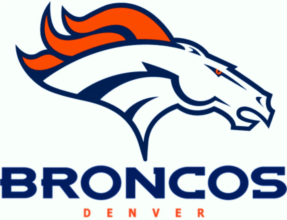
The Broncos trotted through several logo iterations before landing on their current fierce stallion design.
Early versions featured more realistic horse depictions that lacked personality, failing to capture the wild spirit of the American West.
The 1997 redesign changed everything with a dynamic bronco head in profile, featuring flame-red eyes, an orange mane, and a determined expression that screams intensity.
The horse appears to be charging forward, creating a sense of momentum and aggression that perfectly suits a football team.
This logo accompanied back-to-back Super Bowl victories in 1998 and 1999, forever linking the fierce new look with championship success.
A Legacy in Motion

These logo evolutions show that sports branding is never really finished—it’s a constant conversation between honoring tradition and embracing change.
The teams that have succeeded best are those that understood when they had something worth preserving and when it was time for a fresh start.
Whether it’s the Bulls keeping their original design for nearly 60 years or the Nets completely reinventing themselves for a new city, these logos have become more than just team identifiers.
They’re cultural touchstones that unite communities, spark childhood memories, and sometimes even influence whether a franchise wins or loses.
The best logos transcend sports entirely, becoming symbols recognized and worn by millions who simply appreciate great design.
More from Go2Tutors!

- The Romanov Crown Jewels and Their Tragic Fate
- 17 Halloween Costumes Once Considered Taboo
- Famous Hoaxes That Fooled the World for Years
- 15 Child Stars with Tragic Adult Lives
- 16 Famous Jewelry Pieces in History
Like Go2Tutors’s content? Follow us on MSN.