Famous Brand Colours That Triggered Legal Battles Or Trademark Disputes
A single hue might look quiet at first glance. Seen on boxes, shop fronts, little symbols – doing its job without shouting.
Still, today, some tones belong so tightly to one name that courts get called in. Copying them leads to arguments about who owns what eye sees.
Fights pop up not over shape or words but a tint alone. Proof that even the simplest colour holds real power when minds link it to only one place.
A few well-known hues started as simple design picks, yet somehow landed in legal fights. These cases didn’t just stay in court – they shaped how brands pick shades even now.
What began with paint chips and palettes turned into disputes over identity. Some companies fought hard to claim a tint as theirs alone.
Over time, judges had to decide if colour could be owned. Those rulings echo every time a logo gets painted or packaged.
Tiffany Blue

Few colours are as instantly recognizable as Tiffany Blue, the soft robin’s-egg shade associated with the luxury jeweler Tiffany & Co. The company began using the colour in the mid-1800s, long before modern branding rules existed.
Over time, the shade became inseparable from the idea of elegance and exclusivity, particularly through its iconic gift boxes. Tiffany successfully secured trademark protection for its colour in specific commercial contexts, especially jewelry packaging and branding.
Legal disputes arose when other companies used similar shades in ways that could imply association. These cases reinforced the idea that a colour, when consistently used and strongly linked to a brand, can function like a logo in the public mind.
UPS Brown

UPS built an entire identity around a deep, practical shade of brown. Chosen originally to hide dirt on delivery trucks, the colour eventually became a symbol of reliability and professionalism.
The company leaned into this association so heavily that it began referring to itself as ‘the brown company’ in advertising. UPS has defended its colour in multiple disputes, particularly when competitors used similar tones in shipping and logistics.
While no one owns brown outright, UPS demonstrated that consistent use within a specific industry can give a colour legal significance. The lesson was clear: context matters just as much as the shade itself.
T-Mobile Magenta

T-Mobile’s bright magenta is one of the most aggressively defended colours in modern branding. The company has pursued legal action against other telecommunications firms and even unrelated businesses for using similar shades in marketing materials.
These disputes often hinged on whether consumers might assume a connection to T-Mobile. Some cases succeeded, while others faced pushback from courts and public opinion.
Even so, the disputes highlighted how colour trademarks can stretch beyond logos into broader brand presence. Magenta became not just a design choice, but a signal of corporate identity worth protecting.
Cadbury Purple

Cadbury’s association with a specific shade of purple dates back more than a century, tied to its chocolate packaging. The company sought trademark protection for the colour, arguing that consumers directly associated that purple with Cadbury products.
Legal battles emerged when competitors used similar shades, leading to lengthy court proceedings. In some jurisdictions, Cadbury faced challenges proving exclusivity, while in others it secured limited protection.
These mixed outcomes showed how difficult it can be to claim ownership over a colour, even with deep historical roots.
Coca-Cola Red

Coca-Cola red feels almost universal, appearing everywhere from vending machines to holiday decorations. While the company never claimed exclusive rights to the colour red itself, it has defended specific uses tied closely to its branding.
Disputes typically arose when competitors mimicked Coca-Cola’s overall visual identity rather than the colour alone. Courts often viewed the red as one part of a larger brand system.
The takeaway was subtle but important: colour protection is strongest when paired with other distinctive elements.
Christian Louboutin Red

Christian Louboutin’s red-soled shoes turned a design detail into a luxury signature. The vivid red sole became a defining feature, instantly signaling high-end fashion.
When other designers used red soles, Louboutin took legal action, arguing trademark infringement. Courts ultimately granted protection, but with limitations.
The ruling recognized the red sole as a valid trademark only when contrasted with a different shoe color. This case became a landmark example of how colour can be protected in fashion, provided it functions as a clear brand identifier rather than a general design trend.
Owens-Corning Pink

Owens-Corning insulation stands out for its unmistakable pink color, chosen initially for differentiation rather than marketing flair. Over time, the colour became so closely associated with the company that it secured trademark protection.
The company defended its pink insulation against competitors who attempted to use similar shades. Courts acknowledged that, in this specific industrial context, pink had become a source identifier.
This case demonstrated that even utilitarian industries can build strong brand associations through colour alone.
John Deere Green And Yellow

John Deere’s green and yellow color scheme is deeply ingrained in agricultural culture. Farmers often recognize equipment from a distance based purely on these colours.
John Deere has pursued legal action against companies that used similar combinations on farm machinery. These disputes focused on the overall impression created by the colour pairing rather than individual shades.
Courts generally sided with John Deere when confusion seemed likely. The cases reinforced how colour combinations, not just single hues, can carry trademark value.
Barbie Pink
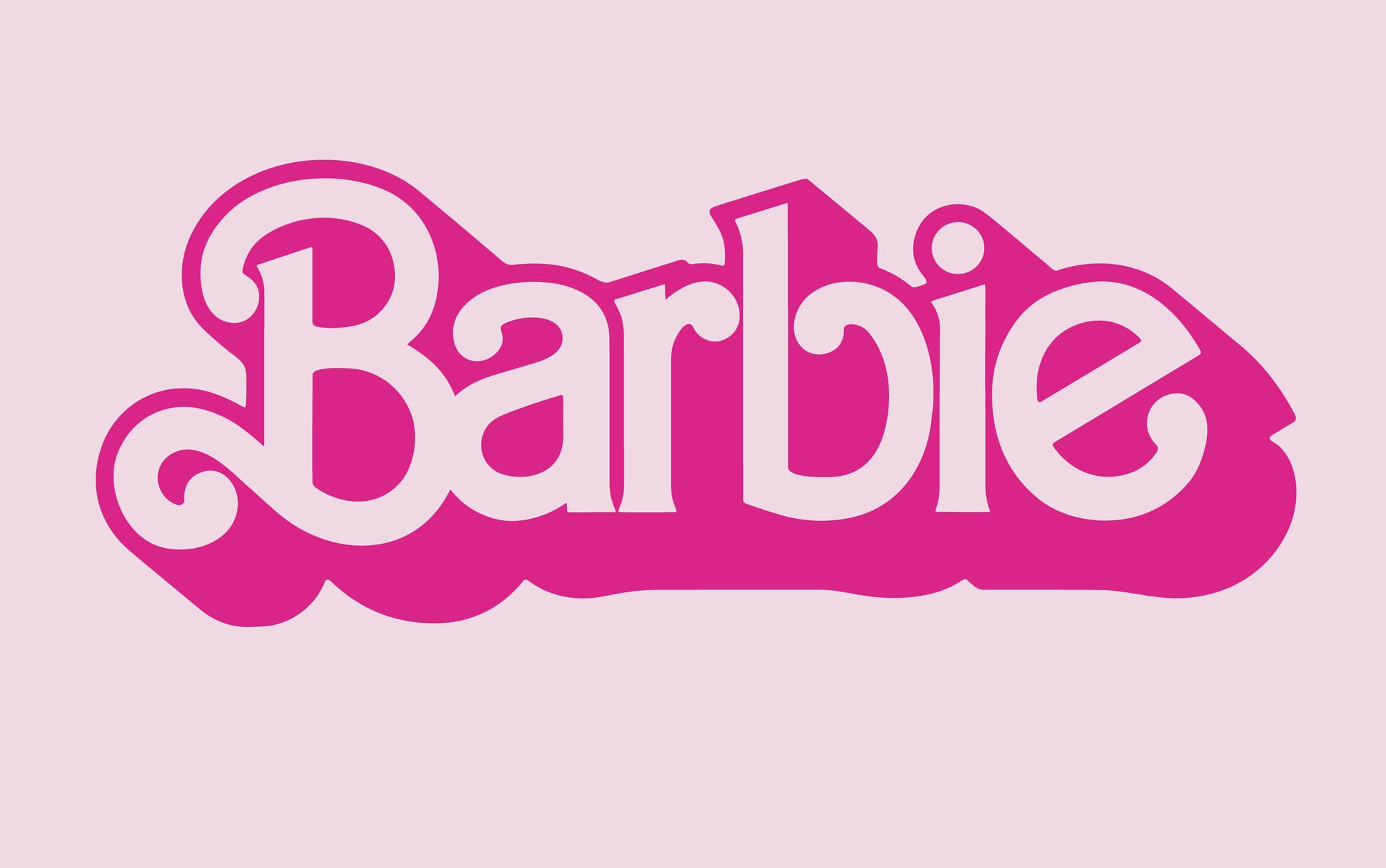
Mattel’s Barbie brand is inseparable from a particular shade of pink that has symbolized the doll’s identity for generations. As the brand expanded into clothing, accessories, and collaborations, disputes emerged over the use of similar pink tones.
Mattel defended its colour associations in various legal contexts, often arguing that competitors were attempting to ride on Barbie’s cultural recognition. While outcomes varied, the disputes underscored how colour can become shorthand for an entire lifestyle brand.
3M Canary Yellow

3M’s Post-it Notes are instantly recognizable thanks to their canary yellow color. The shade originated almost by accident, but it quickly became a defining feature of the product.
As Post-it Notes gained popularity, the colour gained commercial significance. 3M defended its use of canary yellow when competitors launched similar products.
Courts examined whether consumers associated that specific shade with 3M alone. The case showed how even everyday office supplies can develop strong colour-based identities over time.
Orange And Black In Construction Equipment

Several construction equipment manufacturers have fought over orange-and-black color schemes, arguing that the combination signals specific brands. These disputes often involved heavy machinery where color plays a practical role in visibility and safety.
Courts tended to scrutinize whether the colours served functional purposes or brand identification. When functionality dominated, trademark claims weakened.
These cases helped clarify the boundary between practical design and brand ownership.
Why Colour Became A Legal Battlefield

Colour disputes did not arise simply because companies wanted control. They emerged as branding became more sophisticated and competitive.
In crowded markets, visual shortcuts help consumers make quick decisions, and colour is one of the fastest signals available. Courts increasingly recognized that colours could function like words or symbols, provided they clearly identified a single source.
At the same time, judges remained cautious, aware that granting exclusive rights too broadly could limit fair competition. The resulting rulings reflect a careful balancing act rather than blanket permission.
How These Battles Shape Modern Branding

These days, picking one colour for a brand makes teams pause. Courts favor steady choices built over time with strong links in people’s minds.
Still, claiming sole rights to a shade demands solid proof, not just hope. Nowhere is change clearer than online, where hues spread fast between markets and nations.
One moment a tint seems fresh, the next it blends into the background. This shift grows from old arguments about just how much control anyone should have over a single colour.
Why These Colours Still Matter

One colour can spark a courtroom battle, showing just how much people rely on what they see. Started as simple decisions about looks, now those shades carry weight like property.
As rulings pile up, new businesses pick hues more carefully while big brands adjust their visuals bit by bit. Today, color still shapes how brands are seen.
From past legal battles emerges a lesson: basic choices hold weight – emotion, recall, value – when applied steadily, on purpose.
More from Go2Tutors!

- The Romanov Crown Jewels and Their Tragic Fate
- 13 Historical Mysteries That Science Still Can’t Solve
- Famous Hoaxes That Fooled the World for Years
- 15 Child Stars with Tragic Adult Lives
- 16 Famous Jewelry Pieces in History
Like Go2Tutors’s content? Follow us on MSN.