Famous Logos That Looked Different
Logos are everywhere.
They’re on the products people buy, the apps they use, and the stores they visit.
But what most people don’t realize is that many of the world’s most recognizable logos didn’t always look the way they do now.
Some started out clunky and weird, while others were just plain hard to look at.
Let’s take a look at some famous brands that completely changed their logos over the years.
You might be surprised at how different they used to be.
Apple

The first Apple logo wasn’t a sleek, bitten fruit.
It was a detailed drawing of Isaac Newton sitting under an apple tree, surrounded by a decorative border that looked like something from an old book.
Steve Jobs ditched that design after just one year because it was too complicated and didn’t work well at small sizes.
The rainbow-striped apple that came next in 1977 was much simpler and became iconic for decades before Apple switched to the clean, monochrome version people know today.
Starbucks

The original Starbucks logo from 1971 featured a mermaid with two tails, and she was shown in a way that would definitely raise eyebrows today.
The design was brown, not green, and much more detailed with woodcut-style lines everywhere.
Over the years, Starbucks zoomed in closer on the mermaid’s face and made her look more family-friendly.
The current logo dropped the words ‘Starbucks Coffee’ entirely in 2011, leaving just the simplified green siren that everyone recognizes instantly.
Shell

Shell’s logo has been around since 1900, but it started as a realistic drawing of a mussel shell, not the scallop shell people see today.
The early versions were black and white and looked like something from a biology textbook.
It wasn’t until 1948 that Shell introduced the red and yellow colors that are now synonymous with the brand.
The company has refined the shape over and over, making it simpler each time until it became the bold, clean design that sits on gas stations worldwide.
Nike

Before the famous swoosh, Nike didn’t really have a proper logo.
The company paid a design student named Carolyn Davidson just thirty-five dollars in 1971 to create the swoosh, and even then, co-founder Phil Knight said he didn’t love it but hoped it would grow on him.
Early Nike products featured the swoosh with the company name written above it in a chunky, outlined font that looks dated now.
The brand eventually dropped the wordmark altogether, proving that the swoosh alone had become powerful enough to represent the entire company.
Pepsi

Pepsi has changed its logo more times than most people can count.
The original logo from 1898 was just the word ‘Pepsi-Cola’ written in elaborate script that looked fancy but was hard to read.
In the 1940s, Pepsi introduced the red, white, and blue bottle cap design that became the foundation for everything that followed.
The company has tweaked the circular design constantly, and the current version from 2008 features an asymmetrical white wave that some people think looks like a smile while others find it awkward and unnecessary.
Volkswagen

The Volkswagen logo started during a very dark period in history, created under Nazi Germany in the 1930s.
The original design featured the intertwined V and W letters inside a gear-like circle that represented the company’s industrial roots.
After World War II, the logo was simplified significantly to distance the brand from its past.
The modern version is clean and minimalist, and in 2019, Volkswagen flattened the design even more to work better on digital screens and give the brand a more approachable feel.
Firefox
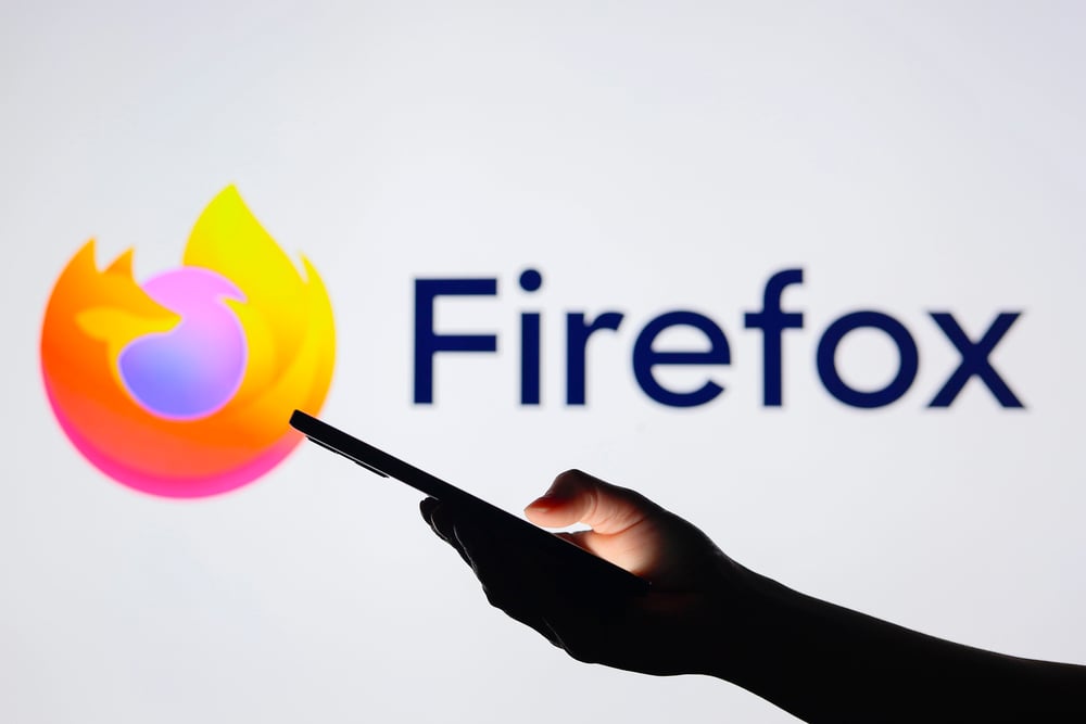
Firefox’s logo is famous for showing a fiery fox wrapped around a blue globe, but the original version from 2002 looked nothing like that.
The first logo featured a stylized phoenix bird, not a fox, because the browser was initially called Phoenix before legal issues forced a name change.
When it became Firefox in 2004, the logo showed a more realistic-looking fox with detailed fur and a busier overall design.
Mozilla has simplified the logo several times since then, and the latest version is so minimal that the fox is barely recognizable as an animal anymore.

Instagram launched in 2010 with a logo that tried to look like an actual vintage camera, complete with a rainbow stripe and fake leather texture.
The design was skeuomorphic, meaning it imitated a real-world object, which was trendy at the time but quickly became outdated.
In 2016, Instagram shocked users by switching to a flat, gradient design with simplified camera outlines that ditched all the realistic details.
People hated it at first, but the new logo fit better with modern design trends and worked well at tiny sizes on phone screens.
Mastercard

Mastercard’s overlapping red and orange circles have been around since 1968, but they used to come with a lot more visual clutter.
The original version included horizontal lines running through both circles and the company name written in a font that feels very dated now.
For decades, Mastercard kept adding and removing elements, trying to modernize without losing brand recognition.
The 2016 redesign stripped away almost everything except the two circles, and in 2019, Mastercard even released a version without the company name, betting that the circles alone were enough.
Burger King

Burger King’s first logo from 1953 featured a cartoon king sitting on a burger, which looked charming in a retro way but didn’t have much staying power.
The logo went through several changes before landing on the design most people remember from 1969: rounded text sandwiched between two orange bun halves.
That version lasted for decades and became deeply associated with the brand.
When Burger King tried to modernize with a metallic, 3D version in 1999, customers didn’t respond well, so the company brought back a flatter version of the classic bun design in 2021.
Mozilla

Mozilla’s logo evolution is closely tied to Firefox, but the parent organization had its own identity crisis over the years.
The early Mozilla logos featured a detailed red dinosaur, which made sense because ‘Mozilla’ was a play on ‘Mosaic Killer,’ referring to an early web browser.
That dinosaur stuck around in various forms until 2017, when Mozilla completely abandoned it for a modern wordmark with a custom font and a protocol-style header.
The change confused long-time fans who missed the dinosaur, but Mozilla insisted the new design better represented its mission as a tech company rather than just a browser maker.
Canon

Canon’s original logo from 1934 featured a Buddhist deity called Kwanon, which the company was named after at the time.
The logo showed the goddess of mercy with multiple arms in a design that would be considered culturally insensitive by today’s standards.
Canon dropped that imagery quickly and switched to a cleaner text-based logo that emphasized the company name.
Over the decades, the font changed multiple times, always getting simpler and more refined until it reached the classic red and white design that photographers and printer users see today.
BP

BP’s logo history reflects the oil company’s various identity shifts and mergers over more than a century.
The original British Petroleum shield logo was dark green and looked very traditional and corporate.
After merging with Amoco in 1998, BP introduced the ‘Helios’ logo in 2000, a green and yellow sunburst meant to signal the company’s interest in renewable energy.
That rebrand cost hundreds of millions of dollars and was supposed to make BP look environmentally friendly, though critics pointed out that the company’s business practices didn’t match the sunny new image.
Warner Bros

The Warner Bros shield logo is one of Hollywood’s most enduring symbols, but it started out looking much different in 1923.
The original version featured a detailed drawing of the Warner studio lot with the letters WB barely visible.
As the studio grew more powerful, the logo evolved into the classic shield shape with the WB letters prominently displayed.
The design has been refined countless times, with different treatments for different eras of film, but the basic shield concept has remained surprisingly consistent compared to other entertainment companies that completely reinvented themselves.
Lego
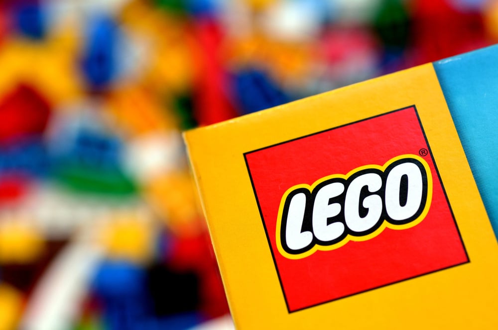
Lego’s logo has changed dramatically since the company started making wooden toys in 1932, long before the plastic bricks existed.
The earliest logos were simple text in various fonts with no distinctive style.
In 1953, Lego introduced a circular logo with the company name in white letters on a red background, which started the color scheme that would stick.
The current logo, which features chunky letters with a yellow outline and white fill, was introduced in 1998 and is designed to look friendly and playful.
The thick, rounded letters mirror the shape of the bricks themselves, creating a visual connection that the earlier text-only logos lacked.
MTV

MTV launched in 1981 with a logo that was revolutionary for its time because it wasn’t static.
The giant graffiti-style M with different patterns and textures filling the TV letters became a template that could be endlessly customized.
Early versions featured hand-drawn elements and textures that looked rough and edgy, perfect for a music channel targeting young viewers.
While the basic M-TV shape has stayed the same, the logo has been reinterpreted thousands of times over the decades, allowing MTV to stay current while maintaining brand recognition that goes back to the network’s earliest days.
Target
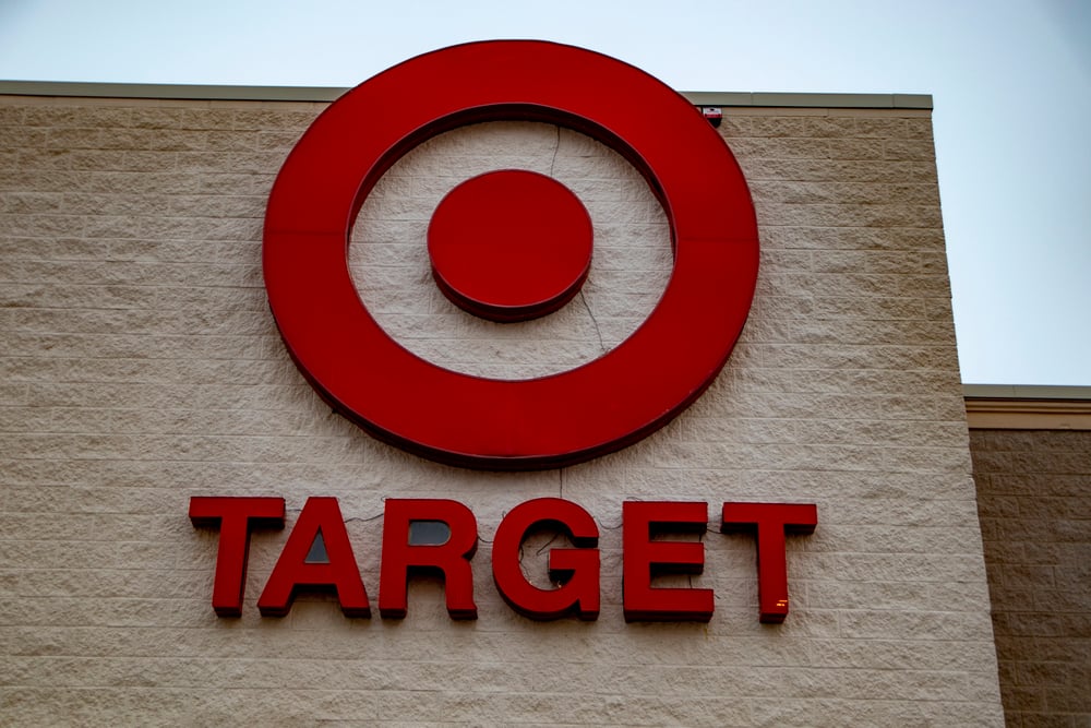
Target’s bullseye logo is so simple now that it’s hard to imagine it being any different, but the original 1962 version was much busier.
The first Target logo featured three rings in red with white space between them, along with the company name written inside the smallest circle.
The design worked, but it had extra elements like a more detailed font and different proportions that made it less powerful.
As Target grew into a retail giant, the company kept simplifying the bullseye until it became the bold, perfectly circular design that shoppers see today on everything from shopping carts to credit cards.
Microsoft
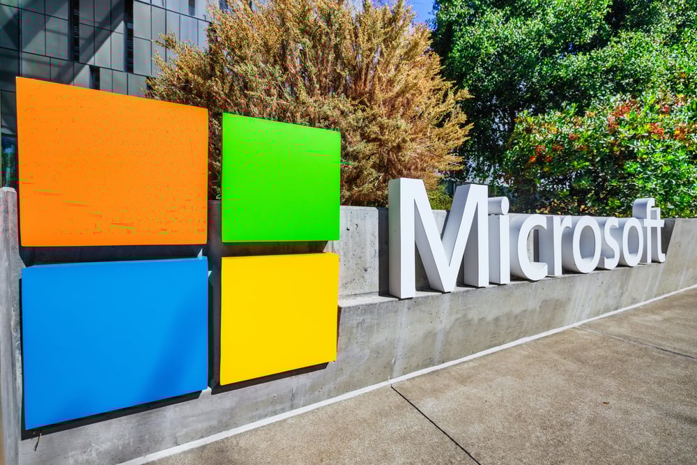
Microsoft’s logo evolution shows how a tech company matured from scrappy startup to global giant.
The first Microsoft logo from 1975 looked like something from a disco album cover, with funky letters and a retro vibe that aged terribly.
In 1987, Microsoft introduced the ‘Pac-Man’ logo, nicknamed that because of a notch in the O that was supposed to look modern but just looked weird.
The company finally settled on a clean, professional approach in 2012 with four colored squares representing different product lines and a simple, authoritative font that says Microsoft is all business now.
Where brands go from here

Logo changes always spark debate because people get attached to the designs they grew up with.
But companies keep evolving their logos anyway, usually in the direction of simpler, flatter designs that work better on phone screens and social media.
The logos that started out busy and detailed have almost all been stripped down to their most basic elements.
What’s interesting is that many brands are now confident enough to drop their names entirely, betting that a shape or symbol alone is enough for people to know who they are.
More from Go2Tutors!

- The Romanov Crown Jewels and Their Tragic Fate
- 13 Historical Mysteries That Science Still Can’t Solve
- Famous Hoaxes That Fooled the World for Years
- 15 Child Stars with Tragic Adult Lives
- 16 Famous Jewelry Pieces in History
Like Go2Tutors’s content? Follow us on MSN.