First Logos Of Famous Companies You Still Use
Brand identity today feels permanent, almost eternal. The swoosh, the bitten apple, the golden arches—they sit in your mind like old friends.
But every company started somewhere, and those first attempts at visual identity often looked nothing like what you see now. Some were surprisingly sophisticated. Others looked like someone’s weekend art project.
The distance between then and now reveals something about ambition, evolution, and sometimes pure luck. These early logos captured moments in time when founders were just hoping anyone would notice them at all.
Apple’s Rainbow Past
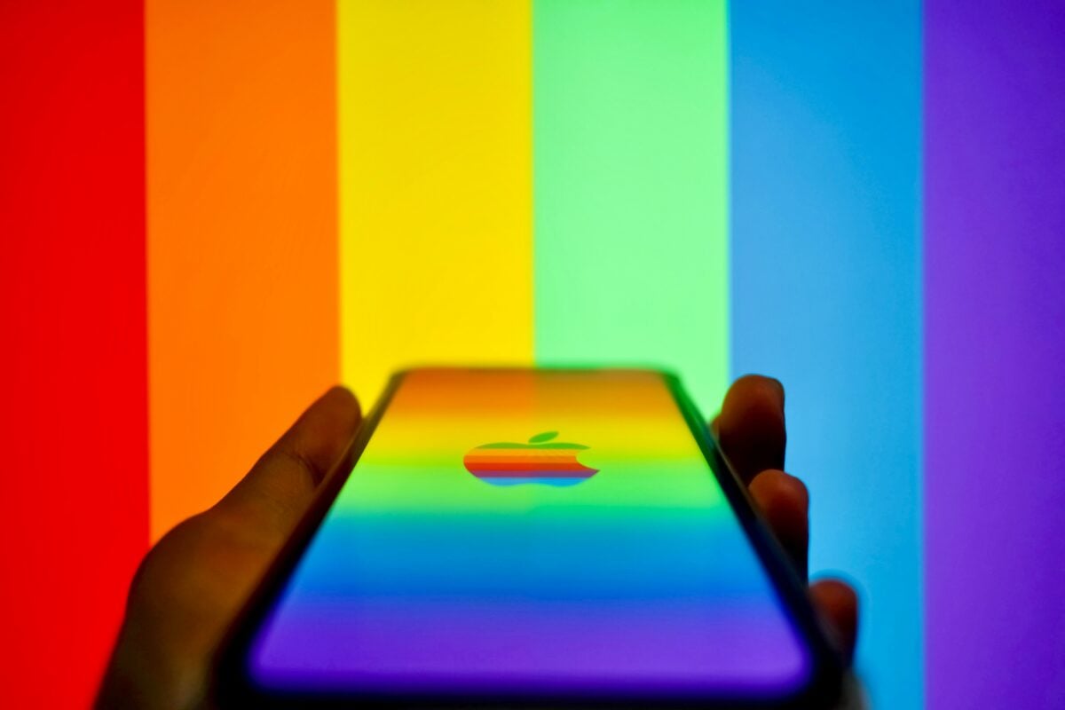
Apple’s first logo showed Isaac Newton sitting under a tree, complete with a banner wrapped around the border. Ronald Wayne designed it in 1976, and it lasted about a year before Steve Jobs decided it was too complex.
The rainbow-striped apple that replaced it became iconic, but even that proved temporary. The rainbow version stuck around from 1977 to 1998, much longer than most people remember.
Those colored stripes weren’t random. They appeared in a specific order and were meant to humanize the company at a time when computers felt cold and intimidating.
Jobs wanted something that felt approachable, and color did that job perfectly.
Starbucks Started Topless

The Starbucks logo from 1971 showed a bare-chested siren with two tails spread wide. She looked straight at you, crown on her head, completely unashamed.
The founders borrowed the image from a 16th-century Norse woodcut, wanting something that felt both nautical and Seattle-appropriate. Over the decades, the siren got increasingly modest.
They covered her chest, zoomed in on her face, and eventually dropped the text entirely. But that original version?
It was bold in ways modern corporate branding rarely attempts.
Nokia Made Rubber Boots
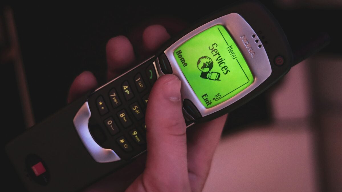
Before Nokia became synonymous with mobile phones, the company made paper products, rubber boots, and tires. Their 1865 logo was simple text—just the word “Nokia” in a straightforward typeface.
Nothing fancy, nothing clever. The company diversified constantly throughout its history, and the logo shifted to match each era.
But that plain text approach from the beginning set a precedent for clarity that carried through even when they dominated the phone market decades later.
Pepsi’s Patriotic Roots

Pepsi’s first logo from 1898 looked like fancy script handwriting in red. Caleb Bradham created the drink in his pharmacy, and the logo reflected the ornate style popular in that era.
By 1940, they had shifted to a bottle cap design with red, white, and blue colors. That color choice wasn’t accidental.
Pepsi leaned hard into American patriotism during World War II, and the red, white, and blue became central to their identity. The logo has morphed dozens of times since, but those colors stuck around longer than anything else.
Shell Started Realistic

The Shell logo from 1900 actually looked like a realistic mussel shell. It was black and white, detailed, and would have taken considerable effort to reproduce consistently.
The Pecten shell became the company symbol because Marcus Samuel, one of the founders, had a father who imported decorative shells. By 1948, they had simplified it dramatically into the smooth, stylized yellow and red version you recognize today.
But that original detailed rendering shows how literal early branding could be.
Volkswagen’s Controversial Beginning
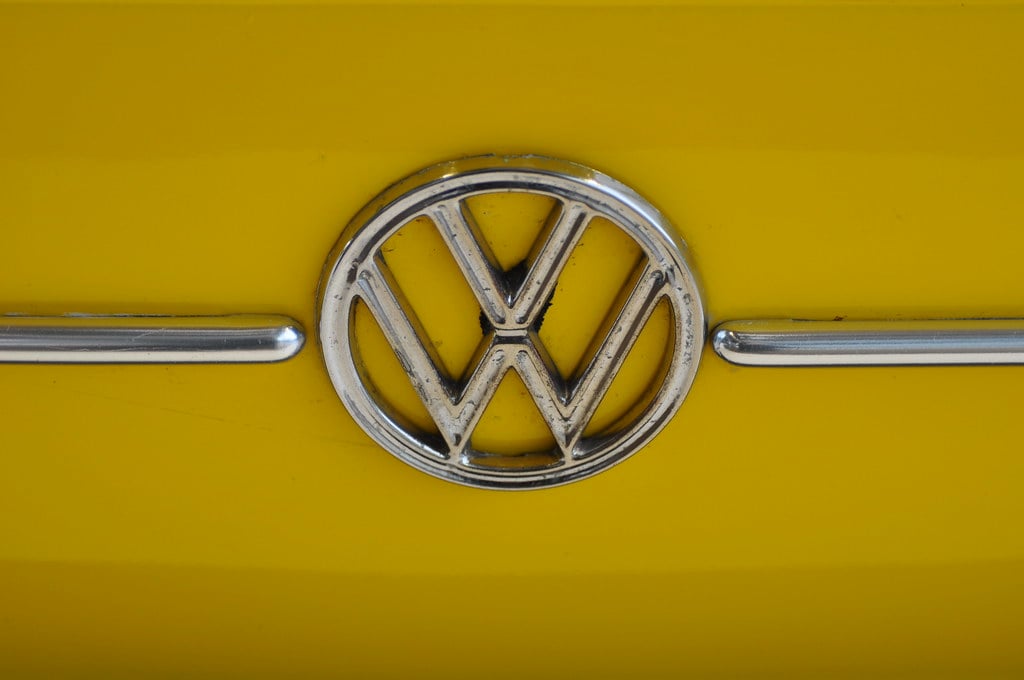
Volkswagen’s first logo appeared in 1938, designed by Franz Xavier Reimspiess during a logo competition. The design combined a V and W in a circle with gear-like detailing around the edge.
It was clean, geometric, and reflected the industrial design philosophy of its time. The company’s origins under Nazi Germany complicate its history in ways the logo can’t hide.
They’ve updated the design repeatedly, stripping away the gear teeth and simplifying the letters, but the basic V-over-W concept remains.
Canon Borrowed From Buddhism

Canon’s original 1934 logo featured Kwanon, the Buddhist goddess of mercy. The company initially called itself Kwanon and used her image to represent compassion and precision.
By 1935, they had dropped the Buddhist imagery and switched to “Canon,” a name that sounded similar but carried no religious weight. The goddess appeared in their very first cameras too, making the Buddhist connection explicit.
Modern Canon probably wouldn’t make that choice today, but it shows how differently companies thought about cultural borrowing in the 1930s.
Microsoft’s Disco Era
Microsoft’s first logo from 1975 looked like something from a disco poster. The letters appeared in a unique split-line style, with the O resembling a Pac-Man shape.
Bill Gates and Paul Allen weren’t exactly design-focused at that point—they were two guys trying to sell software from Albuquerque. The logo lasted only seven years before they moved to the “blibbet” design (the stylized O between Microsoft).
But that original groovy version captures a specific moment when personal computing was still weird and experimental.
BMW’s Aviation Heritage
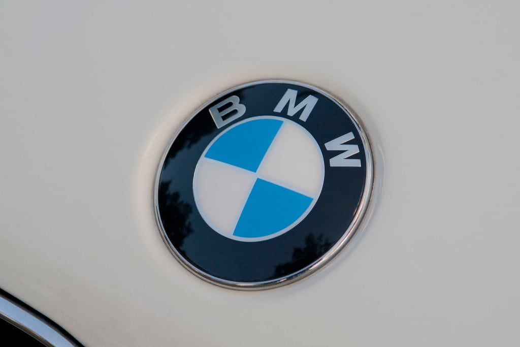
BMW’s logo appeared in 1917 as a blue and white quartered circle, representing a spinning propeller against the Bavarian sky. Or at least, that’s the popular story.
The truth is more boring—the colors simply matched the Bavarian flag because BMW started in Bavaria. The propeller myth didn’t appear until a 1929 advertisement, but it stuck because it sounded better.
Either way, that original quartered circle design has remained remarkably consistent for over a century.
Amazon’s A-to-Z Journey

Amazon’s first logo in 1994 looked nothing like the current smile. It was just the word “Amazon” with a river running through it, playing on the company’s name origin.
The design was literal, a bit clunky, and very much of its time. By 2000, they had introduced the arrow that connects A to Z, suggesting they sell everything.
That subtle smile underneath the text transformed what could have been just another corporate wordmark into something more memorable.
Target’s Simple Success
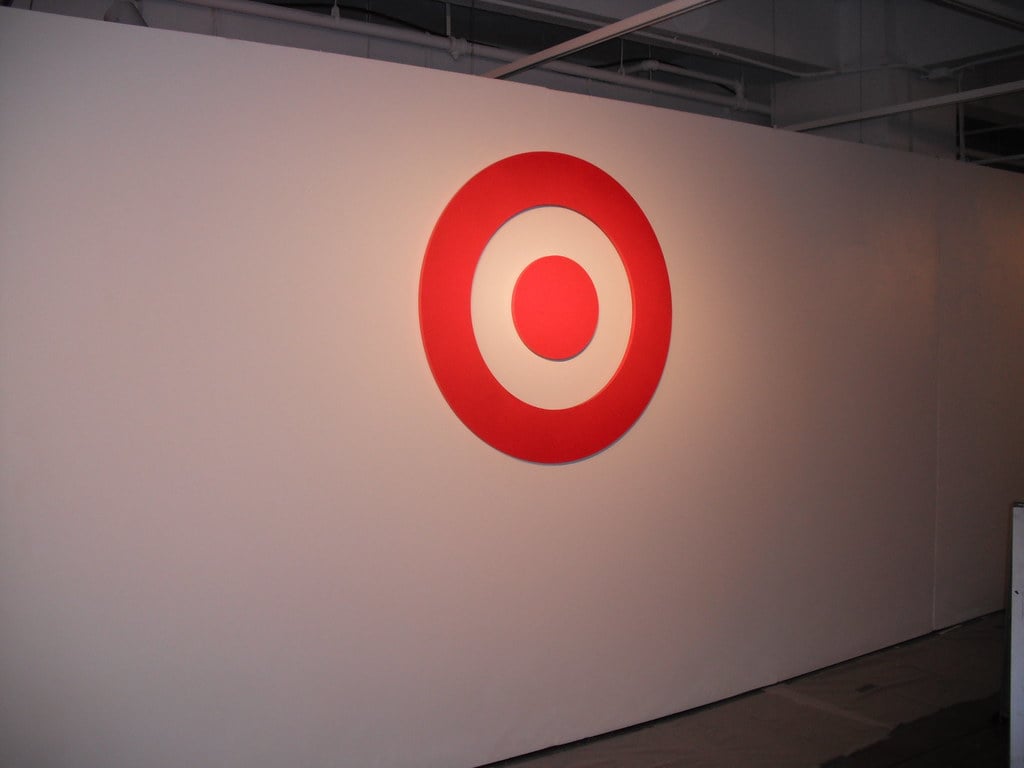
Target’s first logo in 1962 was just three red circles on a white background—a bullseye, straightforward and clear. They’ve refined it over the years, adjusting proportions and adding the wordmark, but the basic concept hasn’t changed in over sixty years.
Sometimes the first idea actually is the best idea. Target proved that simple geometric shapes, executed well, can outlast trendier approaches.
The bullseye means exactly what it looks like, and that clarity has served them well.
McDonald’s Golden Architecture

McDonald’s didn’t start with golden arches in their logo. The original 1940s design featured a cartoon character called Speedee, a little chef with a hamburger for a head.
The actual golden arches were architectural features of their buildings, designed in 1953 by Richard and Maurice McDonald. Jim Schindler took those physical arches and turned them into the M logo in 1962.
The transition from Speedee to the arches shows how sometimes your best branding element comes from your real-world design choices, not your imagination.
Google’s Basic Roots

Landing on screens in 1998, Google’s debut logo leaned into Baskerville Bold, capped with a surprise exclamation – just like Yahoo had done. Built in GIMP by Sergey Brin, its edges felt shaky, noticeably clunky even back then.
Those bright colors showed up right away, though how they landed was uneven, unpolished. From the start, color made sense; craftsmanship did not.
Faster changes came, shifting toward the Catull typeface before long. That early version though?
Proof that even a giant in tech began with one person aiming for good enough to go live.
When Simplicity Wins

Looking at these logos, one thing stands out – a move toward simpler forms. Early versions were often heavy with detail, full of flourishes, yet they slowly faded into sharper, clearer outlines.
Fewer shades appeared. Shapes became easier to recognize.
Tools changed, helping smooth the process. Crisp visuals spread fast on screens, paper, anywhere.
Simplicity stuck because it just worked better. A shift took place alongside it all.
Power grew quietly behind certain names, letting them say little yet mean much. Take Apple – no demo required to sell what it is.
Or Starbucks – its presence speaks before letters form on a sign. The shape on paper holds years of quiet change, layer after layer.
Starting clumsy did not stop what came next – slow recognition grew between the brand and those who saw it again, then again.
More from Go2Tutors!

- The Romanov Crown Jewels and Their Tragic Fate
- 13 Historical Mysteries That Science Still Can’t Solve
- Famous Hoaxes That Fooled the World for Years
- 15 Child Stars with Tragic Adult Lives
- 16 Famous Jewelry Pieces in History
Like Go2Tutors’s content? Follow us on MSN.