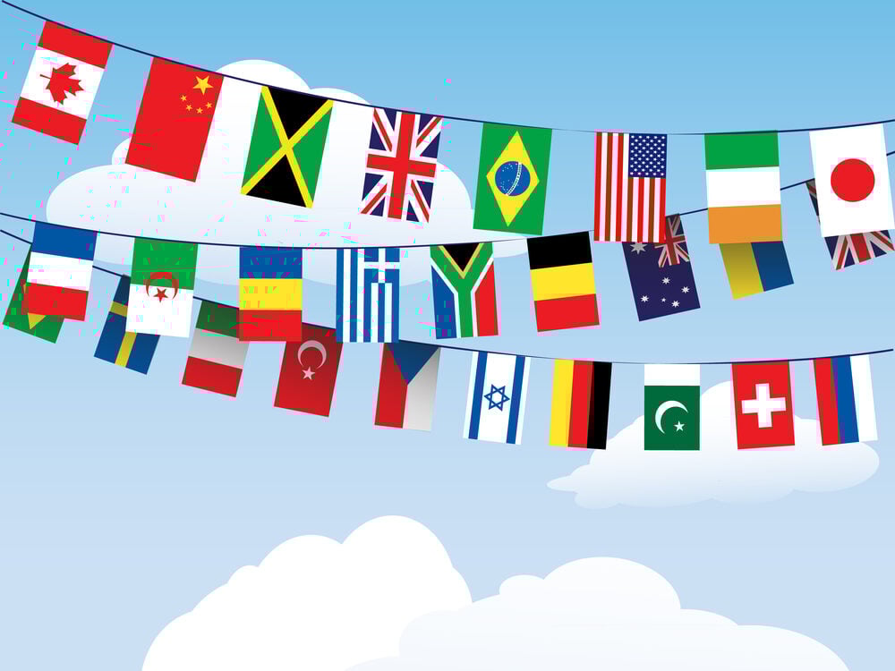
Flags That Look Almost Identical
National flags are supposed to be unique symbols that instantly identify a country. But walk through the United Nations building or watch the Olympics opening ceremony, and you’ll notice something odd—some flags look so similar that telling them apart requires careful examination.
These aren’t coincidences. Some flags share colors because of historical connections, while others just happened to land on the same design.
Either way, the similarity has caused confusion, diplomatic incidents, and plenty of mistaken identity.
Indonesia and Monaco’s Red-White Problem
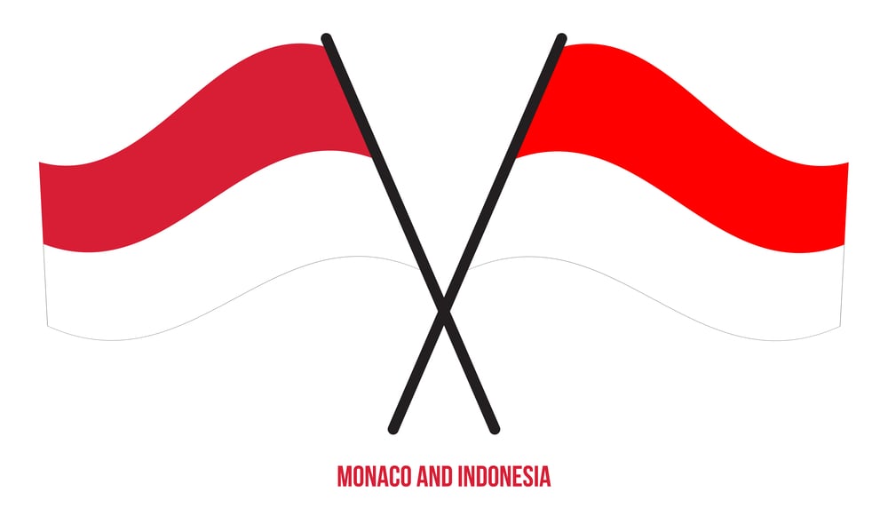
These two flags are identical—a red stripe on top, a white stripe on the bottom. The only difference is the proportion. Indonesia’s flag is slightly longer with a ratio of 2:3, while Monaco’s is squarer at 4:5.
That’s it. From a distance or when they’re hanging limply, you can’t tell them apart.
Indonesia adopted its flag in 1945 after gaining independence from the Netherlands. Monaco’s flag dates back to the 14th century, making it much older.
Both countries know about the similarity and neither seems particularly bothered by it. Monaco’s small size and Indonesia’s location in Southeast Asia mean the flags rarely appear together in contexts where confusion would matter.
Still, when both nations compete in the same international events, organizers have to be extra careful about which flag they’re raising.
Chad and Romania’s Diplomatic Confusion
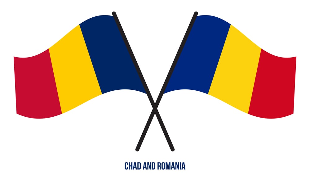
Chad and Romania have nearly identical flags—vertical stripes of blue, yellow, and red. Romania’s blue is slightly lighter, but you need to see them side by side to notice.
This similarity has caused actual problems. Chad adopted its flag in 1959 when it gained independence from France.
Romania has used its tricolor since 1848, though the communist government added a coat of arms that was later removed. In 2004, Chad asked the United Nations to force Romania to change its flag, arguing that Romania’s came second historically if you don’t count the years with the coat of arms.
Romania refused. The UN didn’t intervene.
Today, both countries still use the same design, and people still mix them up regularly. Sports events, diplomatic functions, and news broadcasts occasionally show the wrong flag, much to the annoyance of both nations.
Ireland and Ivory Coast’s Mirror Image
Turn Ireland’s flag around and you get the Ivory Coast’s flag. Both have vertical stripes of green, white, and orange—just in reverse order. Ireland goes green-white-orange from left to right.
Ivory Coast’s goes orange-white-green. The colors carry different meanings in each country.
Ireland’s green represents Catholics, orange represents Protestants, and white symbolizes peace between them. Ivory Coast’s orange represents the northern savannas, white represents peace, and green represents the southern forests.
Despite the similar appearance, the flags emerged from completely different contexts. Ireland adopted its tricolor in the mid-1800s.
Ivory Coast chose its design in 1959 after independence from France. When either flag is hanging still or displayed horizontally, mix-ups happen constantly.
Poland and Indonesia’s Inverted Design
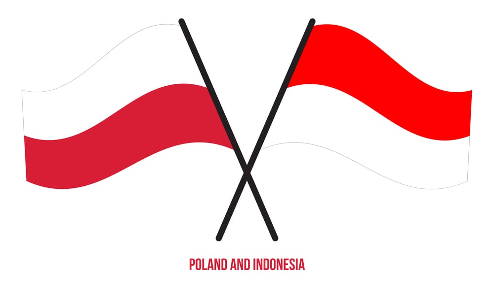
Poland’s flag looks like Indonesia’s flag upside down—white on top, red on the bottom. The colors are almost the same, just flipped.
Poland’s flag is older, dating to the 13th century, though the modern version was officially adopted in 1919. The similarity creates problems at sporting events where flags hang from poles rather than flying.
If a flag isn’t caught by wind, determining which country it represents requires looking at proportions and context. Monaco, Indonesia, and Poland form a triangle of confusion—red and white stripes that can represent three different countries depending on which stripe is on top and how wide the flag is.
Netherlands and Luxembourg’s Color Shade Debate

The Netherlands and Luxembourg both use horizontal stripes of red, white, and blue. The difference is that Luxembourg’s red is lighter and its blue is brighter.
The Dutch flag uses darker, richer tones. Luxembourg’s blue is almost sky blue, while the Netherlands uses a deeper navy.
Luxembourg officially adopted its flag in 1845, but variations of it existed earlier. The Dutch flag dates to the 16th century, making it one of the oldest tricolors still in use.
Luxembourg has considered changing its flag to avoid confusion, but the cost and cultural attachment to the current design have prevented any changes. Broadcasters and publishers dealing with both countries have to be careful about color accuracy, because even slight printing or screen variations can make Luxembourg’s flag look like the Netherlands’ flag.
Australia and New Zealand’s Southern Cross
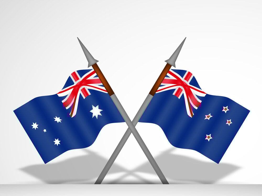
These flags are so similar that even citizens of these countries sometimes struggle to identify them correctly. Both feature the British Union Jack in the upper left corner and stars representing the Southern Cross constellation on a dark blue background.
The differences are subtle. New Zealand’s flag has four red stars with white borders.
Australia’s flag has six white stars—five representing the Southern Cross and one large Commonwealth Star below the Union Jack. The stars are positioned differently, and Australia’s includes a small seventh star.
But when the flags are displayed small, far away, or in poor lighting, they’re nearly impossible to distinguish. New Zealand held a referendum in 2015-2016 about changing its flag specifically to address this confusion, but voters chose to keep the current design.
The similarity frustrates both nations, particularly when international media uses the wrong flag.
Slovenia, Slovakia, and Russia’s Slavic Stripes
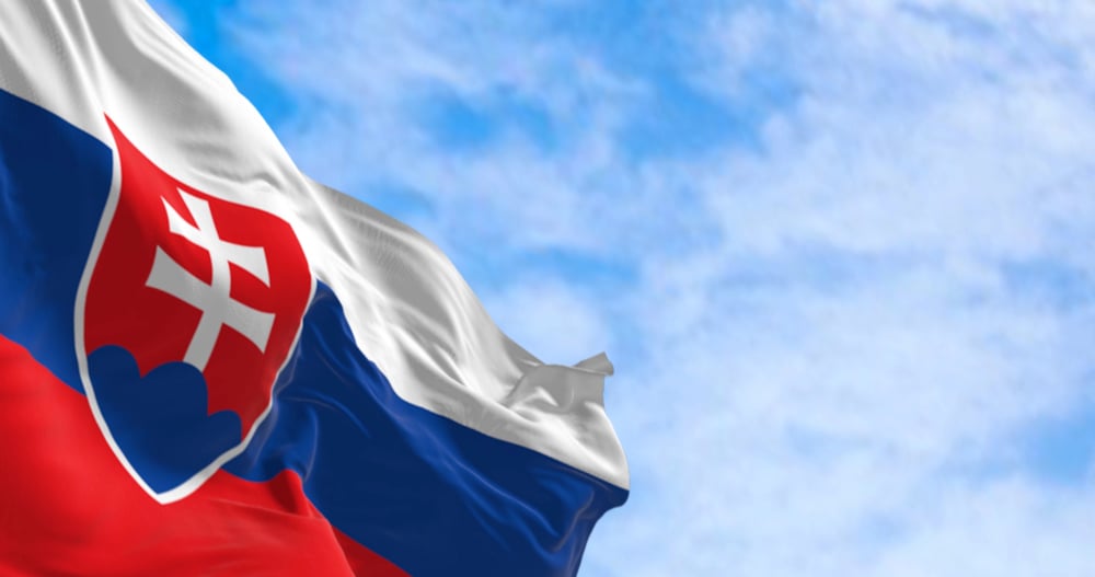
These three flags all use horizontal stripes of white, blue, and red. The order is the same.
The shades are nearly identical. The only way to tell them apart is by looking at the coat of arms—Slovenia has one on the left side, Slovakia has one slightly off-center, and Russia has none.
If the coat of arms isn’t visible or the flag is reduced to a small icon, all three flags look identical. Russia’s flag dates to Peter the Great in the 17th century.
Slovenia and Slovakia both adopted their flags when they became independent in the 1990s, choosing colors that reflected their Slavic heritage. At international events where coat of arms details don’t show clearly, these flags create constant identification problems.
Eurovision Song Contest broadcasts have mixed them up. News websites have used the wrong flag.
The confusion is so common that Slovenian and Slovak officials are used to correcting people.
Mali and Guinea’s Perfect Match
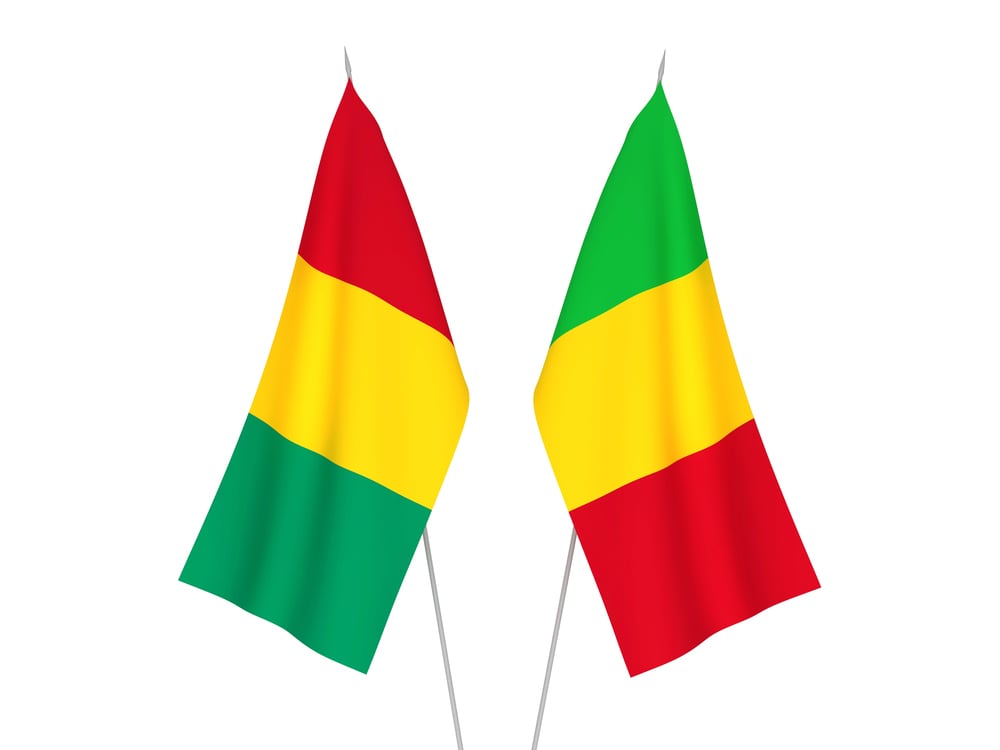
Mali and Guinea have the same flag—vertical stripes of red, yellow, and green. No coat of arms.
No distinguishing features. Identical.
The only difference is that Guinea adopted it first, in 1958, and Mali followed in 1961. Both countries were French colonies that gained independence in the late 1950s.
They chose the Pan-African colors (red, yellow, and green) that many African nations adopted during decolonization. Guinea put them in vertical stripes. Mali decided to use the same design three years later.
Neither country has shown interest in changing, perhaps because they’re both in West Africa and rarely compete in contexts where flag confusion would cause serious problems. But at African Union summits or sporting events involving both nations, organizers have to rely entirely on position and labeling to keep them straight.
Senegal’s Near Miss with Mali and Guinea
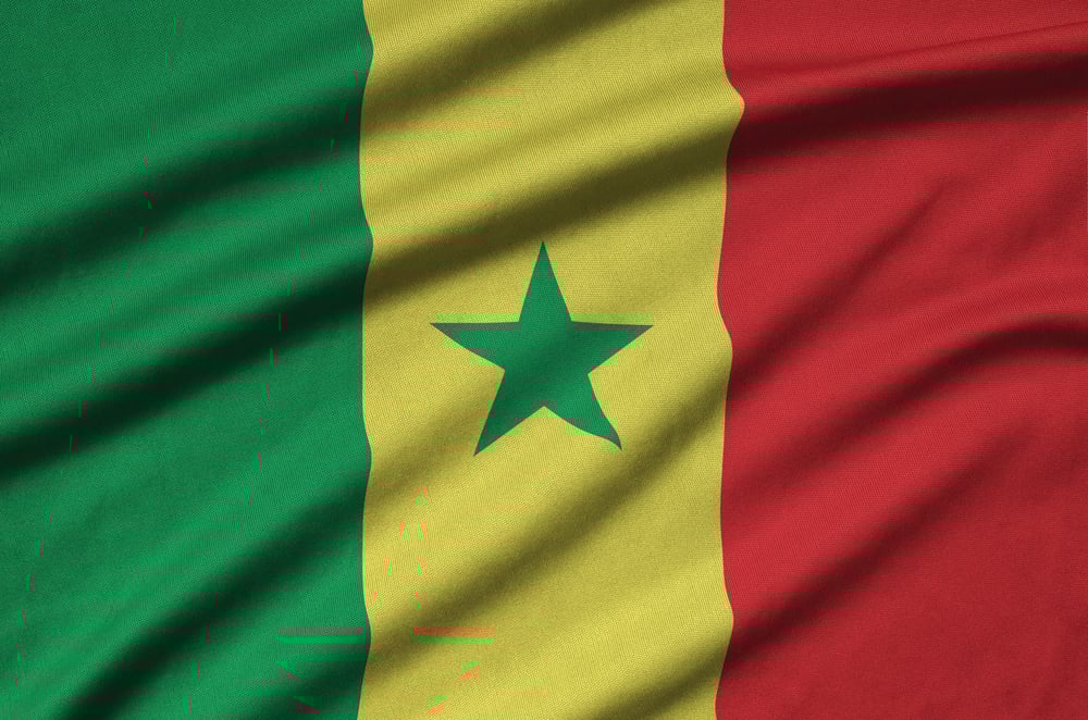
Senegal uses the same vertical stripes of green, yellow, and red as Mali and Guinea. The only difference is a green star in the center of the yellow stripe.
Remove that star and you have Guinea’s flag rotated 180 degrees, or a different arrangement of Mali’s colors. Senegal added the star specifically to distinguish its flag from Guinea’s when it became independent in 1960.
The star represents unity and hope, but its practical purpose is preventing flag confusion. Even with the star, people who see the flag quickly or partially can easily mistake it for Guinea or Mali’s flag.
The three nations share colonial history, similar geography, and the Pan-African color scheme, so their flags looking nearly identical makes historical sense. But it doesn’t make them any easier to tell apart.
Colombia, Venezuela, and Ecuador’s Yellow-Blue-Red Brotherhood
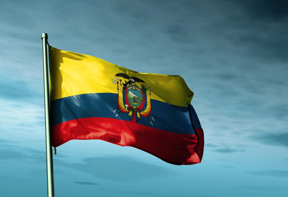
These three South American nations share a flag design of horizontal stripes in yellow, blue, and red. The proportions differ slightly—Colombia and Ecuador have wider yellow stripes than blue and red, while Venezuela’s yellow takes up half the flag.
Venezuela and Ecuador add coats of arms and stars to distinguish themselves, but the fundamental design is the same. The similarity isn’t coincidental. All three countries were part of Gran Colombia, a single nation that existed briefly in the 1820s after independence from Spain.
When Gran Colombia broke apart, the successor states kept variations of the same flag. Ecuador has a detailed coat of arms in the center.
Venezuela has eight stars arching across the blue stripe. Colombia keeps its flag simple without additions.
But show someone these flags without the emblems visible, and they’re essentially identical. The shared design celebrates their common history, though it makes flag recognition more challenging.
Norway and Iceland’s Nordic Red and Blue
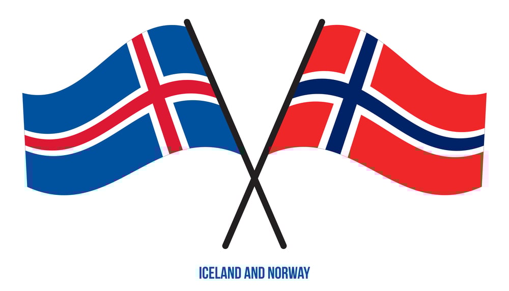
Norway’s flag has a red background with a blue cross outlined in white. Iceland’s flag has a blue background with a red cross outlined in white. The crosses use the same Nordic design.
The colors are just inverted. Both flags have the offset cross that’s characteristic of Scandinavian nations, positioned slightly toward the left side.
Norway adopted its flag in 1821. Iceland followed in 1915 while still under Danish rule, officially adopting it in 1944 with independence. The similar design reflects their shared Nordic heritage and cultural connections.
But when you see these flags from a distance or at an angle where the cross isn’t immediately obvious, they blur together into a confusion of red and blue. Flag manufacturers have to be especially careful with these orders because using the wrong base color but the correct cross color would still produce a valid Nordic flag—just for the wrong country.
Czech Republic and Philippines’ Triangle Confusion
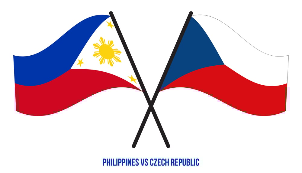
The Czech flag has horizontal stripes of white and red with a blue triangle pointing right from the left edge. The Philippines flag has horizontal stripes of blue and red with a white triangle pointing right from the left edge.
The structure is nearly identical, just with different color arrangements. The Czech design dates to 1920 when Czechoslovakia was created after World War I.
The Philippines adopted its flag in 1898 during the revolution against Spain. Despite being separated by thousands of miles and having completely different historical contexts, they landed on similar designs.
The Philippines flag has an additional unique feature—the blue and red stripes swap positions during wartime, with red on top signifying a state of war. But in peacetime configuration, both flags feature the distinctive triangle-and-stripes pattern that makes them look like relatives.
New Zealand and Australia’s Star Count Problem
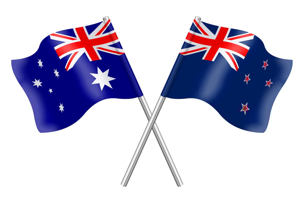
This similarity deserves a second look because it causes so much confusion. New Zealand has four stars. Australia has six.
That should be enough to tell them apart, but in practice it isn’t. The Union Jack occupies the same position on both.
The background blue is the same shade. The stars are white on both flags.
Television broadcasts regularly display the wrong flag when discussing either country. International sporting events have raised the wrong flag before medal ceremonies.
Tourist merchandise in both countries sometimes features the wrong flag. The problem is so widespread that both nations acknowledge it and have developed a sort of resigned humor about the mix-ups.
Australia’s additional stars should make its flag clearly different, but the overall impression from a distance remains nearly identical to New Zealand’s flag. The failed New Zealand flag referendum in 2016 was partly driven by frustration with this persistent confusion.
When Design Meets Coincidence
Flags that look alike? Not every match means someone copied. History links nations, cultures overlap, and governments copy ideas on purpose.
Then again, randomness plays its part too – only so many ways to arrange colors, shapes, lines. Close to two hundred flags out there. Patterns repeat just by chance. Yet mix-ups happen either way, no matter the reason behind them.
Right now, somebody might glance at a red-over-white banner and mistake it for something else entirely. Standing still during the incorrect national song has happened more than once.
Officials have moved through international events while passing by misplaced emblems without realizing. Reports meant to cover one place accidentally showed colors belonging to another.
When identity markers should stand out clearly, history and design choices often blur the lines instead. Mistakes slip in quietly. Even today, two stripes can cause double-takes across continents.
More from Go2Tutors!

- The Romanov Crown Jewels and Their Tragic Fate
- 13 Historical Mysteries That Science Still Can’t Solve
- Famous Hoaxes That Fooled the World for Years
- 15 Child Stars with Tragic Adult Lives
- 16 Famous Jewelry Pieces in History
Like Go2Tutors’s content? Follow us on MSN.