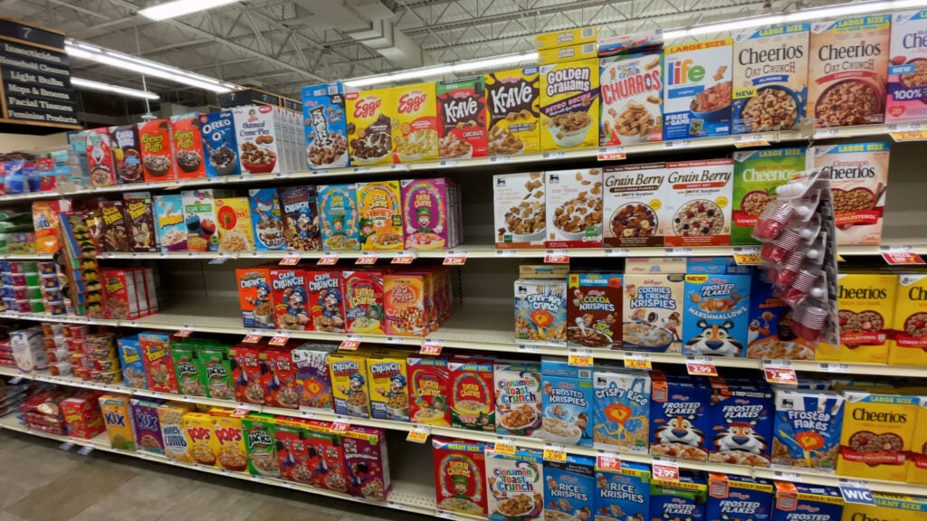
Grocery Items With Instantly Recognizable Packaging
You can spot them from across the aisle. Cover the brand name and logo with your hand, and you still know exactly what the product is.
Some packages have become so embedded in culture that they transcend their original purpose as containers. They’re icons in their own right.
Great packaging does more than protect what’s inside. It creates instant recognition, builds emotional connections, and sometimes becomes more memorable than the actual product.
Walk through any grocery store and certain packages jump out at you, not because they’re shouting for attention, but because they’ve been quietly asserting themselves for decades.
The Can That Inspired Warhol
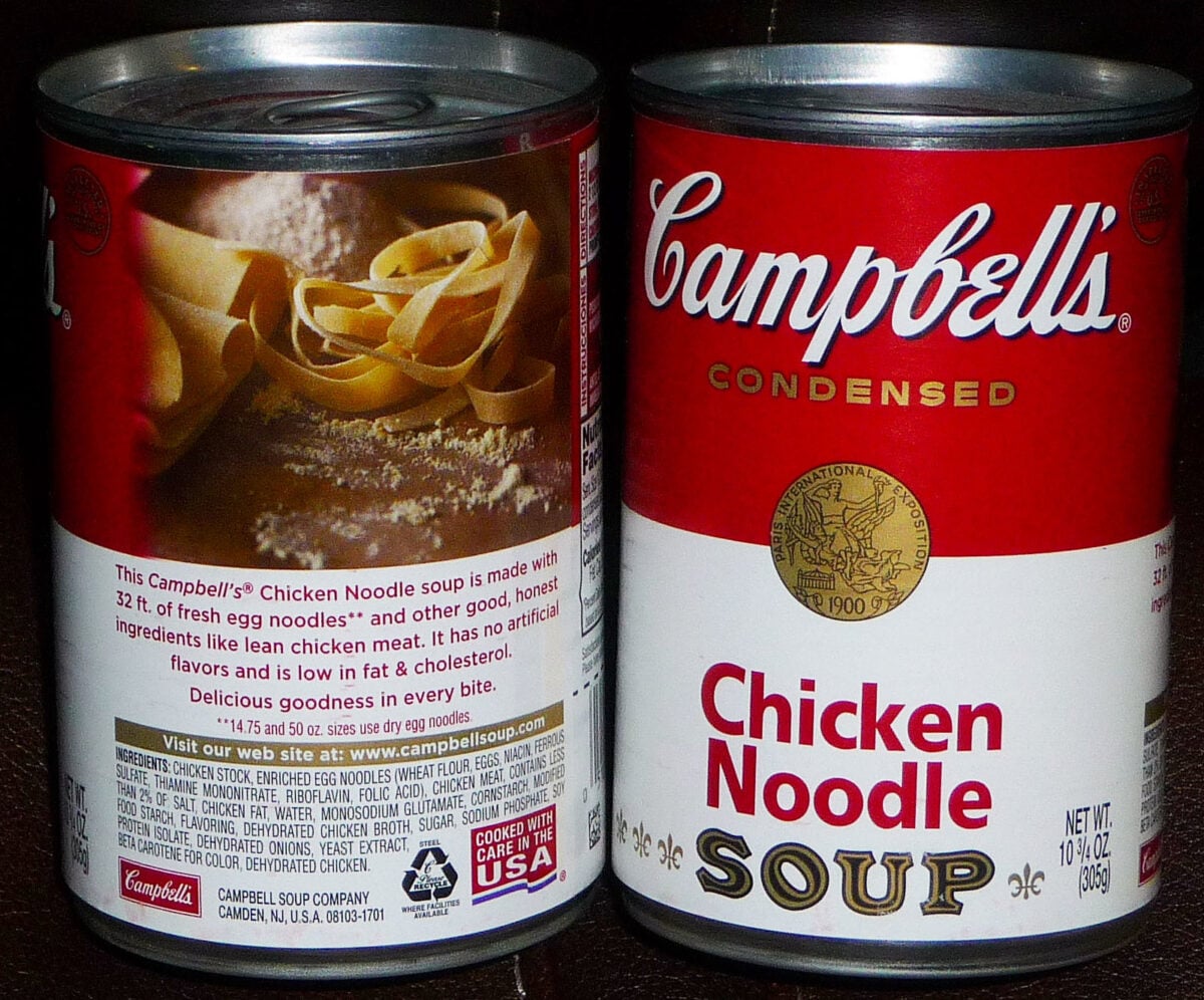
Campbell’s Soup cans were already famous before Andy Warhol painted them in 1962. The red and white design had been around since 1898, when company treasurer Herberton Williams attended a Cornell University football game and liked the team’s uniform colors.
He changed the label from blue and orange to red and white the next day. The gold medallion on the label represents an award the soup won at the 1900 Paris Exposition.
That medal has stayed on the can for over a century. The distinctive cursive script was based on founder Joseph Campbell’s actual signature.
Everything about the can was designed to look premium and trustworthy at a time when canned food was still relatively new and people needed reassurance about what they were buying.
The Bottle with a Shape You Can Draw from Memory
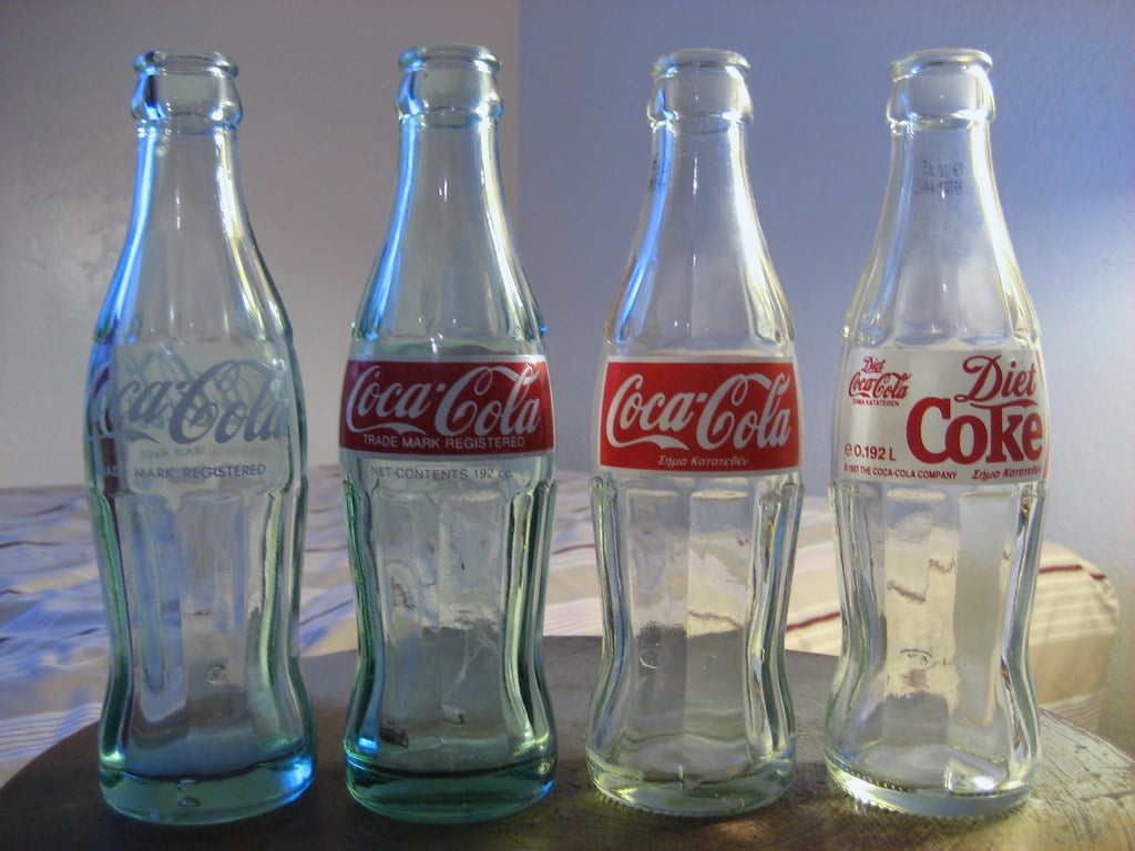
Coca-Cola’s contoured glass bottle is so distinctive that you could recognize it by touch in the dark. The company commissioned the design in 1915 specifically to distinguish its product from competitors.
They wanted a bottle that would be immediately recognizable even if it was broken on the ground. The shape supposedly took inspiration from a cocoa pod, though the designers were actually trying to create a bottle based on coca leaves and accidentally looked up the wrong plant.
The mistake worked out. The bottle became one of the most recognized packages in the world. Even though most Coke now comes in cans or plastic bottles, the contoured glass shape remains the brand’s visual signature.
The Canister That Solved Broken Chips
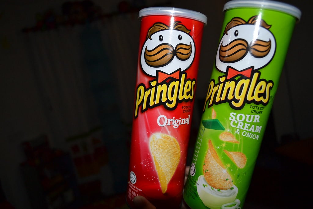
Pringles doesn’t come in a bag because chemist Fredric Baur was tired of broken chips at the bottom. He invented both the saddle-shaped chip and the cylindrical canister in the 1960s.
The can protects the chips and makes them easy to stack. It also stands out on a shelf full of bags.
The tube is so distinctive that Baur requested that some of his ashes be buried in one when he died in 2008. His children honored the request.
They bought a can of Pringles, emptied it, filled it with some of their father’s remains, and buried it. The package meant that much to its creator.
The Girl Who Walks in the Rain
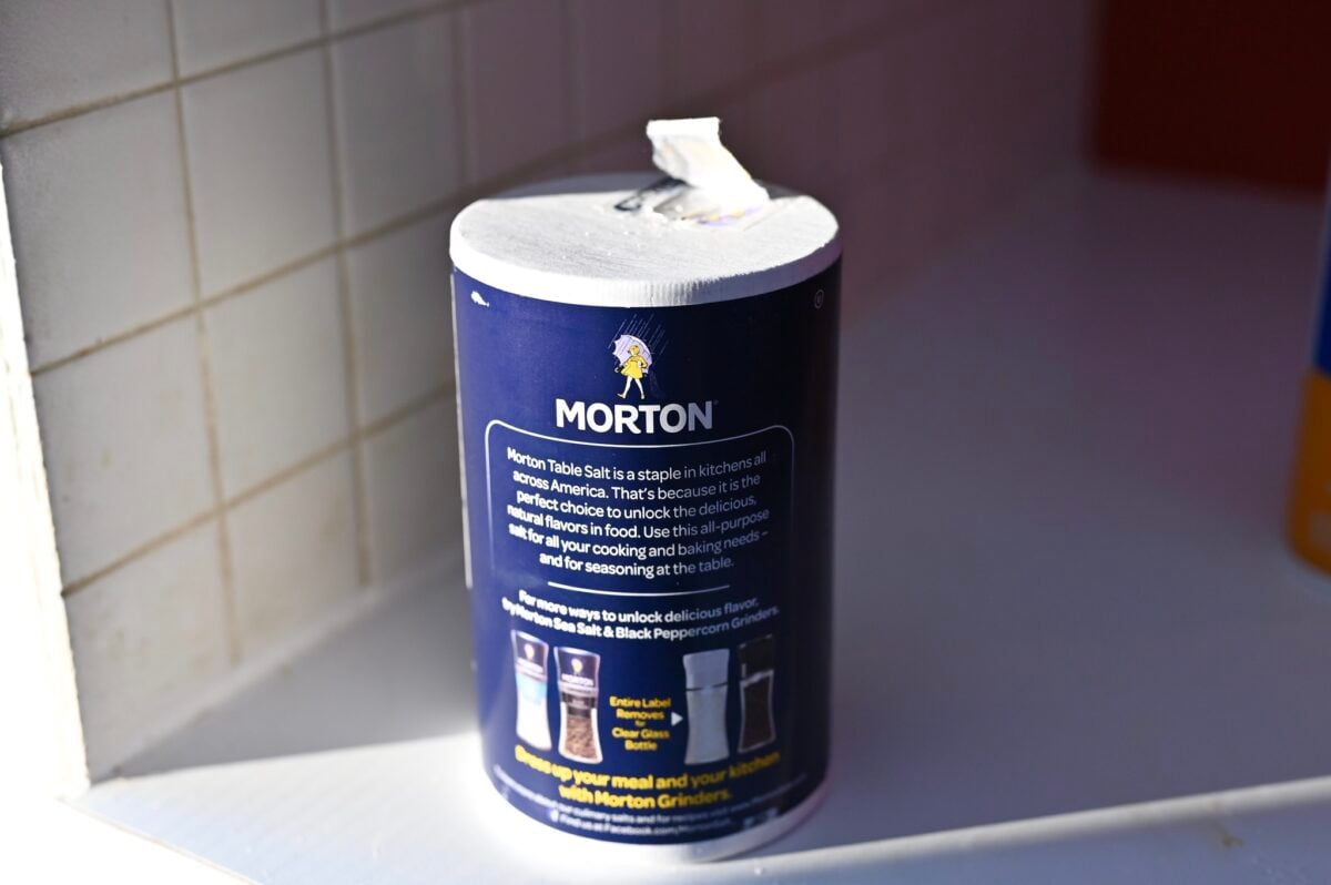
Morton Salt’s round canister with the pouring spout was innovative when it launched in 1911. Most salt came in packages that clumped in humid weather and were difficult to pour.
Morton created a container that solved both problems and added a memorable slogan: “When it rains it pours.” The Umbrella Girl illustration appeared in 1914.
A young girl walks through the rain, holding an umbrella and spilling salt from a package under her arm. The image demonstrates that Morton salt pours freely even in wet weather.
The design has been updated several times over the decades, but the core image remains unchanged. The girl is now over 100 years old and still walking through that same storm.
The Triangle That Might Be a Mountain
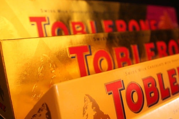
Toblerone has packed its honey and nougat chocolate in triangular prisms since 1908. Creator Theodor Tobler supposedly took inspiration from the Matterhorn, the distinctive pyramidal peak in the Swiss Alps.
The mountain even appears on the package. But another story claims Tobler got the idea from dancers at the Folies Bergère in Paris, where performers formed a human pyramid at the end of their show.
According to his sons, that cabaret act was the real inspiration. Either way, the triangular shape makes Toblerone impossible to mistake for any other chocolate bar.
The package is the product’s defining characteristic.
The Octagonal Bottle That Wouldn’t Surrender
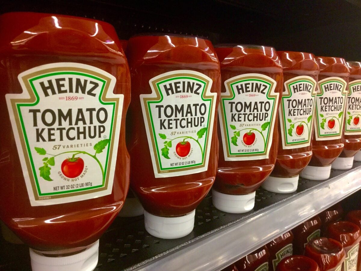
Heinz debuted its ketchup in a keystone-shaped bottle in 1876. Fourteen years later, they introduced the octagonal glass bottle that many people still remember.
The shape was functional. The curved neck helped ketchup flow smoothly.
The narrow opening limited air exposure, which kept the ketchup from turning brown. Heinz removed the glass bottles from grocery stores decades ago in favor of squeezable plastic, but the octagonal design lives on in restaurants.
The company is fiercely protective of the shape. They’ve sued competitors who tried to use similar designs.
In 2011, Heinz released a limited edition of the glass bottles in stores, and nostalgia drove sales. Some packages become more than containers. They become heritage.
The Brown Wrapper with Perfect Typography
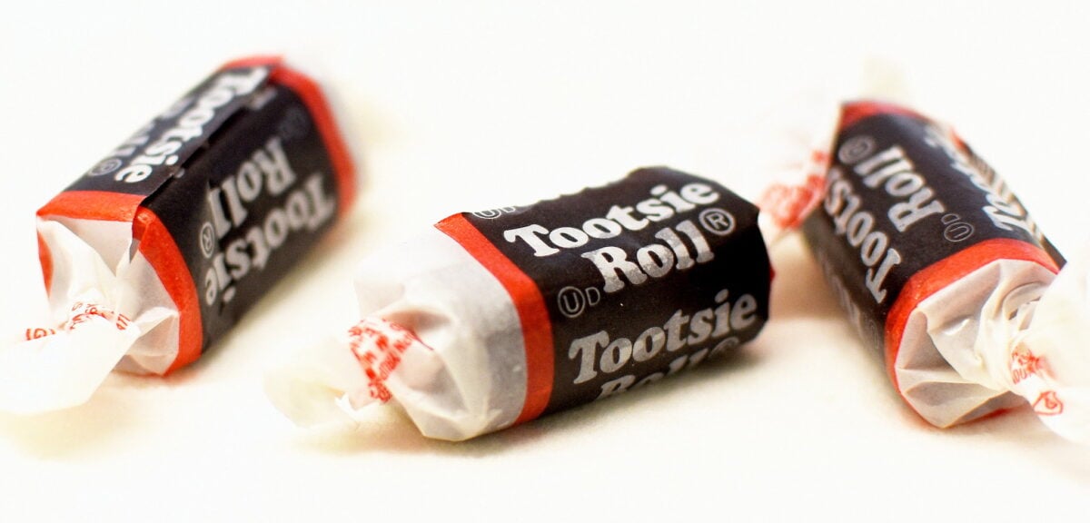
Tootsie Roll’s packaging features Cooper Black, a thick, friendly font that perfectly captures the chewy nature of the candy. The brown wrapper with white lettering is simple but instantly recognizable.
The design has remained essentially unchanged since the candy’s early days. Cooper Black is one of those fonts that appears everywhere once you start noticing it.
It shows up on album covers, in advertisements, and on countless product packages. But Tootsie Roll used it so effectively that many people associate the font primarily with that brown wrapper.
The candy itself is often overlooked these days, but the package remains iconic.
The Blue Package That Creates Nostalgia
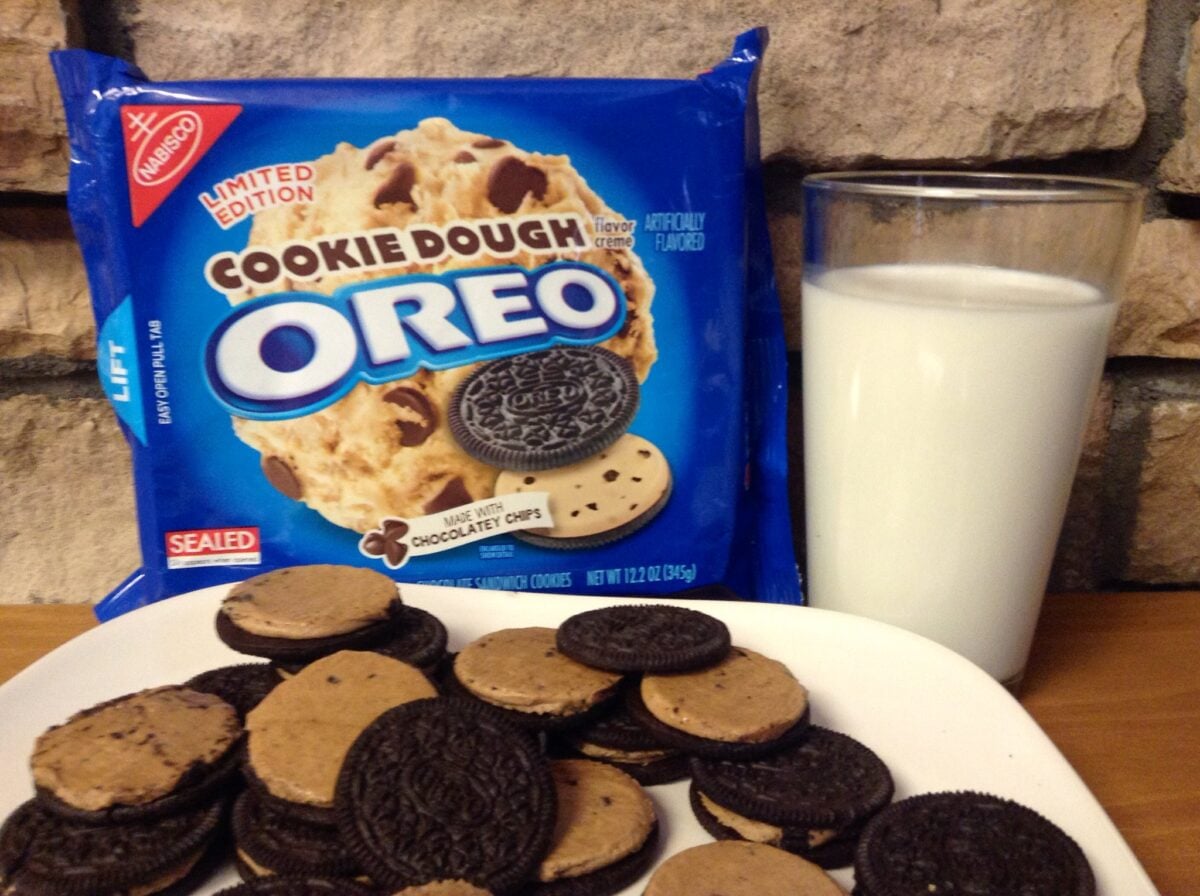
Oreo cookies come in a distinctive blue package with the brand name prominently displayed. The deep blue background creates an emotional response.
Blue is calming and trustworthy. It makes you think of home and childhood. The package looks essentially the same whether you’re buying it in America, China, or anywhere else in the world.
The blue wrapper has become so associated with Oreos that other sandwich cookies struggle to compete even when they taste similar. People buy the blue package because that’s what Oreos look like.
The color has become part of the product’s identity. Change the package color and you’d confuse millions of customers who rely on that blue to find their favorite cookie.
The Tiny Bottle That Packs Heat
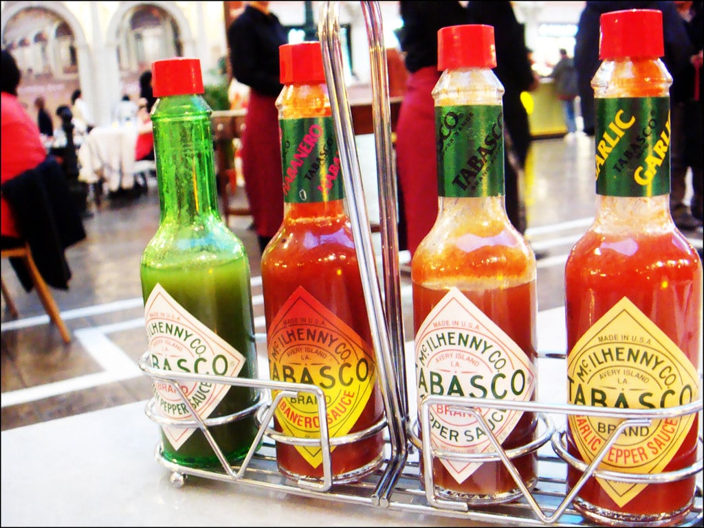
Tabasco sauce has been packaged in the same small bottle since 1868. Founder Edmund McIlhenny used cologne-type bottles because they were the right size and easily available.
The distinctive shape and small scale make Tabasco instantly recognizable even from across a restaurant table. More than 700,000 bottles leave the factory on Avery Island, Louisiana every day.
That’s a lot of tiny bottles. The size feels appropriate for something so concentrated and spicy.
You don’t need much Tabasco to transform a dish. The small bottle communicates that this is powerful stuff, use it carefully.
The package warns you before you even taste what’s inside.
The Red Cap on Clear Glass
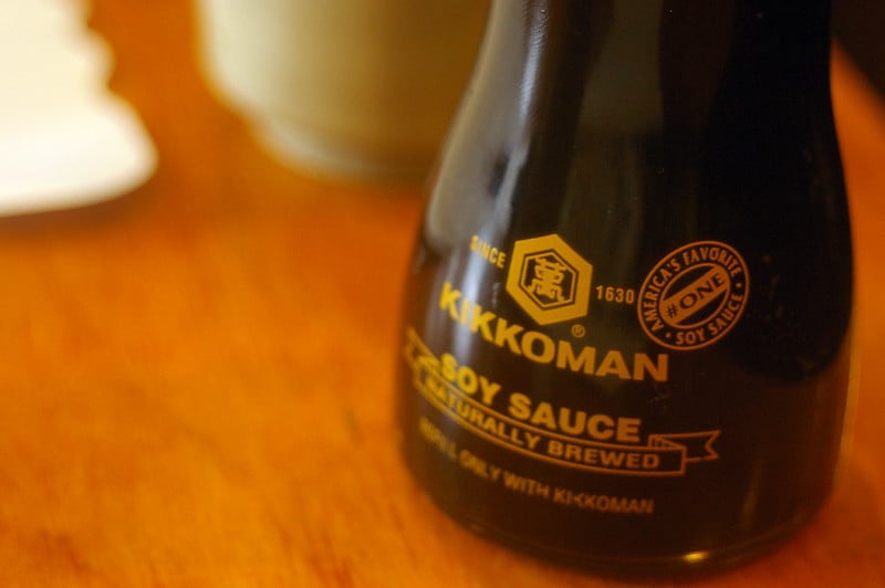
Kikkoman soy sauce bottles are studied in functional design. The clear glass lets you see exactly how much remains.
The distinctive red dripless cap adds a pop of color while serving a practical purpose. Designer Kenji Ekuan created the bottle in the 1960s, and it hasn’t needed changes since.
The shape fits comfortably in your hand. The pour spout delivers the right amount without dripping.
Every element serves both form and function. It’s the kind of design that’s so good you don’t think about it until someone points out how perfect it is. Then you realize you’ve been reaching for that exact bottle shape your entire life without questioning why it works so well.
The Foil Pan That Cooks Itself
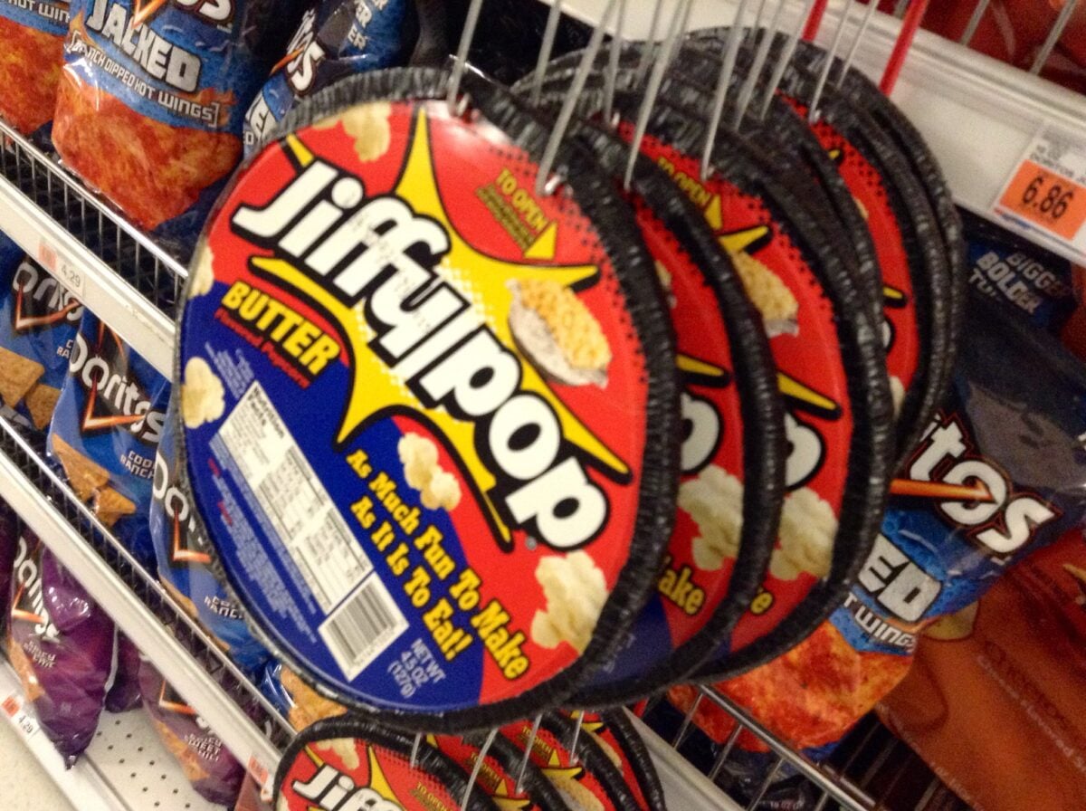
Jiffy Pop predated the microwave by about a decade. You placed the heavy aluminum pan directly on the stove and watched the foil dome expand as the kernels popped.
The package was both a container and cooking vessel. Kids loved watching it transform from a flat pan into a silver balloon.
The design solved multiple problems simultaneously. It packaged the popcorn, provided a cooking method for people without special equipment, and created a memorable experience.
Jiffy Pop wasn’t just food. It was entertainment.
The package did all the work. That distinctive expanding dome shape became so iconic that it remains recognizable decades after most people stopped cooking popcorn on the stovetop.
The Bears That Hold Honey

Honey bear bottles appeared in the 1950s and quickly became the standard way to package honey. The bear shape is cute and immediately communicates what’s inside without words. Kids can identify it from across the store.
Adults can spot it in a crowded pantry. The shape also serves a practical purpose. Honey is thick and slow to pour.
The squeezable plastic bear makes it easy to get honey out and control how much you use. The wide base keeps it stable on the shelf.
Every honey manufacturer seems to use some variation of the bear shape now. The package transcended any single brand to become the default form for an entire category of product.
The KFC Bucket That Became Collectible

Kentucky Fried Chicken introduced the bucket of chicken to go in 1957 at a Salt Lake City restaurant. The bucket was practical for transport and kept the food warm.
But it also became one of the most recognizable packages in fast food. The distinctive red and white striped bucket with Colonel Sanders’ face has remained essentially unchanged for decades.
Limited edition versions have become collector’s items. People keep the buckets and reuse them for storage, crafts, and Halloween candy.
The package has outlived its intended single use to become a cultural artifact. You can find vintage KFC buckets at antique stores, which tells you everything about how a simple container can transcend its purpose.
The Jar That Divides Nations
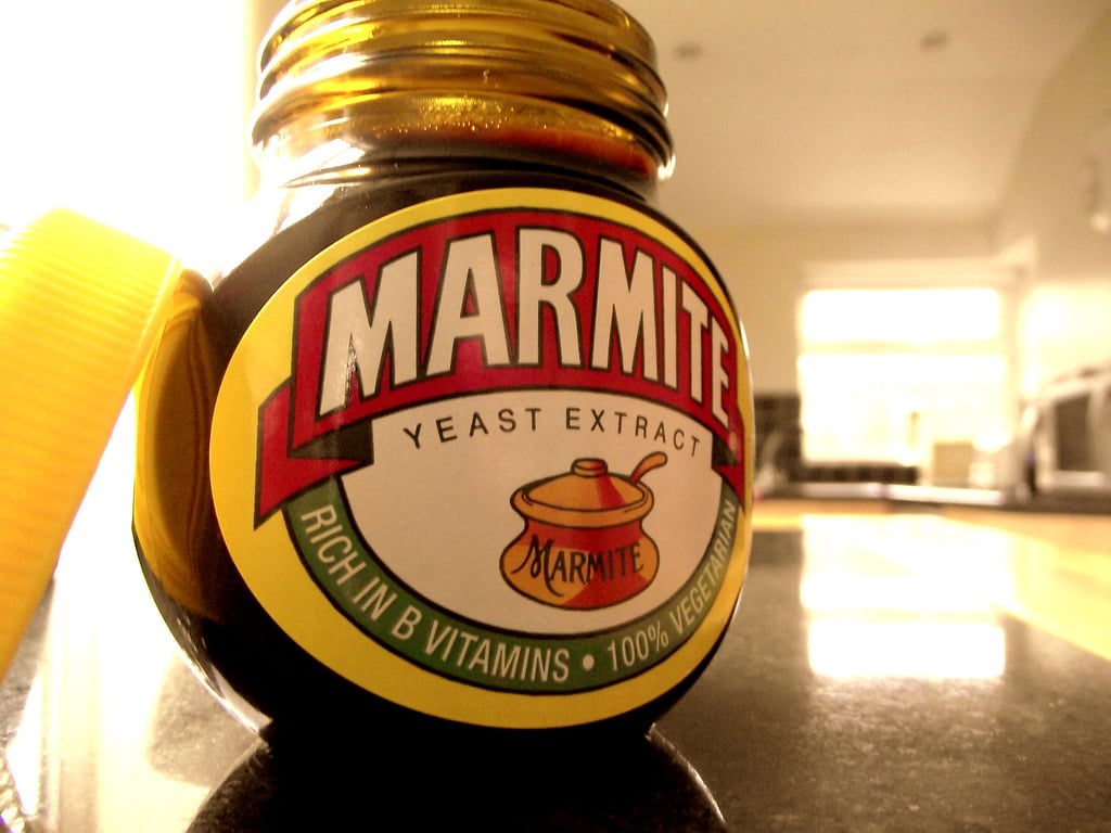
Marmite comes in a squat black jar with a yellow label. The yeast extract spread was named after a French cooking pot, and originally came in earthenware vessels shaped like that pot. Since the 1920s, the glass jar has maintained the same basic form with a picture of the original pot on the label.
The jar’s distinctive shape makes it immediately identifiable on any shelf. British households either have a jar of Marmite in the cupboard or they don’t, with very little middle ground.
The package itself has become shorthand for the product’s polarizing nature. You either love it or hate it, and that jar represents both positions equally.
When the Package Becomes the Product
Some packages transcend their original purpose and become more valuable than what they hold. You recognize them instantly. You have emotional reactions to them.
You remember them from childhood. You can close your eyes and picture them perfectly.
These designs succeeded because they solved real problems while creating memorable visuals. They stayed consistent over decades when competitors were constantly redesigning. They became trusted friends you could find without looking.
The best packaging becomes invisible in one sense and unforgettable in another. You don’t think about it when you reach for it, but you’d notice immediately if it changed.
That’s the paradox of truly great design. It’s both background and icon, functional and emotional, practical and eternal.
More from Go2Tutors!

- The Romanov Crown Jewels and Their Tragic Fate
- 13 Historical Mysteries That Science Still Can’t Solve
- Famous Hoaxes That Fooled the World for Years
- 15 Child Stars with Tragic Adult Lives
- 16 Famous Jewelry Pieces in History
Like Go2Tutors’s content? Follow us on MSN.