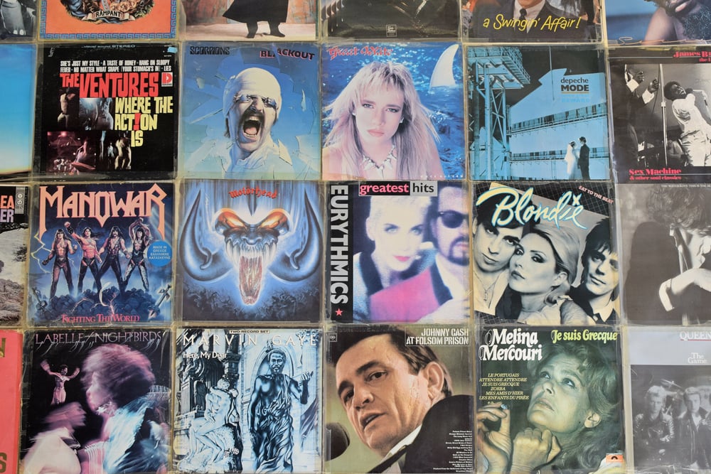
Iconic Album Covers and the Stories Behind Them
Walking into a record store used to be about more than just music. The covers staring back from the shelves told their own stories.
Some featured bands standing in the street. Others went abstract with prisms and colors that made you think.
A few captured split-second moments that nobody planned. These images became just as famous as the songs inside, sometimes more so.
Plenty of covers got designed on purpose to shock or impress. But the best ones?
They often came from accidents, last-minute decisions, or photographers clicking the shutter at exactly the right moment.
Abbey Road
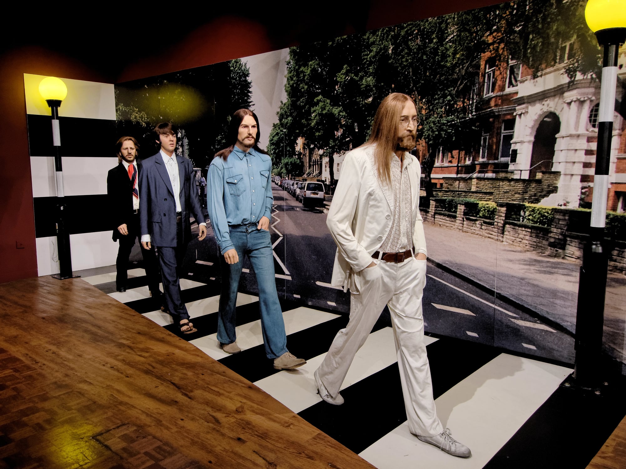
Four guys crossing a street shouldn’t mean much. But when those four guys are the Beatles, everything means something.
Photographer Iain Macmillan stood on a stepladder outside EMI Recording Studios on August 8, 1969, while a police officer held up traffic for about 15 minutes. Seven or eight different versions of the photo were taken, and the band picked the one where everyone looked in step.
Well, almost everyone. Paul McCartney walked barefoot, out of sync with the others, and fans lost their minds trying to figure out what it meant.
The conspiracy theories piled up fast. Some people decided this proved Paul had died and been replaced.
Fans declared this proof of ‘Paul is Dead’, fuelling rumours that he’d been replaced by a double. The truth was simpler and way less interesting.
It was just a quick photo shoot on a Thursday morning. The album wasn’t even supposed to be called Abbey Road originally—Everest was floated as a possibility, after the brand that engineer Geoff Emerick used, but the band balked when it was suggested that they travel to the Himalayas for the photo shoot.
Nevermind
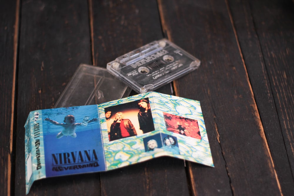
Spencer Elden was four months old when his parents got a call about a photo shoot. His father helped with sets and custom rigging for photo shoots, which is how he got to know underwater photographer Kirk Weddle.
Weddle initially tried to photograph babies at a swimming class, but none of those images fit what Geffen Records was looking for, so they wound up choosing one of the stills that Weddle took of Elden. The dollar bill on a fish hook got added later to drive home the concept.
Elden’s parents were reportedly paid only $200, and the shoot lasted around 15 seconds. That 15-second photo session turned into one of the most recognized images in rock history.
Years later, Elden had mixed feelings about his infant fame. He said he was trying to reach out to people from the band but never met anybody, never got a call or email, and just woke up already being a part of this huge project.
The legal battles that followed decades later got dismissed by judges who ruled the image didn’t constitute anything inappropriate.
London Calling
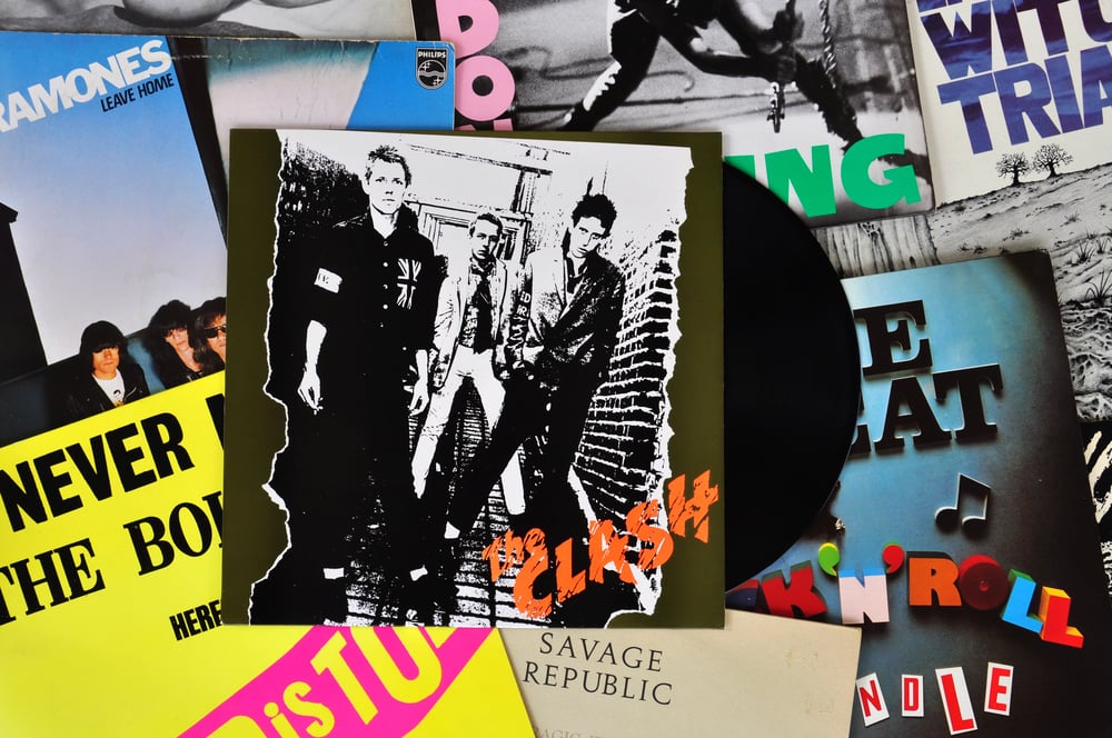
Paul Simonon loved his white Fender Precision Bass. It was older and heavier, probably from the early 1970s, and was his preferred instrument.
On September 21, 1979, at New York’s Palladium, that bass met its end. The Palladium was an all-seat venue and the Clash were used to a more raucous crowd.
As the band tried to rally their fans to their feet, the bouncers pressured them back to their seats. Simonon got frustrated watching security force people to sit during a punk show.
He later explained that the frustration led him to destroy the bass guitar, adding that you always sort of tend to destroy the things you love. Photographer Pennie Smith caught the moment mid-smash.
She didn’t even like the photo at first. Smith thought it was too blurry, but frontman Joe Strummer and graphic designer Ray Lowry believed it would serve as an excellent album cover.
The pink and green lettering on the cover paid direct homage to Elvis Presley’s first album. Right after the photo was taken, the bass guitar did splinter into several pieces, some of which Simonon kept for years afterward—now the guitar is on display at the Museum of London.
The Dark Side of the Moon

Pink Floyd keyboardist Richard Wright had simple instructions for the designers. Wright suggested them to do something clean, elegant and graphic.
Storm Thorgerson and Aubrey Powell from the design group Hipgnosis ran brainstorming sessions that stretched late into the night. One night, Thorgerson showed Powell a black-and-white photograph of a prism with a color beam projected through it, an image he’d also noticed in a physics textbook.
The band approved the prism concept almost immediately. Thorgerson mentioned in an interview with Rolling Stone that the triangle is a symbol of thought and ambition, which was very much a subject of Roger Waters’ lyrics, and noted that the prism belonged to the Floyd.
Artist George Hardie drew the final illustration and worked out the exact color percentages for printing. The album didn’t feature the band’s name anywhere on the cover, which seemed risky but turned out brilliant.
That prism on a black background became more recognizable than any photo of the band members could have been.
Born in the U.S.A.

Annie Leibovitz took hundreds of photos during the shoot for Bruce Springsteen’s seventh studio album. Springsteen once said the cover photo happened by chance, and they took many different types of pictures.
The one they picked showed him from behind, standing in front of an American flag. The cap in his back pocket belonged to the recently deceased father of his friend Lance Larson—Springsteen included it on the album cover in tribute.
People read all kinds of meanings into that image. Some thought Springsteen was celebrating Reagan-era patriotism.
Others claimed he was literally relieving himself on the flag. Springsteen denied both angles in an interview with Rolling Stone in 1984, saying it was unintentional and that the picture of his rear end looked better than the picture of his face, so that’s what went on the cover.
The actual meaning sat somewhere in the middle, a complicated statement about America that matched the complicated songs on the album. Over 70 songs came out of the sessions for the album and, despite its colorful cover image and uplifting music, the lyrics dealt with darker issues such as working-class struggles, patriotism, personal relationships and disillusionment.
Sgt. Pepper’s Lonely Hearts Club Band
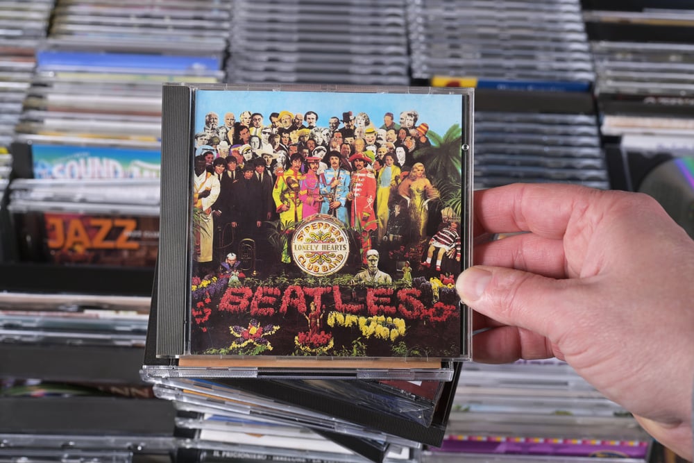
The Beatles wanted to create something completely different for their eighth album. Designers Peter Blake and Jann Haworth created a collage of cardboard cutouts of famous historical figures, from Marilyn Monroe to Albert Einstein, surrounding the band members dressed in colorful military-style uniforms.
The concept turned into a massive production. The image on the cover shows more than 60 faces, featuring everyone from Bob Dylan and Marlon Brando to Sonny Liston, as well as wax figures of the Beatles themselves.
Fans spent hours trying to identify everyone in the crowd and debating what it all meant. The band wore bright satin uniforms that looked like something a military marching band would wear if military marching bands took acid.
The whole thing screamed 1967 in the best possible way. It redefined what an album cover could be and set a new standard for ambition in packaging.
Sticky Fingers

Andy Warhol designed plenty of album covers, but the Rolling Stones gave him complete creative freedom for their 1971 release. Mick Jagger wrote a letter to Warhol saying that in his short experience, the more complicated the format of the album, the more messed up the reproduction and agonizing the delays, but he left it in Warhol’s capable hands to do whatever he wanted.
The image on the sleeve shows Joe Dallesandro’s denim-clad crotch with a working zip, and featured for the first time the band’s famous tongue and lips logo from designer John Pasche. The zipper actually functioned on early pressings, which caused all sorts of problems.
Records stored next to Sticky Fingers sometimes got scratched by that metal zipper. But the cover’s boldness matched the music inside and helped define the Stones’ image for decades.
That tongue logo became just as recognizable as the band itself.
Parallel Lines
Blondie understood the power of contrast. The male members of the band wore black suits, crisp white shirts and thin black ties, creating a visual parallel to the black and white lines behind them, while they smiled or smirked.
Debbie Harry stood slightly in front wearing her classic white dress and heels, a contrast to the band’s beat-up Converse, staring down the viewer with a no-nonsense demeanor that conveyed her icy cool. The simplicity worked perfectly.
No fancy effects, no complicated concepts. Just a band standing against striped wallpaper, but the composition and Harry’s commanding presence turned it into something that stuck in your memory.
The cover captured both the new wave aesthetic and Blondie’s unique position in that scene, where punk attitude met pop accessibility.
Horses

Patti Smith needed a photo for her debut album. The stark image shows Smith in black and white standing strong and confident against a blank wall.
Her photographer was also her boyfriend, Robert Mapplethorpe. The relationship between photographer and subject comes through in every line of that image.
Smith looks completely comfortable, not performing for the camera but just being herself. The jacket slung over her shoulder, the white shirt, the direct gaze—everything about it rejected typical ideas of how women should present themselves on album covers.
The seminal 1975 record wasn’t only sonically incredible but its cover has remained one of the most iconic images of the 1970s. That cover became a statement about authenticity and artistic identity that influenced countless musicians who came after.
Mellon Collie and the Infinite Sadness
The Smashing Pumpkins went big for their third album, releasing a double disc with 28 tracks. The cover needed to match that ambition.
Illustrator and collage artist John Craig was asked by frontman Billy Corgan to design the booklet illustrations, and when the original idea for the cover art fell through, Craig asked why they didn’t give him a shot at the cover. Craig later admitted that the star-riding woman adorning the eventual cover was a composite based on Jean-Baptiste Greuze’s The Souvenir from 1787-1789 and Raphael’s Saint Catherine of Alexandria from around 1507.
Corgan faxed concepts and ideas to Craig, many of which ended up in the deluxe version. The dreamlike quality of the final image captured something about the sprawling, ambitious nature of the album itself.
That woman floating through stars became one of the defining images of 1990s alternative rock.
Wish You Were Here

Pink Floyd’s follow-up to Dark Side of the Moon needed its own distinct identity. Designer Storm Thorgerson decided to accompany the band on their 1974 tour and had given serious thought to the meaning of the lyrics of the band’s new songs, eventually deciding that the tracks were concerned with unfulfilled presence rather than Roger Waters’ friend Syd Barrett’s illness as suggested.
The striking album cover image featuring two men standing across from one another while one is on fire was inspired by the idea that people tend to conceal their true feelings, for fear of getting burned. The image was photographed by Aubrey Powell, showing two businessmen shaking hands with one man on fire.
The symbolism hit hard—people hiding their real selves to avoid getting hurt. The stunt man who stood in flames for the shoot only did it for a few seconds at a time, but those seconds created an image that defined the album’s themes perfectly.
Thriller
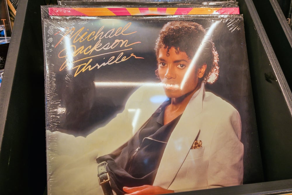
Michael Jackson’s sixth studio album needed a cover that matched his superstar status. The photo showed Jackson in a white suit, leaning casually against a dark background.
Nothing complicated, nothing over the top. The final version with Jackson in the white suit became widely recognized and synonymous with the album’s success, contributing to its iconic status in music history.
The simplicity worked because Jackson’s presence carried the whole thing. The white suit became part of his signature look.
The pose, the slight tilt of his head, the confident but approachable expression—everything communicated exactly what the album delivered. Thriller went on to become the best-selling album of all time, and that cover image appeared on posters in bedrooms across the world.
In the Court of the Crimson King
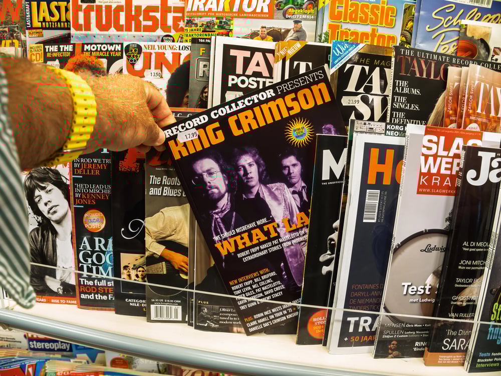
Barry Godber painted one face for one album and then died shortly after. The screaming, wide-eyed face that adorns King Crimson’s debut was painted by Godber, a computer programmer and part-time artist, and tragically it was the only cover he ever created—he died of a heart attack shortly after its completion.
The unsettling image set the tone for one of progressive rock’s defining statements, its distorted humanity reflecting the album’s themes of paranoia, chaos, and grandeur. That face staring out from record store shelves in 1969 looked like nothing else around it.
The bright red, the distorted features, the expression caught somewhere between ecstasy and agony—it told you immediately that this album wasn’t going to sound like anything else either. Godber never got to see how his artwork influenced generations of album cover designers.
The Velvet Underground and Nico

Andy Warhol didn’t just design the cover for the Velvet Underground’s debut album. He produced the record and managed the band.
His solution for the cover was simple but brilliant: a banana. The Andy Warhol creation must have taken all of five minutes to put together, but that’s part of what made it work.
On early pressings, you could peel the banana sticker to reveal a pink banana underneath. The concept fit perfectly with Warhol’s pop art sensibility and the band’s avant-garde sound.
Nothing on the cover prepared you for the music inside, which was exactly the point. Lou Reed and company weren’t interested in explaining themselves, and neither was their cover art.
Unknown Pleasures

Joy Division’s first record showed a design few had come across. Flipping through an old space book in ’77, guitarist Bernard Sumner found squiggles from a distant star – radio pulses – that ended up shaping the band’s visual identity.
At Factory Records, art guy Peter Saville flipped the dark and light parts to give it punch. The pale streaks on dark canvas were real measurements taken from a spinning neutron star, yet nearly every fan buying the LP didn’t get that part.
To them, it simply felt sharp, fresh, nothing like what was around. The picture got tied to post-punk so tightly, it pops up today on shirts people wear without knowing the record.
Because of Saville’s stripped-down style, tons of young designers started shaping their work differently.
Abraxas
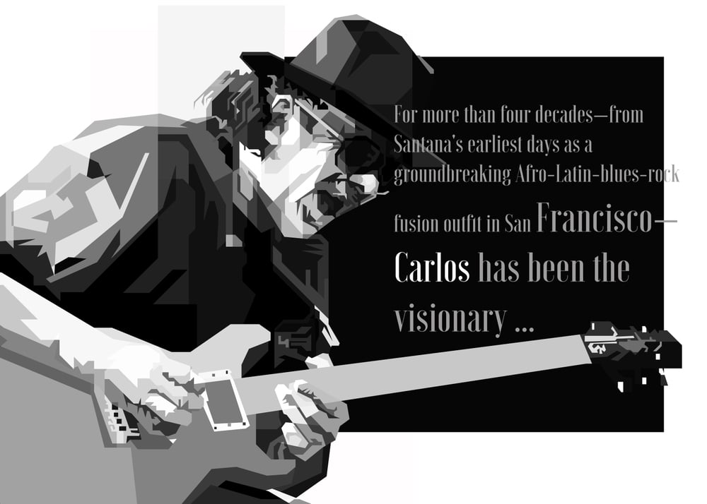
Santana’s second record called for visuals just as bold as its sound – a mix of Latin beats and electric guitar. Instead of “and,” think with or even alongside: this jacket pulled from a dreamy place, thanks to painter Mati Klarwein.
His piece reimagines the Annunciation – not traditional but daring – showing a dark-skinned Mary plus an angel glowing crimson, a conga tucked beneath her knees. Flip it over – the same woman seen there?
She pops up again on Miles Davis’ wild Bitches Brew sleeve; one artist, two legendary records. No stiff poses here – Klarwein mashed sacred symbols with vivid tones, tossing in mystery like spice into soup – all part of what made early ’70s music feel so raw, so searching.
The artwork came first, yet somehow matched Santana’s sound so well you can’t think of the tracks apart from that picture. With its spinning hues and dreamlike shapes, it showed what words couldn’t – how rock met Latin beats and jazz vibes in ways a regular group shot just wouldn’t express.
Meat Is Murder

The Smiths weren’t ones to back down from trouble – this showed up right on their second record’s sleeve. Their singer, Morrissey, lived strictly without animal products, so he linked eating meat to fighting wars by choosing a bold picture: a soldier from Vietnam wearing a helmet stamped with the album name.
A gritty monochrome shot, it carried his dual protest against bloodshed and harm to animals. Each of their albums wore sharp visuals, pulled straight from films, books, or real-life photos snapped during tough moments.
This one stung most since it linked two totally different kinds of harm, making people face them at once. The bluntness in the lyrics lined up with how raw the sound felt.
The Miseducation of Lauryn Hill

Lauryn Hill revisited her old high school for the photo session. With Eric Johnson behind the camera, she headed back to her New Jersey campus – snapping pics in hallways, classrooms, even on a school bus – all echoing the vibe of the album’s name.
The woodshop inspired the main shot: her face carved into a wooden desk like an engraving. That single picture linked learning, self-expression, and creativity.
She’d already built fame with the Fugees; now, this first solo project had to prove itself separate. That desk, etched with her face, turned into something lasting – deeply hers, linked to moments that defined her journey.
Even now, it stands out as one of hip-hop’s rarest album visuals; maybe even more meaningful since the multi-Grammy artist never really matched it again.
Once pictures last longer than songs

Back in the day, album art was what caught your eye first. Walking into a music shop, you’d sift through stacks – then bam, one picture grabs you, makes you reach for it.
In just a split second, that image had to sell itself. A few were so strong they ended up way more iconic than the tracks inside.
Some folks haven’t listened to Unknown Pleasures but still rock that pulsar design on shirts. Meanwhile, the Dark Side of the Moon triangle pops up in college rooms where music mostly comes through apps.
Those visuals broke free from their roots – now they’re just out there, living in everyday life. You don’t need to know a song to get something from them.
Often, the strongest ones happened by accident: someone snapped a quick photo that somehow summed up a whole era, or an artist doodled an idea that ended up meaning more than anyone guessed.
More from Go2Tutors!

- The Romanov Crown Jewels and Their Tragic Fate
- 13 Historical Mysteries That Science Still Can’t Solve
- Famous Hoaxes That Fooled the World for Years
- 15 Child Stars with Tragic Adult Lives
- 16 Famous Jewelry Pieces in History
Like Go2Tutors’s content? Follow us on MSN.