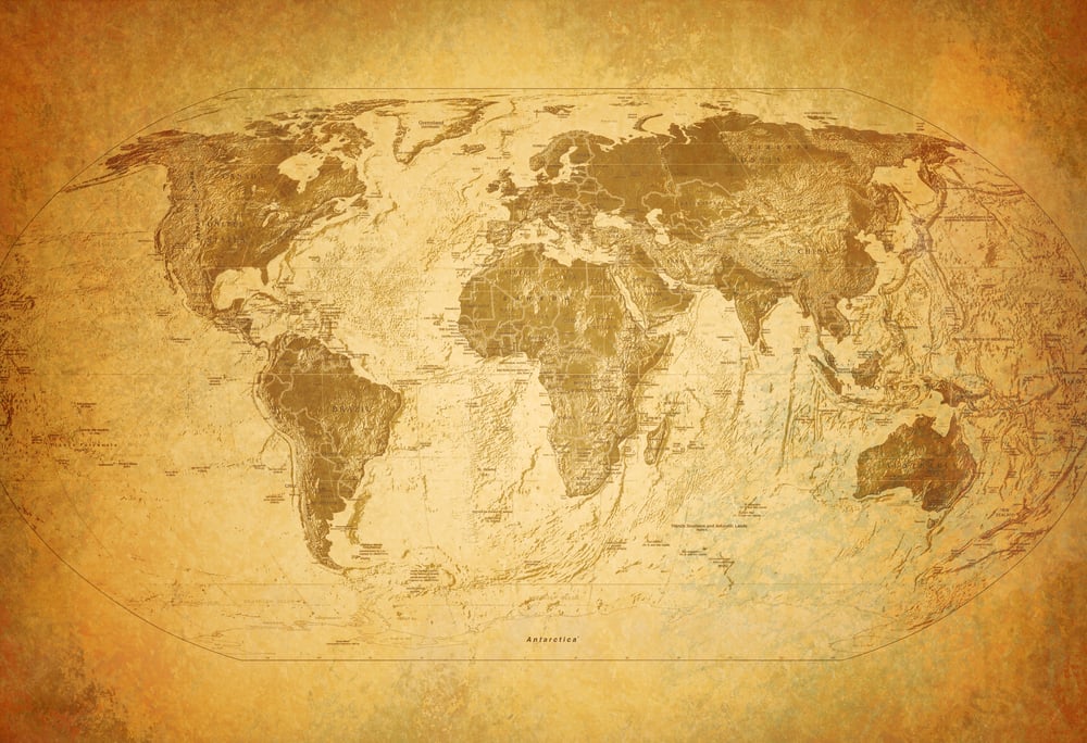
Map Errors and Cartography Mysteries
Maps are supposed to show us the truth about our world, but they’ve been getting things wrong for centuries. Some mistakes happened because of bad information, while others were intentional tricks that mapmakers used for various reasons.
These errors and mysteries reveal how difficult it was to chart the world before satellites and GPS, and some of them still cause confusion today. The history of cartography is filled with phantom islands, misplaced cities, and deliberate lies that became accepted as fact.
Here are some of the most interesting map errors and mysteries that fooled people for years.
The island that never existed

Bermeja was supposed to be a small island off the coast of Mexico in the Gulf. Maps showed it for hundreds of years, and Mexico even used it to claim oil-rich waters in that area.
When surveyors went looking for Bermeja in the late 1990s to settle a border dispute with the United States, they found nothing but open water. The island had appeared on maps since the 1500s, but nobody could explain where it went or if it ever existed at all.
Some people think rising sea levels covered it, while others believe it was a mapping error that got copied over and over.
Mountains that weren’t there

The Mountains of Kong stretched across West Africa on European maps for almost a century. Mapmakers drew this massive mountain range based on reports from a Scottish explorer named Mungo Park in the late 1700s.
The mountains appeared on maps well into the 1880s, affecting how Europeans understood African geography and climate. French explorers finally proved the mountains didn’t exist, but the fake range had already influenced countless other maps and travel plans.
Park probably saw some hills and assumed they continued into a major mountain system.
California as an island
For about 200 years, many maps showed California separated from the rest of North America by water. This error started in the early 1600s and persisted despite evidence that California was actually attached to the mainland.
Spanish explorers had conflicting reports about the geography, and some mapmakers preferred the island version because it looked more interesting. Even after the mistake was officially corrected, maps with island California kept getting printed and sold.
The error became so widespread that some people refused to believe California was a peninsula even when shown proof.
Trap streets and paper towns

Mapmakers deliberately put fake streets and towns on their maps to catch anyone who copied their work. If a competitor’s map showed the same fake location, it proved they’d stolen the information instead of doing their own surveys.
The town of Agloe in New York was one of these traps, created by placing a made-up name at a random crossroads. Years later, someone built an actual store at that spot and named it Agloe General Store, turning the fake town into a real place.
These copyright traps appeared on maps throughout the 20th century and some might still be hiding on maps today.
The moving capital of Brazil
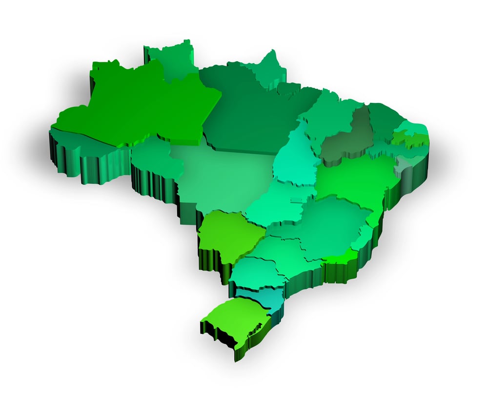
When Brazil decided to build a new capital city called Brasília in the 1950s, maps had to be updated constantly as construction progressed. Early maps showed the city in slightly wrong locations because planners kept adjusting the exact placement.
Some international maps put Brasília hundreds of miles from its actual spot for years after it became the official capital. The confusion came from the fact that the city was built from scratch in the middle of mostly empty land.
Cartographers struggled to accurately represent something that was still being created.
Antarctica’s phantom mountains
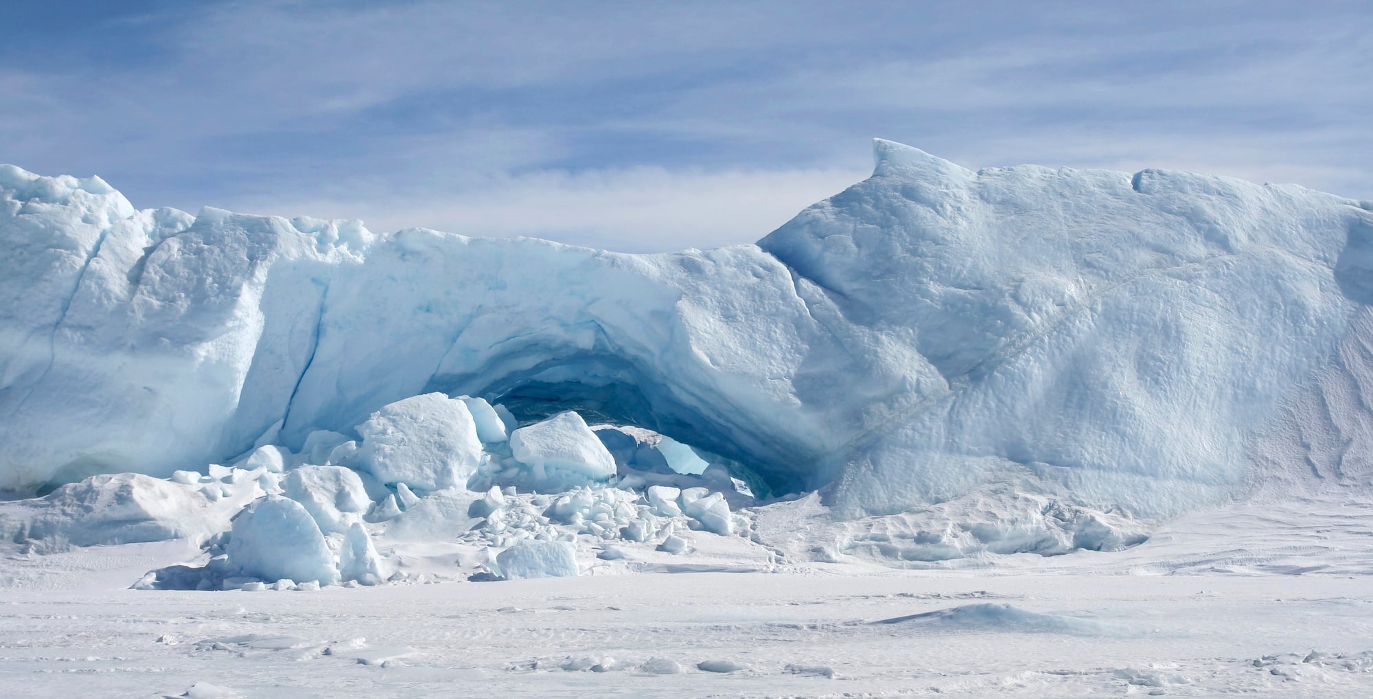
Early maps of Antarctica showed mountain ranges that explorers couldn’t find when they actually reached the continent. The harsh conditions and limited visibility during early expeditions led to serious mistakes about what the land really looked like.
Some explorers reported mountains where there was only flat ice, while others missed actual features because of whiteout conditions. Maps from the early 1900s often contradicted each other completely.
It took aerial photography and modern surveying equipment to finally get Antarctica’s geography right.
The Vinland Map controversy
A map appeared in the 1950s claiming to show that Vikings reached North America long before Columbus. The Vinland Map showed Norse settlements in a place called Vinland, which could have been Newfoundland or somewhere nearby.
Scientists have argued for decades about whether the map is genuine or a clever fake from the 1900s. Some tests suggest the ink is too modern, while other experts defend its authenticity.
The debate continues because proving or disproving the map’s age has turned out to be incredibly difficult.
Rivers running the wrong way
The Colorado River appeared backwards on some early American maps, with its flow direction completely reversed. Mapmakers working from secondhand information sometimes guessed at river directions and got them totally wrong.
Other rivers like the Amazon and the Nile had similar problems on various maps throughout history. These errors could lead explorers seriously astray if they tried to follow the river upstream but were actually going downstream.
Getting river directions right required actually traveling along them, which wasn’t always possible for early cartographers.
The Shrinking Aral Sea

Back then, the 1960s charts marked the Aral Sea as a giant among lakes. Today’s versions display little left – just traces where water once spread wide.
Not because someone drew it wrong, but due to human choices with harsh consequences. Water routes that fed it were rerouted by Soviet farming systems.
As those flows stopped, so did the sea’s survival. Within decades, what took ages to form vanished fast.
Landscapes on paper shift sharply depending on when the map was made.
Magnetic north mistakes

Back then, compass needles aimed at magnetic north instead of true north – so early maps carried steady mistakes. Depending on where you stood, the gap between those two points shifted, also shifting over years.
When map creators ignored this drift, their work wound up tilted out of alignment. Coastlines landed at strange tilts since compass data was flawed.
For hundreds of years, ships followed paths based on skewed directions before experts figured out how to adjust for the earth’s pull.
The Phantom of the North Pole
Back then, folks believed solid ground lay close to the pole – maps drew it in bold. Ice sheets drifting on the ocean? That idea came later.
Expectation shaped the lines on paper more than facts ever did. Picture after picture included cliffs, bays, peaks – all made up.
It wasn’t until metal birds flew low and steel fish slid under ice that truth took hold. Hope had painted those old charts, not eyes.
What people wished for stood written across blank white spaces for decades.
Misplaced cities
European maps often put Asian and African cities in the wrong locations by hundreds of miles. Mapmakers relied on travelers’ descriptions and rough estimates of distance, which led to major errors.
Marco Polo’s accounts of his travels contained distance measurements that cartographers interpreted differently. Some cities appeared in two or three different spots on maps from the same period.
The mistakes only got fixed when surveyors could take accurate measurements using better instruments.
The coastline that kept changing
Australia’s coastline looked different on nearly every map made before the mid-1800s. Early Dutch and British explorers charted different sections at different times, and combining their work created contradictions.
Some maps showed bays where there were actually peninsulas and vice versa. The northern coast was especially problematic because of its complex geography and dangerous sailing conditions.
Getting Australia’s shape right took multiple expeditions and decades of careful surveying.
Imaginary islands in the Pacific

Sailors reported seeing islands in the Pacific Ocean that other ships could never find again. These phantom islands appeared on maps and sent expeditions on wild goose chases.
Sandy Island, supposedly near New Caledonia, appeared on maps until 2012 when a research ship proved nothing was there. Other fake Pacific islands included Sarah Ann Island and Dougherty Island.
The reports often came from tired sailors misidentifying clouds, mirages, or floating debris as land.
The size of Greenland

Most flat maps make Greenland look as big as Africa, even though Africa is actually about 14 times larger. This error comes from the difficulty of representing a round Earth on a flat surface.
The Mercator projection, used for navigation, stretches areas near the poles to extreme sizes. Greenland suffers the worst from this distortion.
People looking at standard world maps get a completely wrong sense of how big Greenland really is compared to other landmasses.
Border disputes from bad maps
War has broken out between nations simply because their maps showed borders differently. Where one country saw a boundary, another saw open land.
Disagreement over the McMahon Line persists due to mismatched lines on Indian and Chinese charts. European rulers once sketched African frontiers based on incomplete drawings of the ground below.
What looked neat on paper ignored villages, tribes, rivers. Mistakes made long ago still echo in modern disputes.
A slight shift in ink on old parchment changed lives across generations.
China’s secret map corrections

Off by hundreds of feet – China’s official maps place certain spots just slightly off. You might stand on a sidewalk only to see your position marked near a wall instead.
This shift isn’t accidental. Authorities enforce it so exact locations stay unclear to outsiders.
Global positioning tools made outside China often misplace users because of this gap. If you walk down a Beijing alley with a foreign gadget, the dot moves slower than your steps.
Businesses from abroad must adapt their systems to match these altered versions. The mismatch hides details that could matter in conflict situations.
Even satellites adjust when serving local platforms.
Why maps still matter
Mistakes pop up everywhere when you look close at old charts – turns out drawing Earth neatly wasn’t ever really possible. People who drew maps did their best using shaky facts and clumsy instruments.
Confusion sometimes led to errors, though some changes were on purpose – useful tricks or hidden agendas shaped lines too. Today’s gadgets have cleaned up a lot of past blunders, yet every map still carries its maker’s blind spots.
Seeing where maps go off track teaches folks to watch closer, and wonder why things are drawn that way.
More from Go2Tutors!

- The Romanov Crown Jewels and Their Tragic Fate
- 13 Historical Mysteries That Science Still Can’t Solve
- Famous Hoaxes That Fooled the World for Years
- 15 Child Stars with Tragic Adult Lives
- 16 Famous Jewelry Pieces in History
Like Go2Tutors’s content? Follow us on MSN.