Old Logos That Got Major Makeovers
Ever noticed how some brands just seem to get better with age? Like that friend who discovers their perfect style and suddenly looks amazing everywhere they go?
That’s exactly what happens when companies nail their logo redesigns. One day they’re struggling with outdated visuals that scream “stuck in the past,” and the next, they’re sporting sleek new looks that make everyone stop and take notice.
Think about it: How many times have you seen a brand’s new logo and thought, “Wow, that’s so much better!” These transformations aren’t accidents—they’re strategic moves that can completely change how we feel about a company.
Here are 13 old logos that got major makeovers, proving that sometimes the best thing you can do is embrace change and trust the process.
Apple – From Complex Chaos to Pure Simplicity
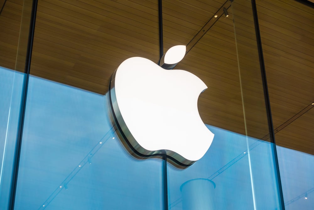
Remember Apple’s original logo from 1976? Picture this: Isaac Newton sitting under a tree with an apple about to fall, all wrapped up in an ornate, rainbow-striped design that looked more like a vintage book illustration than a tech company logo.
It was artistic, sure, but try putting that on a computer screen or business card! By late 1976, Apple realized they needed something that would actually work in the real world, so they switched to the iconic bitten apple we know today.
The transformation was like watching someone trade in a complicated Victorian dress for a perfect little black dress—suddenly everything just worked. That simple apple silhouette became one of the most recognizable symbols on the planet, proving that sometimes less really is more.
McDonald’s – Finding Their Golden Identity
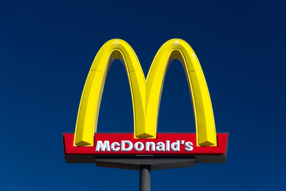
McDonald’s journey to those famous golden arches is like watching a small-town restaurant figure out how to become a global icon. Back in 1940, their logo was just basic black text on white background—about as exciting as a grocery store receipt.
Then came the 1948 redesign featuring ‘Speedee,’ a cheerful chef character with the slogan “I’m Speedee” plastered everywhere, which felt more like a cartoon than a serious restaurant brand. The real magic happened in 1961 when they introduced those overlapping golden arches that formed an ‘M’—inspired by the actual architectural arches of their restaurants.
It was brilliant because it connected their physical buildings with their brand identity. By 1975, they perfected the formula: simple golden arches on a red background that could be spotted from miles away.
This transformation shows how the best logos often come from embracing what makes your business unique rather than trying to be everything to everyone.
Like Go2Tutors’s content? Follow us on MSN.
Starbucks – Simplifying the Siren’s Story
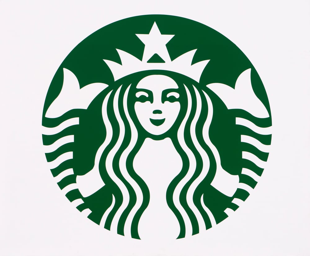
Starbucks’ logo evolution feels like watching someone learn to edit their own story down to the essentials. Their original 1971 logo was incredibly detailed—a brown, topless mermaid surrounded by text reading “Starbucks Coffee, Tea, and Spices.”
While historically accurate to their maritime coffee trading roots, it was way too complex for modern branding needs. The 1987 redesign brought us closer to today’s version: they introduced that iconic green color and simplified the siren, though she was still surrounded by the company name.
Then came the bold 2011 decision that shocked everyone—they dropped the text entirely and let the green siren stand alone. This move said, “We’re so confident in our brand recognition that we don’t even need our name on the logo anymore.”
It was like watching someone finally feel comfortable enough to let their personality speak for itself without constant explanation.
Pepsi – Chasing Cultural Moments

Pepsi’s logo history reads like a fascinating study in how brands try to stay relevant across different generations. Starting with simple red script in 1898, they’ve redesigned their logo more times than most people change jobs.
The 1940s brought that patriotic red, white, and blue circular design during the height of American optimism. The 1970s version got more dynamic with bolder colors and that distinctive wave design, reflecting the era’s energy and movement.
But here’s what’s interesting: their recent redesigns have focused on making that wave look like a smile, tapping into our psychological need for positive emotions. Each change shows how Pepsi has tried to mirror what their customers were feeling during different decades.
It’s like watching someone constantly update their wardrobe to stay current—sometimes it works perfectly, and sometimes you wonder what they were thinking.
Shell – From Literal to Legendary

Shell’s transformation is a masterclass in how to evolve a symbol while keeping its essence intact. They started with an actual, realistic black-and-white shell illustration—which made perfect sense for a company literally named Shell.
But imagine trying to use that detailed drawing on a tiny app icon or roadside sign! The genius move came in 1915 when they introduced color and began stylizing the shell into the bold red and yellow design we recognize today.
This wasn’t just about aesthetics—it was about creating something that would work across every possible application, from massive highway signs to tiny credit cards. The warm red and yellow colors also trigger psychological associations with energy, warmth, and reliability.
Shell proved that you don’t have to abandon your roots to modernize; you just need to find the clearest, strongest way to express them.
Like Go2Tutors’s content? Follow us on MSN.
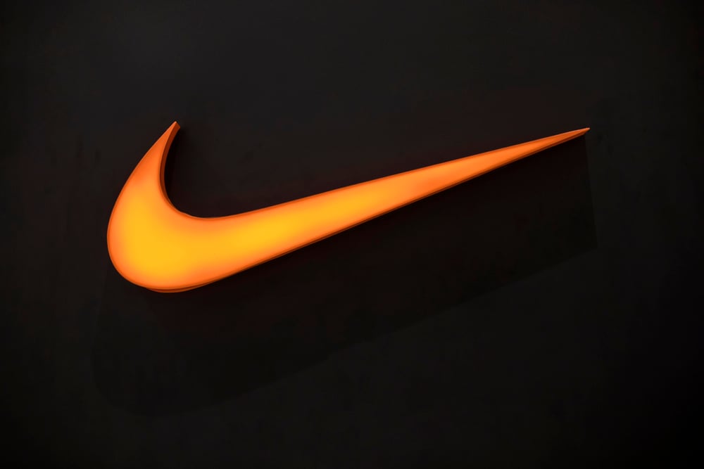
Nike – The Power of Simplicity
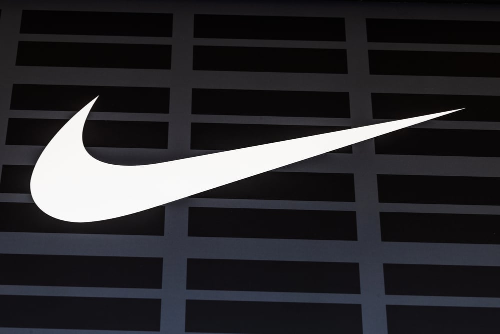
Nike’s logo story is incredibly inspiring for anyone who’s ever worried their idea isn’t fancy enough. Originally called Blue Ribbon Sports, they commissioned a graphic design student named Carolyn Davidson to create their logo in 1971—and paid her just $35 for what would become one of the world’s most valuable symbols.
The ‘swoosh’ was initially met with lukewarm reactions, but Nike founder Phil Knight said, “I don’t love it, but it will grow on me.” Talk about an understatement!
The swoosh perfectly captures movement, speed, and forward momentum without needing any explanation. It’s the kind of logo that works just as well on a massive billboard as it does embroidered on a tiny shoe tongue.
This transformation taught the business world that sometimes the most powerful symbols are the ones that feel effortless and natural, even if they don’t knock your socks off immediately.
Google – Growing Into Digital Maturity
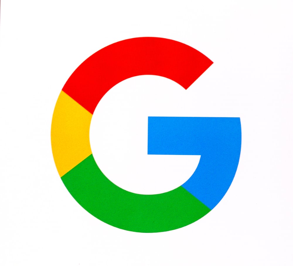
Google’s logo evolution mirrors how the entire tech industry grew up. Their original 1996 logo looked like something a computer science student would create for a class project—which, let’s be honest, isn’t far from the truth!
The letters were all different colors but felt random and childlike. The 1998 redesign gave us the classic Google we remember from the early internet days, with more sophisticated typography and that distinctive exclamation mark that screamed “We’re fun and approachable!”
The 2015 redesign was a game-changer—they switched to a cleaner, more geometric font that works perfectly on everything from massive computer screens to tiny smartphone apps. The colorful letters remained, but everything felt more grown-up and professional.
This evolution shows how even tech giants need to mature their visual identity as they become more integral to people’s daily lives.
Instagram – Embracing Digital Reality
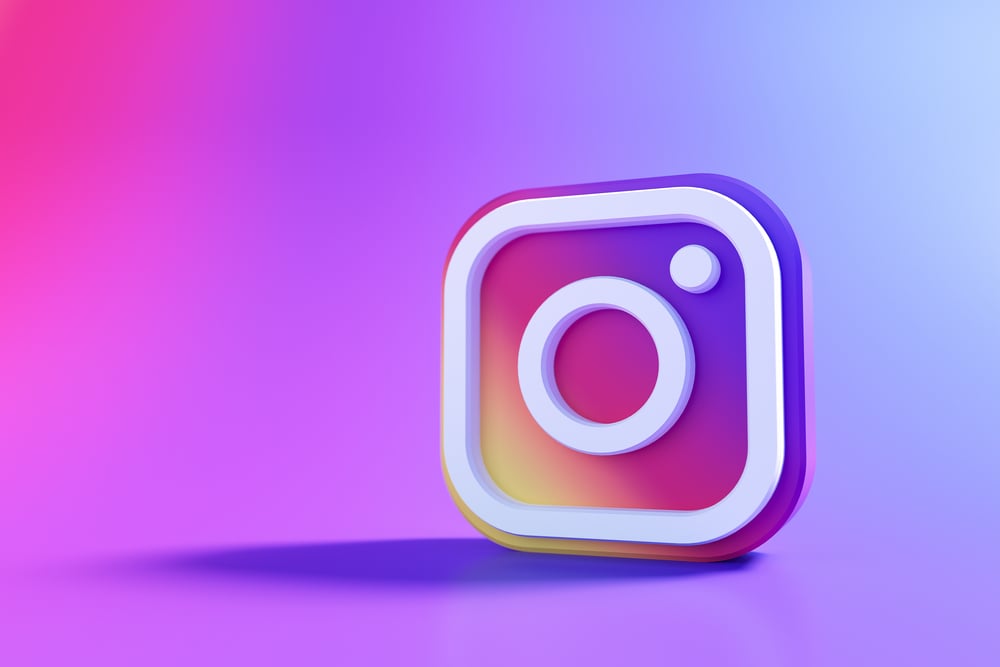
Instagram’s logo transformation was like watching someone trade in their vintage camera collection for the latest iPhone. The original skeuomorphic design featured a detailed, realistic camera with rainbow stripes and silver details that tried to make digital feel physical.
While charming in a nostalgic way, this approach quickly felt outdated as people became more comfortable with purely digital experiences. The 2016 redesign was bold and controversial—they stripped away all the realistic details and created a simple, gradient-filled camera outline that could work at any size.
The vibrant pink-to-orange gradient feels modern, energetic, and perfectly suited for a platform celebrating visual creativity. This change divided opinions initially, but it positioned Instagram as a forward-thinking platform rather than one stuck in the past.
Sometimes evolution means letting go of what’s comfortable to embrace what’s necessary.
Like Go2Tutors’s content? Follow us on MSN.
Firefox – Simplifying the Flame
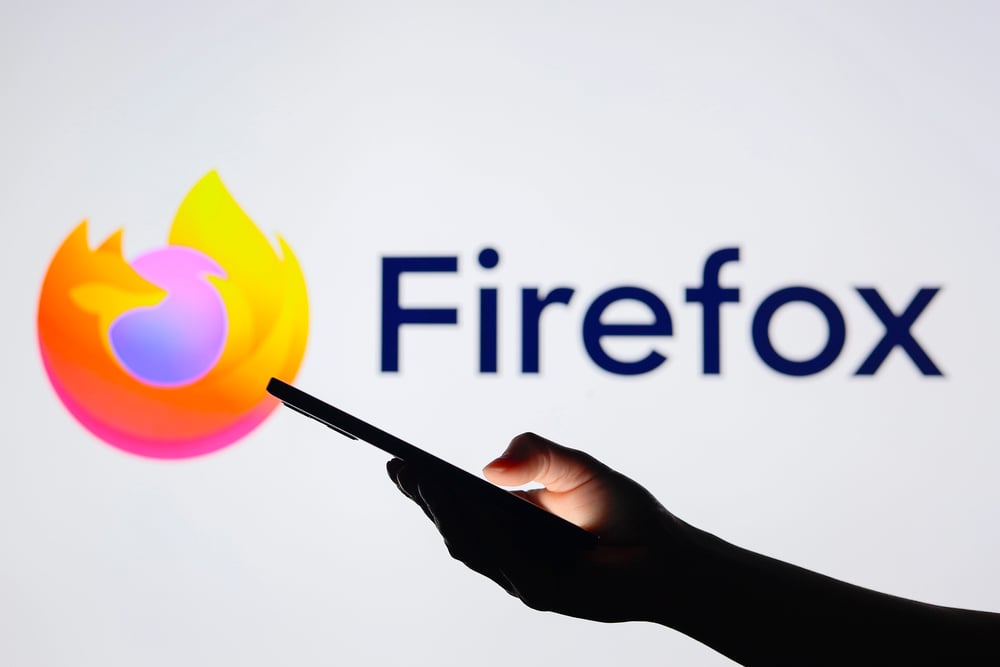
Firefox’s logo evolution demonstrates how even beloved designs sometimes need to adapt for practical reasons. Their original fox wrapped around a globe was incredibly detailed and beautiful—you could see individual fur textures and realistic flames.
But try shrinking that down to favicon size or app icon dimensions, and suddenly all those gorgeous details become an unreadable blur. The recent redesign maintains the essential fox-and-flame concept but uses bold, simple shapes that remain clear and recognizable at any size.
The flowing, dynamic lines suggest speed and agility, which perfectly matches their browser’s performance promises. The warmer orange and red color palette feels energetic and approachable rather than technical and intimidating.
This transformation shows how good design isn’t just about looking beautiful—it’s about working effectively across every possible application.
Dunkin’ – Modernizing a Classic
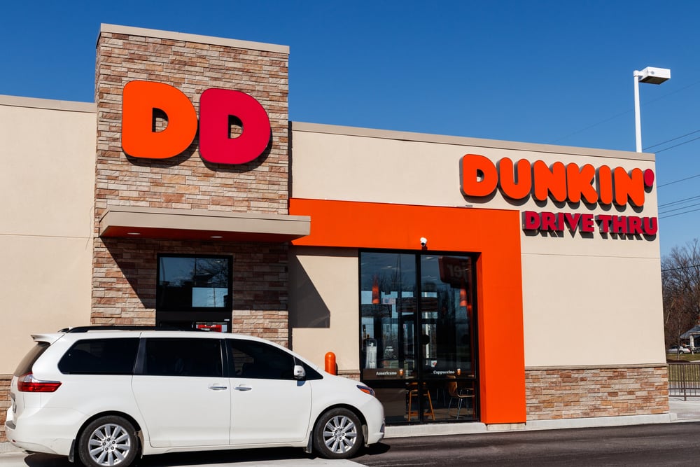
Dunkin’s recent rebrand was like watching your favorite local coffee shop grow into a sophisticated urban café while keeping all the warmth that made you fall in love with it originally. Dropping “Donuts” from their name and logo signaled a major shift—they weren’t just a donut shop anymore, but a modern beverage and snack destination.
The new design keeps those beloved pink and orange colors that trigger happy, energetic feelings, but simplifies everything else. The font is cleaner and more contemporary, while the overall layout feels less cluttered and more premium.
This wasn’t about abandoning their heritage; it was about evolving their identity to match how their business had actually grown. The makeover perfectly balances nostalgia with progress, showing existing customers they’re still the same Dunkin’ while attracting new audiences who might want more than just donuts.
Burger King – Finding Their Royal Voice
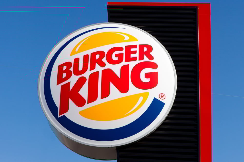
Burger King’s logo journey feels like watching someone figure out their personal style after years of trying different looks. Their original 1950s design was pretty standard restaurant fare—just text in a basic font that could have belonged to any diner.
The 1969 redesign introduced those distinctive bun-shaped curves around the text, which was genius because it literally incorporated their core product into their visual identity. The colors evolved too, moving from basic black and white to that bold red, yellow, and blue combination that feels both appetizing and energetic.
Recent refinements have focused on making everything cleaner and more modern while keeping those essential elements that make Burger King uniquely recognizable. The current logo works beautifully across digital platforms while maintaining the playful, approachable personality that sets them apart from more corporate-feeling competitors.
This evolution shows how the best brand updates honor the past while embracing the future.
Like Go2Tutors’s content? Follow us on MSN.
Levi’s – Streamlining Heritage
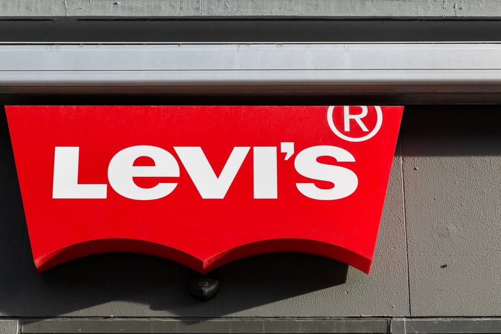
Levi’s logo transformation is a perfect example of how heritage brands can modernize without losing their soul. Their original 1800s design was incredibly detailed—featuring elaborate text, decorative elements, and even small illustrations that told the story of their denim craftsmanship.
While historically rich, this complexity made it impossible to use effectively on modern applications like small clothing tags or digital advertising. The current simplified design strips away all the decorative elements and focuses on that iconic red Levi’s tab and clean typography.
This isn’t about rejecting their heritage—it’s about finding the clearest way to communicate their brand essence. The red color remains instantly recognizable, while the simplified approach works just as well on a massive highway billboard as it does on a tiny garment label.
This evolution proves that sometimes honoring your history means having the courage to simplify it.
UPS – Embracing Simplicity
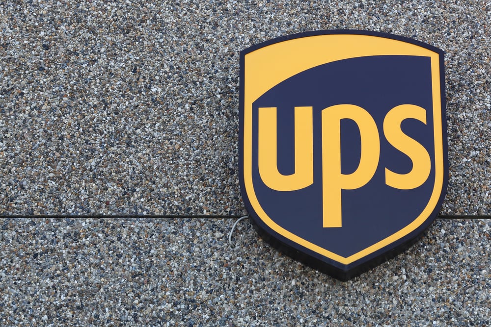
UPS proved that sometimes the boldest redesign move is knowing what to keep and what to eliminate. For decades, their logo featured an ornate shield design with a detailed bow-tied package on top, surrounded by decorative ribbons and complex typography.
While this communicated their shipping heritage, it was way too detailed for modern applications—imagine trying to read all those elements on a smartphone screen! The 2003 redesign was brilliant in its simplicity: they kept the shield shape that communicated protection and reliability, but stripped away everything else except clean, bold letters spelling “UPS.”
The brown color palette remained because it had become synonymous with the brand, but everything else got streamlined for maximum impact and readability. This transformation demonstrates how successful rebranding isn’t about changing everything—it’s about identifying your strongest elements and presenting them in the clearest possible way.
Sometimes evolution means having the confidence to let your core strengths speak for themselves.
Your Brand Evolution Journey
These logo transformations teach us something powerful about growth and change. Whether you’re running a business or just navigating life’s transitions, the same principles apply: sometimes holding onto every detail of the past prevents you from embracing a better future.
See how the most successful makeovers simply found stronger, more lucid ways to express their core identity rather than eschewing it. Apple simply found a more straightforward way to demonstrate their innovation. McDonald’s found a more memorable way to represent their brand without altering their food.
Having the ideal starting point isn’t magic. It all comes down to having the guts to change course when your current strategy becomes outdated.
The same kind of careful refinement that these businesses adopted can help your personal brand, business, or even your life philosophy. Start where you are. Keep what works. Simplify what doesn’t.
Your future self will thank you for having the wisdom to evolve.
More from Go2Tutors!

- 16 Historical Figures Who Were Nothing Like You Think
- 12 Things Sold in the 80s That Are Now Illegal
- 15 VHS Tapes That Could Be Worth Thousands
- 17 Historical “What Ifs” That Would Have Changed Everything
- 18 TV Shows That Vanished Without a Finale
Like Go2Tutors’s content? Follow us on MSN.