Old Travel Posters That Defined the Jet Age
The jet age didn’t just change how people traveled. It changed how they dreamed.
Between the 1950s and 1970s, commercial aviation transformed from a luxury reserved for the wealthy into something more accessible for everyday families. Airlines competed fiercely for customers, and their weapon of choice was the travel poster.
These weren’t just advertisements. They were windows into a world that suddenly felt within reach, painted in bold colors and impossible optimism.
Let’s take a look at the posters that made an entire generation fall in love with flying.
Pan Am’s blue globe

Pan American World Airways owned the jet age before anyone else even understood what it meant. Their posters featured a simple blue globe that became instantly recognizable across the world.
The design was clean and modern, showing destinations as accessible points on a shrinking planet. Pan Am sold the idea that the world wasn’t big anymore. It was yours to explore, and they would take you there in style.
TWA’s twin globes and David Klein’s magic
Trans World Airlines hired designer David Klein in the late 1950s, and he created some of the most beloved travel posters ever made. His style was playful and energetic, with swooping lines and bright colors that practically vibrated off the page.
Klein’s TWA posters for destinations like New York, Paris, and San Francisco didn’t just show places. They captured the feeling of arriving somewhere exciting. Each poster felt like a party invitation.
Like Go2Tutors’s content? Follow us on MSN.
Air France’s elegant sophistication
While American airlines went bold and modern, Air France took a different path. Their posters oozed elegance and refinement, often featuring artistic illustrations that looked like they belonged in a museum.
The French airline understood that luxury wasn’t just about speed or convenience. It was about making travelers feel cultured and sophisticated. Their posters promised that flying Air France meant arriving as a better version of yourself.
BOAC’s invitation to the Commonwealth
British Overseas Airways Corporation connected Britain to its former colonies and beyond. Their posters often featured exotic destinations like India, Africa, and the Far East rendered in rich, warm colors.
BOAC understood the British fascination with distant lands and Empire nostalgia. These posters whispered about adventure in places where tea time still mattered, even if you were thousands of miles from London.
SAS and the northern route
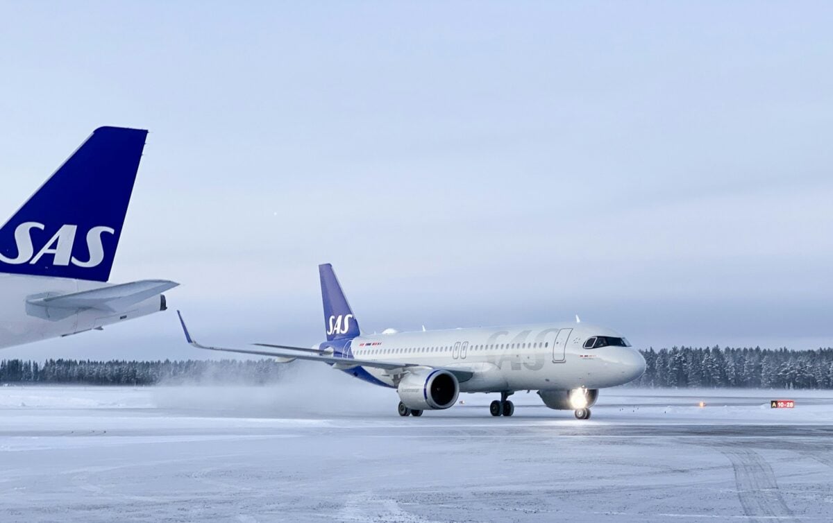
The Scandinavian Airlines System carved out a unique identity by promoting their polar routes. Their posters emphasized speed and efficiency, showing how flying over the Arctic could cut hours off transatlantic journeys.
The design aesthetic was crisp and modern, reflecting Scandinavian design principles that were becoming popular worldwide. SAS didn’t sell glamour. They sold smart travel for people who valued their time.
Like Go2Tutors’s content? Follow us on MSN.
Swissair’s precision and mountain peaks
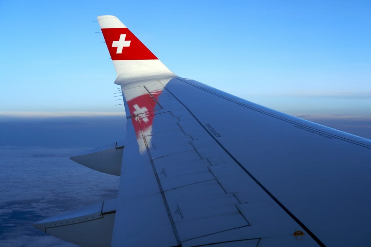
Switzerland’s national airline created posters that reflected their country’s reputation for precision and natural beauty. Mountain peaks featured prominently, rendered in clean lines and bold colors.
Swissair posters suggested that flying with them was like their famous watches: reliable, elegant, and perfectly engineered. The Swiss cross became a symbol of quality that travelers trusted.
Qantas and the kangaroo route

Australia’s Qantas faced a unique challenge. They needed to convince people that traveling to the bottom of the world was worth the incredibly long journey.
Their posters featured the famous kangaroo logo and images of sun-drenched beaches, exotic wildlife, and wide-open spaces. Qantas sold Australia as a frontier worth crossing oceans to reach, and their posters made that journey look less daunting.
Alitalia’s Italian flair

Italy’s national carrier brought Mediterranean warmth to airline advertising. Their posters featured bold typography mixed with images of ancient ruins, coastal villages, and Renaissance art.
Alitalia understood that Italy sold itself. Their job was simply to make getting there look as appealing as being there. The posters promised that the Italian experience started the moment you boarded their plane.
Like Go2Tutors’s content? Follow us on MSN.
United’s friendly skies
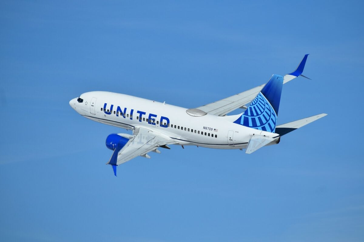
United Airlines coined the phrase “Fly the Friendly Skies” and built their visual identity around American optimism. Their posters from the 1960s featured smiling flight attendants, happy families, and destinations that looked perpetually sunny.
United sold domestic travel as wholesome and accessible. These weren’t posters for sophisticates or adventurers. They were for regular Americans taking their first flights.
Japan Airlines and Eastern mystique
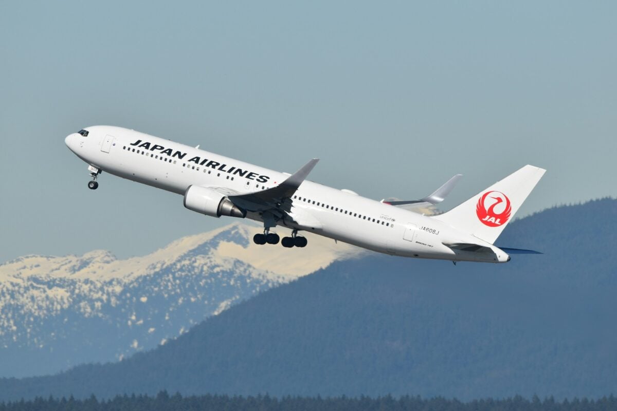
JAL’s posters introduced Western travelers to a Japan that felt both ancient and futuristic. Cherry blossoms, Mount Fuji, and traditional temples appeared alongside images of modern Tokyo.
The airline understood that Western fascination with Japan blended respect for tradition with curiosity about their rapid modernization. These posters made Japan feel exotic but not intimidating.
Lufthansa’s German efficiency
West Germany’s rebuilt airline needed to overcome wartime associations while establishing credibility. Their posters emphasized technical excellence and reliability through clean, geometric designs.
Lufthansa didn’t apologize for being German. Instead, they leaned into their reputation for engineering prowess. The message was clear: German planes would get you there safely and on time.
Like Go2Tutors’s content? Follow us on MSN.
El Al’s gateway to ancient lands
Israel’s national airline created posters that connected modern jet travel to biblical history. Images of Jerusalem, the Dead Sea, and ancient ruins appeared in designs that felt both contemporary and timeless.
El Al sold Israel as a place where history came alive, and their posters made that history feel urgent and accessible for Jewish travelers and curious tourists alike.
KLM’s Dutch golden age
The Dutch airline, one of the world’s oldest, created posters that referenced their country’s artistic heritage. Delft blue colors appeared frequently, along with windmills, tulips, and canal houses rendered in styles that nodded to Dutch master painters.
KLM connected their modern airline to centuries of Dutch exploration and trade. Flying with them meant joining a long tradition of Dutch travelers.
Braniff’s explosion of color
In the mid-1960s, Braniff Airlines went completely wild with color. They hired designer Alexander Girard to create an identity that was impossible to ignore.
Their posters featured psychedelic colors and patterns that reflected the era’s youth culture. Braniff made flying fun and slightly rebellious.
These weren’t your parents’ travel posters, and that was exactly the point.
Like Go2Tutors’s content? Follow us on MSN.
When flying felt like the future
Those old posters captured a moment when air travel represented pure optimism about tomorrow. Today, flying feels routine, sometimes even tedious, with long security lines and cramped seats.
But those vintage images remind us that jet travel once symbolized freedom and possibility. The world those posters promised, where distance meant nothing and everywhere felt close, actually came true.
We’re living in that future now, even if we’ve forgotten how remarkable it is that we can have breakfast in one hemisphere and dinner in another.
More from Go2Tutors!

- 16 Historical Figures Who Were Nothing Like You Think
- 12 Things Sold in the 80s That Are Now Illegal
- 15 VHS Tapes That Could Be Worth Thousands
- 17 Historical “What Ifs” That Would Have Changed Everything
- 18 TV Shows That Vanished Without a Finale
Like Go2Tutors’s content? Follow us on MSN.