Old World Maps That Shaped Earth’s View
Humans have always needed to know where they are. Before satellites and GPS, people drew what they knew on parchment, clay, and papyrus.
These early maps did more than show roads or coastlines. They revealed how entire civilizations understood their place in the world, what they valued, and what they feared.
The lines on these ancient documents shaped politics, sparked wars, and opened trade routes that changed history. Looking at old maps feels like reading someone’s diary.
You see their assumptions, their blind spots, and their imagination filling in the unknown. Some maps placed paradise in the east. Others put monsters at the edges.
Each one tells a story about the people who made it and the world they thought they lived in.
The Babylonian Clay Tablet

Around 600 BCE, someone in Babylon pressed a map into wet clay. This small tablet, barely bigger than your palm, shows the world as a flat disk surrounded by water.
Babylon sits at the center. Seven cities scatter around it.
Beyond the outer ring lie unknown regions marked only by brief descriptions. The map places Babylon at the center because that’s what made sense.
Your city is the most important thing in your world. Why would it be anywhere else?
This thinking shaped cartography for centuries. People put themselves in the middle and arranged everything else around that fixed point.
Ptolemy’s Mathematical Framework

Claudius Ptolemy changed everything in the 2nd century. His Geographia didn’t just list places.
It gave coordinates. He created a grid system using latitude and longitude, turning mapmaking from art into something closer to science.
Ptolemy’s maps had problems. He underestimated Earth’s size.
He stretched Africa too far east. He imagined a landlocked Indian Ocean.
But his method mattered more than his errors. For over a thousand years, people copied his approach.
When Europeans rediscovered his work in the 1400s, it became the foundation for modern cartography. Columbus used Ptolemy’s calculations when planning his westward voyage, which partly explains why he thought he’d reached Asia.
The Simplified Medieval View

Medieval European mapmakers created T-O maps—simple diagrams showing the world as a circle divided into three continents. The T inside the O represented water: the Mediterranean forming the vertical line, the Nile and Don Rivers making the horizontal bar.
Asia filled the top half. Europe and Africa split the bottom. These maps weren’t trying to help you navigate.
They served religious education. Jerusalem appeared at the center.
East pointed up because that’s where paradise supposedly existed. The whole design reflected theology more than geography.
When you needed to sail somewhere, you used a different kind of map entirely.
The Hereford Cathedral’s Grand Vision
The Hereford Mappa Mundi, created around 1300, sprawls across a single sheet of vellum five feet tall. It contains everything medieval scholars thought they knew.
Jerusalem dominates the center. Biblical events scatter across the landscape.
Mythical creatures prowl the edges. Historical cities sit next to imaginary kingdoms.
The map includes nearly 500 labeled locations. You can find the Tower of Babel, the Garden of Eden, the route of the Exodus, and the Pillars of Hercules.
Red Sea gets its name literally—the mapmaker painted it red. Strange beings populate distant lands: people with dog heads, people with one giant foot, people with no heads at all.
This map wasn’t made for travelers. It taught believers about creation, history, and the spiritual geography of existence.
Standing before it in Hereford Cathedral, you weren’t supposed to plan a trip. You were supposed to understand your place in God’s design.
The Venetian Masterpiece

Fra Mauro spent years creating his circular world map in the 1450s. Working in Venice, he had access to travelers, merchants, and sea captains who brought back stories from distant lands.
His map stretches over six feet across and contains thousands of annotations in Venetian dialect. Unlike earlier religious maps, Fra Mauro tried to show the world as it actually looked.
He placed south at the top, following Islamic and Ethiopian mapping traditions. He drew Africa as a continent you could sail around—decades before Portuguese sailors proved it.
He included details about African kingdoms, Asian trade routes, and the Indian Ocean’s true scope. The map marks a turning point. It blends medieval religious iconography with practical geographic knowledge.
Paradise still appears, but so do real trade winds and actual coastlines. Fra Mauro was helping Venice maintain its trading empire.
Accuracy mattered.
The Map That Named America

Martin Waldseemüller published his world map in 1507. It measured roughly four feet by eight feet when assembled from twelve separate woodcut sheets.
For the first time, a map showed the Americas as separate continents, not part of Asia. And Waldseemüller did something bold: he labeled the southern continent “America” after the explorer Amerigo Vespucci.
The name stuck, though Waldseemüller later regretted the choice. He tried to change it in later editions, but people kept using “America.”
The map spread across Europe. It shaped how people visualized the New World.
It reinforced the idea that European explorers were discovering empty lands, even though millions already lived there. Only one copy survives today.
The Library of Congress bought it in 2003 for ten million dollars.
Mercator’s Lasting Distortion

Gerardus Mercator published his projection in 1569, creating a map that sailors could actually use. His innovation solved a crucial problem: how to represent Earth’s curved surface on a flat sheet while keeping navigation angles consistent.
Draw a straight line on a Mercator map, and you can follow that compass bearing across the ocean. The projection distorts size, especially near the poles.
Greenland appears larger than Africa, though Africa is actually fourteen times bigger. Antarctica stretches into an impossible white strip across the bottom.
Europe and North America look more prominent than they should. Despite these distortions, Mercator’s projection dominated for centuries.
It still appears in classrooms and textbooks. The map you probably pictured when you thought “world map” uses Mercator’s method.
Its influence shaped how generations understood Earth’s geography, making northern regions seem more important simply because they look bigger.
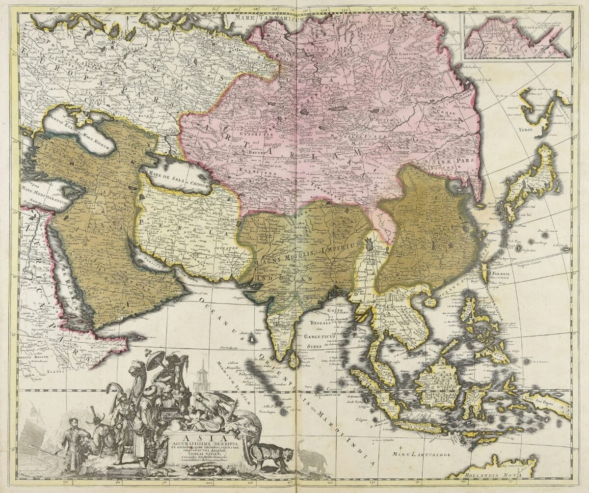
Eastern Perspectives

Chinese cartographers developed sophisticated mapping traditions independent of European methods. The Yu Ji Tu, carved in stone in 1136, used a grid system and accurately depicted China’s coastline and river systems.
It predated similar European maps by centuries. Chinese maps are often oriented south at the top.
They focused on the Middle Kingdom and treated surrounding regions as peripheral. Some maps showed the emperor at the cosmic center, with barbarian lands fading into the margins.
The maps reflected Chinese political philosophy—the emperor mediated between heaven and earth, and the empire formed the civilized core of existence. These maps served administration, not exploration.
Officials needed to know provincial boundaries, river courses, and distances between cities. Accuracy mattered for tax collection, flood control, and military planning.
Chinese maps developed remarkably precise measurement techniques long before Europe caught up.
The Turkish Admiral’s Fragment

In 1513, Ottoman admiral Piri Reis compiled a world map from multiple sources. Only about one-third survives, showing the Atlantic Ocean, parts of Europe and Africa, and the east coast of South America.
The map includes surprising details: an accurate outline of South America’s coast, which European ships had barely explored at the time. Piri Reis noted in his annotations that he used about twenty source maps, including charts that supposedly came from Christopher Columbus.
He also referenced older maps that dated back centuries. The result blends Ottoman, Portuguese, and possibly pre-Columbian knowledge into one document.
The map raises questions about what information circulated before European exploration became official history. It shows features that weren’t supposedly known in 1513.
Some researchers see evidence of ancient nautical knowledge preserved through maritime traditions. Others think Piri Reis simply had access to recent Portuguese charts that haven’t survived.
The Golden Age of Islamic Maps
While medieval Europe relied on T-O diagrams, Islamic scholars created detailed world maps based on mathematical principles and astronomical observations. Al-Idrisi, working in Sicily in 1154, produced a world map accompanied by a detailed geographic text describing climates, cultures, and trade routes.
Islamic cartographers placed south at the top, reversing the modern convention. They calculated distances, measured latitudes, and corrected errors in Ptolemy’s work.
The maps served practical purposes—pilgrimage routes to Mecca, trade networks across the Sahara and Indian Ocean, and administrative needs of the caliphates. These maps preserved and expanded Greek and Roman geographic knowledge that Europe had lost during the early Middle Ages.
When European scholars rediscovered this information in the 1400s, much of it came through Arabic translations and Islamic geographic texts. The knowledge flowed back west, helping fuel the Renaissance.
The Sailors’ Secret Charts
Portolan charts appeared in the Mediterranean around 1300. Unlike religious world maps, these charts showed coastlines with remarkable accuracy. They included compass roses and rhumb lines—straight lines radiating across the map showing compass directions. Sailors could plot courses by drawing lines between points.
Nobody knows exactly how portolan charts originated. They appeared suddenly, already sophisticated. Some researchers think sailors guarded their knowledge, passing it down through practical experience rather than written theory. The charts stayed remarkably accurate even as they were copied for centuries.
These charts stayed regional. They showed the Mediterranean, the Black Sea, and eventually the Atlantic coast of Europe and Africa.
They didn’t try to show the whole world. Sailors needed precision more than completeness.
An accurate harbor beats a vague continent.
The Explosion of New Knowledge

After 1492, maps changed faster than ever before. Each voyage brought back new information.
Coastlines got redrawn. Continents took shape.
The Pacific Ocean appeared—bigger than anyone imagined. Mapmakers struggled to keep up.
These maps became political weapons. Spain and Portugal divided the world with a line on a map in the Treaty of Tordesillas.
England, France, and the Netherlands ignored this division and drew their own claims. Maps justified colonization—if you put your flag on a map, you could claim sovereignty over the land and people already there.
Accuracy improved, but so did agenda. Maps showed European forts and trading posts while erasing indigenous territories.
They named rivers after kings who’d never seen them. They drew borders through communities that had no say in the process.
The maps that brought geographical knowledge also brought subjustice and displacement.
Borders, Power, and Imagination

Maps aren’t only about showing what’s there – they shape it. Colonial rulers sketched boundaries through Africa and Asia, turning fake lines into actual divisions.
Nations grew up along those marks. Conflicts erupted because of them.
Reality shifted to fit the map, not the land. Right now, maps still hold influence.
Not just because of how big a nation looks, but where it’s placed on screen. Some regions appear – others get left out completely.
It depends who decides what counts. Naming spots in one tongue over another also shapes perception.
Each map decides what’s visible, while leaving some stuff out. These decisions come from who made it, who’ll see it, or why it exists.
The old maps prove nothing’s ever fully neutral. Yet every one carries a take on reality shaped by what people knew back then, what they believed, or what they wanted.
To Babylonians, putting their city in the middle felt right. Meanwhile, Mercator blowing up Europe matched imperial goals just fine.
So each drawing really just mirrors its maker’s viewpoint.
Lines That Built Our World
Pick a map, any map – it’s packed with choices made over hundreds of years. Some guesses were wrong; others came from real finds.
Every layout twists reality a bit – maybe land size, maybe spacing, or outlines. Lines between regions?
They’re shaped by deals signed long ago and fights that happened even earlier. Place names tell stories, usually ones tied to conflict.
What you’re looking at isn’t how Earth really is. Instead, it’s shaped by countless cartographers’ choices over time.
Back then, mapmakers used what little they knew to draw charts that lasted way beyond their lives. So their sketches turned into travel paths.
When they weren’t sure, they just made stuff up – stuff people later took as truth. New adventurers came along, fixed errors, but still got things wrong in different ways.
Every group believed they’d nailed it once and for all. Yet every one passed on new mistakes for those who followed.
Knowing this past shifts your view of every map. Lines carry weight.
Names hold meaning. Each one reflects decisions – decisions that echo across years.
Earlier charts framed how folks pictured the planet; those views built the reality we live in now.
More from Go2Tutors!

- The Romanov Crown Jewels and Their Tragic Fate
- 13 Historical Mysteries That Science Still Can’t Solve
- Famous Hoaxes That Fooled the World for Years
- 15 Child Stars with Tragic Adult Lives
- 16 Famous Jewelry Pieces in History
Like Go2Tutors’s content? Follow us on MSN.