Phones With Designs That Make No Sense
Phone makers spend millions developing new devices, but sometimes they create things that leave everyone scratching their heads. These aren’t just minor flaws or quirky features.
They’re design choices so baffling that people wonder if anyone actually tested these phones before shipping them to stores. Some became famous for all the wrong reasons, while others quietly disappeared after users realized how impractical they were.
Here are some phones whose designs still make people wonder what the designers were thinking.
The Samsung Galaxy Note 7

Samsung created a phone that looked beautiful and worked great, except for one tiny problem. It kept exploding.
The battery design was so flawed that the phones would overheat and catch fire, sometimes while just sitting on a table. Airlines banned them from flights, and Samsung had to recall millions of units.
The company tried to fix the issue with a replacement program, but those phones started exploding too. This forced a complete shutdown of the entire product line.
The Essential Phone’s camera bump
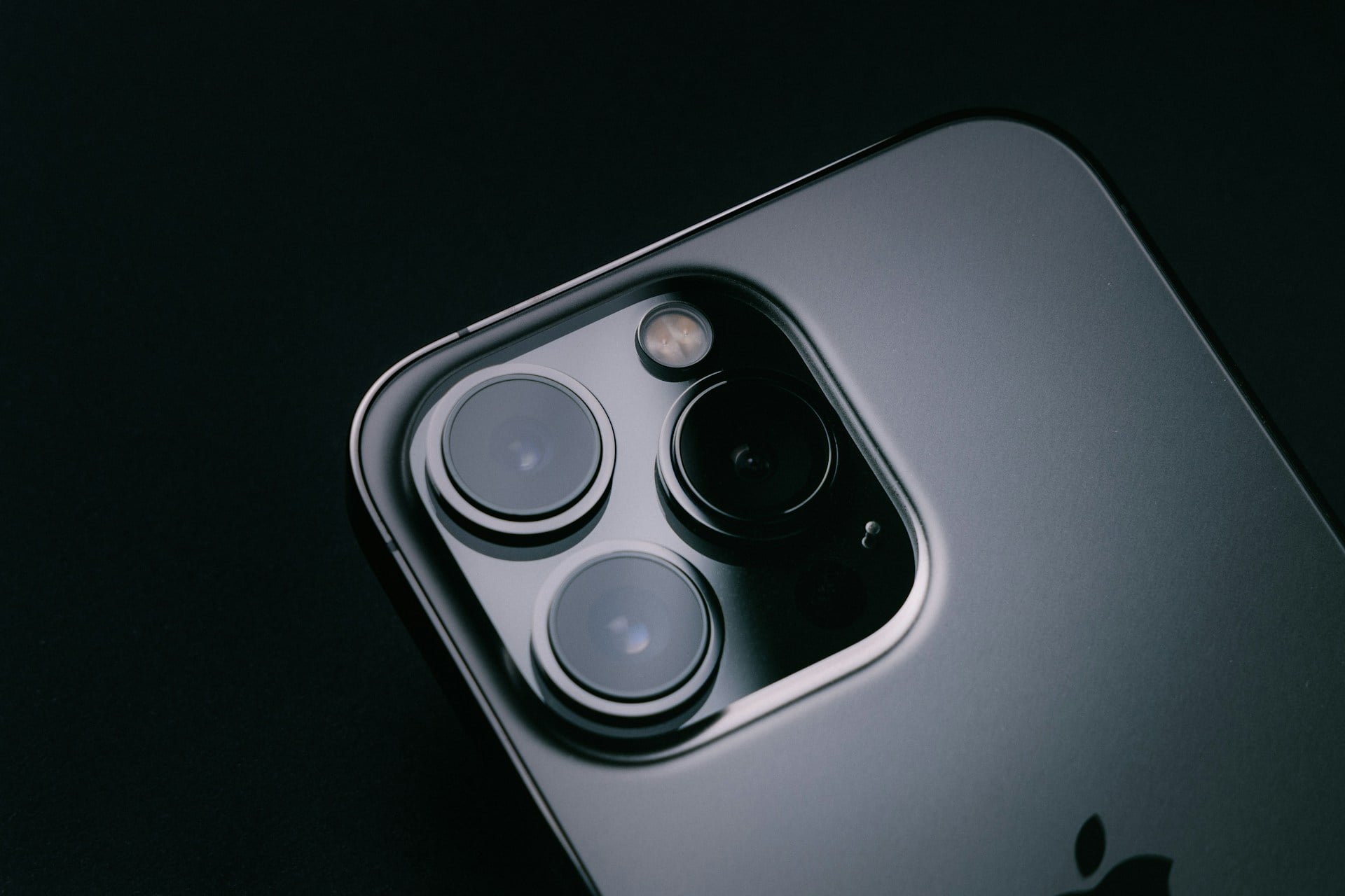
Andy Rubin, one of Android’s creators, launched the Essential Phone with a camera that stuck out like a sore thumb. The bump was so big and oddly placed that the phone wobbled when laid flat on a table.
Every time someone tried to type with the phone lying down, it rocked back and forth like a seesaw. Despite having high-end specs and a titanium body, that annoying camera bump made the whole device feel unfinished and poorly thought out.
The LG Wing’s rotating screen

LG decided to make a phone where the main screen rotated 90 degrees to reveal a smaller second screen underneath. The idea sounded cool in theory, but the execution made little practical sense.
The phone was thick, heavy, and the rotating mechanism added moving parts that could break. Most apps didn’t even support the weird dual-screen setup, so users ended up with a bulky phone that did less than a regular one.
LG discontinued its entire phone business not long after.
The Amazon Fire Phone’s four front cameras

Amazon thought people desperately needed four cameras on the front of their phones for 3D tracking and head movement detection. The Fire Phone used these cameras to create a parallax effect that made images look slightly three-dimensional when you tilted the device.
Nobody asked for this feature, and it drained the battery incredibly fast. The phone flopped so badly that Amazon sold it for 99 cents less than a year after launch.
The company lost millions on the project.
The Motorola Flipout’s square flip design
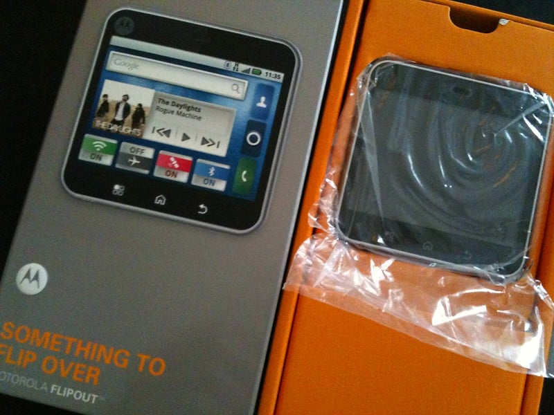
Motorola made a phone that was square and flipped open from the side instead of up and down. The keyboard and screen were both tiny because they had to fit into a square shape.
Typing on it felt cramped, and the whole device looked like a toy rather than a serious smartphone. The odd proportions meant it didn’t fit comfortably in pockets or hands.
The flip mechanism felt flimsy. It disappeared from stores faster than most people could even see one in person.
The Nokia N-Gage’s side-talking design
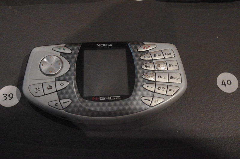
Nokia tried to combine a phone with a gaming device, but the speaker and microphone placement made users hold the phone sideways against their face. People called it ‘side-talking’ and it looked absolutely ridiculous in public.
The device was shaped like a taco, and making calls meant pressing the thin edge against your ear and mouth. Even the gaming features couldn’t save a phone that made users look foolish every time it rang.
The RED Hydrogen One’s holographic screen

RED, known for expensive cameras, made a phone with a screen that supposedly displayed holographic 3D images without glasses. The technology barely worked, the content library was almost empty, and the phone cost $1,300.
Most users couldn’t see the 3D effect properly, and those who could find it gave them headaches. The phone was thick, heavy, and its modular accessories that were promised never actually shipped to customers.
The Kyocera Echo’s dual-screen hinge
Kyocera created a phone with two separate screens connected by a hinge, allowing them to open like a book. The hinge created a visible gap between the screens that ruined any content spanning both displays.
Apps had trouble figuring out how to use the dual screens, and the phone was bulky even when closed. The battery couldn’t handle powering two screens, so it died quickly.
Sprint stopped selling it after just a few months of disappointing sales.
The Yota Phone’s e-ink back screen
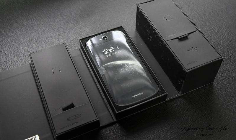
This Russian phone had a regular color screen on the front and an e-ink display on the back like a Kindle. The idea was to save battery by reading on the back screen, but it created more problems than it solved.
The phone was expensive, thick, and having two screens meant double the chance of cracking something when dropped. Most people just used the front screen anyway, making the whole back display pointless extra weight and cost.
The BlackBerry Storm’s clickable touchscreen
BlackBerry made a touchscreen that physically clicked down when pressed, like pushing a giant button. The entire screen moved when you touched it, which felt weird and made typing frustrating.
The mechanism broke easily, leaving users with screens that clicked unevenly or got stuck. People who loved BlackBerry keyboards hated the Storm.
People who wanted smooth touchscreens went to iPhones instead. It satisfied nobody and damaged BlackBerry’s reputation.
The Microsoft Kin’s social media focus

Microsoft designed phones specifically for teenagers obsessed with social media, but made them so limited they couldn’t even download apps. The Kin One and Kin Two had weird pebble shapes that felt awkward to hold.
They required expensive data plans despite having fewer features than basic smartphones. Microsoft killed the entire product line after just 48 days on the market.
This made it one of the fastest phone failures in history.
The Siemens Xelibri collection’s fashion focus
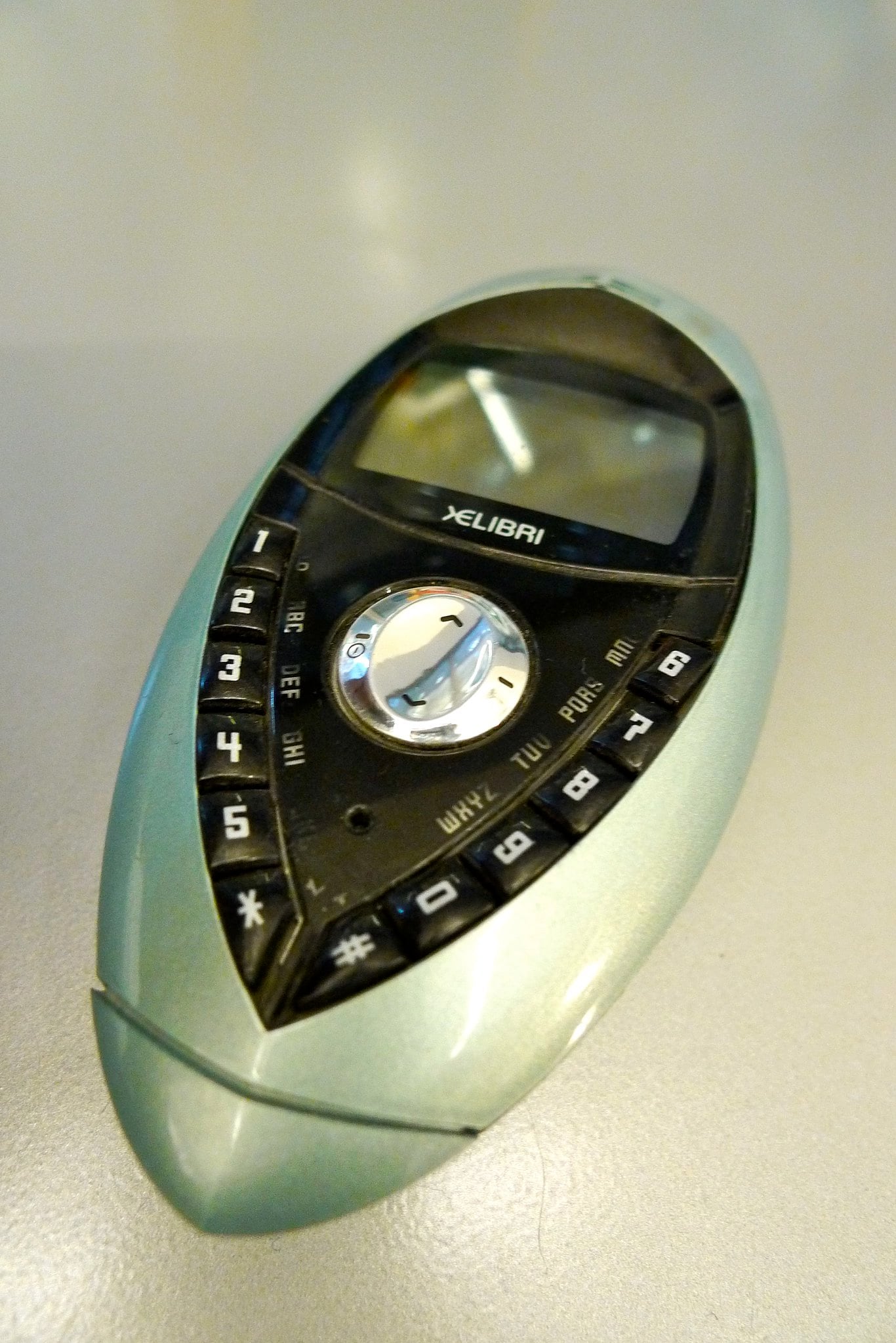
Siemens created a whole line of phones designed to be fashion accessories rather than functional devices. Some looked like makeup compacts, others resembled jewelry boxes.
They prioritized style so heavily that basic phone features suffered, with tiny screens and awkward button layouts. The batteries died quickly because the unusual shapes couldn’t fit decent power cells.
The entire Xelibri line flopped because people actually needed to use their phones, not just look at them.
The Palm Pre’s sliding keyboard mechanism
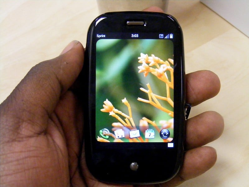
Palm’s Pre had a sliding keyboard that seemed like a good idea until people actually used it. The slider mechanism felt loose and cheap right out of the box.
Over time, it got worse, developing wobbles and eventually breaking completely. The phone’s build quality was so poor that many units fell apart within months.
The slider also made the phone thicker than necessary. The keyboard itself was cramped and uncomfortable to type on.
The HTC ChaCha’s Facebook button
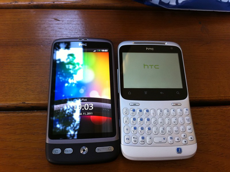
HTC put a dedicated Facebook button on the ChaCha that glowed blue when you could share something. The button took up valuable space and only worked with one app that people were already using anyway.
Pressing it by accident happened constantly, and disabling it wasn’t easy. The phone itself was oddly shaped with a keyboard that made it look outdated even when it was new.
Nobody needed a hardware button for something a simple tap could accomplish.
The Nexus 6’s enormous size

Google and Motorola made a phone so huge that most people couldn’t comfortably hold it in one hand. The Nexus 6 had a 6-inch screen at a time when that was considered absurdly large.
It didn’t fit in normal pockets, and using it one-handed was basically impossible for average-sized hands. The phone was also expensive and had a slippery curved back that made it easy to drop.
Size became the defining feature, overshadowing everything else about the device.
The OnePlus 2’s USB Type-C without fast charging
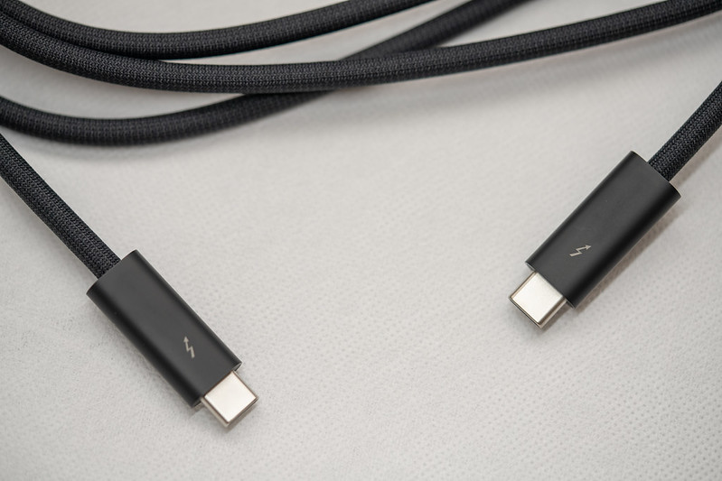
OnePlus put a USB Type-C port on the OnePlus 2 in 2015, making it one of the first phones with the new connector. But they implemented it wrong, using an old USB 2.0 controller that didn’t support fast charging properly.
Users got the inconvenience of needing new cables without any of the benefits the new standard offered. The company even shipped adapters that violated USB specifications and could damage other devices.
It was a half-baked attempt to seem cutting-edge that backfired completely.
The Nextbit Robin Relies on Cloud Storage
Out of nowhere, Nextbit built a phone that shifted old apps and pictures to the internet when they weren’t used. Helpful idea? Maybe – until those online systems vanished suddenly.
Less than twenty-four months after release, everything stored there stopped being reachable. All at once, people could not get back what was saved, making the entire feature pointless.
Its look didn’t help either: loud blues and pale greens split opinions fast. Relying on remote storage managed by an untested team turned out poorly over time.
The Z Flip Has a Crease Issue
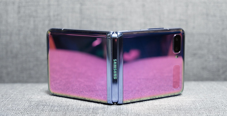
A fold down the center stayed put on Samsung’s Z Flip, even though folks liked the old-school clamshell look. That line across the display showed up clearly, got caught by fingers while scrolling, attracted lint and grit too.
Swiping met resistance where layers pressed together over time. Plastic covered the inside face rather than tougher glass, so scrapes appeared fast from everyday contact.
Hinges on first models wore out quicker than expected, sometimes snapping shut oddly or sticking open. Fixing just the front panel ran close to what a whole standard smartphone would cost these days.
Fond memories of flip phones didn’t fix how fragile the tech still felt.
Why bad designs still happen
Pushing new gadgets can feel urgent when so many brands fight for attention. Because of this rush, some teams try bold moves that change what phones do.
Yet often the outcome is awkward features nobody asked for. Gadgets built on shaky ideas tend to vanish fast.
Odd choices show clearly: being unique means nothing without practical thinking. What matters most lives in daily habits – how fingers tap, eyes scan, minds switch tasks.
Flashy shots at launch events rarely match life offscreen.
More from Go2Tutors!

- The Romanov Crown Jewels and Their Tragic Fate
- 13 Historical Mysteries That Science Still Can’t Solve
- Famous Hoaxes That Fooled the World for Years
- 15 Child Stars with Tragic Adult Lives
- 16 Famous Jewelry Pieces in History
Like Go2Tutors’s content? Follow us on MSN.