Posters That Had Photoshop Fails
Movie studios, advertisers, and designers spend thousands of dollars creating posters that grab attention and look perfect. Sometimes though, the editing process goes horribly wrong and nobody catches the mistakes before printing.
These fails range from missing body parts to bizarre proportions that make people look like aliens. Here are some of the most hilarious and shocking Photoshop disasters that made it onto official posters.
Twilight New Moon Missing Hand

The poster for Twilight New Moon featured Bella wrapped in Edward’s arms, except Edward was mysteriously missing his right hand. His arm appeared to end at the wrist with nothing holding onto Bella’s shoulder, creating a creepy effect nobody intended.
Fans spotted the error immediately and flooded social media with jokes about vampire anatomy. The studio never acknowledged the mistake but quietly released a corrected version weeks later.
This simple oversight became one of the most talked-about poster fails in movie history.
Harry Potter Extra Fingers
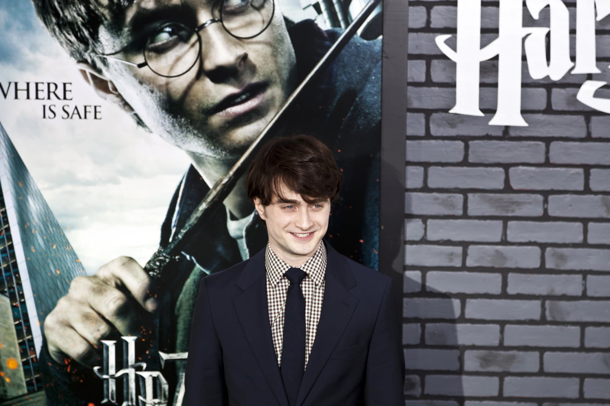
A promotional poster for one of the Harry Potter films gave Emma Watson’s character Hermione an extra set of fingers on one hand. The digital artist clearly copied and pasted parts of the hand to adjust the position but forgot to clean up the duplicate fingers.
Sharp-eyed fans counted six fingers instead of five and spread screenshots across fan forums. The poster appeared in magazines and online before anyone at Warner Bros noticed the error.
It’s the kind of mistake that seems impossible to miss once someone points it out.
Black Widow Vanishing Torso

Marvel’s poster for Avengers Age of Ultron featured Scarlett Johansson as Black Widow with a waist so tiny that her internal organs couldn’t possibly fit inside. The aggressive editing made her torso look like it had been squeezed in a vice, shrinking her body to inhuman proportions.
Critics called out Marvel for unrealistic body standards and poor quality control on official promotional materials. The company defended the poster initially before quietly replacing it with a less edited version.
This incident sparked bigger conversations about how female bodies get digitally altered in Hollywood marketing.
Bohemian Rhapsody Extra Tooth

The poster for the Freddie Mercury biopic Bohemian Rhapsody tried to recreate the famous Live Aid performance but gave Rami Malek a bizarre extra tooth. The editing team clearly enhanced his teeth to match Mercury’s iconic overbite but went way overboard with the digital dentistry.
Social media users zoomed in on the poster and shared close-ups showing what looked like a mutant smile. The weird tooth became a bigger topic of conversation than the actual movie premiere for a few days.
Someone at the studio had clearly gotten carried away with the liquify tool.
American Horror Story Backwards Foot
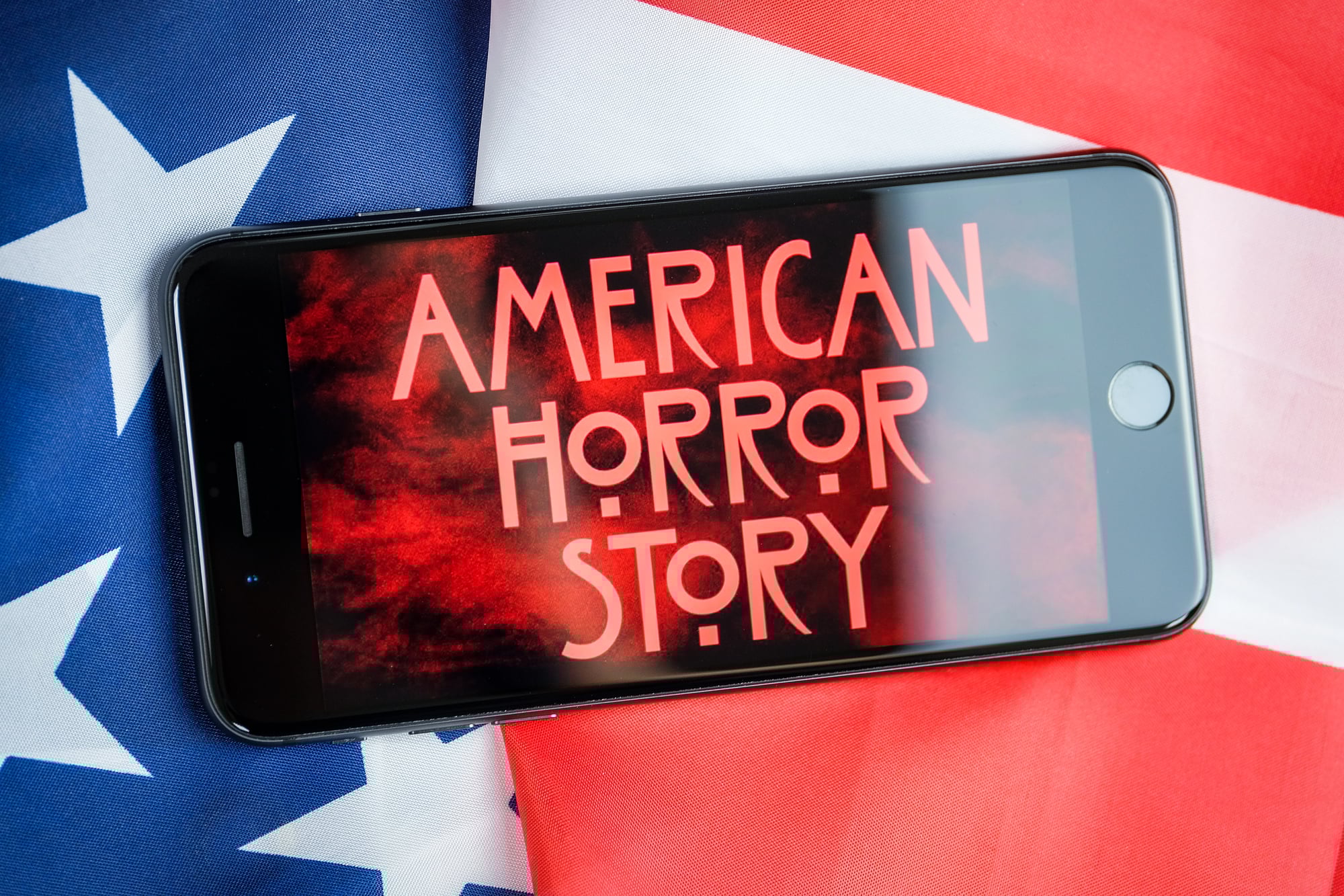
A poster for American Horror Story Coven showed a character with their foot bent completely backwards at an impossible angle. The image featured someone in heels, but the foot pointed in the opposite direction from where human ankles can actually bend.
Fans debated whether this was intentional horror imagery or just a careless editing mistake. The show’s creator never clarified, leaving everyone to wonder if the twisted limb was supposed to be creepy or was just sloppy work.
Either way, it definitely got people talking about the poster.
Atomic Blonde Missing Leg
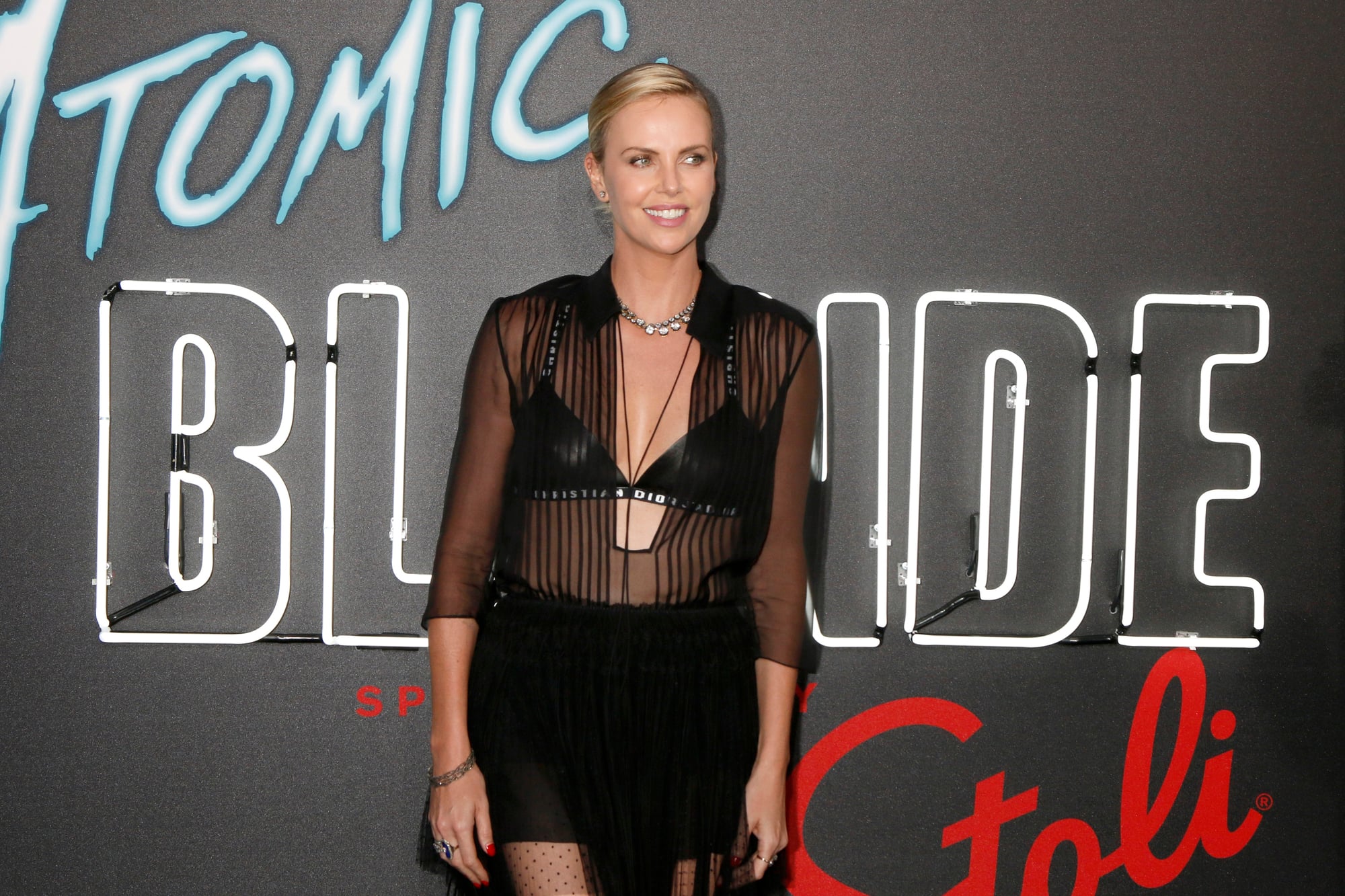
The action movie poster for Atomic Blonde featured Charlize Theron in a powerful pose, except one of her legs appeared to vanish into thin air. The editing made her thigh disappear where it should have been visible, creating a confusing optical illusion.
Some viewers thought maybe her leg was just hidden behind something, but careful examination showed it was clearly a Photoshop error. The studio released the poster across multiple countries before anyone caught the mistake.
It’s particularly embarrassing for an action movie where physical presence matters so much to the marketing.
The Hunger Games Catching Fire Giant Hand
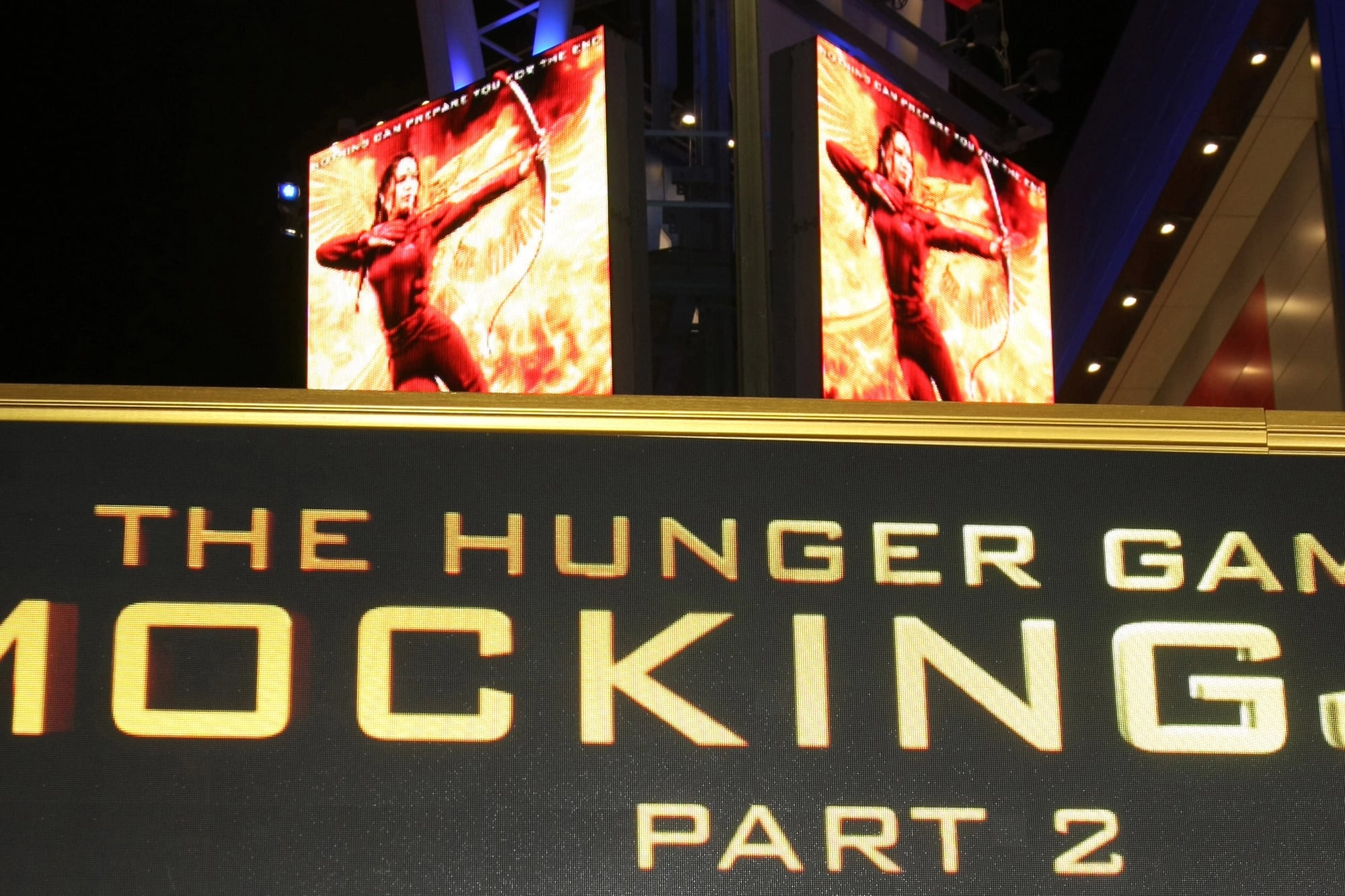
Katniss Everdeen appeared on the Catching Fire poster with one hand that was significantly larger than the other, looking like it belonged to a different person. The size difference was so obvious that fans immediately created memes comparing her hands to oven mitts and baseball gloves.
The editing team had likely merged images from different photoshoots without matching the scale properly. Lionsgate never commented on the bizarre proportions despite widespread mockery online.
The poster stayed in circulation anyway, becoming a permanent piece of internet humor.
Keeping Up With The Kardashians Pool Disaster

A promotional poster for Keeping Up with the Kardashians showed the family lounging by a pool with water that curved and warped in physically impossible ways. The editing was so aggressive that the pool’s edge bent around their bodies like melting plastic.
Background elements twisted and stretched in directions that defied basic physics and perspective. Fans accused the family of excessive body editing that distorted everything around them.
The poster became exhibit A in ongoing discussions about unrealistic beauty standards on reality TV.
Pirates Of The Caribbean Tiny Head

Orlando Bloom appeared on a Pirates of the Caribbean poster with a head that was way too small for his body, making him look like a bobblehead toy. The proportion fail was so extreme that his neck looked like it could barely support his miniature skull.
Someone clearly pasted his head from one photo onto a body from another shot without checking if the sizes matched. The poster hung in movie theaters for weeks before people started pointing out how weird it looked.
Disney never addressed the criticism or replaced the bizarre image.
The Tourist Floating Hand

The romantic thriller poster for The Tourist showed Angelina Jolie with a mysterious floating hand that didn’t connect to any arm or body. The disembodied hand appeared to hover near her shoulder, creating an unintentionally spooky effect.
Fans speculated whether it was Johnny Depp’s hand poorly edited into the frame or just a random appendage from another photo. The studio insisted the poster looked fine despite clear evidence that something had gone wrong in post-production.
This became one of those fails that people still reference years later when talking about bad movie marketing.
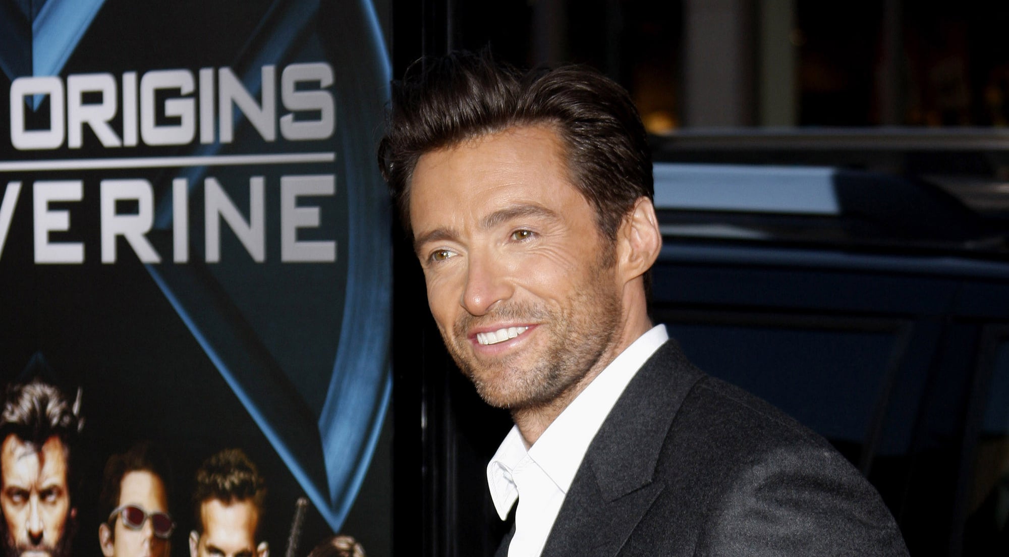
Australia Leg Swap

The poster for the movie Australia starring Nicole Kidman and Hugh Jackman appeared to show the two actors with their legs swapped. Kidman’s body seemed to connect to a leg in a position that matched Jackman’s stance, while his leg aligned with her body position.
The confusing composition made viewers do double takes trying to figure out whose limbs belonged to whom. Some people insisted it was just an optical illusion from the camera angle, but others remained convinced it was lazy editing.
Either way, the poster created more confusion than romantic chemistry.
Pitch Perfect 2 Backwards Hand

The comedy sequel Pitch Perfect 2 released a poster showing Anna Kendrick with her hand bent backwards at the wrist in a way that would require broken bones. The unnatural angle made it look like her hand had been attached to the wrong arm or flipped during editing.
Fans of the movie series immediately spotted the error and shared it widely across social media platforms. Universal Pictures never acknowledged the mistake despite all the online attention it received.
The poster remained in use for the entire marketing campaign with the backwards hand intact.
Bring It On Muscle Mayhem

The cheerleading movie Bring It On featured a poster where one performer’s arm muscles appeared to be on the wrong side of their limb. The bizarre anatomy made it look like their bicep was located where the tricep should be, or vice versa.
The editing team had clearly flipped or mirrored part of the image without checking if body parts still made anatomical sense. Teen audiences who actually understood cheerleading stunts caught the error right away.
It became a running joke among fans about how the editors clearly didn’t know basic human anatomy.
X-Men Origins Wolverine Claw Confusion
The poster for X-Men Origins Wolverine showed Hugh Jackman’s character with his metal claws coming out of his knuckles at weird angles. The spacing between the claws looked off, and they didn’t align properly with his hands like they should.
Hardcore fans who knew every detail of Wolverine’s powers immediately noticed the editing failed to follow the established rules. Some claws appeared too far apart while others seemed too close together, creating an inconsistent look.
Fox never fixed the poster despite fan complaints about the sloppy attention to detail.
Transformers Floating People
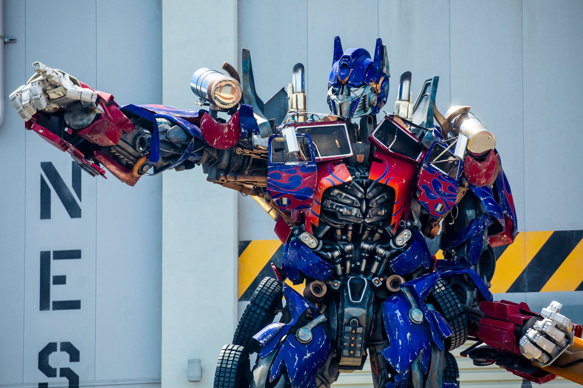
Multiple Transformers movie posters featured humans standing on surfaces that didn’t exist, floating in mid-air without any logical support. The aggressive editing combined so many elements from different photos that gravity seemed to stop working in the final images.
Buildings, robots, and people all occupied the same space in ways that made no physical sense. Michael Bay’s team became notorious for these over-edited posters that prioritized spectacle over coherent composition.
The franchise kept making similar mistakes across multiple movie releases without learning from previous fails.
Step Up Revolution Clone Army

A single background performer showed up again and again across the Step Up Revolution promo art, thanks to clumsy digital duplication. Three or four versions of one dancer stood near each other, shifted only by small differences in stance.
Observant viewers caught matching facial features, hairstyles, clothing – dead giveaways of copy-paste shortcuts. Rushed production often leads to oversights like these, where detail takes a backseat to speed.
What slipped through review turned into quiet amusement for longtime fans of the series.
Easy A Without Arms Or Legs

A strange blur between sleeve and arm drew eyes on the Easy A promo art starring Emma Stone. Where skin stopped became unclear, tangled in cloth like smudged ink.
Inspired by old-school film vibes from the eighties, the design leaned into flair until form broke down. Some wondered if stretched limbs were planned quirks or simple errors.
That fuzzy line between joke and flaw never quite settled. Oddness won out – less sweet, more unsettling.
When Perfection Goes Wrong
Proof that massive budgets don’t stop basic blunders – Photoshop slips show how speed kills quality. When polish becomes an obsession, faces twist into something uncanny.
Fans now pounce fast; flaws go viral before sunrise. Simplicity wins more than heavy touch-ups ever could.
Glitches stay online, looping endlessly – a quiet nod to what gets overlooked by machines and worn-out teams alike.
More from Go2Tutors!

- The Romanov Crown Jewels and Their Tragic Fate
- 13 Historical Mysteries That Science Still Can’t Solve
- Famous Hoaxes That Fooled the World for Years
- 15 Child Stars with Tragic Adult Lives
- 16 Famous Jewelry Pieces in History
Like Go2Tutors’s content? Follow us on MSN.