Stories Behind Everyday Symbols
Symbols are everywhere. They guide us through airports, warn us of danger, help us navigate websites, and even tell us which bathroom to use.
Most people see these little icons dozens of times each day without giving them a second thought. But behind each familiar symbol lies a story—sometimes surprising, often clever, and occasionally downright strange.
Let’s take a closer look at the fascinating origins of the symbols that have become such a natural part of daily life.
The heart shape
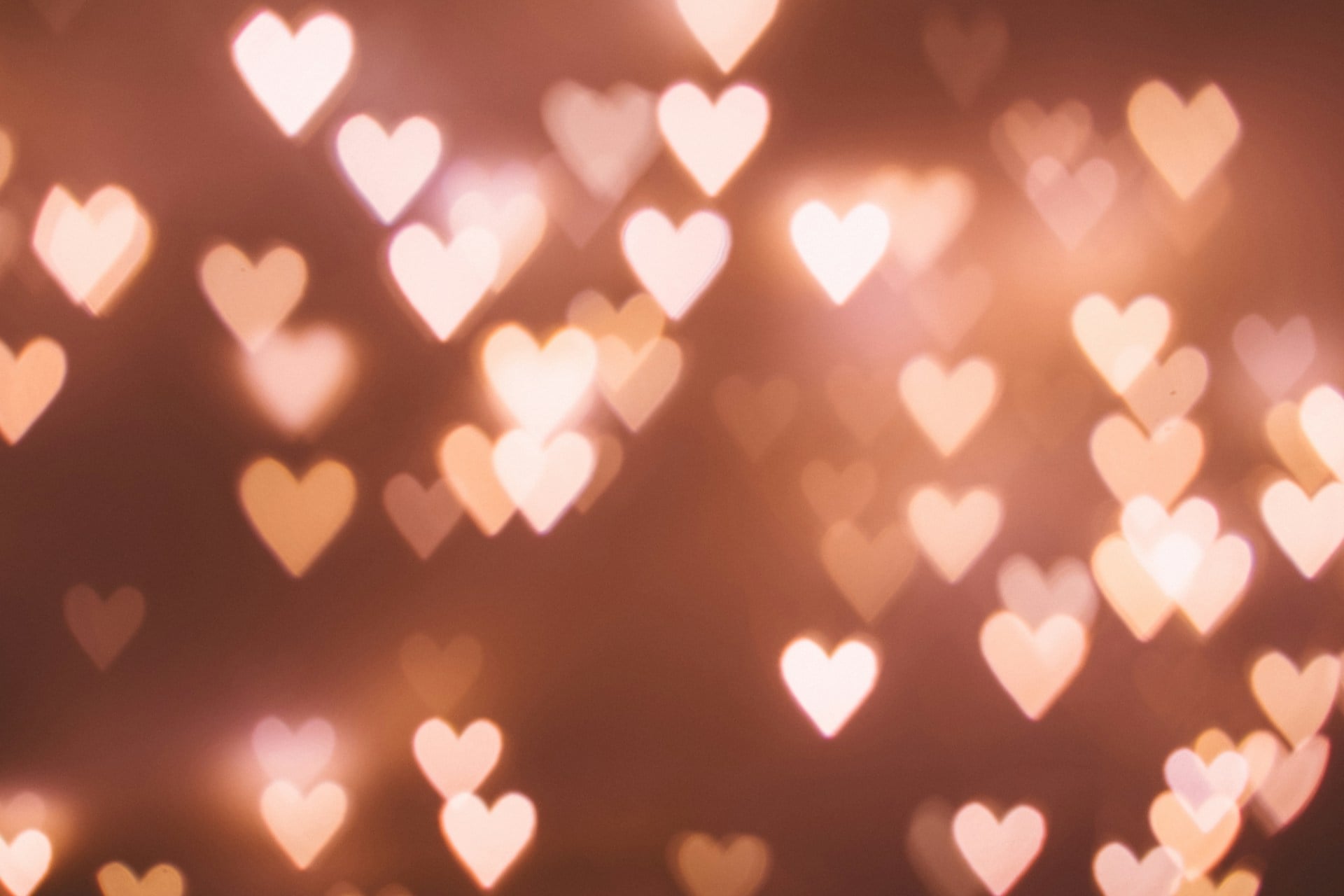
The human heart, which is more of a lumpy, muscular organ than a smooth, symmetrical shape, is not at all like the heart symbol. The silphium plant, which the ancient Romans used as a method of birth control, is thought by some historians to be the source of the icon.
Coins from the city of Cyrene featured the characteristic curved shape of the plant’s seed pod. The shape was simplified and stylized over centuries by artists and craftspeople, eventually becoming the well-known universal symbol of love and affection.
The heart symbol became extremely popular during the Middle Ages when it began to appear in religious manuscripts and artwork, regardless of the veracity of the silphium theory.
The power button

It wasn’t just a circle with a line through the top. Binary code symbols were used by engineers in the 1940s, with “1” denoting on and “0” denoting off.
The power button displayed a standby state by combining the two symbols—the circle for zero and the line for one. This symbol was formally standardized in 1973 by the Institute of Electrical and Electronics Engineers.
These days, it can be found on everything from computers to coffee makers, and the majority of people can understand it right away without any further explanation or words.
The USB symbol
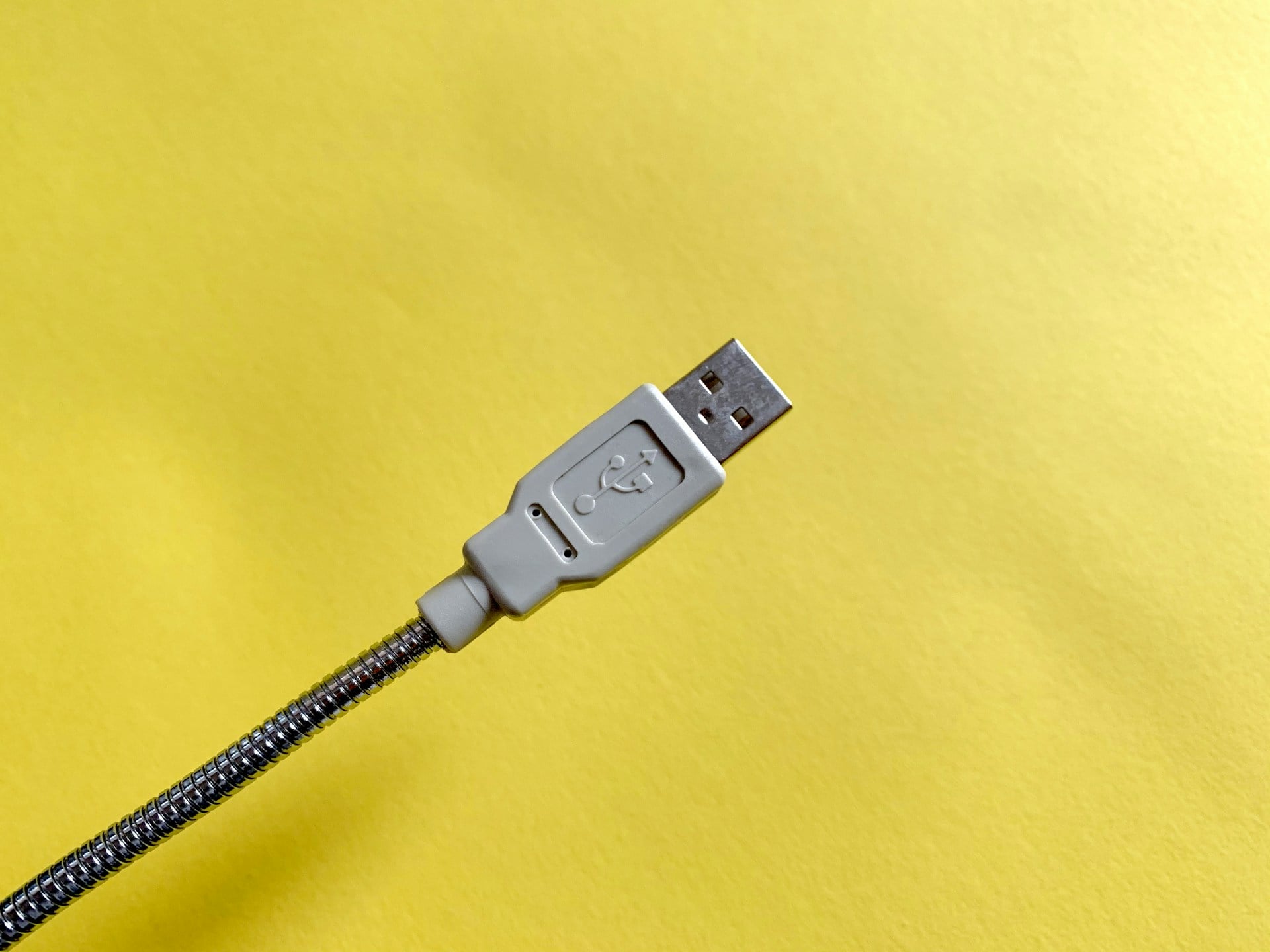
The USB logo shows a circle at the bottom with three prongs extending upward, each ending in a different shape: a circle, a triangle, and a square. This design references Neptune’s trident, the three-pronged spear from mythology.
The different shapes at the end represent the variety of devices that can connect through a single universal port. Ajay Bhatt and his team at Intel created the USB standard in the mid-1990s to replace the confusing mess of different cables and ports that computers needed at the time.
The Bluetooth icon

This symbol combines two Nordic runes that represented the initials of Harald Bluetooth, a 10th-century Danish king. Harald united Denmark and Norway, just as Bluetooth technology unites different devices wirelessly.
Jim Kardach, an Intel engineer, came up with the name after reading about the Viking king who had a reputation for bringing people together. The runes ‘H’ and ‘B’ merged to create that distinctive angular symbol.
Kardach thought it would be a temporary codename, but it stuck and became the official brand.
The recycling arrows

Gary Anderson, a college student, designed the three-arrow triangle in 1970 for a contest sponsored by a paper company. He was just 23 years old and studying at the University of Southern California.
His design won, and the Container Corporation of America put it into the public domain, meaning anyone could use it for free. Anderson based the arrows on the Möbius strip, a mathematical concept of a surface with only one side.
The continuous loop perfectly represented the cycle of recycling: collect, process, and reuse.
The ‘@’ symbol
People called this symbol different names across languages—’little snail’ in Italian, ‘monkey tail’ in Dutch, and ‘rolled-up A’ in Greek. But its modern fame came from Ray Tomlinson, who sent the first email in 1971 and needed a way to separate the user’s name from their location.
He chose the ‘@’ symbol because it wasn’t commonly used in names and clearly meant ‘at’ a particular place. Before email, accountants and merchants used it as shorthand for ‘at the rate of’ in commercial transactions.
That one decision by Tomlinson turned an obscure accounting symbol into one of the most recognized characters worldwide.
The peace sign
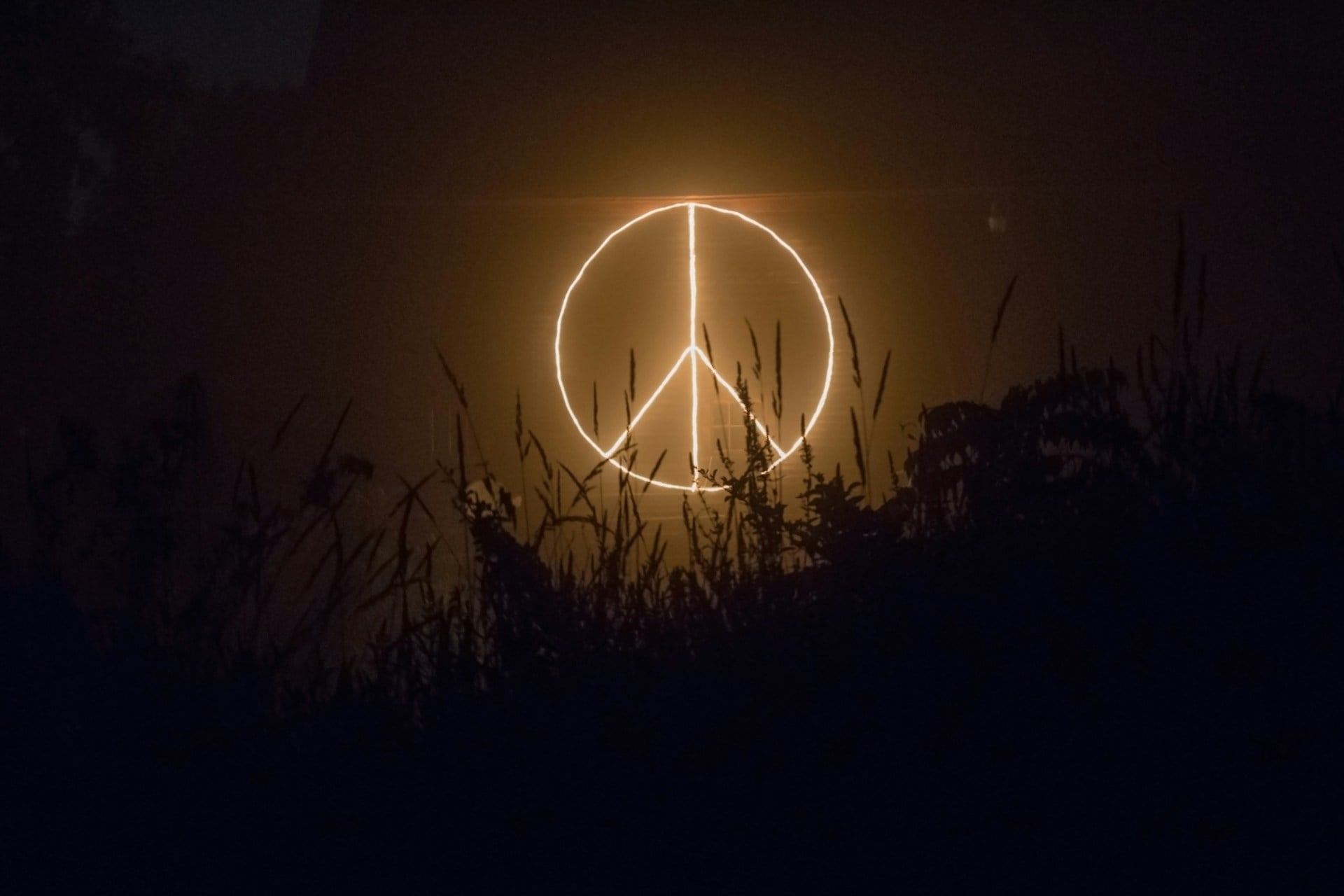
British graphic designer Gerald Holtom created this symbol in 1958 for nuclear disarmament protests. He combined the semaphore signals for ‘N’ and ‘D’ (nuclear disarmament) inside a circle.
Semaphore is a flag-signaling system where different arm positions represent letters. Holtom held flags in the downward positions for those letters and traced the resulting shape.
The designer later said the drooping lines also represented his own despair about nuclear weapons. The symbol spread quickly through anti-war movements and became a broader icon for peace.
The Wi-Fi symbol

The curved lines radiating from a point resemble radio waves spreading outward from a transmitter. The Wireless Ethernet Compatibility Alliance hired Interbrand, a marketing firm, to create both the term ‘Wi-Fi’ and its logo in 1999.
The symbol needed to work across languages and cultures without confusion. Those stacked curves increasing in size show signal strength—more curves mean stronger connection.
Despite what many people think, ‘Wi-Fi’ doesn’t actually stand for anything; it was just created to sound catchy and tech-forward.
The checkmark

The checkmark’s origin remains somewhat mysterious, but many historians trace it back to the Roman letter ‘V,’ which stood for ‘veritas’ (truth). Teachers and clerks gradually simplified and modified this mark over centuries.
In the United States, people use a checkmark to indicate correctness, while in many European countries, teachers use it to mark errors. This opposite meaning has caused confusion in international business and education.
The checkmark became especially important in the digital age, appearing in countless apps and interfaces to confirm actions or show completion.
The medical cross
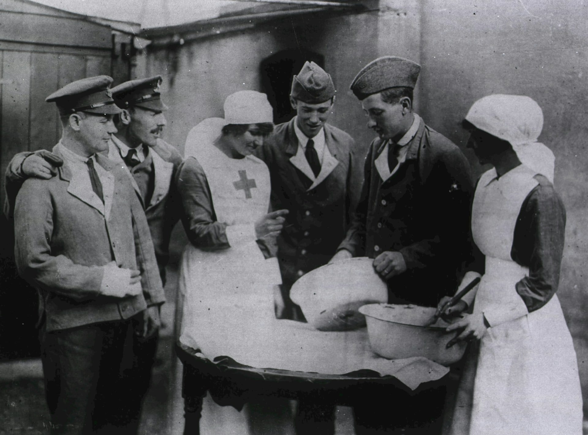
The International Committee of the Red Cross adopted the red cross symbol in 1863 to mark medical personnel and facilities during wartime. Henry Dunant, a Swiss humanitarian, proposed this neutral symbol after witnessing the bloody Battle of Solferino.
The design reversed the colors of the Swiss flag as a tribute to Switzerland’s neutrality and humanitarian tradition. Countries with different religious backgrounds later created alternate symbols—the red crescent and red crystal—to avoid religious connotations.
These symbols gained legal protection under international law, and misusing them can result in serious penalties.
The play button triangle

The triangle pointing right has become so associated with starting media that people instantly recognize what it means. Before the digital age, reel-to-reel tape machines used geometric symbols because language-specific words wouldn’t work for international markets.
The triangle pointing right suggested forward motion and direction. Engineers at Philips standardized these symbols for cassette players in the 1960s, and the design carried over to every media player since.
The triangle’s simplicity made it perfect for shrinking down to tiny sizes on early portable devices.
The copyright symbol

The ‘C’ in a circle became the standard way to claim ownership of creative works. The Buenos Aires Convention of 1910 first established this symbol for international copyright protection.
Before that, countries used various phrases and marks to indicate copyright. The simple circle-C design worked across language barriers and printed clearly even at small sizes.
Many people don’t realize that in the United States, copyright exists automatically when someone creates an original work; the symbol just provides additional legal benefits and notice to others.
The hashtag

This symbol had many names before social media made ‘hashtag’ universal—pound sign, number sign, octothorpe. Its use on phones came from Bell Labs engineers who needed a symbol for their tone-dialing system in the 1960s.
Chris Messina, a social technology expert, suggested using it on Twitter in 2007 to group related conversations. He proposed it casually in a tweet, not imagining it would transform social media.
The symbol’s ability to create instant, searchable categories without complex coding made it perfect for organizing the chaos of online conversations.
The ampersand
The ‘&’ character evolved from the Latin word ‘et,’ which means ‘and.’ Roman scribes would write the letters quickly, causing them to blur together into a single character.
By the first century, this ligature—a combination of two or more letters—had become common in cursive handwriting. The name ‘ampersand’ itself came from a quirky linguistic evolution: people used to recite the alphabet with ‘and per se and’ at the end, which eventually slurred into ‘ampersand.’
Type designers have created thousands of unique ampersand versions, making it one of the most varied characters in typography.
The skull and crossbones

Pirates weren’t the first to use this warning symbol. European gravestones featured skulls as reminders of mortality centuries before pirates sailed the seas.
The skull and crossbones became associated with danger and poison in the 19th century when the symbol appeared on bottles of toxic substances. The U.S. military used it in World War I to mark dangerous materials.
Pirates probably chose variations of this imagery to intimidate merchant ships into surrendering without a fight. The symbol remains effective because the human skull is universally recognized as representing death across cultures.
The biohazard symbol
After conducting extensive research on what constitutes an effective warning, Dow Chemical developed this symbol in 1966. They required a memorable, distinctive symbol for biological hazards that wouldn’t happen by accident.
After testing a number of options, the designers discovered that this three-part circular design perfectly balanced those needs. The symbol had to be able to function in any direction and be identifiable even if it was partially obscured.
The team that created it, led by Charles Baldwin, purposefully used unconventional danger symbols to make it appear eerie. The design was adopted as the global standard for identifying biological hazards in research and medical facilities.
The barcode stripes

The barcode was created in 1952 by Norman Joseph Woodland and Bernard Silver in response to a grocery store chain executive’s complaint about inefficient checkout procedures. The bullseye-like circular patterns used in Woodland’s initial design were challenging to print reliably.
The version with vertical lines was more compatible with scanning and printing devices. A pack of Wrigley’s chewing gum at an Ohio supermarket in 1974 was the first product to be scanned.
Globally, those straightforward black and white lines transformed logistics, inventory control, and retail.
The question mark
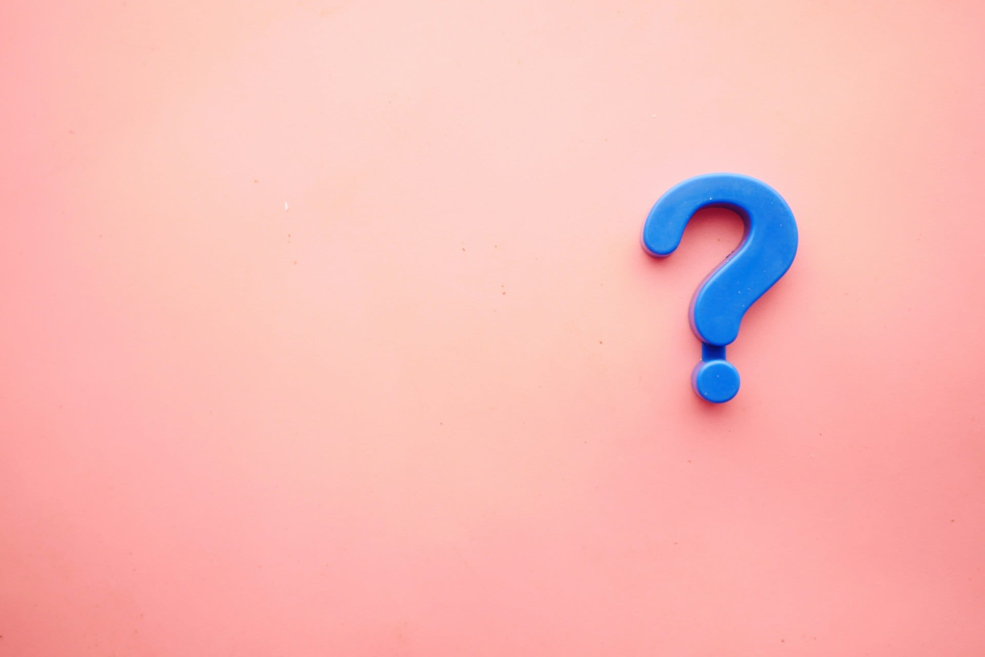
The Latin word “quaestio,” which means “question,” is probably where this punctuation mark originated. The letters were eventually stacked, with the ‘q’ on top and the ‘o’ below, after medieval scribes shortened it to ‘qo’.
The ‘o’ evolved into a dot and the ‘q’ into a curve over time. According to a different theory, it originated from a tonal mark that denotes rising inflection at the conclusion of a sentence.
By the 1600s, the question mark had become standardized in English printing, regardless of its precise origin. Even young children who are just learning to read can instantly recognize it due to its unique shape.
How symbols shape modern life

These symbols have become a silent language that crosses borders and connects people who speak different languages. They’ve evolved from simple practical needs into powerful tools of communication that shape how everyone interacts with technology, signs, and each other.
The best symbols work so seamlessly that people forget they’re even there—at least until someone takes the time to wonder where they came from. Next time one of these familiar icons appears, there’s now a story behind it worth remembering.
More from Go2Tutors!

- The Romanov Crown Jewels and Their Tragic Fate
- 13 Historical Mysteries That Science Still Can’t Solve
- Famous Hoaxes That Fooled the World for Years
- 15 Child Stars with Tragic Adult Lives
- 16 Famous Jewelry Pieces in History
Like Go2Tutors’s content? Follow us on MSN.