The Secret History of the World’s Favorite Fonts
Walk into any coffee shop, scroll through your phone, or glance at a billboard, and you’re surrounded by silent storytellers. These aren’t the words themselves—they’re the shapes that hold the words.
Fonts carry more weight than most people realize, whispering messages about trustworthiness, elegance, rebellion, or authority before you’ve read a single sentence. Behind every familiar typeface lies a story of human ambition, corporate intrigue, and cultural revolution that shaped how the world communicates.
Times New Roman

The Times commissioned Stanley Morison to solve a problem in 1931. Their existing font looked dated and cramped.
Morison designed something that packed more words per line while staying perfectly readable. The newspaper adopted it, and suddenly every other publication wanted that same crisp authority.
Helvetica
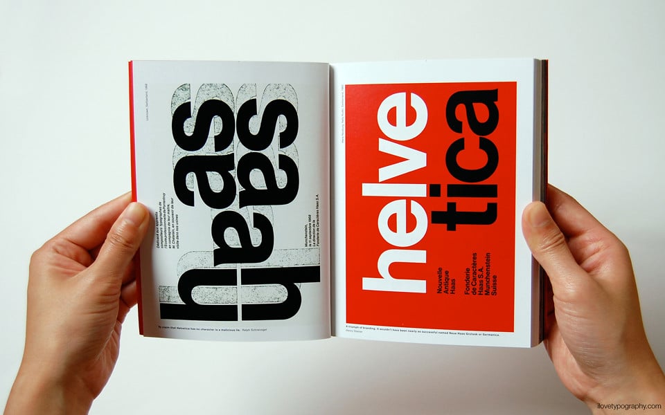
Max Miedinger wasn’t trying to create the world’s most ubiquitous font (and let’s be honest, calling it “ubiquitous” feels generous when most people couldn’t pick it out of a lineup—but they see it everywhere, which is exactly the point). He wanted something clean and neutral for the Haas Type Foundry in Switzerland, something that wouldn’t impose personality on the message it carried—pure Swiss efficiency in letter form. So he sketched something that looked almost apologetically simple.
But neutrality, it turned out, was exactly what the world wanted in 1957. And corporations discovered that Helvetica didn’t just look clean; it looked trustworthy without trying too hard, modern without being trendy, substantial without being heavy. American Airlines slapped it on their planes, and suddenly every major brand wanted that same invisible confidence—the kind of typography that whispers “we’re competent professionals” without actually whispering anything at all.
Comic Sans
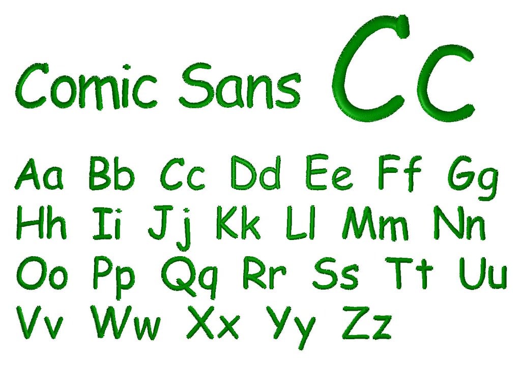
Picture a designer sitting in front of a computer screen, thinking about comic book speech bubbles. Vincent Connare wanted something playful for Microsoft Bob, that friendly software assistant that was supposed to make computers less intimidating.
Comic Sans was never meant to escape that small corner of the software world. The font found its way into everything.
School newsletters, small business signs, casual emails between colleagues. People loved how approachable it felt, how it softened serious messages and made formal communications feel human.
Others developed an almost physical revulsion to its cheerful irregularity, as if the font was personally mocking their sense of design propriety.
Futura
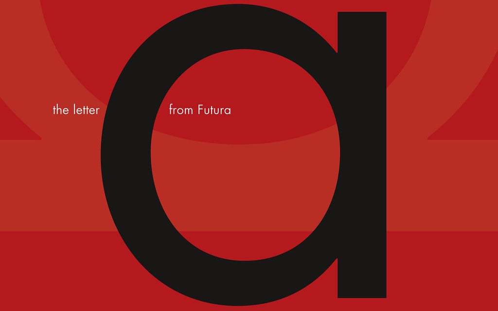
Paul Renner built letters like an architect builds buildings. Clean lines, perfect circles, no ornamentation that couldn’t justify its existence.
Futura arrived in 1927 carrying the confidence of the Bauhaus movement—form follows function, stripped down to mathematical precision. The font suggested a gleaming future where efficiency ruled and clutter disappeared.
Fashion brands adopted it for luxury that didn’t need to shout. Movie posters used it for stories set in space or in imagined tomorrows. NASA even took it to the moon, where it appeared on the plaque left behind by Apollo 11.
Garamond
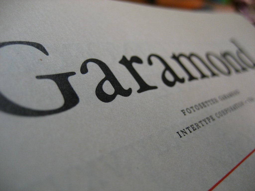
Claude Garamond cut type in 16th-century Paris, shaping metal letters by hand with tools that required both strength and delicate precision. His letters carried the confidence of the Renaissance—learned but not stiff, elegant but not fragile.
They spread across Europe as printing presses multiplied, becoming the standard for books that mattered. Modern versions of Garamond still carry that old-world authority (though calling them “versions” understates the complexity—there are dozens of interpretations, each designer making their own decisions about what Garamond would have wanted, which is both presumptuous and necessary).
Publishers choose it when they want text that feels established and trustworthy, the kind of typography that suggests the content has been carefully considered rather than hastily assembled. And yet there’s something almost stubborn about Garamond’s continued relevance: it refuses to feel dated, even as design trends cycle through minimalism and maximalism and back again.
Bodoni
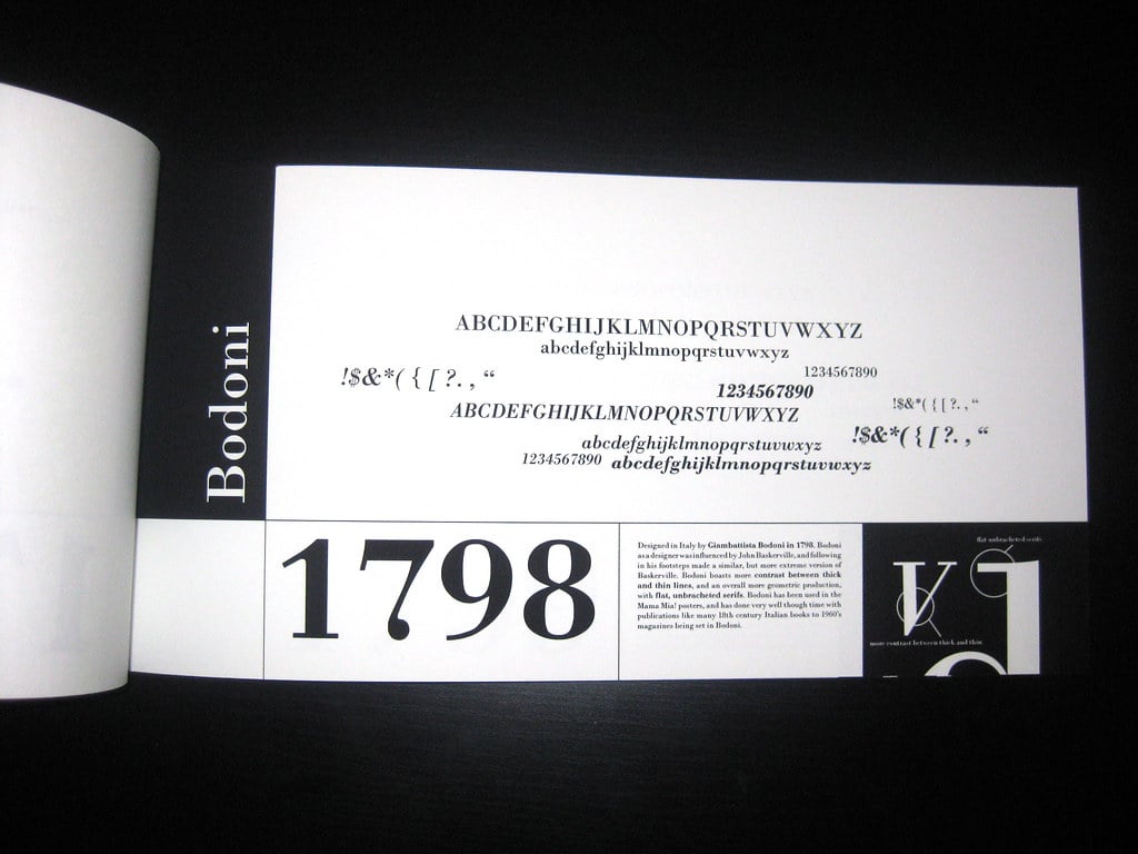
Giambattista Bodoni carved letters like jewelry. Thick strokes crashed into impossibly thin ones, creating contrast so dramatic it seemed to vibrate on the page.
His 18th-century Italian workshop produced type that demanded attention—elegant but never quiet. Fashion magazines discovered that Bodoni made everything look more expensive.
The stark contrast between thick and thin strokes suggested luxury that knew its own worth. Vogue, Harper’s Bazaar, and countless high-end brands adopted variations of Bodoni to signal sophistication that didn’t need to explain itself.
Arial
Microsoft needed a font that looked like Helvetica but wasn’t Helvetica. Licensing fees mattered, and creating something similar but legally distinct made business sense.
Robin Nicholas and Patricia Saunders delivered Arial in 1982—close enough to feel familiar, different enough to avoid lawsuits. Designers noticed the differences immediately.
Arial’s curves felt slightly softer, its spacing marginally looser. But most people saw a clean, professional font that worked well on screens and printed documents. Arial became Windows’ default sans-serif, appearing on millions of computers worldwide whether users chose it or not.
Georgia
Computer screens in the 1990s turned most fonts into blurry approximations of their printed versions. Matthew Carter designed Georgia specifically for digital display, creating a serif font that stayed sharp and readable even at small sizes on low-resolution monitors.
Georgia bridges the gap between traditional and modern typography like a diplomat who speaks both languages fluently. The serifs provide classical authority, but they’re drawn with enough weight and spacing to survive the rough translation from print to pixel.
News websites adopted it for body text that needed to feel substantial but accessible, while designers appreciated how it maintained personality without sacrificing legibility.
Trajan
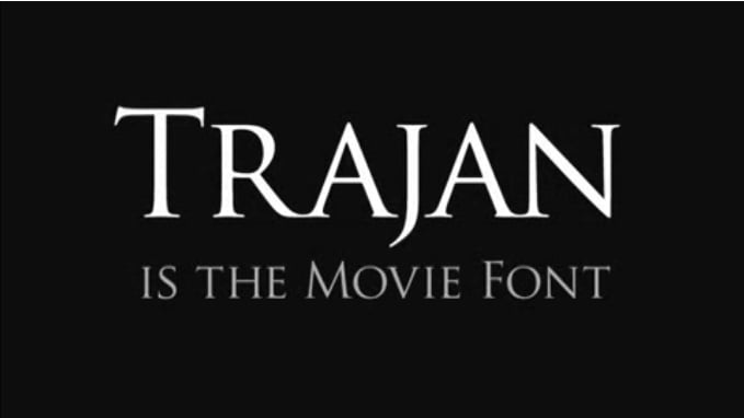
Carved letters on ancient Roman monuments don’t typically inspire modern typography, but Carol Twombly saw something worth preserving. Trajan captures the monumental weight of classical inscription—letters that were meant to last centuries and communicate imperial authority to illiterate and educated citizens alike.
Movie posters discovered that Trajan made everything feel epic. Historical dramas, fantasy adventures, and serious documentaries all borrowed its classical gravitas.
The font suggests permanence and importance, making even modest projects feel slightly more significant than they might actually be.
Baskerville
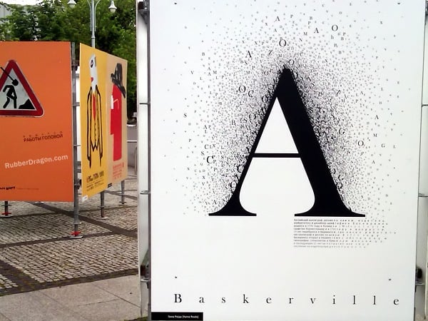
John Baskerville approached type design like a scientist conducting experiments. His 18th-century letters balanced mathematical precision with subtle warmth, creating something that felt both rational and human.
The contrast between thick and thin strokes was more pronounced than earlier designs but never dramatic enough to sacrifice readability. Modern Baskerville works particularly well for extended reading—books, magazines, and long-form digital content that needs to hold attention without causing fatigue.
Publishers appreciate how it signals quality and thoughtfulness, while readers often don’t consciously notice the font at all, which is exactly the point for body text.
Frutiger

Airport signage requires a special kind of clarity—information that can be absorbed quickly by tired travelers carrying luggage while walking past at various speeds (and let’s not forget that half of them are probably squinting at signs while simultaneously checking their phones, dragging children, or operating on three hours of sleep from an overnight flight). Adrian Frutiger designed his namesake font for Charles de Gaulle Airport in Paris, where confusion could mean missed connections and international incidents.
So the letters needed to be unmistakably clear from a distance, equally readable whether you’re rushing or strolling, and completely unambiguous about which gate is 23B and which is 28B. Transit systems worldwide adopted Frutiger variations because airports had already proven the font worked under pressure.
But something interesting happened: designers discovered that Frutiger’s practical clarity translated beautifully to corporate communications, healthcare systems, and government documents—anywhere information needed to be absorbed quickly and without error.
Optima
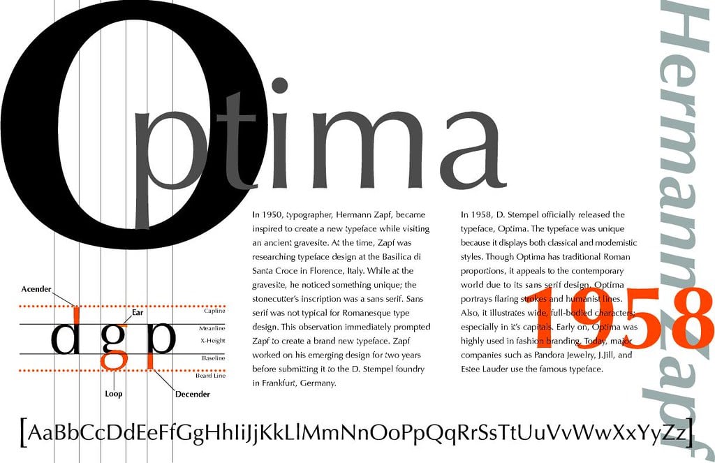
Hermann Zapf sketched letters inspired by ancient Roman inscriptions, but he removed the serifs entirely. Optima occupies an unusual space between serif and sans-serif fonts—classical proportions without traditional flourishes, creating something that feels both timeless and distinctly modern.
The font appears on the Vietnam Veterans Memorial in Washington, D.C., where its quiet dignity serves names that deserve careful attention. Optima doesn’t compete with its content; it supports and honors it, providing enough personality to feel intentional but never enough to feel decorative.
Caslon
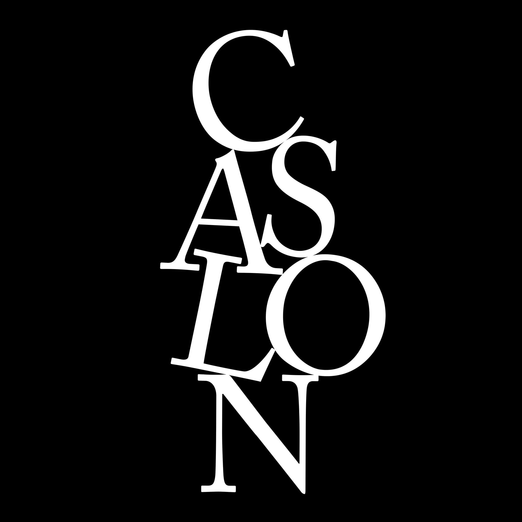
William Caslon cut type in 18th-century London, creating letters that became so standard that “when in doubt, use Caslon” became a printer’s motto. His fonts carried the weight of the British Empire, appearing in documents that shaped nations and defined eras.
The Declaration of Independence was set in Caslon. Modern versions of Caslon retain that sense of historical authority without feeling frozen in amber.
Publishers choose it for books that benefit from traditional credibility, while designers appreciate its subtle irregularities that keep text from feeling mechanical or cold.
The Typography That Shapes Tomorrow
Fonts don’t just carry words—they carry the weight of human intention. Every letter shape represents countless decisions about how communication should feel, look, and function in the world.
The next time you glance at your screen or flip through a magazine, remember that someone, somewhere, spent months perfecting the curve of an “a” or the spacing between letters, hoping to make your reading experience just slightly more pleasant, trustworthy, or engaging than it was before.
More from Go2Tutors!

- The Romanov Crown Jewels and Their Tragic Fate
- 13 Historical Mysteries That Science Still Can’t Solve
- Famous Hoaxes That Fooled the World for Years
- 15 Child Stars with Tragic Adult Lives
- 16 Famous Jewelry Pieces in History
Like Go2Tutors’s content? Follow us on MSN.