Unusual Mascots Tied to Global Events
Mascots at major international gatherings often aim to project a sense of unity, national pride, or cultural identity. Sometimes they succeed beautifully.
Other times, they become the subject of bewildered conversations and puzzled stares. The designers take creative risks, and the results don’t always land as expected.
These strange creations still manage to embed themselves in the collective memory of the events they represent, for better or worse.
Cobi the Cubist Dog
Barcelona’s 1992 Olympic Games introduced the world to Cobi, a dog designed by artist Javier Mariscal. The mascot drew inspiration from cubist art, which made sense given Barcelona’s connection to Picasso and the broader modernist movement.
But Cobi didn’t look like a typical dog. The angular lines and abstract features confused people who expected something more traditional.
The initial reaction was mixed. Some called it ugly.
Others found it refreshingly different. Over time, Cobi grew in audiences, becoming one of the more memorable Olympic mascots precisely because it dared to be unconventional.
The character appeared in animated series and merchandise, slowly winning over skeptics.
Izzy and the Mystery Blob
Atlanta’s 1996 Olympics went in a completely different direction. Instead of representing an animal or cultural symbol, the organizing committee created Izzy, originally called “Whatizit.”
The name itself acknowledged that nobody quite knew what this mascot was supposed to be.
Izzy looked like a blue blob with eyes, arms, and legs. The designers gave it sneakers and tried to make it seem athletic, but the result felt forced.
Critics panned it immediately. Even after redesigns that added a more muscular build and changed some features, Izzy remained unpopular.
The mascot represents what happens when creativity goes too far into abstraction without grounding itself in something recognizable.
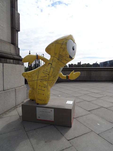
Wenlock and Mandeville’s Industrial Heritage
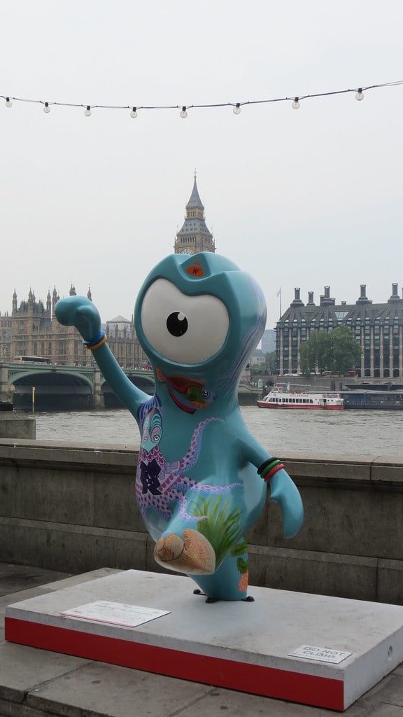
London’s 2012 Olympics featured two mascots that looked like they came from a science fiction film. Wenlock and Mandeville were metallic figures with a single eye each, designed to represent drops of steel from the construction of the Olympic Stadium.
The names came from Much Wenlock, a town that hosted early Olympic-style games, and Stoke Mandeville, where the Paralympic movement began.
The concept made sense when you read the backstory. But without that context, they just looked strange.
Children didn’t warm to them the way organizers hoped. The cyclops design was too alien, too cold.
The mascots had educational value and clever symbolism, but they failed to connect emotionally with audiences.
Vinicius and Tom’s Brazilian Fantasy
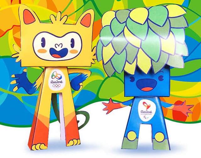
Rio de Janeiro’s 2016 Olympics brought forth Vinicius, a yellow creature combining features from various Brazilian animals. The mascot represented the country’s biodiversity but ended up looking like a cartoon character from a fever dream.
Tom, the Paralympic mascot, represented Brazilian flora and appeared equally abstract.
Brazilian children voted on the names, choosing to honor musicians Vinicius de Moraes and Tom Jobim. The cultural references were meaningful locally, but the visual designs didn’t translate well internationally.
The mascots felt generic despite their specific inspiration, blending too many elements into something that lost its identity in the process.
Miraitowa and Someity’s Checkered Pattern
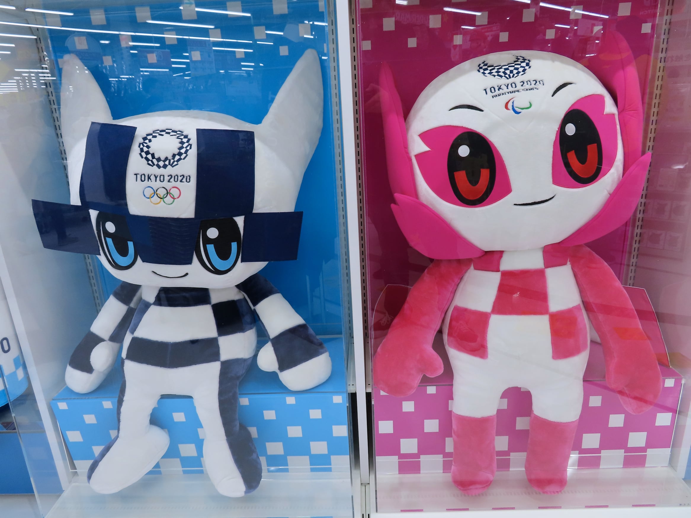
Tokyo’s 2020 Olympics (held in 2021) introduced Miraitowa and Someity, both featuring the indigo checkered pattern from the Games’ logo. Miraitowa’s name combined the Japanese words for future and eternity.
Someity took its name from a popular cherry blossom variety.
The designs were cleaner than many previous mascots, but they still felt corporate and sterile. The checkered pattern dominated their appearance, making them look more like brand mascots than characters with personality.
They had superpowers in their backstory, which added narrative depth, but the execution felt calculated rather than inspired.
The Phrygian Cap Comes to Paris

Paris 2024 made a bold choice by turning a Phrygian cap into its Olympic mascot. The red hat, a symbol of the French Revolution and liberty, became a cartoon character with eyes, arms, and legs.
The Paralympic version wore a prosthetic leg, making a statement about inclusion.
You either loved the absurdity or found it baffling. A hat with limbs shouldn’t work as a mascot, yet the organizers committed fully to the concept.
The historical significance gave it weight, but the visual execution remained polarizing. It demonstrated that sometimes cultural symbolism matters more than conventional appeal.
Zakumi’s Controversial Creation
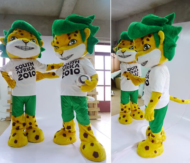
South Africa’s 2010 FIFA World Cup featured Zakumi, a green and yellow leopard wearing a white shirt and green shorts. The name combined “ZA” (South Africa’s country code) and “kumi” (Swazi for ten).
The design acknowledged African wildlife while incorporating national colors.
What made Zakumi unusual was the timing. Some critics argued that using an endangered species as a mascot sent mixed messages about conservation.
Others questioned whether a predator was appropriate for a celebration of international unity. Despite these debates, Zakumi became more accepted than many Olympic mascots, probably because the design stayed relatively conventional even while sparking discussions.
Footix and the Rooster Decision
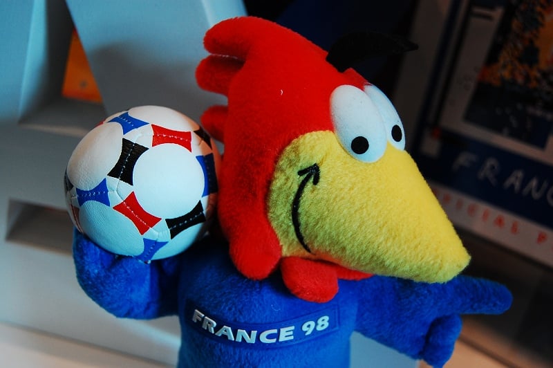
France’s 1998 World Cup mascot was Footix, a blue rooster with the words “FRANCE 98” on its chest. Roosters symbolize France, so the choice made cultural sense.
But Footix looked cartoonish in ways that dated poorly. The large eyes and simplified features felt aimed at very young children rather than the broader audience watching the tournament.
The mascot’s popularity varied by region. French audiences accepted it more readily than international viewers, who found it unremarkable.
Footix worked as a symbol but failed as a character. The design lacked the personality that might have elevated it beyond a basic representation of national identity.
Naranjito the Smiling Orange
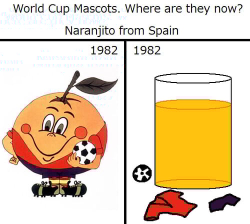
Spain’s 1982 World Cup gave the world Naranjito, an anthropomorphic orange dressed in the Spanish team’s uniform. The name came from “naranja,” the Spanish word for orange, combined with a diminutive suffix.
Orange trees are common in Spain, particularly in the Valencia region, so the connection made geographical sense.
Naranjito smiled constantly, which gave it a friendlier appearance than many mascots that followed. The simplicity worked in its favor.
An orange with a face and a uniform was straightforward enough for anyone to understand, even if it was strange. The design avoided complexity and became memorable for its directness.
Fuleco’s Environmental Message
Brazil’s 2014 World Cup introduced Fuleco, a three-banded armadillo wearing a shell with the colors of the Brazilian flag. The name blended “futebol” (football) and “ecologia” (ecology).
Organizers wanted to draw attention to endangered species and environmental conservation.
The concept was admirable, but the execution raised questions. Using an endangered animal as a mascot seemed to trivialize the conservation message some argued.
Others appreciated the awareness it brought to the armadillo’s plight. Fuleco represented good intentions meeting complicated reality.
The mascot tried to do too much, serving both as entertainment and education, and ended up doing neither perfectly.
Zabivaka’s Political Shadow
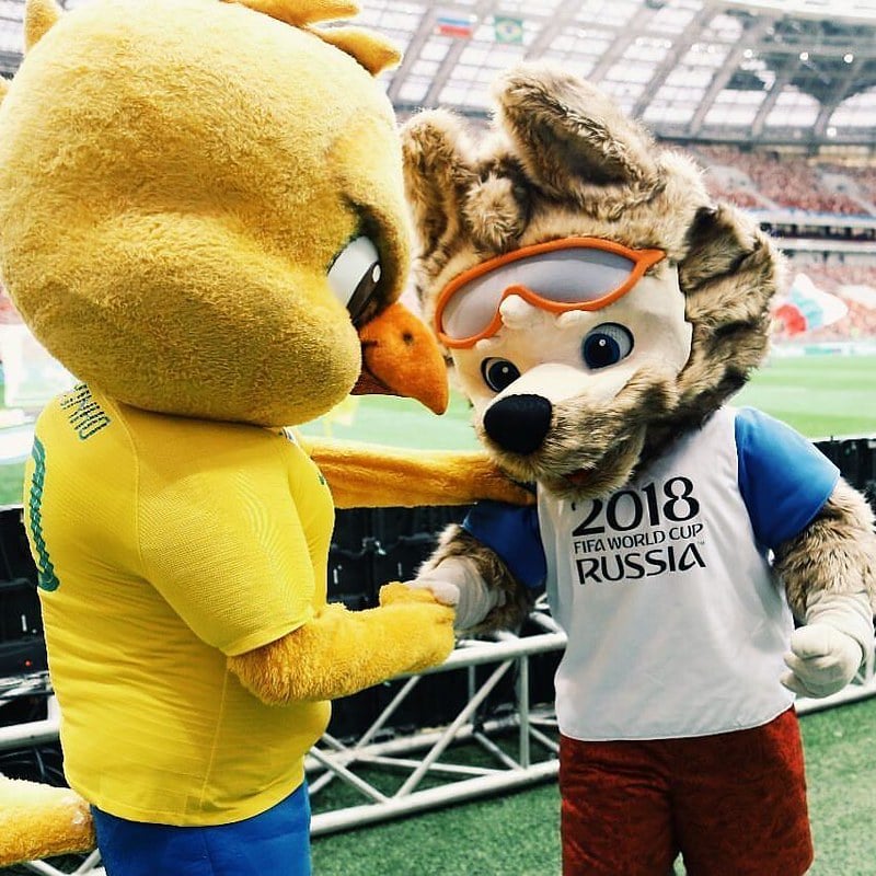
Russia’s 2018 World Cup mascot was Zabivaka, a wolf wearing sports goggles and a white, blue, and red uniform. The name means “the one who scores” in Russian.
Wolves hold significance in Russian folklore, representing strength and cunning.
Zabivaka was actually popular among mascots, winning a public vote against competitors including a cat and a tiger. But the political context complicated reception.
Some critics saw the wolf as representing aggression, though that reading might have been influenced by broader tensions. The mascot itself was well-designed and appealing, showing that execution matters more than symbolism in many cases.
La’eeb’s Abstract Journey
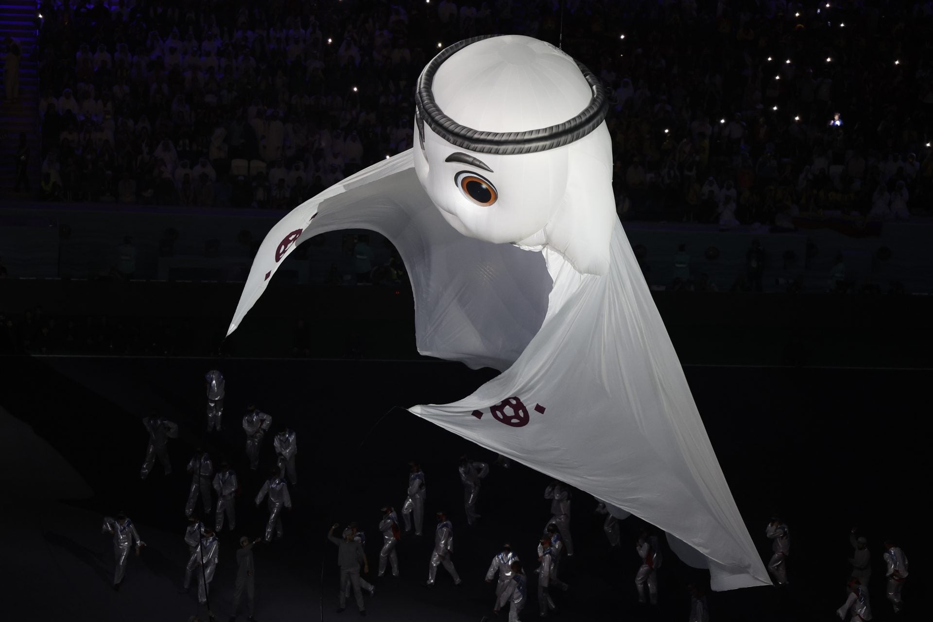
Qatar’s 2022 World Cup presented La’eeb, a mascot described as representing a keffiyeh, the traditional Arab headdress. But La’eeb looked more like a floating ghost or a piece of animated cloth than a cultural garment.
The name means “super-skilled player” in Arabic.
The design was polarizing from the start. The lack of clear features made it difficult to read emotionally.
Children and adults struggled to connect with something that felt more like an animated special effect than a character. La’eeb demonstrated that abstraction needs careful handling.
Without enough concrete details, mascots become forgettable despite their uniqueness.
The Robot of Osaka 1970
Japan’s Expo ’70 in Osaka didn’t have an official mascot in the traditional sense, but the event featured a robot that became its unofficial symbol. Standing several stories tall, the robot represented Japan’s technological ambitions during an era of rapid industrial growth.
The design was retrofuturistic even at the time, with bold lines and a mechanical aesthetic.
The robot wasn’t cute or friendly. It was impressive and somewhat intimidating.
This approach reflected different priorities. The Expo wanted to showcase innovation and progress, not create a cuddly character for children.
The robot succeeded by being memorable and photograph-worthy, even if it didn’t inspire the same affection as animal mascots.
Haibao’s Blue Enthusiasm
Shanghai’s 2010 World Expo featured Haibao, a blue cartoon character with a curled top that resembled the Chinese character “人” (person). The name meant “treasure of the seas,” referencing Shanghai’s coastal location.
Haibao smiled widely and struck energetic poses, embodying optimism.
The design was simple but effective. The blue color stood out in promotional materials, and the character’s poses conveyed movement and excitement.
Haibao avoided the complexity that tripped up other mascots. It didn’t try to be realistic or overly symbolic.
The result was a mascot that worked functionally without generating strong emotions in either direction.
When Strangeness Becomes Memory
What ties these mascots together? A willingness to try something different sometimes too much so.
Not every idea worked perfectly, yet each one sparked conversation. Their strangeness stuck in people’s minds, regardless of success.
Instead of going for obvious animal choices or plain human shapes, creators went another direction. Predictability was left behind on purpose.
Strange how mascots tie into big events. Not that one ever decided an outcome at a fair or sports meet.
Still, somehow, it sticks around in memory. Long after medals fade from mind, names like Izzy or Wenlock pop up in talk about past Olympic years.
Oddity keeps them alive in memory, long after most fade away. A funny look, a silly costume these stick because they stand out.
To linger in culture, you do not need praise. Just be different enough to get noticed.
Being odd can beat being perfect every time.
More from Go2Tutors!

- The Romanov Crown Jewels and Their Tragic Fate
- 13 Historical Mysteries That Science Still Can’t Solve
- Famous Hoaxes That Fooled the World for Years
- 15 Child Stars with Tragic Adult Lives
- 16 Famous Jewelry Pieces in History
Like Go2Tutors’s content? Follow us on MSN.