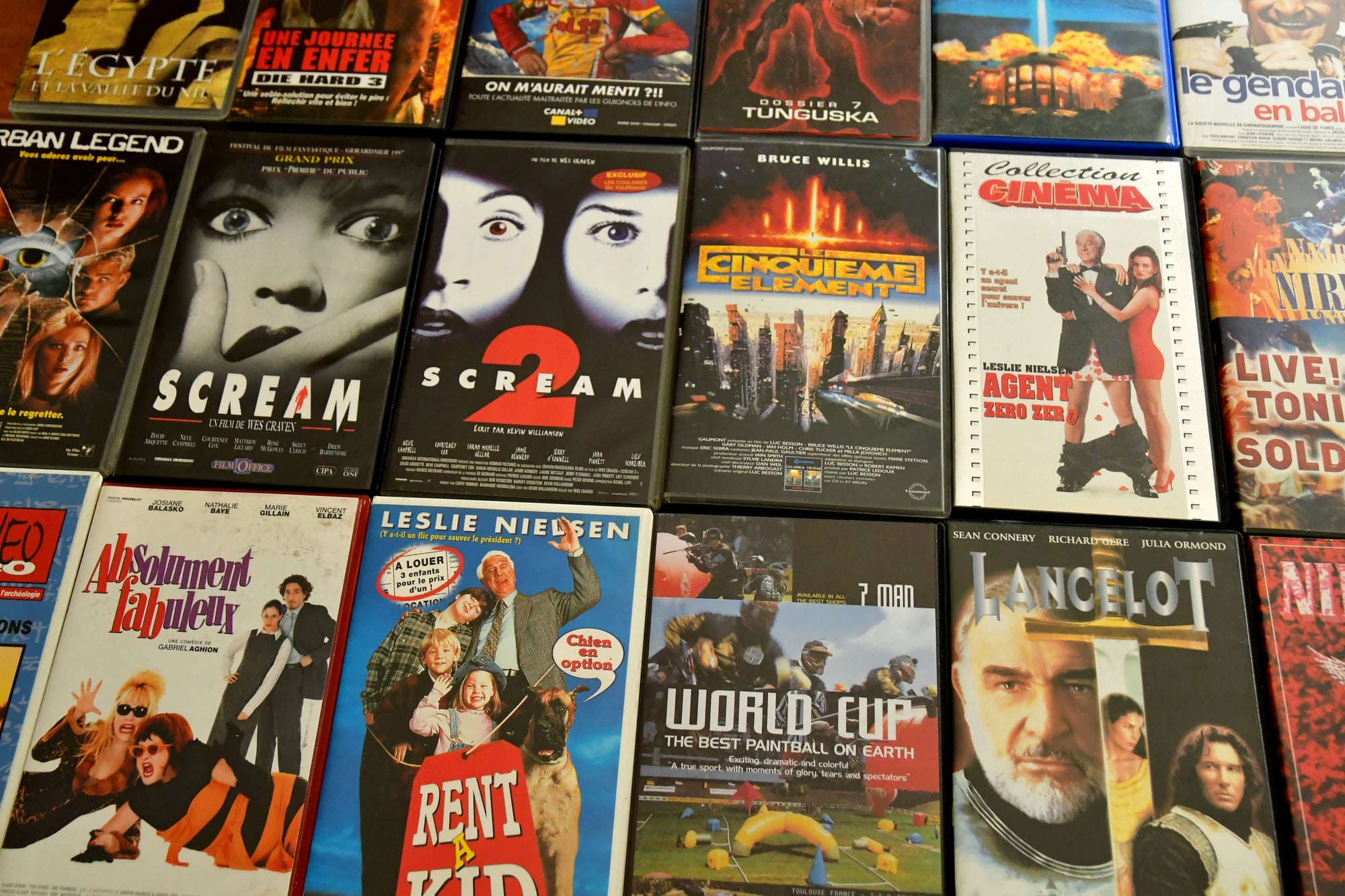
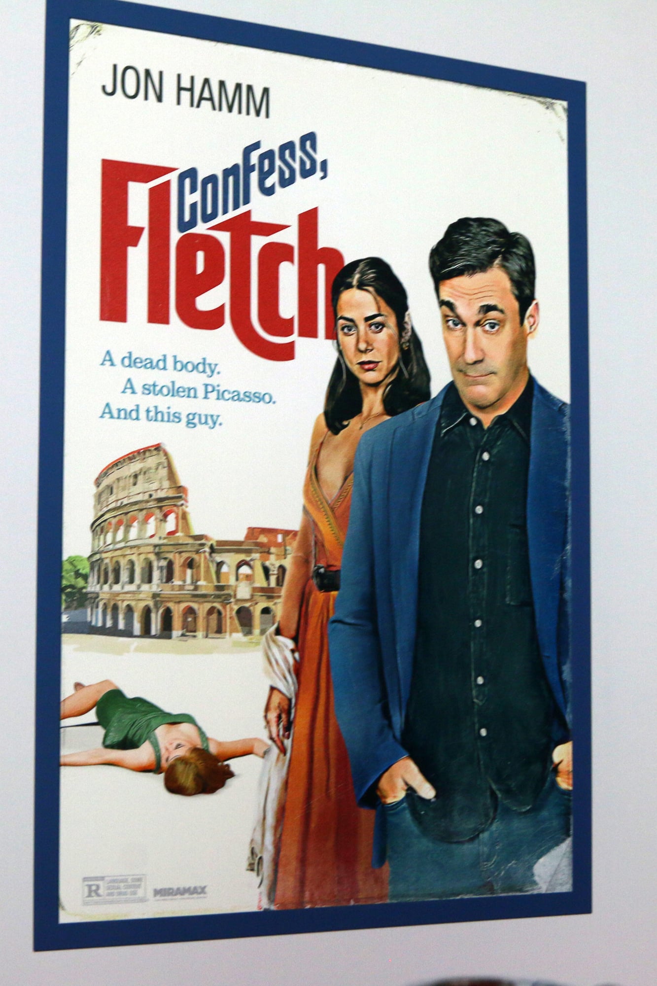
Vintage Film Posters and Their Visual Secrets
You stroll by these at flea markets or garage clear-outs – barely even look twice. Old film ads seem just like basic billboards from way back when.
Yet artists at the time used sneaky methods folks rarely catch on to. Their work pulled your gaze exactly where they wanted it, slipped hidden hints right under your nose, while turning one picture into a full-on tale.
The Floating Head Syndrome
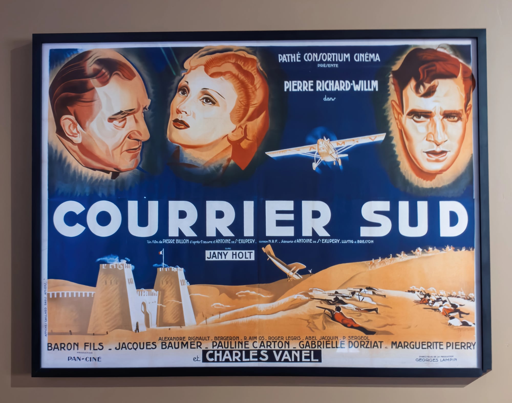
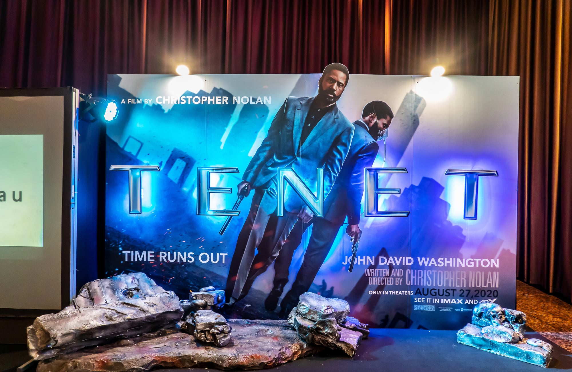
Movie studios always went for huge faces on ads. That trick started way back in old-school cinema promos but really took off after the ’70s.
You’d see just a head floating over scenes, no body attached. Not because they were cutting corners.
Actually fixed several headaches at once. Big names could veto how they looked, so shooting whole figures brought up issues – wardrobe troubles, awkward stances, bad lighting.
Close-ups avoided all that mess. Gave actors more say without extra fuss.
The method built a pecking order – largest head, first spot, no exceptions. Reps haggle so their clients land on ads, turning those big faces into must-have promises.
Hidden Arrows in Typography
Letter spacing on vintage posters does more than look pretty. Designers used the gaps between words to create visual arrows that pointed viewers toward specific elements.
The title might stretch across the top with extra space that naturally draws your eye down to the star’s name. Then another gap leads you to the studio logo.
You follow the path without realizing anyone built it. Modern designers still use this trick, but the old posters made it an art form.
The Three-Color Limitation
Early posters used lithography, which meant each color required a separate printing stone or plate. Studios kept costs down by limiting designs to three or four colors maximum.
The three-stone lithography process, developed by Jules Chéret in the 1800s, used yellow, blue, and red. These could be mixed to create additional colors.
But this restriction forced creativity. Bold primary colors dominated many vintage posters.
Red, white, and black became common for horror films. The limitation shaped the style, making vintage posters instantly recognizable by their color approach.
Diagonal Lines That Vanish
Watch how the horizon line tilts in adventure posters from the 1950s. That angle isn’t random.
Diagonal compositions create tension and movement. A straight horizontal line feels stable and boring.
Tilt it 15 degrees and suddenly everything feels dynamic. The designers knew this instinctively.
They’d place the actor’s sword or the building’s edge at these exact angles. Your brain processes the diagonal as action, even when nothing’s actually moving.
The Miniature Second Scene
Look closely at the background of any vintage poster and you’ll find a second story happening. While the main image shows the romantic leads, a tiny scene in the corner depicts the actual plot.
Someone’s falling off a building. A car chase unfolds.
The villain lurks in the shadows. These miniature scenes told audiences what kind of movie they were buying tickets for, while the star power up front got them through the door.
It’s true in advertising, just hidden where most people wouldn’t look first.
Reversed Negatives Nobody Caught
Sometimes poster artists worked from publicity photos that got printed backward. The actor’s hair part switched sides.
A right-handed character suddenly held a gun in their left. Studios caught most of these mistakes, but some slipped through.
Collectors hunt for these reversed posters now because they’re rarer than the corrected versions. The error becomes the treasure.
Strategic Smoke and Fog
Fog wasn’t just atmosphere in old posters. It served as a visual eraser.
Got an awkward composition? Add fog to hide the problem area.
Need to blend two photos that don’t match? Fog smooths the transition.
Designers used it like digital artists use blur today. It also created depth, making flat images look three-dimensional.
The best poster artists knew exactly how much fog to add before it looked like they were covering up mistakes.
The Phantom Third Act
Action posters from the 1960s often showed scenes that never appeared in the actual film. The hero dangles from a helicopter.
The building explodes in flames. Audiences saw the poster, bought tickets, then sat through a movie where none of that happened.
Studios didn’t consider it lying. The poster sold the feeling of the movie, not a literal scene-by-scene breakdown.
As long as the tone matched, they figured they’d delivered what they promised.
Color-Coded Genres
Before you read a single word on a vintage poster, the colors told you everything. Yellow and red meant comedy.
Deep blues and purples signaled mystery or noir. Bright primary colors advertised family entertainment.
This color grammar became so standard that audiences learned to read it subconsciously. You knew what kind of movie you were getting just from the palette.
Theaters grouped posters by color zones, and people could navigate to their preferred genre without reading titles.
The Overlapping Photo Technique
Studios shot actors separately, then layered the images together. This let them control exactly who appeared largest and who got pushed to the edges.
But the technique created visual problems. Lighting never quite matched between photos.
Shadows fell in wrong directions. Skilled poster artists added painted elements to blend everything together.
The truly great ones made it look like all the actors stood in the same room, even when they’d been photographed months apart on different continents.
Negative Space Faces
Turn a vintage poster upside down and sometimes a face appears in the negative space. These hidden images weren’t accidents.
Some designers embedded them deliberately as a signature. Others did it to create subliminal unease in horror posters.
The shape between two buildings forms an eye. The gap in the trees becomes a mouth.
Your brain registers something unsettling without knowing exactly what it saw.
Typography That Changes Size
Read the text on an old poster and you’ll notice the letters grow and shrink within the same word. This isn’t poor planning.
Designers adjusted letter sizes to create visual balance. If one letter had an awkward shape, they’d shrink it.
If a word felt too light, they’d beef up certain characters. The result looks unified, even though individual letters vary wildly.
Your eye averages everything out and sees consistency where technically none exists.
The Strategic Crop
Stars negotiated what parts of their body appeared on posters. Some refused to show their legs.
Others demanded full-length shots. This led to bizarre croppings where an actor’s torso floats in frame with no visible connection to anything below the waist.
Designers worked around these demands by adding strategic elements—a desk, a car door, a conveniently placed bush—that explained why you couldn’t see the rest of the person. The movie business has always been about compromise, and the posters document every negotiation.
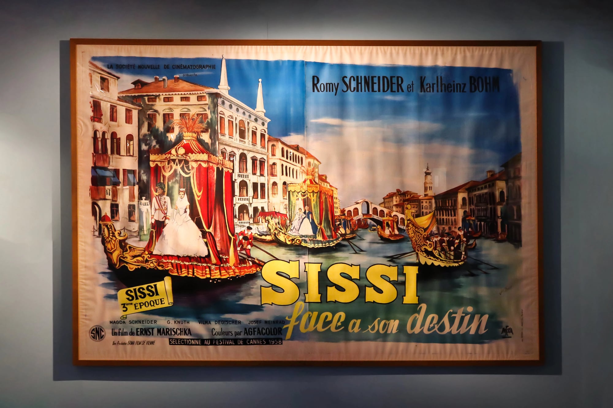
Painted Additions to Photos
Most vintage posters started as photographs, but few stayed that way. Artists painted over sections to add drama.
They extended hair, adjusted jawlines, smoothed wrinkles, and changed clothing colors. They’d paint entirely new backgrounds or add weather effects.
The original photo served as a starting point, not the final product. This hybrid approach combined photography’s realism with painting’s flexibility.
Modern photoshop does the same thing, just faster.
What They Chose Not to Show
The strongest move in poster design? Leaving stuff out.
Old Hitchcock ones had barely anything – a dark shape, an outline, maybe a knife. That uncertainty pulled crowds better than explosions ever did.
Scary movie ads kept the creature hidden. Romance movie ads showed the moment right before a kiss.
That pause sparked longing. Viewers imagined what came next – something way stronger than any sketch on paper.
When the Illusion Becomes the Art
Old posters didn’t aim to show real life. Instead, they stitched dreams out of bits – chopped-up pictures, brushwork fixes, wild shades, moments pulled from thin air.
What’s cool is how everything clicked anyway. You bought into the trick, even when you saw the cracks.
Or maybe because you saw them. This is the true mystery behind each old poster.
Flaws tell you people made it – something worth saving, errors included.
More from Go2Tutors!

- The Romanov Crown Jewels and Their Tragic Fate
- 13 Historical Mysteries That Science Still Can’t Solve
- Famous Hoaxes That Fooled the World for Years
- 15 Child Stars with Tragic Adult Lives
- 16 Famous Jewelry Pieces in History
Like Go2Tutors’s content? Follow us on MSN.