15 Subtle Psychological Tricks Brands Use in Packaging Design
Ever grabbed something off a store shelf that wasn’t on your shopping list? Chances are, it wasn’t random chance. Packaging design merges artistic creativity with hard psychological science—crafting experiences explicitly designed to hijack attention and trigger purchase decisions within mere seconds.
The biggest companies pour millions into researching exactly how our brains process visual and tactile packaging cues. Here is a list of 15 subtle psychological tactics brands employ in their packaging designs to influence consumer behavior.
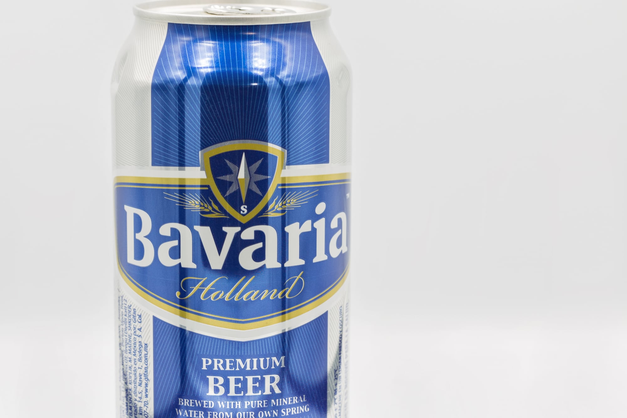
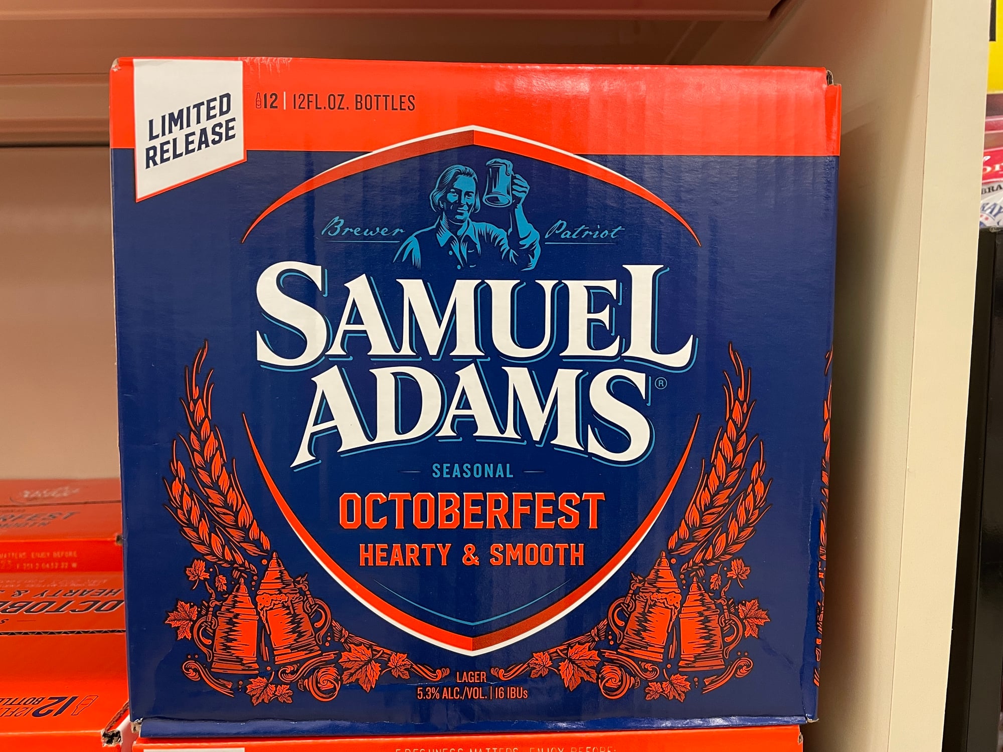
Strategic Color Psychology
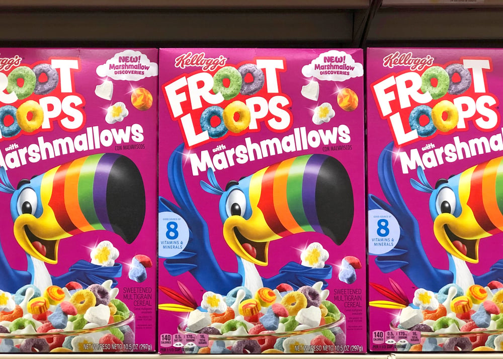
The colors wrapping your favorite products aren’t chosen by accident—they’re selected based on deep psychological associations we’ve developed throughout our lives. Blue conveys trustworthiness and reliability—making it perfect for financial products and household cleaners.
Red stimulates excitement and urgency—which explains why it dominates impulse purchase items. Green signals health and environmental consciousness—hence its prevalence in organic food packaging. You’ll notice entire product categories often share similar color palettes—this isn’t a coincidence but calculated psychological positioning.
The Nostalgia Effect
Many brands cleverly incorporate vintage-inspired designs or retro typography—tapping into powerful emotional connections with the past. This nostalgia effect—where packaging feels somehow familiar and comforting—creates an immediate emotional bridge with potential buyers.
Products featuring phrases like “since 1892” or similar heritage markers tend to trigger trust responses even when consumers haven’t previously tried the product. Our brains instinctively assign greater authenticity to things that appear to have withstood the test of time.
Like Go2Tutors’s content? Follow us on MSN.
Tactile Engagement
Physical texture creates powerful subconscious quality associations before you’ve even tried a product. Luxury items typically incorporate soft-touch finishes or subtly embossed elements—delivering a premium sensation against fingertips.
High-end wine bottles include deep punts and considerably heavier glass—suggesting sophistication through weight. Some food packages feature textured sections mimicking natural materials related to their ingredients—like rough paper suggesting artisanal production.
Face Pareidolia Exploitation
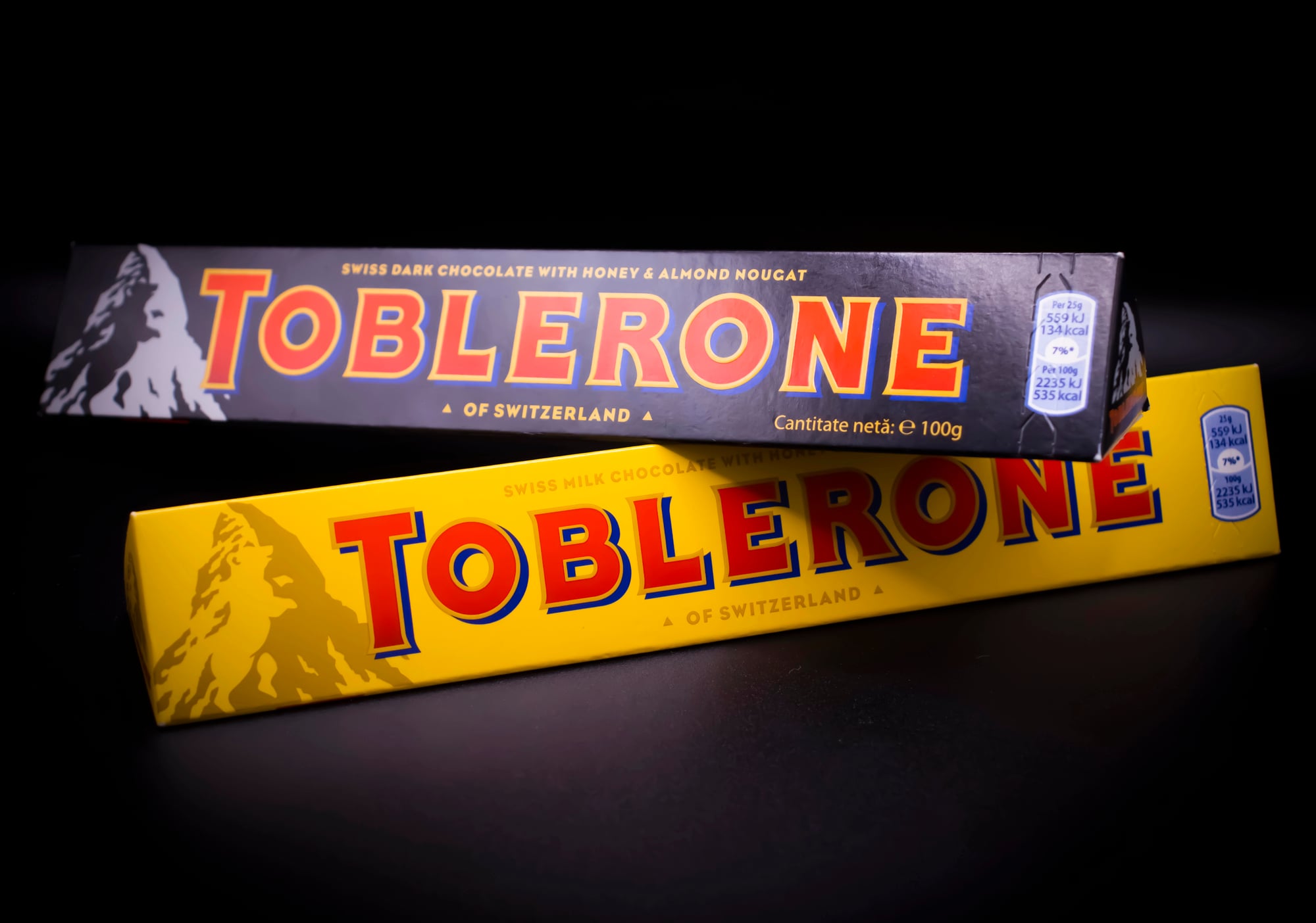
Our brains come factory-wired to recognize facial patterns everywhere—a phenomenon scientists call pareidolia. Smart packaging designers incorporate subtle facial elements into their layouts—triggering immediate attention and emotional connection without conscious awareness.
The Toblerone mountain secretly contains a bear. The Amazon arrow forms an unmistakable smile. These hidden faces generate subconscious affinity with products that might otherwise vanish into visually crowded retail environments.
Sound Engineering

The acoustic properties of packaging significantly influence quality perception—sometimes more than the actual contents. Premium chocolate makers meticulously engineer packaging with specific opening sounds—crisp foils separating with satisfying precision.
Potato chip manufacturers design bags to produce distinctive crinkling sounds—which consumers subconsciously associate with freshness. Beverage companies extensively test the exact acoustic profiles created when cans open or bottles are uncapped.
Like Go2Tutors’s content? Follow us on MSN.
Transparent Windowing
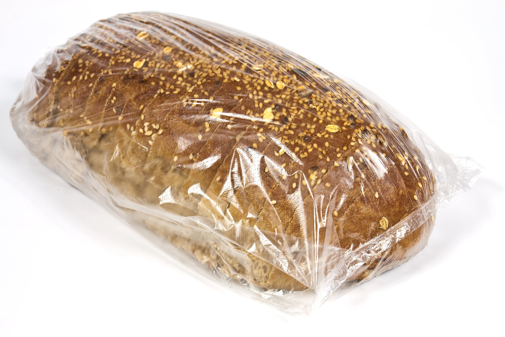
Strategic placement of transparent sections creates immediate visual access to products—establishing trust through visibility while simultaneously highlighting specific attributes. Pasta manufacturers showcase a perfect golden color through small windows.
Bakery items reveal appetizing glimpses through carefully positioned openings. This transparency signals confidence in product quality—yet allows highly controlled visualization of only the most appealing characteristics.
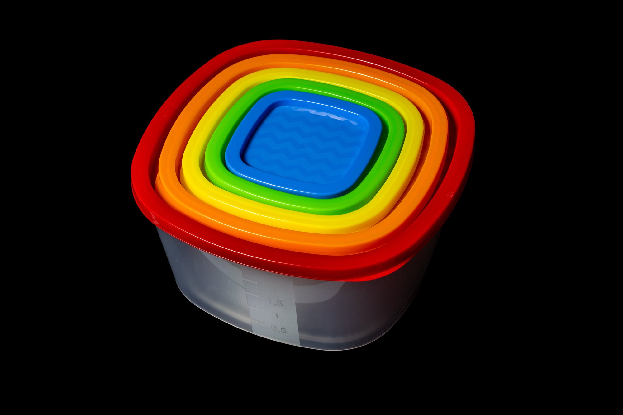
Size Perception Manipulation

Package shapes dramatically influence perceived volume—frequently creating impressions of greater quantity than actually contained inside. Tall, slender containers typically appear larger than short, wide ones—despite containing identical volumes.
Some ice cream containers subtly taper inward at the bottom—creating misleading visual cues about capacity. Concave bottoms in jars and bottles effectively reduce actual content while maintaining overall size impressions.
Name Positioning Psychology
Product names positioned in the upper left corner receive first attention from western consumers—following natural reading patterns ingrained since childhood. Important claims placed here receive disproportionate cognitive processing during split-second shelf scans.
Complementary information frequently appears in diagonal corners—creating visual pathways that guide eyes across the entire package surface. This strategic text placement ensures key selling points receive priority attention in the rapid visual hierarchy established during shopping.
Like Go2Tutors’s content? Follow us on MSN.
Minimalist Luxury Signaling
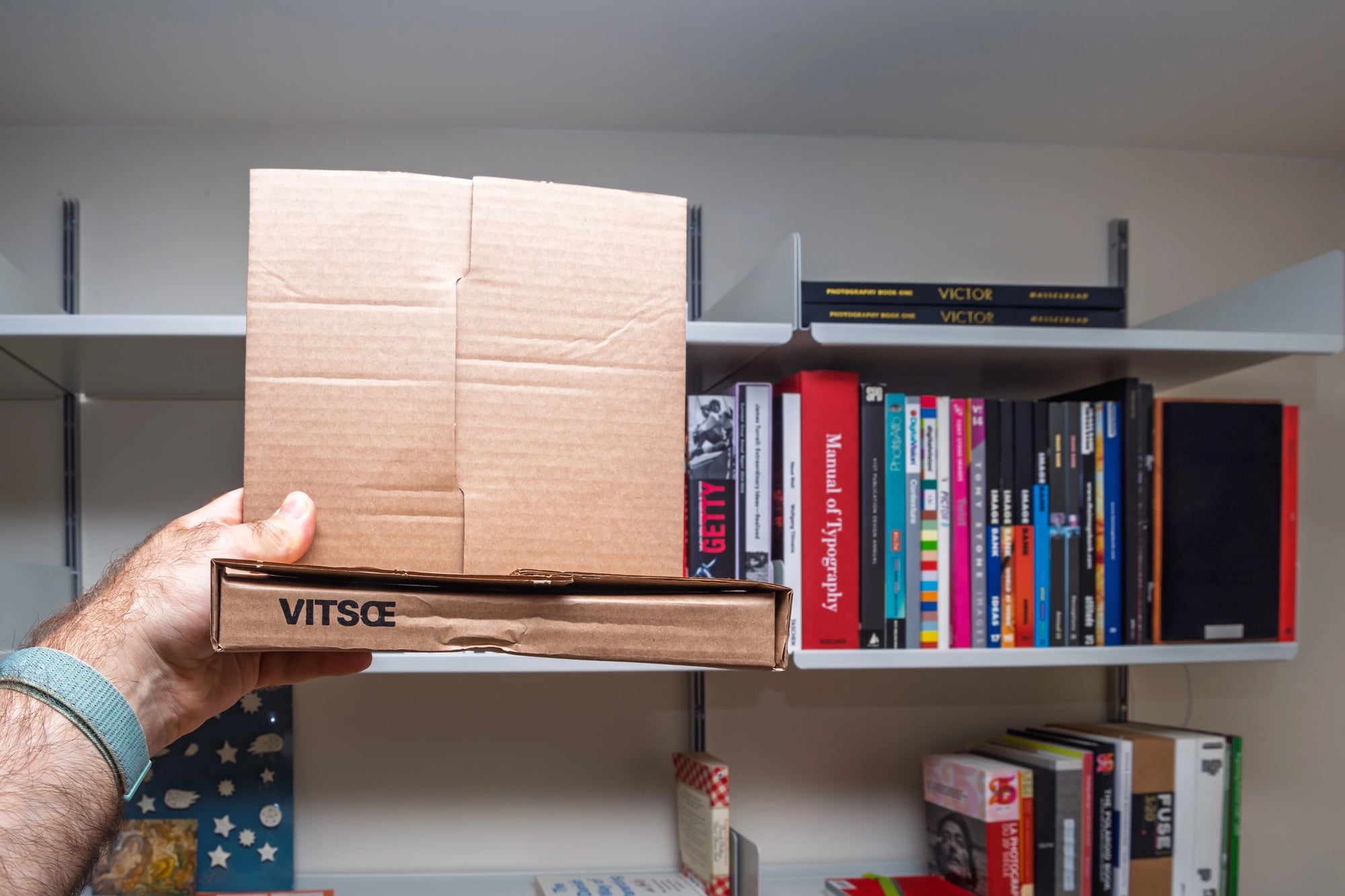
Ultra-simple packaging with substantial empty space signals premium positioning—particularly effective in increasingly crowded marketplaces. This approach—sometimes termed “white space luxury”—exploits the psychological association between simplicity and sophistication.
Fewer design elements require higher quality execution—signaling confidence and premium status without explicit claims. Brands like Apple pioneered this approach—creating packages so minimalist they transform opening into ceremonial experiences.
Haptic Symbolism
The physical weight of packaging creates immediate quality associations before consumers even examine contents—an unconscious evaluation happening the moment an item leaves the shelf. Heavier packages trigger perceptions of greater value and substance—regardless of actual product quality.
Premium spirits arrive in deliberately weighted bottles. High-end cosmetics incorporate unnecessarily substantial components. This exploitation of weight-quality association operates below conscious awareness—yet powerfully influences purchasing decisions across categories.
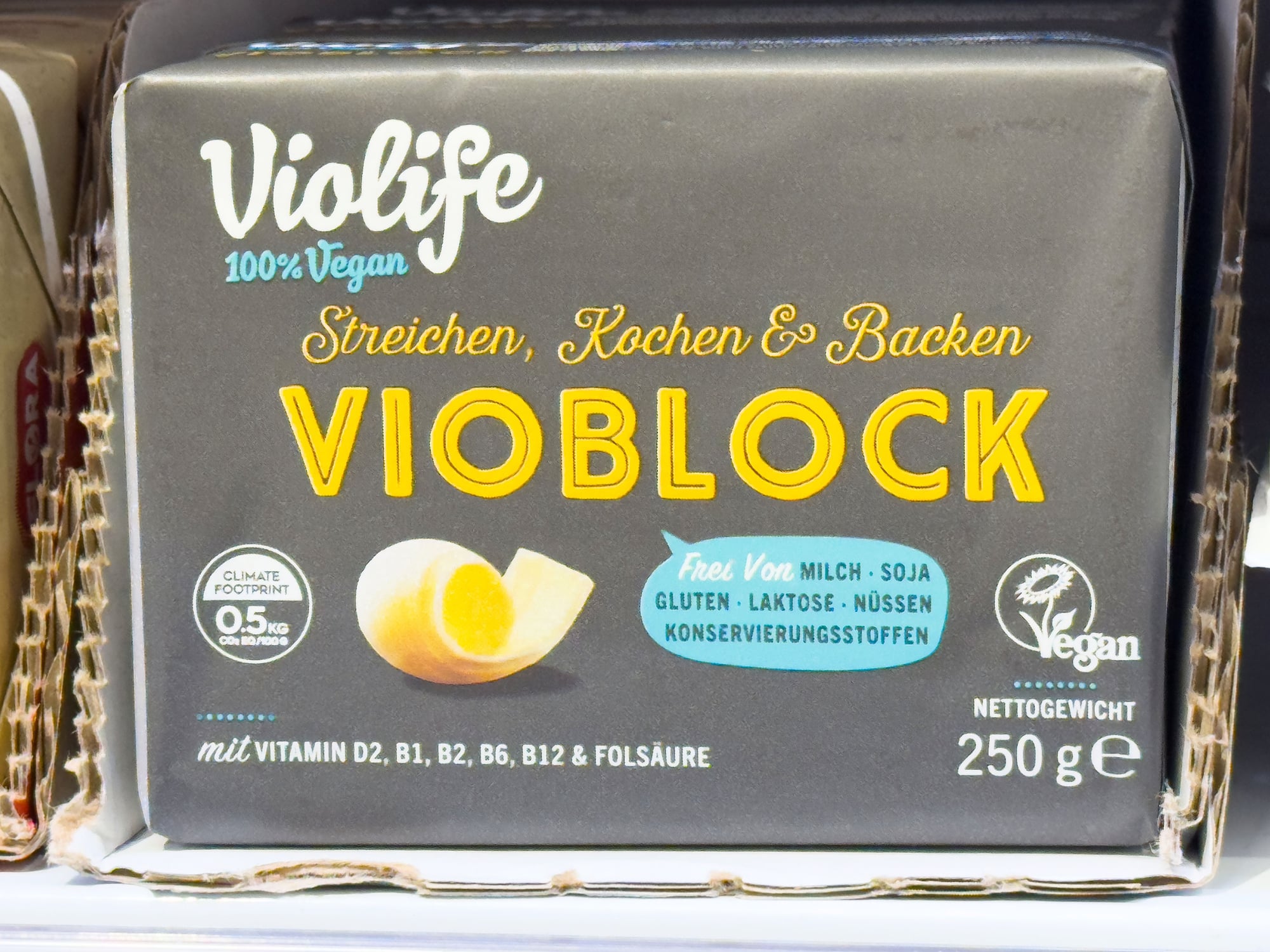
Manufactured Authenticity

Clever brands deliberately create imperfections or handcrafted aesthetics to establish authenticity perceptions in mass-produced items. Slightly asymmetric labels, hand-drawn elements, or intentionally varied printing suggest small-batch production.
These manufactured authenticity markers trigger associations with artisanal quality despite industrial production scales. Packages featuring maker signatures or production notes further reinforce this perception.
Like Go2Tutors’s content? Follow us on MSN.
Temporal Urgency Creation
Limited edition packaging or seasonal designs exploit the fear of missing out by creating artificial scarcity in the marketplace. Temporary packaging changes for holidays or special events trigger urgency that standard packaging cannot achieve.
These time-bounded designs provide both novelty and deadline pressure—combining two powerful psychological motivators into single purchase trigger. Collectors’ instincts activate even for disposable packaging when presented as temporarily available design variants.
Cross-Sensory Suggestion
Packaging imagery powerfully triggers taste, smell and texture expectations before purchase occurs. Images of steam rising from food suggest warmth and freshness.
Water droplets signal refreshment and crispness. Chocolate shown melting primes expectations for smoothness. These visual cues create specific sensory anticipation that influences actual taste experience after purchase.
Infantile Triggering

Rounded shapes, large eyes, and certain proportions trigger innate nurturing responses associated with caring for infants. Brands incorporate these neotenic design elements to create immediate emotional connection with consumers.
Curved logos and rounded package corners subconsciously appear friendlier and more approachable than angular alternatives. This exploitation of parental instincts works across diverse demographics.
Like Go2Tutors’s content? Follow us on MSN.
Environmental Virtue Signaling

Packaging incorporating obvious sustainability features provides social status rewards alongside functional benefits for environmentally conscious consumers. Conspicuous environmental virtue elements—visible seed papers, prominent recycling symbols, or earth-toned materials—transform everyday purchases into identity statements.
These designs exploit the psychological need for social approval by making environmental values visible during product use. The approach succeeds even when actual environmental benefits prove minimal compared to alternatives without visible virtue signals.
The Psychology Behind the Package

From color theory to weight manipulation, today’s packaging represents a sophisticated marriage between creative design and psychological research applied to consumer behavior. These subtle influences operate largely outside conscious awareness—shaping preferences and triggering purchases through evolutionary buttons and learned associations.
Understanding these mechanisms offers fascinating insight into how external cues shape seemingly personal choices in retail environments. The most effective packaging doesn’t merely contain products—it contains carefully crafted psychological triggers designed to leap from shelf to shopping cart through nearly invisible yet remarkably powerful influence.
More from Go2Tutors!

- 18 Unexpectedly Valuable Collectibles You Might Have Lying Around
- 15 Things Every Teenager in the ’70s Did That Teens Today Wouldn’t Understand
- 15 Strange Things People Have Tried to Ban (And Failed)
- 15 Inventions That Were Immediately Banned After Being Created
- 20 Actors Who Were Almost Cast in Iconic Roles
Like Go2Tutors’s content? Follow us on MSN.