15 Times One Terrible Logo Redesign Tanked a Whole Brand
A company’s logo isn’t just a pretty picture—it’s the face customers recognize and connect with emotionally. Smart redesigns can revitalize aging brands. Bad ones? They can torpedo years of built-up goodwill in days.
Here is a list of 15 logo redesigns that backfired so spectacularly that they actually damaged the companies they were supposed to help.
Gap’s Blue Box Blunder
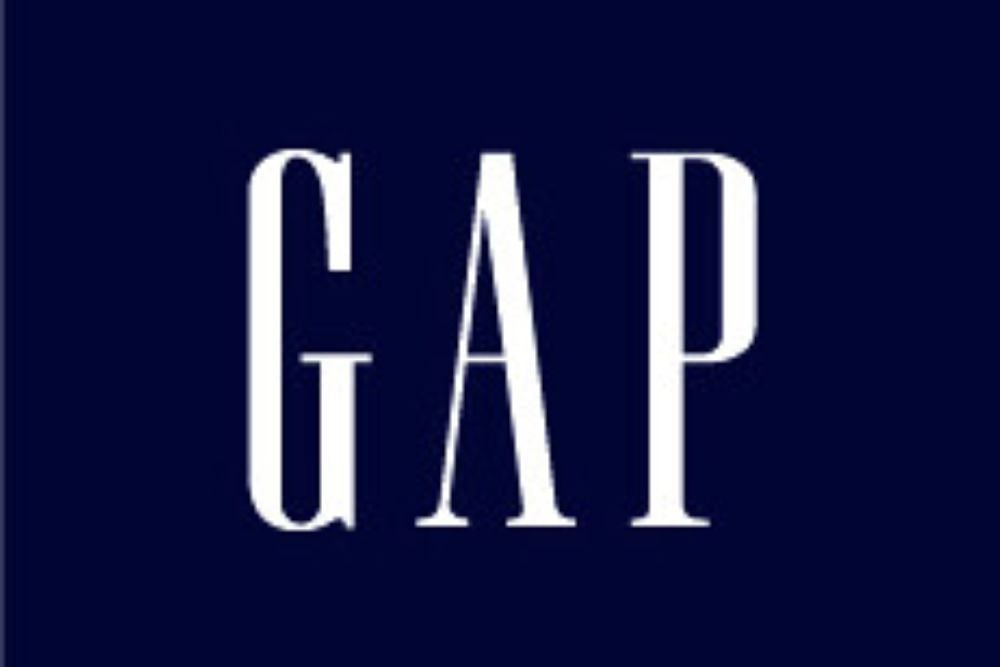
Gap’s notorious 2010 logo redesign lasted barely a week before massive public backlash forced them to backpedal. Their replacement for the classic blue box looked cheap and generic — reminiscent of something thrown together in PowerPoint rather than designed for a major fashion retailer.
Customers weren’t just disappointed; they were suspicious this signaled declining quality throughout the brand. Sales took an immediate hit as loyal shoppers questioned what other corners might be getting cut.
Tropicana’s Packaging Disaster
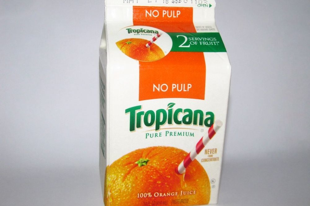
Tropicana learned the hard way that messing with iconic imagery carries huge risks. Their 2009 redesign ditched the beloved orange-with-straw visual that shoppers had recognized for decades.
The new generic glass of juice confused customers who couldn’t quickly spot their favorite brand during grocery trips. Sales didn’t just dip — they crashed by 20% within eight weeks, costing Tropicana about $137 million before they frantically reversed course.
London 2012 Olympics Logo Debacle
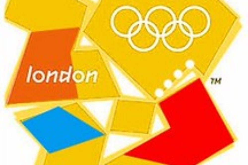
The London Olympics spent £400,000 developing a logo that was immediately ridiculed worldwide. Critics compared it to everything from broken jigsaw pieces to unfortunate anatomical positions — yet worse than the mockery were the practical problems.
The animated version actually triggered seizures in epileptic viewers, forcing organizers to pull promotional videos from circulation and creating a public health controversy instead of Olympic excitement.
Animal Planet’s Sideways Disaster

When Animal Planet decided to turn their name sideways in 2008, nobody could figure out why. The bizarre tilted text proved nearly impossible to read quickly — and they compounded the error by removing the elephant and globe imagery that viewers connected with nature programming.
Viewership declined steadily as the channel seemed to lose its identity, trying desperately to appear edgy while confusing its loyal audience.
Airbnb’s Symbol of Mockery
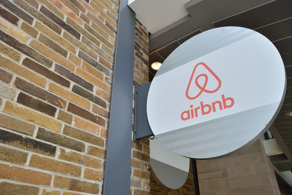
Airbnb’s 2014 logo — supposedly representing “belonging” — unleashed a tidal wave of anatomical comparisons online. Their symbol (nicknamed the ‘bélo’) became the subject of endless memes mocking its suggestive shape, though company leadership tried valiantly to maintain a straight face.
The controversy completely overshadowed their rebranding message for months, creating an unnecessary headache during a crucial growth period.
RadioShack’s ‘The Shack’ Misfire

RadioShack’s desperate attempt to seem cool by rebranding as ‘The Shack’ in 2009 felt about as authentic as your uncle trying to use teen slang. The casual nickname couldn’t mask deeper problems — worse still, the simplified logo abandoned the technical heritage that loyal customers valued.
This strategic error accelerated their decline as the company struggled to define its relevance in a changing electronics market.
Kraft’s Corporate Starburst Failure
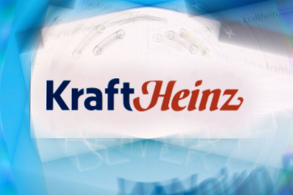
When Kraft unveiled their 2009 corporate logo redesign, people couldn’t decide if it belonged on a children’s toy or a carnival poster — definitely not a respected food conglomerate. The chaotic explosion of colors and shapes communicated absolutely nothing about their products or values.
Customers scratched their heads in confusion until the company quietly retreated to a more traditional design several years later.
SciFi Channel’s Syfy Confusion
The SciFi Channel’s 2009 rebrand to ‘Syfy’ demonstrated spectacular tone-deafness toward their core audience. While executives celebrated securing a unique, trademarkable name — science fiction fans felt insulted by the dumbed-down spelling.
Adding to the disaster, they hadn’t done their international research; ‘syfy’ happens to be slang for ‘syphilis’ in some countries. Viewership dropped as loyalty eroded among the very demographic they couldn’t afford to lose.
Cardiff City’s Dragon Disappointment
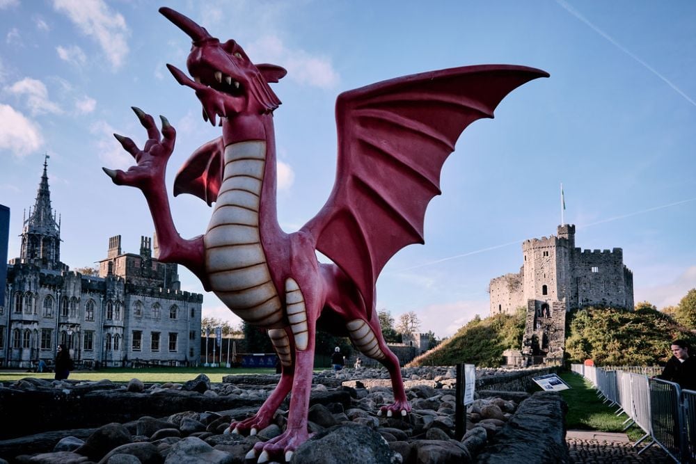
Welsh soccer club Cardiff City unleashed fan fury in 2012 when they swapped their beloved bluebird logo for a red dragon and changed their century-old blue uniforms to red. The Malaysian owner believed this would bring luck and appeal to Asian markets — instead, it alienated generations of supporters.
Stadium attendance plummeted until the club eventually surrendered to sustained protests and restored their traditional colors and emblem.
UC Logo’s Short-lived Redesign
The University of California system learned about the power of alumni loyalty when their 2012 modern logo update survived less than a week. Their simplified, gradient-filled ‘C’ looked distressingly corporate and cheap compared to the distinguished traditional seal.
More than 50,000 people signed petitions against it, believing it diminished the prestige of their beloved institution. School administrators rapidly backtracked rather than fight the overwhelming opposition.
Pepsi’s Billion-Dollar Mistake
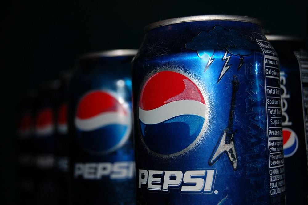
Pepsi committed a billion-dollar blunder with their 2008 logo redesign. The new “smile” cost roughly $1 million to create and millions more to implement across their global presence. Yet consumers generally considered it an inferior version of their classic look.
Despite Pepsi’s massive market position, they lost share to Coca-Cola following the change, proving that even beverage giants can’t ignore public perception.
Uber’s App Icon Confusion
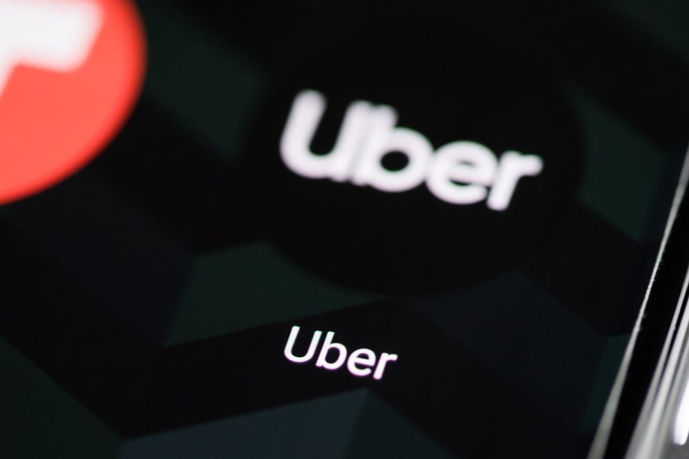
Uber created a genuine functional problem with their 2016 app icon redesign. By removing the recognizable ‘U’ in favor of an abstract geometric pattern, they made their app virtually invisible to users scanning their phone screens.
The company received immediate complaints from frustrated customers who literally couldn’t find the app on their phones. This practical disconnection between service and symbol forced another redesign just two years later.
Instagram’s Gradient Controversy
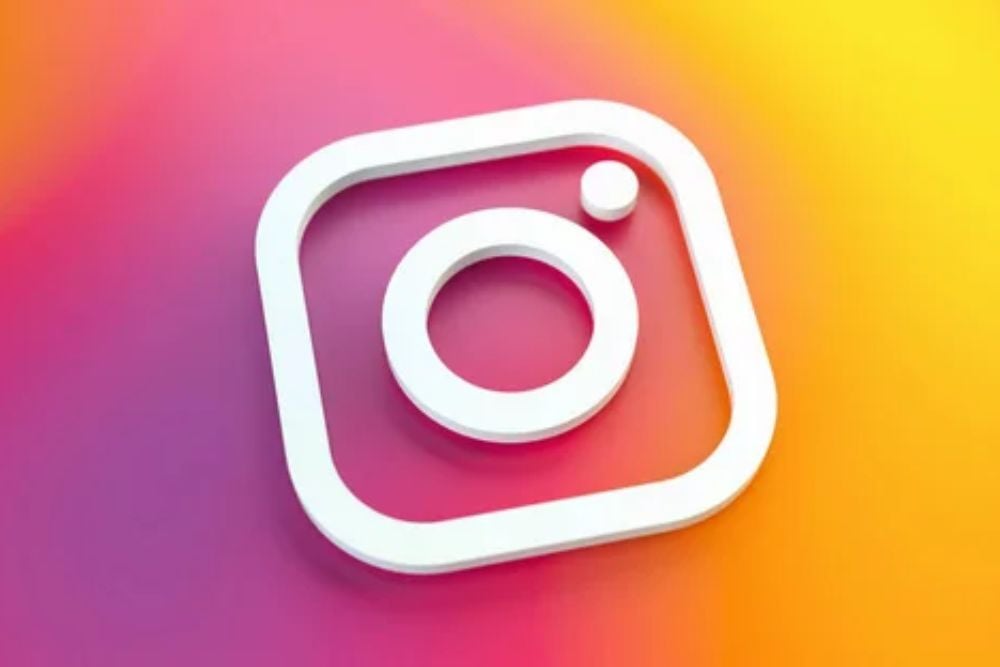
Instagram’s 2016 abandonment of their retro camera icon for a simplified gradient sparked intense user resistance. Though too popular to suffer serious user exodus, the redesign became a cultural flashpoint that damaged their carefully cultivated vintage aesthetic.
The company spent considerable resources defending a change that many loyal users never truly accepted, demonstrating how visual identity becomes emotionally important.
Weight Watchers’ WW Confusion
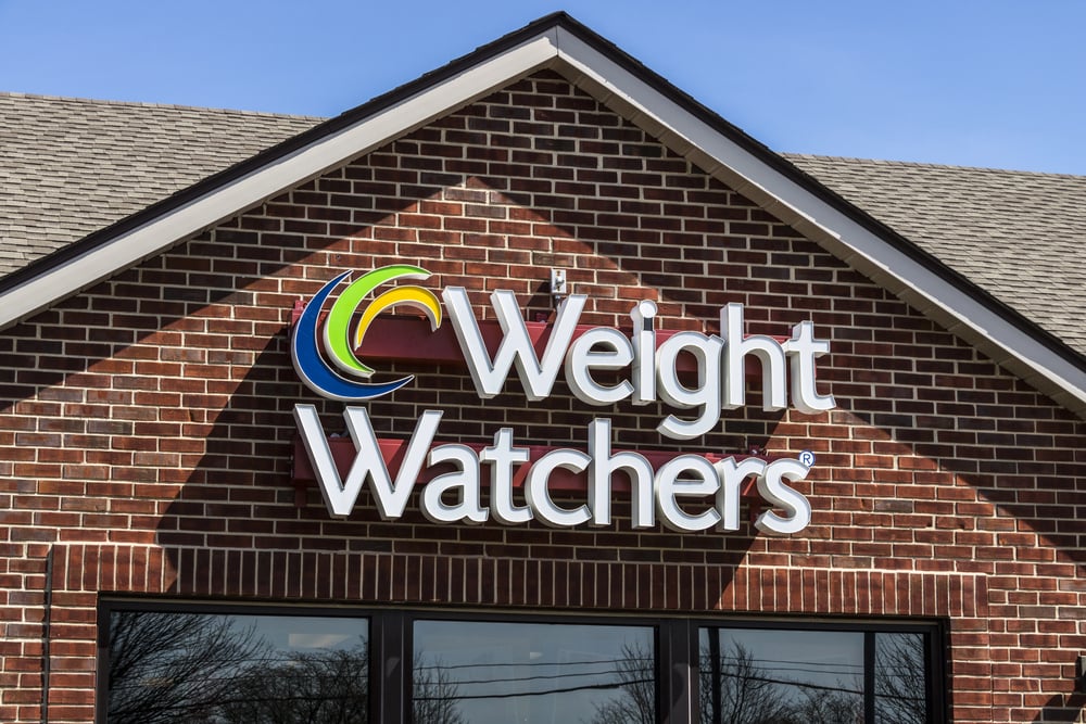
Weight Watchers created an identity crisis with their 2018 rebrand to simply ‘WW.’ The simplified acronym, intended to shift focus toward wellness rather than weight loss, instead created confusion about the company’s purpose.
Many longtime customers interpreted the change as abandoning the core mission they valued. Membership numbers declined noticeably in the quarters following the rebrand as the company struggled to articulate what they now stood for.
Leeds United’s Shield Scandal
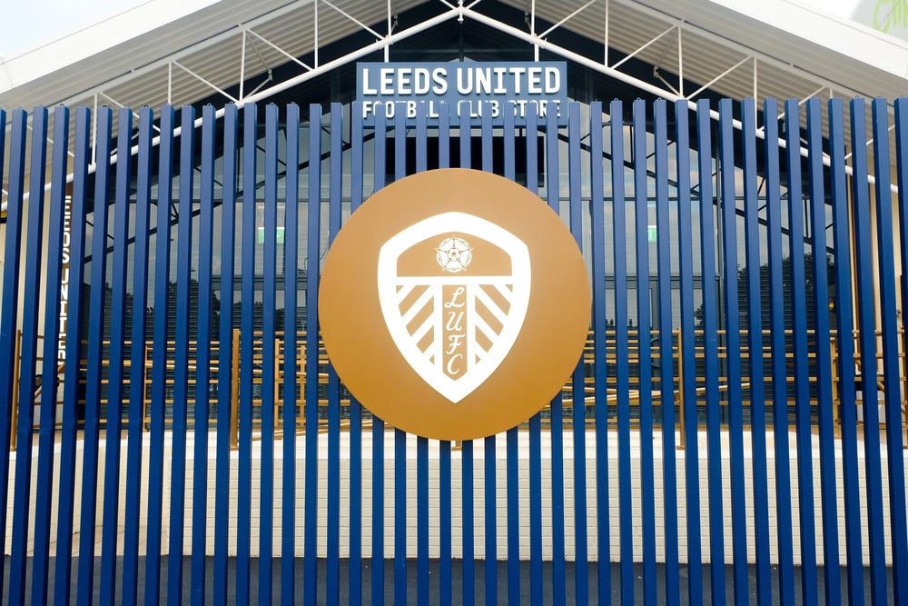
English soccer club Leeds United created unprecedented backlash with their 2018 logo redesign. Their new emblem, showing a person doing a ‘Leeds salute’ (a fist-to-chest gesture), appeared so amateurish that fans collected over 77,000 petition signatures against it within just 24 hours.
The simplistic, cartoon-like design looked unprofessional compared to other teams’ emblems. Club leadership quickly abandoned the design before it appeared on any official merchandise, though not before suffering massive public embarrassment.
The Lasting Impact of Visual Identity

These logo redesign disasters reveal how deeply consumers connect with brand visuals. These failures weren’t merely aesthetic misjudgments—they represented fundamental disconnections between companies and their audiences.
Successful brands understand that evolution should honor tradition while moving forward thoughtfully. The most effective redesigns maintain visual elements that customers have emotional attachments to while updating just enough to feel contemporary without sacrificing recognition.
More from Go2Tutors!

- The Romanov Crown Jewels and Their Tragic Fate
- 13 Historical Mysteries That Science Still Can’t Solve
- Famous Hoaxes That Fooled the World for Years
- 15 Child Stars with Tragic Adult Lives
- 16 Famous Jewelry Pieces in History
Like Go2Tutors’s content? Follow us on MSN