Famous Logos Changed for Strange Reasons
When you think about the brands you love, their logos probably pop into your head right away. That little swoosh, that bitten apple, or those golden arches all mean something to you.
Companies spend millions making sure their logos stick in your brain, so when they decide to change them, there’s usually a pretty good reason. But sometimes those reasons are downright bizarre.
Here’s the thing though. Sometimes the stories behind these changes are way weirder than you’d ever expect.
Pepsi’s gravitational field theory
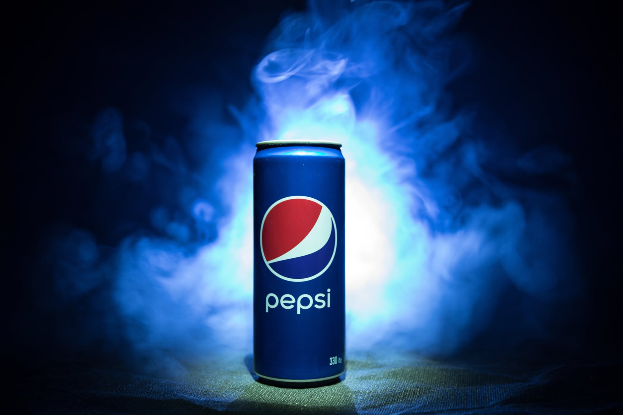
Pepsi paid a design agency a million dollars for a new logo back in 2008, and what they got was absolutely bananas. The agency handed over a 27-page document that talked about the Golden Ratio, feng shui, Earth’s magnetic field, and gravitational pulls between planets.
They seriously tried to explain how the new swoosh connected to the Mona Lisa’s smile and represented universal balance. Most people just saw a tilted circle that looked like someone knocked the old logo sideways.
The whole thing became a massive joke in the design world, and honestly, you have to wonder if anyone at Pepsi actually read that document before nodding and saying yes.
Gap’s six-day disaster

Gap rolled out a new logo in 2010 that ditched their famous blue box for plain Helvetica text with a sad little gradient square in the corner. People hated it immediately.
Like, really hated it. The internet went wild creating parody versions and demanding the old logo back.
Gap caved after just six days, which has to be some kind of record. The truly weird part was when they tried to crowdsource ideas for a replacement, which made them look completely lost.
A huge company with tons of money basically admitted they had no clue what they were doing, and design students still study this mess as an example of what not to do.
Tropicana’s $50 million packaging mistake

Tropicana decided their orange juice cartons needed a makeover in 2009, so they got rid of that orange with a straw sticking out of it. Big mistake.
They replaced it with something that looked like every boring store brand on the shelf, and customers couldn’t find their juice anymore. Sales crashed by 20 percent in about five weeks.
That’s roughly $50 million down the drain, which probably made a lot of executives panic. They brought back the old design super fast and learned an incredibly expensive lesson about fixing things that weren’t broken in the first place.
Starbucks removing its name
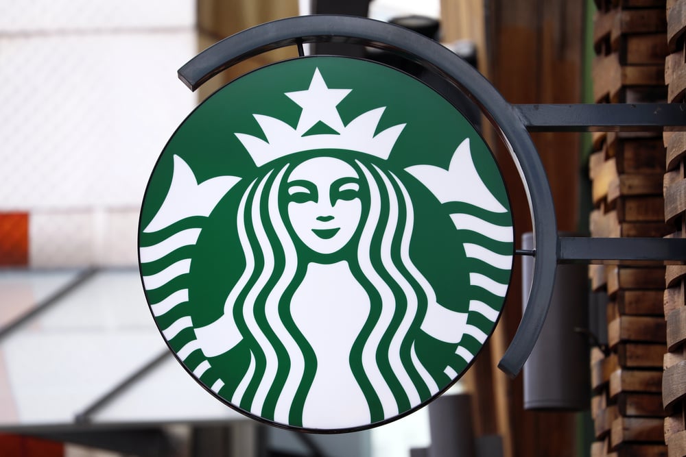
Starbucks dropped the word ‘Starbucks’ from their logo in 2011 and kept just the mermaid lady. Their thinking was that everyone knew who they were by now, so why bother with text? It worked out okay, but man, that’s some serious confidence.
You’re basically saying your company is so famous that a green circle with a lady in it automatically means coffee. To be fair, they were mostly right, but imagine making that pitch in a meeting and asking people to trust that customers would just figure it out.
Kraft’s singles controversy

Kraft changed the packaging design on their American cheese singles, and parents freaked out. They removed the pictures of individual wrapped slices from the front of the box, which seems like nothing.
But moms complained their kids couldn’t find the cheese at the store anymore, and some people swore the cheese tasted different even though it was the exact same product. Kraft had to publicly explain that only the box changed, nothing else.
The whole thing was fascinating because it showed how much a box design can mess with people’s heads and even change how they think food tastes.
Animal Crackers’ cage-free redesign

Nabisco kept circus animals in cages in their Barnum’s Animals Crackers box for 116 years until PETA asked them to stop. The animal rights group said showing caged animals promoted circuses that mistreated them, so Nabisco redesigned the box to show the animals roaming free in a grassland.
Here’s what’s funny though: these are crackers that people eat, but apparently everyone felt better about munching on an elephant if it looked happy and free on the box first. The logic is kind of weird when you think about it, but the company went ahead and did it anyway.
Aunt Jemima’s long-overdue change

The Aunt Jemima brand used a racist stereotype as their logo for over 130 years before finally changing it in 2020. The image was based on harmful caricatures of Black women from a really ugly period in American history.
What’s truly bizarre is that it took until 2020 for Quaker Oats to fix this, and it only happened after nationwide protests about racial justice. They rebranded as Pearl Milling Company, which was actually the original company name from way back.
It’s genuinely shocking that such an obviously offensive logo made it all the way to the age of smartphones and social media before someone with power decided to do something about it.
Instagram’s skeuomorphic surrender

Instagram started with a logo that looked like an old Polaroid camera with a rainbow stripe across it. In 2016, they switched to a flat gradient design that looked like every other app trying to be minimal and modern.
Their explanation? Younger users didn’t know what the camera represented because they’d never seen an actual Polaroid. Instagram basically said their audience was too young to understand their own logo.
The new design threw away all that personality for a generic gradient that honestly could represent anything from a photo app to a weather app to who knows what.
Mozilla Firefox’s disappearing fox

Firefox kept making their fox smaller and less detailed with each logo update until the 2019 version barely had a fox at all. Now it looks more like an abstract flame wrapped around a purple orb.
Mozilla said they needed something simpler that would work on tiny screens like smartwatches and phones. The weird logic here is that the thing that made Firefox special, the actual fox, became a problem they needed to solve.
It’s like if McDonald’s said the golden arches were too fussy and replaced them with a yellow blob.
Mastercard’s text removal gamble

Mastercard announced in 2019 that they’d drop their name from the logo in certain places, leaving just the red and yellow circles. They said 81 percent of people recognized the circles alone, so the text was unnecessary.
That’s some serious confidence, similar to what Starbucks did. But here’s the thing: you see Starbucks stores and cups everywhere, but you only see Mastercard on your tiny plastic card.
Betting that overlapping circles can represent your entire financial company seems bold, even if they did test it a bunch first.
Olive Garden’s endless breadstick identity

Olive Garden didn’t exactly change their logo dramatically, but they shifted their whole brand identity toward breadsticks instead of Italian food. Their marketing went so hard on unlimited breadsticks that people started forgetting they even served pasta.
The restaurant leaned into this strange direction because research showed breadsticks were more popular than their actual meals. They basically rebranded around a side item, which would be like Burger King becoming famous for their ketchup packets instead of burgers.
Warner Bros’ shield variations
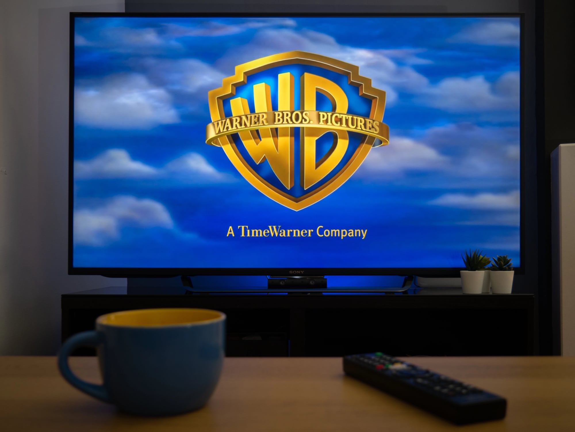
Warner Bros has changed their shield logo countless times, but the weirdest reason involved creating different versions for different movies. The Harry Potter films got a magical-looking shield, the Dark Knight movies got a dark gritty one, and so on.
Most studios keep their opening logo the same no matter what movie you’re watching, but Warner Bros decided to morph theirs to match each film. It created some cool variations, but it also meant their brand stopped being consistent, which is usually the whole point of having a logo.
British Petroleum’s green gamble
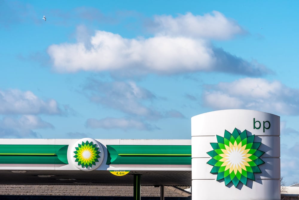
BP spent over $200 million in 2000 to change their sunflower logo and rebrand as ‘Beyond Petroleum’ to look environmentally friendly. The problem was they were still mostly an oil company doing oil company things, but they wanted everyone to think they cared about the planet.
After the Deepwater Horizon oil spill in 2010, that green rebrand looked completely ridiculous and maybe even dishonest. The logo stayed the same, but nobody believed the environmental message anymore.
It became a perfect example of greenwashing and proof that a pretty logo can’t hide what a company actually does.
Comedy Central’s chaotic flexibility
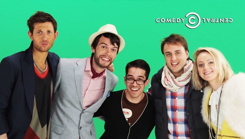
Comedy Central launched a logo system in 2011 where the letters stayed the same but everything else could change wildly. Sometimes the logo was clean, other times it was covered in bizarre patterns or animated into weird shapes.
Their reasoning was that comedy is unpredictable and messy, so their logo should be too. It made sense conceptually, but it also meant they had basically infinite logos, which seems like it would drive designers crazy.
Most brands want people to recognize them instantly, but Comedy Central decided that was boring.
Little Caesars’ Pizza Pizza punctuation

Little Caesars removed the exclamation marks from ‘Pizza! Pizza!’ and changed it to ‘Pizza Pizza’ with periods instead. Their explanation was that exclamation marks felt dated and too aggressive.
A company known for cheap pizza and a cartoon Roman emperor decided punctuation was their biggest branding issue. The change was so tiny that most people never even noticed, which makes you wonder why they bothered.
Somewhere, marketing teams had long meetings debating whether periods or exclamation marks better represented affordable pizza, which seems like a strange use of everyone’s time.
Pringles’ updated mustache man

Pringles gave their mustache guy a makeover in 2021, making his face simpler and less detailed. They said he needed to look good on phones and tablets where people see ads.
The strange part is putting so much effort into tweaking eyebrows and mustache lines on a chip container that most people grab without really looking at it. Pringles took this update seriously though, like their sales actually depended on whether their cartoon man had the perfect number of facial hair lines drawn on him.
Yahoo’s 30-day logo disaster
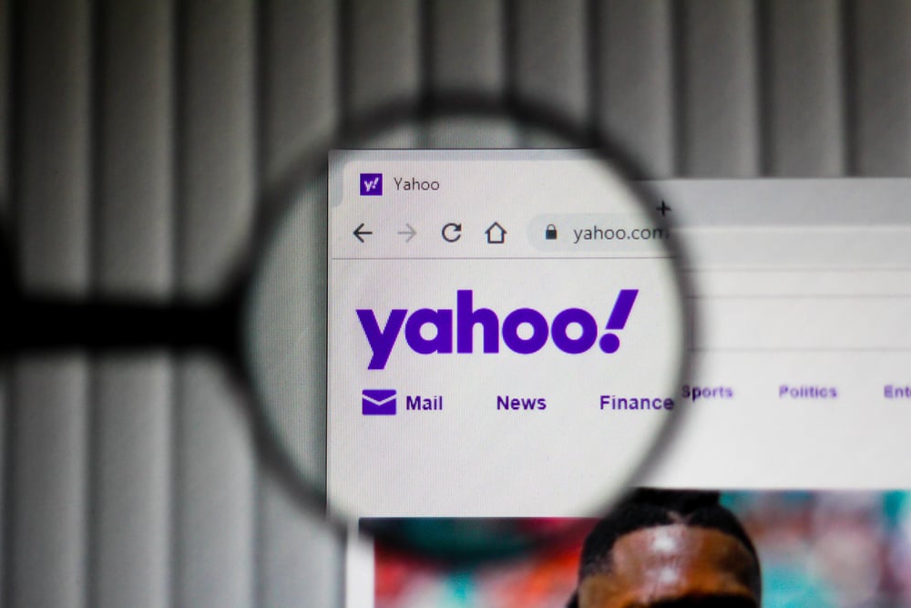
Yahoo announced in 2013 that they’d show a different logo variation for 30 straight days before revealing the final version. This weird approach was supposed to build excitement, but the final logo looked like someone’s first try at graphic design.
The custom font was somehow worse than just using something standard, and the tilted exclamation mark looked like a mistake. Yahoo thought the process would be fun and get people engaged, but it mostly proved that designing by public spectacle doesn’t work.
The logo became just another reminder that Yahoo was struggling.
Dunkin’ dropping the donut
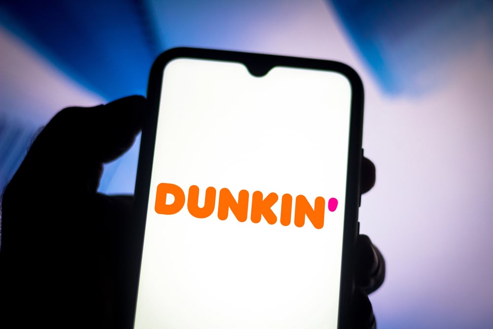
Dunkin’ Donuts became just Dunkin’ in 2019, cutting donuts from their name completely. The company wanted to emphasize their coffee and drinks instead of just baked goods, which made business sense since they sold more beverages anyway.
Still, dropping half your name after 68 years feels strange. It’s like Pizza Hut deciding to call itself just Hut.
The change worked better than expected because most people already shortened it to Dunkin’ in conversation, but walking away from your signature product in your actual name still seems like an odd choice.
Why brands make weird moves

These logo changes show that big corporations make decisions for all kinds of wild reasons, from cosmic theories to social pressure to whether punctuation marks feel too aggressive. Some changes were genuine attempts to keep up with the times, while others showed companies completely missing what their customers actually cared about.
The failures taught everyone that brand recognition usually matters way more than trendy design choices. Behind every logo are real people sitting in meetings making calls that sometimes turn out brilliant and sometimes turn out completely ridiculous, and honestly, that makes these stories way more interesting.
More from Go2Tutors!

- The Romanov Crown Jewels and Their Tragic Fate
- 13 Historical Mysteries That Science Still Can’t Solve
- Famous Hoaxes That Fooled the World for Years
- 15 Child Stars with Tragic Adult Lives
- 16 Famous Jewelry Pieces in History
Like Go2Tutors’s content? Follow us on MSN.