Famous Typefaces Through History
You see typefaces everywhere, every single day, but you probably don’t think about them unless they’re really bad (looking at you, Comic Sans on that dentist’s sign). But behind every font on your computer is a story—sometimes it’s about a 16th-century punch cutter perfecting letterforms by candlelight, sometimes it’s about a Swiss designer trying to create the most neutral typeface possible, and sometimes it’s just about corporate branding that accidentally took over the world.
These aren’t just pretty letters. They’re historical artifacts, cultural markers, and occasionally the subject of surprisingly passionate nerd arguments. Let’s look at the typefaces that actually shaped how we read and communicate.
Garamond
Claude Garamond was a French punch cutter and type designer in the 16th century, and his typeface became the standard for European printing for like 200 years. He cut his letterforms between 1530 and 1545, and they were based on the work of Aldus Manutius and Francesco Griffo but refined to be more elegant and readable.
The thing is, what we call “Garamond” today is actually a bunch of different revivals and interpretations—there’s no single definitive version. Apple used Garamond for years in their marketing (before switching to their custom San Francisco typeface), and it’s still everywhere in book publishing because it’s readable and saves space compared to other serif fonts.
Caslon
William Caslon created his typeface in London in 1722, and it became so popular that there was a saying in printing: “When in doubt, use Caslon.” The American Declaration of Independence was printed in Caslon (which is kind of ironic since it was a British typeface).
It’s got this sturdy, unpretentious quality that just works for a lot of applications. The letters aren’t trying to be fancy, they’re just clear and functional.
Caslon fell out of favor for a while but came back during the Arts and Crafts movement in the late 1800s when people got nostalgic for traditional craftsmanship.
Baskerville

John Baskerville was a writing master and printer in Birmingham, England, who created his typeface in 1757. He was kind of obsessed with making the perfect letterform and developed new printing techniques and inks to show off his type’s fine details.
The contrast between thick and thin strokes was sharper than earlier typefaces, and this made some people uncomfortable—Benjamin Franklin even wrote to him defending the typeface against critics who said it hurt their eyes (people complain about fonts on the internet like this is a new thing, but apparently it’s been happening for centuries). Baskerville’s work influenced the development of “modern” typefaces like Bodoni and Didot.
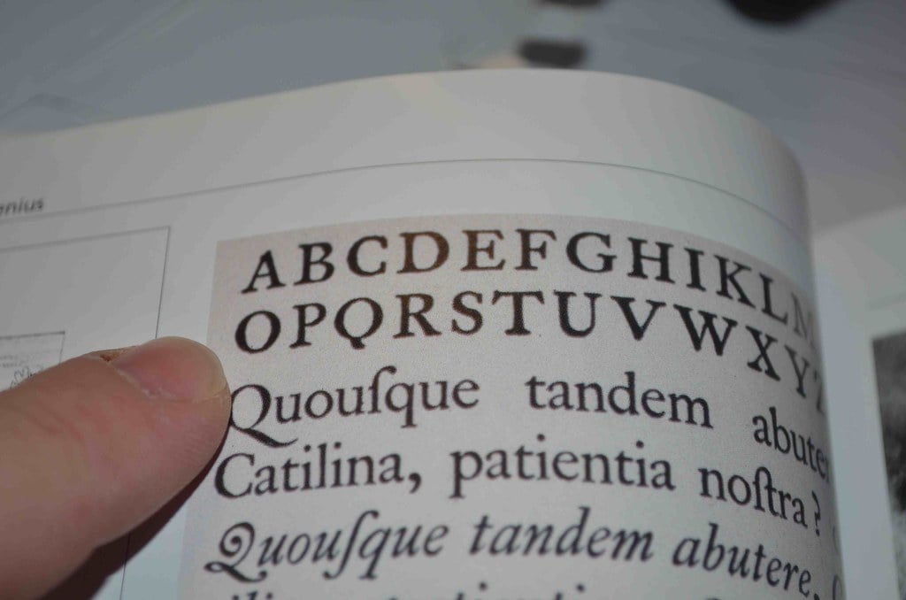
Bodoni
Giambattista Bodoni created his typeface in Parma, Italy, in the late 1700s. It’s dramatic, with extreme contrast between thick and thin strokes and hairline serifs that look like they might break if you breathe on them wrong.
Bodoni was inspired by the Enlightenment idea that everything could be perfected through reason, and he wanted to make the most rational, geometric letterforms possible. The typeface screams “luxury” and “fashion”—Vogue used it for decades, and you still see it on perfume bottles and high-end branding.
But it’s kind of terrible for body text because those thin strokes disappear at small sizes.
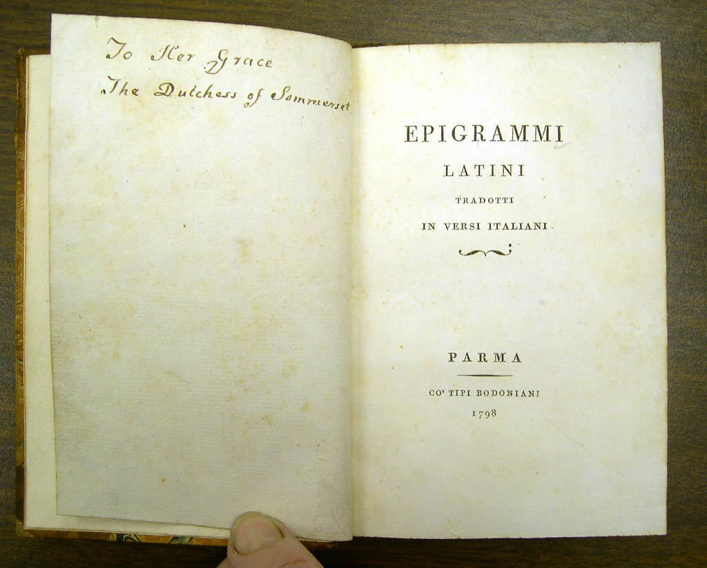
Didot
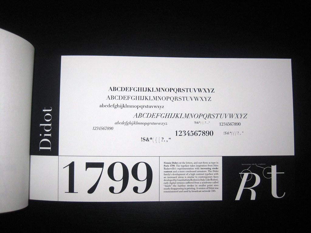
The Didot family were French printers and type designers, and Firmin Didot created this typeface around 1784-1811. It’s similar to Bodoni but slightly more refined and elegant (the French would probably say it’s better, but they say that about everything).
Like Bodoni, it’s got extreme stroke contrast and is gorgeous at large sizes but not great for reading long passages. Fashion magazines love Didot—it’s on the cover of Harper’s Bazaar, and it just has this aristocratic French vibe that screams sophisticated (or pretentious, depending on your perspective).
The Didot family also standardized the point system for measuring type, which is still used today.
Clarendon
Clarendon was created in 1845 by Robert Besley for the Fann Street Foundry in London. It’s a slab serif, which means the serifs are thick and blocky instead of delicate.
This typeface was designed for emphasis and display use—it was meant to grab your attention in advertisements and wanted posters (which is exactly what it was used for in the American West). It’s got a sturdy, authoritative feel that makes you think of 19th-century newspapers and Victorian-era posters.
Wells Fargo uses a version of Clarendon in their logo, and it shows up in a lot of retro or vintage designs because it immediately signals “old-timey” without being too decorative.
Futura
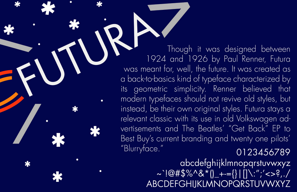
Paul Renner designed Futura in Germany in 1927, right in the middle of the Bauhaus movement when everyone was obsessed with geometric shapes and modernist principles. It’s based on circles, triangles, and straight lines—almost like someone tried to build letters from the most basic forms possible.
Futura was supposed to represent the future (hence the name), and it became the typeface of progress and science. NASA used it on the Apollo 11 lunar plaque, Volkswagen used it for decades, and Wes Anderson uses it in basically all his movies because it has that clean, symmetrical, slightly retro-futuristic look.
Some letters are weird though (that lowercase ‘a’ and ‘g’ are very geometric and not how anyone actually writes).
Helvetica
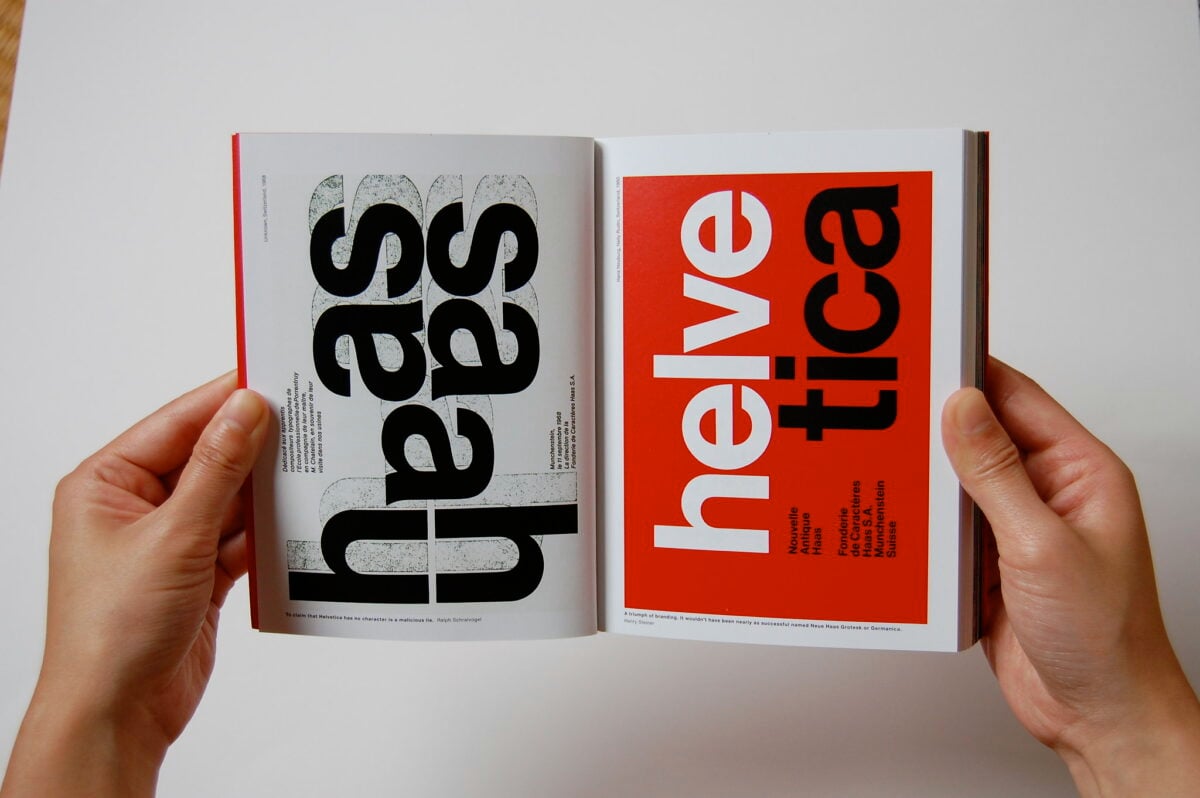
Helvetica was designed by Max Miedinger and Eduard Hoffmann in Switzerland in 1957, originally called “Neue Haas Grotesk” before being renamed Helvetica (Latin for Swiss) in 1960. The goal was to create the most neutral typeface possible—no personality, no historical baggage, just clear communication. And it worked maybe too well.
It became the default typeface for corporate America and governments worldwide. The New York City subway uses it, American Airlines uses it, tons of brands use it because it feels modern and professional without calling attention to itself.
There’s literally a documentary about it called “Helvetica” where designers either love it or hate it with surprising intensity (graphic designers have strong feelings about fonts).
Times New Roman
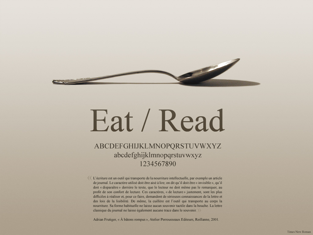
Stanley Morison designed Times New Roman in 1931 for The Times newspaper in London. The brief was simple: create a typeface that’s more readable and space-efficient than what they were using.
It had to work in the terrible printing conditions of a newspaper press, fit more words per line, and still be clear when printed on cheap paper at high speed. Mission accomplished—it became one of the most used typefaces ever, though mostly because Microsoft made it the default in Word.
Every student has written papers in Times New Roman at 12 points with 1-inch margins (you probably tried increasing the font size to 12.5 or the margins to 1.1 inches to meet page requirements, don’t lie).
Gill Sans
Eric Gill designed this typeface between 1928 and 1930, inspired by Edward Johnston’s typeface for the London Underground. It’s a humanist sans-serif, which means it has some organic variation and warmth compared to geometric faces like Futura.
The BBC used it for decades in their corporate identity, and it became associated with British design and culture. Gill himself was a weird guy—a sculptor and engraver who had some really disturbing personal life stuff that’s come out in biographies (not getting into that here, but you can Google it if you want to ruin the typeface for yourself).
Despite all that, Gill Sans remains a beautiful and functional typeface that balances modern simplicity with classical proportions.
Univers
Adrian Frutiger designed Univers in 1954 as a complete family of related fonts with different weights and widths, all designed together as a system. This was revolutionary at the time—usually, bold and italic versions were added later and didn’t always match well.
Frutiger created a numbering system for the different variations that made sense (unlike the random naming conventions most typefaces used). It’s similar to Helvetica but slightly more humanist and less rigid.
Apple used Univers for years before switching to other fonts, and it shows up in a lot of Swiss designs because Frutiger was Swiss and the Swiss take their typography very seriously.
Frutiger
Also designed by Adrian Frutiger (yeah, he shows up twice on this list), Frutiger was created in 1975 for wayfinding signage at the Charles de Gaulle Airport in Paris. The brief was to make a sans-serif that was extremely readable at a distance and at various angles, because airport signage needs to work when you’re rushing to catch a flight and can’t stop to squint.
It succeeded so well that it became popular for corporate use and other signage systems. The letters are slightly wider and more open than Helvetica, which makes them easier to distinguish from each other quickly.
It’s one of those typefaces that does its job so well you don’t notice it.
Comic Sans

Vincent Connare designed Comic Sans in 1994 for Microsoft, inspired by comic book lettering. It was meant for speech bubbles in Microsoft Bob, a software program that was trying to make computers friendlier and less intimidating (Microsoft Bob was a spectacular failure, but Comic Sans lived on).
The problem is that Comic Sans escaped its intended use and started appearing everywhere—serious business documents, gravestones, hospital signs, wedding invitations. Designers absolutely hate it, not because it’s badly designed for its purpose, but because people use it for everything it was never meant for.
There are literally websites and movements dedicated to banning Comic Sans. But honestly, kids with dyslexia often find it easier to read than other fonts, so it serves a purpose even if that purpose isn’t making graphic designers happy.
Gotham
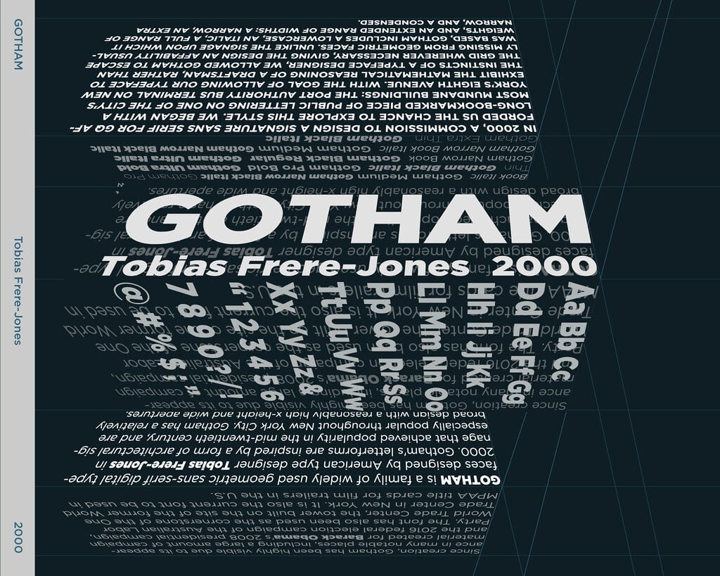
Tobias Frere-Jones designed Gotham in 2000 for GQ magazine, inspired by architectural lettering he photographed around New York City—the kind of bold, straightforward sans-serif letters you’d see on building facades and signs from the 1930s-1960s. It’s got this sturdy, honest, no-nonsense American quality.
Barack Obama’s 2008 presidential campaign used Gotham for all their materials, and it became so associated with his campaign that people started calling it “the Obama font” (which probably helped it become even more popular). It combines geometric shapes with subtle humanist touches, and it just feels trustworthy and modern without being cold.
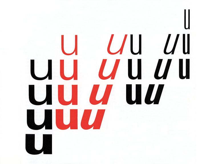
The Letters That Carry Meaning

Typography’s not only for legibility – it carries mood and meaning through shapes. Spot Didot?
Fashion pops into mind. Clarendon shows up?
Think old-school Americana or cowboy vibes. See Helvetica?
It whispers office life, clean design, Switzerland – no fuss. These links didn’t pop up outta nowhere – they grew slowly, shaped by years of showing up in certain places till the font and its meaning got tangled together.
Once you catch onto fonts, though, there’s no turning back (yeah, my bad). You’ll stroll past a bank spotting Gotham on a sign, then spot Comic Sans slapped on some “Dog Grooming” shop, quietly side-eyeing each pick – because that’s just how it goes once you get into type. It shifts your view, letter by letter.
More from Go2Tutors!

- The Romanov Crown Jewels and Their Tragic Fate
- 13 Historical Mysteries That Science Still Can’t Solve
- Famous Hoaxes That Fooled the World for Years
- 15 Child Stars with Tragic Adult Lives
- 16 Famous Jewelry Pieces in History
Like Go2Tutors’s content? Follow us on MSN.