First Websites Ever Launched
The internet existed for years before anyone figured out how to make it useful for regular people. Then Tim Berners-Lee invented the World Wide Web in 1989, and suddenly the idea of connected documents made sense.
The first websites were basic by today’s standards. No images, no video, barely any formatting.
Just text and hyperlinks. But they started something that would reshape human communication forever.
Info.cern.ch – The Very First Website

Tim Berners-Lee launched the first website on August 6, 1991, while working at CERN in Switzerland. The site explained what the World Wide Web was and how to use it.
It included instructions for creating your own web pages and setting up a web server. The URL was info.cern.ch, and you can still visit a restored version today.
The original page was painfully simple. Gray background, black text, blue hyperlinks.
No graphics at all. But it worked. You could click links and jump to other documents.
That was enough to change everything.
SLAC’s Database Goes Online

Stanford Linear Accelerator Center became the first website in North America when it went live in December 1991. SLAC physicists needed to share research data across institutions, and the web provided an answer.
The site was functional rather than fancy, designed for scientists who needed information fast. The content was dense and technical.
Papers, data sets, contact information. Nobody was thinking about design or user experience yet.
They just wanted a way to make information available without physically mailing documents or relying on FTP servers that required technical knowledge to navigate.
NCSA Mosaic Changes the Game

The National Center for Supercomputing Applications launched the Mosaic web browser in 1993, and their website showed what the browser could do. Mosaic was the first browser that could display images inline with text.
Before that, you had to download images separately and open them in different programs. The NCSA website demonstrated this capability with actual pictures embedded in pages.
It sounds basic now, but seeing images appear automatically on a web page was mind-blowing in 1993. Suddenly the web wasn’t just for academics sharing research papers.
It could be visually interesting.
Yahoo’s Directory Takes Shape
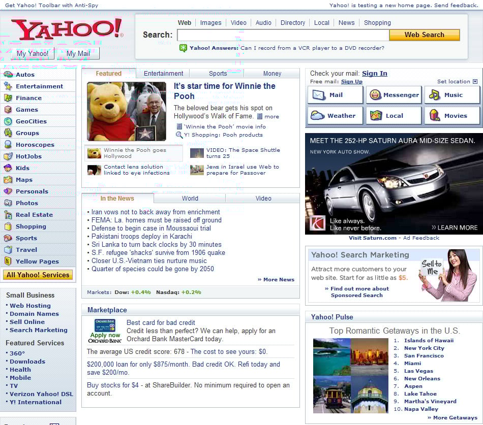
Yahoo started in 1994 as a “Guide to the World Wide Web.” Two Stanford students maintained a directory of interesting websites organized by category.
The site was just a list of links with brief descriptions, but it solved a real problem. Finding anything on the early web was nearly impossible without directories like this.
The name changed to Yahoo in 1995, but the concept stayed the same. Click a category, see a list of sites, pick one that looks interesting.
No algorithms, no personalization. Just humans organizing links into categories.
It worked well enough that Yahoo became one of the biggest internet companies for years.
Amazon Sells Books Online

Jeff Bezos launched Amazon in July 1995 as an online bookstore. The website was simple but functional.
Search for a book, read a description, buy it. The inventory was massive compared to physical bookstores because Amazon didn’t need shelf space.
They could list any book that existed. The site didn’t have reviews at first.
No recommendations. No one-click ordering. Just a database of books you could purchase and have shipped to your house.
That was novel enough. Most people in 1995 didn’t think anyone would trust entering credit card information on a website.
eBay Connects Buyers and Sellers

Pierre Omidyar launched AuctionWeb in September 1995, which later became eBay. The site let people auction items to each other.
The first item sold was a broken laser pointer. Someone actually paid for it.
That proved people would buy anything online if the price was right. The site was crude.
Text-based listings, no photos at first, basic search functionality. But the concept worked.
People had stuff they wanted to sell. Other people wanted to buy that stuff.
eBay connected them and took a small fee. Simple as that.
Craigslist Starts in San Francisco

Craig Newmark started emailing a list of San Francisco events to friends in 1995. By 1996, he turned it into a website.
Craigslist was intentionally basic. No fancy design, no graphics, just classified ads organized by category.
The minimalist approach was partly technical limitation and partly philosophy. Newmark wanted the site to be fast and accessible to everyone, including people with slow internet connections.
The design barely changed over the following decades because it worked. People could find apartments, jobs, used furniture, and dates without any confusion.
CNN Brings News to the Web
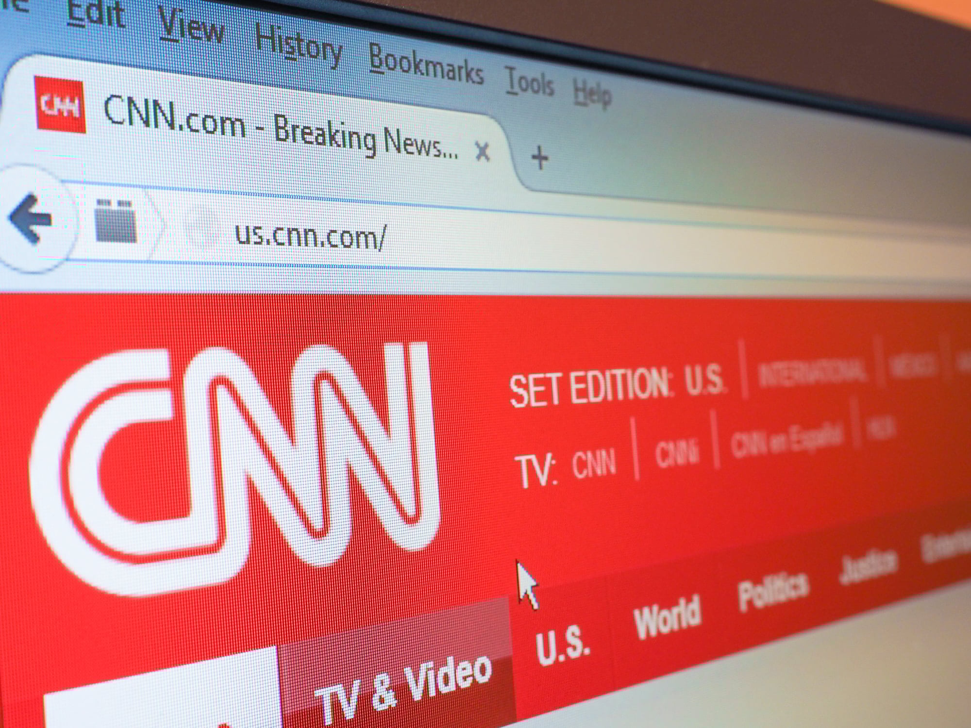
CNN launched CNN.com in August 1995, becoming the first major news organization with a significant web presence. The site posted news stories throughout the day, updating faster than print newspapers could.
Early versions were text-heavy with minimal images due to bandwidth constraints. The site proved that news could work online.
People checked CNN.com multiple times a day for updates, something they never did with newspapers. The constant availability changed how people consumed news.
You didn’t have to wait for the evening broadcast or morning paper anymore.
Internet Movie Database Organizes Film Info

IMDb started as a collection of movie lists posted to Usenet newsgroups in 1990. It moved to the web in 1993 and became the internet’s comprehensive movie database.
The site let anyone contribute information, which was radical at the time. Most databases were created and maintained by experts or companies.
The early version was all text. Movie titles, cast lists, crew information, release dates.
No photos, no video clips, no streaming trailers. Just data.
But if you wanted to know who directed a particular film or what else an actor had appeared in, IMDb had the answer.
The Drudge Report Breaks Stories

Matt Drudge launched the Drudge Report in 1997 as a simple page of news links and original reporting. The design was brutally basic.
White background, black text, links to news stories. No images except for one siren graphic at the top.
Drudge broke several major stories by aggregating rumors and leaks from other sources. The site got millions of visitors despite looking like it was made in 1995.
The minimal design meant it loaded fast and worked on any browser. Drudge proved that content mattered more than presentation if the content was good enough.
Blogger Lets Everyone Publish

Pyra Labs launched Blogger in 1999, making it easy for anyone to start a blog without knowing HTML or running their own server. You created an account, wrote posts in a simple text box, and clicked publish.
The platform handled all the technical stuff. Blogger democratized web publishing.
Before it existed, creating a website required technical knowledge. After Blogger launched, anyone who could write an email could have a blog.
Millions of people started publishing their thoughts, stories, and expertise. The web became much more diverse and interesting as a result.
Google’s Minimalist Search Page

Google launched in 1998 with a search page that was almost insulting in its simplicity. White background, a logo, a search box, two buttons.
That was it. Every other search engine filled their homepage with news, weather, stock quotes, and ads.
Google stripped all that away. The minimal design was partly about speed.
The page loaded instantly even on slow connections. But it also reflected their philosophy.
You came to Google to search, not to browse news or check email. The search box was all you needed.
That simplicity helped Google dominate search within a few years.
Netflix Ships DVDs by Mail

Netflix launched in 1997 as a DVD rental service. The website lets you browse movies, add them to a queue, and have DVDs mailed to your house.
No late fees, which was revolutionary at the time. Blockbuster made millions on late fees.
The site wasn’t trying to be flashy. Movie listings, search functionality, a queue manager.
That was enough. The business model was innovation, not the website design.
But making it easy to browse and order DVDs online was crucial. Netflix’s website interface became the template for every other subscription service.
PayPal Solves Online Payments

Back when it started in 1999, PayPal made sending cash as easy as shooting off an email. Using the site meant hooking up your bank details or plastic.
Once set, moving funds to someone only needed their inbox name. At first, recipients could get paid even without signing up themselves.
Back when the web was young, paying online often meant trouble. Typing your card number at each new store? That raised eyebrows.
A shield showed up in the form of PayPal. Put data into one vault – just once – and suddenly you could hand off payments without handing out info.
Safety grew quiet but steady. Shopping clicked because trust did too.
What These Simple Sites Started

Back then, sites felt clunky compared to today’s versions, yet they planted seeds for what we now see everywhere online. Take search bars – those showed up long ago, tucked into corners of simple pages.
Shopping carts too, awkward at first, slowly became familiar fixtures. User posts began popping up even when designs barely worked.
Social bits slipped in through forums and comments before anyone called them features. News started streaming in tiny updates, not unlike how it does now.
Each idea arrived quiet and unpolished, later growing hard to miss. The slow internet made things easier somehow.
With narrow bandwidth and clunky dial-up connections, websites could not afford clutter. Simplicity became a must, not a choice.
Designers shifted attention straight to what worked instead of how it looked. Success often came from doing just one task clearly, while others failed by stretching too thin.
Over time, complexity crept into the web – sometimes making things clunkier. Yet those early sites set down basics that still hold.
Pages link to one another. Information stays within reach.
Buying or signing up feels straightforward. Humans interact without hurdles.
Everything else? Just extra layers built on top.
More from Go2Tutors!

- The Romanov Crown Jewels and Their Tragic Fate
- 13 Historical Mysteries That Science Still Can’t Solve
- Famous Hoaxes That Fooled the World for Years
- 15 Child Stars with Tragic Adult Lives
- 16 Famous Jewelry Pieces in History
Like Go2Tutors’s content? Follow us on MSN.