Iconic Album Covers With Hidden Meanings
Album covers are more than just packaging for music. They’re canvases where artists embed secret messages, inside jokes, and cryptic symbols that fans might miss at first glance.
Some of these hidden elements are playful Easter eggs, while others carry deeper meanings that mirror the themes within the music itself. The best part is that many of these secrets went unnoticed for years, even by devoted listeners who stared at the artwork countless times.
From optical illusions to messages that only appear under special lighting, musicians and designers have found creative ways to hide their intentions in plain sight. Here is a list of iconic album covers with hidden meanings that reveal there’s always more to discover when you look a little closer.
The Beatles’ Sgt. Pepper’s Lonely Hearts Club Band

The 1967 masterpiece features a crowd of famous figures, but photographer Michael Cooper snuck in a subtle nod to The Beatles’ biggest rivals. Hidden among the collage is a doll wearing a shirt that reads ‘Welcome The Rolling Stones’.
The favor was later returned when Cooper shot the Stones’ psychedelic album cover and hid the faces of all four Beatles in the flowers and fabric. The mutual acknowledgment between these rock giants shows how friendly competition sometimes breeds creative respect.
David Bowie’s Blackstar

Released just days before Bowie’s death in 2016, this cover holds multiple layers of secrecy. The fragmented stars at the bottom spell out ‘Bowie’ when you look closely. Even more impressive, the black star glows blue under ultraviolet light, and the inner gatefold sleeve reveals hidden stars when exposed to sunlight.
Designer Jonathan Barnbrook suggested the meaning is open to interpretation, which feels perfectly aligned with Bowie’s enigmatic artistic vision throughout his career.
Pink Floyd’s Wish You Were Here

The iconic image shows two businessmen shaking hands, except one is engulfed in flames. Designer Aubrey Powell hired a stuntman who was actually set on fire, and the photographer captured the perfect shot on the 15th attempt.
The handshake symbolizes the empty, destructive deals common in the music industry, literally depicting the expression ‘I’ve been burnt’. This visual critique matches the album’s themes in some songs like ‘Welcome to the Machine’.
Led Zeppelin IV

The gatefold sleeve shows a hermit standing on a hillside, seemingly innocent enough. When you hold the image up to a mirror, though, a horned beast appears in the rocks behind him.
Whether this was intentional or just fans seeing patterns isn’t entirely clear, but it certainly didn’t help squash those persistent rumors about the band’s alleged occult interests during the early ’70s.
The Velvet Underground & Nico

Andy Warhol designed this 1967 cover with layers of hidden content. The seemingly pure black surface actually contains a faint skull tattoo that belonged to Joe Spencer, one of Warhol’s discoveries from his Factory scene.
You can only see it under black light or when examining the cover closely at an angle. Later vinyl editions featured a gatefold that revealed a field of stars when held up to bright light or sunlight, adding another dimension to Warhol’s artistic vision.
The Beatles’ Abbey Road

Beyond being one of the most parodied images in music history, this zebra crossing photograph fueled conspiracy theories for decades. Paul McCartney’s bare feet sparked the ‘Paul is Dead’ rumor, with fans interpreting the image as a funeral procession.
The white Volkswagen Beetle parked on the street has a license plate reading ‘LMW 28IF’, which theorists claimed meant Paul would have been 28 if he had lived. The whole thing was nonsense, of course, but it shows how people can find meaning in the smallest details.
Kate Bush’s Aerial

What looks like rocks jutting from water against a sunset is actually something far more precise. The shapes are the waveform of a blackbird’s song, referencing the bird chirping through the final track on the album’s second disc.
A dedicated fan actually recreated the sound from the visual waveform and blogged about it, which is exactly the kind of devotion Kate Bush inspires in her listeners.
Paul McCartney’s Ram
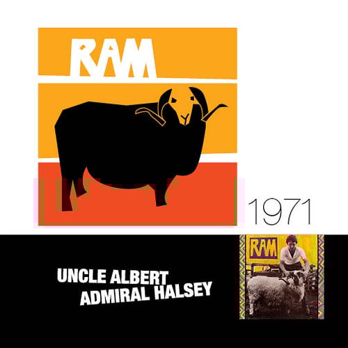
This 1971 solo album seems straightforward with McCartney holding an actual ram on the cover. Look at the right edge of the zigzag artwork, though, and you’ll spot tiny letters spelling ‘L.I.L.Y.’ standing for ‘Linda I Love You’.
It’s a sweet tribute to his wife Linda McCartney, who collaborated with him on the album just one year after The Beatles split up.
Santana’s Abraxas

The lion on Santana’s 1970 album cover isn’t just a single image. When you examine it closely, you’ll see it’s actually composed of nine different faces arranged to form the big cat.
The jawbone is a hula skirt worn by a woman whose head nestles between the lion’s eyes. The painting, called Annunciation by Mati Klarwein, carries spiritual significance, with the imagery representing the angel Gabriel’s visit to Mary in Christian tradition.
Radiohead’s In Rainbows

Dedicated Radiohead fans spotted multiple numerical Easter eggs on this 2007 release. The ‘I’ and ‘O’ in the band’s name are designed to look like the number 10, matching the number of letters in ‘In Rainbows’.
The album was released on October 10th (the 10th month) with 10 days’ notice. Some fans even theorized it connected thematically to ‘OK Computer’, whose working title was ‘Zeroes and Ones’.
Whether that last connection is real or fans reading too deeply depends on who you ask.
Nirvana’s Nevermind

The baby swimming toward a dollar bill on a fishhook isn’t just a striking image. Kurt Cobain explained it as commentary on how society conditions people to chase wealth from birth.
The dollar remains just out of reach, symbolizing the futile pursuit of money and the loss of innocence that comes with buying into consumer culture. For an album that defined grunge’s anti-establishment ethos, it’s a fitting visual metaphor.
Green Day’s Dookie

The chaotic cartoon cityscape under attack from flying monkeys carries social commentary beneath its playful exterior. Hidden throughout the scene are references to the band’s influences and critiques of modern consumerism.
The playful art style masks a deeper message about youth disillusionment and societal breakdown, which aligns with the rebellious energy that made the album a ’90s punk classic.
Iron Maiden’s Somewhere in Time
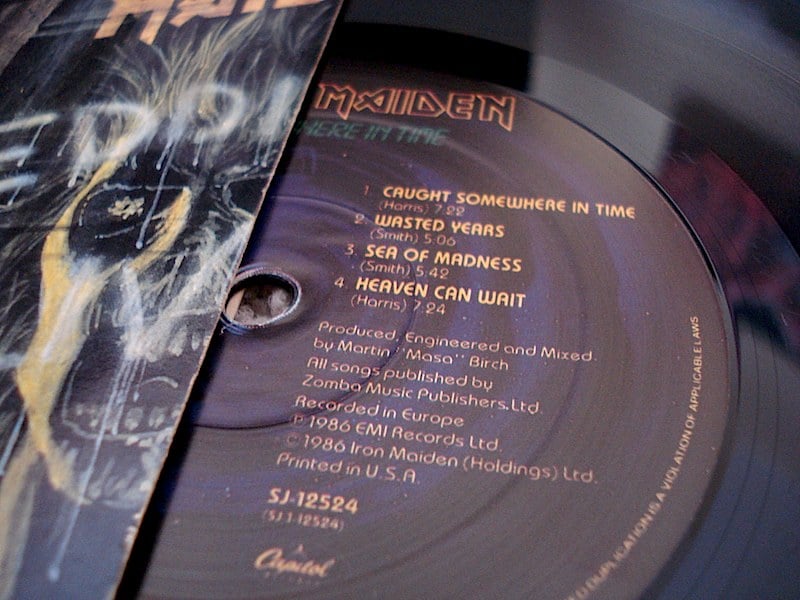
This 1988 cover incorporated numerous references to science fiction stories, movies, and previous Maiden album sleeves throughout the futuristic cityscape. The band’s favorite hidden detail appears in the bottom left corner, where a banner hangs in a shop window behind the time-traveling Eddie.
When you reverse the image, it reads ‘THIS IS A VERY BORING PAINTING’. Artist Derek Riggs apparently had a sense of humor about his own detailed work.
Beastie Boys’ Licensed to Ill

The cover shows the tail section of a plane with what appears to be a normal serial number: ‘3MTA3’. Hold it up to a mirror, though, and it reads ‘EAT ME’.
Producer Rick Rubin explained that the jet imagery was inspired by Led Zeppelin’s private plane shown in the Hammer of the Gods biography, meant as both homage and satire of rock and roll excess. The gatefold reveals the plane crashed into a mountain, adding another layer to the joke.
Grateful Dead’s Wake of the Flood

The 1973 cover features clouds behind a central figure that seem ordinary at first. Tilt your head to the right and look closely, though, and a skull emerges from the cloud formations.
This kind of hidden imagery fits perfectly with the Dead’s psychedelic aesthetic and the mystical themes that ran through much of their music.
The Rolling Stones’ Their Satanic Majesties Request

Photographer Michael Cooper created this psychedelic 1967 cover for the Stones after shooting the Beatles’ Sgt. Pepper’s album. Hidden in the flowers and fabric in the foreground are headshots of all four Beatles members, with Paul and George on the left and Ringo and John on the right.
The Stones returned the favor that Cooper had done on the Beatles’ album, creating a circular exchange between the two biggest bands of the era.
Pink Floyd’s The Dark Side of the Moon

The prism splitting white light into a rainbow spectrum became one of music’s most recognizable images. Designed by Storm Thorgerson and Aubrey Powell of Hipgnosis, the clean geometric design represents transformation and enlightenment.
Many interpret it as commentary on fame’s pressures and modern life’s fractured nature, themes that run throughout the album’s exploration of human experience. The band’s confidence shows in leaving their name off the cover entirely, letting the art speak for itself.
More Than Meets the Eye

These hidden messages transform album covers from simple packaging into interactive art that rewards closer inspection. Whether artists embedded secret love notes, inside jokes, or profound symbolism, these visual puzzles add another dimension to the listening experience.
The tradition continues today, with modern artists still finding new ways to hide meaning in their artwork, ensuring that fans will keep discovering secrets in the albums they thought they knew by heart.
More from Go2Tutors!

- The Romanov Crown Jewels and Their Tragic Fate
- 13 Historical Mysteries That Science Still Can’t Solve
- Famous Hoaxes That Fooled the World for Years
- 15 Child Stars with Tragic Adult Lives
- 16 Famous Jewelry Pieces in History
Like Go2Tutors’s content? Follow us on MSN.