Photos Of 13 Ugliest Buildings in the World
Strange how beauty shifts when it comes to buildings. What seemed cutting edge one decade might look clumsy the next.
Now and then, ideas laughed at, find fans after years pass. Still, some structures keep showing up labeled eyesores – off-putting shapes, odd materials, or bold choices just do not settle right with most folks.
Here’s something to consider: ugly doesn’t equal irrelevant. Some buildings carry deep cultural weight, bold historical aims, or remarkable engineering.
What they’re judged on isn’t poor performance – just heated debates about looks. Take thirteen structures people love to hate.
What makes them stir so much anger becomes clear on inspection.
Boston City Hall (United States)

Boston City Hall, completed in 1968, is one of the most recognizable examples of Brutalist architecture in America. Its heavy concrete forms, exposed structural elements, and blocky geometry were intended to express civic strength and transparency.
Instead, many critics see an imposing fortress that feels detached from the human scale. The stark gray exterior and rigid angles have long made it a target for public frustration.
Admirers defend it as an architectural landmark. Public polls regularly rank it among the least attractive buildings in the United States.
The Scottish Parliament Building (Scotland)

The Scottish Parliament Building opened in 2004 after years of delays and escalating costs. Designed by Spanish architect Enric Miralles, it features unconventional shapes, abstract window patterns, and irregular forms meant to symbolize Scottish identity.
For many observers, the result looks disjointed rather than symbolic. The fragmented rooflines and asymmetrical facades feel chaotic to some viewers.
While architects praise its ambition, critics argue it lacks the visual dignity typically associated with government buildings.
Ryugyong Hotel (North Korea)

Dominating the skyline of Pyongyang, the Ryugyong Hotel stands over 1,000 feet tall and takes the shape of a steep concrete pyramid. Construction began in 1987 but stalled for years, leaving it unfinished and windowless for decades.
Although exterior glass panels were eventually added, the structure’s massive scale and sharp triangular form make it appear severe. Its long period of abandonment amplified its reputation as a monumental miscalculation.
Even completed, its stark silhouette remains controversial.
Torre Velasca (Italy)

In Milan, Torre Velasca rises with a narrow base that widens dramatically at the top, creating a silhouette often compared to a mushroom. Completed in 1958, the design was meant to echo medieval watchtowers.
Instead, many see an awkward imbalance between the lower and upper sections. The heavy overhang gives the tower a top-heavy appearance that feels out of sync with the surrounding skyline.
Supporters appreciate its historical references. Detractors find it visually clumsy.
The Longaberger Basket Building (United States)

The former headquarters of the Longaberger Company in Ohio was built to resemble a giant picnic basket. Known as the Longaberger Basket Building, it opened in 1997 and features enormous handles arching over the roof.
As a marketing statement, it succeeded in drawing attention. As for architecture, it divided opinion sharply.
Oversized novelty structures often struggle to age gracefully. This one became a symbol of corporate excess rather than design sophistication.
The National Library Of Belarus (Belarus)
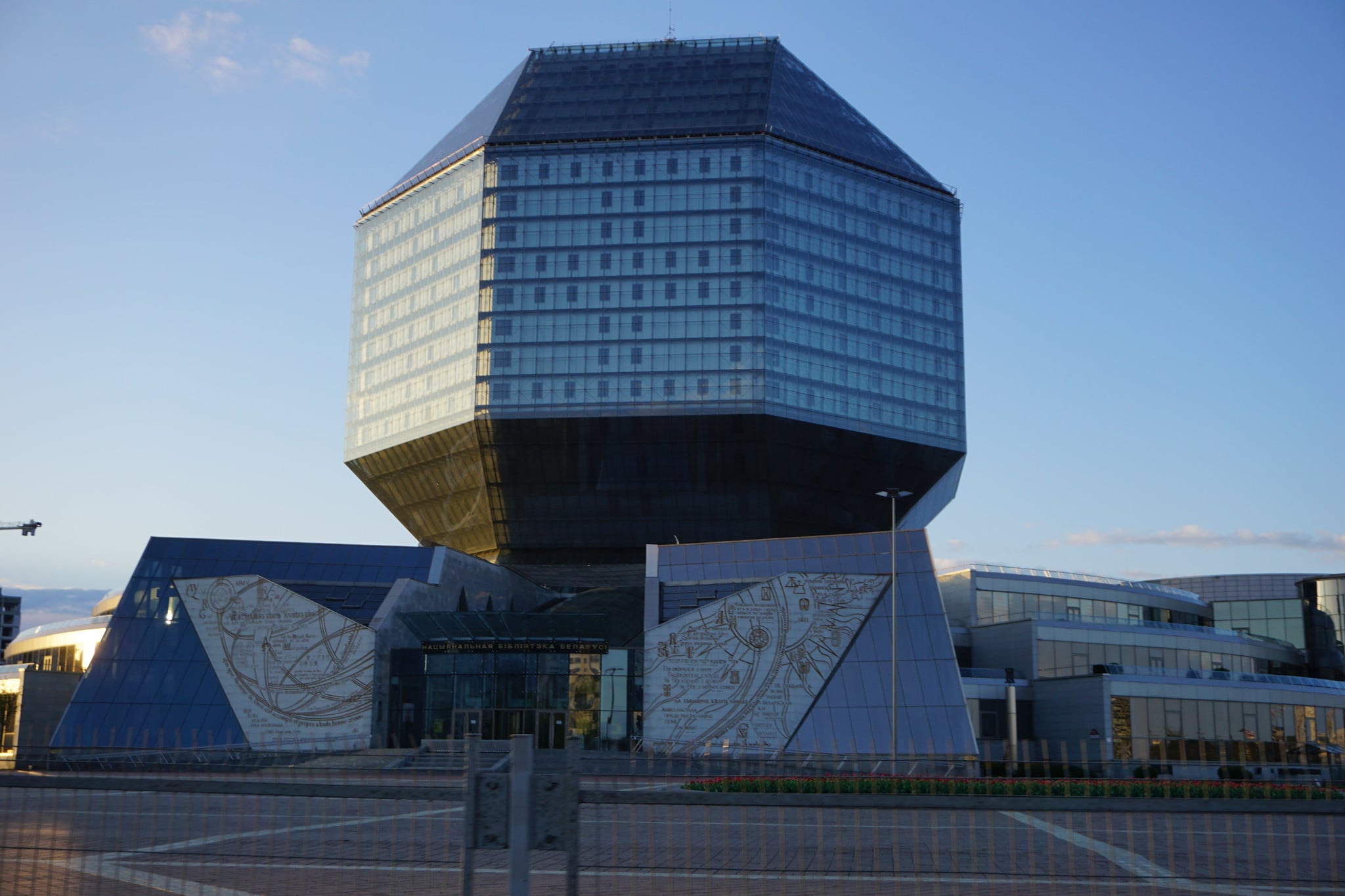
The National Library of Belarus looks like a giant faceted diamond resting on a pedestal. Completed in 2006, the building’s geometric shape makes it one of the most unusual libraries in the world.
While impressive in scale, the form feels abrupt against its surroundings. The angular glass exterior can appear bulky rather than elegant.
Some admire its futuristic ambition. Others see it as visually overwhelming.
Federation Square (Australia)

Located in Melbourne, Federation Square was designed as a modern civic space with bold, fragmented facades. The complex combines sharp angles, metal panels, and irregular shapes intended to create visual dynamism.
Many residents, however, found the design disorienting. The clash of textures and geometric patterns can feel restless rather than harmonious.
Over time, public opinion has softened slightly. It remains one of Australia’s most debated landmarks.
The Metropolitan Cathedral Of Christ The King (United Kingdom)

In Liverpool, the Metropolitan Cathedral of Christ the King replaced an unfinished traditional cathedral design with a circular modern structure in the 1960s. Its tent-like form and crown-shaped roofline stand in stark contrast to Gothic cathedrals.
Some appreciate its bold break from tradition. Others find it lacking the intricate detail and vertical grace associated with historic churches.
The modernist approach continues to divide visitors decades after its completion.
J. Edgar Hoover Building (United States)

The J. Edgar Hoover Building serves as the headquarters of the FBI. Built in the 1970s, it exemplifies Brutalist government architecture with massive concrete slabs and recessed windows.
Critics argue that the building feels uninviting and fortress-like. Its heavy facade and lack of ornamentation contribute to a perception of institutional coldness.
Despite its functional importance, its visual appeal remains widely questioned.
Elephant Building (Thailand)
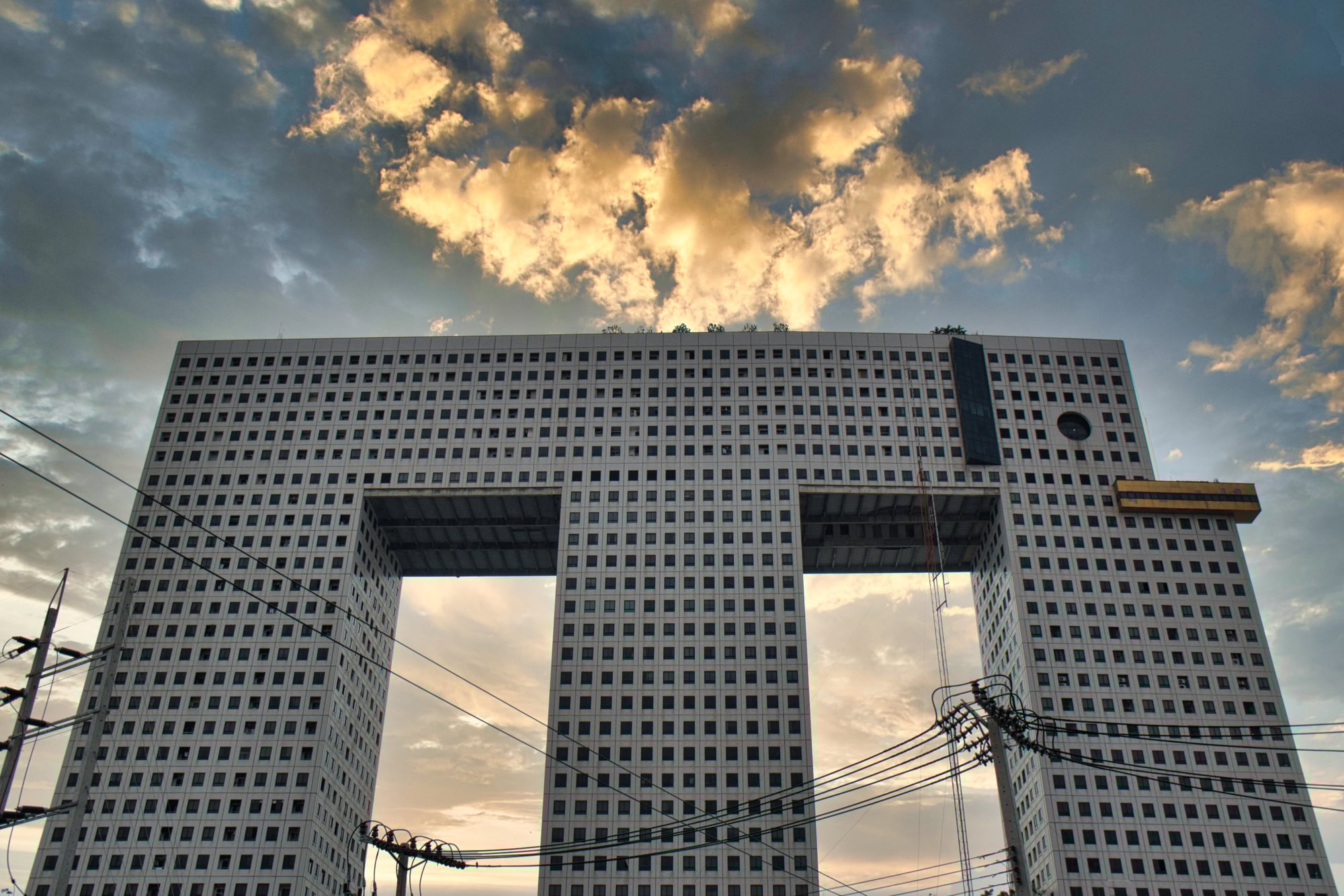
A giant elephant stands tall in Bangkok, but wait – it’s actually a building. Finished back in 1997, this structure wears its unique shape like a badge, showing off curved legs and small round eyes built right into the design.
Inside, people work and live side by side, though the layout hides behind playful form instead of boring boxes. Its look grabs attention, yet what happens inside stays ordinary.
Starting small but ending loud – that’s how it lands. Not charm, but weight takes over when you see it up close.
Though meant to be fun, too much realism drains the joy away. Boldness wins where nuance might have served better.
CCTV Headquarters (China)
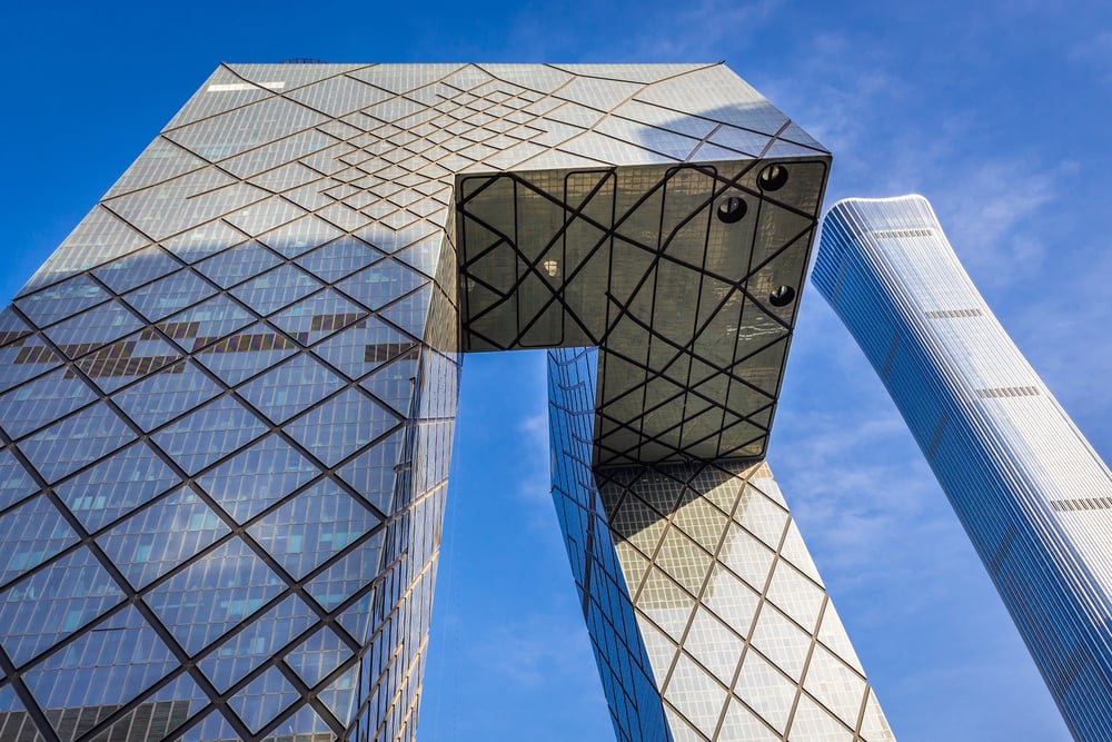
Twisting upward, the CCTV Headquarters ignores classic tower shapes with its jagged loop. By 2012 it stood finished, leaning into sharp turns that link corners without end.
Standing tall, it shows what careful planning can build. Its look splits opinion – bold to some, clumsy to others.
A few call it forward thinking, full of courage; meanwhile, critics say it clashes with the city above. Shape alone stirs debate where silence might have been.
Tour Montparnasse (France)
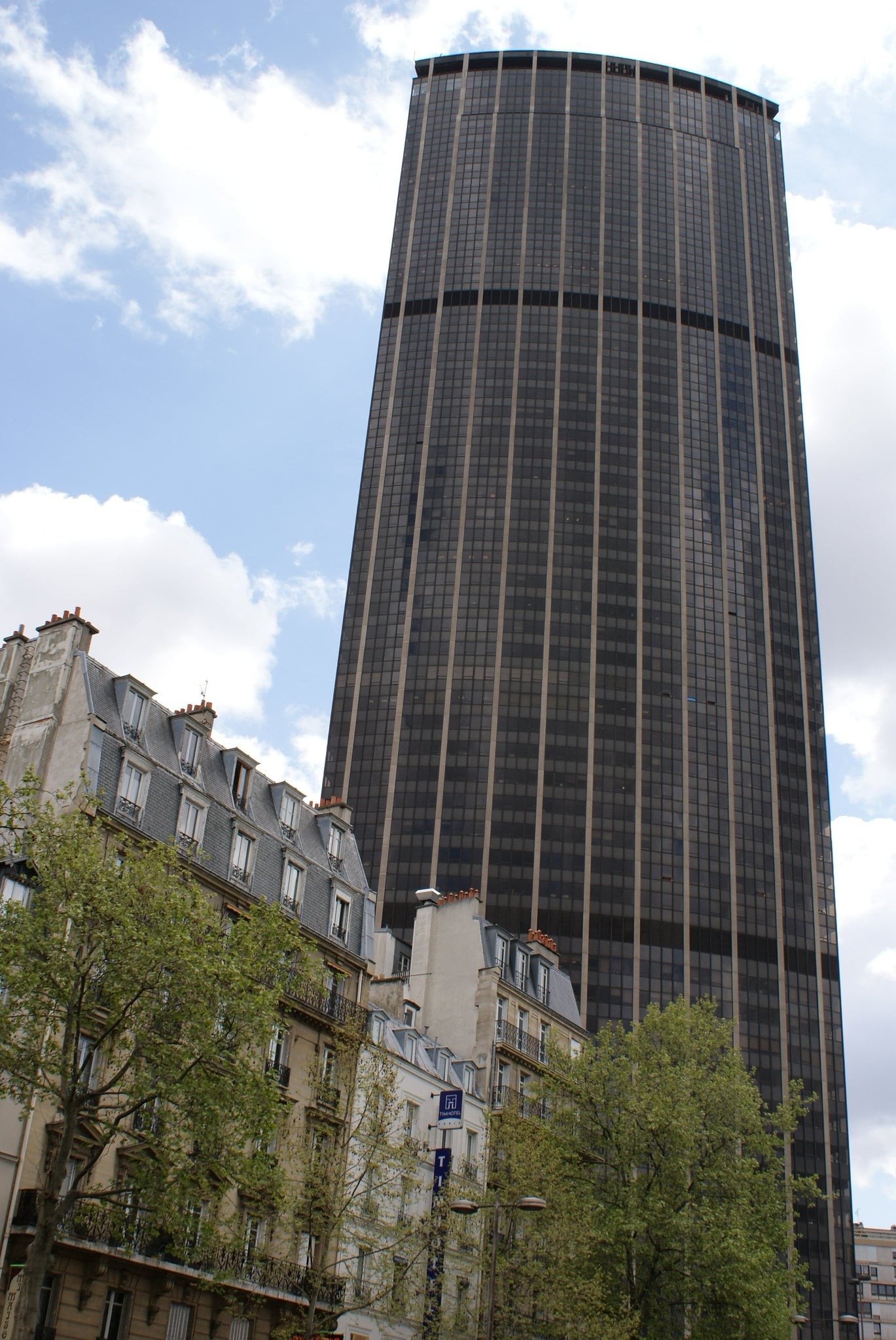
That tall, boxy building in Paris? It sticks out because most others nearby are about the same height.
Built in 1973, its dark shape cuts through the skyline like a shadow on flat rooftops. Most structures around it stay low and balanced in design.
This one simply refuses to blend. For years, plenty of locals in Paris have frowned at its sharp, modern look.
Unlike the older buildings nearby, it stands out in a jarring way. Because it looms so large, city rules now limit tall buildings downtown.
Mirador Building (Spain)
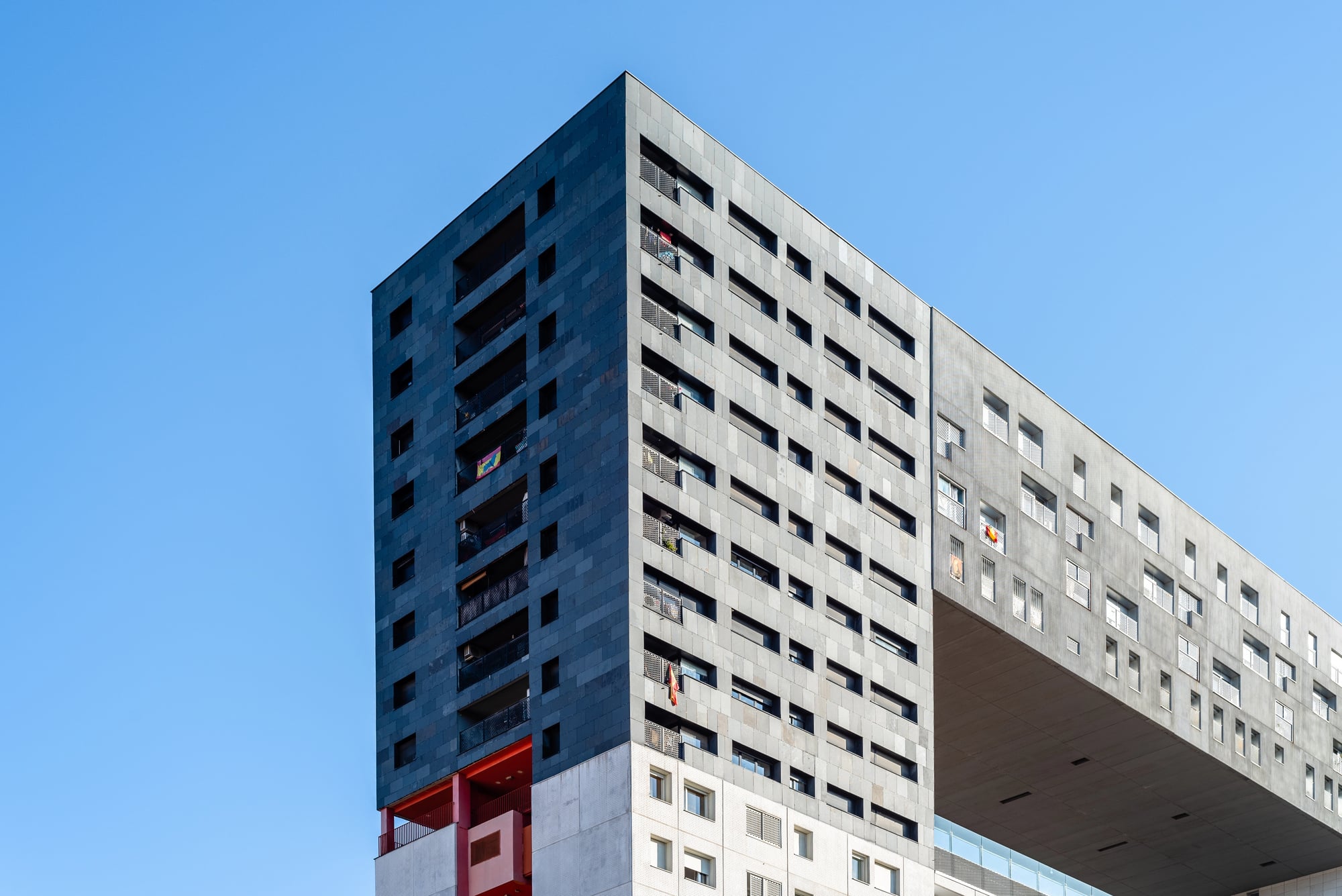
Madrid’s Mirador Building features a large rectangular void near its upper levels, giving the appearance of a massive frame cut into the structure. Completed in 2005, it was designed as social housing with communal space.
The open gap was intended to create shared outdoor areas. Yet visually, the building’s blocky form and hollow center strike some viewers as unfinished or awkward.
Its experimental approach earns admiration from architects and skepticism from the public.
Why Taste And Time Change Everything

Some structures called unattractive are actually acts of daring design. When new ideas took hold, creators leaned into raw materials like poured stone instead of old styles.
Sharp shapes or meanings meant something then that might seem off now. Time changes how we see what once felt futuristic.
Decades pass, tastes change. Buildings once mocked might later be seen as pieces of history.
Not every structure gets that chance though. A few keep splitting people’s views, no matter how much time goes by.
When Controversy Becomes Legacy

Skyscrapers stay put, long past their moment. Not loved by everyone, these 13 stand out because decisions made decades ago still echo today.
What people think of them shifts – sometimes slowly – with taste, not just stone or steel. A shape dismissed now might make sense later.
Not every opinion on design sticks around forever. Often, structures people love to hate are exactly those that refused to blend in from day one.
More from Go2Tutors!

- The Romanov Crown Jewels and Their Tragic Fate
- 13 Historical Mysteries That Science Still Can’t Solve
- Famous Hoaxes That Fooled the World for Years
- 15 Child Stars with Tragic Adult Lives
- 16 Famous Jewelry Pieces in History
Like Go2Tutors’s content? Follow us on MSN.