Most Recognizable Brand Logos Worldwide
Some images speak louder than words ever could. They flash across your vision for half a second and instantly trigger recognition, memory, emotion — sometimes even craving.
These symbols have transcended their original purpose as company identifiers to become cultural shorthand, embedded so deeply in our collective consciousness that spotting them feels automatic. The most powerful brand logos don’t just represent products or services.
They’ve earned a place in the visual vocabulary of modern life, recognized across languages, borders, and generations. Here are the logos that have achieved true global recognition.
Apple
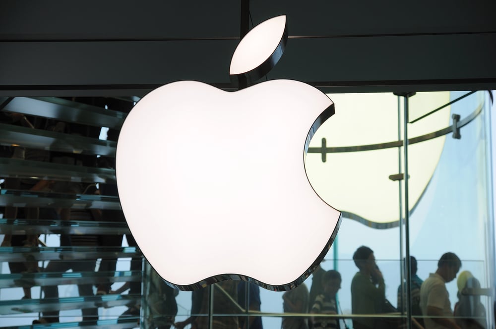
Apple’s logo works because it’s stubborn in its simplicity. A fruit with a bite taken out of it.
No text, no explanation, no apologizing for being exactly what it is. The rainbow stripes disappeared decades ago, leaving behind something even more confident: pure silver, pure black, or pure white depending on where it lands.
That bite mark does all the work — without it, you’d have generic fruit. With it, you have one of the most valuable symbols in corporate history.
McDonald’s
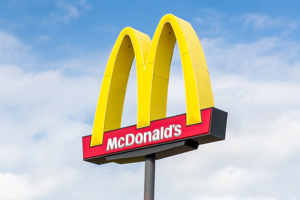
The golden arches have become a modern compass rose (though instead of pointing toward magnetic north, they point toward something far more immediate: the promise of predictable satisfaction, the kind that arrives in exactly the same way whether you’re in downtown Manhattan or a highway rest stop in rural Montana). Walk into any McDonald’s anywhere in the world, and the experience feels familiar before you’ve ordered anything — not because the food is identical, but because those arches have trained your brain to expect a certain rhythm, a certain pace, a certain kind of no-surprises efficiency that fits neatly into whatever hurry you happen to be in.
The logo itself has become shorthand for something larger than burgers: it signals that this place understands you’re probably not here for a culinary adventure, and that’s perfectly fine. So when you spot those arches from a car window, your brain doesn’t process “restaurant” first.
It processes “known quantity.”
Nike
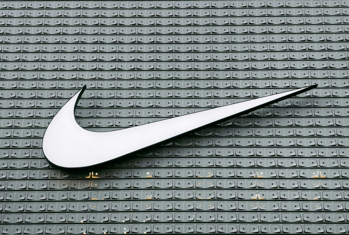
Nike’s swoosh is marketing stripped down to its essential truth. Movement, frozen in a symbol.
The logo doesn’t need the company name next to it anymore — hasn’t for years. That curved line carries enough weight to stand alone on shoes, shirts, and billboards.
It suggests motion even when it’s sitting perfectly still, which is precisely what athletic branding should do.
Coca-Cola
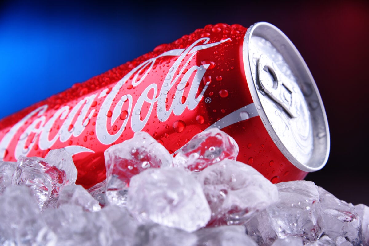
The Coca-Cola script feels like it was written by the same hand that signed the Declaration of Independence — that particular blend of authority and flourish that makes you believe this thing has always existed, will always exist, and has earned the right to take up space in your refrigerator without justification. The lettering curves and flows in a way that suggests celebration even when you’re not particularly in the mood to celebrate anything; it’s the visual equivalent of someone insisting that right now, this moment, deserves to be marked as special.
And the color red that accompanies it doesn’t just grab attention — it demands it, the way a cardinal demands notice in a winter landscape. The script has remained essentially unchanged for over a century, which takes a particular kind of confidence: most brands fidget with their identity every few years, but Coca-Cola decided long ago that perfection doesn’t require improvement.
But here’s what really makes it work: the logo feels handmade in an increasingly digital world. Personal, even though it represents one of the largest corporations on earth.
Google’s logo succeeds because it refuses to take itself too seriously. Primary colors are arranged like a child’s art project, but somehow that playfulness signals exactly what the company wants you to believe about complicated technology: that it should feel simple, approachable, maybe even fun.
The letters themselves are unremarkable. Standard sans-serif, nothing fancy.
But those colors — blue, red, yellow, blue again, green, red — create just enough visual rhythm to feel intentional without feeling corporate. It’s the logo equivalent of rolling up your sleeves before getting to work.
Starbucks

The siren sits inside her green circle like a maritime tattoo that got promoted to the corporate boardroom — intricate, mysterious, and carrying just enough backstory to make ordering coffee feel like participating in something with deeper roots than your Tuesday morning routine. She’s been simplified over the years (the early versions were far more anatomically explicit, which probably wouldn’t play well in suburban shopping centers), but what remains still suggests that your drink comes with a side of seafaring adventure, even if you’re just grabbing a latte on your way to the office.
The green that surrounds her has become as recognizable as the logo itself; it’s the exact shade that signals “premium coffee experience” in a way that brown or black never could. And unlike logos that try to explain what the company does, the siren operates on pure association: she doesn’t tell you anything practical about coffee, but she makes you feel like this particular coffee comes with stories attached.
Microsoft

Microsoft’s logo is geometry with a point to prove. Four squares, four colors, arranged to suggest a window — which makes sense, given that Windows built the company.
The simplicity feels intentional rather than lazy. Red, green, blue, yellow.
Each square is the same size, each color equally weighted. It’s the visual equivalent of saying “we do many things, we do them all well, and we don’t need to show off about it.”
Amazon

The arrow beneath Amazon’s name does more work than most people notice. It starts at the ‘a’ and ends at the ‘z’, suggesting the company sells everything from A to Z.
Clever enough to satisfy the marketing department, subtle enough not to annoy customers who just want to buy something and move on with their day. But that arrow also curves into a smile, which transforms a shipping indicator into something that suggests satisfaction.
The logo promises both selection and happiness, which is exactly what e-commerce should promise.

Facebook’s logo is confident in its ordinariness (back when the platform felt ordinary, which seems like ancient history now, though the logo has remained steadfastly unchanged through every controversy, algorithm shift, and congressional hearing that followed). The lowercase ‘f’ in white against that particular shade of blue — not navy, not sky blue, but something in between that’s become as recognizable as any corporate color in existence — manages to feel both friendly and institutional, which is probably the most impressive branding trick of the social media era.
The font is clean without being sterile, casual without being sloppy, and it sits inside its blue square like it was always meant to be there. And maybe that’s the point: Facebook wanted to feel inevitable, like connecting with people online was as natural as breathing, and the logo reflects that ambition by refusing to call attention to itself.
The ‘f’ doesn’t try to explain what Facebook does. It just sits there, confident that you already know.
Adidas

Adidas built their logo around the idea of overcoming obstacles. Three stripes that slope upward, forming a triangle that suggests a mountain to be climbed.
The stripes themselves have history — they appeared on the company’s first shoes in 1949. But arranging them into a peak was genius: it takes a simple pattern and gives it direction, purpose, aspiration.
The logo doesn’t just identify the brand; it embodies what the brand wants you to feel about yourself when you wear it.
Toyota

Toyota’s logo looks like it was designed by someone who understood that car buyers want to feel both practical and optimistic — which is saying something, given that most people approach car shopping with roughly the same enthusiasm they’d bring to root canal surgery. The interlocking ovals suggest precision without showing off about it, the kind of engineering confidence that doesn’t need to announce itself but somehow communicates reliability just by existing.
The outer oval contains two inner ones, and while the company will tell you this represents the heart of the customer and the heart of the product coming together, what it actually communicates is simpler: things fit together properly here, no surprises, no loose ends. And the symmetry of it creates a sense of balance that works whether the logo is sitting on a Prius or a pickup truck.
The logo manages to feel both modern and timeless, which is exactly what you want from something that’s supposed to get you places for the next decade.
Samsung

Samsung’s logo commits to simplicity without apology. Blue letters, standard font, no decorative elements or symbolic flourishes.
The wordmark approach works because the company name itself carries the weight. No need for abstract symbols or clever visual metaphors — just clean typography that suggests the products themselves will be equally straightforward.
Sometimes the most recognizable choice is refusing to try too hard.
Intel
Intel’s logo succeeds by making computer processors feel approachable. “Intel Inside” became one of the most successful marketing campaigns in tech history, but the logo itself — clean blue letters in a reliable font — does the real work of making complicated technology seem trustworthy.
The swoosh underneath the text adds just enough movement to keep the wordmark from feeling static. It suggests progress, innovation, forward momentum, all the things you want from the company that makes the brain of your computer.
Pepsi

The Pepsi logo has gone through more changes than a Broadway show, but it keeps circling back to the same basic idea: red, white, and blue in a shape that suggests both motion and refreshment. The current version — a circle with a wavy line through the middle — works because it feels both patriotic and international, both classic and contemporary.
The wave suggests liquid in motion, which is exactly what a beverage logo should do. It’s Coca-Cola’s main rival, but where Coke feels like tradition, Pepsi feels like the future.
The Power of Visual Shorthand

These logos have earned something most brands never achieve: the ability to communicate instantly across every barrier that usually slows down human understanding. Language, culture, age, education level — none of it matters when these symbols appear.
They’ve become part of the basic visual vocabulary of modern life, as fundamental as traffic signs or currency symbols. That kind of recognition isn’t accidental.
It’s the result of decades of consistent use, strategic placement, and — perhaps most importantly — products and services that actually lived up to what the logos promised. The symbol and the experience became inseparable, which is the only way a logo transitions from corporate identifier to cultural landmark.
More from Go2Tutors!
- The Romanov Crown Jewels and Their Tragic Fate
- 13 Historical Mysteries That Science Still Can’t Solve
- Famous Hoaxes That Fooled the World for Years
- 15 Child Stars with Tragic Adult Lives
- 16 Famous Jewelry Pieces in History
Like Go2Tutors’s content? Follow us on MSN.