Everyday Objects Designed to Trick Your Brain Without You Realizing It
Most people walk through the designed world assuming it was built for their convenience. Some of it was. Much of it was built to manage their behaviour — to direct where they look, how long they stay, what they buy, how hungry they feel, and how much they spend.
The environments and objects that do this most effectively are the ones that never announce themselves, the ones that feel so natural you assume you’re making choices freely. You are making choices.
They’ve simply been structured very carefully in advance.
The Supermarket Entrance That Starts With Produce
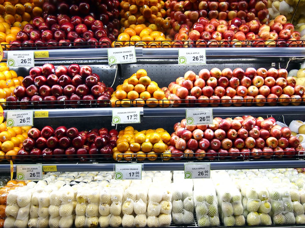
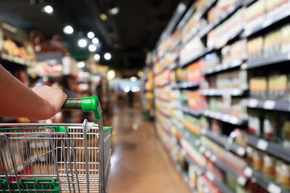
Almost every major supermarket on earth opens with a fresh produce section — towers of bright fruit, loose vegetables, baskets of herbs. It smells alive and wholesome.
The logic is not dietary. Research in retail psychology has established that entering a clean, colourful space full of fresh food puts shoppers in a positive, open mood and triggers a sense of virtue that makes them more willing to spend later in the store.
The healthy purchase at the front is a permission slip for the impulse purchase three aisles later.
Milk at the Back of the Store
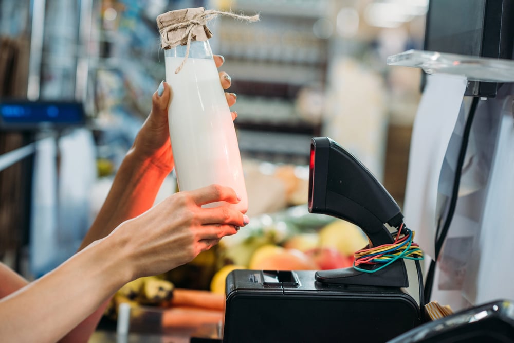
Milk, eggs, and bread — the items that appear on almost every shopping list — are reliably positioned as far from the entrance as possible. This is not logistics.
It is a deliberate walk. On the way to the dairy section, you pass hundreds of items you didn’t plan to buy, and research suggests that between 60 and 70 percent of supermarket purchases are unplanned.
The dairy section exists at the back because that is the price you pay for the milk.
Supermarkets With No Clocks and No Windows
Strip away any reference to the external world — sunlight, the time of day, whether it’s raining — and shoppers lose their sense of time. Without a clock or window, the experience inside the store becomes self-contained, and people stay longer than they intended.
Longer visits mean more purchases. The practical reasons (sun degrading packaging, walls needed for shelving) do exist, but the behavioural effect of eliminating time cues has been studied, documented, and exploited by retail designers for decades.
Shopping Carts Made Progressively Larger
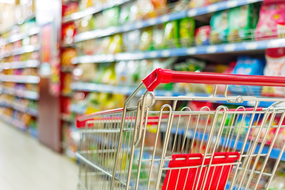
The standard supermarket trolley has grown considerably over the decades. Research on shopping psychology found that people tend to fill whatever container they are given, and that an incompletely filled cart creates a subtle discomfort — a sense that you haven’t finished yet.
Larger carts produce larger shops. Some stores experimented with reducing cart size to see if it reduced spending. It did.
Eye-Level Shelf Positioning
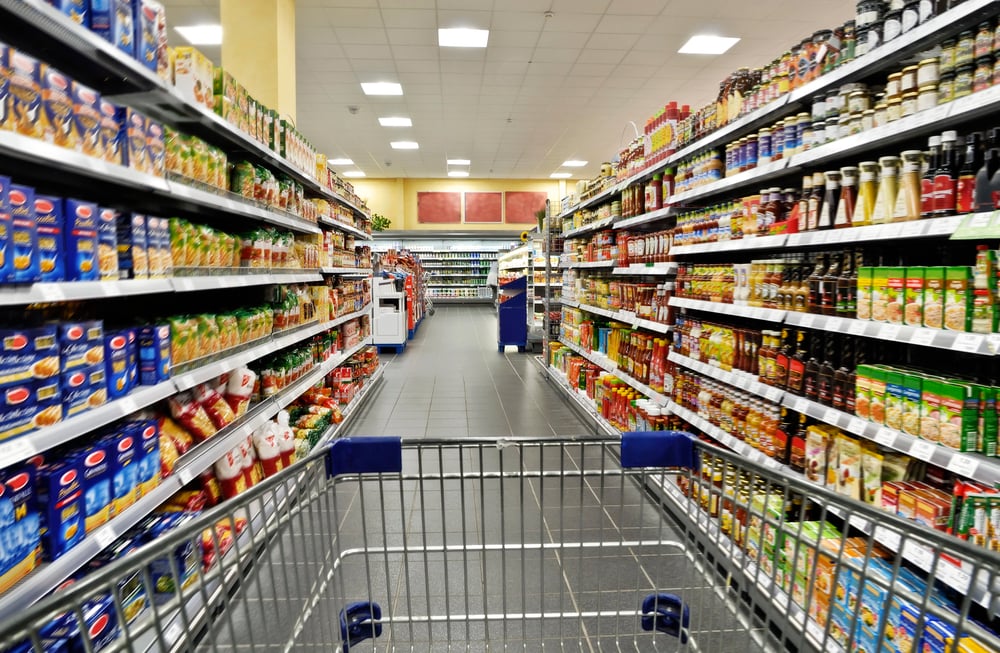
Products placed at eye level in a supermarket sell more than products placed above or below it. Products placed at children’s eye level — brightly coloured items at roughly shelf height for a seven-year-old — sell to children’s parents.
This positioning is not random and is not determined by logical organisation. Premium brands and high-margin products claim the eye-level shelf.
Generic and budget alternatives tend to live at floor level or on the topmost shelf, requiring physical effort to retrieve.
Checkout Aisle Products
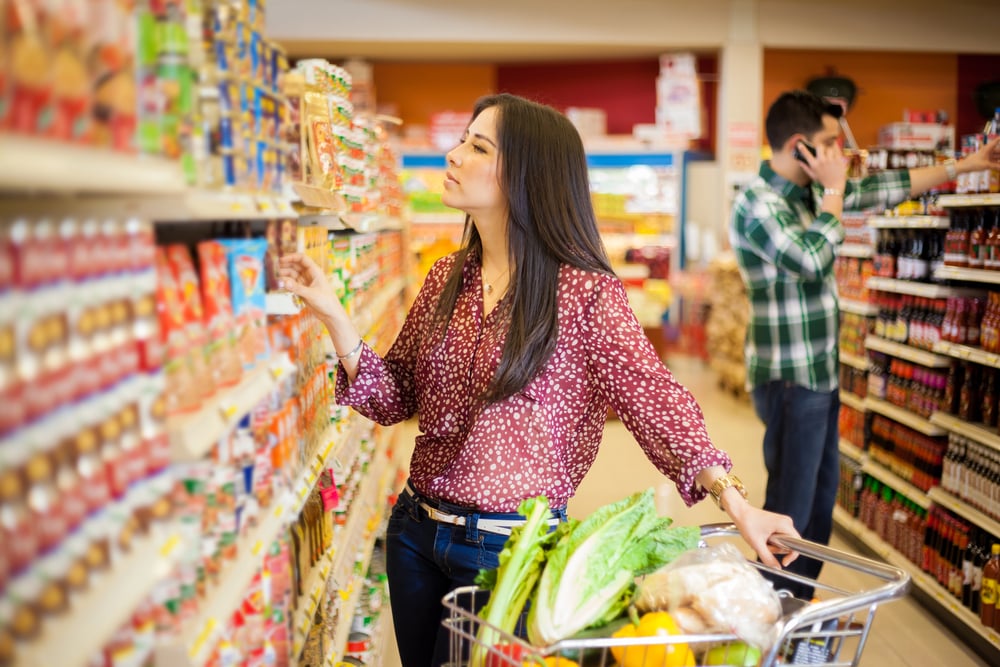
The products displayed along the path to the checkout — and in the checkout lane itself — are placed there specifically because you are most likely to make impulsive, unconsidered purchases while waiting. You’ve completed your shopping mentally.
Your guard is down. Confectionery, small gadgets, magazines, and convenience items line this final section.
The checkout lane is not a waiting area. It is the last commercial opportunity the store gets before you leave, and it is designed with that single goal in mind.
Plates and Portion Sizes at Restaurants
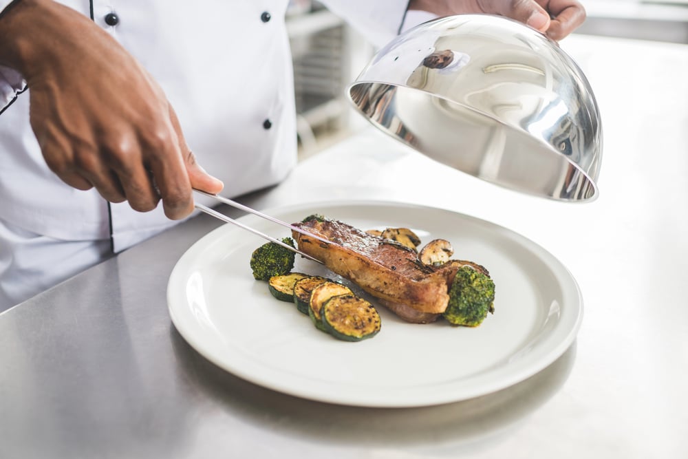
A larger plate makes the same portion of food look smaller, which creates a sense that you are getting less value and may order more. Smaller plates make the same portion look more generous and leave diners feeling more satisfied.
This is not a theoretical effect — it was one of the subjects studied extensively by Cornell food psychologist Brian Wansink over many years, who found that people systematically underestimate or overestimate portions based on the size of the vessel. Buffet restaurants use medium plates deliberately.
Upscale restaurants use large plates to make smaller portions look considered rather than inadequate.
The Smell of Fresh Bread
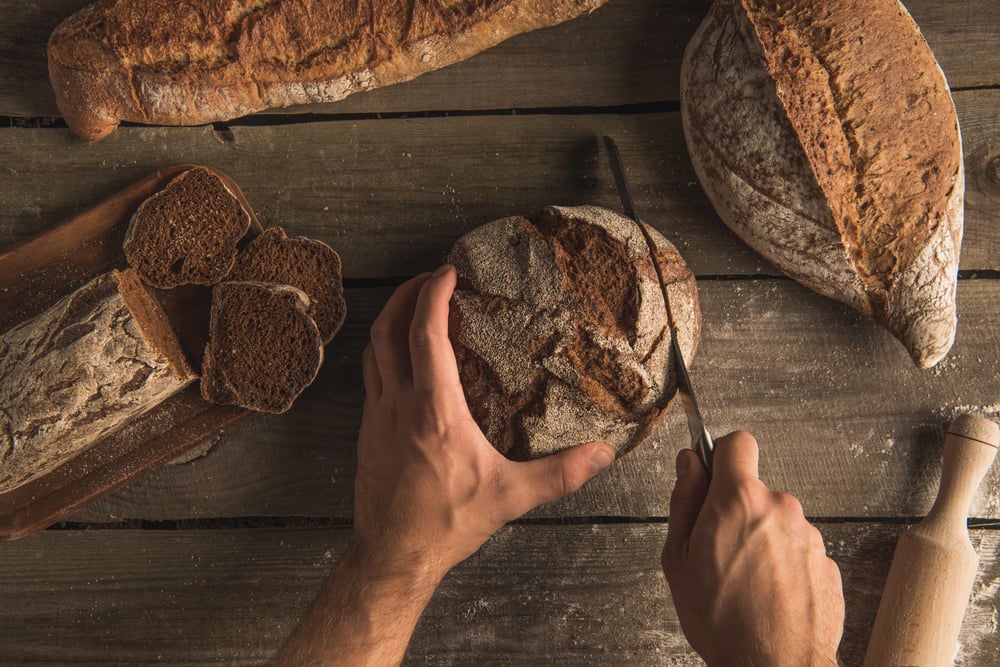
Many supermarkets bake bread on-site, or pump the smell of baking bread through ventilation systems near the entrance. Fresh bread is one of the most reliably appetite-stimulating smells that exists — it is warm, familiar, and deeply associated with home and nourishment.
It also makes you hungry. Hungry people buy more food.
The bread oven is not in the front of the store because it’s the most logical place to put it. It is there because what comes out of it works.
Slow Music in Supermarkets

The tempo of background music in retail environments has been shown in peer-reviewed research to affect the speed at which shoppers move and the amount they spend. Slower music leads to slower movement through the store, which leads to more time spent examining products, which leads to more purchases.
Upbeat music accelerates movement and reduces dwell time. The music you hear in a supermarket has been tested to produce a specific behavioural outcome.
Fast Food Chairs Designed to Be Uncomfortable
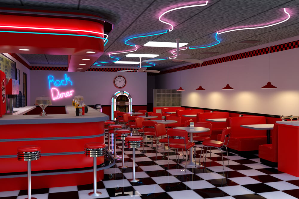
Fast food restaurant seating is typically hard, angular, and deliberately uncomfortable for extended periods. Bright colours, hard surfaces, and upright chairs create an environment that is fine for 15 to 20 minutes and notably unpleasant after 30.
The speed-of-turnover model that fast food restaurants depend on requires diners to leave. The seating is a timer disguised as furniture.
Price Anchoring With a “Decoy” Option
When a menu or product list offers three sizes — small, medium, and large — and the large is only marginally more expensive than the medium, the large size appears to be of disproportionate value. The medium is the decoy: it exists primarily to make the large look like a bargain by comparison.
The same principle operates when a coffee shop lists a small size at one price and a large at a price that’s barely higher. You weren’t going to buy the small.
The small was there to make the large look reasonable.
The Number 9 in Prices
Pricing items at £9.99 rather than £10.00 has been studied so extensively that it now appears in every introductory marketing textbook. The human brain processes numbers from left to right and encodes the first significant digit — so £9.99 registers closer to £9 than to £10, even though the difference is a single penny.
Variants include £99, £999, and any pricing that ends in 9. Retailers have been using this for well over a century, and its effectiveness has been replicated across multiple countries and economic contexts.
The IKEA Maze
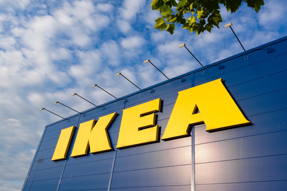
IKEA stores are famously designed as a single winding path through the entire showroom, with no obvious shortcuts and arrows on the floor to direct traffic in one direction. This is not accidental.
The design ensures that visitors walk through all departments, not just the ones they came for. IKEA’s own research found that the longer a customer spends in the store, the more they buy.
The maze is the product.
Fake Window Lighting in Windowless Spaces
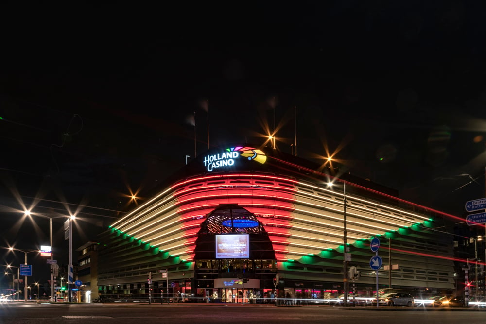
Casinos — environments specifically designed to separate visitors from their money over extended periods — frequently use lighting that mimics natural daylight at a consistent, comfortable intensity. There are no actual windows, no natural daylight cycles, and no visual indicators of whether it is day or night outside.
The comfortable lighting creates an impression of reasonable daytime activity. The absence of any natural time reference allows the building to contain its own reality, one in which time has been effectively suspended.
The Slot Machine Near Miss
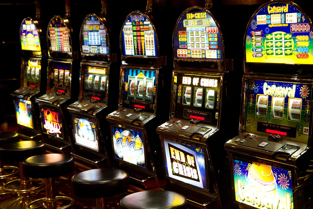
On modern electronic gaming machines, the combination of symbols that appears just above or just below the winning line — where the jackpot combination was “almost” achieved — is not random. These near-miss outcomes are programmed to appear more frequently than they would if the reels were genuinely independent, because research has shown that near misses produce the same neurological arousal as wins, and that they dramatically increase the likelihood of continued play.
The machine is not almost paying you out. It is playing a sound and showing you a picture specifically designed to feel as though it nearly did.
Mirror Placement in Retail Stores

Fitting rooms are placed at the back of clothing stores for the same reason that dairy is at the back of supermarkets. But the mirrors inside them are also not neutral.
Studies in retail psychology have found that mirrors in fitting rooms are often slightly angled, lit from the front with warm light, and positioned to present the most flattering possible version of how a garment looks on the wearer. Some retailers have experimented with slimming mirror effects.
The purpose is to make the purchase decision feel straightforward.
Hotel Room Light Switches That Don’t Work Intuitively

The proliferation of light switches in hotel rooms — panels with four or six identical rocker switches, no labels, and no obvious logic — is a minor mystery of the built environment. The less charitable explanation is that it discourages guests from turning off all the lights, which reduces the energy savings that would accrue to the hotel rather than to the guest.
The more charitable explanation is that hotel electrical systems are complex and the wiring was not designed with usability in mind. Both are probably partially true.
The “Limited Time Only” Label

The words “limited time only,” “while stocks last,” or “available this weekend” trigger a cognitive bias called loss aversion — the psychological finding that the pain of losing something is approximately twice as powerful as the pleasure of gaining an equivalent thing. The label doesn’t describe a genuine scarcity.
In most cases, the item will be available again shortly. What it describes is a manufactured urgency: the feeling that not buying now means losing access to something valuable. That feeling is real.
The underlying scarcity, often, is not.
Loyalty Cards That Track You
Supermarket loyalty cards offer genuine discounts in exchange for data about every item you purchase, how frequently you shop, what triggers you to spend more, and what time of day you visit. The discount is real.
What it purchases is a comprehensive profile of your behaviour over years, which is used to target promotions precisely to your established patterns, to place products on your regular route through the store, and to personalise offers in ways that are more effective than broad advertising. You are not getting a discount.
You are selling your shopping data for a discount.
Restaurant Background Lighting
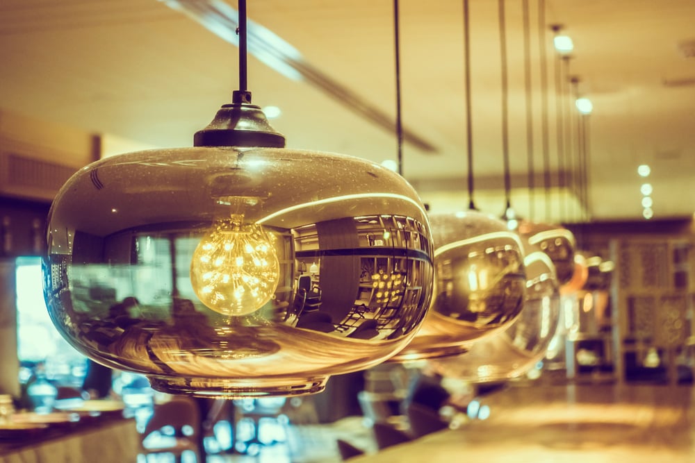
Dim lighting in upscale restaurants slows the pace of eating, encourages conversation, and extends the meal — which extends the opportunity to order more wine, a dessert, a digestif. It also makes the food look warmer and more appealing.
Very bright lighting in fast food contexts has the opposite psychological effect: it increases alertness, speeds up eating, and unconsciously signals that the space is not intended for lingering.
Rounded Corners on Devices and Screens
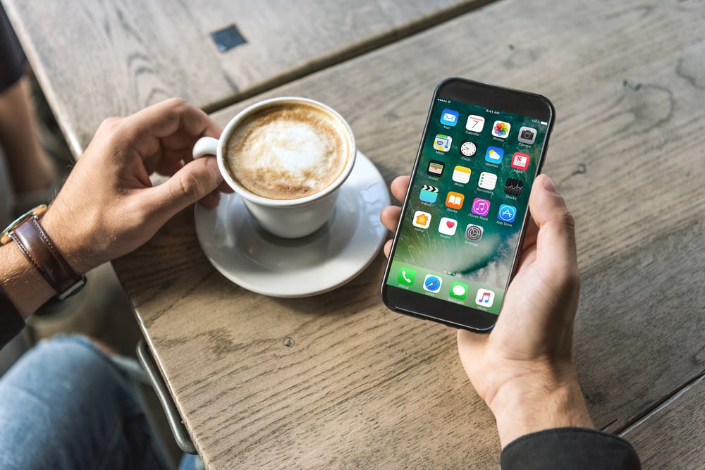
Product designers at Apple and elsewhere have documented the psychological impact of sharp versus rounded corners on consumer perception. Objects with sharp corners trigger a mild but measurable threat response in the human brain — corners are associated, at some deep level, with potential physical harm.
Rounded corners suppress this response and produce a marginally more positive, trusting reaction. The decision to round the corners of a smartphone is partly aesthetic and partly a deliberate manipulation of the neurological response to the object.
The “New and Improved” Label
The phrase “new and improved” appears on products that have been reformulated, re-packaged, or simply relaunched with different marketing. Research on consumer psychology has found that people perceive “new” products as better than familiar ones, even when the product is substantially similar.
The label taps two separate biases simultaneously: the preference for novelty and the preference for perceived quality improvement. It makes no specific claims and is therefore almost impossible to dispute.
Escalators Positioned After the Store Entrance
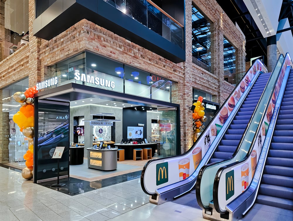
Department stores typically place escalators away from the entrance, requiring customers to walk through at least one floor of merchandise before reaching the stairs or escalator to the next level. This is the same principle as dairy at the back of the supermarket: the item you need (access to the next floor) requires a walk past items you didn’t know you wanted.
Multi-floor retail environments are designed so that getting from any point to any other point involves maximum product exposure.
Social Proof Counters on Websites
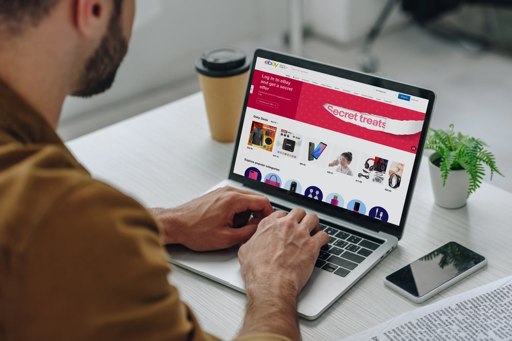
“2,456 people are looking at this right now.” “Only 3 left in stock.” “Most popular choice.” These labels exist to trigger two effects simultaneously: the perception of scarcity (making you fear missing out) and the perception of social consensus (making the popular choice feel like the correct one).
The numbers themselves are frequently generated in real time from live data, but they are also displayed in ways designed to maximise the emotional impact rather than to simply inform. A badge that says “Best Seller” is not a neutral description of sales data.
It is a sales tool disguised as a data point.
The “Free” Trigger

Behavioural economists, most notably Dan Ariely in his research on irrational decision-making, have documented the extraordinary distorting effect of the word “free” on consumer choices. People will go significantly out of their way, and make objectively worse choices, to obtain something described as free — even when the cost of obtaining it exceeds its value.
A free gift with purchase, free shipping on orders over a certain threshold, a free upgrade — these are not marketing sweeteners. They are carefully calibrated applications of one of the most reliably irrational tendencies in human decision-making.
The Designed World Is Still Designing
What makes the manipulation effective is not that it defeats reason — it mostly doesn’t. If you think carefully about why the milk is at the back of the store, you understand the mechanism immediately. The problem is that you don’t think carefully about it, because you are thinking about the milk.
These designs work in the gap between what your rational mind is doing and what your automatic responses are already doing without it. Most decisions made inside a designed environment are made in that gap.
The designers understand this. They have built environments, products, and interfaces around it.
Understanding the mechanisms doesn’t guarantee immunity — the near-miss on a slot machine still produces a neurological jolt even in people who know exactly how near-miss programming works. But it changes the conversation you’re having with the designed world.
You’re still in the maze. You’re just reading the map.
More from Go2Tutors!

- The Romanov Crown Jewels and Their Tragic Fate
- 13 Historical Mysteries That Science Still Can’t Solve
- Famous Hoaxes That Fooled the World for Years
- 15 Child Stars with Tragic Adult Lives
- 16 Famous Jewelry Pieces in History
Like Go2Tutors’s content? Follow us on MSN.