Failed Rebranding Attempts
Rebranding can breathe new life into a company, but sometimes, it completely backfires.
Businesses often aim to look modern, attract new audiences, or show they’ve evolved.
Yet, when they go too far or lose sight of what made people love them in the first place, things can spiral fast.
Some rebrands flop so hard they become cautionary tales for years.
It’s always fascinating to see how even powerful, well-funded brands can stumble when trying to reinvent themselves.
Let’s dive into some of the most memorable rebranding disasters that prove change isn’t always a good thing.
Gap

In 2010, Gap swapped its classic blue box logo for a plain, generic design featuring a small blue square above the word ‘Gap.’
The redesign looked cheap and corporate, lacking the warmth and nostalgia the brand had built for decades.
Fans were furious, saying it felt like Gap had erased its personality overnight.
Within six days, the company gave in to public pressure and brought the old logo back.
The incident cost them not just money, but also credibility, showing that loyalty can’t be redesigned.
Tropicana

When Tropicana overhauled its orange juice packaging in 2009, it replaced its iconic orange-with-a-straw image with a bland photo of a glass of juice.
The result was chaos.
Customers couldn’t find the product they were used to buying, leading to a 20% sales drop worth around $30 million in just two months.
The new design might have looked clean on paper, but it erased the brand’s most recognizable symbol.
Tropicana quickly switched back, admitting that familiarity matters far more than minimalism.
Coca-Cola’s “New Coke”

In 1985, Coca-Cola tried to take on Pepsi by launching a sweeter version of its drink called ‘New Coke.’
The company spent millions on research, but it underestimated one thing: emotional connection.
Loyal fans felt betrayed and even organized protests demanding the old formula.
After only 79 days, Coca-Cola brought back the original under the name ‘Coca-Cola Classic,’ which ironically boosted sales in the long run.
The lesson was clear—don’t fix what isn’t broken.
RadioShack
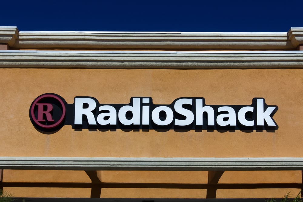
RadioShack’s 2009 attempt to rebrand itself as ‘The Shack’ was meant to modernize its image and appeal to younger customers.
The campaign cost millions but solved none of the company’s real problems.
Shoppers were confused, wondering why the store’s focus hadn’t changed even though the name had.
The move made it seem like RadioShack was trying too hard to sound cool while still selling the same outdated products.
It became another nail in the coffin for the struggling retailer.
Yahoo

After months of teasing a big reveal in 2013, Yahoo’s CEO Marissa Mayer unveiled a new logo that looked barely different from the old one.
The change was supposed to symbolize innovation and renewal, but most people didn’t even notice the difference.
The lack of boldness made it feel like a wasted effort.
Instead of capturing a new audience, the update highlighted how out of touch the company had become with its own identity.
Uber
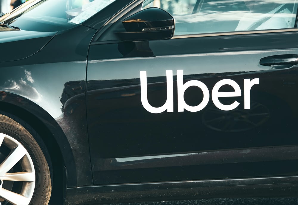
Uber’s 2016 redesign replaced its recognizable ‘U’ logo with a strange geometric icon inspired by bits and atoms.
The problem was, no one could tell it was Uber anymore.
The rebrand confused riders and drivers alike, and even some executives later admitted it didn’t connect with the brand’s purpose.
Eventually, Uber went back to a simpler design that focused on clarity and recognition.
It proved that when your business depends on visibility, your logo shouldn’t need a decoding guide.
MasterCard

In 2006, MasterCard tried removing its name from the overlapping red and yellow circles to modernize its look.
The simplified version was supposed to feel sleek and digital-friendly, but people didn’t instantly recognize it.
The brand quickly learned that recognition builds trust, especially when it comes to money.
They later reincorporated their name and adjusted the design to balance simplicity with familiarity.
Pepsi
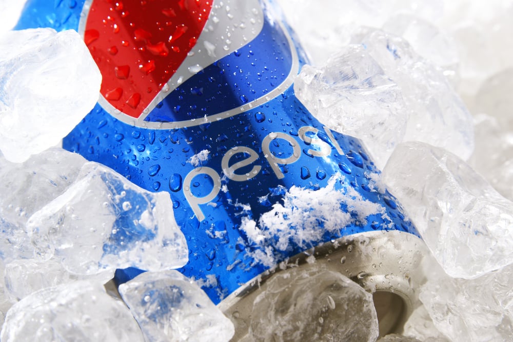
Pepsi’s 2008 logo redesign cost over a million dollars in design fees and countless hours of branding work.
The result was a white stripe across the circle that looked like an uneven grin.
Some joked that it resembled a smiley face or even a parody of the Obama campaign logo from the same year.
Despite the hype, the change didn’t help Pepsi stand out or increase sales.
Instead, it became a prime example of how overthinking design can make a brand lose its visual punch.
Kraft Heinz
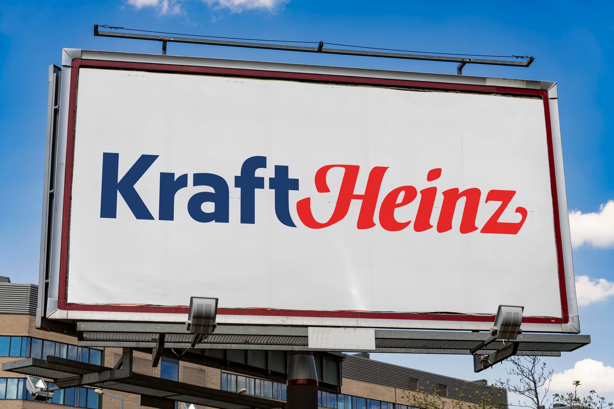
After their merger, Kraft Heinz wanted to present a unified, modern image.
The new logo was minimal, flat, and cold—so simple it looked unfinished.
Consumers didn’t connect with it, and critics said it lacked the warmth that once defined Kraft’s family-friendly vibe.
The rebrand highlighted the tension between tradition and modernization, and the company later toned down its design to feel more human again.
British Airways

In the late 1990s, British Airways attempted to look more international by painting its plane tails with artwork from around the world.
While creative, the change upset many British travelers who saw it as a rejection of the Union Jack.
Even Prime Minister Margaret Thatcher reportedly covered a model plane’s tail with her handkerchief during a press conference, calling it a mistake.
The backlash forced the airline to restore the national flag, proving that heritage can be a brand’s strongest asset.
J.C. Penney

In 2011, J.C. Penney decided to drop its discount-heavy image and go for everyday low pricing.
The idea sounded smart in theory but failed miserably in practice.
Shoppers missed their coupons and sales, which had become part of their shopping routine.
Sales plunged by billions, and the CEO behind the plan was eventually replaced.
It showed that trying to change customer habits too quickly can backfire, no matter how well-intentioned the idea.
Weight Watchers

To move beyond dieting, Weight Watchers shortened its name to ‘WW’ in 2018, aiming to focus on wellness.
The trouble was, no one knew what ‘WW’ meant.
The rebrand created confusion, and even loyal members weren’t sure if it was still a weight-loss program.
The company eventually had to clarify its purpose again, realizing that clarity always beats cleverness.
Gap Kids’ “Logo Remix”
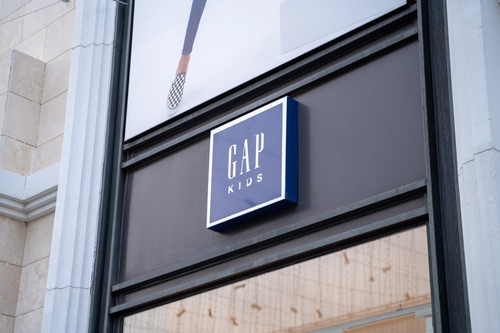
Gap Kids’ attempt to remix its logo with playful fonts and colors seemed fun on paper, but it came across as messy and unfocused.
The design looked like a kindergarten art project, lacking the polish expected from a global retailer.
Parents criticized it for being out of touch with the brand’s clean and classic image.
Within days, the campaign was scrapped, adding another entry to Gap’s growing list of rebranding blunders.
Syfy Channel

When the Sci-Fi Channel rebranded to ‘Syfy’ in 2009, it wanted to trademark the name and appeal to a broader audience.
Instead, fans mocked the change, calling it childish and confusing.
The new name lost the geeky charm that defined the network’s roots.
Although the network eventually stabilized, the name remains one of the most ridiculed rebrands in TV history.
Reebok

Reebok’s 2014 logo change replaced its famous vector symbol with a triangle representing fitness, mind, and body.
While it aimed to position Reebok as a lifestyle brand, it ignored its deep roots in sports and street culture.
Fans felt disconnected, and the logo didn’t attract the new crowd it hoped for.
A few years later, Reebok quietly brought back elements of the old design to reconnect with its original audience.
Hershey’s

When Hershey’s unveiled a new logo featuring a stylized chocolate kiss icon, people online immediately noticed something unfortunate—it looked like a brown emoji swirl.
The company had intended to show modern simplicity, but instead became the butt of jokes across social media.
Though Hershey’s didn’t revert the change, the backlash reminded designers that even small tweaks can carry unintended meanings.
Netflix
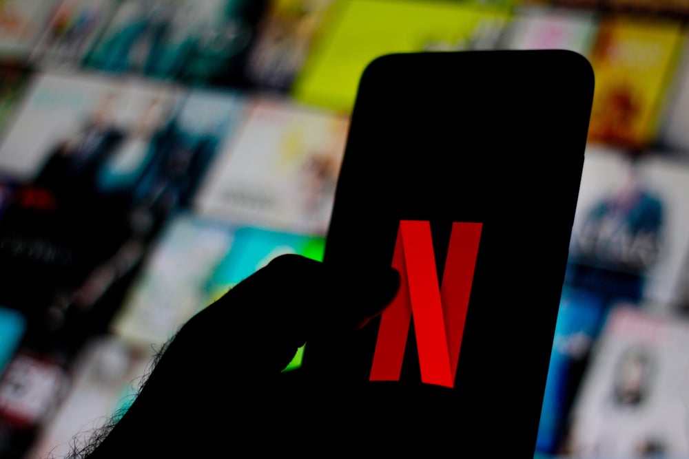
In 2011, Netflix decided to split its services into two: Netflix for streaming and Qwikster for DVD rentals.
Customers were expected to manage two separate accounts and payments.
The reaction was immediate outrage.
People didn’t understand why Netflix was making things harder.
Within weeks, the company scrapped the idea, issued a public apology, and promised to listen to customers in the future.
Tropicana’s redemption
After the failed packaging redesign, Tropicana learned an important lesson about consumer attachment.
When they brought back the classic orange-with-a-straw image, shoppers welcomed it like an old friend.
The company also improved its communication by publicly acknowledging that the change had missed the mark.
This rare moment of humility helped rebuild trust and reminded everyone that listening to customers never goes out of style.
Lessons from logo limbo

From Coca-Cola’s formula fiasco to Tropicana’s packaging confusion, every failed rebrand tells the same story: connection matters more than change.
People develop emotional ties to familiar symbols, colors, and words.
When brands forget that, they risk erasing the very thing that keeps customers loyal.
The smartest companies today evolve carefully, honoring their roots while moving forward.
In the end, the best rebrand is one that feels like a natural continuation—not a total reset.
More from Go2Tutors!

- The Romanov Crown Jewels and Their Tragic Fate
- 13 Historical Mysteries That Science Still Can’t Solve
- Famous Hoaxes That Fooled the World for Years
- 15 Child Stars with Tragic Adult Lives
- 16 Famous Jewelry Pieces in History
Like Go2Tutors’s content? Follow us on MSN.