Logos That Changed So Gradually Most People Never Even Noticed
Some of the world’s most recognizable brands have pulled off one of the greatest magic tricks in marketing history. They’ve completely transformed their visual identity while keeping millions of customers completely unaware of the changes happening right in front of them.
These aren’t dramatic overnight rebrands that make headlines — they’re subtle, strategic evolutions that unfold over decades.
The secret lies in making each individual change so small that it barely registers, even though the cumulative effect represents a total transformation. It’s the corporate equivalent of watching a child grow up: you see them every day and notice nothing, but compare a photo from five years ago and the difference is stunning.
These logos have mastered the art of change without disruption, maintaining customer loyalty while staying visually relevant.
Shell

Shell’s logo looks practically unchanged since the 1970s, but that’s exactly the point. The company has been tweaking the shell design continuously, making microscopic adjustments to the curves, colors, and proportions that keep it feeling fresh without ever feeling different.
The yellow got warmer. The red got more vibrant.
The shell itself became more symmetrical and the lines more refined. Each change happened so gradually that even design professionals would struggle to pinpoint when specific modifications occurred.
Yet compare the 1971 version to today’s logo and you’re looking at what amounts to a complete redesign that somehow feels like no redesign at all.
IBM
The famous blue striped IBM logo underwent one of the most patient transformations in corporate history (spanning nearly two decades of tiny adjustments that nobody seemed to notice, even though the final result bears almost no resemblance to where it started). What began as a solid, somewhat clunky wordmark slowly developed horizontal lines that gave it movement and sophistication — but the lines appeared so gradually, growing more pronounced with each iteration, that customers never experienced the jarring sensation of a “new” logo.
And the blue itself shifted through at least six distinct shades over the years, each one barely perceptible from its predecessor but collectively representing a complete color overhaul. So IBM managed something that should be impossible: they created an entirely new visual identity while maintaining perfect brand continuity.
Pepsi

The Pepsi logo tells the story of a brand that refused to sit still but was smart enough never to run. Between 1950 and 1991, the logo changed seventeen times.
Seventeen. Most people remember maybe three versions.
Each iteration made small adjustments to the circle, the wave, the typography, or the red-white-blue proportions. The changes were frequent enough that no single version existed long enough to become deeply embedded in consumer memory, yet gradual enough that each transition felt natural.
Pepsi essentially trained an entire generation to accept logo evolution as normal, which explains why they can make more dramatic changes today without losing customer recognition.
Apple
Apple’s logo evolution reads like a meditation on simplification — the kind where you remove everything nonessential until only the essence remains, except the removal happens so slowly that the essence seems to have been there all along. The rainbow apple didn’t become the monochrome apple overnight; it lost colors one season at a time, each version slightly more muted than the last, until the rainbow had faded so gradually that its disappearance felt like waking up rather than losing something.
The apple itself grew sleeker in parallel, its curves refined and its proportions adjusted in increments so small they registered more as seasonal changes than design decisions. And perhaps most remarkably, the logo learned to feel equally at home on a computer screen and a billboard, adapting its weight and spacing for different contexts while never announcing these adaptations as changes.
McDonald’s
McDonald’s golden arches represent the ultimate triumph of patient branding. The arches have never disappeared, never changed color, never rotated or inverted or reimagined.
They’ve simply gotten more golden, more arch-like, more perfect with each passing decade.
The changes happen in the margins: slightly thicker lines, marginally different curves, fractionally adjusted proportions. The typography has shifted at least eight times, but always in service of making the arches feel more prominent, more authoritative.
McDonald’s has spent fifty years perfecting the same logo, and most people think it’s never changed at all. Which is exactly what makes it brilliant.
Nike
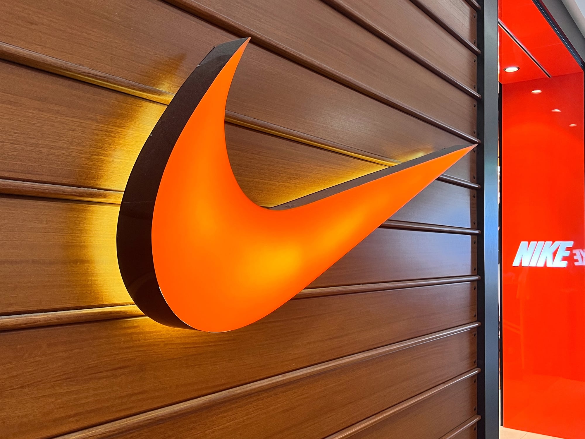
The swoosh has been getting smaller for thirty years, and somehow this has made it more powerful rather than less visible. When the wordmark “Nike” disappeared from most applications in the 1990s, the swoosh had already been growing more confident and self-contained through subtle refinements to its curve and proportions.
The logo learned to work at any size because Nike patiently adjusted its thickness, angle, and internal spacing across hundreds of applications. Each sport demanded slightly different proportions, each product category required minor modifications, but the core shape remained so consistent that these variations felt like natural adaptations rather than design changes.
The swoosh didn’t become iconic overnight — it became iconic through repetition and refinement.
Mastercard
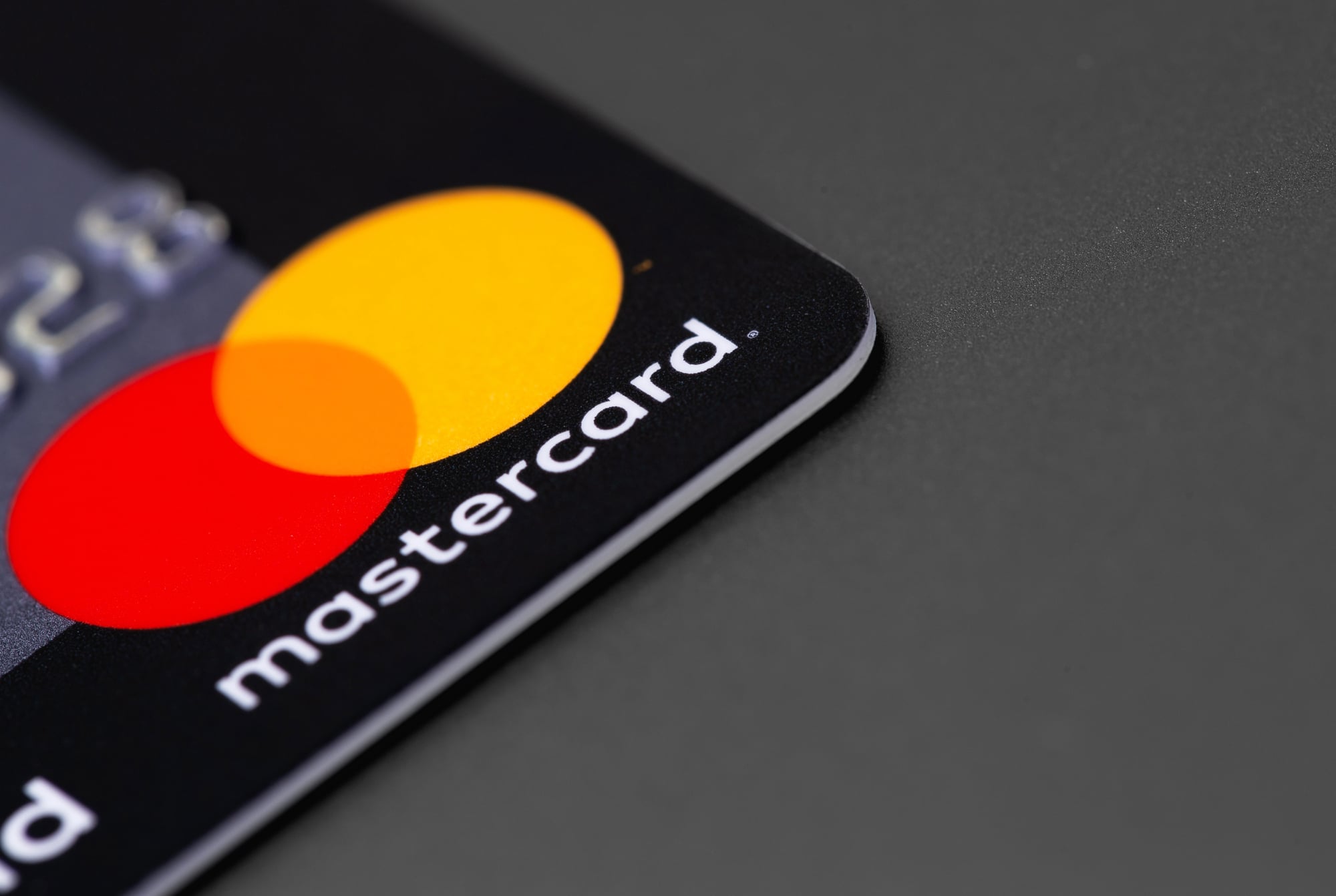
Mastercard’s interlocking circles tell a story of colors learning to behave like shapes, and shapes learning to carry meaning that words never could (because the evolution happened so slowly that customers had time to absorb each layer of meaning before the next one appeared, which is why the wordmark could eventually disappear without anyone feeling lost). The red circle and yellow circle started as simple geometric forms, but over decades of tiny adjustments to their overlap, their saturation, and their positioning relative to each other, they developed into something closer to a symbol than a logo.
And when “MasterCard” became “Mastercard” and then eventually disappeared altogether in certain contexts, the circles had already been doing the heavy lifting for so long that the transition felt overdue rather than premature. The genius lies in how the logo trained people to recognize the brand through color and shape relationships rather than text, preparing them for a wordless future they didn’t know was coming.
Starbucks
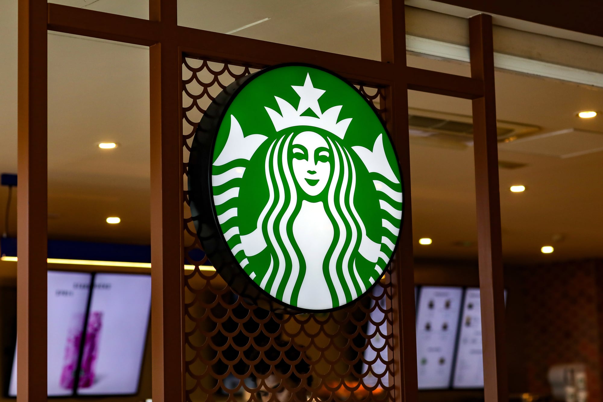
The siren has been swimming toward simplicity for decades. She started trapped inside a circle of text, surrounded by stars and borders and explanatory elements that made the logo feel crowded rather than iconic.
Each redesign removed something: first the outer ring, then some of the text, then the remaining border elements. Meanwhile, the siren herself became more stylized, her features more geometric, her hair more flowing.
The changes happened roughly every decade, which gave customers time to adjust while keeping the brand feeling contemporary. Starbucks essentially performed plastic surgery on their logo one feature at a time, and the result looks natural rather than constructed.
Volkswagen

Volkswagen’s logo evolution represents forty years of arguing with geometry until geometry gives up and becomes art instead. The VW letters started as straightforward industrial lettering — functional, unglamorous, exactly what you’d expect from a company that built practical cars for practical people.
But practical doesn’t sell luxury SUVs, so the letters began their slow transformation: rounded corners appeared gradually, the internal spacing grew more generous, the overall proportions shifted from square to circular in increments so small they might have been measurement errors. And the circle that contains the letters learned to feel less like a boundary and more like a frame, which somehow made the letters feel more important rather than more constrained.
The logo never announced these changes because the logo never stopped looking like a VW logo — it just kept getting better at it.
Target
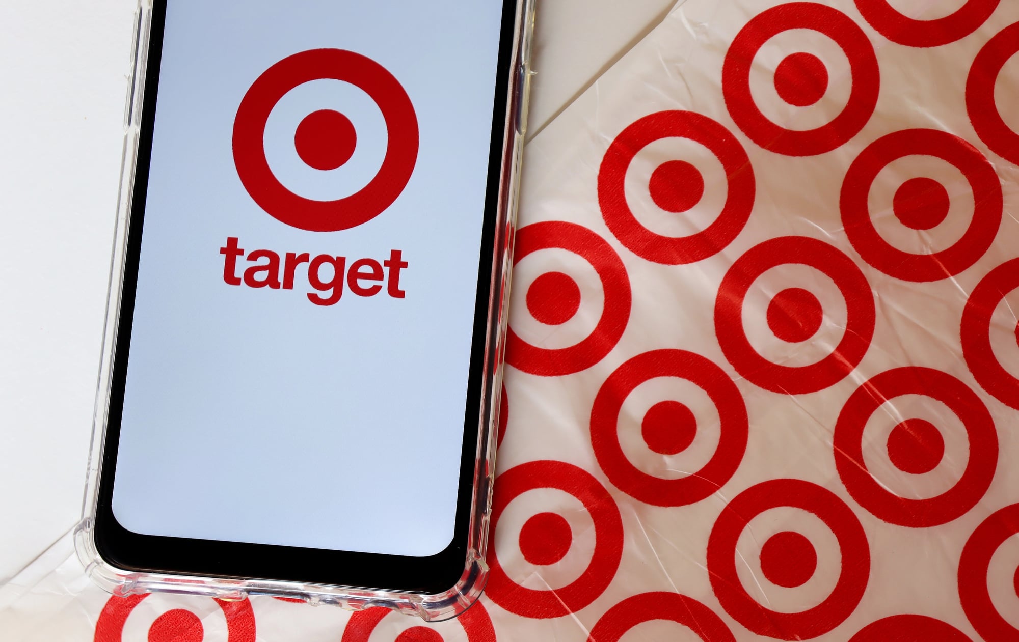
Target’s bullseye works because it’s impossible to improve and difficult to ruin. The company has spent thirty years making microscopic adjustments that most people couldn’t identify even when looking at before and after comparisons.
The rings got slightly thicker, then slightly thinner. The red shifted warmer, then cooler, then warmer again.
The proportions between the rings changed by fractions of percentages. Each modification served a specific purpose — better reproduction at small sizes, improved contrast on different backgrounds, more balanced negative space — but the cumulative effect was a logo that felt increasingly confident and authoritative while never feeling different.
Mercedes-Benz
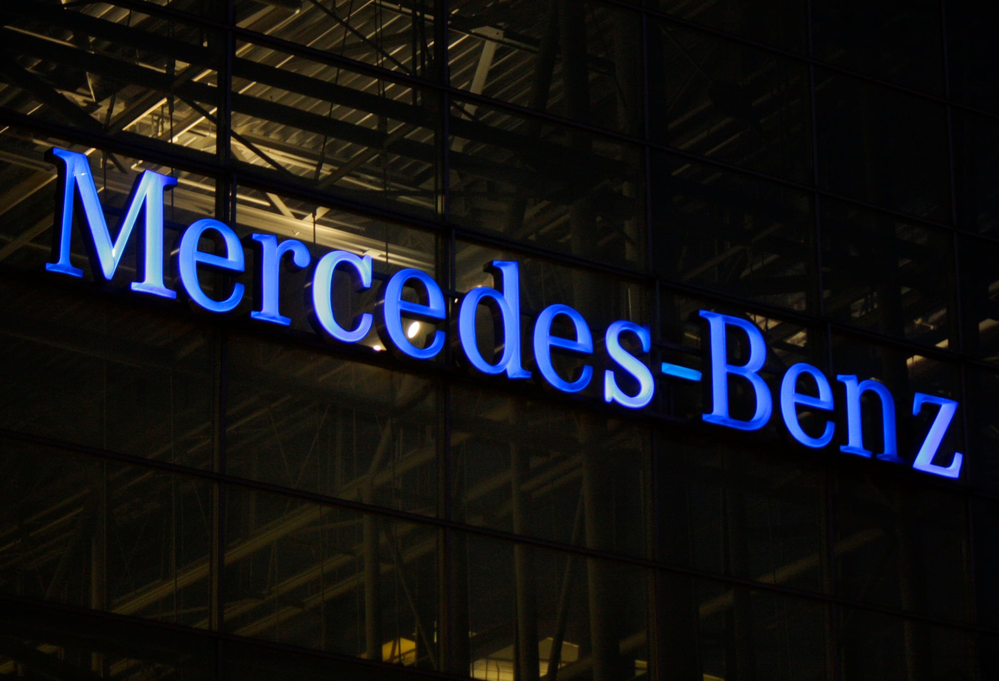
The three-pointed star has been perfecting its relationship with the circle that contains it for nearly a century. This isn’t about the star itself, which has remained essentially unchanged — it’s about the infinite small adjustments to how the star sits within its border, how thick that border should be, how much space should exist between star and circle.
Mercedes has also mastered the art of contextual adaptation, using slightly different proportions for different applications while maintaining perfect visual consistency. The logo on a car grille uses different spacing than the logo on letterhead, but both feel like the same mark.
This kind of systematic flexibility takes decades to develop and even longer to implement without anyone noticing.
FedEx
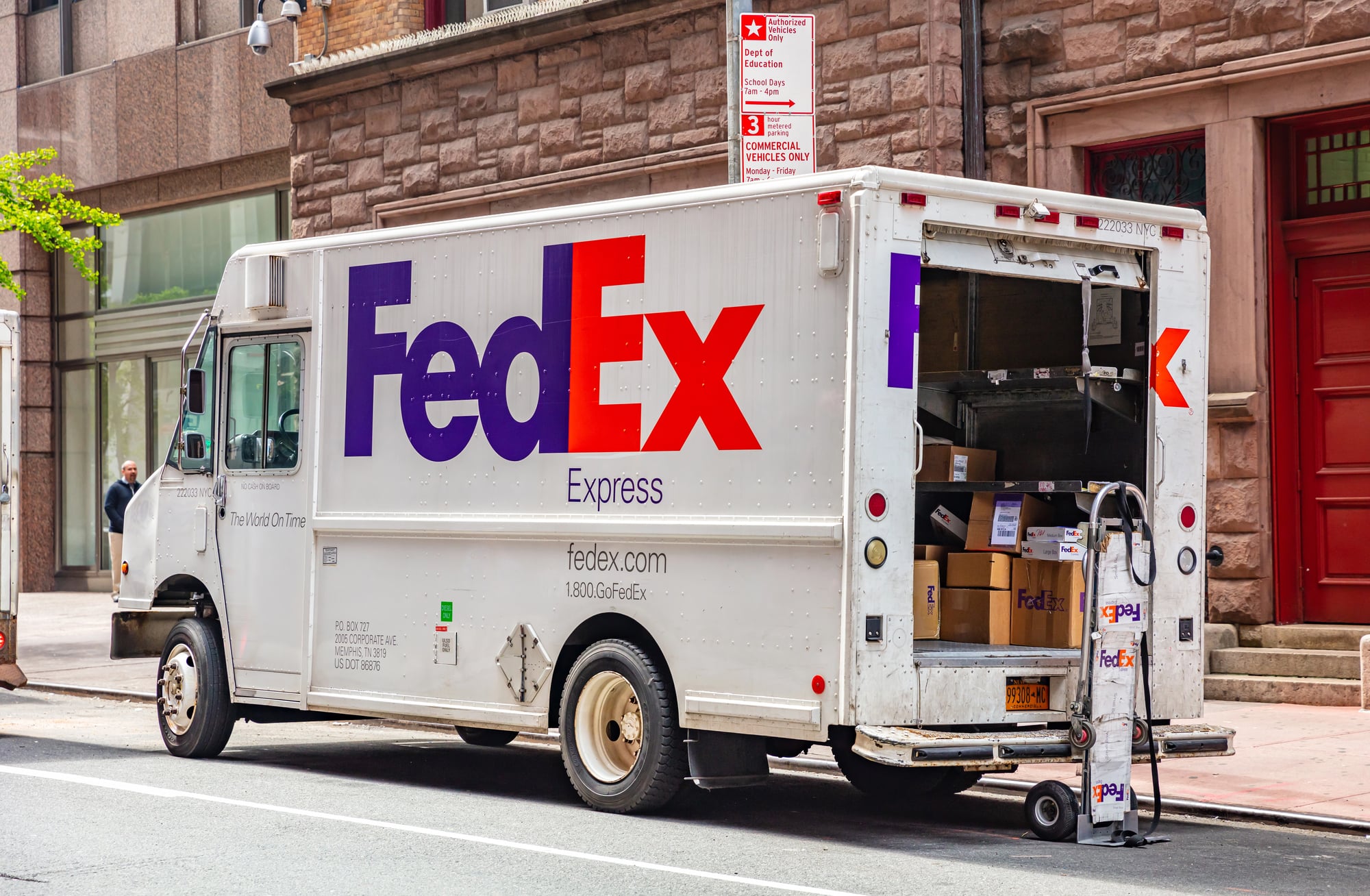
FedEx created one of the most famous hidden symbols in logo design — the arrow between the E and X — but the logo’s real achievement is how it’s been refined since that arrow was introduced. The typography has been adjusted countless times to make the arrow more prominent, more elegant, more integrated into the letterforms themselves.
Each refinement served the arrow: slightly tighter spacing here, fractionally different letter weights there, microscopic adjustments to the baseline and x-height. The changes were so subtle that the logo appeared static while actually being in constant motion.
FedEx spent twenty years perfecting a five-letter wordmark, and most people think it’s never changed since the arrow appeared.
Ford
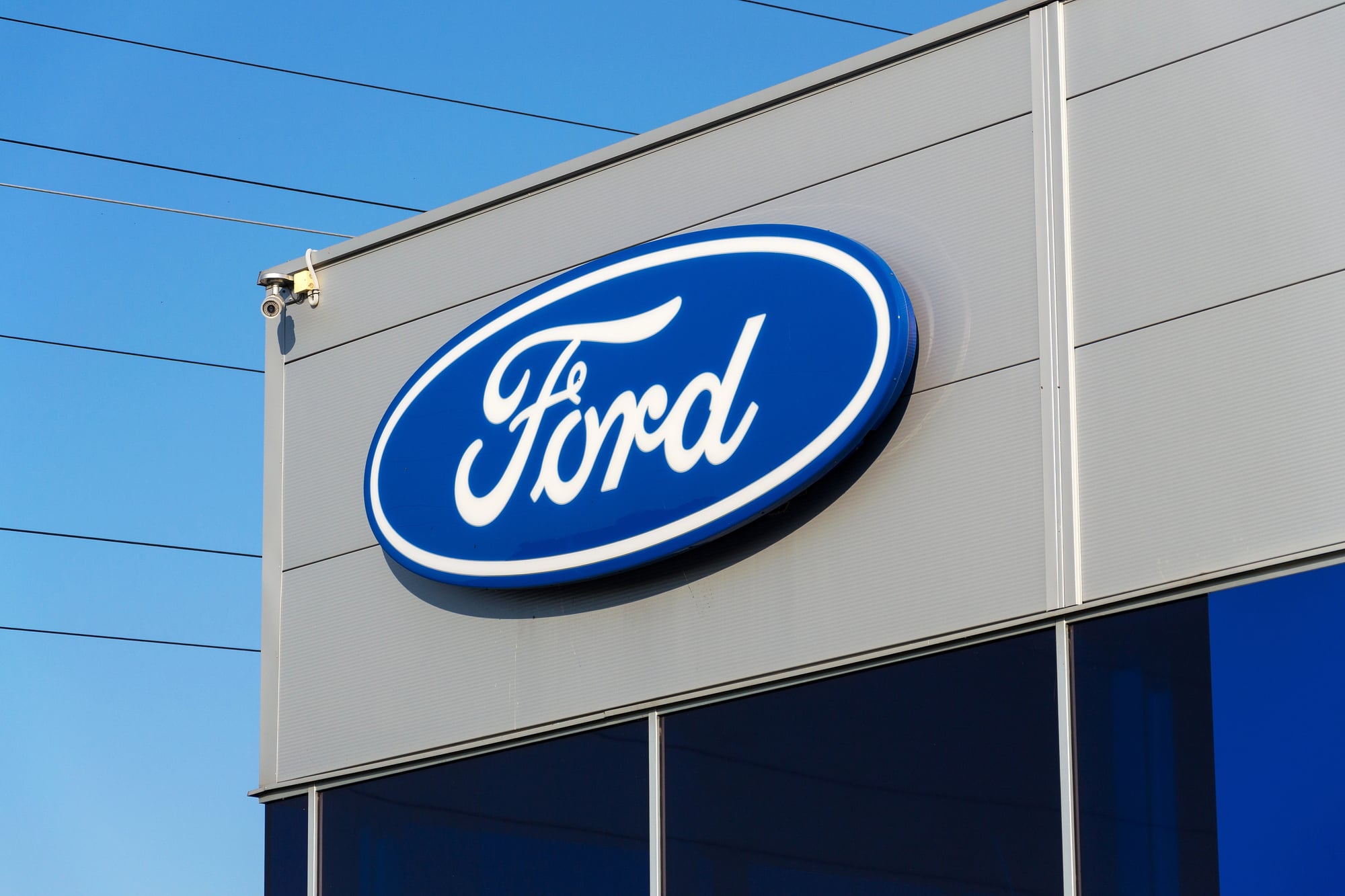
Ford’s script logo represents 120 years of the same signature getting gradually more confident about itself. The oval appeared in 1912 and has been slowly perfecting its proportions ever since, but the real evolution happened in the letterforms — the way the F connects to the o, how the r relates to the d, the overall rhythm of the script.
Each generation of designers made tiny adjustments to the letter spacing, the curve relationships, the thickness variations that give script fonts their personality. The logo never looked dramatically different from one year to the next, but compare the 1960 version to today’s mark and you’re seeing a complete typographic transformation that happened one adjustment at a time.
UPS

UPS brown became more brown over thirty years of color refinement, which sounds impossible but makes perfect sense when you see the progression. The shield shape also grew more confident, its proportions more balanced, its internal elements more integrated.
But the real story is how UPS gradually eliminated everything that wasn’t essential to brand recognition. Decorative elements disappeared slowly, typography simplified incrementally, and the overall design moved steadily toward something that could work equally well on a delivery truck and a smartphone screen.
The logo evolved for digital applications decades before anyone knew digital applications would matter.
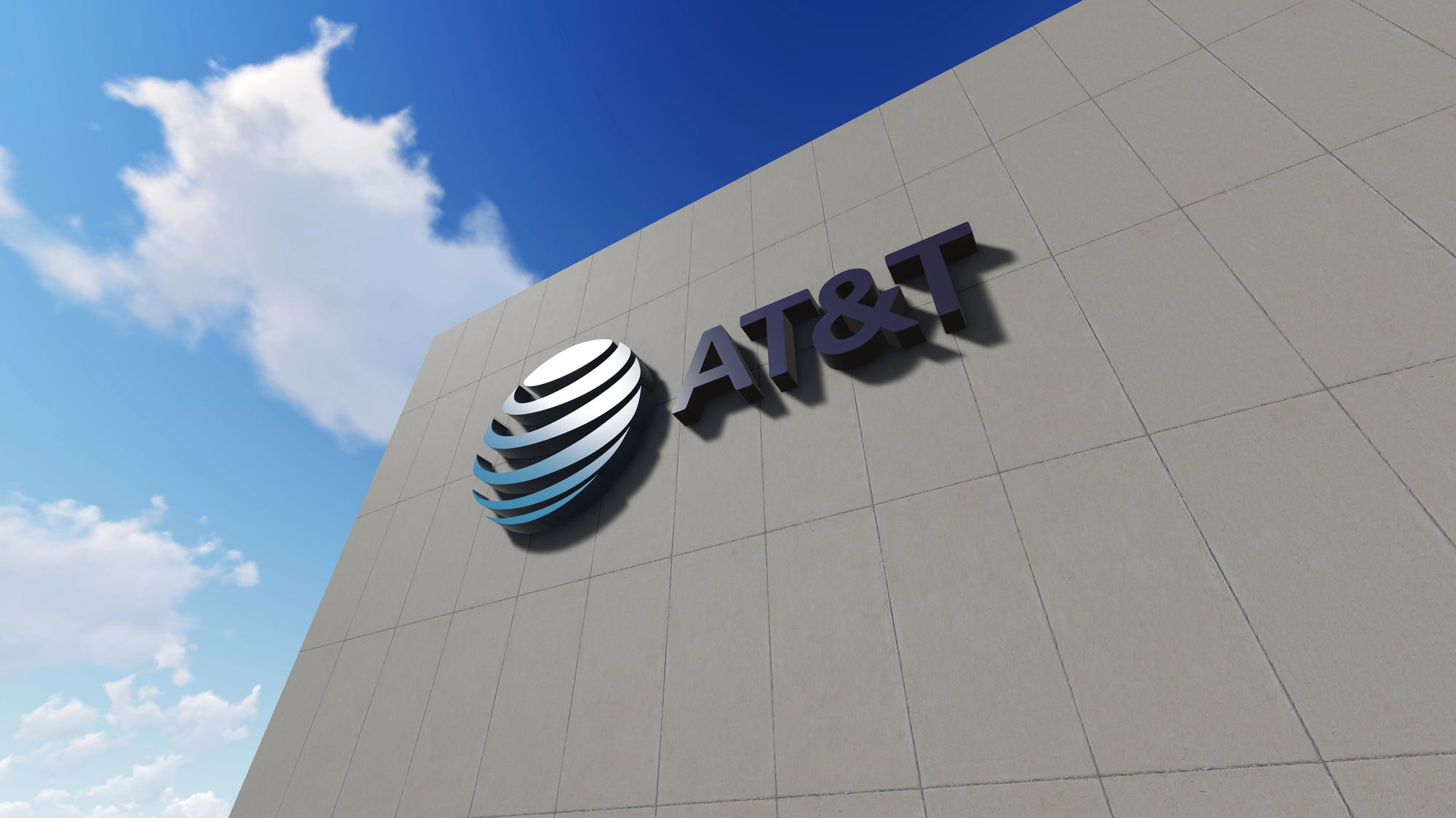
AT&T
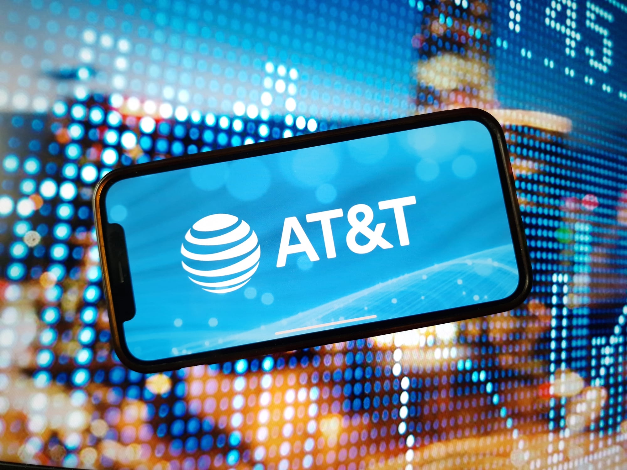
The death star logo — that striped sphere that dominated AT&T’s identity for decades — disappeared so gradually that its absence felt natural rather than shocking. The company spent fifteen years slowly reducing the logo’s prominence, simplifying its internal elements, and introducing alternative marks that could work alongside it.
When the striped sphere finally vanished completely, AT&T had already been functioning with simplified alternatives for so long that customers barely noticed. The transition happened through patient redundancy: new elements were introduced alongside familiar ones until the new elements could stand alone.
It’s corporate rebranding through careful substitution rather than dramatic replacement.
When Brands Become Background Music
These logo evolutions succeed because they understand something fundamental about human attention: people notice disruption, but they adapt to gradual change without conscious effort. The logos that changed most successfully over time learned to modify themselves at the pace of cultural adaptation rather than the speed of design trends.
They became visual background music — always present, always appropriate, never demanding attention for their own sake while continuously evolving to stay relevant.
More from Go2Tutors!

- The Romanov Crown Jewels and Their Tragic Fate
- 13 Historical Mysteries That Science Still Can’t Solve
- Famous Hoaxes That Fooled the World for Years
- 15 Child Stars with Tragic Adult Lives
- 16 Famous Jewelry Pieces in History
Like Go2Tutors’s content? Follow us on MSN.